
JDI Light Framework
JDI Light is a powerful Test Automation Framework that helps to make your tests fast, sustainable and provides obvious and predictable test run results.
JDI Light is powered by Selenium and has simple integration with Selenium-based projects.
Highlights
- Has simple integration with any Selenium-based project, allowing to increase overall project stability, add user action logs and enrich standard WebElement capabilities with new features in just minutes.
- Complements the Page Object pattern with powerful pre-made UI Elements: Buttons, TextFields, Forms, Tables and many others.
- Enables you to write stable and predictable tests that fail only because of business logic or layout changes. No more waits, thread sleeps and other flaky stuff.
- Increases your overall test execution speed, especially for complex cases like searching huge tables, selecting dropdown items out of a hundred or entering text containing thousands of lines.
- Provides detailed logs and well-readable reports of all user actions with no additional effort.
- All UI Elements have assertions/matchers powered by Hamcrest and a wait with expected condition during timeout.
- Easy integration with all modern automation tools: CI (Jenkins, TC etc.), logging (Log4j or any other slf4j-based logs), reporting (Allure or Report Portal); browser/device farms (Selenium Grid, BrowserStack, Selenoid etc.), test runners (TestNG, JUnit) etc.
Navigation
Introduction provides examples of common test automation tasks solved with JDI Light.
Tutorial walks you through adding JDI Light to your project, implementing test scenarios and using UI Elements. You also get to see how much JDI Light reduces the needed effort, compared to pure Selenium.
Theory addresses the key principles behind JDI Light framework and the tools it offers to put these principles into practice.
Documentation contains technical description of JDI Light features/settings and UI Element sets.
Introduction
Simple JDI examples
Create a simple Login test
First of all, let's see how JDI solves typical problems. Let's start with Login, since most tests start with signing in.
You can find a Java code example here.
Test Scenario
@Test
public void loginTest() {
    homePage.open();
    userIcon.click();
    loginForm.loginAs(DEFAULT_USER);
    homePage.checkOpened();
}
- Open Home Page (https://jdi-testing.github.io/jdi-light/index.html)
- Click on User Icon (to open login dialog)
- Log in as a default user:
- Enter 'Roman' in login text field
- Enter 'Jdi1234' in password text field
- Press 'Enter'
- Verify that Home Page has been opened
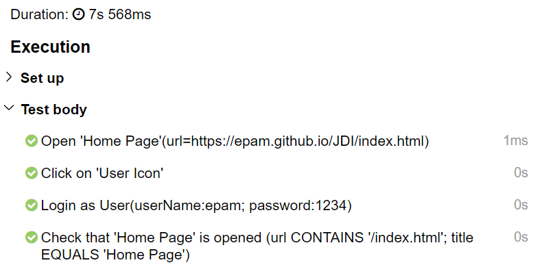
[22:17.102  STEP] : Open 'Home Page'(url=>https://jdi-testing.github.io/jdi-light/index.html)
[22:23.617  STEP] : Click on 'User Icon'
[22:23.727  STEP] : Login as User (userName:epam; password:1234)
[22:24.516  STEP] : Check that 'Home Page' is opened (url CONTAINS '/index.html'; title EQUALS 'Home Page')
So simple! But there's more to it. Try to run this test in your IDE and see what you get...
- A detailed log in the console output (pictured to the right; nice, isn't it?)
- Log file containing the same log (src/test/.logs/) in case you'd like to view the test execution results separately. (requires log4j2.xml file in src/test/resources)
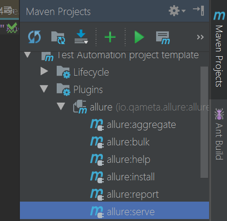
- A neat Allure report of your test execution. (requires proper Allure settings in pom.xml)
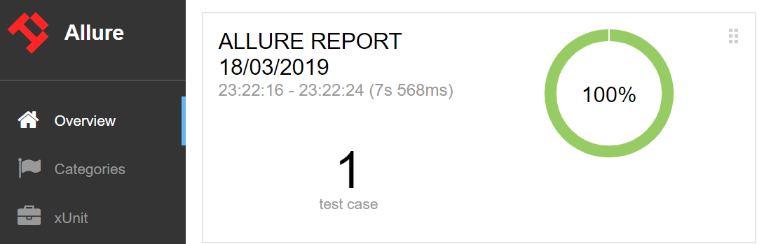
Just move the allure-results folder to your local folder and run Maven > Plugins > Allure > allure:serve (see picture below).
@JSite("https://jdi-testing.github.io/jdi-light/")
public class JdiTestSite {
    public static HomePage homePage;
}
@BeforeSuite(alwaysRun = true)
public static void setUp() {
    initElements(JdiTestSite.class);
}

@Url("/index.html") @Title("Home Page")
public class HomePage extends WebPage {
    @Css("form") public static LoginForm loginForm;
    @Css("img#user-icon") public static Icon userIcon;
}

public class LoginForm extends Form<User> {
    @Css("#name") TextField userName;
    @Css("#password")  TextField password;
    @Css("[type=submit]") Button enter;
}
UI Page Objects
Now let's have a look at Page Objects in JDI. For example, we used the following objects in the login test above:
Site — your application entity. It contains all the Pages of your application and can be initiated with a single method call.
HomePage — Pages contain UI elements: common, complex and composite. Pages also carry meta-information about their URLs and titles and allow executing common actions like
open,checkOpened,getUrl,getTitle,zoom,scrolletc.LoginForm — Forms and Sections are logical parts of pages; they can include other sections or just UI elements. Forms also offer additional actions like
fill,submit,checketc.UI elements (typified elements) —
Button,TextField,Checkbox,Iconetc. are simple elements representing the elements of an actual UI.
Below you can find a common JDI project structure:
@Test
public void nonPageObjectTest() {
    WebPage.openUrl("https://jdi-testing.github.io/jdi-light/index.html");
    $("img#user-icon").click();
    $("form #name").input("Roman");
    $("form #password").input("Jdi1234");
    $("form [type=submit]").click();
    Assert.assertEquals(WebPage.getUrl(), "https://jdi-testing.github.io/jdi-light/index.html");
}
public class LoginForm extends Form<User> {
    TextField userName = $("#name");
    TextField password = $("#password");
    Button enter = $("[type=submit]");
}
Short term non-Page Object style
If you need a quick test (i.e. you don't need Page Objects), you can simply use jQuery/Selenide style without any additional code.
You can also directly initialize UI elements defined in your Page Objects if you don't like annotations.
Smart Test locators
See details and examples for Smart locators in the documentation
@Test
public void assertTest{
  title.is().text(containsString("jdi"));
  name.assertThat().text(is("Roman"));
  color.has().attr("color", is("red"))
}
@Test
public void chainAssertTest{
  title.assertThat()
    .text(containsString("jdi"))
    .attr("color", is("red"))
    .tag(is("h1"))
}
@Test
public void listAssertTest{
    searchResults.is().notEmpty();
    searchResults.assertThat()
        .size(equalTo(10))
        .any(e -> e.name.equals("Jdi intro 2"))
        .each(e -> e.name.toLowerCase().contains("jdi"))
        .onlyOne(e -> e.name.contains("Jdi intro 1"))
        .noOne(e -> e.name.contains("Selenide"));
}
@Test
public void tableChainTest() {
    users.assertThat()
        .displayed().size(6).size(greaterThan(3))
        .notEmpty().row(d -> d.user.contains("Ivan"))
        .allRows(d -> d.user.length() > 4)
        .atLeast(3).rows(d -> d.type.contains("User"))
        .row(SPIDER_MAN)
        .exact(2).rows(d -> d.description.contains(":VIP"))
        .exact(1).rows(SPIDER_MAN);
}
Asserts/Matchers integrated with elements
JDI has a really flexible set of matchers integrated into it.
- To access element matchers, you can use the following methods:
is()
assertThat()
has()
waitFor()
shouldBe()
All these methods are equivalent. Different names just help making code more descriptive and human-readable. - JDI matchers are powered by Hamcrest, the most popular matcher library in the Java world.
And you can chain these matchers to verify multiple conditions.
- With JDI you won't have to struggle with waits or execute sloppy tests.
JDI matchers handle most kinds of problems. They will pass when you expect them to and fail whenever there is a real error.
Really useful, don't you agree?
Custom elements
public class Checklist extends HtmlElement {
    @Override
    public boolean isSelected() {
        return find("<<").hasClass("active");
    }
}
public class Checklist extends HtmlChecklist {
    @Override
    public boolean isSelected(HtmlElement value) {
        return hasClass("active") && attr("ui").equals("label");
    }
}
public class ContactForm extends Form<Contacts> {
    TextField name, lastName, position, passportNumber, passportSeria;
...
    @UI("['Submit']") public Button submit;

    @Override
    public void fillAction(Field field, Object element, Object parent, String setValue) {
        if (isInterface(field, TextField.class))
            ((TextField)element).higlight();
        super.fillAction(field, element, parent, setValue);
    }
}
JDI HTML elements can handle typical standard cases, but each application has its unique culture of layout development.
So if your developers are not following common standards, you can easily create a pack of elements specific to your application and use them with JDI. You can create your own elements or simply extend the existing ones, overriding a couple of methods.
Check these examples:
Start a new project with JDI
You can start a new test automation project with JDI in mere seconds!
Just download one of the templates at Github JDI template repository.
Java + Allure + TestNg (recommended)
Java + Allure + JUnit
CSharp + NUnit
How to improve your Selenium project with new capabilities in just a few minutes
Logging and Reporting
Tutorial
In this tutorial we’ll take a glance at JDI Light, a library that simplifies test automation, makes test run results stable, predictable and easy to maintain.
- Quick Start — a short instruction on how to add JDI Light to your project and perform its basic configuration.
- JDI Light at a glance — a few simple test examples with and without Page Objects. Typified UI Elements and logs in JDI Light.
- JDI Light Forms — a small complex element example that showcases the primary benefits of using JDI Light.
- UI Elements and optimization — a more sophisticated example elaborating on types of elements in JDI Light and demonstrating their capabilities.
- Reduce the amount of code with JDI Light — a concise example of how JDI Light can decrease the amount of code threefold compared to Selenium.
Demonstrates that you can write clear and stable tests with 3 times less effort.
1. Quick Start
- Adding JDI Light to your projects
- A brief configuration overview
Let’s start from the beginning by adding JDI Light to our test project and going through the setup step by step.
Note: JDI Light ships with a template project that helps to save setup time.
Maven Dependencies
<dependency>
    <groupId>com.epam.jdi</groupId>
    <artifactId>jdi-light-html</artifactId>
    <version>RELEASE</version>
</dependency>
First, we need to add JDI Light to the dependency section of our pom.xml file:
The latest version can be found in the Maven Central Repository.
Configuration
That’s all! We don’t need to explicitly configure anything else to start working. By default, JDI Light will download Chrome driver automatically, set it up and run it as soon as we try to access the first page.
We can change the default settings by altering the test.properties file (located within src/test/resources directory).
src/test/resources/test.properties
driver=chrome
#driver.version=2.23 | LATEST
#timeout.wait.element=10
#timeout.wait.page=30
domain=https://jdi-testing.github.io/jdi-light/
#page.load.strategy=normal | eager | none
#browser.size=MAXIMIZE | 1024x762
...
Let’s have a detailed look at some options:
- driver — we can specify the driver used to run our tests. Common options include
chrome,firefox,ie; we can also just put${driver}here and read the driver name from the command line. - driver.version — by default, JDI Light will download the latest version of a driver for us, but if we need a specific version we can put it here (in which case the framework will find and download exactly this version).
- timeout.wait.element — the maximum amount of time in seconds that will be spent waiting for an element on the opened page to load. The default element loading timeout is 10 seconds.
- timeout.wait.page — JDI Light automatically defines a newly opened page and uses this value as page loading timeout (it is usually greater than the element loading timeout). The default is 30 seconds.
- domain — web application root URL (used when our tests work with a single application). Can also be read from the command line if set up as
${domain}. - page.load.strategy — similarly to Selenium, page loading strategies are:
normal,eager,none. - browser.size — browser window size. By default, JDI Light will maximize the browser window, but we can set the exact size.
- screenshot.strategy =
off|on failure|on assert|new page— determines when screenshots are taken; it's used by AllureLogger.class and its sub/superclasses. Can be overwritten in test project. - html.code.strategy =
off|on failure|on assert|new page— logs the last processed element HTML code. - requests.strategy =
off|on failure|on assert|new page— logs 4ХХ, 5ХХ errors in the console. - allure.steps =
true— turn on the steps for Allure.
Note: you can find more examples in the documentation.
2. JDI Light at a glance
- Simple Open page test
- No Page Objects test example
- Page Objects test example
Let's start
@Test
public void openJDITestSite() {
    openUrl("https://jdi-testing.github.io/jdi-light/");
}
OK, now let’s write our first test case. We can open the JDI test site by using a static method openUrl() of the WebPage class.
WebPage provides essential methods to work with a browser: getUrl(), getTitle(), back(), forward(), getHtml(), refresh(). It also provides methods that allow to scroll up / down / left / right / to page top / to page bottom or zoom the page.
Simple test scenario
@Test
public void loginSimpleTest() {
    openUrl("https://jdi-testing.github.io/jdi-light/");
    $("img#user-icon").click();
    $("#name").sendKeys("Roman");
    $("#password").sendKeys("Jdi1234");
    $("#login-button").click();
    $("#user-name").is().displayed();
}
Now we can write a more involved typical test: log in to a page.
Every test should contain an assertion, so let’s add it to our test.
Code like this is easy to write. However, it will inevitably become hard to maintain as the number of tests grows and elements used get repeated throughout the tests.
For example, if we have an element found by $(".menu-about a") locator in more than 10 tests and its locator gets changed, we must go through all the tests and adjust the locator.
Page Objects are here to help us!
See the examples above on Github
Page Objects
public class HomePage extends WebPage {
    @FindBy(css = "img#user-icon") public WebElement userIcon;
    @FindBy(id = "name") public WebElement name;
    @FindBy(id = "password") public WebElement password;
    @FindBy(id = "login-button") public WebElement loginButton;
    @FindBy(id = "user-name") public WebElement userName;
}
public class HomePage extends WebPage {
    @UI("img#user-icon") public static Link userIcon;
    @UI("#name") public static TextField name;
    @UI("#password") public static TextField password;
    @UI("#login-button") public static Button loginButton;
    @UI("#user-name") public static Text userName;
}
Let’s develop our first simple Page Object and see how the test case will look like. We have our Home Page with several elements on it:
- user icon — clicking on it opens the login form.
- name, password — two text fields in the login form.
- login button — clicking on it starts a login attempt.
- user name — element that will appear after a successful login.
In order to make the code simple, in JDI Light we can use a unified annotation, @UI("..."). It handles both CSS and XPath locators, thus reducing the amount of code.
It's also a good use case for one of the main JDI Light features: typified elements like TextField, Button and Text.
The other great news is that we can make our Page Object elements static and keep tests clearer and more obvious.
@JSite("https://jdi-testing.github.io/jdi-light/")
public class SiteJdi {
    @Url("/") public static HomePage homePage;
    @Url("/contacts") @Title("Contact Form")
    public static ContactsPage contactPage;
}
Page Objects in JDI Light are called UI Objects and extend standard Selenium Page Objects' capabilities with typified elements like TextField, Button, Text etc. They also carry additional meta-information about a page, like URL and title.
Pretty simple and obvious, isn’t it?
Page URLs are relative to the site domain specified in the @JSite annotation or in test.properties file.
Note: We won't be calling ContactsPage methods in this example; it is put here to demonstrate the usage of @Url and @Title annotations.
public interface TestsInit {
    @BeforeSuite(alwaysRun = true)
    static void setUp() {
        initElements(SiteJdi.class);
    }
}
And the last thing to consider before writing a test: all UI Objects of our application are initialized at once. We can do it with just a single line of code in the setup method that runs before all tests.
Note: in other frameworks we have to call initElements() for each Page Object.
public class PageObjectExample implements TestsInit {
    @Test
    public void loginTest() {
        homePage.open();
        userIcon.click();
        name.sendKeys("Roman");
        password.sendKeys("Jdi1234");
        loginButton.click();
        userName.assertThat().displayed();
    }
}

[ STEP 09:30.825] : Open 'Home Page'(url=https://jdi-testing.github.io/jdi-light/) (SiteJdi.homePage (url=https://jdi-testing.github.io/jdi-light/; title=))
[ STEP 09:37.188] : Click on 'User Icon' (HomePage.userIcon (css='img#user-icon'))
[ STEP 09:37.291] : Input 'Roman' in 'Name' (HomePage.name (css='#name'))
[ STEP 09:37.539] : Input 'Jdi1234' in 'Password' (HomePage.password (css='#password'))
[ STEP 09:37.756] : Click on 'Login Button' (HomePage.loginButton (css='#login-button'))
[ STEP 09:37.860] : Assert that 'User Name' is displayed (HomePage.userName (css='#user-name'))

[ STEP 11:16.923] : Open 'Home Page'(url=https://jdi-testing.github.io/jdi-light/)
[ STEP 11:22.983] : Click on 'User Icon'
[ STEP 11:23.088] : Input 'Roman' in 'Name'
[ STEP 11:23.369] : Input 'Jdi1234' in 'Password'
[ STEP 11:23.598] : Click on 'Login Button'
[ STEP 11:23.688] : Assert that 'User Name' is displayed
Now we can write our test using these UI Objects and execute it.
- This test scenario is pretty clear and references the actual UI elements.
- We can easily update elements placed in UI Objects without going through all the tests.
- We have all metadata about pages in one place and can open and validate pages without URL and title duplication in the test code.
- JDI Light tests are stable and will not fail in cases where Selenium throws exceptions (like StaleElementException or NoSuchElementException)
- We get the following text in the log:
It lists exactly what we do in our test with all the details and without any extra effort on our part. Fabulous!
We can change the log level to STEP (just add logger.setLogLevel(STEP) to the setUp() method) and remove the details. The resulting log will be fit to share with a Customer, a Business Analyst or a Manual QA to let them know what our automated tests verify.
See PageObject examples in PageObjectExample.java on Github
3. JDI Light Forms
- Simple login test example. DataClass example
- Login Form in Data Driven Test approach
- Page Objects test example
Standard Login form
public class LoginForm extends Form<User> {
    @UI("#name") TextField name;
    @UI("#password") TextField password;
    @UI("#login-button") Button loginButton;
}
public class JDISite {
    @Url("/") public static HomePage homePage;
    public static LoginForm loginForm;
    ...
}
@Test
public void loginTest() {
    userIcon.click();
    loginForm.loginAs(ROMAN);
    userName.is().displayed();
}
public class User extends DataClass<User> {
    public String name, password;
}
Now we will optimize the previous example using forms.
Let's move the login form elements to a separate UI Object — LoginForm.
Then we'll set LoginForm as a root UI Object in our JDISite class.
Now we can rewrite our test in the following way:
ROMAN is a business entity of class User associated with Login Form. User class is a simple data class with two String fields that have the same names as TextField elements in LoginForm.
Aligning data class field names with form field names works for every kind of form field that supports fill-like interaction: TextField, TextArea, Checkbox, DropDown etc.
This gets covered more in depth in Contact Form example.
  User ROMAN = new User().set(c -> {
      c.name = "Roman"; c.password = "Jdi1234";
  } );
Output: ROMAN.toString() --> User(name:Roman; password:Jdi1234)
new User().equals(new User());
Any class can be used as data class, but extending it from DataClass (User extends DataClass<User> in this case) gives us additional benefits:
- It won't be necessary to keep the same order of fields in the data class and the form.
- Two data class instances will be compared by equality of their fields and not by reference (so NOT like it would have been with the
equals()method). - There will be a good-looking
toString()representation of the data class instance based on its fields.
See this example in LoginExample.java on Github
Cover Login Form with Data-Driven tests
public class UsersDataProvider {
    public static User NO_PASSWORD = new User().set(c -> c.name = "Roman");
    public static User NO_CREDENTIALS = new User().set(c -> {
        c.name = ""; c.password = "";}
    );
    public static User WRONG_CREDENTIALS = new User().set(c -> {
        c.name = "Alex"; c.password = "Password";}
    );
    ...
}

public class LoginExample implements TestsInit {
    @BeforeMethod
    public void before() {
        loggedOut();
        loginFormShown();
    }
    @Test
    public void failedLoginTest1() {
        loginForm.loginAs(NO_PASSWORD);
        userName.is().hidden();
    }
    @Test
    public void failedLoginTest2() {
        loginForm.loginAs(WRONG_CREDENTIALS);
        userName.is().hidden();
    }
    @Test
    public void failedLoginTest3() {
        loginForm.loginAs(NO_CREDENTIALS);
        userName.is().hidden();
    }
    ...
}
This lets us easily increase the amount of different tests.
Let's cover login functionality with tests checking the following cases:
1) No password; 2. Wrong credentials; 3. No credentials.
In order to do this we will create a separate file (UsersDataProvider.java) for our test data and put User entities with the corresponding field values there.
Note: if you leave some fields null, this data will not be provided.
Since we would like to validate empty values in fields for NO_CREDENTIALS user we'll have to set them as empty strings.
Now we can write our tests:
Note: we don't need to write any other code except test scenarios. Already written UI Objects will be enough.
Note: In order to be sure that the user is logged out and login form is opened before each test we can add these conditions as loggedOut() and loginFormShown()States in @BeforeMethod.
See this example in LoginExample.java on Github
Failed Login Form tests with Data Provider
public class UsersDataProvider {
    ...
    @DataProvider(name = "failedUsers")
    public static Object[][] failedUsers() {
        return new User[][]{{NO_PASSWORD}, {NO_CREDENTIALS}, {WRONG_CREDENTIALS}};
    }
But the scenarios in previous example are pretty much the same. The only difference is the test data. We can simplify our tests using DataProvider.
Let's add failedUsers() method that returns test data for our cases as a 2D array of User instances to our UsersDataProvider.java file, then mark this method with @DataProvider(name = "failedUsers").
public class UsersDataProvider {
    ...
    @Test(dataProvider = "failedUsers", dataProviderClass = UsersDataProvider.class)
    public void dataFailedLoginTest(User user) {
        loginForm.loginAs(user);
        userName.is().hidden();
    }
As a next step, we will create one common test scenario that accepts User instance as a parameter.
And the last step is just to link our test to the data provider method using @Test annotation attributes.
That's it! If we run this scenario, it will execute 3 tests that validate different cases of login failure. This way you can easily manage same scenarios with different test data, increase testing coverage, add new data sets or update them without changing the actual tests. It's that simple!
I Like it!
See this example in LoginExample.java on Github
4. UI Elements and optimization
- Main UI Element types in JDI Light and a few examples.
- Complex Contact Form example.
- Check and verify Form methods. Errors in logs.
- 5 Ways to describe Form with a complex Selenium example (17 lines) to 1 line Form
UI Elements on Contact Form
We've had a quick look at JDI Light; now let's look closer at UI Elements. In JDI we have 3 kinds of elements:
- Common Elements:
Button,TextField,Text,Checkboxetc. Some of them we have already used in Login Form. All of these elements have simple structure and can be described using one locator or Selenium element. Note: See the full list and more details in Documentation - Complex elements like
Dropdown,Checklist,RadioButtons,MultiSelect,DataListetc. They represent actual UI elements that encompass the functionality of multiple Common Elements. For example,Dropdownmay be regarded as combination of elements that represent value, caret (expand dropdown) arrow and list of options;Checklistis basically a list ofCheckboxelements.
Note: See the full list and more details in Documentation - Composite elements are typified Page Objects. These are
WebPage,Form,Section: classes having Common, Complex Elements or sub-sections as their fields.
Note: See the full list and more details in Documentation
Let's look at an example: Contact Form on Contacts page.
This form, compared to the Login Form, has more different UI elements. Let's describe it.
public class ContactForm extends Form<ContactInfo> {
    @UI("#passport") Checkbox passport;
    @UI("#name") TextField name;
    @UI("#last-name") TextField lastName;
    @UI("#position") TextField position;
    @UI("#passport-number") TextField passportNumber;
    @UI("#passport-seria") TextField passportSeria;
    @UI("#accept-conditions") public Checkbox acceptConditions;
    @UI("#description") TextArea description;
    @UI("button[type=submit]") Button submit;
    ...
}
Here we have Common elements:
5 TextField elements (name, lastName, position, passportNumber, passportSeria)
2 Checkbox elements (passport, acceptConditions)

1 TextArea (description)
1 Button (submit)

public class ContactForm extends Form<ContactInfo> {
...
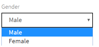
@UI("#gender") Dropdown gender;
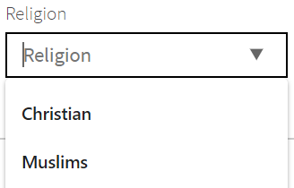
@UI("#religion") Combobox religion;
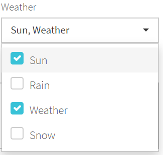
@UI("#weather") MultiDropdown weather;
}
// Selenium implementation that takes 21 lines of code instead of 1 line in JDI Light, namely:
// @UI("#weather") MultiDropdown weather
@FindBy(css ="#weather .caret") WebElement weatherExpand;
@FindBy(css ="#weather label") List<WebElement> weatherList;
@FindBy(css ="#weather button") WebElement weatherValue;
@FindBy(css ="#weather ul") WebElement weatherIsExpanded;
private boolean weatherIsExpanded() {
return weatherIsExpanded.getAttribute("style").equals("display: block;");
}
public void select(String value) {
if (!weatherIsExpanded())
weatherExpand.click();
String[] values = value.split(", ");
for (String val : values) {
for (WebElement listOption : weatherList) {
if (listOption.getText().trim().equals(val))
listOption.click();
}
}
}
public String getValue() {
return weatherValue.getText();
}
And Complex elements:
Dropdown (gender) — An element with one selectable value, expand arrow and a list of options.
Combobox (religion) — Mix of Dropdown and TextField. You can select a value from a list of options or enter your own value.
MultiDropdown (weather) — Dropdown that allows selection of multiple options. We also provide an example of Selenium implementation of equivalent functionality for comparison.
@Url("/contacts") @Title("Contact Form")
public class ContactPage extends WebPage {
    @UI("#contact-form") public static ContactForm contactForm;
}
And the Contact Form itself is a Composite UI Object (PageObject with additional capabilities in JDI).
We will call the Contact Form placed on another Composite Page Object a Contact Page.
Pay attention to the fact that Contact Form and Contact Page have the additional meta-information:
@Urland@Titlefor Contact Page.- Locator for Contact Form specified with the
@UIannotation. It ensures that all elements that belong to Contact Form Page Object are searched only within the context of Contact Form: in case when there are multiple elements with a locator like"button[type=submit]"on the webpage (for example, this locator is valid for the logout button on Contact Page), it will be the element belonging to Contact Form that gets found.
public class ContactInfo extends DataClass<ContactInfo> {
    public String passport, name, lastName, position, passportNumber,
        passportSeria, gender, religion, weather, acceptConditions, description;
}
The next important points of attention are ContactPage extends WebPage and ContactForm extends Form<ContactInfo> inheritance declarations. They grant these Page Objects webpage and form functionality and allow access to their meta-information.
ContactInfo, the data class to be used with ContactForm, looks pretty much the same as the data class for Login Form. Each field that is used when filling the form is a String.
@UI("img#user-icon") public static Link userIcon;
@UI("#user-name") public static Text userName;
@UI(".sidebar-menu span") public static Menu sideMenu;
We also have a few Common elements that are placed directly in Site:
LinkelementuserIconandTextelementuserName; we have already been using them in earlier tests.- One new Complex element,
Menu, representing the list of links in the left sidebar. This element is also found by one locator but contains 16 menu items, and you can also select the item you need by its name defined inMenuOptionsenum (found in src/main/java/jdisite/enums).
Contact Form test scenario
@Test
public void simpleContactFormTest() {
    sideMenu.select("Contact form");
    contactPage.checkOpened();
    contactForm.submit(FULL_CONTACT);
    contactForm.check(FULL_CONTACT);
}
Now let's write a complex test that:
- Opens the Contacts Page by selecting a corresponding menu option
- Verifies that this page has the correct URL and title
- Fills all 11 different elements in the Contact Form with some values
- And verifies that the form has been filled correctly
This is just as simple as filling the Login Form!
Amazing!
public static ContactInfo FULL_CONTACT = new ContactInfo().set(c -> {
    c.name = "Roman"; c.lastName = "Full Contact"; c.position = "ChiefQA";
    c.passportNumber = 4321; c.passportSeria = 123456;
    c.description = "JDI - awesome UI automation tool";

    c.gender = "Female"; c.religion = "Other"; c.weather = "Sun, Snow";
    c.acceptConditions = true; c.passport = true;
    }
);
The most complicated part is creating the test data that we would like to utilize:
public static ContactInfo SIMPLE_CONTACT = new ContactInfo().set(c -> {
    c.name = "Roman"; c.lastName = "Iovlev"; c.position = "ChiefQA";
    c.passportNumber = 4321; c.passportSeria = 123456; }
);
@Test
public void simpleContactFormTest() {
    sideMenu.select(ContactForm);
    contactPage.checkOpened();
    contactForm.submit(SIMPLE_CONTACT);
    contactForm.check(SIMPLE_CONTACT);
}
Now if we would like to fill only the TextField elements, we only need to change our test data.
Note: In the second example we use MenuOptions enum value (ContactForm) to select a sideMenu item. It reduces the chance of making a mistake by limiting the choice of options. The enum is found at src/main/java/jdisite/enums.
See this example in ContactFormExamples.java on Github
Failed form example in logs
@Test
public void failCheckExample() {
    sideMenu.select(ContactForm);
    contactPage.checkOpened();
    contactForm.fill(FULL_CONTACT);
    contactForm.acceptConditions.uncheck();
    contactForm.submit();
    List<String> result = contactForm.verify(FULL_CONTACT);
    assertThat(result, Matchers.hasSize(1));
    assertThat(result, hasItem("Field 'acceptConditions' (Actual: 'false' <> Expected: 'true')"));
}
Now let's fail the validation of our form and see how JDI Light will display the failure results. We can build upon the previous example and just change some field before the check. Let's write a test that does this, execute it and observe the results.
Forms in JDI have two methods which verify the entered data:
check— commonly used verification that validates a form, then throws an exception indicating all the incorrect values if there are any.verify— has the same behavior ascheck, but instead of throwing an exception this method returns a string list containing messages with expected/actual values for each incorrectly filled field, so it's up to you to decide how to manage the result.
In our example we revert one field, acceptConditions, to an unchecked state, and the resulting exception gets presented in a clear way (pictured to the right):
"Field 'acceptConditions' (Actual: 'false' <> Expected: 'true')"
You can find this example in ContactFormExamples.java on Github
Using Forms in different ways
    @BeforeMethod
    public void before() {
        loggedOut();
        if (loginForm.isHidden())
            userIcon.click();
    }
We've had a first look at UI Elements in JDI Light and at the capabilities of Forms, and now we can look deeper at Form initialization and see how it can help you write less code.
Let's start with a simple Form — Login.
We're planning to have a lot of tests with the preconditions "User is logged out" and "Login form is opened", so let's write a corresponding @BeforeMethod state for this set of test cases.
//Example 1
public class SeleniumLoginForm {
    @FindBy(id = "name") public WebElement name;
    @FindBy(id = "password") public WebElement password;
    @FindBy(id = "login-button") public WebElement loginButton;

    public void loginAs(User user) {
        name.sendKeys(user.name);
        password.sendKeys(user.password);
        loginButton.click();
    }
}
//Example 2
public class SeleniumLoginForm {
    ...
    // 3 lines for Elements
    public void loginAs(User user) {
        if (user.name != null) {
            name.clear();
            name.sendKeys(user.name);
        }
        if (user.password != null) {
            password.clear();
            password.sendKeys(user.password);
        }
        loginButton.click();
    }
}
//now we should add the class SeleniumLoginForm on JDISite.java:
public static SeleniumLoginForm seleniumLoginForm;

public class SelenideLoginForm {
    UIElement name = $("#name"),
          password = $("#password"),
       loginButton = $("#login-button");
    // + Same 11 rows for methods like in Selenium
    ...
}
//now we should add the class SelenideLoginForm on JDISite.java:
public static SelenideLoginForm selenideLoginForm;

public class LoginForm extends Form<User> {
    @UI("#name") TextField name;
    @UI("#password") TextField password;
    @UI("#login-button") Button loginButton;
}
//now we should add the class LoginForm on JDISite.java:
public static LoginForm loginForm;

public class LoginFormSmart extends Form<User> {
    TextField name, password;
    Button loginButton;
}
//now we should add the class LoginFormSmart on JDISite.java:
public static LoginFormSmart loginFormSmart;
In JDI Light we can describe a Form in different styles:
Selenium — a typical Page Object with WebElements and @FindBy annotations, Selenium actions upon Web Elements and no inheritance from JDI Light classes. Code like that will still work in pure Selenium projects without JDI.
See Example 1
But for cases where we would like to fill a form with different values, but it's not guaranteed that all form fields are empty, we need to extend our loginAs method and make it more complex and stable.
See Example 2
See the example in Selenium LoginForm.java on Github
JQuery/Selenide — Selenide or jQuery-like style, where instead of @FindBy annotations you can use direct initialization.
See the example in SelenideLoginForm.java on Github
Regular JDI Light Form — typical JDI Forms with typified elements, @UI annotations, extending from Form without overriding fill/check methods.
See the example in LoginForm.java on Github
JDI Light Form with smart locators — If it's possible to align field names with locators, you can use smart locators for elements and remove locator annotations from Forms. This also allows you to declare form fields with the same type in one line, separated by commas.
See more details and examples for Smart locators in documentation
See example in LoginFormSmart.java on Github
on JDISite.java >> public static Form<User> lightLoginForm;
If your Form has only TextField elements and buttons, instead of describing a UI object you can simply write a single line in the corresponding page class or in the root Site class:
This allows us to construct Login Forms in 1 line instead of 17!
5. Reduce the amount of code with JDI Light
- Initialize Driver in Selenium and JDI Light
- Page Objects code
- Compare Login Form code
- Reduce Complex Contact Form Page Object code from 97 lines (Selenium) to 8 lines of code (JDI Light)
- Test Data in Selenium and JDI Light
- Discuss example results
Now we know enough about Forms, so let's see how this can help us write code faster (by writing less code).
Let's try to code in Selenium the same Fill Contact Form test scenario that we have already covered with JDI Light:
- Open Home Page by URL.
- Open Contact Page by selecting a menu item.
- Validate that this Page has the correct URL and title.
- Fill all 11 different elements in the contact form with values.
- And verify that the form is filled correctly.
Note: You can find all the Selenium code here.
The same scenario with JDI Light is found here.
In this example I will develop Selenium code solution as effectively as possible while trying to keep the same look and feel of the test scenario.
At the same time, we will see how this code can be optimized using knowledge we got from Use Forms in different ways topic.
I will list the amount of lines of code we wrote for each action in brackets.
1. Set up and run Chrome driver
public static WebDriver DRIVER;
public static void runChromeDriver() {
    System.setProperty("webdriver.chrome.driver", "C:\\Selenium\\chromedriver.exe");
    DRIVER = new ChromeDriver();
    DRIVER.manage().window().maximize();
}
Selenium: (6 lines of code)
Here it is done with a simple method, runChromeDriver().
Note: To run the driver in Selenium you need to download the latest version from the official site and put it in Selenium folder.
JDI Light: (0 lines of code)
You don't need to write any code for this. By default, the latest version of ChromeDriver will be downloaded automatically.
2. Create Page Objects for Home and Contact pages
public class HomePage {
    public static final String URL = "https://jdi-testing.github.io/jdi-light/";
    @FindBy(id ="user-icon") public static WebElement userIcon;
    @FindBy(id ="user-name") public static WebElement userName;
}
public static HomePage homePage = initElements(DRIVER, HomePage.class);

public class ContactPage {
    public static final String URL = "https://jdi-testing.github.io/jdi-light/contacts.html";
    public static final String TITLE = "Contact Form";
    public static ContactForm contactForm = initElements(DRIVER, ContactForm.class);
}
public static ContactPage contactPage = initElements(DRIVER, ContactPage.class);
Selenium: (12 lines of code)
Using PageFactory.initElements(), we can create simple Page Objects with minimum code like in the example.
If you want to have cool pages in Selenium, you can use BasePage, which handles all the standard stuff related to opening and checking pages.
Note: I hope this "BasePage" approach will be useful for your Selenium projects.
@Url("/")
public class HomePage extends WebPage {
    @UI("#user-icon") public static Link userIcon;
    @UI("#user-name") public static Text userName;
}
public static HomePage homePage;

@Url("/contacts") @Title("Contact Form")
public class ContactPage extends WebPage {
    @UI("#contact-form") public static ContactForm contactForm;
}
public static ContactPage contactPage;
JDI Light: (11 lines of code)
In JDI Light we already have all the functions related to webpages. You can find them in the WebPage class, so you just need to extend your Page Object from it and use @Url and @Title annotations to set page metadata.
The code for UI Objects in Selenium and JDI Light in this case looks pretty much the same.
However, there are several points worth noting:
- Locators are a little bit shorter thanks to
@UIannotations.
- Forms can have root locators, so their sub-element locators can be simplified.
- We don't have to initialize each page with the
PageFactory.initElements()method, like Selenium does it.
public class LoginForm {
    @FindBy(id = "name") WebElement name;
    @FindBy(id = "password") WebElement password;
    @FindBy(id = "login-button") WebElement loginButton;

    public void loginAs(User user) {
        if (user.name != null) {
            name.clear();
            name.sendKeys(user.name);
        }
        if (user.password != null) {
            password.clear();
            password.sendKeys(user.password);
        }
        loginButton.click();
    }
    public boolean isHidden() {
        return !name.isDisplayed();
    }
}
public static LoginForm loginForm = initElements(DRIVER, LoginForm.class);
3. Create a simple Login Form
Selenium: (21 lines of code)
This form contains WebElements (name, password, loginButton) and actions like loginAs() and isHidden().
JDI Light(1 line of code)
public static Form<User> loginForm;
In JDI Light you don't need to create a UI Object for such a simple form. Just declare it in your site class.
Note: And, of course, you don't need to initialize this form.
4. Creating a complex Contact Form
In total, we have 97 lines of code for Selenium and only 8 lines of code in JDI Light, but let's go step by step and see the difference in details.
Selenium Contact Form code (97)
JDI Light Contact Form code (8)
Note: Unfortunately, we can't use one-liner Form in this case because the form has elements of different kinds, but we still can use short form descriptions with Smart locators. Just describe element types and names and use one-line initialization with your root "#contact-form" locator.
    @FindBy(css ="#contact-form #name") WebElement name;
    // +4 more TextFields
    @FindBy(css ="#contact-form #accept-conditions") WebElement acceptConditionsCheckbox;
    @FindBy(css ="#contact-form #passport") WebElement passportCheckbox;
    @FindBy(css ="#contact-form #description") WebElement descriptionText;
    @FindBy(css ="#contact-form [type=submit]") WebElement submitButton;
Selenium: (9 lines of code)
In Selenium we have to describe all elements of the form. This is easy to do for simple elements like TextField, Checkbox, TextArea and buttons.
Note: You must add #contact-form to some element locators.
And because WebElement doesn't give us any clues about the type of element, it is a good practice to denote an element type in a variable name.
    TextField name, lastName, position, passportNumber, passportSeria;
    Checkbox passport, acceptConditions;
    TextArea description;
JDI Light: (3 lines of code)
In JDI Light we just need to describe the types of elements and list them for each type. In this example, locators align with field names, so we can utilize Smart locators without writing explicit ones.
    // Dropdown
    @FindBy(id = "gender") WebElement gender;
    private Select gender() {
        return new Select(gender);
    }
    // Combobox
    @FindBy(id = "religion") WebElement religion;
    // MultiDropdown
    @FindBy(css ="#weather .caret") WebElement weatherExpand;
    @FindBy(css ="#weather label") List<WebElement> weatherList;
    @FindBy(css ="#weather button") WebElement weatherValue;
    @FindBy(css ="#weather ul") WebElement weatherIsExpanded;
    private boolean weatherIsExpanded() {
        return weatherIsExpanded.getAttribute("style").equals("display: block;");
    }
    private void selectWeather(String value) {
        if (!weatherIsExpanded())
            weatherExpand.click();
        String[] values = value.split(", ");
        for (String val : values) {
            for (WebElement listOption : weatherList) {
                if (listOption.getText().trim().equals(val))
                    listOption.click();
            }
        }
    }
Selenium: (23 lines of code)
The situation with Complex elements is more interesting:
Instead of Dropdown we can use Select class from selenium-support package and WebElement + gender() method. These are enough to handle all actions.
Instead of Combobox we can use a one-line WebElement (just using it as a standard TextField).
But instead of MultiDropdown we'll need to add 4 WebElements and a few methods: select and isExpanded.
The general problem with Complex elements in standard Selenium approach is that we have to create methods like these for every equivalent of Dropdown, MultiDropdown etc. JDI Light allows to define an element once (or pick one from element library) and then just use it in one line in all Page Objects.
    Dropdown gender;
    Combobox religion;
    MultiDropdown weather;
JDI Light: (3 lines of code)
In JDI Light it is as simple as for Common elements.
Note: They are so short that we could write them in one line, but let's keep each on its own line.
public void submit(ContactInfo contact) {
    if (contact.name != null) {
        nameTextField.clear();
        nameTextField.sendKeys(contact.name);
    }
    // +6 more elements, 4 lines each including Combobox and TextArea
    // Dropdown
    if (contact.gender != null) {
        gender().selectByVisibleText(contact.gender);
    }
    // MultiDropdown
    if (contact.weather != null) {
        selectWeather(contact.weather);
    }
    // Checkboxes
    if (contact.passport && !passportCheckbox.isSelected() ||
            !contact.passport && passportCheckbox.isSelected())
        passportCheckbox.click();
    if (contact.acceptConditions && !acceptConditionsCheckbox.isSelected() ||
            !contact.acceptConditions && acceptConditionsCheckbox.isSelected())
        acceptConditionsCheckbox.click();
    submitButton.click();
}
public void check(ContactInfo contact) {
    //  20 lines to validate contact
}
Selenium: (65(37) lines of code)
We'll need to write two methods: submit and check.
Like with the Login Form, in order to manage different test data fed into the Contact Form we'll have to check values for null. We can avoid this check in only one case (for example, just fill all fields with null and save a few lines of code).
Using a flexible approach, we need 43 + 22 = 65 lines of code.
We can improve this code by using a common method that clears and sends keys to an abstract WebElement: this will reduce our code to 55 lines.
If we remove null validations, it will make our methods less universal, but will save additional 18 lines and reduce the code to 37 lines for Form methods.
Selenium Contact Form code (97)
Short Selenium Contact Form code (69)
JDI Light: (0 lines of code)
In JDI Light we don't need methods for these typical actions. Standard Form actions are flexible and allow to operate with any kind of data.
JDI Light Contact Form code (8)
5. Test Data
public class User {
    public String name, password;
    // + 3 lines constructor
    // + 8 lines set methods
    // + 16 lines to Override equals, hashCode and toString
}
public class ContactInfo {
    public String name, lastName, position, gender, religion, weather, description;
    public int passportNumber, passportSeria;
    public boolean passport, acceptConditions;
    // + 16 lines constructor
    // + 44 lines set methods
    // + 30 lines to Override equals, hashCode and toString
}
public static User ROMAN = new User("Roman", "Jdi1234");
public static ContactInfo SIMPLE_CONTACT = new ContactInfo()
    .setName("Roman").setLastName("Iovlev").setPosition("ChiefQA")
    .setPassportNumber(4321).setPassportSeria(123456)
    .setDescription("JDI - awesome UI autoamtion tool");
public static ContactInfo FULL_CONTACT = new ContactInfo(
    "Roman", "Full Contact", "ChiefQA", "Female", "Other",
    "Sun, Snow", "JDI - awesome UI automation tool",
    4321, 123456, true, false
);
Selenium: (134 lines of code)
For a simple User entity with two fields we should have at least one constructor, but it would be nice to override equals(), hashCode() and toString() methods in order to have a log-friendly representation of an entity and ability to compare the actual and expected results by class fields. Additionally, if we want to have the ability to set up different data, we have to create setter methods for each field.
You can generate all of these methods using "Generate" option in IntelliJ IDEA (right-click the data class and select "Generate").
We need at least 7 lines of code, but for a reusable entity we should write 31 lines of code.
The same holds true for ContactInfo and for any Data entity in the standard approach. For ContactInfo the full declaration is more important because we plan to make use of more fields, and it will take more lines of code.
After these manipulations, we can create transparent test data.
User data
ContactInfo data
User Roman
Full and Simple Contact info
public class User extends DataClass<User> {
    public String name, password;
}
public class ContactInfo extends DataClass<ContactInfo> {
    public String name, lastName, position, gender, religion, weather, description;
    public int passportNumber, passportSeria = -1;
    public boolean passport, acceptConditions;
}
public static User ROMAN = new User().set(c -> {
    c.name = "Roman"; c.password = "Jdi1234";}
);
public static ContactInfo SIMPLE_CONTACT = new ContactInfo().set(c -> {
    c.name = "Roman"; c.lastName = "Iovlev"; c.position = "ChiefQA";
    c.passportNumber = 4321; c.passportSeria = 123456;
    c.description = "JDI - awesome UI autoamtion tool"; }
);
public static ContactInfo FULL_CONTACT = new ContactInfo().set(c -> {
    c.name = "Roman"; c.lastName = "Full Contact"; c.position = "ChiefQA";
    c.religion = "Other"; c.weather = "Sun, Snow"; c.acceptConditions = true;
    c.gender = "Female"; c.passportNumber = 4321; c.passportSeria = 123456;
    c.passport = true; c.description = "JDI - awesome UI automation tool"; }
);
JDI Light: (22 lines of code)
To create Test Data in JDI Light, we can use DataClass. It allows us to create different test data, compare data entities, print their meaningful representations and at the same preserve code clearness.
No constructors, no method overriding and with all functions in place thanks to DataClass.
User data
ContactInfo data
Test Data
6. Conclusion
// Selenium Init
@BeforeSuite(alwaysRun = true)
static void setUp() {
    runChromeDriver();
    DRIVER.navigate().to(HomePage.URL);
}
// JDI Light Init
@BeforeSuite(alwaysRun = true)
static void setUp() {
    initElements(JDISite.class);
    homePage.open();
}
// Selenium Test Scenarios
@BeforeMethod
public void before() {
    loggedIn();
    selectInMenu("Contact form");
}
@Test
public void submitContactDataTest() {
    assertEquals(DRIVER.getCurrentUrl(), ContactPage.URL);
    assertEquals(DRIVER.getTitle(), ContactPage.TITLE);
    contactForm.submit(FULL_CONTACT);
    contactForm.check(FULL_CONTACT);
}
@Test
public void submitContactSimpleDataTest() {
    assertEquals(DRIVER.getCurrentUrl(), ContactPage.URL);
    assertEquals(DRIVER.getTitle(), ContactPage.TITLE);
    contactForm.submit(SIMPLE_CONTACT);
    contactForm.check(SIMPLE_CONTACT);
}
// JDI Test Scenarios
@BeforeMethod
public void before() {
    loggedIn();
    sideMenu.select("Contact form");
}
@Test
public void submitContactFormTest() {
    contactPage.checkOpened();
    contactForm.submit(FULL_CONTACT);
    contactForm.check(FULL_CONTACT);
}
@Test
public void simpleContactFormTest() {
    contactPage.checkOpened();
    contactForm.submit(SIMPLE_CONTACT);
    contactForm.check(SIMPLE_CONTACT);
}
As a result, we have test scenarios that look pretty much the same in Selenium and JDI Light, but the amount of code and time spent writing the code is significantly different.
You can find the complete project code in the "result" branch of Selenium and JDI Light example repositories.
Statistical results:


In our example, we wrote 3 times less amount of code with JDI Light.
This means that if a regular Test Automation engineer writes these tests using Selenium, it will take about 1 working day, while using JDI Light this work will only take 2-3 hours. In other words, an engineer can automate 3 times more test cases in the same period of time.
Note: You can try to automate this test scenario by yourself from scratch without clues and check how much time this will take in your case.
But JDI Light does not only save your time. Less amount of code increases code clearness.
In addition, if you run test scenarios with JDI Light, you will get logs of all your actions in a readable format. If you would like to have the same format of logs in Selenium, you need to write additional 30-50 lines of code for this example and spend 5-10% of your total effort on logs.
Note: JDI Light removes only waste code and keeps all the business-relevant parts in place.
Lesser amount of code, stable tests and clear logs will reduce maintenance effort during regression testing and increase the credibility of your tests, because with JDI Light, once tests are written, they will only fail in case of real application changes or performance issues, but not because of test instability.
JDI Light in BDD Style (even for Manual QA)
TBD
Create Custom controls
TBD
JDI settings at a glance
TBD
Test Framework structure
TBD
Theory
UI Elements
In order to effectively utilize Page Objects pattern we need to place elements on pages. Instead of Selenium WebElement objects that basically represent HTML tags, in JDI we introduce UI Elements that represent UI elements interacted with by an actual user.
JDI provides the ability to create your own elements or use standard elements from a rich collection.
Common elements
@UI("input[type=text].name") public TextField name;
@UI("h1") public Label label;
@UI("//div[@name='disclamer']") public Text disclaimer;
@UI("textarea[ui=description]") public TextArea description;
@UI("//*[text()='Submit']") public Button submit;
- Are used to make your Page Objects more intuitive and clear.
- An element's type and name is displayed in JDI logs and reports, which simplifies test maintenance.
- And, of course, we expect that the actions each UI element provides are specific to its type (for example,
Buttonwon't allow you tosendKeys, unlikeWebElementorSelenideElement).
In JDI we have the following Common elements:
Label, Button, Checkbox, ColorPicker, DateTimeSelector, FileInput, Icon, Image, Link, Menu, NumberSelector, ProgressBar, Range, Text, TextField, TextArea, Title.
Complex elements
@UI(".colors") public Dropdown colors;
@UI("input[type=checkbox].conditions") public Checklist acceptConditions;
@JDropdown(root = ".colors", value = ".dropdown-value", list = "li", expand = ".caret")
public Dropdown colors;
@UI("[ui=label] li") public JList<Labels> tabs;
@UI("//button[text()='%s']") public JList<Button> buttons;
In addition to Common elements, JDI Light features Complex elements: they represent UI elements encompassing the functionality of multiple Common elements.
Some Complex elements may be regarded as sets of similar Common elements (something you would likely implement as List<WebElement> in Selenium). Typical examples of such Complex elements are Menu, Checklist, RadioButtons, or Tabs.
Note: You can still use lists of Common elements like List<Button> or List<Label> if need be.
Other Complex elements may be regarded as made up of different Common elements. Typical examples would be Dropdown or Combobox.
In JDI we have the following Complex elements:
RadioButtons, Table, DataTable, Dropdown, MultiDropdown, DataList, Checklist, MultiSelector, Combobox.
Composite elements
public class LoginForm extends Form<User> {
    public TextField name, password;
    @UI("//*[text()='Submit']") public Button submit;
    ...
}
public class TopPanel extends Section {
    @UI("form.login") public LoginForm loginForm;
    @UI("h1") public Label label;
    @UI(".colors") public Dropdown colors;
    ...
}
@Url("/login.html") @Title("Login to JDI")
public class LoginPage extends WebPage {
    @UI(".top-panel") public TopPanel topPanel;
    ...
}
Composite elements represent webpages or webpage sections and are mainly used as containers for elements and actions.
Typical examples of Composite elements are WebPage and Section.
Composite elements can also have a locator that defines a context for all elements within them. This means that all elements in a composite element will be searched relatively under this locator.
Composite elements might have predefined actions like fill, submit and check for Form, or open(), checkOpened() for WebPage.
Remember that you can create your own Composite elements with JDI Light when you need to describe sections like Header, Navigation Bar, Footer, Sidebar, Advertisement Section or the main section of a page.
In JDI we have the following Composite elements:
UI Objects
public class AwesomeApplication {
    public LoginPage loginPage;
    @UI(".nav li") public Menu navigation;
}
@Url("/login.html") @Title("Login to JDI")
public class LoginPage extends WebPage {
    @UI(".top-panel") public TopPanel topPanel;
    ...
}
public class TopPanel extends Section {
    @UI("form.login") public LoginForm loginForm;
    @UI("h1") public Label label;
    @UI(".colors") public Dropdown colors;
    ...
}
UI Objects extend the standard Page Objects pattern with UI Elements and allow users to split pages into sections.
A typical UI object structure consists of:
- A Site class that contains all the pages of an application and its common parts like header, footer or navigation panel.
- Page Objects extending
WebPageand representing respective application pages. - Composite elements (typically represented by
Sectionobjects or other Composite elements), acting as containers for other elements and smaller sections. - UI Elements representing functional elements on a page utilized by the end user.
Entity Driven Testing
(1)
public class LoginForm extends Form<User> {
    public TextField name, password;
    @UI("//*[text()='Submit']") public Button submit;
    ...
}
public class User extends DataClass<User> {
    public String name, password;
}
@Test(dataProvider = "users")
public void loginTest(User user) {
    loginForm.loginAs(user);
}
(2)
@UI("#user-table")
public static DataTable<?, UserInfo> userTable;
public class UserInfo extends DataClass<UserInfo> {
    public String number, type, user, description;
}
@Test
public void userInfoTest() {
    usersListPage.open();
    userTable.has().value(SPIDER_MAN, inRow(2));
    userTable.assertThat()
      .all().rows(d -> d.user.length() > 4)
      .no().rows(d -> isBlank(d.user))
      .atLeast(3).rows(d -> d.type.contains("User"))
      .exact(1).rows(SPIDER_MAN);
    assertEquals(userTable.dataRow("Wolverine").type, "Admin");
}
(3)
@UI(".search-results li") public DataList<?, Result> resultsList;
public class Result extends DataClass<Result> {
    public String name, description, link;
}
@Test
public void resultsTest() {
  resultsList.assertThat()
    .value(containsString("name:JDI FACEBOOK GROUP; description:English Community Facebook group"))
    .any(e -> e.description.toLowerCase().contains("jdi"))
    .each(e -> e.name.toLowerCase().contains("jdi"))
    .onlyOne(e -> e.name.contains("OWNER"))
    .noOne(e -> e.name.equalsIgnoreCase("Selenide"));

  resultsList.assertThat(not(empty()))
    .and(hasSize(greaterThan(2)))
    .and(hasItem(CORRECT))
    .and(hasItems(CORRECT, CORRECT_2, CORRECT_3))
    .and(not(hasItem(CORRUPTED)))
    .and(not(hasItems(CORRUPTED, CORRUPTED_2)));
}
Entity Driven Testing (EDT) is an approach that implies utilizing Business Entities instead of unnamed test data in the test scenarios.
EDT can be organically combined with Data Driven Testing that uses Business Entities as input with similar scenarios.
JDI Light natively supports EDT with Form, Table and DataList. See the examples in the right panel:
Example scenario:
> Provide List<User> for test
0. Check that there is a user in the database
1. Log in with user data
2. Submit user data in Contact Us form
3. Get actual opening from vacancy table
4. Assert that actual opening equals to expected opening
Code example:
@Test(dataProvider = “users")                      //>
public void formTest(User user) {
    DB.users.shouldHave(user);                     //0.
    loginForm.loginAs(user);                       //1.
    contactUsForm.submit(user);                    //2.
    Vacancy vacancy = vacancyTable.getEntity(3);   //3.
    Assert.areEquals(vacancy, expectedVacancy);    //4.
}
Smart Locators
Smart locators example
Let's assume you have a uniform method to locate most of the elements (for example, most of the elements involved in UI test automation have a predictable id, or a name, or a special attribute used to locate them.)
Let's assume you have @UI("[ui=last-name]") public TextField lastName element in JDI. In this case you can simplify it to public TextField lastName and omit the locator.
Now for more complex example. Suppose you have the following HTML:
<input type="text" ui="name"/>
<input type="text" ui="last-name"/>
<input type="text" ui="pin-code"/>
<input type="text" ui="promo-code"/>
<input type="checkbox" ui="accept-conditions"/>
<a href="..." ui="external-link">External link</a>
<button ui="submit-button">
public class UserCard : Form<User>
{
    [FindBy(Css = "#name")] public TextField Name;
    [FindBy(Css = "#last-name")] public TextField LastName;
    [FindBy(Css = "#submit-button")] public Button SubmitButton;
}
SmartSearchLocator = "#{0}";
SmartSearchName(string name) => StringExtensions.SplitHyphen(name);
public class UserCard : Form<User>
{
    TextField name;
    TextField LastName;
    Button SubmitButton;
}
@FindBy(css = "[ui=name]")
public WebElement name;
@FindBy(css = "[ui=last-name]")
public WebElement lastName;
@FindBy(css = "[ui=pin-ncodeame]")
public WebElement pinCode;
@FindBy(css = "[ui=promo-code]")
public WebElement promoCode;
@FindBy(css = "[ui=accept-conditions]")
public WebElement acceptConditions;
@FindBy(css = "[ui=submit-button]")
public WebElement submitButton;
With pure Selenium, Page Object elements for that will look like this (see on the right panel) =====>
@UI("[ui=name]") public Textfield name;
@UI("[ui=last-name]") public Textfield lastName;
@UI("[ui=pin-code]") public Textfield pinCode;
@UI("[ui=promo-code]") public Textfield promoCode;
@UI("[ui=accept-conditions]") public Checkbox acceptConditions;
@UI("[ui=submit-button]") public Button submitButton;
In JDI Light with standard UI Objects the code gets more descriptive, but there still are duplications in locator and element names (see on the right panel) =====>
public Textfield name, lastName, pinCode, promoCode;
public Checkbox acceptConditions;
public Button submitButton;
But by using smart locators you can write this without any duplications (without locators) in just a few lines. Looks cool, doesn't it?
Define smart locator using test.properties
smart.locators="[ui=%s]"
smart.locators.toName=UPPER_SNAKE_CASE
You can set up your smart locators in the test.properties file the following way.
First, assign a value to the smart.locators property:
- set it to
#%sin case your smart locator translates to id - set it to
.%sfor classname - set it to
[name=%s]for name (or swapnamefor any other attribute)
Then, assign a value to the smart.toName property. Suppose that you have set smart.locators to [ui=%s]:
kebab-casewill provide[ui=last-name]locator for public WebElementlastName.camelCasewill provide[ui=lastName]locator for public WebElementlastName.snake_casewill provide[ui=last_name]locator for public WebElementlastName.PascalCasewill provide[ui=LastName]locator for public WebElementlastName.UPPER_SNAKE_CASEwill provide[ui=LAST_NAME]locator for public WebElementlastName.
...or, if the property looks like smart.locators=//*[text()='%s']:
First Upper Casewill provide//*[text()='Submit Form']locator for public WebElementsubmitForm.ALL UPPER CASEwill provide//*[text()='SUBMIT FORM']locator for public WebElementsubmitForm.
Define a Smart Locator using WebSettings
WebSettings.SMART_SEARCH_LOCATORS = asList("#%s");
WebSettings.SMART_SEARCH_NAME = StringUtils::toKebabCase;
// JDI Light style
WebSettings.SMART_SEARCH = el -> {
  String locatorName = toKebabCase(el.getName());
  UIElement element = $("[auto="+locatorName+"]", el.base().parent));
  element.setName(el.getName());
  return element.getWebElement();
}
// Selenium style
WebSettings.SMART_SEARCH = el -> {
  String locatorName = toKebabCase(el.getName());
  return getDriver.findElement(By.cssClass("[auto="+locatorName+"]"));
}
You can also set up Smart Locators in code using WebSettings.SMART_SEARCH_NAME and WebSettings.SMART_SEARCH_LOCATORS variables:
Or you can define by yourself what should be done when UI Element has no locator using WebSettings.SMART_SEARCH.
Smart Annotations
When your locators follow standard patterns you can use Smart Annotations to mark elements:
For @UI("#last-name") TextField lastName;
use @SId TextField lastName;
For @UI(".contact-form") Form<CardData> contactForm;
use @SClass Form<CardData> contactForm;
For @UI("//*[text()='Submit Card']") Button submitCard;
use @SText Button submitCard;
For @UI("[name='accept-conditions']") Checkbox acceptConditions;
use @SName Checkbox acceptConditions;
Or use @Smart annotation for any specific HTML attribute:
For @UI("[data-type=data-multi-combobox]") MultiCombobox dataMultiCombobox;
use @Smart("data-type") MultiCombobox dataMultiCombobox;
Custom Smart Annotations
You can also always create your own annotation enabling smart behavior.
Let's assume you would like to use smart locators for buttons like //button[text()='Button Text'].
First, create a new annotation:
SButton.java
@Retention(RetentionPolicy.RUNTIME)
@Target({ElementType.TYPE, ElementType.FIELD})
public @interface SButton {
}
Then set up the behavior for this annotation before you call initSite:
@BeforeSuite(alwaysRun = true)
public static void setUp() {
    JDI_ANNOTATIONS.add("Buttons", aRule(SButton.class,
        (e, a) -> e.setLocator(format("//button[text()='%s']", splitCamelCase(e.getName())))));
    initSite(YourAwesomeSite.class);
That's all. Now we can write:
@SButton public Button logIn, signIn, cancel, useVipAccess;
Instead of:
@FindBy(xpath = "//button[text()='Log In']")
public WebElement logIn;
@FindBy(xpath = "//button[text()='Sign In']")
public WebElement signIn;
@FindBy(xpath = "//button[text()='Cancel']")
public WebElement cancel;
@FindBy(xpath = "//button[text()='Use Vip Access']")
public WebElement useVipAccess;
JDI Annotations
In order to control element behavior in JDI Light you can use the following standard annotations:
@Root — ignores all parent sections locators for this element and uses only locator that specified for element (including smart locators).
@Frame("frame-id") or @Frame({"frame-id", "div[name-adv]"}) — in case you have two or more frames above the element, use driver.switchTo().frame(...) before searching your element. Or call it multiple times if @Frame has list of locators. Can be used together with @UI locator.
@Css("div.dropdown") — if your element has a CSS locator (deprecated, recommended to use universal @UI locator instead.)
@XPath("//div[text()='Submit']") — if your element has an XPath locator (deprecated, recommended to use universal @UI locator instead.)
@ByText("Submit") — used to locate elements by text (uses locator ".//*/text()[normalize-space(.) = %s]/parent::*".)
@WithText("Navigation") — used to locate elements by text containing given substring (uses locator ".//*/text()[contains(normalize-space(.), %s)]/parent::*")
@ClickArea(...) — specifies how click will be performed. Allowed values: SMART_CLICK (tries to find area where user able to click), TOP_LEFT (click top left corner of the element), TOP_RIGHT (click top right corner of the element), BOTTOM_LEFT (click bottom left corner of the element), BOTTOM_RIGHT (click bottom right corner of the element), CENTER (standard Selenium click in the center of the element), JS (using JS click).
@GetTextAs(...) — specifies how getText will be performed. Allowed values: TEXT (getText()), VALUE (getAttribute("value")), INNER (jsExecute("innerText")), LABEL (using a label related to the element; good for checkboxes and radio buttons), SMART_TEXT (tries smart value search).
@SetTextAs(...) — specifies how text input will be performed. Allowed values: SEND_KEYS (sendKeys(...)), SET_TEXT (set value attribute using JS), CLEAR_SEND_KEYS (clear() then sendKeys(...)).
@NoCache — always get the element from the page. Do not use cache.
@WaitTimeout(sec) — set sec seconds implicit wait for the element.
@NoWait — no element wait timeout; the element won't be found unless it's present on the page.
@Name(“Test”) — sets the name of an element to the provided value.
@GetAny — gets element without validation.
@GetVisible — returns displayed element.
@GetInvisible — returns invisible element.
@GetVisibleEnabled — returns displayed and enabled element.
@GetShowInView — returns displayed and clickable element.
@PageName — sets pageName variable for the element.
@SId — sets smart ID locator, e.g “By.cssSelector: #Test”, where “Test” is the element's id attribute.
@SText — sets smart text locator, e.g. “By.xpath: .//*/text()[normalize-space(.) = "S Text"]/parent::*”, where “SText” is the name of the element. Be aware that it’s creating a locator with white space for words starting with capital letter.
@SName — sets smart name locator, e.g. for “@Name(“Test”) @SName” it will be “By.cssSelector: [name='test']”.
@Smart — sets smart locator, e.g. for “@Name(“Smart”) @Smart(“id”)” it will be “By.cssSelector: [id=’smart’]”.
@SClass — sets smart class locator, e.g. for “@Name(“Test”) @SName” it will be “By.cssSelector: .test”.
@UI — for list UI locator, e.g. @UI("img"), see more examples in the previous section.
@FindBy — an annotation that can have attributes such as: css, tagName, linkText, partialLinkText, xpath; text, id, name, className, group. Could be quickly changed to from Selenium @FindBy by changing the import line.
@VisualCheck — adds the “(“visualCheck”, “”)” pair to params.
JDI Locators (as simple as CSS, as powerful as XPath)
@XPath("//div[contains(@class,'btn')]//*[text()='Submit']")
@UI("div.btn['Submit']")

@XPath("//*[contains(@class,'nav-menu')]//*[@data-role='header']//*[contains(text(),'Navigation menu')]")
@UI(".nav-menu [data-role=header][*'Navigation menu']")

@XPath("//label[text()='Gold status']/..//input[@type='checkbox']")
@UI("label['Gold status']<input[type=checkbox]")

@XPath("//*[contains(@class,'nav-menu')]//*[@data-role='header'][3]")
@UI(".nav-menu [data-role=header][3]")
With JDI Light you can use simple and fast CSS-like selectors with the power of XPath locators. Now you can search by text or index with CSS-like syntax or even move up the DOM tree.
See some examples below:
XPath: //div[contains(@class,'btn')]//*[text()='Submit']
JDI Locator: div.btn['Submit']
XPath: //*[contains(@class,'nav-menu')]//*[@data-role='header']//*[contains(text(),'Navigation menu')]
JDI Locator: .nav-menu [data-role=header][*'Navigation menu']
XPath: //label[text()='Gold status']/..//input[@type='checkbox']
JDI Locator: label['Gold status']<input[type=checkbox]
XPath: //*[contains(@class,'nav-menu')]//*[@data-role='header'][3]
JDI Locator: .nav-menu [data-role=header][3]
FAQ
TBD
Documentation
Base information
Base Elements
UIBaseElement
UIElement
  @Test
  public void click() {
      submit.click();
      assertEquals(sum.getText(), "Summary: 3");
  }

  @Test
  public void isDisplayed(){
      assertTrue(submit.isDisplayed());
  }

  @Test
  public void input(){
      description.input("Hello world!");
      assertEquals(description.getText(), "Hello world!");
      description.clear();
  }

  @Test
  public void hasAttribute() {
      assertTrue(submit.hasAttribute("class"));
      assertTrue(submit.hasAttribute("type"));
  }
Available methods in Java JDI Light:
| Method | Description | Return Type |
|---|---|---|
| check() | Clicks on element if it's not selected | void |
| classes() | Gets all element's classes as list | List |
| clear() | Clears input field | void |
| click() | Clicks on element | void |
| click(ElementArea area) | Clicks on element area (possible ElementArea values are SMART_CLICK, TOP_LEFT, TOP_RIGHT, BOTTOM_LEFT, BOTTOM_RIGHT, CENTER, JS) | void |
| click(int x, int y) | Clicks on point (x, y) | void |
| doubleClick() | Double clicks on the element | void |
| dragAndDropTo(int x, int y) | Drags and drops element to certain coordinates | void |
| dragAndDropTo(WebElement to) | Drags and drops element to another element | void |
| focus() | Focuses on element | void |
| getAllAttributes() | Gets all element attributes | MapArray |
| getAttribute(String value) | Gets the value of specified element attribute | String |
| getCssValue(String value) | Gets element CSS value | String |
| getLocation() | Gets element location as point | Point |
| getRect() | Gets element rectangle | Rectangle |
| getSize() | Gets element size | Dimension |
| getTagName() | Gets element tag name | String |
| getText() | Gets element text | String |
| getValue() | Gets element text | String |
| hasAttribute(String attrName) | Returns true if the element has an expected attribute | boolean |
| hasClass(String className) | Returns true if the element has an expected class | boolean |
| highlight() | Highlights element with red color | void |
| highlight(String color) | Scrolls view to element and highlights it with a border of specified color | void |
| hover() | Hovers mouse cursor over the element | void |
| input(String value) | Inputs specified value as keys | void |
| isDeselected() | Checks that element is deselected | boolean |
| isDisabled() | Checks that element is disabled | boolean |
| isDisplayed() | Checks that element is displayed | boolean |
| isEnabled() | Checks that element exists | boolean |
| isHidden() | Checks that element is hidden | boolean |
| isNotExist() | Checks that element does not exist | boolean |
| isNotVisible() | Checks that element is not visible by user | boolean |
| isSelected() | Checks that element is selected | boolean |
| isVisible() | Checks that element is visible by user | boolean |
| jsExecute(String jsCode) | Executes JavaScript code | String |
| labelText() | Gets label text | String |
| makePhoto() | Gets a screenshot of the element | File |
| placeholder() | Gets element “placeholder” attribute value | String |
| printHtml() | Gets element “innerHTML” attribute value | String |
| rightClick() | Right clicks on the element | void |
| select() | Selects item | void |
| select(int index) | Selects item by index | void |
| select(String value) | Selects item by value | void |
| select(String… names) | Selects items by values | void |
| sendKeys(CharSequence… value) | Sends specified value as keys | void |
| setAttribute(String name, String value) | Sets value to the specified attribute | void |
| setText(String value) | Puts value as text | void |
| setValue() | Inputs value | void |
| show() | Scrolls screen view to item | void |
| uncheck() | Clicks on element if selected | void |
Aliases in Java JDI Light:
| Method | Description | Return Type |
|---|---|---|
| attr(String value) | Gets element attribute | String |
| attrs() | Gets all element attributes | MapArray |
| css(String prop) | Gets element css value | String |
| text() | Gets element text | String |
WebList
Extended Selenium features
Wait After Action
You can annotate a UI element with @WaitAfterAction. This tells JDI to wait after executing this element's methods.
@WaitAfterAction(value = 3, method = "getText") would mean that JDI will wait 3 seconds after executing the annotated element's getText() method.
If the method name is not specified, the wait will be applied to all action methods of the element (like click, check or select, depending on the element), and you can write the annotation like @WaitAfterAction(3).
You can also apply the default @WaitAfterAction which sets the wait to 1 second for all action methods.
   @WaitAfterAction(value = 3, method = "getText")
   public Text colorValue;

   @WaitAfterAction(2)
   public Dropdown detailsButton;

   @WaitAfterAction
   public Dropdown colors;

   ...

   @Test
   public void selectColor() {
     detailsButton.click()  // will wait 2 seconds after click
     colors.select("Gold");  // will wait 1 second after select
     assertEquals(colorValue.getText(), "Gold") // will wait 3 seconds after getText
   }
1. HTML5 elements
1.1 HTML5 Common elements
1.1.1 Label
  // @FindBy(xpath = "//label[@for='your-name']")
  @UI("//label[@for='your-name']")

  public static TextField yourName;

  @Test
  public void labelTest() {
      assertEquals(yourName.label().getText(), "Your name:");
      yourName.label().is().text(containsString("Your"));
      disabledName.label().is().text(equalToIgnoringCase("Surname:"));
  }
 In the next test Label is found from NameTextField locator:

 [FindBy(Css = "div.main-content #name")]
 public TextField NameTextField { get; set; }

 By default, Label is found by locator By.CssSelector($"[for={WebElement.GetAttribute("id")}]")

 [Test]
 public void LabelTest()
 {
     Assert.AreEqual(TestSite.Html5Page.NameTextField.Label().GetText(), "Your name:");
     TestSite.Html5Page.NameTextField.Label().Is.Text(ContainsString("Your"));
     Assert.AreEqual(TestSite.Html5Page.SurnameTextField.Label().GetText(), "Surname:");
     TestSite.Html5Page.SurnameTextField.Label().Is.Text(ContainsString("Surname:"));
 }

 [Test]
 public void GetLabelTextTest()
 {
     AreEqual(TestSite.Html5Page.ColorPicker.LabelText(), "Select a color");
 }
Label — Defines a label for an <input> control.
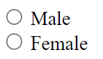
<form>
    <input type="radio" name="gender" value="male" id="male">
    <label for="male">Male</label>
    <input type="radio" name="gender" value="female" id="female">
    <label for="female">Female</label>
</form>
Available methods in JDI Light:
| Method | Description | Return Type |
|---|---|---|
| setValue(String) | sets value | void |
| getValue() | gets value | String |
| getText() | returns value. Overrided method of UIBaseElement | String |
| is() | Assert action | TextAssert |
Available methods in C# JDI Light:
| Method | Description | Return Type |
|---|---|---|
| assertThat() | Assert action | TextAssert |
| click() | Click the button | void |
| getText() | Get button text | String |
| is() | Assert action | TextAssert |
| Label() | Creates label for element using the element's Id | Label |
| LabelText() | Gets the text of a label | string |
1.1.2 Button
@UI("[value*='Red Button']")
// @FindBy(css = "[value*='Red Button']")
public static Button redButton;

@Test
public void clickTest() {
    redButton.click();
    validateAndAcceptAlert("Red button");

    blueButton.click();
    validateAndAcceptAlert("Blue button");
}
[FindBy(Css = ".red")]
public Button RedButton;

[Test]
public void ClickTest()
{
    RedButton.Click();
    Assert.AreEqual(GetAlert().GetAlertText(), "Red button");
    GetAlert().AcceptAlert();
}

[Test]
public void GetTextTest()
{
    Assert.AreEqual(RedButton.GetText(), "Big Red Button-Input");
}
Button — The <button> tag is used to create clickable buttons on the web page
Here is an example with provided HTML code:
html
<input type="button" value="Big Red Button-Input" class="uui-button red" onclick="alert('Red button');">
Button is located in the following classes:
- Java: com.epam.jdi.light.ui.html.common.Button
- C#: JDI.Light.Elements.Common.Button
Available methods in Java JDI Light:
| Method | Description | Return Type |
|---|---|---|
| getValue() | Get button's value | String |
| is() | Assert action | TextAssert |
Available methods and properties in C# JDI Light:
| Method/Property | Description | Return Type |
|---|---|---|
| AssertThat | Assert action | TextAssert |
| Click() | Click the button | void |
| GetText() | Get button text | string |
| Is | Assert action | TextAssert |
Java test examples
C# test examples
BDD Steps example
1.1.3 Checkbox
Checkbox — Element allows you to select a single value for submission.

Checkbox is located in the following classes:
- Java: com.epam.jdi.light.ui.html.common.Checkbox*
- C#: JDI.Light.Elements.Common.CheckBox*
Here is an example with provided HTML code:
//@FindBy(xpath = "//input[@type='checkbox' and @id='accept-conditions']")
@UI("//input[@type='checkbox' and @id='accept-conditions']")
public static Checkbox acceptConditions;

@Test
public void checkTest() {
    acceptConditions.check();
    acceptConditions.is().selected();
}

@Test
public void uncheckTest() {
    acceptConditions.uncheck();
    acceptConditions.is().deselected();
}

@Test
public void getLabelTextTest() {
    acceptConditions.label().is().text(labelText);
}
[FindBy(XPath = "//*[@id='elements-checklist']//*[text()='Water']")]
[IsChecked(typeof(CustomCheck), nameof(CustomCheck.CheckFunc))]
public CheckBox CbWater;

[FindBy(Css = "#accept-conditions")]
public CheckBox AcceptConditions { get; set; }

[Test]
public void CheckSingleTest()
{
     Assert.DoesNotThrow(() => TestSite.MetalsColorsPage.CbWater.Check(true));
     Jdi.Assert.Contains(TestSite.ActionsLog.Texts[0], "Water: condition changed to true");
}

[Test]
public void UncheckSingleTest()
{
     TestSite.MetalsColorsPage.CbWater.Click();
     TestSite.MetalsColorsPage.CbWater.Uncheck();
     Jdi.Assert.Contains(TestSite.ActionsLog.Texts[0], "Water: condition changed to false");
}

[Test]
public void IsCheckTest()
{
     Assert.IsFalse(TestSite.MetalsColorsPage.CbWater.IsChecked);
     TestSite.MetalsColorsPage.CbWater.Click();
     Assert.IsTrue(TestSite.MetalsColorsPage.CbWater.IsChecked);
}

[Test]
public void MultipleUncheckTest()
{
     TestSite.MetalsColorsPage.CbWater.Click();
     TestSite.MetalsColorsPage.CbWater.Uncheck();
     TestSite.MetalsColorsPage.CbWater.Uncheck();
     Jdi.Assert.Contains(TestSite.ActionsLog.Texts[0], "Water: condition changed to false");
}

[Test]
public void ClickTest()
{
     TestSite.MetalsColorsPage.CbWater.Click();
     Jdi.Assert.Contains(TestSite.ActionsLog.Texts[0], "Water: condition changed to true");
     TestSite.MetalsColorsPage.CbWater.Click();
     var texts = TestSite.ActionsLog.Texts;
     Jdi.Assert.Contains(texts[0], "Water: condition changed to false");
}

[Test]
[TestCaseSource(typeof(CheckBoxProvider), nameof(CheckBoxProvider.InputData))]
public void SetValueTest(bool value, bool expected)
{
     if (!expected) TestSite.MetalsColorsPage.CbWater.Click();
     TestSite.MetalsColorsPage.CbWater.Value = value;
     var resultMsg = "Water: condition changed to " + expected.ToString().ToLower();
     Jdi.Assert.Contains(TestSite.ActionsLog.Texts[0], resultMsg);
}

[Test]
public void IsValidationTest()
{
    TestSite.Html5Page.Open();
    TestSite.Html5Page.AcceptConditions.Is.Selected();
    TestSite.Html5Page.AcceptConditions.Click();
    TestSite.Html5Page.AcceptConditions.Is.Deselected();
    TestSite.Html5Page.AcceptConditions.Is.Enabled();
    TestSite.Html5Page.AcceptConditions.Is.Displayed();
}

[Test]
public void LabelTest()
{
    TestSite.Html5Page.Open();
    Assert.AreEqual("Accept terms and conditions", TestSite.Html5Page.AcceptConditions.Label().GetText());
    TestSite.Html5Page.AcceptConditions.Label().Is.Text(ContainsString("terms and conditions"));
    TestSite.Html5Page.AcceptConditions.Label().Is.Text(EqualTo("accept terms and conditions"));
}

[Test]
public void AssertValidationTest()
{
    TestSite.Html5Page.Open();
    TestSite.Html5Page.AcceptConditions.AssertThat.Selected();
}

[Test]
public void BaseValidationTest()
{
    TestSite.Html5Page.Open();
    BaseElementValidation(TestSite.Html5Page.AcceptConditions);
}
<div>
  <input type="checkbox" id="accept-conditions" checked="">
  <label for="accept-conditions">Accept terms and conditions</label>
</div>
Available methods in Java JDI Light:
| Method | Description | Return Type |
|---|---|---|
| safeGetLabel() | Safely returns label | Label |
| check(String) | Set to checked if string value equals "true" (case insensitive), otherwise set to unchecked | void |
| check() | Set to checked | void |
| uncheck() | Set to unchecked | void |
Available methods in C# JDI Light:
| Method | Description | Return Type |
|---|---|---|
| AssertThat | Gets assert for checkbox | CheckBoxAssert |
| Check(bool checkEnabled = true) | Checks a checkbox | void |
| Deselected() | Checks whether a checkbox is deselected | CheckBoxAssert |
| Displayed() | Checks whether a checkbox is displayed | CheckBoxAssert |
| Enabled() | Checks whether a checkbox is enabled | CheckBoxAssert |
| Is | Gets assert for checkbox | CheckBoxAssert |
| IsChecked | Determines whether a checkbox is checked | bool |
| Selected() | Checks whether a checkbox is selected | CheckBoxAssert |
| Uncheck(bool checkEnabled = true) | Unhecks a checkbox | void |
1.1.4 ColorPicker
//@FindBy(xpath = "//input[@type='color' and @id='color-picker']")
@UI("//input[@type='color' and @id='color-picker']")
public static ColorPicker colorPicker;

@Test
public void getColorTest() {
    assertEquals(disabledPicker.color(), defaultColor);
}
@Test
public void setColorTest() {
    colorPicker.setColor("#432376");
    assertEquals(colorPicker.color(), "#432376");
    disabledPicker.setColor("#432376");
    assertEquals(disabledPicker.color(), "#432376");
}
[FindBy(Css = "#color-picker")]
public ColorPicker ColorPicker;

[Test]
public void GetColorTest()
{
    Assert.AreEqual(ColorPicker.Color(), "#3fd7a6");
}

[Test]
public void SetColorTest()
{
    ColorPicker.SetColor("#432376");
    Assert.AreEqual(ColorPicker.Color(), "#432376");
}
ColorPicker — Elements of this type provide a user interface element that lets a user specify a color, either by using a visual color picker interface or by entering the color into a text field in "#rrggbb" hexadecimal format. Only simple colors (with no alpha channel) are allowed. The values are compatible with CSS.
Color Picker is located in the following classes:
- Java: com.epam.jdi.light.ui.html.common.ColorPicker
Here is an example with provided HTML code:
<div>
  <input type="color" value="#3fd7a6" id="color-picker">
  <label for="color-picker">Select a color</label>
</div>
Here is the list of some available methods in Java:
| Methods | Description | Return Type |
|---|---|---|
| color() | Returns color code in hexadecimal format ("#rrggbb") | String |
| setColor(String) | Set color from string hex representation ("#rrggbb") | void |
Here is the list of some available methods in C#:
| Methods | Description | Return Type |
|---|---|---|
| AssertThat() | Assert action | ColorAssert |
| Color() | Returns color code in hexadecimal format ("#rrggbb") | string |
| Is() | Assert action | ColorAssert |
| SetColor(String) | Set color from string hex representation ("#rrggbb") | void |
Java test examp
Test examples in C#
BDD Steps example
1.1.5 DateTimeSelector
DateTimeSelector — Is used for Input Type Date and its derivatives and allows users to set the value of date and/or time.
The list of supported elements:
- Input Type Date
- Input Type Week
- Input Type Month
- Input Type Time
- Input Type DateTime-Local
Input Type Date — A graphical control element that allows user to set value for date.
//@FindBy(css = "#birth-date")
@UI("#birth-date")

public static DateTimeSelector birthDate;

@Test
public void setDateTimeTest() {
    birthDate.setDateTime("2018-11-13");
    assertEquals(birthDate.value(), "2018-11-13");
}

@Test
public void labelTest() {
    assertEquals(birthDate.label().getText(), "Birth date");
    birthDate.label().is().text(containsString("Birth"));
}
[FindBy(Css = "#birth-date")]
public IDateTimeSelector BirthDate { get; set; }

[Test]
public void SetBirthDateTest()
{
    TestSite.Html5Page.BirthDate.Format = "yyyy-MM-dd";
    TestSite.Html5Page.BirthDate.SetDateTime(_dateTime);
    TestSite.Html5Page.BirthDate.AssertThat().SelectedTime(Is.EqualToIgnoringCase("2019-04-01"));
}
<div>
  <label for="birth-date">Birth date</label>
  <input type="date" id="birth-date" value="1985-06-18" min="1970-01-01" max="2030-12-31">
</div>
Type Date test examples in Java
Type Date test examples in C#
Input Type Week — A graphical control element that allows user to set values for week and year.
//@FindBy(css = "#autumn-week")
@UI("#autumn-week")

public static DateTimeSelector autumnWeek;

@Test
public void setDateTimeTest() {
    autumnWeek.setDateTime("2018-W12");
    autumnWeek.show();
    assertEquals(autumnWeek.value(), "2018-W12");
}

@Test
public void labelTest() {
    autumnWeek.label().assertThat().text(is("Autumn"));
    autumnWeek.label().is().text(equalToIgnoringCase("autumn"));
}
[FindBy(Css = "#autumn-week")]
public IDateTimeSelector AutumnDateTime { get; set; }

[Test]
public void AutumnDateTimeTest()
{
    var calendar = new GregorianCalendar();
    var weekNum = calendar.GetWeekOfYear(_dateTime, CalendarWeekRule.FirstFullWeek, DayOfWeek.Monday);
    TestSite.Html5Page.AutumnDateTime.Format = "yyyy-" + $"W{weekNum}";

    TestSite.Html5Page.AutumnDateTime.SetDateTime(_dateTime);
    var setValue = TestSite.Html5Page.AutumnDateTime.GetValue();
    Assert.AreEqual(setValue, "2019-W13");
}

<div>
  <label for="autumn-week">Autumn</label>
  <input type="week" id="autumn-week" value="2018-W40" min="2018-W35" max="2018-W48" required="">
</div>
Type Week test examples in Java
Type Week test examples in C#
Input Type Month — a graphical control element that allows user to set values for month and year.
//@FindBy(css = "#month-date")
@UI("#month-date")

public static DateTimeSelector monthDate;

@Test
public void setDateTimeTest() {
    monthDate.setDateTime("2018-10");
    monthDate.show();
    assertEquals(monthDate.value(), "2018-10");
}

@Test
public void labelTest() {
    monthDate.label().is().text(containsString("Holidays"));
    monthDate.label().is().text(equalToIgnoringCase("month of holidays"));
}
[FindBy(Css = "#month-date")]
public IDateTimeSelector MonthOfHolidays { get; set; }

[Test]
public void SetMonthTest()
{
    TestSite.Html5Page.MonthOfHolidays.Format = "yyyy-MM";
    TestSite.Html5Page.MonthOfHolidays.SetDateTime(_dateTime);
    var setValue = TestSite.Html5Page.MonthOfHolidays.GetValue();
    Assert.AreEqual(setValue, "2019-04");
}

<div>
  <label for="autumn-week">Autumn</label>
  <input type="week" id="autumn-week" value="2018-W40" min="2018-W35" max="2018-W48" required="">
</div>
Type Month test examples in C#
Type Month test examples in Java
Input Type Time — A graphical control element that allows user to set time.
//@FindBy(css = "#booking-time")
@UI("#booking-time")

public static DateTimeSelector bookingTime

@Test
public void setDateTimeTest() {
    bookingTime.setDateTime("05:00");
    bookingTime.show();
    assertEquals(bookingTime.value(), "05:00");
}

@Test
public void labelTest() {
    assertEquals(bookingTime.label().getText(), "Booking Time:");
    bookingTime.label().is().text(equalToIgnoringCase("booking Time:"));
}
[FindBy(Css = "#booking-time")]
public IDateTimeSelector BookingTime { get; set; }

[Test]
public void SetTimeTest()
{
    TestSite.Html5Page.BookingTime.Format = "H:mm";
    TestSite.Html5Page.BookingTime.SetDateTime(_dateTime);
    var setValue = TestSite.Html5Page.BookingTime.GetValue();
    Assert.AreEqual(setValue, "15:00");
}

<div>
  <label for="booking-time">Booking Time:</label>
  <input type="time" id="booking-time" value="11:00" min="9:00" max="18:00">
</div>
Type Time test examples in C#
Type Time test examples in Java
Input Type DateTime-Local — A graphical control element that allows user to set time and date.
//@FindBy(css = "#party-time")
@UI("#party-time")

public static DateTimeSelector partyTime;

@Test
public void setDateTimeTest() {
    partyTime.setDateTime("2017-05-10T00:00");
    partyTime.show();
    assertEquals(partyTime.value(), "2017-05-10T00:00");
}

@Test
public void labelTest() {
    partyTime.label().assertThat().text(is("Date/time:"));
    partyTime.label().is().text(equalToIgnoringCase("date/time:"));
}
[FindBy(Css = "#party-time")]
public IDateTimeSelector PartyTime { get; set; }

[Test]
public void SetPartyTimeTest()
{
    TestSite.Html5Page.PartyTime.Format = "yyyy-MM-ddTHH:mm";
    TestSite.Html5Page.PartyTime.SetDateTime(_dateTime);
    var setValue = TestSite.Html5Page.PartyTime.GetDateTime();
    Assert.AreEqual(setValue, _dateTime);
}
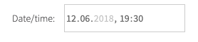
<div>
  <label for="party-time">Date/time:</label>
  <input type="datetime-local" id="party-time" value="2018-06-12T19:30" min="2018-05-07T00:00" max="2018-06-14T00:00">
</div>
Type DateTime-Local test examples in Java
Type DateTime-Local test examples in C#
There following classes represent this type of element:
- C#: JDI.Light.Elements.Common.DateTimeSelector
- Java: com.epam.jdi.light.ui.html.common.DateTimeSelector
Here is the list of some methods available in C#:
| Method | Description | Return Type |
|---|---|---|
| AssertThat() | Assert action of DateTimeSelector | DateTimeSelectorAssert |
| GetDateTime() | Returns the set date or time | DateTime |
| Is() | Assert action of DateTimeSelector | DateTimeSelectorAssert |
| Max() | Gets attribute with name 'max' | string |
| Min() | Gets attribute with name 'min' | string |
| SetDateTime(string/DateTime value) | Sets a date or time | void |
| Value() | Returns value attribute | string |
And here are some of the methods available in Java:
| Method | Description | Return Type |
|---|---|---|
| value() | Returns the set date or time | String |
| max() | Gets attribute with name max | String |
| min() | Gets attribute with name min | String |
| setDateTime(String) | Sets a date or time | void |
| setValue(String) | Sets a date or time | void |
| getValue() | Returns the set date or time | String |
| is() | Assertion | DateTimeAssert |
In the following sections there are examples of different implementations of such fields.
1.1.6 FileInput
FileInput — A graphical control element that allows user to upload documents to web site.
//@FindBy(id = "avatar")
@UI("#avatar")
public static FileInput avatar;

@Test
public void uploadTest() {
    avatar.uploadFile(mergePath(COMMON.projectPath,"/src/test/resources/functional.xml"));
    avatar.is().text(containsString("functional.xml"));
    assertTrue(avatar.getText().contains("functional.xml"));
    assertTrue(avatar.getValue().contains("functional.xml"));
}

@Test
public void labelTest() {
    assertEquals(avatar.labelText(), "Profile picture:");
    avatar.label().is().text(containsString("picture"));
}
[Test]
public void FileInputTest()
{
    FileInput.SelectFile(CreateFile(filename));
}

[Test]
public void DisabledUploadTest()
{
    Sleep(2000);
    try
    {
         TestSite.Html5Page.DisabledFileInput.SelectFile(CreateFile(_fileName));
    }
    catch (Exception e)
    {
         Logger.Exception(e);
    }
    Sleep(2000);
    TestSite.Html5Page.DisabledFileInput.Is.Text(EqualTo(""));
}

[Test]
public void LabelTest()
{
    AreEqual(TestSite.Html5Page.FileInput.LabelText(), "Profile picture:");
    TestSite.Html5Page.FileInput.Label().Is.Text(ContainsString("picture"));
}

[Test]
public void BaseValidationTest()
{
    BaseElementValidation(TestSite.Html5Page.FileInput);
}
FileInput element is located in JDI Light in:
- Java: com.epam.jdi.light.ui.html.elements.common.FileInput
- C#: JDI.Light.Elements.Composite.FileInput
Here is an example with HTML code provided:
<div class="html-left">
  <label for="avatar">Profile picture:</label>
  <input type="file" id="avatar" accept="image/png, image/jpeg">
</div>
Available method in Java JDI Light:
| Method | Description | Return Type |
|---|---|---|
| uploadFile(String) | set file path to input | void |
| uploadFileRobot(String, long) | set file path to input | void |
| setValue(String) | set file path to input | void |
| text() | returns text of input field | String |
| getValue() | Get file name | String |
| is() | property that returns object for work with assertions | TextAssert |
Available method in C# JDI Light:
| Method | Description | Return Type |
|---|---|---|
| CleanupDownloads() | Cleans the directory | void |
| HasSize(Matcher |
Checks that a file has a particular size according to the matcher | FileAssert |
| IsDownloaded() | Checks whether a file is downloaded | FileAssert |
| SelectFile(string filepath) | Select file to upload | void |
| Text(Matcher |
Checks whether an occurrence of a text is contained within a text file | FileAssert |
Test examples in Java
Test examples in C#
BDD Steps example
1.1.7 Icon
Icon — Is a simple element type that represents icons and graphic images.

  @UI("#jdi-logo")
  // same as FindBy(css = "#jdi-logo")
  public static Icon userIcon;

  @Test
  public void loginWithUserToLightLocatorFormTest() {
      userIcon.click();
      loginAs("#login-form", DEFAULT_USER);
      homePage.checkOpened();
  }
  [FindBy(Css = "#jdi-logo")]
  public IIcon Logo
  ;

  [Test]
  public void GetSourceTest()
  {
    Jdi.Assert.AreEquals(LogoImage.GetSource(), Src);
  }

  [Test]
  public void GetTipTest()
  {
    Jdi.Assert.AreEquals(LogoImage.GetAlt(), Alt);
  }
<label for="jdi-logo">JDI Logo:</label>
<img src="/jdi-light/images/jdi-logo.jpg" id="jdi-logo" alt="Jdi Logo 2"
     width="101" height="100" onclick="alert('JDI Logo');">
Icon is represented by Image class:
Icon in JDI is a descendant of Image. It inherits all Image's methods and serves as its wrapper. Here are Java methods for Icon, inherited from Image interface:
| Method | Description | Return Type |
|---|---|---|
| alt() | get value of alt attribute | String |
| click() | click on the image | void |
| height() | get value of height attribute | int |
| is() | method for building assertions | ImageAssert |
| src() | get value of src attribute | String |
| width() | get value of width attribute | int |
| fileName() | Get image source path | String |
| getValue() | Get image source path | String |
Here is a list of available methods in C#:
| Method | Description | Return Type |
|---|---|---|
| Alt | get value of alt attribute | string |
| AssertThat() | method for building assertions | ImageAssert |
| Click() | click on the image | void |
| Height | get value of height attribute | string |
| Is() | method for building assertions | ImageAssert |
| Src | get value of src attribute | string |
| Width | get value of width attribute | string |
1.1.8 Image
Image — Is a simple element type that represents graphic images.
  @UI("#jdi-logo")
  // same as FindBy(css = "#jdi-logo")
  public static Image jdiLogo;

  @Test
  public void isValidationTest() {
      WebPage.refresh();
      jdiLogo.is().src(containsString("jdi-logo.jpg"));
      jdiLogo.is().alt(is("Jdi Logo 2"));
      jdiLogo.assertThat().height(is(100));
      jdiLogo.assertThat().width(is(101));
  }

  @Test
  public void getSrcTest() {
      assertEquals(jdiLogo.src(), text);
  }
  [FindBy(Css = "#jdi-logo")]
  public IImage LogoImage;

  [Test]
  public void GetSourceTest()
  {
    Jdi.Assert.AreEquals(LogoImage.GetSource(), Src);
  }

  [Test]
  public void GetTipTest()
  {
    Jdi.Assert.AreEquals(LogoImage.GetAlt(), Alt);
  }
<label for="jdi-logo">JDI Logo:</label>
<img src="/jdi-light/images/jdi-logo.jpg" id="jdi-logo" alt="Jdi Logo 2"
     width="101" height="100" onclick="alert('JDI Logo');">
Images are represented by the following classes in Java and C#:
- Java: com.epam.jdi.light.ui.html.elements.common.Image
- C#: JDI.Light.Elements.Common.Image
Here is a list of available methods in Java:
| Method | Description | Return Type |
|---|---|---|
| alt() | get value of alt attribute | String |
| click() | click on the image | void |
| height() | get value of height attribute | int |
| is() | method for building assertions | ImageAssert |
| src() | get value of src attribute | String |
| width() | get value of width attribute | int |
| fileName() | Get image source path | String |
| getValue() | Get image source path | String |
Here is a list of available methods in C#:
| Method | Description | Return Type |
|---|---|---|
| Alt | get value of alt attribute | string |
| AssertThat() | method for building assertions | ImageAssert |
| Click() | click on the image | void |
| Height | get value of height attribute | string |
| Is() | method for building assertions | ImageAssert |
| Src | get value of src attribute | string |
| Width | get value of width attribute | string |
1.1.9 Link
  //@FindBy(css = "[ui=github-link]")
  @UI("[ui=github-link]")
  public static Link githubLink;

  @Test
  public void getTextTest() {
        assertEquals(githubLink.getText(), text);
  }

  @Test
  public void getRefTest() {
        assertEquals(githubLink.ref(), "https://github.com/jdi-testing");
  }
  [FindBy(Css = "[ui = github-link]")]
  public ILink GithubLink;

  [Test]
  public void GetTextTest()
  {
      Assert.AreEqual(GithubLink.GetText(), Text);
  }

  [Test]
  public void GetUrlTest()
  {
       Assert.AreEqual(GithubLink.Url(), "https://epam.github.io/JDI/html5.html");
  }
Link — A graphical control element that allows user to link from one page to other web pages, files, locations within the same page, email addresses, or any other URL.
Link are represented by the following class:
- Java: com.epam.jdi.light.ui.html.elements.common.Link
- C#: JDI.Light.Elements.Common.Link

<a ui="github-link" href="https://github.com/jdi-testing" alt="Github JDI Link">Github JDI</a>
Here is the list of available methods in Java:
| Method | Description | Return Type |
|---|---|---|
| alt() | Returns the alternate text | String |
| click() | Follow the link | void |
| getValue() | Returns the link text | String |
| is() | Returns object for work with assertions | LinkAssert |
| ref() | Returns the reference | String |
| url() | Returns the URL | URL |
Test examples in Java
BDD Steps example
Here is the list of available methods in C#:
| Method | Description | Return Type |
|---|---|---|
| Alt() | Returns the alternate text | string |
| AssertThat() | Returns object for work with assertions | LinkAssert |
| Click() | Follow the link | void |
| GetText() | Returns the link text | string |
| Is() | Returns object for work with assertions | LinkAssert |
| Ref() | Returns the reference | string |
| Url() | Returns the URL | string |
Test examples in C#
BDD Steps example
1.1.10 Menu
Menu — A list of links which lead to different pages or sections of website.
Menu element is located in JDI Light in:
- Java: _com.epam.jdi.light.ui.html.
- C#: JDI.Light.Elements.Composite.Menu
Here is an example with provided HTML code:
  @UI(".sidebar-menu [ui=label]")
  //@FindBy(css = ".sidebar-menu [ui=label]")
  public static Menu leftMenu;

  @Test
  public void setNullValueTest() {
        String optionName = null;
        String selectedValue = leftMenu.selected();
        leftMenu.select(optionName);
        leftMenu.has().text(selectedValue);
  }

  @Test
  public void selectTest() {
        leftMenu.select("Contact form");
        contactFormPage.checkOpened();
  }
  [FindBy(Css = "ul.sidebar-menu")]
  public Menu SidebarMenu;

  [Test]
  public void SelectEnumTest()
  {
       TestSite.SidebarMenu.Select(Navigation.MetalsColors);
       TestSite.MetalsColorsPage.CheckOpened();
  }

  [Test]
  public void IsValidationTest()
  {
       TestSite.SidebarMenu.Select("Elements packs", "HTML 5");
       TestSite.SidebarMenu.Is.Selected("HTML 5")
  }

  [Test]
  public void AssertValidationTest()
  {
       TestSite.SidebarMenu.Select("Elements packs", "HTML 5");
       TestSite.SidebarMenu.AssertThat.Selected("HTML 5");
  }
<ul class="sidebar-menu left">
<li ui="label" index="1">
<a href="index.html">
<span>Home</span>
</a>
</li>
<li ui="label" index="2">
<a href="contacts.html">
<span>Contact form</span>
</a>
</li>
<li class="menu-title" index="3">
<a ui="label">
<span>Service</span>
<div class="fa fa-caret-down arrow"/>
</a>
<ul class="sub hide-menu">
<li ui="label" index="1">
<a href="support.html">
<p>
<span>Support</span>
</p>
</a>
</li>
<li ui="label" index="2">
<a href="dates.html">
<span>Dates</span>
</a>
</li>
<li ui="label" index="3">
<a href="complex-table.html">
<span>Complex Table </span>
</a>
</li>
<li ui="label" index="4">
<a href="simple-table.html">
<span>Simple Table</span>
</a>
</li>
<li ui="label" index="5">
<a href="search.html">
<span>Search</span>
</a>
</li>
<li ui="label" index="6">
<a href="user-table.html">
<span>User Table</span>
</a>
</li>
<li ui="label" index="7">
<a href="table-pages.html">
<span>Table with pages</span>
</a>
</li>
<li ui="label" index="8">
<a href="different-elements.html">
<span>Different elements</span>
</a>
</li>
<li ui="label" index="9">
<a href="performance.html">
<span>Performance</span>
</a>
</li>
</ul>
</li>
<li ui="label" index="4">
<a href="metals-colors.html">
<span>Metals & Colors</span>
</a>
</li>
<li class="menu-title active" index="5">
<a ui="label">
<span>Elements packs</span>
<div class="fa fa-caret-down arrow"/>
</a>
<ul class="sub">
<li ui="label" index="1" class="active">
<a href="html5.html">
<span>HTML 5</span>
</a>
</li>
<li ui="label" index="2">
<a href="mobile-html5.html">
<span>Mobile and HTML 5</span>
</a>
</li>
<li ui="label" index="3">
<a href="bootstrap-new.html">
<span>Bootstrap</span>
</a>
</li>
<li ui="label" index="4">
<a href="bootstrap_form.html">
<span>Bootstrap form</span>
</a>
</li>
<li ui="label" index="5">
<a href="bootstrap_forms.html">
<span>Bootstrap forms</span>
</a>
</li>
<li ui="label" index="6">
<a href="react-ant.html">
<span>React Ant</span>
</a>
</li>
<li ui="label" index="7">
<a href="angular.html">
<span>Angular</span>
</a>
</li>
<li ui="label" index="8">
<a href="material">
<span>Material UI</span>
</a>
</li>
<li ui="label" index="9">
<a href="vuetify">
<span>Vuetify</span>
</a>
</li>
</ul>
</li>
</ul>
Available methods in Java JDI Light:
| Method | Description | Return Type |
|---|---|---|
| selected() | Returns selected menu item | String |
| selected(String/int) | Check is item seleceted | boolean |
| values() | Returns selected menu item and subitems | List |
| values(TextTypes) | Returns selected menu item and subitems | List |
| select(String/String.../int/int.../TEnum/TEnum...) | Select menu element | void |
| listEnabled() | Returns all enable menu options | List |
| listDisabled() | Returns all disabled menu options | List |
| attrs() | Gets all element attributes | List |
| getText() | Gets button text | String |
| getValue() | Returns the value | String |
| setValue(String) | Sets the value | void |
| isDisplayed() | Check that menu is displayed | boolean |
| isHidden() | Check that menu is hidden | boolean |
| size() | Get menu size | int |
| isEmpty() | Check that '{name}' menu is empty | boolean |
| isNotEmpty() | Check that '{name}' menu is not empty | boolean |
Available methods in C# JDI Light:
| Method | Description | Return Type |
|---|---|---|
| AssertThat | Get select assert | MenuSelectAssert |
| Is | Get select assert | MenuSelectAssert |
| List |
Gets values of all options | List |
| string Selected() | Returns selected menu item | string |
| void HoverAndClick(string[]) | Hovers and clicks menu item and subitems | void |
| void HoverAndClick(string) | Hovers and clicks menu item | void |
| void Select(string[]) | Select menu element and subelements by string values | void |
| void Select(string) | Select menu element | void |
| void Select(int[]) | Select menu element and subelements by index | void |
| void Select(int) | Select menu element and subelements by index | void |
| void Select(Enum[]) | Select menu element and subelements by getting values of enum | void |
| void Select(Enum) | Select menu element | void |
1.1.11 NumberSelector
NumberSelector — A graphical control element that allows the user to enter a number.
NumberSelector is represented by the following classes:
- Java: com.epam.jdi.light.ui.html.common.NumberSelector
- C#: JDI.Light.Elements.Common.NumberSelector
    @UI("#height")
    //@FindBy(css = "#height")
    public static NumberSelector height;

    @Test
    public void minTest() {
        assertEquals(height.min(), 0.3);
    }

    @Test
    public void maxTest() {
        assertEquals(height.max(), 2.5);
    }

    @Test
    public void setNumberTest() {
        height.setNumber("1.4");
        assertEquals(height.value(), "1.4");
    }

    @Test
    public void stepTest() {
        assertEquals(height.step(), 0.2);
    }
    [FindBy(Css = "#height")]
    public INumberSelector numberSelector;

    [Test]
    public void GetNumberTest()
    {
        Jdi.Assert.AreEquals(number, numberSelector.Value());
    }
<label for="height">Height (metres):</label>
<input type="number" id="height" min="0.3" max="2.5" step="0.2"
 placeholder="20 cm increments. Range [0.3,2.5]">
Here is the list of available methods in Java:
| Method | Description | Return Type |
|---|---|---|
| is() | Returns object for work with assertions | NumberAssert |
| max() | Returns the max value | double |
| min() | Returns the min value | double |
| value() | Returns the value | String |
| setNumber(String) | Sets the value | void |
| setValue(String) | Sets the value | void |
| getValue() | Returns the value | String |
| step() | Returns the step value | double |
Here is the list of available methods in C#:
| Method | Description | Return Type |
|---|---|---|
| AssertThat() | Returns object for work with assertions | NumberAssert |
| Is() | Returns object for work with assertions | NumberAssert |
| Max | Returns the max value | double |
| Min | Returns the min value | double |
| Placeholder | Returns the placeholder text | String |
| SetNumber(double) | Sets the value | void |
| Step | Returns the step value | double |
| Value | Returns the value | double |
1.1.12 ProgressBar
Progress Bar — Element for displaying an indicator showing the completion progress of a task.
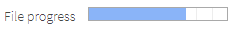
ProgressBar is located in the following class:
- Java: com.epam.jdi.light.ui.html.elements.common.ProgressBar
- C#: JDI.Light.Elements.Common.ProgressBar
  @UI("#progress")
  // @FindBy(id = "progress")
  public static ProgressBar progress;

  @Test
  public void getLabelTextTest() {
        assertEquals(progress.labelText(), "File progress");
  }

  @Test
  public void getValueTest() {
        assertEquals(progress.value(), 70);
  }

  @Test
  public void maxTest() {
        assertEquals(progress.max(), 100);
  }
  [FindBy(Css = "#progress")]
  public ProgressBar Progress;

  [Test]
  public void GetValueTest()
  {
       Assert.AreEqual(Progress.Value(), "70");
  }

  [Test]
  public void MaxTest()
  {
       Assert.AreEqual(Progress.Max(), "100");
  }
Here is an example with provided HTML code:
<label for="progress">File progress</label>
<progress id="progress" max="100" value="70"></progress>
Available methods in Java JDI Light:
| Method | Description | Return Type |
|---|---|---|
| getValue() | Get current progress value | String |
| is() | Various assert actions for Progress bar | ProgressAssert |
| max() | Get progressbar maximum possible value | int |
| value() | Get current progress value | int |
Test examples in Java
BDD Steps example
Available methods in C# JDI Light:
| Method | Description | Return Type |
|---|---|---|
| AssertThat() | Various assert actions for Progress bar | ProgressAssert |
| Is() | Various assert actions for Progress bar | ProgressAssert |
| Max() | Get progressbar maximum possible value | string |
| Value() | Get current progress value | string |
Test examples in C#
BDD Steps example
1.1.13 Range
  @UI("#volume")  //@FindBy(id = "volume")
  public static Range volume;

  double defaultVolume = 90;

  @Test
  public void setupValueTest() {
        volume.setupValue(10);
        assertEquals(volume.value(), 10.0);

        defaultRange.setupValue(65);
        assertEquals(defaultRange.value(), 65.0);

        minMaxRange.setupValue(3);
        assertEquals(minMaxRange.value(), 3.0);

        fractionalRange.setupValue(3.5);
        assertEquals(fractionalRange.value(), 3.5);
  }

  @Test
 public void stepTest() {
        assertEquals(volume.step(), 5.0);
        assertEquals(defaultRange.step(), 1.0);
        assertEquals(minMaxRange.step(), 2.0);
        assertEquals(fractionalRange.step(), 0.5);
 }

  @Test
  public void maxTest() {
        assertEquals(volume.max(), 100.0);
        assertEquals(defaultRange.max(), 100.0);
        assertEquals(minMaxRange.max(), 10.0);
        assertEquals(fractionalRange.max(), 7.0);
  }
  [FindBy(Css = "#volume")]
  public IRange Volume { get; set; }
  [Test]
  public void GetValueTest()
  {
      Assert.AreEqual(TestSite.Html5Page.DisabledRange.Value(), 50);
  }
  [Test]
  public void MinTest()
  {
      Assert.AreEqual(TestSite.Html5Page.Volume.Min(), 10);
  }
  [Test]
  public void MaxTest()
  {
      Assert.AreEqual(TestSite.Html5Page.Volume.Max(), 100);
  }
  [Test]
  public void StepTest()
  {
      Assert.AreEqual(TestSite.Html5Page.Volume.Step(), 5);
  }
  [Test]
  public void SetRangeTest()
  {
      TestSite.Html5Page.Volume.SetValue(10);
      Assert.AreEqual(TestSite.Html5Page.Volume.Value(), 10);
  }
  [Test]
  public void RangeTest()
  {
      TestSite.Html5Page.Volume.SetValue("30");
      Assert.AreEqual(TestSite.Html5Page.Volume.GetValue(), "30");
  }
Range — A graphical control element that allows the user to set the value within a range.
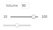
<label for="volume">Volume</label>
<input type="text" disabled="" id="volume-value" class="range-value" value="90">
<br>
<span>10</span>
<input type="range" id="volume" min="10" max="100" value="90" step="5" class="range" list="volume-list" oninput="show_val(this)" onchange="show_val(this)">
<span>100</span>
<datalist id="volume-list">
  <option value="0">
  </option>
  <option value="20">
  </option>
  <option value="40">
  </option>
  <option value="60">
  </option>
  <option value="80">
  </option>
  <option value="100">
  </option>
</datalist>
Range is represented by the following class:
- Java: com.epam.jdi.light.ui.html.elements.common.Range
- C#: JDI.Light.Elements.Common.Range
Here is a list of available methods in C#:
| Method | Description | Return Type |
|---|---|---|
| AssertThat() | Returns object for work with assertions | RangeAssert |
| GetValue() | Returns the value | String |
| Is() | Returns object for work with assertions | RangeAssert |
| Max() | Returns the max value | Double |
| Min() | Returns the min value | Double |
| SetValue(string value) | Sets the value | void |
| SetValue(double value) | Sets the value | void |
| Step() | Returns the step value | Double |
| Value() | Returns the value | Double |
Test examples in C#
BDD Steps example
And here are methods available in Java:
| Method | Description | Return Type |
|---|---|---|
| getValue() | Gets the value | String |
| is() | Returns object for work with assertions | RangeAssert |
| max() | Returns the max value | double |
| min() | Returns the min value | double |
| setupValue(double volume) | Sets the value | void |
| setValue(String volume) | Sets the value | void |
| step() | Returns the step value | double |
| value() | Returns the value | double |
Test examples in Java
BDD Steps example
1.1.14 Text
Text — Is a combination of letters and text symbols. Most testing activities involve working with text: text is typed into login fields, buttons get located by their texts, actual text gets compared to expected.
  @UI("[ui=jdi-text]")
  //@FindBy(css = "[ui=jdi-text]")
  public static Text jdiText;

  String text = "Powerful Framework for UI Tests Automation. Suitable for any UI project: Web(Html5, Angular, React...), Mobile(Android IOs), Desktop(Win app) etc.";

  @Test
  public void getTextTest() {
      assertEquals(jdiText.getText(), text);
  }

  @Test
  public void getValueTest() {
      assertEquals(jdiText.getValue(), text);
  }

  @Test
  public void isValidationTest() {
      jdiText.is().enabled();
      jdiText.is().text(is(text));
      jdiText.is().text(containsString("Powerful Framework for UI"));
  }
  [FindBy(Css = ".main-txt")]
  public TextElement Text;

  [Test]
  public void GetTextTest()
  {
      Jdi.Assert.AreEquals(TestSite.HomePage.Text.Value, _expectedText);
  }

  [Test]
  public void GetValueTest()
  {
      Jdi.Assert.AreEquals(TestSite.HomePage.Text.Value, _expectedText);
  }

  [Test]
  public void SetAttributeTest()
  {
      var attributeName = "testAttr";
      var value = "testValue";
      TestSite.HomePage.Text.SetAttribute(attributeName, value);
      Jdi.Assert.AreEquals(TestSite.HomePage.Text.GetAttribute(attributeName), value);
  }

  [Test]
  public void WaitSuspendButtonTextTest()
  {
       TestSite.Html5Page.Open();
       TestSite.Html5Page.GhostButton.Is.Displayed();
       TestSite.Html5Page.GhostButton.Is.Text(EqualTo("GHOST BUTTON"));
       Thread.Sleep(3000);
       TestSite.Html5Page.SuspendButton.Is.Displayed();
       TestSite.Html5Page.SuspendButton.Is.Text(EqualTo("SUSPEND BUTTON"));
  }

   [Test]
   public void IsValidationTest()
   {
        TestSite.HomePage.Text.Is.Enabled();
        TestSite.HomePage.Text.Is.Text(EqualTo(_expectedText));
        TestSite.HomePage.Text.Is.Text(ContainsString(_contains));
   }

   [Test]
   public void AssertValidationTest()
   {
        TestSite.HomePage.Text.AssertThat.Text(EqualTo(_expectedText));
   }

   [Test]
   public void BaseValidationTest()
   {
       TestSite.Html5Page.Open();
       BaseElementValidation(TestSite.Html5Page.JdiText);
   }
<p ui="jdi-text">Powerful Framework for UI Tests Automation. Suitable for any UI project:
Web(Html5, Angular, React...), Mobile(Android IOs), Desktop(Win app) etc.</p>
Text is represented by the following class:
- C#: JDI.Light.Elements.Common.TextElement
- Java: com.epam.jdi.light.ui.html.elements.common.Text
Here is a list of available methods in C#:
| Method | Description | Return Type |
|---|---|---|
| AssertThat | Gets text assert | TextAssert |
| Is | Gets text assert | TextAssert |
| GetText() | returns text | String |
| GetValue() | returns text | String |
| WaitFor | Gets text assert | TextAssert |
And here are methods available in Java:
| Method | Description | Return Type |
|---|---|---|
| getValue() | Get current value | String |
| is() | Various assert actions for Text | TextAssert |
1.1.15 TextField
  @UI("#your-name") //@FindBy(css = "#your-name")
  public static TextField yourName;

  String defaultText = "TextField";


  @Test
  public void inputTest() {
        yourName.input("New text");
        assertEquals(yourName.getText(), "New text");
  }

  @Test
  public void sendKeysTest() {
        yourName.sendKeys("Test");
        assertEquals(yourName.getValue(), defaultText +"Test");
  }

  @Test
  public void clearTest() {
        yourName.clear();
        assertEquals(yourName.getText(), "");
  }
  [FindBy(Id = "name")]
  public ITextField NameField;

  [Test]
  public void InputTest()
  {
      TestSite.ContactFormPage.NameField.Input(ToAddText);
      Jdi.Assert.AreEquals(TestSite.ContactFormPage.NameField.Value, ToAddText);
  }

  [Test]
  public void SendKeyTest()
  {
      TestSite.ContactFormPage.NameField.SendKeys(ToAddText);
      Jdi.Assert.AreEquals(TestSite.ContactFormPage.NameField.Value, _defaultText + ToAddText);
  }

  [Test]
  public void ClearTest()
  {
      TestSite.ContactFormPage.NameField.Clear();
      Jdi.Assert.AreEquals(TestSite.ContactFormPage.NameField.Value, "");
  }
TextField — Is a simple element type that allows users to fill in text fields.
<label for="name">Your name:</label>
<input type="text" id="name" placeholder="Input name">
<label for="disabled-name">Surname:</label>
<input type="text" id="disabled-name" placeholder="Iovlev" disabled="">
Text fields are represented by the following classes in Java and C#:
- C#: JDI.Light.Elements.Common.TextField
- Java: com.epam.jdi.light.ui.html.elements.common.TextField
Here is a list of available methods and properties in C#:
| Method / Property | Description | Return Type |
|---|---|---|
| AssertThat | property that returns object for work with assertions | TextAssert |
| Clear() | clears the text field | void |
| Focus() | places cursor within the text field | void |
| GetText() | returns text from the text field | String |
| GetValue() | returns text from the text field | String |
| Input(string text) | sets new text | void |
| Is | property that returns object for work with assertions | TextAssert |
| Placeholder | returns value of the placeholder attribute | String |
| SendKeys(string value) | adds text to the field | void |
| SetText(String value) | sets new text | void |
Test examples in C#
BDD Steps example
And here are methods available in Java:
| Method | Description | Return Type |
|---|---|---|
| getText() | returns text from the text field | String |
| getValue() | returns text from the text field | String |
| setValue(String) | sets new value | void |
| is() | returns object for work with assertions | TextAssert |
Test examples in Java
BDD Steps example
1.1.16 TextArea
TextArea — Is a simple element type that allows users to fill in text areas (unlike TextField, multiple lines of text are allowed).
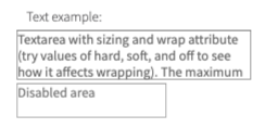
  @UI("#text-area")
  // same as FindBy(css = "#text-area")
  public static TextArea textArea;

  String defaultText = "TextArea";

  @Test
  public void addNewLineTest() {
      textArea.setLines("line1", "line2");
      textArea.addNewLine("line3");
      assertEquals(textArea.getText(), "line1\nline2\nline3");
  }

  @Test
  public void isValidationTest() {
      textArea.is().enabled();
      textArea.setText(defaultText);
      textArea.is().text(is(defaultText));
      textArea.is().text(containsString("Area"));
      disabledTextArea.is().disabled();
   }

  @Test
  public void rowsTest() {
      assertEquals(textArea.rows(), 3);
      assertEquals(textArea.cols(), 33);
      assertEquals(textArea.minlength(), 10);
      assertEquals(textArea.maxlength(), 200);

      textArea.is().rowsCount(is(3));
      textArea.is().colsCount(is(33));
      textArea.is().minlength(is(10));
      textArea.is().maxlength(is(200));
  }
  [FindBy(Css = "#text-area")]
  public ITextArea TextArea;

  [Test]
  public void GetTextTest()
  {
      TextArea.SetText(Text);
      Assert.AreEqual(TextArea.GetText(), "Text");
  }

  [Test]
  public void AddNewLineTest()
  {
     TextArea.SetText("line1", "line2");
     TextArea.AddNewLine("line3");
     Assert.CollectionEquals(TextArea.GetLines(), new[] { "line1", "line2", "line3" });
  }
<label for="text-area">Text example:</label>
<textarea id="text-area" rows="3" cols="33" maxlength="200" minlength="10" required="" wrap="hard" placeholder="Input huge text">Textarea with sizing and wrap attribute (try values of hard, soft, and off to see how it affects wrapping). The maximum number of characters is constrained to 200 by the maxlength attribute.
                            </textarea>
<br>
<textarea disabled="" placeholder="Disabled area"/>
Text areas are represented by the following classes:
- Java: com.epam.jdi.light.ui.html.elements.common.TextArea
- C#: JDI.Light.Elements.Common.TextArea
In Java TextArea is a descendant of UIBaseElement with HasLabel, SetValue, HasPlaceholder, IsInput interfaces parameterized with TextAreaAssert and inherits its methods. But TextArea also has methods of its own.
In C# TextArea is a descendant of TextField and inherits its methods. But TextArea also has methods of its own.
Here is a list of available methods in Java:
| Method | Description | Return Type |
|---|---|---|
| addNewLine(String) | add line to the already existing | void |
| cols() | returns value of cols attribute | int |
| getLines() | returns lines (text) from the text area | List |
| getValue() | calls getText() method | String |
| getText() | returns value of attribute "value" | String |
| is() | returns object for work with assertions | TextAreaAssert |
| maxlength() | returns value of maxlength attribute | int |
| minlength() | returns value of minlength attribute | int |
| rows() | returns value of rows attribute | int |
| setLines(String...) | sets lines (text) | void |
| setValue(String) | setting value | void |
Here is a list of available methods in C#:
| Method | Description | Return Type |
|---|---|---|
| AddNewLine(string line) | add line to the already existing ones | void |
| AssertThat() | returns object for work with assertions | TextAreaAssert |
| Cols() | returns value of cols attribute | int |
| GetLines() | returns lines (text) from the text area | string[] |
| Is() | returns object for work with assertions | TextAreaAssert |
| Maxlength() | returns value of maxlength attribute | int |
| Minlength() | returns value of minlength attribute | int |
| Rows() | returns value of rows attribute | int |
| SetLines(string[] lines) | sets lines (text) | void |
1.1.17 Title
Title — A graphical control element representing document title, which is displayed in the title bar of the browser or tab page.
Title is represented by the following class:
- Java: com.epam.jdi.light.elements.common.Label
- C#: _JDI.Light.Elements.Common.Title

    @UI("[ui=jdi-title]")
    //@FindBy(css = "[ui=jdi-title]")
    public static Label jdiTitle;

    @Test
    public void getTextTest() {
        assertEquals(jdiTitle.getText(), text);
    }

    @Test
    public void getValueTest() {
        assertEquals(jdiTitle.getValue(), text);
    }

    @Test
    public void clickTest() {
        jdiTitle.click();
        assertEquals(getAlertText(), "JDI Title");
        acceptAlert();
    }

    @Test
    public void isValidationTest() {
        jdiTitle.is().enabled();
        jdiTitle.is().text(is(text));
        jdiTitle.is().text(equalTo(text));
        jdiTitle.is().text(equalToIgnoringCase("jdi TESTING platform"));
    }
    [FindBy(Css = "[ui=jdi-title]")]
    public Title JdiTitle;

    [Test]
    public void GetTextTest()
    {
            Assert.AreEqual(JdiTitle.GetText(), "Title text");
    }

    [Test]
    public void ClickTest()
    {
            JdiTitle.ClickTitle();
    }

    [Test]
    public void IsValidationTest()
    {
           TestSite.Html5Page.JdiTitle.Is.Enabled();
           TestSite.Html5Page.JdiTitle.Is.Text(EqualTo(_text));
           TestSite.Html5Page.JdiTitle.Is.Text(Is(_text));
           TestSite.Html5Page.JdiTitle.Is.Text(EqualToIgnoringCaseMatcher.EqualTo("jdi TESTING platform"));
    }

    [Test]
    public void AssertValidationTest()
    {
           TestSite.Html5Page.JdiTitle.AssertThat.Text(EqualTo(_text));
    }

    [Test]
    public void BaseValidationTest()
    {
           BaseElementValidation(TestSite.Html5Page.JdiTitle);
    }
<h1 ui="jdi-title" onclick="alert('JDI Title');">JDI Testing platform</h1>
Here is the list of methods available in C# JDI Light:
| Method | Description | Return Type |
|---|---|---|
| getValue() | Returns | String |
| Is | Gets Title's assert | TextAssert |
Here is the list of available methods in Java JDI Light:
| Method | Description | Return Type |
|---|---|---|
| AssertThat() | Gets Title's assert | TitleAssert |
| click() | Click title | void |
| getText() | Returns title text | String |
| Is() | Gets Title's assert | TitleAssert |
1.2 HTML5 Complex elements
1.2.1 RadioButtons
RadioButtons — Interface element that allows user to select a single option from a predefined group.
Radio buttons are represented by the following class:
- Java: com.epam.jdi.light.ui.html.elements.complex.RadioButtons
- C#: JDI.Light.Elements.Complex.RadioButtons
Consider an example where each radio button has a particular color, described by the following HTML code:
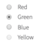
    //@FindBy(name = "colors")
    @UI("[name=colors]")
    public static RadioButtons colors;

    @Test
    public void selectTest() {
        colors.select("Green");
        assertEquals(colors.getValue(), "Green");
        colorsNoLocator.select("Blue");
        colorsNoLocator.is().selected("Blue");
    }

    @Test
    public void valuesTest() {
        assertEquals(colors.values(), asList("Red", "Green", "Blue", "Yellow"));
    }

    @Test
    public void isValidationTest() {
        colors.is().selected("Blue");
        colors.is().selected(Blue);
        colors.is().values(hasItem("Yellow"));
        colors.is().disabled(hasItem("Yellow"));
        colors.is().enabled(not(hasItem("Yellow")));
        colors.is().enabled(hasItems("Green", "Blue"));

        colorsNoLocator.is().selected("Blue");
        colorsNoLocator.is().selected(Blue);
    }

    @Test
    public void assertValidationTest() {
        colors.assertThat().values(contains("Red", "Green", "Blue", "Yellow"));
    }
    [FindBy(Css = "#colors")]
    public IRadioButtons MyRadioButtons;

    [Test]
    public void SelectRadioButton()
    {
        MyRadioButtons.Select("some value");
    }
    [Test]
    public void SelectRadioButtonByIndex()
    {
        MyRadioButtons.Select(1);
    }
    [Test]
    public void GetSelected()
    {
        var selected = MyRadioButtons.GetSelected();
        Assert.AreEqual(selected, "some value");
        MyRadioButtons.Is().Selected(Is.EqualTo("some value"));
        MyRadioButtons.AssertThat().Selected(Is.EqualTo("some value"));
    }
<input type="radio" id="red" name="colors">
<label for="red">Red</label> <br>

<input type="radio" id="green" name="colors" checked="">
<label for="green">Green</label> <br>

<input type="radio" id="blue" name="colors">
<label for="blue">Blue</label> <br>

<input type="radio" id="yellow" name="colors" disabled="">
<label for="yellow">Yellow</label>
Here is the list of some available methods in Java:
| Method | Description | Return Type |
|---|---|---|
| assertThat() | Returns object for work with assertions | RadioButtonAssert |
| is() | Returns object for work with assertions | RadioButtonAssert |
| select(String/int/Enum) | Select radiobutton by value/index | void |
| selected() | Get selected radiobutton value | string |
| values() | Returns list of values | List |
Here is the list of some available methods in C#:
| Method | Description | Return Type |
|---|---|---|
| AssertThat() | Returns object for work with assertions | RadioButtonAssert |
| Is() | Returns object for work with assertions | RadioButtonAssert |
| Select(string/int) | Select radiobutton by value/index | void |
| Selected() | Get selected radiobutton value | string |
| Values() | Returns list of values | List |
1.2.2 Table
Table — A complex element that consists of a header, a body (at least one row and one column) and a footer. This element allows several read-only interactions.
Tables are represented by the following classes in Java and C#:
- Java: com.epam.jdi.light.elements.complex.table.Table
- C#: JDI.Light.Elements.Complex.Table
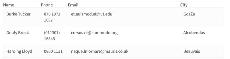
  @UI("#users-table")
  //@FindBy(id = "users-table")
  @JTable(
          root = "#users-table",
          row = "//tr[%s]/td",
          column = "//tr/td[%s]",
          cell = "//tr[{1}]/td[{0}]",
          allCells = "td",
          headers = "th",
          header = {"Name", "Phone", "Email", "City"},
          rowHeader = "Name",
          size = 4
    )
    public static Table usersSetup;

  @Test
  public void tableDataTest() {
        assertEquals(users.row(ELEMENT.startIndex + 1).asData(UserInfo.class),
          GRADY_BROCK);
  }

  @Test
  public void tableEntityTest() {
      UserRow user = users.row(ELEMENT.startIndex + 1).asLine(UserRow.class);
      user.name.click();
      Alerts.validateAndAcceptAlert(containsString("Brock"));
      user.city.click();
      Alerts.validateAndAcceptAlert(is("Alcobendas"));
  }
  [Test]
  public void HugeTableSearchByColumnNamesContainValuesTest()
  {
      PerformancePage.UsersTable.AssertThat().HasRowWithValues(
          ContainsValue("Meyer", InColumn("Name")),
          ContainsValue("co.uk", InColumn("Email")));
      var row = PerformancePage.UsersTable.Row(
          ContainsValue("Meyer", InColumn("Name")),
          ContainsValue("co.uk", InColumn("Email")));
          Assert.AreEqual(
       "Brian Meyer;(016977) 0358;
          mollis.nec@seddictumeleifend.co.uk;Houston",
        row.GetValue());
  }

  [Test]
  public void HugeTableSearchByColumnNumbersContainValuesTest()
  {
      PerformancePage.UsersTable.AssertThat().HasRowWithValues(
          ContainsValue("Burke", InColumn(1)),
          ContainsValue("ut.edu", InColumn(3)));
      var row = PerformancePage.UsersTable.Row(1);
      PerformancePage.UsersTable.Is().HasRowWithValues(
         HasValue("Brian Meyer", InColumn("Name")),
         HasValue("(016977) 0358", InColumn("Phone")),
         HasValue("mollis.nec@seddictumeleifend.co.uk",
              InColumn("Email")),
         HasValue("Houston", InColumn("City")));
  }

  [Test]
  public void HugeTableSearchByColumnNamesHasValuesTest()
  {
      PerformancePage.UsersTable.AssertThat().HasRowWithValues(
          HasValue("Brian Meyer", InColumn("Name")),
          HasValue("mollis.nec@seddictumeleifend.co.uk",
          InColumn("Email")));
      var row = PerformancePage.UsersTable.Row(
          HasValue("Brian Meyer", InColumn("Name")),
          HasValue("mollis.nec@seddictumeleifend.co.uk",
           InColumn("Email")));
      Assert.AreEqual("Brian Meyer;(016977)
               0358;mollis.nec@seddictumeleifend.co.uk;Houston",
               row.GetValue());
  }

  [Test]
  public void HugeTableSearchByColumnNumbersHasValuesTest()
  {
      PerformancePage.UsersTable.AssertThat().HasRowWithValues(
          HasValue("Brian Meyer", InColumn(1)),
          HasValue("mollis.nec@seddictumeleifend.co.uk",
           InColumn(3)));
      var row = PerformancePage.UsersTable.Row(
          ContainsValue("Meyer", InColumn("Name")),
          ContainsValue("co.uk", InColumn("Email")));
      Assert.AreEqual("Brian Meyer;
          (016977) 0358;mollis.nec@seddictumeleifend.co.uk;Houston",
          row.GetValue());
  }

  [Test]
  public void TableChainTest()
  {
      PerformancePage.UsersTable.AssertThat()
          .Size(400)
          .Size(Is.GreaterThan(399))
          .HasRowWithValues(
              HasValue("Brian Meyer", InColumn("Name")),
              HasValue("mollis.nec@seddictumeleifend.co.uk",
             InColumn("Email")))
          .NotEmpty()
          .RowsWithValues(3, ContainsValue("Baker", InColumn(1)))
          .HasColumn("Email")
          .HasColumns(new[] {"Name", "City"})
          .Columns(Is.SubsequenceOf(new[] {"Name", "City", "Phone",
           "Email", "Address"}));
  }

  [Test]
  public void TableRowPerformanceTest()
  {
      PerformancePage.Open();
      PerformancePage.CheckOpened();
      AreEqual("Burke Tucker;076 1971 1687;et.euismod.et@ut.edu;GozŽe",
         PerformancePage.UsersTable.Row(1).GetValue());
      AreEqual("Burke Tucker;076 1971 1687;et.euismod.et@ut.edu;GozŽe",
        PerformancePage.UsersTable.Row("Burke Tucker").GetValue());
      AreEqual("Burke Tucker;076 1971 1687;et.euismod.et@ut.edu;GozŽe",
        PerformancePage.UsersTable.Row(Users.Name).GetValue());
      var value = PerformancePage.UsersTable.Preview();
      AreEqual("Name Phone Email City" +
        "Burke Tucker 076 1971 1687 et.euismod.et@ut.edu GozŽe"+
        "Grady Brock (011307) 16843 cursus.et@commodo.org Alcobendas"+
        "Harding Lloyd 0800 1111 neque.In.ornare@mauris.co.uk Beauvais",
                           value.Substring(0, 194));
  }

  [Test]
  public void TableCellPerformanceTest()
  {
      PerformancePage.Open();
      PerformancePage.CheckOpened();
      AreEqual("ipsum.non.arcu@auctorullamcorper.ca",
         PerformancePage.UsersTable.Cell(3, 4));
      AreEqual("ipsum.non.arcu@auctorullamcorper.ca",
         PerformancePage.UsersTable.Cell("Email", 4));
      AreEqual("ipsum.non.arcu@auctorullamcorper.ca",
         PerformancePage.UsersTable.Cell(3, "Zachary Hendrix"));
      AreEqual("ipsum.non.arcu@auctorullamcorper.ca",
         PerformancePage.UsersTable.Cell("Email", "Zachary Hendrix"));
  }

  [Test]
  public void TableColumnPerformanceTest()
  {
      PerformancePage.Open();
      PerformancePage.CheckOpened();
      AreEqual("076 1971 1687;(011307) 16843;0",
         PerformancePage.UsersTable.Column(2).
           GetValue().Substring(0, 30));
      AreEqual("076 1971 1687;(011307) 16843;0",
      PerformancePage.UsersTable.Column("Phone").
          GetValue().Substring(0, 30));
      AreEqual("076 1971 1687;(011307) 16843;0",
      PerformancePage.UsersTable.Column(Users.Phone).
          GetValue().Substring(0, 30));
  }
<table class="uui-table stripe tbl-without-header table-td-click"
                ui="table" id="users-table">
    <tbody>
        <tr>
            <th>Name</th>
            <th>Phone</th>
            <th>Email</th>
            <th>City</th>
        </tr>
        <tr>
            <td>Burke Tucker</td>
            <td>076 1971 1687</td>
            <td>et.euismod.et@ut.edu</td>
            <td>GozŽe</td>
        </tr>
        <tr>
            <td>Grady Brock</td>
            <td>(011307) 16843</td>
            <td>cursus.et@commodo.org</td>
            <td>Alcobendas</td>
        </tr>
        <tr>
            <td>Harding Lloyd</td>
            <td>0800 1111</td>
            <td>neque.In.ornare@mauris.co.uk</td>
            <td>Beauvais</td>
        </tr>
    </tbody>
</table>
JDI JTable annotation
Along with providing a Table type element JDI Light also provides a @JDropdown annotation for a better element locating. In addition to what Table type does @JDropdown also allows some kind of customization in the way the element is being located on the page.
This annotation has the following fields that can be used for locating a table element:
- String root() - value of this field points to the root locator of table element
- String[] header() - list of the columns names
- String headers() - locator of a table header
- String row() - locator representing a single row of a table
- String column() - locator representing a column of a table
- String cell() - locator representing a table cell
- String allCells() - locator representing all table cells
- String rowHeader() - the value of a table header corresponding to a particular raw
- int size() - amount of columns
- int count() - amount of rows
- int firstColumnIndex() - index of the first column
- int[] columnsMapping() - a collection containing indexes of the columns that are going to be used for processing, e.g. if one decides to work with not all columns but only with particular ones or if a column contains e.g. an icon or a checkbox and should not be processed then its index shouldn't be listed in columnsMapping field
Here is a list of available methods in Java:
| Method | Description | Return Type |
|---|---|---|
| getStartIndex() | Returns start index | int |
| setStartIndex(int) | Sets start index | void |
| core() | Returns a UIElement | UIElement |
| setHeader(List |
Sets header value | void |
| headerUI() | Returns a header name | WebList |
| footerUI() | Returns a footer name | WebList |
| rowHeader() | Returns a value of a table header corresponding to a particular raw | List |
| cell(int, int) | Returns a cell object of a table according to column number and row number | String |
| cell(int, String) | Returns a cell object of a table according to the row number and column name | String |
| cell(String, int) | Returns a cell object of a table according to the column name and row number | String |
| cell(String, String) | Returns a cell object of a table according column name and row name | String |
| column(Enum<?>) | Returns a column object of a table according to column name | Line |
| column(int) | Returns a column object of a table according to column number | Line |
| column(String) | Returns a column object of a table according to column name | Line |
| columns() | Returns a list of column objects of a table | List |
| count() | Returns amount of rows | int |
| filterRows(Matcher |
Sets and returns a list of filtered rows of a table according to matching column | List |
| filterRows(Pair |
Sets and returns a list of filtered rows of a table according to matching column | List |
| getValue() | Returns a string content of values for a particular row, where values are separated by ";" | String |
| header() | Returns a list of table's headers | List |
| isEmpty() | Asserts whether a table is empty | boolean |
| isNotEmpty() | Asserts whether a table is not empty | boolean |
| preview() | Returns table preview | String |
| row(Matcher |
Check that the table has rows that meet expected condition | Line |
| row(Enum<?>) | Returns a row object of a table according to row name | Line |
| row(int) | Returns a row object of a table according to row number | Line |
| row(Pair |
Returns a row object of a table according to matching column | Line |
| row(String) | Returns a row object of a table according to row name | Line |
| row(ColumnMatcher...) | Returns a row object of a table according to matcher | Line |
| rows() | Returns a list of rows of a table | List |
| rows(ColumnMatcher...) | Get all table rows that match criteria | List |
| rowsImages() | Get all table rows | List |
| setup(Field) | Initialize field | void |
| getTableJs() | Returns table | T |
| clear() | clears the text field | void |
| refresh() | Clears all data and lines | void |
| offCache() | Turns off cache usage | void |
| size() | Returns amount of columns | int |
| validateRowIndex(int) | Validates row index | void |
| webRow(int) | Returns all UIElements in the row according to row number | WebList |
| webRow(int,String) | Returns all UIElements in the row according to row number | WebList |
| webRow(String) | Returns all UIElements in the row according to row name | WebList |
| webRow(Enum<?>) | Returns all UIElements in the row according to row name | List |
| webColumn(int) | Returns all UIElements in the column according to column number | WebList |
| webColumn(String) | Returns all UIElements in the column according to column name | WebList |
| webColumn(Enum<?>) | Returns all UIElements in the column according to column name | WebList |
| webCell(int, int) | Returns all UIElements in the column according to cell position | UIElement |
| getJSValues(String) | Returns list of locators | List |
| jsCells() | Returns list of locators | List |
| jsColumn(int) | Returns list of column locators | List |
| jsColumn(String) | Returns list of column locators | List |
| jsRow(int) | Returns list of row locators | List |
| jsRow(String) | Returns list of row locators | List |
| jsRowIndexByName(String) | Returns row index by its name | int |
| getRowIndexByName(String) | Returns row index by its name | int |
| getRow(int) | Returns row by its row number | WebList |
| getColumn(int) | Returns column by its row number | WebList |
| getCell(int,int) | Returns cell by its column number and row number | UIElement |
| filter() | Filters a table | WebList |
| filterBy(String) | Filters a table with by a filterName | UIElement |
| searchBy(String) | Filter {name} by column {0} | UIElement |
And here are methods available in C#:
| Method | Description | Return Type |
|---|---|---|
| AssertThat() | Applicable for performing assert actions for tables | TableAssert |
| Cell(int colNum, int rowNum) | Sets and returns a cell object of a table according to the cell's indices | string |
| Cell(string colName, int rowNum) | Sets and returns a cell object of a table according to the cell's column name and row index | string |
| Cell(int colNum, string rowName) | Sets and returns a cell object of a table according to the cell's column index and row name | string |
| Cell(string colName, string rowName) | Sets and returns a cell object of a table according to the cell's column name and row name | string |
| Column(int colNum) | Sets and returns a column object of a table according to the column's index | Line |
| Column(string colName) | Sets and returns a column object of a table according to the column's name | Line |
| Column(Enum colName) | Sets and returns a column object of a table according to column name | Line |
| Columns() | Sets and returns a list of column objects of a table | List |
| Columns(Matcher |
Asserts whether headers satisfy some matcher condition | TableAssert |
| ContainsValue(string value, Column column) | Looks for an object by some value occurrence in a particular column | TableMatcher |
| Empty() | Asserts whether table is empty | TableAssert |
| FilterRows(Matcher |
Sets and returns a list of filtered rows of a table according to matching column | List |
| FilterRows(params KeyValuePair |
Sets and returns a list of filtered rows of a table according to matching column | List |
| GetValue() | Returns a string content of values for a particular row, where values are separated by ";" | string |
| HasColumn(string column) | Asserts whether table has a particular header | TableAssert |
| HasColumns(IEnumerable |
Asserts whether table has particular headers | TableAssert |
| HasRowWithValues(params TableMatcher[] matchers) | Asserts whether a row with particular matchers exists in a table | TableAssert |
| HasValue(string value, Column column) | Looks for an object (exact match) in a particular column | TableMatcher |
| Is() | Applicable for performing assert actions for tables | TableAssert |
| InColumn(string value) | Sets an object of some column to a particular value | Column |
| InColumn(int num) | Sets an object of some column to a particular column number | Column |
| NotEmpty() | Asserts whether table is not empty | TableAssert |
| Row(params TableMatcher[] matchers) | Sets and returns a row object from a table according to some matcher params (returns 'null' if there is no such row) | Line |
| Row(int rowNum) | Sets and returns a row object of a table according to the row index | Line |
| Row(string rowName) | Sets and returns a row object of a table according to the row name | Line |
| Row(Enum rowName) | Sets and returns a row object of a table according to row name | Line |
| Row(Matcher |
Sets and returns a row object of a table according to matching column | Line |
| Row(params KeyValuePair |
Sets and returns a row object of a table according to matching column | Line |
| RowsAsLines(params TableMatcher[] matchers) | Sets and returns a list of rows of a table according to matchers | List |
| RowsAsLines() | Sets and returns a list of rows of a table | List |
| RowsWithValues(int count, params TableMatcher[] matchers) | Asserts whether rows with particular matchers exist in a table multiple times | TableAssert |
| string Preview() | Returns a string content of the whole table | string |
| Size(Matcher |
Asserts whether table size satisfies some matcher condition | TableAssert |
| Size(int expectedSize) | Asserts whether table has a particular size | TableAssert |
1.2.3 DataTable
DataTable — A complex element that consists of a header, a body (at least one row and one column) and a footer. You are able to perform a list of read-only interactions with this element in order to get all data based on specified criteria.
DataTables are represented by the following classes in Java:
  @UI("#users-table")
  //@FindBy(id = "users-table")
  public static DataTable<UserRow, UserInfo> usersData;
  @JTable(
          root = "#users-table",
          row = "//tr[%s]/td",
          column = "//tr/td[%s]",
          cell = "//tr[{1}]/td[{0}]",
          allCells = "td",
          headers = "th",
          header = {"Name", "Phone", "Email", "City"},
          rowHeader = "Name",
          size = 4
    )
  public static DataTable<UserRow, UserInfo> usersDataSetup;

  public static UserInfo GRADY_BROCK = new UserInfo().set(u-> {
        u.name = "Grady Brock";
        u.email = "cursus.et@commodo.org";
        u.phone = "(011307) 16843";
        u.city = "Alcobendas";
  });

  @Test
  public void filterDataTest() {
      assertEquals(usersData.dataRow(ELEMENT.startIndex + 1), GRADY_BROCK);
      assertEquals(usersData.dataRow("Grady Brock"), GRADY_BROCK);
      assertEquals(usersData.dataRow(d -> d.name.contains("Brock")), GRADY_BROCK);
      usersData.assertThat().row(d -> d.equals(GRADY_BROCK));
      usersData.has().row(GRADY_BROCK);
  }

  @Test
  public void filterLinesTest() {
      UserRow line =  usersData.line(ELEMENT.startIndex + 1);
      validateUserRow(line);
      line =  usersData.line("Grady Brock");
      validateUserRow(line);
      line =  usersData.line(d -> d.name.contains("Brock"));
      validateUserRow(line);
  }

  private void validateUserRow(UserRow line) {
      line.city.click();
      Alerts.validateAndAcceptAlert(is(GRADY_BROCK.city));
      assertEquals(line.email.getText(), GRADY_BROCK.email);
  }
- Java: com.epam.jdi.light.elements.complex.table.DataTable
<table class="uui-table stripe tbl-without-header table-td-click"
     ui="table" id="users-table">
    <tbody>
        <tr>
            <th>Name</th>
            <th>Phone</th>
            <th>Email</th>
            <th>City</th>
        </tr>
        <tr>
            <td>Burke Tucker</td>
            <td>076 1971 1687</td>
            <td>et.euismod.et@ut.edu</td>
            <td>GozŽe</td>
        </tr>
        <tr>
            <td>Grady Brock</td>
            <td>(011307) 16843</td>
            <td>cursus.et@commodo.org</td>
            <td>Alcobendas</td>
        </tr>
        <tr>
            <td>Harding Lloyd</td>
            <td>0800 1111</td>
            <td>neque.In.ornare@mauris.co.uk</td>
            <td>Beauvais</td>
        </tr>
    </tbody>
</table>
Here is a list of available methods in Java (DataTable expand Table class - methods from previous table are available too_):
In return types, column "D" refers to the user data object and "L" refers to the table line object.
| Method | Description | Return Type |
|---|---|---|
| dataRow(int) | Get table row by the row number | D |
| allData() | Get all table rows | List |
| allData(MapArray |
Get all table rows | List |
| allLines() | Gets all object rows from the specified table | List |
| allLines(MapArray |
Gets all object rows from the specified table | List |
| columnValues(String, Class |
Returns column values | |
| dataRow(String) | Get table row by the row name | D |
| dataRow(Enum<?>) | Get table row by the row name | D |
| dataRow(Matcher |
Get table row that match criteria in column | D |
| dataRow(ColumnMatcher...) | Get first table row that match criteria | D |
| dataRow(JFunc1 |
Get first table row that match criteria | D |
| dataRow(Pair |
Get table row that match criteria in column | D |
| dataRows(JFunc1 |
Get all table rows that match criteria | List |
| dataRows(ColumnMatcher...) | Get all table rows that match criteria | List |
| dataRows(JFunc1 |
Get at least a specified number of rows of the table that meet the criteria | List |
| filterData(Matcher |
Get table rows that match criteria in column | List |
| filterDatas(Pair |
Get table rows that match criteria in column | List |
| filterLines(Matcher |
Get table rows that match criteria in column | List |
| filterLines(Pair |
Get table rows that match criteria in column | List |
| get(String) | Returns values of the specified row | D |
| getValue() | Get table value | String |
| elements(int) | Returns elements of table | List |
| line(Enum<?>) | Returns an object of a table according to row name | L |
| line(int) | Returns an object of a table according to row number | L |
| line(JFunc1 |
Get first table row that match criteria | L |
| line(Matcher |
Get table row that match criteria in column | L |
| line(Pair |
Get table row that match criteria in column | L |
| line(ColumnMatcher...) | Get first table row that match criteria | L |
| line(String) | Get table row by the row name | L |
| lines(JFunc1 |
et first table row that match criteria | List |
| lines(ColumnMatcher...) | Get all table rows that match criteria | List |
| offCache() | Turns off cache usage | void |
| refresh() | Clears all data and lines | void |
| setup(Field) | Sets up the table using specified fields | void |
| is() | Returns object for work with assertions | DataTableAssert |
| is(Matcher<? super List |
Returns object for work with assertions | DataTableAssert |
| assertThat(Matcher<? super List |
Returns object for work with assertions | DataTableAssert |
| verify(Matcher<? super List |
Returns object for work with assertions | DataTableAssert |
1.2.4 Dropdown
Dropdown — A graphical control element that allows user to choose a single value from a list.
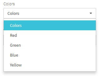
JDI Light has support for dropdown elements with their own type. There are several ways of dropdown usage in JDI Light, each serving different needs.
Dropdown representation
JDI Light provides a Dropdown class which is using for dropdown representation as a type of web element.
This class can also be used when working with HTML5 elements in cases when dropdown is represented with HTML <select> tag.
Consider an example of HTML5 dropdown with the given HTML code:

    @JDropdown(root = "div[ui=dropdown]",
        value = ".filter-option",
        list = "li",
        expand = ".caret")
    public static Dropdown colors2; //@FindBy(css = "div[ui=dropdown]")

    @Test
    public void selectStringTest() {
         colors2.select("Red");
         lastLogEntry.assertThat()
             .text(containsString("Colors: value changed to Red"));
    }

    @Test
    public void selectEnumTest() {
        colors2.select(Green);
        lastLogEntry.assertThat()
            .text(containsString("Colors: value changed to Green"));
    }

    @Test
    public void selectIndexTest() {
        colors2.select(ELEMENT.startIndex + 3);
        lastLogEntry.assertThat()
            .text(containsString("Colors: value changed to Blue"));
    }
    [FindBy(Css = "#dress-code")]
    public Dropdown DressCode;

    [Test]
    public void SelectEnumTest()
    {
        DressCode.Select(Fancy);
        Assert.AreEquals(DressCode.GetSelected(), "Fancy");
    }

    [Test]
    public void LabelTest()
    {
        AreEqual(TestSite.Html5Page.DressCode.Label().GetText(), "Dress code:");
        TestSite.Html5Page.DressCode.Label().Is.Text(ContainsString("Dress"));
    }

    [Test]
    public void IsValidationTest()
    {
        TestSite.Html5Page.DressCode.Is.Selected("Casual");
        TestSite.Html5Page.DressCode.Is.Selected(DressCode.Casual);
        TestSite.Html5Page.DressCode.Is.Values(HasItems(new[] { "Pirate" }));
        TestSite.Html5Page.DressCode.Is.Disabled(HasItems(new[] { "Disabled" }));
        TestSite.Html5Page.DressCode.Is.Enabled(HasItems(new[] { "Pirate", "Fancy" }));
    }

    [Test]
    public void AssertValidationTest()
    {
        TestSite.Html5Page.DressCode.AssertThat.Values(
        ContainsInAnyOrder(new[] {"Fancy", "Casual", "Disabled", "Pirate"}));
    }

    [Test]
    public void BaseValidationTest()
    {
        BaseElementValidation(TestSite.Html5Page.DressCode);
    }
<select id="dress-code">
    <option value="fancy">Fancy</option>
    <option value="casual" selected="">Casual</option>
    <option value="disabled" disabled="">Disabled</option>
    <option value="pirate">Pirate</option>
</select>
JDI Dropdown annotation
For convenience, JDI Light provides a @JDropdown annotation to locate dropdown elements. This annotation can be used in cases when working with a complex element that may have a more complicated HTML structure. JDropdown annotation allows to customize navigation of the web element inner structure by using annotation default methods.
[JDropDown(root: "#colors",
           value: ".filter-option",
           list:"li",
           expand:".caret")]
public Droplist Colors;

[Test]
public void ComplexTest()
{
    MetalAndColorsPage.ShouldBeOpened();
    MetalAndColorsPage.Colors.Select(Green);
}
<div class="form-group colors" ui="dropdown" id="colors">
<select class="selectpicker uui-form-element" style="display: none;">
<option>Colors</option>
<option>Red</option>
<option>Green</option>
<option>Blue</option>
<option>Yellow</option>
</select>
<div class="btn-group bootstrap-select uui-form-element"><button type="button"
class="btn dropdown-toggle selectpicker btn-default" data-toggle="dropdown" title="Colors"><span
class="filter-option pull-left" value="">Colors</span> <span class="caret"></span></button>
<div class="dropdown-menu open" style="max-height: 933px; overflow: hidden; min-height: 90px;">
<ul class="dropdown-menu inner selectpicker" role="menu"
style="max-height: 921px; overflow-y: auto; min-height: 78px;">
<li rel="0" class="selected"><a tabindex="0" class="" style=""><span class="text">Colors</span>
<i class="glyphicon glyphicon-ok icon-ok check-mark"></i></a></li>
<li rel="1"><a tabindex="0" class="" style=""><span class="text">Red</span>
<i class="glyphicon glyphicon-ok icon-ok check-mark"></i></a></li>
<li rel="2"><a tabindex="0" class="" style=""><span class="text">Green</span>
<i class="glyphicon glyphicon-ok icon-ok check-mark"></i></a></li>
<li rel="3"><a tabindex="0" class="" style=""><span class="text">Blue</span>
<i class="glyphicon glyphicon-ok icon-ok check-mark"></i></a></li>
<li rel="4"><a tabindex="0" class="" style=""><span class="text">Yellow</span>
<i class="glyphicon glyphicon-ok icon-ok check-mark"></i></a></li>
</ul>
</div>
</div>
</div>
JDropdown annotation consists of the following elements using which element inner structure can be customised:
- root() - value of this element points to the root locator of dropdown element
- value() - locator of option selected by default in dropdown list
- list() - locator representing list options
- expand() - locator for expanding the dropdown list
- how() - type of locators with which elements will be identified. By default it is css
Here is a list of some available methods:
| Method | Description | Return Type |
|---|---|---|
| iCore() | UIElement | |
| list() | Returns a WebList item representing a list of available Dropdown options | WebList |
| select(String/int) | Select the specified element by the value | void |
| isDisplayed() | Show\wait that dropdown element displayed on the screen | boolean |
| selected(String) | Is 'String' selected | boolean |
| selected() | Check that '{name}' is displayed | String |
| values() | Get '{name}' values | List |
| getText() | Gets element text | String |
| getValue() | Gets element value | String |
| setValue(String) | Sets element value | void |
| setup(Field field) | Setup the dropdown using specified fields | void |
| size() | Return amount of elements in the list | int |
Available Assert methods in C#:
| Method | Description | Return Type |
|---|---|---|
| AssertThat | Gets dropdown assertion | DropDownAssert |
| Disabled(Matcher |
Checks that dropdown values are disabled by some condition | DropDownAssert |
| Enabled(Matcher |
Checks that dropdown values are enabled by some condition | DropDownAssert |
| Is | Gets dropdown assertion | DropDownAssert |
| Selected(string option) | Checks whether some option is selected | DropDownAssert |
| Selected(Enum option) | Checks whether some option is selected | DropDownAssert |
| Values(Matcher |
Checks that dropdown values match some condition | DropDownAssert |
1.2.5 MultiDropdown
MultiDropdown – A graphical control element that allows user to choose several values from a list.
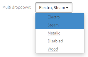
JDI Light provides a MultiSelector class which is using for MultiDropdown representation as a type of web element.
    //@FindBy(id = "multi-dropdown")
    @UI("#multi-dropdown")
    public static MultiSelector multiDropdown;

    @Test
    public void selectTest() {
        skipForFirefox();
        multiDropdown.check("Electro", "Metalic");
        assertEquals(multiDropdown.checked(), asList("Electro", "Metalic"));
    }

    @Test
    public void disabledTest() {
        skipForFirefox();
        multiDropdown.select("Disabled");
        assertEquals(multiDropdown.selected(), "Steam");
    }

    @Test
    public void labelTest() {
        assertEquals(multiDropdown.label().getText(), "Multi dropdown:");
        multiDropdown.label().is().text(containsString("Multi"));
    }

    @Test
    public void isValidationTest() {
        multiDropdown.is().selected("Steam");
        multiDropdown.is().selected(Steam);
        multiDropdown.assertThat().values(hasItem("Wood"));
        multiDropdown.assertThat().disabled(hasItem("Disabled"))
            .enabled(not(hasItem("Disabled")))
            .enabled(hasItems("Electro", "Metalic"));
    }
[FindBy(Css = "#multi-dropdown")]
public MultiDropdown MultiDropdown { get; set; }

[Test]
public void SelectMultipleOptions()
{
    var optionsList = new List<string> { "Steam", "Electro" };
    TestSite.Html5Page.MultiDropdown.SelectOptions(optionsList);
    Jdi.Assert.IsTrue(TestSite.Html5Page.MultiDropdown.OptionsAreSelected(optionsList));
}

[Test]
public void CheckOptionExists()
{
    TestSite.Html5Page.MultiDropdown.Expand();
    Jdi.Assert.IsTrue(TestSite.Html5Page.MultiDropdown.OptionExists("Steam"));
    Jdi.Assert.IsFalse(TestSite.Html5Page.MultiDropdown.OptionExists("Steam2"));
}

[Test]
public void CheckOptionIsDisabled()
{
    TestSite.Html5Page.MultiDropdown.Expand();
    Jdi.Assert.IsFalse(TestSite.Html5Page.MultiDropdown.OptionIsEnabled("Disabled"));
    Jdi.Assert.IsTrue(TestSite.Html5Page.MultiDropdown.OptionIsEnabled("Wood"));
}

[Test]
public void LabelTest()
{
    Jdi.Assert.AreEquals(TestSite.Html5Page.MultiDropdown.Label().GetText(), "Multi dropdown:");
    TestSite.Html5Page.MultiDropdown.Label().Is.Text(ContainsString("Multi"));
}

[Test]
public void IsValidationTest()
{
    TestSite.Html5Page.MultiDropdown.SelectOptions(new List<string> { "Steam" });
    TestSite.Html5Page.MultiDropdown.Is.Selected("Steam");
    TestSite.Html5Page.MultiDropdown.Is.Selected(Ages.Steam);
    TestSite.Html5Page.MultiDropdown.Is.Values(HasItems( new []{ "Wood" }));
    TestSite.Html5Page.MultiDropdown.Is.Disabled(HasItems(new[] { "Disabled" }));
    TestSite.Html5Page.MultiDropdown.Is.Enabled(HasItems( new []{ "Electro", "Metalic" }));
}

[Test]
public void AssertValidationTest()
{
    TestSite.Html5Page.MultiDropdown.SelectOptions(new List<string> { "Steam" });
    TestSite.Html5Page.MultiDropdown.AssertThat.Values(ContainsInAnyOrder( new []{ "Disabled", "Electro", "Metalic", "Wood", "Steam" }));
}

[Test]
public void BaseValidationTest()
{
    BaseElementValidation(TestSite.Html5Page.MultiDropdown);
}
<span class="multiselect-native-select">
   <select id="multi-dropdown" multiple="multiple">
      <option value="electro">Electro</option>
      <option value="steam" selected="">Steam</option>
      <option value="metalic">Metalic</option>
      <option value="dis" disabled="">Disabled</option>
      <option value="wood">Wood</option>
   </select>
   <div class="btn-group">
      <button type="button" class="multiselect dropdown-toggle btn btn-default" data-toggle="dropdown" title="Steam">
      <span class="multiselect-selected-text">Steam</span>
      <b class="caret"/>
      </button>
      <ul class="multiselect-container dropdown-menu">
         <li>
            <a tabindex="0">
            <label class="checkbox" title="Electro">
            <input type="checkbox" value="electro"> Electro</label>
            </a>
         </li>
         <li class="active">
            <a tabindex="0">
            <label class="checkbox" title="Steam">
            <input type="checkbox" value="steam"> Steam</label>
            </a>
         </li>
         <li>
            <a tabindex="0">
            <label class="checkbox" title="Metalic">
            <input type="checkbox" value="metalic"> Metalic</label>
            </a>
         </li>
         <li class="disabled">
            <a tabindex="-1">
            <label class="checkbox" title="Disabled">
            <input type="checkbox" value="dis" disabled=""> Disabled</label>
            </a>
         </li>
         <li>
            <a tabindex="0">
            <label class="checkbox" title="Wood">
            <input type="checkbox" value="wood"> Wood</label>
            </a>
         </li>
      </ul>
   </div>
</span>
MultiDropdown are represented by the following classes:
- Java: com.epam.jdi.light.ui.html.elements.complex.MultiSelector
- C#: JDI.Light.Elements.Composite.MultiDropdown
The list of methods available for Java in JDI Light:
| Method | Description | Return Type |
|---|---|---|
| list() | locator representing list options | WebList |
| select(String/int) | Selects the value based on its visible text/index | WebList |
| check(String/String.../TEnum.../int...) | Check that only particular elements are selected | void |
| checked() | Get checked elements | List |
| is() | Applicable for performing assert actions for MultiDropdown | UIMSelectAssert |
| selected() | Get selected value | String |
| selected(String) | Get selected value | boolean |
| values() | Get the elements values | List |
| values(TextTypes) | Get the elements values | List |
| listEnabled() | Get the list of enabled elements | List |
| listDisabled() | Get the list of disabled elements | List |
| setValue() | Sets element value | void |
| getValue() | Gets element value | String |
| getStartIndex() | Gets start index | int |
| setStartIndex(int) | Sets start index | void |
| unckeckAll(String) | Uncheck all selected elements | void |
| uncheck(String.../TEnum.../int.../String) | Unchecks particular elements by index/name | void |
Here is the list of some methods available for C# in JDI Light:
| Method | Description | Return Type |
|---|---|---|
| AssertThat | Gets multiDropDown assert | MultiDropdownAssert |
| Close() | Close expanded list | void |
| Disabled(Matcher |
Check whether some values are disabled in MultiDropDown by some matcher | MultiDropdownAssert |
| Enabled(Matcher |
Check whether some values are enabled in MultiDropDown by some matcher | MultiDropdownAssert |
| Expand() | Expand list | void |
| GetSelectedOptions() | Get selected options | List |
| Is | Gets multiDropDown assert | MultiDropdownAssert |
| OptionIsEnabled(string) | Check whether option is enabled | bool |
| OptionExists(string) | Check whether option exists in list | bool |
| SelectOption(string) | Select specified option | void |
| SelectOptions(List) | Select specified options | void |
| Selected(string option) | Check whether option is selected | MultiDropdownAssert |
| Selected(Enum option) | Check whether option is selected | MultiDropdownAssert |
| Values(Matcher |
Check whether some values exist in MultiDropDown by some matcher | MultiDropdownAssert |
1.2.6 DataList
DataList – A graphical control element that allows user to choose one value from a list or enter it by himself. DataList element contains a set of options with values available as inputs.
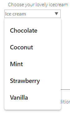
DataList is provided by JDI Light in:
- Java: com.epam.jdi.light.ui.html.elements.complex.DataListOptions
- C#: JDI.Light.Elements.Common.DataList
C# JDI DataList annotation
For better use in C# JDI Light provides a [JDataList] annotation to locate DataList elements. This annotation consists of the following elements:
- root - value of this element points to the root locator of the dropdown element
- values - options locator in dropdown list
- how - type of locators with which elements will be identified. By default it is set as css
    // @FindBy(id = "ice-cream-flavors")
    @UI("#ice-cream-flavors")
    public static DataListOptions iceCream;

    @Test
    public void getValueTest() {
        assertEquals(iceCream.getValue(), "Coconut");
    }

    @Test
    public void getTextTest() {
        assertEquals(iceCream.getText(), "Coconut");
    }

    @Test
    public void inputTest() {
        iceCream.input("New text");
        assertEquals(iceCream.getText(), "New text");
    }

    @Test
    public void inputNullValueTest() {
        String value = iceCream.getText();
        iceCream.input(null);
        iceCream.has().text(value);
    }

    @Test
    public void clearTest() {
        iceCream.clear();
        assertEquals(iceCream.getText(), "");
    }

    @Test
    public void selectTest() {
        iceCream.select("Chocolate");
        assertEquals(iceCream.getValue(), "Chocolate");
    }
    [JDataList("#ice-cream", "#ice-cream-flavors > option")]
    public DataList IceCream { get; set; }

    [JDataList("#disabled-dropdown","#disabled-dropdown > option")]
    public DataList DisabledDropdownAsDataList { get; set; }

    [Test]
    public void GetValueTest()
    {
        AreEqual(TestSite.Html5Page.IceCream.Selected(), "Coconut");
    }

    [Test]
    public void LabelTest()
    {
        AreEqual(TestSite.Html5Page.IceCream.Label().GetText(), "Choose your lovely icecream");
        TestSite.Html5Page.IceCream.Label().Is.Text(ContainsString("lovely icecream"));
    }

    [Test]
    public void IsValidationTest()
    {
         TestSite.Html5Page.IceCream.Is.Enabled();
         TestSite.Html5Page.IceCream.Is.Attr("value" ,EqualTo(_text));
         TestSite.Html5Page.IceCream.Select("Vanilla");
         TestSite.Html5Page.IceCream.Is.Attr("value", ContainsString("Van"));
    }

    [Test]
    public void AssertValidationTest()
    {
         TestSite.Html5Page.IceCream.AssertThat.Attr("value", ContainsString(_text));
    }

    [Test]
    public void BaseValidationTest()
    {
         BaseElementValidation(TestSite.Html5Page.IceCream);
    }

    [Test]
    public void NegativeSelectTest()
    {
         Throws<ElementNotSelectableException>(() => TestSite.Html5Page.DisabledDropdownAsDataList.Select("Fancy", false));
    }

    [Test]
    public void NegativeSelectEnumTest()
    {
          Throws<ElementNotSelectableException>(() => TestSite.Html5Page.DisabledDropdownAsDataList.Select(DressCode.Fancy, false));
    }

    [Test]
    public void NegativeSelectNumTest()
    {
          Throws<ElementNotFoundException>(() => TestSite.Html5Page.IceCream.Select(7, false));
    }

    [Test]
    public void AssertOptionsValuesTest()
    {
          IsTrue(TestSite.Html5Page.IceCream.Values().SequenceEqual(_options));
    }
Have a look at the following example with HTML code provided:
<datalist id="ice-cream-flavors">
    <option value="Chocolate"></option>
    <option value="Coconut"></option>
    <option value="Mint"></option>
    <option value="Strawberry"></option>
    <option value="Vanilla"></option>
</datalist>
The list of methods available for Java in JDI Light:
| Method | Description | Return Type |
|---|---|---|
| list() | Returns a WebList item representing a list of available Datalist options | WebList |
| getText() | Gets button text | String |
| listEnabled() | Return list of values of enabled options | List |
| listDisabled() | Return list of values of disabled options | List |
| isEnabled() | Check that '{name}' is enabled | boolean |
| isDisplayed() | Check that '{name}' is displayed | boolean |
| isExpanded() | Return if element expanded | boolean |
| isCollapsed() | Checks whether element is collapsed | boolean |
| is() | Returns DropdownAssert class | DropdownAssert |
| getStartIndex() | Returns start index | int |
| setStartIndex() | Sets start index | void |
| select(String/int) | Select combobox option by value or index | void |
| selected() | Get selected option value | String |
| values() | Get all option values from combobox | List |
Here is the list of some methods available for C# in JDI Light:
| Method | Description | Return Type |
|---|---|---|
| assertThat() | Returns object for work with assertions | ComboBoxAssert |
| Expand() | Expands the list of possible values | void |
| GetSelected() | Get selected combobox value | string |
| Input(string) | Input user's value into combobox | void |
| is() | Returns object for work with assertions | ComboBoxAssert |
| Select(string/int) | Select combobox by value/index | void |
1.2.7 CheckList
CheckList – A graphical control element representing a set of checkboxes, each of which allows user to control a two-state parameter (enabled or disabled).
Checklist element type is available in the following packages:
- Java: com.epam.jdi.light.elements.complex.CheckList
- C#: JDI.Light.Elements.Complex.CheckList
See an example with HTML code describing checklist element.
  //@FindBy(name = "checks-group")
  @UI("[name=checks-group]")
  public static Checklist weather;

  @Test
  public void getValueTest() {
      assertEquals(weather.getValue(), "Hot option");
  }

  @Test
  public void checkTest() {
      weather.check("Cold");
      assertEquals(weather.checked(), asList("Cold"));
  }

  @Test
  public void uncheckTest() {
      weather.check("Rainy day", "Sunny");
      weather.uncheck("Rainy day");
      weather.is().checked(hasSize(3));
      weather.is().checked(hasItems("Hot option", "Cold", "Sunny"));
  }

  @Test
  public void selectTest() {
      weather.select("Cold");
      assertEquals(weather.checked(), asList("Hot option", "Cold"));
  }
  [FindBy(Css = "div:nth-child(11) > div.html-left")]
  public ICheckList weather;

  [FindBy(Css = "div:nth-child(11) > div.html-left")]
  public ICheckList<MyCheckBox> genericWeather;

  [Test]
  public void CheckCheckList()
  {
      weather.Check("Cold", "Hot option");
      Jdi.Assert.CollectionEquals(new[] { "Cold", "Hot option" }, weather.Checked());
  }

  [Test]
  public void UncheckTest()
  {
      _weather.Check(false, "Rainy day", "Sunny");
      _weather.Uncheck(false, "Rainy day", "Sunny");
      _weather.Is.Selected(HasSize(2));
      _weather.Is.Selected(HasItems(new[] { "Hot option", "Cold" }));
  }

  [Test]
  public void IsValidationTests()
  {
      weather.AssertThat
                  .Values(HasItems(new[] {"Cold", "Sunny"}))
                  .Disabled(HasItems(new[] {"Disabled"}))
                  .Size(Is.LessThan(6))
                  .AllDisplayed();
  }

  [Test]
  public void UncheckAllTest()
  {
      _weather.Uncheck(false, "Rainy day", "Sunny");
      _weather.UncheckAll();
      _weather.Is.Selected(HasSize(0));
  }

  [Test]
  public void CheckAllTest()
  {
      _weather.CheckAll();
      _weather.Is.Selected(HasSize(4));
      _weather.Is.Selected(HasItems(new[] { "Hot option", "Cold", "Rainy day", "Sunny" }));
  }

  [Test]
  public void IsDisabledTest()
  {
      _weather.Select(false, "Disabled");
      _weather.Is.Selected(HasItems(new [] { "Hot option" } ));
  }
<input type="checkbox" id="hot" name="checks-group" checked="">
<label for="hot">Hot option</label> <br>

<input type="checkbox" id="cold" name="checks-group">
<label for="cold">Cold</label> <br>

<input type="checkbox" id="rainy" name="checks-group">
<label for="rainy">Rainy day</label> <br>

<input type="checkbox" id="sunny-day" name="checks-group">
<label for="sunny-day">Sunny</label> <br>

<input type="checkbox" id="disabled-ch" name="checks-group" disabled="">
<label for="disabled-ch">Disabled</label>
List of available methods in Java JDI Light:
| Method | Description | Return Type |
|---|---|---|
| list() | Returns a WebList item representing a list of available Checklist options | WebList |
| isDisplayed() | Check that Checklist is displayed | boolean |
| check(String.../TEnum/TEnum.../int/int...) | Check specified checkboxes and uncheck others | void |
| checkAll() | Check all checkboxes in checklist | void |
| checked() | Get selected checkbox values | List |
| is() | Get select assert | ChecklistAssert |
| listEnabled() | Get enabled checkboxes | List |
| listDisabled() | Get disabled checkboxes | List |
| selected(UIElement/String) | Get selected checkbox values | boolean |
| selected() | Get '{name}' selected option | String |
| select(String.../TEnum/TEnum.../int/String/int...) | Select checkboxes | void |
| uncheck(String.../TEnum/TEnum.../int.../int) | Uncheck specified checkboxes and check others | void |
| uncheckAll() | Uncheck all checkboxes in checklist | void |
| setValue(String) | Sets the value | void |
| getStartIndex() | Returns start index | int |
| setStartIndex(int) | Set start index | void |
Here is the list of some methods available for C# in JDI Light:
| Method | Description | Return Type |
|---|---|---|
| AssertThat | Get select assert | SelectAssert |
| Check(params string[]/params int[]) | Check checklist by values/indexes | void |
| CheckAll() | Check all checkboxes | void |
| Checked() | Get selected checkboxes from checklist value | List<String> |
| Has | Get select assert | SelectAssert |
| Is | Get select assert | SelectAssert |
| ListEnabled() | Get enabled checkboxes | List<String> |
| ListDisabled() | Get disabled checkboxes | List<String> |
| Select(params string[]/params int[]) | Select checklist by values/indexes | void |
| Selected(string option) | Checks whether a checkbox is selected | bool |
| Size() | Get checklist size | int |
| Uncheck(params string[]/params int[]) | Unselect checklist by values/indexes | void |
| UncheckAll() | Uncheck all checkboxes | void |
| Values() | Get checklist values | List<String> |
1.2.8 MultiSelector
MultiSelector – A graphical control element that allows user to make a multiple choice. MultiSelector is represented by the following class:
- Java: com.epam.jdi.light.ui.html.complex.MultiSelector
- C#: JDI.Light.Elements.Common.MultiSelector
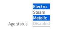
@UI("#ages") // @FindBy(css = "#ages")
public static MultiSelector ages;

@Test
public void selectTest() {
    ages.check("Electro", "Metalic");
    assertEquals(ages.checked(), asList("Electro", "Metalic"));
}

@Test
public void selectEnumTest() {
    ages.check(Wood, Steam);
    assertEquals(ages.checked(), asList("Steam", "Wood"));
}

@Test
public void selectNumTest() {
    ages.check(1, 5);
    assertEquals(ages.checked(), asList("Electro", "Wood"));
}
[Test]
public void MultiSelectByValues()
{
    MyMultiSelector.Select(string[]);
}
[Test]
public void MultiSelectByIndexes()
{
    MyMultiSelector.Select(int[]);
}
<select id="ages" multiple="" size="4">
    <option value="electro">Electro</option>
    <option value="steam" selected="">Steam</option>
    <option value="metalic">Metalic</option>
    <option value="dis" disabled="">Disabled</option>
    <option value="wood">Wood</option>
</select>
Here is a list of available methods and properties in C#:
| Method / Property | Description | Return Type |
|---|---|---|
| AssertThat | Property that returns object for work with assertions | SelectAssert |
| Check(string/string[]/int/int[]/Enum[]) | Select multiselector by values | void |
| Checked() | Get selected values | List<string> |
| has() | Returns object for work with assertions | SelectAssert |
| Is | Property that returns object for work with assertions | SelectAssert |
| Selected() | Get selected values | string |
| shouldBe() | Returns object for work with assertions | SelectAssert |
| Uncheck(string[]/Enum[]/int[]) | Select multiselector by values/indexes | void |
| waitFor() | Returns object for work with assertions | SelectAssert |
Here is the list of available methods/asserts in Java:
| Method | Description | Return Type |
|---|---|---|
| select(String) | Selects the value based on its visible text | void |
| select(int) | Selects the value based on its index | void |
| assertThat() | Returns object for work with assertions | SelectAssert |
| check(String/String.../TEnum.../int...) | Select multiselector by values | void |
| checked() | Get selected values | List |
| is() | Returns object for work with assertions | UIMSelectAssert<?,?> |
| values() | Get the elements values | List |
| values(TextTypes) | Get the elements values | List |
| selected() | Get selected element value by name | String |
| selected(String) | Checks if element selected by name | boolean |
| listEnabled() | Get the list of enabled elements | List |
| listDisabled() | Get the list of disabled elements | List |
| setValue(String) | Sets element value | void |
| getValue() | Gets element value | String |
| getStartIndex() | Returns start index | int |
| SetStartIndex(int) | Sets start index | void |
| uncheck(String.../TEnum.../int...) | Select multiselector by values/indices | void |
| uncheckAll() | Unchecks all elements | void |
1.3 HTML5 Composite elements
1.3.1 Section
  [FindBy(Id = "contact-form")]
  public Contact ContactSection;

  [FindBy(Css = ".footer-content")]
  public static Footer Footer;

  [FindBy(Css = ".uui-header")]
  public static Header Header;

  public JdiSearch Search;

  [FindBy(Id = "summary-block")]
  public Summary SummaryBlock;

  [Test]
  public void SectionTest()
  {
      var e = TestSite.HomePage.Get<Section>(By.CssSelector(".main-title"));
      Assert.AreEqual("EPAM FRAMEWORK WISHES…", e.Text);
      Assert.AreEqual("Section", e.Name);
      Assert.AreEqual(true, e.Displayed);
      Assert.AreEqual(true, e.Enabled);
      Assert.AreEqual(false, e.Hidden);
      Assert.AreEqual(By.CssSelector(".main-title"), e.Locator);
      Assert.AreEqual(false, e.Selected);
      Assert.AreEqual("h3", e.TagName);
  }

  [TestCaseSource(nameof(_contactSectionCases))]
  public void CustomContactSectionTest(string htmlElementToCheckName, string expectedLocator, string expectedName, string expectedSmartLocator)
  {
      var targetElement =
          ContactSection.GetType().GetMember(htmlElementToCheckName)[0].GetMemberValue(ContactSection) as UIElement;
      ContactSection.CheckInitializedElement(targetElement, expectedLocator, expectedName, expectedSmartLocator);
  }

  [Test]
  public void CustomFooterSectionTest()
  {
      FooterSection.CheckInitializedElement(FooterSection.AboutLink, "By.PartialLinkText: About", "AboutLink", null);
  }

  [TestCaseSource(nameof(_headerSectionCases))]
  public void CustomHeaderSectionTest(string htmlElementToCheckName, string expectedLocator, string expectedName, string expectedSmartLocator)
  {
      var targetElement =
          HeaderSection.GetType().GetMember(htmlElementToCheckName)[0].GetMemberValue(HeaderSection) as UIElement;
      HeaderSection.CheckInitializedElement(targetElement, expectedLocator, expectedName, expectedSmartLocator);
  }

  [TestCaseSource(nameof(_jdiSearchSectionCases))]
  public void CustomJdiSearchSectionTest(string htmlElementToCheckName, string expectedLocator, string expectedName, string expectedSmartLocator)
  {
      var targetElement =
          JdiSearchSection.GetType().GetMember(htmlElementToCheckName)[0].GetMemberValue(JdiSearchSection) as UIElement;
      JdiSearchSection.CheckInitializedElement(targetElement, expectedLocator, expectedName, expectedSmartLocator);
  }

  [Test]
  public void CustomSummarySectionTest()
  {
      TestSite.MetalsColorsPage.Open();
      SummarySection.CheckInitializedElement(SummarySection.Calculate, "By.Id: calculate-button", "Calculate", null);
  }

  private static object[] _contactSectionCases =
  {
      new object[] { nameof(ContactSection.DescriptionField), "By.CssSelector: textarea#description", "Description", null },
      new object[] { nameof(ContactSection.FirstRoller), "By.XPath: .//a[@class='ui-slider-handle ui-state-default ui-corner-all' and position()=1]", "FirstRoller", null },
      new object[] { nameof(ContactSection.LastNameField), "By.CssSelector: input#last-name", "Last Name", null },
      new object[] { nameof(ContactSection.NameField), "By.CssSelector: input#name", "First Name", null },
      new object[] { nameof(ContactSection.SecondRoller), "By.XPath: .//a[@class='ui-slider-handle ui-state-default ui-corner-all' and position()=2]", "SecondRoller", null },
      new object[] { nameof(ContactSection.SubmitButton), "By.XPath: //button[@type='submit' and contains(., 'Submit')]", "SubmitButton", null },
  };

  private static object[] _headerSectionCases =
  {
      new object[] { nameof(HeaderSection.Image), "By.XPath: //img[@src=\"label/Logo_Epam_Color.svg\"]", "Image", null },
      new object[] { nameof(HeaderSection.Menu), "By.CssSelector: ul.uui-navigation.nav", "Menu", null },
      new object[] { nameof(HeaderSection.UserIcon), "By.CssSelector: #user-icon", "UserIcon", null },
      new object[] { nameof(HeaderSection.Search), "By.CssSelector: input#last-name", "Search", "By.Id: search" }
  };

  private static object[] _jdiSearchSectionCases =
  {
      new object[] { nameof(JdiSearchSection.SearchButton), "By.CssSelector: .search>.icon-search", "SearchButton", null },
      new object[] { nameof(JdiSearchSection.SearchButtonActive), "By.CssSelector: .icon-search.active", "SearchButtonActive", null },
      new object[] { nameof(JdiSearchSection.SearchInput), "By.CssSelector: .search-field input", "SearchInput", null },
  };
Section - Logical part of Web Page that contains other UI Elements
Section is located in the following classes:
- Java: com.epam.jdi.light.elements.composite.Section
- C#: JDI.Light.Elements.Composite.Section
   @UI(".someSectionUI") // @FindBy(css = ".someSectionUI")
    public static CustomSection customSectionUI;

   @Test(dataProvider = "customSectionWebElementDataProvider", dataProviderClass = CustomSectionDataProvider.class)
    public void customSectionWebElementTest(IBaseElement htmlElementToCheck, String expectedLocator, Object expectedParent, String expectedName) {
        checkInitializedElement(htmlElementToCheck, expectedLocator, expectedParent, expectedName);
    }
And here are methods available in Java:
| Method | Description | Return Type |
|---|---|---|
| click() | Makes a click | void |
| click(ElementArea) | Makes a click to area | void |
| is() | Returns object for work with assertions | TextAssert |
1.3.2 Form
Form – Logical part of a web page that represents an HTML form. Form consists of elements based on SetValue interface and buttons with submit function.
Form provides the fill, submit and verify/check functionality.
<form class="form" id="contact-form">
  <div class="row overflow">
    <div class="col-sm-4">
      <div class="form-group form-group10">
        <label for="first-name">First Name</label>
        <input id="first-name" type="text" class="uui-form-element">
      </div>
    </div>
    <div class="col-sm-4">
      <div class="form-group form-group10">
        <label for="last-name">Last Name</label>
        <input id="last-name" type="text" class="uui-form-element">
      </div>
    </div>
    <div class="col-sm-4">
      <div class="form-group form-group10">
        <label for="position">Position</label>
        <input id="position" type="text" class="uui-form-element">
      </div>
    </div>
    <div class="col-sm-3">
      <div class="form-group form-group10 lower">
        <label for="passport">Passport</label>
        <input id="passport" type="checkbox" name="passport" class="uui-form-element">
      </div>
    </div>
    <div class="col-sm-4">
      <div class="form-group form-group10">
        <label for="passport-number">Number</label>
        <input id="passport-number" type="text" class="uui-form-element">
      </div>
    </div>
    <div class="col-sm-5">
      <div class="form-group form-group10">
        <label for="passport-seria">Seria</label>
        <input id="passport-seria" type="text" class="uui-form-element">
      </div>
    </div>
  </div>
  <div class="row">
    <div class="col-sm-4">
      <label for="gender">Gender</label>
      <select class="uui-form-element" ui="dropdown" id="gender">
        <option>Male</option>
        <option checked="">Female</option>
      </select>
    </div>
    <div class="col-sm-4">
      <label for="religion">Religion</label>
      <div class="form-group form-group10">
        <input list="religion-options" id="religion" placeholder="Religion" class="uui-form-element">
        <datalist id="religion-options">
          <option>Christian</option>
          <option>Muslims</option>
          <option>Induism</option>
          <option>Other</option>
        </datalist>
      </div>
    </div>
    <div class="col-sm-4">
      <label for="weather">Weather</label>
      <div class="form-group salad" ui="droplist" id="weather">
        <div class="dropdown salad">
          <button type="button" class="btn btn-default dropdown-toggle" data-toggle="dropdown" aria-haspopup="true" aria-expanded="false">
            <span class="caret"/>
          </button>
          <ul class="dropdown-menu" style="display: none;">
            <li>
              <a href="#" class="checkbox">
                <input type="checkbox" id="g5" class="uui-form-element blue">
                <label for="g5">Sun</label>
              </a>
            </li>
            <li>
              <a href="#" class="checkbox">
                <input type="checkbox" id="g6" class="uui-form-element blue">
                <label for="g6">Rain</label>
              </a>
            </li>
            <li>
              <a href="#" class="checkbox">
                <input type="checkbox" id="g7" class="uui-form-element blue">
                <label for="g7">Weather</label>
              </a>
            </li>
            <li>
              <a href="#" class="checkbox">
                <input type="checkbox" id="g8" class="uui-form-element blue">
                <label for="g8">Snow</label>
              </a>
            </li>
          </ul>
        </div>
      </div>
    </div>
  </div>
  <div class="row overflow">
    <div class="col-sm-12">
      <div class="form-group">
        <label for="description">Description</label>
        <textarea class="uui-form-element" rows="4" cols="10" id="description"/>
      </div>
      <div>
        <input id="accept-conditions" type="checkbox" name="accept-conditions">
        <label for="accept-conditions">Accept conditions</label>
      </div>
    </div>
    <div class="col-sm-12 text-right">
      <button class="uui-button dark-blue" type="submit">Submit</button>
    </div>
  </div>
</form>
Form is located in the following classes:
- Java: com.epam.jdi.light.elements.composite.Form
- C#: JDI.Light.Elements.Composite.Form
public class FormContactsTests implements TestsInit {
    @BeforeMethod
    public void before() {
        shouldBeLoggedIn();
        contactFormPage.shouldBeOpened();
        refresh();
    }

private static Contacts defaultContact() {
        return new Contacts().set(c -> {
            c.firstName = "Roman";
            c.lastName = "Iovlev";
            c.position = "ChiefQA";
            //c.passport = true;
            c.passportNumber = "4321";
            c.passportSeria = "123456";
            c.description = "JDI - awesome UI automation tool";
            c.acceptConditions = "true";
            c.gender = "Female";
            c.religion = "Other";
        });
    }

    @Test
    public void fillContactFormTest() {
        main.contactForm.description.getText();
        main.contactForm.fill(DEFAULT_CONTACT);
        main.contactForm.check(DEFAULT_CONTACT);
    }

    @Test
    public void submitTextToContactFormTest() {
        main.contactForm.submit("Roman");
        main.contactForm.check(ONLY_NAME_FILLED_DEFAULT_CONTACT);
        checkContactFormSubmitted();
    }

    @Test
    public void submitEntityToContactFormTest() {
        main.contactForm.submit(DEFAULT_CONTACT);
        main.contactForm.check(DEFAULT_CONTACT);
        checkContactFormSubmitted();
    }

    @Test
    public void submitTextToContactFormUsingCustomButtonTest() {
        main.contactForm.submit("Roman", "custom");
        main.contactForm.check(ONLY_NAME_FILLED_DEFAULT_CONTACT);
    }

    @Test
    public void submitTextToContactFormUsingNonExistentButtonTest() {
        main.contactFormCustom.submit("Roman", "nonExistent");
    }

    @Test
    public void submitEntityToContactFormUsingCustomButtonTest() {
        main.contactForm.submit(DEFAULT_CONTACT, "custom");
        main.contactForm.check(DEFAULT_CONTACT);
        checkContactFormSubmitted();
    }

    @Test
    public void submitEntityToContactFormUsingNonExistentButtonTest() {
        main.contactFormCustom.submit(DEFAULT_CONTACT, "nonExistent");
    }

    @Test
    public void plainSubmitTest() {
        main.contactForm.fill(DEFAULT_CONTACT);
        main.contactForm.submit();
        main.contactForm.check(DEFAULT_CONTACT);
        checkContactFormSubmitted();
    }

    @Test
    public void pressButtonTest() {
        main.contactFormCustom.fill(DEFAULT_CONTACT);
        main.contactFormCustom.pressButton("custom");
        main.contactFormCustom.check(DEFAULT_CONTACT);
        checkContactFormSubmitted();
    }

    @Test
    public void verifyMethodPositiveTest() {
        main.contactForm.fill(DEFAULT_CONTACT);
        List<String> verified = main.contactForm.verify(DEFAULT_CONTACT);
        assertEquals(verified.size(), 0);
    }

    @Test
    public void verifyMethodNegativeTest() {
        main.contactForm.fill(ALL_EXCEPT_NAME_FILLED_DEFAULT_CONTACT);
        List<String> verified = main.contactForm.verify(DEFAULT_CONTACT);
        assertEquals(verified.size(), 1);
        assertTrue(verified.get(0).contains("Roman"));
    }

    @Test
    public void checkMethodPositiveTest() {
        main.contactForm.fill(DEFAULT_CONTACT);
        main.contactForm.check(DEFAULT_CONTACT);
        assertEquals(main.contactForm.verify(DEFAULT_CONTACT).size(), 0);
    }

    @Test(expectedExceptions = RuntimeException.class)
    public void checkMethodNegativeTest() {
        main.contactForm.fill(ALL_EXCEPT_NAME_FILLED_DEFAULT_CONTACT);
        TIMEOUTS.element.set(1);
        main.contactForm.check(DEFAULT_CONTACT);
    }

    @Test
    public void sendMethodTest() {
        main.contactFormCustom.fill(DEFAULT_CONTACT);
        main.contactFormCustom.send();
        main.contactFormCustom.check(DEFAULT_CONTACT);
        checkContactFormSubmitted();
    }

    @Test
    public void sendEntityMethodTest() {
        main.contactFormCustom.send(DEFAULT_CONTACT);
        main.contactFormCustom.check(DEFAULT_CONTACT);
        checkContactFormSubmitted();
    }

    @Test
    public void addEntityMethodTest() {
        main.contactFormCustom.add(DEFAULT_CONTACT);
        main.contactFormCustom.check(DEFAULT_CONTACT);
        checkContactFormSubmitted();
    }

    @Test
    public void publishMethodTest() {
        main.contactFormCustom.publish(DEFAULT_CONTACT);
        main.contactFormCustom.check(DEFAULT_CONTACT);
        checkContactFormSubmitted();
    }

    @Test
    public void saveMethodTest() {
        main.contactFormCustom.save(DEFAULT_CONTACT);
        main.contactFormCustom.check(DEFAULT_CONTACT);
        checkContactFormSubmitted();
    }

    @Test
    public void updateMethodTest() {
        main.contactFormCustom.update(DEFAULT_CONTACT);
        main.contactFormCustom.check(DEFAULT_CONTACT);
        checkContactFormSubmitted();
    }

    @Test
    public void cancelMethodTest() {
        main.contactFormCustom.cancel(DEFAULT_CONTACT);
        main.contactFormCustom.check(DEFAULT_CONTACT);
        checkContactFormSubmitted();
    }

    @Test
    public void closeMethodTest() {
        main.contactFormCustom.close(DEFAULT_CONTACT);
        main.contactFormCustom.check(DEFAULT_CONTACT);
        checkContactFormSubmitted();
    }

    @Test
    public void backMethodTest() {
        main.contactFormCustom.back(DEFAULT_CONTACT);
        main.contactFormCustom.check(DEFAULT_CONTACT);
        checkContactFormSubmitted();
    }

    @Test
    public void selectMethodTest() {
        main.contactFormCustom.select(DEFAULT_CONTACT);
        main.contactFormCustom.check(DEFAULT_CONTACT);
        checkContactFormSubmitted();
    }

    @Test
    public void nextMethodTest() {
        main.contactFormCustom.next(DEFAULT_CONTACT);
        main.contactFormCustom.check(DEFAULT_CONTACT);
        checkContactFormSubmitted();
    }

    @Test
    public void searchMethodTest() {
        main.contactFormCustom.search(DEFAULT_CONTACT);
        main.contactFormCustom.check(DEFAULT_CONTACT);
        checkContactFormSubmitted();
    }

    @Test
    public void onlyMandatoryOptionTest() {
        main.contactFormCustom.onlyMandatory().fill(DEFAULT_CONTACT);
        main.contactFormCustom.check(ONLY_NAME_FILLED_DEFAULT_CONTACT);
        assertEquals(main.contactFormCustom.getFilter(), ALL);
    }

    @Test
    public void onlyOptionalOptionTest() {
        main.contactFormCustom.onlyOptional().fill(DEFAULT_CONTACT);
        main.contactFormCustom.check(ALL_EXCEPT_NAME_FILLED_DEFAULT_CONTACT);
        assertEquals(main.contactFormCustom.getFilter(), ALL);
    }

    @Test
    public void overriddenFillActionTest() {
        main.contactFormCustomFill.fill(DEFAULT_CONTACT);
        main.contactFormCustomFill.check(UPPER_CASE_NAME_CONTACT);
    }

    @Test
    public void uiFormTest() {
        main.contactFormUI.submit(DEFAULT_CONTACT);
        main.contactFormUI.check(DEFAULT_CONTACT);
        checkContactFormSubmitted();
    }

    @Test
    public void overriddenGetActionTest() {
        main.contactFormCustomGet.fill(DEFAULT_CONTACT);
        main.contactFormCustomGet.check(LOWER_CASE_NAME_CONTACT);
    }

    private void checkContactFormSubmitted() {
        lastLogEntry.assertThat()
                .text(containsString("submit:button clicked"));
    }
}
Form is parameterized by an entity that corresponds to the form. For example, a login form can be parameterized by a user entity. The entity should extend DataClass class (parameterized by the entity itself). The names of the entity fields should be exactly the same as the names of the form fields. All fields of the entity managed by the form should be Strings.
JDI Light allows you to define a form in three ways:
By creating a normal JDI Light Form - a typical Form in JDI with typified elements, @UI annotations, extending from Form.
By using smart locators for a JDI Light Form - Such Form utilizes the
Smart locator functionality of JDI. In this case there is no need to explicitly define
locators for the form elements as such locators can be obtained implicitly from field names
using Smart locator functionality.
See more details and examples for Smart locators in documentation
If a Form consists of only TextFields and Buttons, there is no need to define a Form UI Object. Such form can be added directly to the related page or to the root Site class. In this case the form field will be taken from the entity that the form is being parameterized by.
Form Filters
In Java, Form has a filter property that defines which form elements will be filled/submited or verified/checked. Filter can be set to either ALL, MANDATORY or OPTIONAL.
Based on this property, fill/submit and verify/check functions are applied to either all form elements or only mandatory (only optional) form elements.
Mandatory form fields should be marked with @Mandatory annotation. Optional form fields are the ones without
@Mandatory annotation. ALL is the default Form option.
To set form filters
as MANDATORY or OPTIONAL, onlyMandatory() and onlyOptional() methods
should be used. They set the corresponding form filter option for a duration of a single
action (all form action methods set the form filter option back to ALL).
Form Actions
In Java, Form also has a FILL_ACTION and GET_ACTION lambdas. This defines how the Form should be filled and verified. The default behavior defined in the Form class simply utilizes setValue(String value) method of the SetValue interface and getValue() method of the HasValue interface.
However, these lambdas can be redefined in the HtmlSettings class in order to customise the behavior for "non-text" form elements such as Checkboxes (the behavior of custom elements is defined by @FillValue and @VerifyValue annotations).
FILL_ACTION and GET_ACTION lambdas can also be further modified in order to customize Form behavior, but it is important to take into account that behavior defined in the HtmlSettings might be lost.
It is customary to reassign these lambdas before all the tests are run, for example in TestNG's @BeforeSuite method.
In Java, if fill/submit and verify/check methods need to be redefined for a specific form, it is possible to override fillAction() and getAction() for such form.
Methods available for Java in JDI Light:
| Method | Description | Return Type |
|---|---|---|
| add(T) | Fills all settable elements and clicks “add” Button or ”addButton” | void |
| back(T) | Fills all settable elements and clicks “back” Button or ”backButton” | void |
| cancel(T) | Fills all settable elements and clicks “cancel” Button or ”cancelButton” | void |
| check(T) | Verifies that form has been filled correctly. If not, throws an exception | void |
| close(T) | Fills all settable elements and clicks “close” Button or ”closeButton” | void |
| fill(T) | Fills all settable elements of the form that can be matched with fields of the input entity | void |
| fillAction(Field, Object, Object, String) | Defines the specifics of how form elements will be filled | void |
| getAction(Field, Object, Object) | Defines the specifics of how form elements will be obtained for verification and checks | String |
| isDisplayed() | Check that form is displayed | boolean |
| isValid() | Return that form is valid | boolean |
| login() | Clicks "login" Button or "loginButton" | void |
| login(T) | Fills all settable elements and clicks “login” Button or ”loginButton” | void |
| loginAs(T) | Fills all settable elements and clicks “login” Button or ”loginButton” | void |
| next(T) | Fills all settable elements and clicks “next” Button or ”nextButton” | void |
| onlyMandatory() | Sets form filter option to MANDATORY, meaning that only mandatory form elements are filled/submitted or verified/checked for the duration of a single form action | void |
| onlyOptional() | Sets form filter option to OPTIONAL, meaning that only optional form elements are filled/submitted or verified/checked for the duration of a single form action | void |
| pressButton(String) | Clicks “buttonName” Button or "buttonNamebutton". Allows different buttons to send one form, e.g. save/publish/cancel/search/update/... | void |
| publish(T) | Fills all settable elements and clicks “publish” Button or ”publishButton” | void |
| save(T) | Fills all settable elements and clicks “save” Button or ”saveButton” | void |
| select(T) | Fills all settable elements and clicks “select” Button or ”selectButton” | void |
| search(T) | Fills all settable elements and clicks “search” Button or ”searchButton” | void |
| send() | Sends the form by clicking “send” Button or "sendButton" | void |
| send(T) | Fills all settable elements and clicks “send” Button or ”sendButton” | void |
| submit() | Sends the form by clicking "submit" Button or "submitButton" | void |
| submit(String) | Fills first settable form field with value and clicks "submit" Button or "submitButton" | void |
| submit(T) | Fills all settable elements and clicks "submit" Button or "submitButton" | void |
| submit(String, String) | Fills first settable field with value and clicks “buttonName” Button or "buttonNamebutton" | void |
| submit(T, String) | Fills all settable elements and clicks “buttonName” Button or "buttonNamebutton" | void |
| verify(T) | Verifies that form has been filled correctly. If not, returns a list of keys where verification has failed | List |
| update(T entity) | Fills all settable elements and clicks “update” Button or ”updateButton” | void |
1.3.3 WebPage
WebPage - A parent Java class for all JDI Page Object classes. WebPage class extends DriverBase class, implements PageObject interface and contains a number of commonly used methods:
WebPage is provided by JDI Light in:
- Java: com.epam.jdi.light.elements.composite.WebPage
Methods available for Java in JDI Light:
public class ActionsWebPageTests implements TestsInit {

    @BeforeMethod(alwaysRun = true)
    public void before() {
        shouldBeLoggedIn();
        contactFormPage.shouldBeOpened();
        leftMenu.select("Contact form");
    }

    @Test
    public void getUrlTest() {
        Assert.assertEquals(WebPage.getUrl(), "https://jdi-testing.github.io/jdi-light/contacts.html");
    }

    @Test
    public void getTitleTest() {
        Assert.assertEquals(WebPage.getTitle(), "Contact Form");
    }

    @Test
    public void checkOpenedTest() {
        contactFormPage.checkOpened();
    }


    @Test
    public void isOpenedTest() {
        Assert.assertTrue(contactFormPage.isOpened());
    }

    @Test
    public void scrollToBottomTest() {
        WebPage.scrollToBottom();
    }

    @Test
    public void scrollToTopTest() {
        WebPage.scrollToTop();
    }

    @Test
    public void scrollDownTest() {
        WebPage.scrollDown(30);
    }

    @Test
    public void scrollUpTest() {
        WebPage.scrollUp(20);
    }

    @Test
    public void scrollRightTest() {
        WebPage.scrollRight(10);
    }

    @Test
    public void scrollLeftTest() {
        WebPage.scrollLeft(5);
    }

    @Test
    public void toStringTest() {
        Assert.assertEquals(contactFormPage.toString(), "StaticSite.contactFormPage (url=https://jdi-testing.github.io/jdi-light/contacts.html; title=Contact Form)");
    }
}
| Method | Description | Return Type |
|---|---|---|
| asForm() | Returns new Form parameterized with local Name | Form |
| back() | Go back to previous page | void |
| checkOpened() | Checks that page has opened | void |
| forward() | Go forward to next page | void |
| getCurrentPage() | Returns the name of current Page | String |
| getHtml() | Gets HTML of current page | String |
| getTitle() | Returns Page Title | String |
| getUrl() | Returns URL of Page | String |
| isOpened() | Checks that page has opened | boolean |
| open(String) | Opens url specified for page | void |
| open(Object...) | Opens url specified for page with parameters | void |
| openedPage(String) | Checks that page has opened | void |
| openSite() | Opens a Site | void |
| openSite(Class<?>) | Parameterized Site opening | void |
| openUrl(String) | Opening WebPage with URL | void |
| openUrl(String,String) | Opening WebPage with URL and page name | void |
| refresh() | Reloads current page | void |
| reload() | Same as refresh() | void |
| scroll(int,int) | Scrolls to designated position | void |
| scrollToTop() | Scrolls to top | void |
| scrollToBottom() | Scrolls to bottom | void |
| scrollDown(int) | Scrolls down to designated position | void |
| scrollUp(int) | Scrolls up to designated position | void |
| scrollRight(int) | Scrolls right to designated position | void |
| scrollLeft(int) | Scrolls left to designated position | void |
| setCurrentPage(WebPage) | Instantiates the current Page with Name | void |
| setUrl(String) | Setting Up URL of Page | void |
| setUrl(String,String,CheckTypes) | Parameterized setting Up URL of Page | void |
| shouldBeOpened() | Checks that page has opened | void |
| shouldBeOpened(Object) | Checks that page has opened with parameters | void |
| title() | Returns new StringCheckType object with checked Title | StringCheckType |
| toString() | Overrides the Object class toString() method | String |
| updatePageData(Url,Title) | Setting Page URL and Title | void |
| url() | Returns new StringCheckType object with checked URL | StringCheckType |
| visualWindowCheck() | empty | void |
| WebPage() | Default constructor for WebPage class | WebPage |
| WebPage(String) | Parameterized URL constructor for WebPage class | WebPage |
| WebPage(String,String) | Parameterized with URL and Title constructor | WebPage |
| windowScreenshot() | Getting window screenshot,returns path or exception | String |
| xOffset() | Getting window x offset | long |
| yOffset() | Getting window y offset | long |
| zoom(double) | Zooms current page | void |
| zoomLevel() | Getting zoom level | double |
More than that, it has a nested StringCheckType class with the following methods:
| Method | Description | Return Type |
|---|---|---|
| check() | Checks that current page url/title equals to expected url/title | boolean |
| contains() | Checks that current page url/title contains expected url/title-matcher | boolean |
| match() | Checks that current page url/title matches to expected url/title-matcher | boolean |
| StringCheckType(Supplier |
A parameterized constructor | StringCheckType |
2. Angular elements
2.1 Angular Common elements
2.1.1 Icons
Icon overview
Icon is located in the following class:
- Java: com.epam.jdi.light.ui.html.elements.common.Icon
There is two different icons in Angular: Basic icon and SVG icon:
    //@FindBy(id="#basic_icon")
    @UI("#basic_icon")
    public static Icon basicIcon;

    //@FindBy(id="#svg_icon")
    @UI("#svg_icon")
    public static Icon svgIcon;


    @Test
    public void checkBasicIconIsDisplayed() {
        basicIcon.show();
        basicIcon.is().displayed();
    }

    @Test
    public void checkSVGIconIsDisplayed() {
        svgIcon.show();
        svgIcon.is().displayed();
    }
<mat-icon _ngcontent-hkf-c334="" role="img" aria-hidden="false" aria-label="Example home icon" class="mat-icon notranslate material-icons mat-icon-no-color">home</mat-icon>
<mat-icon _ngcontent-hkf-c335="" role="img" svgicon="thumbs-up" aria-hidden="false" aria-label="Example thumbs up SVG icon" class="mat-icon notranslate mat-icon-no-color"><svg xmlns="http://www.w3.org/2000/svg" width="100%" height="100%" fit="" preserveAspectRatio="xMidYMid meet" focusable="false">
    <path d="M0 0h24v24H0z" fill="none"></path>
    <path d="M1 21h4V9H1v12zm22-11c0-1.1-.9-2-2-2h-6.31l.95-4.57.03-.32c0-.41-.17-.79-.44-1.06L14.17 1 7.59 7.59C7.22 7.95 7 8.45 7 9v10c0 1.1.9 2 2 2h9c.83 0 1.54-.5 1.84-1.22l3.02-7.05c.09-.23.14-.47.14-.73v-1.91l-.01-.01L23 10z"></path>
</svg></mat-icon>
| Method | Description | Return Type |
|---|---|---|
| isDisplayed() | Verify state | boolean |
| show() | Scroll to element | void |
Here you can find Icons tests
2.1.2 Progress spinner
Progress Spinner overview
Progress Spinner is located in the following class:
- Java: com.epam.jdi.light.angular.elements.common.Spinner
    //@FindBy(id="#basic-progress-spinner")
    @UI("#basic-progress-spinner")
    public static Spinner basicProgressSpinner;

    //@FindBy(id="#show-spinner")
    @UI("#show-spinner")
    public static Button showSpinner;


    @Test
    public void checkSpinnerAppearAndThenDisappear() {
        showSpinner.click();
        basicProgressSpinner.is().displayed();
        basicProgressSpinner.waitFor().hidden();
    }
<mat-spinner _ngcontent-krq-c336="" role="progressbar" mode="indeterminate" class="mat-spinner mat-progress-spinner mat-primary mat-progress-spinner-indeterminate-animation" style="width: 100px; height: 100px;">
  <svg preserveAspectRatio="xMidYMid meet" focusable="false" viewBox="0 0 100 100" style="width: 100px; height: 100px;">
    <circle cx="50%" cy="50%" r="45" class="ng-star-inserted" style="animation-name: mat-progress-spinner-stroke-rotate-100; stroke-dasharray: 282.743px; stroke-width: 10%;"/>
  </svg>
</mat-spinner>
| Method | Description | Return Type |
|---|---|---|
| isDisplayed() | Verify state | boolean |
| show() | Scroll to element | void |
Here you can find Spinner tests
2.1.3 Slide toggle
Slide toggle overview
Slide toggle is located in the following class:
- Java: com.epam.jdi.light.angular.elements.common.SlideToggle
There is two different slide toggles in Angular: Basic and Configurable:
Basic toggle:
    //@FindBy(id="slide-toggles-basic")
    @UI("#slide-toggles-basic")
    public static SlideToggle basicSlideToggle;

    @Test
    public void basicTest() {
        basicSlideToggle.is().displayed();
        resultSlideToggle.is().displayed();
        checkedCheckbox.is().displayed();
        disableCheckbox.is().displayed();
        colorRadioButtons.is().displayed();
    }

    @Test
    public void basicToggleCheckedTest() {
        basicSlideToggle.check();
        basicSlideToggle.is().selected();
        basicSlideToggle.uncheck();
        basicSlideToggle.is().deselected();
    }
<mat-slide-toggle _ngcontent-bco-c235="" class="mat-slide-toggle mat-accent mat-checked" id="mat-slide-toggle-1" tabindex="-1">
<label class="mat-slide-toggle-label" for="mat-slide-toggle-1-input">
<div class="mat-slide-toggle-bar">
<input type="checkbox" role="switch" class="mat-slide-toggle-input cdk-visually-hidden" id="mat-slide-toggle-1-input" tabindex="0" aria-checked="true">
<div class="mat-slide-toggle-thumb-container">
<div class="mat-slide-toggle-thumb"/>
<div mat-ripple="" class="mat-ripple mat-slide-toggle-ripple mat-focus-indicator">
<div class="mat-ripple-element mat-slide-toggle-persistent-ripple"/>
</div>
</div>
</div>
<span class="mat-slide-toggle-content">
<span style="display: none;"> </span>Slide me!</span>
</label>
</mat-slide-toggle>
Configurable slide toggle:
    //@FindBy(id="slide-toggles-configured")
    @UI("#slide-toggles-configured")
    public static SlideToggle resultSlideToggle;

    @Test
    public void resultToggleColorTest() {
        disableCheckbox.uncheck();
        resultSlideToggle.check();
        primaryRadioButton.click();
        resultSlideToggle.has().cssClass("mat-primary");
        accentRadioButton.click();
        resultSlideToggle.has().cssClass("mat-accent");
        warningRadioButton.click();
        resultSlideToggle.has().cssClass("mat-warn");
    }

    @Test
    public void resultToggleCheckedTest() {
        resultSlideToggle.uncheck();
        checkedCheckbox.check();
        resultSlideToggle.is().selected();
        checkedCheckbox.uncheck();
        resultSlideToggle.is().deselected();
    }

    @Test
    public void resultToggleDisableTest() {
        disableCheckbox.check();
        resultSlideToggle.is().disabled();
        disableCheckbox.uncheck();
        resultSlideToggle.is().enabled();
    }
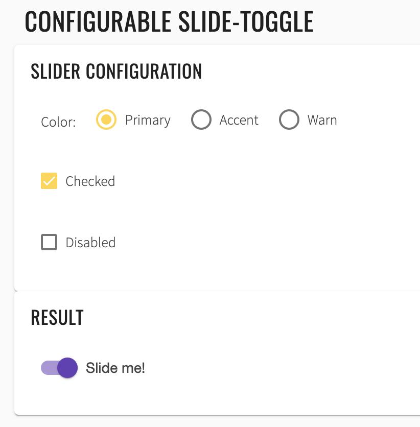
<mat-card-content _ngcontent-noq-c236="" class="mat-card-content">
<h4 _ngcontent-noq-c236="">Slider configuration</h4>
<section _ngcontent-noq-c236="" class="example-section">
<label _ngcontent-noq-c236="" class="example-margin">Color:</label>
<mat-radio-group _ngcontent-noq-c236="" role="radiogroup" class="mat-radio-group ng-untouched ng-pristine ng-valid">
<mat-radio-button _ngcontent-noq-c236="" value="primary" class="mat-radio-button example-margin mat-accent" tabindex="-1" id="mat-radio-13">
<label class="mat-radio-label" for="mat-radio-13-input">
<div class="mat-radio-container">
<div class="mat-radio-outer-circle"/>
<div class="mat-radio-inner-circle"/>
<input type="radio" class="mat-radio-input cdk-visually-hidden" id="mat-radio-13-input" tabindex="0" name="mat-radio-group-11" value="primary">
<div mat-ripple="" class="mat-ripple mat-radio-ripple mat-focus-indicator">
<div class="mat-ripple-element mat-radio-persistent-ripple"/>
</div>
</div>
<div class="mat-radio-label-content">
<span style="display: none;"> </span> Primary </div>
</label>
</mat-radio-button>
<mat-radio-button _ngcontent-noq-c236="" value="accent" class="mat-radio-button example-margin mat-accent mat-radio-checked" tabindex="-1" id="mat-radio-14">
<label class="mat-radio-label" for="mat-radio-14-input">
<div class="mat-radio-container">
<div class="mat-radio-outer-circle"/>
<div class="mat-radio-inner-circle"/>
<input type="radio" class="mat-radio-input cdk-visually-hidden" id="mat-radio-14-input" tabindex="0" name="mat-radio-group-11" value="accent">
<div mat-ripple="" class="mat-ripple mat-radio-ripple mat-focus-indicator">
<div class="mat-ripple-element mat-radio-persistent-ripple"/>
</div>
</div>
<div class="mat-radio-label-content">
<span style="display: none;"> </span> Accent </div>
</label>
</mat-radio-button>
<mat-radio-button _ngcontent-noq-c236="" value="warn" class="mat-radio-button example-margin mat-accent" tabindex="-1" id="mat-radio-15">
<label class="mat-radio-label" for="mat-radio-15-input">
<div class="mat-radio-container">
<div class="mat-radio-outer-circle"/>
<div class="mat-radio-inner-circle"/>
<input type="radio" class="mat-radio-input cdk-visually-hidden" id="mat-radio-15-input" tabindex="0" name="mat-radio-group-11" value="warn">
<div mat-ripple="" class="mat-ripple mat-radio-ripple mat-focus-indicator">
<div class="mat-ripple-element mat-radio-persistent-ripple"/>
</div>
</div>
<div class="mat-radio-label-content">
<span style="display: none;"> </span> Warn </div>
</label>
</mat-radio-button>
</mat-radio-group>
</section>
<section _ngcontent-noq-c236="" class="example-section">
<mat-checkbox _ngcontent-noq-c236="" class="mat-checkbox example-margin mat-accent ng-untouched ng-pristine ng-valid" id="mat-checkbox-6">
<label class="mat-checkbox-layout" for="mat-checkbox-6-input">
<div class="mat-checkbox-inner-container">
<input type="checkbox" class="mat-checkbox-input cdk-visually-hidden" id="mat-checkbox-6-input" tabindex="0" aria-checked="false">
<div matripple="" class="mat-ripple mat-checkbox-ripple mat-focus-indicator">
<div class="mat-ripple-element mat-checkbox-persistent-ripple"/>
</div>
<div class="mat-checkbox-frame"/>
<div class="mat-checkbox-background">
<svg version="1.1" focusable="false" viewBox="0 0 24 24" xml:space="preserve" class="mat-checkbox-checkmark">
<path fill="none" stroke="white" d="M4.1,12.7 9,17.6 20.3,6.3" class="mat-checkbox-checkmark-path"/>
</svg>
<div class="mat-checkbox-mixedmark"/>
</div>
</div>
<span class="mat-checkbox-label">
<span style="display: none;"> </span>Checked</span>
</label>
</mat-checkbox>
</section>
<section _ngcontent-noq-c236="" class="example-section">
<mat-checkbox _ngcontent-noq-c236="" class="mat-checkbox example-margin mat-accent ng-untouched ng-pristine ng-valid" id="mat-checkbox-7">
<label class="mat-checkbox-layout" for="mat-checkbox-7-input">
<div class="mat-checkbox-inner-container">
<input type="checkbox" class="mat-checkbox-input cdk-visually-hidden" id="mat-checkbox-7-input" tabindex="0" aria-checked="false">
<div matripple="" class="mat-ripple mat-checkbox-ripple mat-focus-indicator">
<div class="mat-ripple-element mat-checkbox-persistent-ripple"/>
</div>
<div class="mat-checkbox-frame"/>
<div class="mat-checkbox-background">
<svg version="1.1" focusable="false" viewBox="0 0 24 24" xml:space="preserve" class="mat-checkbox-checkmark">
<path fill="none" stroke="white" d="M4.1,12.7 9,17.6 20.3,6.3" class="mat-checkbox-checkmark-path"/>
</svg>
<div class="mat-checkbox-mixedmark"/>
</div>
</div>
<span class="mat-checkbox-label">
<span style="display: none;"> </span>Disabled</span>
</label>
</mat-checkbox>
</section>
</mat-card-content>
List of some available Slide toggle methods:
| Method | Description | Return Type |
|---|---|---|
| check() | Check element | void |
| uncheck() | Uncheck element | void |
| isEnabled() | Verify state | boolean |
| isDisabled() | Verify state | boolean |
| isDisplayed() | Verify state | boolean |
| isSelected() | Verify state | boolean |
| selected() | Verify state | boolean |
| deselected() | Verify state | boolean |
| click() | Click element | void |
| hasClass() | Verify element class | boolean |
Here you can find Slide toggle tests
2.1.4 Checkbox
Checkbox overview
Checkbox is located in the following class:
- Java: com.epam.jdi.light.angular.elements.common.Checkbox
There is two different checkboxes in Angular: Basic and Configurable.
See examples with HTML code describing datepicker elements.
  //@FindBy(id="basic-checkbox")
  @UI("basic-checkbox")
  public static Checkbox basicCheckbox;

  @Test
  public void checkLabelValue() {
      basicCheckbox.label().has().value("Check me!");
      resultCheckbox.label().has().value("I'm a checkbox");
  }

  @Test
  public void basicCheckboxValidation() {
      basicCheckbox.is().displayed().and().enabled().and().deselected();
  }

  @Test
  public void checkBasicCheckbox() {
      basicCheckbox.check();
      basicCheckbox.is().selected();
  }

<section class="example-section">
  <mat-checkbox id="basic-checkbox">Check me!</mat-checkbox>
</section>
  //@FindBy(id="checked-checkbox")
  @UI("checked-checkbox")
  public static Checkbox checkedCheckbox;

  //@FindBy(id="indeterminate-checkbox")
  @UI("indeterminate-checkbox")
  public static Checkbox indeterminateCheckbox;

  //@FindBy(id="disabled-checkbox")
  @UI("disabled-checkbox")
  public static Checkbox disabledCheckbox;

  //@FindBy(id="result-checkbox")
  @UI("result-checkbox")
  public static Checkbox resultCheckbox;

  //@FindBy(id="align-before-radio-button")
  @UI("align-before-radio-button")
  public static Button alignBeforeRadioButton;

  //@FindBy(id="align-after-radio-button")
  @UI("align-after-radio-button")
  public static Button alignAfterRadioButton;

  @Test
  public void indeterminateTest() {
      indeterminateCheckbox.click();
      resultCheckbox.is().indeterminate();
  }

  @Test
  public void disabledOption() {
      disabledCheckbox.click();
      resultCheckbox.is().disabled();
  }

  @Test
  public void configurableCheckboxTest() {
      indeterminateCheckbox.check();
      alignBeforeRadioButton.click();
      resultCheckbox.is().indeterminate().and().cssClass("mat-checkbox-label-before");
  }
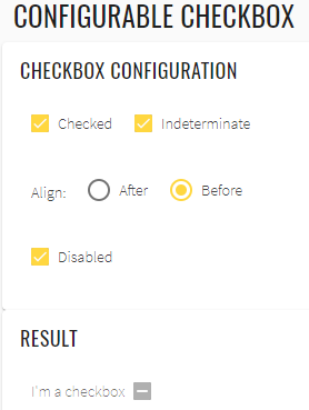
<mat-card>
  <mat-card-content>
    <h4>Checkbox configuration</h4>
    <section class="example-section">
      <mat-checkbox id="checked-checkbox" class="example-margin" [(ngModel)]="checked">
        Checked
      </mat-checkbox>
      <mat-checkbox id="indeterminate-checkbox" class="example-margin" [(ngModel)]="indeterminate">
        Indeterminate
      </mat-checkbox>
    </section>
    <section class="example-section">
      <label class="example-margin">Align:</label>
      <mat-radio-group [(ngModel)]="labelPosition">
        <mat-radio-button id="align-after-radio-button" class="example-margin" value="after">
          After
        </mat-radio-button>
        <mat-radio-button id="align-before-radio-button" class="example-margin" value="before">
          Before
        </mat-radio-button>
      </mat-radio-group>
    </section>
    <section class="example-section">
      <mat-checkbox id="disabled-checkbox" class="example-margin" [(ngModel)]="disabled">
        Disabled
      </mat-checkbox>
    </section>
  </mat-card-content>
</mat-card>
<mat-card class="result">
  <mat-card-content>
    <h4>Result</h4>
    <section class="example-section">
      <mat-checkbox
        id="result-checkbox"
        class="example-margin"
        [(ngModel)]="checked"
        [(indeterminate)]="indeterminate"
        [labelPosition]="labelPosition"
        [disabled]="disabled">
        I'm a checkbox
      </mat-checkbox>
    </section>
  </mat-card-content>
</mat-card>
List of some available Checkbox methods:
| Method | Description | Return Type |
|---|---|---|
| is() | Assert action | CheckboxAssert |
| check() | Check element | void |
| uncheck() | Uncheck element | void |
| click() | Click on element | void |
| isSelected() | Shows that Checkbox has selected | boolean |
| isEnabled() | Shows that Checkbox has enabled | boolean |
| isDisabled() | Shows that Checkbox has disabled | boolean |
| isIndeterminate() | Shows that Checkbox has indeterminate | boolean |
| label() | Get element label | Label |
Here you can find Checkbox tests
2.1.5 Inputs
Input overview
Input is located in the following class:
- Java: _com.epam.jdi.light.ui.html.elements.common.TextField _com.epam.jdi.light.ui.html.elements.common.TextArea
There are eight different inputs in Angular:
- Basic inputs
- Input with a custom ErrorStateMatcher
- Auto-resizing textarea
- Input with a clear button
- Input with error messages
- Input in a form
- Input with hints
- Input with prefixes and suffixes
Basic inputs:
    //@FindBy(id="inputs_basic_food")
    @UI("#inputs_basic_food")
    public static TextField foodBasicInput;

    //@FindBy(id="inputs_basic_comment")
    @UI("#inputs_basic_comment")
    public static TextField leaveACommentBasicInput;

    @Test
    public void basicInputTest() {
        foodBasicInput.isDisplayed();
        foodBasicInput.clear();
        foodBasicInput.setText("Lasagna");
        foodBasicInput.is().text("Lasagna");
        foodBasicInput.clear();
        foodBasicInput.sendKeys("Ice Cream");
        foodBasicInput.is().text(containsString("Ice"));

        leaveACommentBasicInput.isDisplayed();
        leaveACommentBasicInput.sendKeys("Delicious");
        leaveACommentBasicInput.is().text("Delicious");
    }
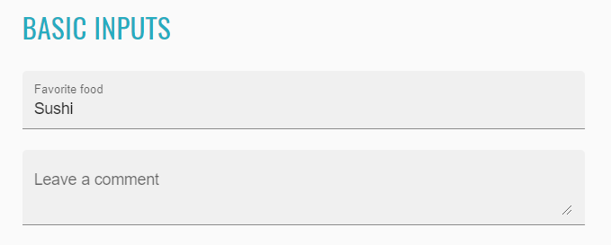
<input _ngcontent-ohc-c255="" matinput="" id="inputs_basic_food" placeholder="Ex. Pizza" value="Sushi" class="mat-input-element mat-form-field-autofill-control ng-tns-c94-34 cdk-text-field-autofill-monitored" aria-invalid="false" aria-required="false">
Input with a custom ErrorStateMatcher:
    //@FindBy(id="inputs_errorStateMatcher_email")
    @UI("#inputs_errorStateMatcher_email")
    public static TextField emailErrorStateMatcherInput;

    //@FindBy(id="inputs_errorStateMatcher_message")
    @UI("#inputs_errorStateMatcher_message")
    public static Text errorStateMatcherMessageInput;

    @Test
    public void inputWithACustomErrorStateMatcherTest() {
        emailErrorStateMatcherInput.isDisplayed();
        emailErrorStateMatcherInput.sendKeys("test");
        errorStateMatcherMessageInput.is().text("Please enter a valid email address");
    }
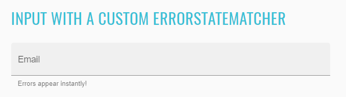
<input _ngcontent-ohc-c256="" matinput="" id="inputs_errorStateMatcher_email" placeholder="Ex. pat@example.com" class="mat-input-element mat-form-field-autofill-control ng-tns-c94-39 cdk-text-field-autofill-monitored ng-untouched ng-pristine ng-invalid" aria-describedby="mat-hint-3" aria-invalid="false" aria-required="false">
Auto-resizing textarea:
    //@FindBy(id="inputs_autosize_textarea")
    @UI("#inputs_autosize_textarea")
    public static TextArea autoSizeTextArea;

    @Test
    public void autoResizingTextAreaTest() {
        autoSizeTextArea.isDisplayed();
        autoSizeTextArea.setLines("line1", "line2");
        autoSizeTextArea.addNewLine("line3");
        autoSizeTextArea.is().text("line1\nline2\nline3");
        autoSizeTextArea.clear();
        autoSizeTextArea.is().text("");
        autoSizeTextArea.setText("TextArea");
        autoSizeTextArea.is().text(containsString("Text"));
    }
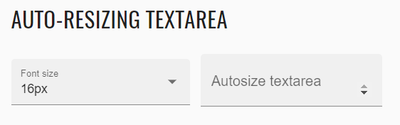
<textarea _ngcontent-ohc-c257="" rows="1" matinput="" id="inputs_autosize_textarea" cdktextareaautosize="" cdkautosizeminrows="1" cdkautosizemaxrows="5" class="mat-input-element mat-form-field-autofill-control cdk-textarea-autosize ng-tns-c94-42 cdk-text-field-autofill-monitored" aria-invalid="false" aria-required="false" style="min-height: 18px; max-height: 90px; height: 18px;"></textarea>
Input with a clear button:
    //@FindBy(id="inputs_clearable_textbox")
    @UI("#inputs_clearable_textbox")
    public static TextArea clearableInput;

    //@FindBy(id="inputs_clearable_button")
    @UI("#inputs_clearable_button")
    public static Button clearableInputButton;

    @Test
    public void clearableInputTest() {
        clearableInput.isDisplayed();
        clearableInput.clear();
        clearableInput.sendKeys("test");
        clearableInputButton.isDisplayed();
        clearableInputButton.click();
        clearableInput.is().text("");
    }
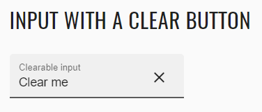
<input _ngcontent-ohc-c258="" matinput="" id="inputs_clearable_textbox" type="text" class="mat-input-element mat-form-field-autofill-control ng-tns-c94-43 cdk-text-field-autofill-monitored ng-untouched ng-pristine ng-valid" aria-invalid="false" aria-required="false">
<button _ngcontent-ohc-c258="" mat-button="" id="inputs_clearable_button" matsuffix="" mat-icon-button="" aria-label="Clear" class="mat-focus-indicator mat-button mat-icon-button mat-button-base ng-tns-c94-43 ng-star-inserted">
        <span class="mat-button-wrapper">
            <mat-icon _ngcontent-ohc-c258="" role="img" class="mat-icon notranslate material-icons mat-icon-no-color" aria-hidden="true">close</mat-icon>
        </span>
  <div matripple="" class="mat-ripple mat-button-ripple mat-button-ripple-round"/>
  <div class="mat-button-focus-overlay"/>
</button>
Input with error messages:
    //@FindBy(id="inputs_error_email")
    @UI("#inputs_error_email")
    public static TextField emailInput;

    //@FindBy(id="inputs_error_message")
    @UI("#inputs_error_message")
    public static Text errorMessageInput;

    @Test
    public void inputWithErrorMessagesTest() {
        emailInput.isDisplayed();
        emailInput.sendKeys("test");
        emailInput.sendKeys(Keys.ENTER);
        errorMessageInput.isDisplayed();
        errorMessageInput.is().text("Please enter a valid email address");
    }
<input _ngcontent-ohc-c259="" matinput="" id="inputs_error_email" placeholder="Ex. pat@example.com" class="mat-input-element mat-form-field-autofill-control ng-tns-c94-44 cdk-text-field-autofill-monitored ng-untouched ng-pristine ng-invalid" aria-invalid="false" aria-required="false">
Inputs in a form:
    //@FindBy(css="input-form-example form")
    @UI("input-form-example form")
    public static InputsForm inputsForm;

     @Test
    public void inputsInAFormTest() {
        inputsForm.fill(DEFAULT_USER);
        inputsForm.firstName.is().text("Long");
        inputsForm.lastName.is().text("Dinh");
        inputsForm.address.is().text("259 Tran Hung Dao Street");
        inputsForm.address2.is().text("Ward Co Giang, District 1");
        inputsForm.city.is().text("Ho Chi Minh");
        inputsForm.state.is().text("Ho Chi Minh");
        inputsForm.postalCode.is().text("70000");
    }
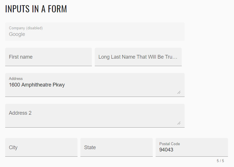
<form _ngcontent-sod-c260="" novalidate="" class="example-form ng-untouched ng-pristine ng-valid"></form>
Input with hints:
    //@FindBy(id="inputs_hints_message")
    @UI("#inputs_hints_message")
    public static TextField messageHintInput;

    //@FindBy(id="inputs_hints_text")
    @UI("#inputs_hints_text")
    public static Text messageHint;

    //@FindBy(id="inputs_hints_counter")
    @UI("#inputs_hints_counter")
    public static Text messageCounterHint;

    @Test
    public void inputWithHintsTest() {
        messageHintInput.isDisplayed();
        messageHintInput.sendKeys("test");
        messageHint.isDisplayed();
        messageHint.is().text("Don't disclose personal info");
        messageCounterHint.isDisplayed();
        messageCounterHint.is().text("4 / 256");
    }
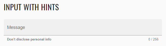
<input _ngcontent-ohc-c261="" matinput="" id="inputs_hints_message" maxlength="256" placeholder="Ex. I need help with..." class="mat-input-element mat-form-field-autofill-control ng-tns-c94-53 cdk-text-field-autofill-monitored" aria-describedby="inputs_hints_text inputs_hints_counter" aria-invalid="false" aria-required="false">
<mat-hint _ngcontent-ohc-c261="" id="inputs_hints_text" class="mat-hint ng-tns-c94-53"><strong _ngcontent-ohc-c261="">Don't disclose personal info</strong></mat-hint>
Input with prefixes and suffixes:
    //@FindBy(id="inputs_prefixes")
    @UI("#inputs_prefixes")
    public static Text prefixInput;

    //@FindBy(id="inputs_suffixes")
    @UI("#inputs_suffixes")
    public static Icon suffixInput;

    //@FindBy(id="inputs_prefixes_suffixes_phone")
    @UI("#inputs_prefixes_suffixes_phone")
    public static TextField telephoneInput;

    @Test
    public void inputWithPrefixesAndSuffixesTest() {
        prefixInput.isDisplayed();
        suffixInput.isDisplayed();
        telephoneInput.isDisplayed();
        telephoneInput.sendKeys("0123456789");
        telephoneInput.clear();
        telephoneInput.is().text("");
    }
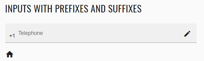
<span _ngcontent-ohc-c262="" matprefix="" id="inputs_prefixes" class="ng-tns-c94-54">+1 </span>
<input _ngcontent-ohc-c262="" type="tel" matinput="" id="inputs_prefixes_suffixes_phone" placeholder="555-555-1234" class="mat-input-element mat-form-field-autofill-control ng-tns-c94-54 cdk-text-field-autofill-monitored" aria-invalid="false" aria-required="false">
<mat-icon _ngcontent-ohc-c262="" role="img" matsuffix="" id="inputs_suffixes" class="mat-icon notranslate material-icons mat-icon-no-color ng-tns-c94-54" aria-hidden="true">edit</mat-icon>
List of available methods:
TextField:
| Method | Description | Return Type |
|---|---|---|
| getText() | returns text from the text field | String |
| getValue() | returns text from the text field | String |
| setValue(String) | returns text from the text field | void |
| is() | property that returns object for work with assertions | TextAssert |
TextArea:
| Method | Description | Return Type |
|---|---|---|
| setLines(String...) | Add lines as one string with '\n' delimiter | void |
| getText() | Returns lines dividing text using '\n' | List |
| addNewLine(String) | add line to the already existing | void |
| cols() | returns value of cols attribute | int |
| rows() | returns value of rows attribute | int |
| getText() | returns text from the textarea | String |
| getValue() | returns text from the textarea | String |
| maxlength() | returns value of maxlength attribute | int |
| minlengt() | returns value of minlength attribute | int |
| setValue(String) | returns text from the text field | void |
| is() | property that returns object for work with assertions | TextAssert |
Java tests examples
2.1.6 Toolbar
Toolbar overview
"mat-toolbar" is a container for headers, titles, or actions.
There is two different toolbars in Angular: Single row and Multiple row.
    /**@FindBy(id = "toolbar-basic") public static ToolbarSection toolbarSection;*/
    @UI("#toolbar-basic")
    public static TextArea toolbarTextArea;
    public static Text toolbarTextArea;

    /**@FindBy(id = "toolbar-table") public static ToolbarSection toolbarSection;*/
    @UI("#toolbar-table")
    public static Table toolbarTable;

    /**@FindBy(css = "#toolbar-table span:not(.example-spacer)") public static ToolbarSection toolbarSection;*/
    @UI("#toolbar-table span:not(.example-spacer)")
    public static JList<Text> toolbarRowsElementsWithText;

    @Test
    public void basicToolbarTest() {
        String textForTest = "My App";
        String classForTest = "mat-toolbar";
        toolbarTextArea.is().displayed();
        toolbarTable.has().cssClass(classForTest);
        toolbarTextArea.is().text(containsString(textForTest));
    }

    @Test
    public void multiRowToolbarTest() {
        String classForTest = "mat-toolbar";
        List<String> listForTest = Arrays.asList("Custom Toolbar", "Second Line", "Third Line");
        toolbarTable.is().displayed();
        toolbarTable.has().cssClass(classForTest);
        toolbarRowsElementsWithText.is().values(listForTest);
    }

    @Test
    public void multiRowToolbarColorTest() {
        String colorForTest = "primary";
        toolbarTable.has().attr("color", colorForTest);
    }
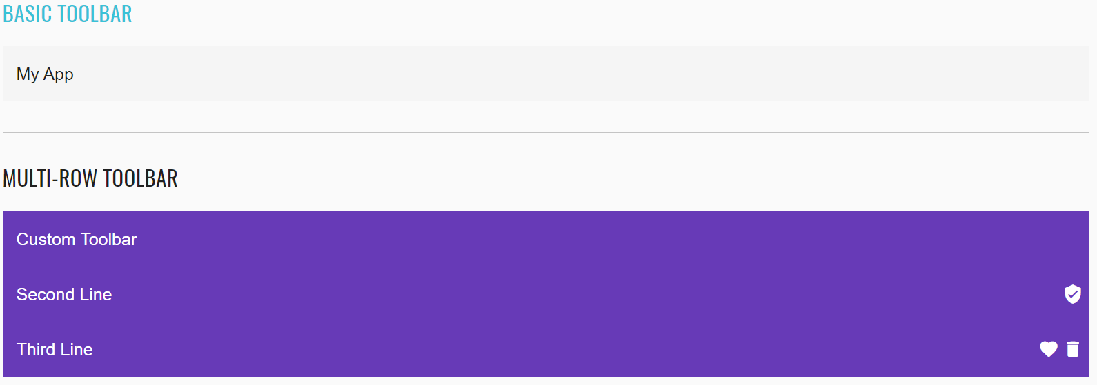
<mat-toolbar _ngcontent-duh-c290="" id="toolbar-basic" class="mat-toolbar mat-toolbar-single-row">My App</mat-toolbar>
<mat-toolbar _ngcontent-duh-c291="" id="toolbar-table" color="primary" class="mat-toolbar mat-primary mat-toolbar-multiple-rows"><mat-toolbar-row _ngcontent-duh-c291="" class="mat-toolbar-row"><span _ngcontent-duh-c291="">Custom Toolbar</span></mat-toolbar-row><mat-toolbar-row _ngcontent-duh-c291="" class="mat-toolbar-row"><span _ngcontent-duh-c291="">Second Line</span><span _ngcontent-duh-c291="" class="example-spacer"></span><mat-icon _ngcontent-duh-c291="" role="img" aria-hidden="false" aria-label="Example user verified icon" class="mat-icon notranslate example-icon material-icons mat-icon-no-color">verified_user</mat-icon></mat-toolbar-row><mat-toolbar-row _ngcontent-duh-c291="" class="mat-toolbar-row"><span _ngcontent-duh-c291="">Third Line</span><span _ngcontent-duh-c291="" class="example-spacer"></span><mat-icon _ngcontent-duh-c291="" role="img" aria-hidden="false" aria-label="Example heart icon" class="mat-icon notranslate example-icon material-icons mat-icon-no-color">favorite</mat-icon><mat-icon _ngcontent-duh-c291="" role="img" aria-hidden="false" aria-label="Example delete icon" class="mat-icon notranslate example-icon material-icons mat-icon-no-color">delete</mat-icon></mat-toolbar-row></mat-toolbar>
| Method | Description | Return Type |
|---|---|---|
| hasClass() | Match passed value with the element class | boolean |
| values() | Assert that values are the same | List |
| has() | assert that element has attribute | boolean |
| attr() | Check whether an element has attribute of specified name and with given value | IsAssert |
| is() | Assert action | TextAssert |
| displayed() | Check that element is displayed | TextAssert |
Here you can find Toolbar tests
2.1.7 Basic Button
Button overview
Basic Button is located in the following class:
- Java: com.epam.jdi.light.ui.html.elements.common.Button
The angular Button:
    //@FindBy(id="basic-buttons-label")
    @UI("#basic-buttons-label")
    public static Button basicBasicButton;

    //@FindBy(id="basic-primary-button")
    @UI("#basic-primary-button")
    public static Button basicPrimaryButton;

    @Test
    public void clickTest() {
        basicBasicButton.click();
        basicBasicButton.has().cssClass(FOCUSED_CLASS);
        basicButtonsSection.basicButtonsLabel.is().has().text(containsString(BASIC_TEXT));
    }

    @Test
    public void clickWithMoveTest() {
        basicWarnButton.click(ElementArea.TOP_LEFT);
        basicWarnButton.has().cssClass(FOCUSED_CLASS);
        basicButtonsSection.basicButtonsLabel.is().has().text(containsString(WARN_TEXT));
    }

    @Test
    public void disableButtonTest() {
        basicDisabledButton.is().disabled();
    }

    @Test
    public void assertValidationTest() {
        basicBasicButton.assertThat().text(is(BASIC_TEXT));
        basicPrimaryButton.assertThat().text(is(PRIMARY_TEXT));
        basicAccentButton.assertThat().text(is(ACCENT_TEXT));
        basicWarnButton.assertThat().text(is(WARN_TEXT));
        basicDisabledButton.assertThat().text(is(DISABLED_TEXT));
        basicLinkButton.assertThat().text(is(LINK_TEXT));
    }

    @Test
    public void isValidationTest() {
        basicWarnButton.is().displayed();
        basicWarnButton.is().enabled();
        basicWarnButton.is().text(is(WARN_TEXT));
        basicWarnButton.is().text(containsString(WARN_TEXT));
        assertThat(basicWarnButton.core().css("font-size"), is("14px"));
        basicWarnButton.assertThat().displayed()
                .and().text(is(WARN_TEXT))
                .core()
                .css("font-size", is("14px"))
                .and()
                .cssClass("mat-button")
                .and()
                .attr("type")
                .tag(is("button"));
        basicDisabledButton.is().text(containsString(DISABLED_TEXT));
        basicDisabledButton.is().disabled();
    }
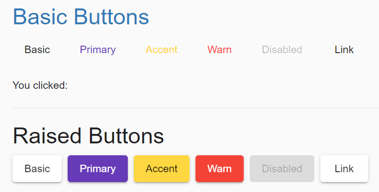
<button _ngcontent-jos-c358="" mat-raised-button="" color="primary" id="raised-primary-button" class="mat-focus-indicator mat-raised-button mat-button-base mat-primary" ng-reflect-color="primary">
    <span class="mat-button-wrapper">Primary</span>
    <div matripple="" class="mat-ripple mat-button-ripple" ng-reflect-disabled="false" ng-reflect-centered="false" ng-reflect-trigger="[object HTMLButtonElement]"></div>
    <div class="mat-button-focus-overlay"></div>
</button>
| Method | Description | Return Type |
|---|---|---|
| getValue() | Returns value | String |
| is() | Assert action | TextAssert |
Basic Button java tests examples
2.1.8 Button toggle
Button toggle overview
Button toggle is based on Basic Button. Basic Button is located in the following class:
- Java: com.epam.jdi.light.ui.html.elements.common.Button
Button toggle located in the following class:
- Java: com.epam.jdi.light.angular.elements.complex.ButtonToggle
There are two different button toggles in Angular: Basic and Exclusive:
    //@FindBy(id = "mat-button-toggle-group-font")
    @UI("#mat-button-toggle-group-font")
    public static ButtonToggle basicButtonToggle;

    @Test
    public void verifyButtonToggle() {
        basicButtonToggle.is().displayed();
        basicButtonToggle.is().enabled();
        String ITALIC = "italic";
        basicButtonToggle.clickButtonToggleByValue(ITALIC);
        basicButtonToggle.is().assertButtonToggleIsSelected(ITALIC);
        basicButtonToggle.is().assertButtonToggleButtonIsPressed(ITALIC);
        basicButtonToggle.is().assertButtonToggleButtonHasText(ITALIC);
    }

    @Test
    public void verifyButtonToggleCombineSelection() {
        String BOLD = "bold";
        basicButtonToggle.clickButtonToggleByValue(BOLD);
        String UNDERLINE = "underline";
        basicButtonToggle.clickButtonToggleByValue(UNDERLINE);
        basicButtonToggle.is().assertButtonToggleIsSelected(BOLD);
        basicButtonToggle.is().assertButtonToggleIsSelected(UNDERLINE);
        basicButtonToggle.clickButtonToggleByValue(BOLD);
        basicButtonToggle.is().assertButtonToggleIsNotSelected(BOLD);
    }
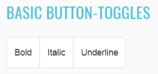
<mat-button-toggle _ngcontent-eoo-c327="" value="underline" id="underline-button-toggle" class="mat-button-toggle mat-focus-indicator mat-button-toggle-appearance-standard" tabindex="-1">
    <button type="button" class="mat-button-toggle-button mat-focus-indicator" tabindex="0" aria-pressed="false">
        <div class="mat-button-toggle-label-content">Underline</div>
    </button>
    <div class="mat-button-toggle-focus-overlay"></div>
    <div matripple="" class="mat-ripple mat-button-toggle-ripple"></div>
</mat-button-toggle>
Exclusive button toggle:
    //@FindBy(id = "mat-button-toggle-group-align")
    @UI("#mat-button-toggle-group-align")
    public static ButtonToggle basicButtonToggleAlign;

    //@FindBy(css = "div.example-selected-value")
    @UI("div.example-selected-value")
    public static Text selectedValue;

    @Test
    public void verifyExclusiveButtonToggle() {
        String LEFT = "left";
        basicButtonToggleAlign.is().displayed();
        basicButtonToggleAlign.is().enabled();
        basicButtonToggleAlign.clickButtonToggleByValue(LEFT);
        basicButtonToggleAlign.is().assertButtonToggleIsSelected(LEFT);
        selectedValue.has().text("Selected value: left");
    }

    @Test
    public void verifyExclusiveButtonToggleSeparateSelection() {
        String CENTER = "center";
        String LEFT = "left";
        String RIGHT = "right";
        basicButtonToggleAlign.clickButtonToggleByValue(CENTER);
        basicButtonToggleAlign.clickButtonToggleByValue(RIGHT);
        basicButtonToggleAlign.clickButtonToggleByValue(LEFT);
        basicButtonToggleAlign.is().assertButtonToggleIsSelected(LEFT);
        basicButtonToggleAlign.is().assertButtonToggleIsNotSelected(RIGHT);
        basicButtonToggleAlign.is().assertButtonToggleIsNotSelected(CENTER);
    }

<mat-button-toggle _ngcontent-pwh-c328="" value="left" aria-label="Text align left" id="left-align-button-toggle" class="mat-button-toggle mat-focus-indicator mat-button-toggle-appearance-standard" tabindex="-1">
    <button type="button" class="mat-button-toggle-button mat-focus-indicator"  tabindex="0" aria-pressed="false" name="mat-button-toggle-group-7" aria-label="Text align left">
        <div class="mat-button-toggle-label-content"><mat-icon _ngcontent-pwh-c328="" role="img" class="mat-icon notranslate material-icons mat-icon-no-color" aria-hidden="true">format_align_left</mat-icon></div>
    </button>
    <div class="mat-button-toggle-focus-overlay"></div>
    <div matripple="" class="mat-ripple mat-button-toggle-ripple"></div>
</mat-button-toggle>
List of available methods:
| Method | Description | Return Type |
|---|---|---|
| clickButtonToggleByValue(String) | Click required button | void |
| clickButtonToggleByValue(String) | is button pressed | boolean |
| buttonToggleHasText(String) | Does button has text | boolean |
| isButtonToggleSelected(String) | Is button toggle selected | boolean |
| is() | Assert action | ButtonToggleAssert |
Here you can find Button toggle tests
2.1.9 Badge
Badge overview
Badge is located in the following class:
- Java: com.epam.jdi.light.angular.elements.common.Badge
  //@FindBy(css = "#text-with-badge span")
  @UI("#text-with-badge span")
  public static Badge textWithBadge;

  //@FindBy(css = "#button-with-left-badge span:not(.mat-button-wrapper)")
  @UI("#button-with-left-badge span:not(.mat-button-wrapper)")
  public static Badge buttonWithBadge;

  //@FindBy(css = "#icon-with-badge span")
  @UI("#icon-with-badge span")
  public static Badge iconWithBadge;

  @Test
  public void basicBadgeTest() {
      textWithBadge.show();
      textWithBadge.badge().is().displayed();
      textWithBadge.badge().has().text("4");
      textWithBadge.has().color("Violet");
  }

  @Test
  public void buttonBadgeTest() {
      buttonWithBadge.show();
      buttonWithBadge.badge().is().displayed();
      buttonWithBadge.badge().has().text("8");
      buttonWithBadge.has().color("Yellow");
  }

  @Test
  public void iconBadgeTest() {
      iconWithBadge.show();
      iconWithBadge.badge().is().displayed();
      iconWithBadge.badge().has().text("15");
      iconWithBadge.has().color("Red");
  }
<span _ngcontent-iwc-c329="" matbadge="4" matbadgeoverlap="false" id="text-with-badge" class="mat-badge mat-badge-above mat-badge-after mat-badge-medium">
    "Text with a badge"
    <span _ngcontent-iwc-c329="" id="mat-badge-content-0" class="mat-badge-content mat-badge-active">4</span>
</span>
| Method | Description | Return Type |
|---|---|---|
| is() | Assert action | BadgeAssert |
| badge() | Get badge | UIElement |
| color(String) | Check that color is correct | boolean |
Here you can find Badge tests
2.1.10 Progress bar
Progress bar overview
Progress bar is located in the following class:
- Java: com.epam.jdi.light.ui.angular.elements.common.ProgressBar
There is 5 different progress bars in Angular: Buffer, Determinate, Indeterminate, Query and Configurable:
Buffer progress bar:
  //@FindBy(css = "#show-buffer-progress-bar-button")
  @UI("#show-buffer-progress-bar-button")
  public static Button showBufferProgressBarButton;

  //@FindBy(css = "#mat-progress-bar-buffer")
  @UI("#mat-progress-bar-buffer")
  public static ProgressBar matProgressBarBuffer;

  @Test
  public void verifyBufferProgressBarTest() throws Exception {
      showBufferProgressBarButton.click();
      matProgressBarBuffer.shouldBe().displayed();
      matProgressBarBuffer.show();
      matProgressBarBuffer.shouldBe().visible();
      matProgressBarBuffer.has().mode(BUFFER);
      matProgressBarBuffer.has().value(0);
      matProgressBarBuffer.has().bufferValue(0.0);
      matProgressBarBuffer.has().max(100);
      matProgressBarBuffer.has().min(0);
      matProgressBarBuffer.has().color(BLUE);
      matProgressBarBuffer.is().disappear(5);
  }
<progress-bar-buffer-example _nghost-pnn-c338="" ng-version="9.1.0">
    <h2 _ngcontent-pnn-c338="" class="example-h2">
        <a _ngcontent-pnn-c338="" href="https://material.angular.io/components/progress-bar/overview#buffer"> Buffer progress-bar </a>
    </h2>
    <button _ngcontent-pnn-c338="" mat-raised-button="" id="show-buffer-progress-bar-button" class="mat-focus-indicator mat-raised-button mat-button-base">
        <span class="mat-button-wrapper"> Show progress-bar for 5 seconds
</span>
        <div matripple="" class="mat-ripple mat-button-ripple"/>
        <div class="mat-button-focus-overlay"/>
    </button>
    <div _ngcontent-pnn-c338="" hidden="">
        <mat-progress-bar _ngcontent-pnn-c338="" role="progressbar" aria-valuemin="0" aria-valuemax="100" id="mat-progress-bar-buffer" mode="buffer" class="mat-progress-bar mat-primary" aria-valuenow="0">
            <svg width="100%" height="4" focusable="false" class="mat-progress-bar-background mat-progress-bar-element">
                <defs>
                    <pattern x="4" y="0" width="8" height="4" patternUnits="userSpaceOnUse" id="mat-progress-bar-0">
                        <circle cx="2" cy="2" r="2"/>
                    </pattern>
                </defs>
                <rect width="100%" height="100%" fill="url('/jdi-light/angular.html#mat-progress-bar-0')"/>
            </svg>
            <div class="mat-progress-bar-buffer mat-progress-bar-element" style="transform: scaleX(0);"/>
            <div class="mat-progress-bar-primary mat-progress-bar-fill mat-progress-bar-element" style="transform: scaleX(0);"/>
            <div class="mat-progress-bar-secondary mat-progress-bar-fill mat-progress-bar-element"/>
        </mat-progress-bar>
    </div>
</progress-bar-buffer-example>
Determinate progress bar:
  //@FindBy(css = "#mat-progress-bar-determinate")
  @UI("#mat-progress-bar-determinate")
  public static ProgressBar matProgressBarDeterminate;

  @Test
  public void verifyDeterminateProgressBarTest() throws Exception {
      matProgressBarDeterminate.shouldBe().displayed();
      matProgressBarDeterminate.show();
      matProgressBarDeterminate.shouldBe().visible();
      matProgressBarDeterminate.has().mode(DETERMINATE);
      matProgressBarDeterminate.has().value(40);
      matProgressBarDeterminate.has().max(100);
      matProgressBarDeterminate.has().min(0);
      matProgressBarDeterminate.has().color(BLUE);
  }
<progress-bar-determinate-example _nghost-pnn-c339="" ng-version="9.1.0">
    <h2 _ngcontent-pnn-c339="" class="example-h2">
        <a _ngcontent-pnn-c339="" href="https://material.angular.io/components/progress-bar/overview#determinate"> Determinate progress-bar </a>
    </h2>
    <mat-progress-bar _ngcontent-pnn-c339="" role="progressbar" aria-valuemin="0" aria-valuemax="100" id="mat-progress-bar-determinate" mode="determinate" value="40" class="mat-progress-bar mat-primary" aria-valuenow="40">
        <svg width="100%" height="4" focusable="false" class="mat-progress-bar-background mat-progress-bar-element">
            <defs>
                <pattern x="4" y="0" width="8" height="4" patternUnits="userSpaceOnUse" id="mat-progress-bar-1">
                    <circle cx="2" cy="2" r="2"/>
                </pattern>
            </defs>
            <rect width="100%" height="100%" fill="url('/jdi-light/angular.html#mat-progress-bar-1')"/>
        </svg>
        <div class="mat-progress-bar-buffer mat-progress-bar-element"/>
        <div class="mat-progress-bar-primary mat-progress-bar-fill mat-progress-bar-element" style="transform: scaleX(0.4);"/>
        <div class="mat-progress-bar-secondary mat-progress-bar-fill mat-progress-bar-element"/>
    </mat-progress-bar>
</progress-bar-determinate-example>
Indeterminate progress bar:
  //@FindBy(css = "#show-indeterminate-progress-bar-button")
  @UI("#show-indeterminate-progress-bar-button")
  public static Button showIndeterminateProgressBarButton;

  //@FindBy(css = "#mat-progress-bar-indeterminate")
  @UI("#mat-progress-bar-indeterminate")
  public static ProgressBar matProgressBarIndeterminate;

  @Test
  public void verifyIndeterminateProgressBarTest() {
      showIndeterminateProgressBarButton.click();
      matProgressBarIndeterminate.shouldBe().displayed();
      matProgressBarIndeterminate.show();
      matProgressBarIndeterminate.shouldBe().visible();
      matProgressBarIndeterminate.has().mode(INDETERMINATE);
      matProgressBarIndeterminate.has().max(100);
      matProgressBarIndeterminate.has().min(0);
      matProgressBarIndeterminate.has().color(BLUE);
      matProgressBarIndeterminate.is().disappear(5);
  }
<progress-bar-query-example class="ng-star-inserted">
    <mat-progress-bar role="progressbar" aria-valuemin="0" aria-valuemax="100" tabindex="-1" mode="query" class="mat-progress-bar mat-primary">
        <div aria-hidden="true">
            <svg width="100%" height="4" focusable="false" class="mat-progress-bar-background mat-progress-bar-element">
                <defs>
                    <pattern x="4" y="0" width="8" height="4" patternUnits="userSpaceOnUse" id="mat-progress-bar-3">
                        <circle cx="2" cy="2" r="2"/>
                    </pattern>
                </defs>
                <rect width="100%" height="100%" fill="url('/components/progress-bar/overview#mat-progress-bar-3')"/>
            </svg>
            <div class="mat-progress-bar-buffer mat-progress-bar-element"/>
            <div class="mat-progress-bar-primary mat-progress-bar-fill mat-progress-bar-element" style="transform: scale3d(0, 1, 1);"/>
            <div class="mat-progress-bar-secondary mat-progress-bar-fill mat-progress-bar-element"/>
        </div>
    </mat-progress-bar>
</progress-bar-query-example>
Query progress bar:
  //@FindBy(css = "#mat-progress-bar-query")
  @UI("#mat-progress-bar-query")
  public static ProgressBar matProgressBarQuery;

  @Test
  public void verifyQueryProgressBarTest() {
      matProgressBarQuery.shouldBe().displayed();
      matProgressBarQuery.show();
      matProgressBarQuery.shouldBe().visible();
      matProgressBarQuery.has().mode(QUERY);
      matProgressBarQuery.has().max(100);
      matProgressBarQuery.has().min(0);
      matProgressBarQuery.has().color(BLUE);
  }
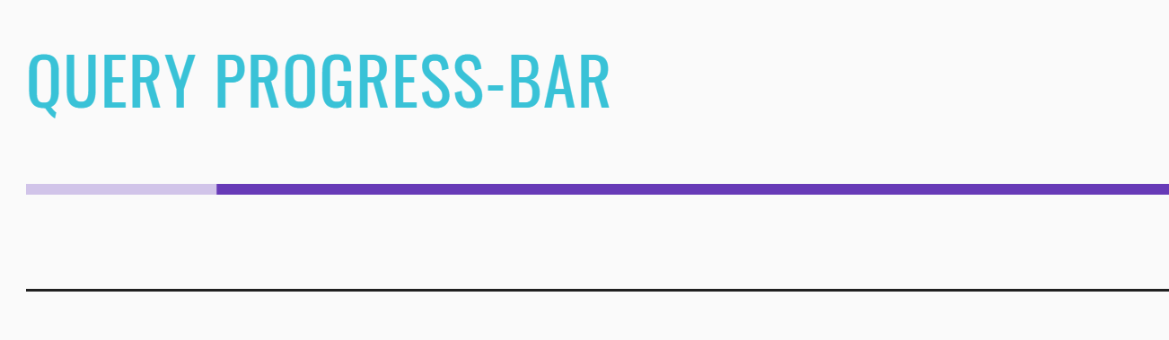
<progress-bar-determinate-example _nghost-pnn-c339="" ng-version="9.1.0">
    <h2 _ngcontent-pnn-c339="" class="example-h2">
        <a _ngcontent-pnn-c339="" href="https://material.angular.io/components/progress-bar/overview#determinate"> Determinate progress-bar </a>
    </h2>
    <mat-progress-bar _ngcontent-pnn-c339="" role="progressbar" aria-valuemin="0" aria-valuemax="100" id="mat-progress-bar-determinate" mode="determinate" value="40" class="mat-progress-bar mat-primary" aria-valuenow="40">
        <svg width="100%" height="4" focusable="false" class="mat-progress-bar-background mat-progress-bar-element">
            <defs>
                <pattern x="4" y="0" width="8" height="4" patternUnits="userSpaceOnUse" id="mat-progress-bar-1">
                    <circle cx="2" cy="2" r="2"/>
                </pattern>
            </defs>
            <rect width="100%" height="100%" fill="url('/jdi-light/angular.html#mat-progress-bar-1')"/>
        </svg>
        <div class="mat-progress-bar-buffer mat-progress-bar-element"/>
        <div class="mat-progress-bar-primary mat-progress-bar-fill mat-progress-bar-element" style="transform: scaleX(0.4);"/>
        <div class="mat-progress-bar-secondary mat-progress-bar-fill mat-progress-bar-element"/>
    </mat-progress-bar>
</progress-bar-determinate-example>
Configurable progress bar:
  //@FindBy(css = "#mat-progress-bar-configurable")
  @UI("#mat-progress-bar-configurable")
  public static ProgressBar matProgressBarConfigurable;

  @Test
  public void verifyBasicConfigurableProgressBarTest() throws Exception {
      matProgressBarConfigurable.shouldBe().displayed();
      matProgressBarConfigurable.show();
      matProgressBarConfigurable.shouldBe().visible();
      matProgressBarConfigurable.has().mode(DETERMINATE);
      matProgressBarConfigurable.has().value(50);
      matProgressBarConfigurable.has().max(100);
      matProgressBarConfigurable.has().min(0);
      matProgressBarConfigurable.has().color(BLUE);
  }
<progress-bar-configurable-example _nghost-pnn-c342="" ng-version="9.1.0"><h2 _ngcontent-pnn-c342="" class="example-h2">Configurable progress bar</h2><mat-card _ngcontent-pnn-c342="" class="mat-card mat-focus-indicator"><mat-card-content _ngcontent-pnn-c342="" class="mat-card-content"><h4 _ngcontent-pnn-c342="">Progress bar configuration</h4><section _ngcontent-pnn-c342="" class="example-section"><label _ngcontent-pnn-c342="" class="example-margin">Color:</label><mat-radio-group _ngcontent-pnn-c342="" role="radiogroup" class="mat-radio-group ng-untouched ng-pristine ng-valid"><mat-radio-button _ngcontent-pnn-c342="" id="progress-bars-primary-color-radio" value="primary" class="mat-radio-button example-margin mat-accent mat-radio-checked" tabindex="-1"><label class="mat-radio-label" for="progress-bars-primary-color-radio-input"><div class="mat-radio-container"><div class="mat-radio-outer-circle"></div><div class="mat-radio-inner-circle"></div><input type="radio" class="mat-radio-input cdk-visually-hidden" id="progress-bars-primary-color-radio-input" tabindex="0" name="mat-radio-group-33" value="primary"><div mat-ripple="" class="mat-ripple mat-radio-ripple mat-focus-indicator"><div class="mat-ripple-element mat-radio-persistent-ripple"></div></div></div><div class="mat-radio-label-content"><span style="display: none;"> </span> Primary </div></label></mat-radio-button><mat-radio-button _ngcontent-pnn-c342="" id="progress-bars-accent-color-radio" value="accent" class="mat-radio-button example-margin mat-accent" tabindex="-1"><label class="mat-radio-label" for="progress-bars-accent-color-radio-input"><div class="mat-radio-container"><div class="mat-radio-outer-circle"></div><div class="mat-radio-inner-circle"></div><input type="radio" class="mat-radio-input cdk-visually-hidden" id="progress-bars-accent-color-radio-input" tabindex="0" name="mat-radio-group-33" value="accent"><div mat-ripple="" class="mat-ripple mat-radio-ripple mat-focus-indicator"><div class="mat-ripple-element mat-radio-persistent-ripple"></div></div></div><div class="mat-radio-label-content"><span style="display: none;"> </span> Accent </div></label></mat-radio-button><mat-radio-button _ngcontent-pnn-c342="" id="progress-bars-warn-color-radio" value="warn" class="mat-radio-button example-margin mat-accent" tabindex="-1"><label class="mat-radio-label" for="progress-bars-warn-color-radio-input"><div class="mat-radio-container"><div class="mat-radio-outer-circle"></div><div class="mat-radio-inner-circle"></div><input type="radio" class="mat-radio-input cdk-visually-hidden" id="progress-bars-warn-color-radio-input" tabindex="0" name="mat-radio-group-33" value="warn"><div mat-ripple="" class="mat-ripple mat-radio-ripple mat-focus-indicator"><div class="mat-ripple-element mat-radio-persistent-ripple"></div></div></div><div class="mat-radio-label-content"><span style="display: none;"> </span> Warn </div></label></mat-radio-button></mat-radio-group></section><section _ngcontent-pnn-c342="" class="example-section"><label _ngcontent-pnn-c342="" class="example-margin">Mode:</label><mat-radio-group _ngcontent-pnn-c342="" role="radiogroup" class="mat-radio-group ng-untouched ng-pristine ng-valid"><mat-radio-button _ngcontent-pnn-c342="" id="progress-bars-determinate-mode-radio" value="determinate" class="mat-radio-button example-margin mat-accent mat-radio-checked" tabindex="-1"><label class="mat-radio-label" for="progress-bars-determinate-mode-radio-input"><div class="mat-radio-container"><div class="mat-radio-outer-circle"></div><div class="mat-radio-inner-circle"></div><input type="radio" class="mat-radio-input cdk-visually-hidden" id="progress-bars-determinate-mode-radio-input" tabindex="0" name="mat-radio-group-37" value="determinate"><div mat-ripple="" class="mat-ripple mat-radio-ripple mat-focus-indicator"><div class="mat-ripple-element mat-radio-persistent-ripple"></div></div></div><div class="mat-radio-label-content"><span style="display: none;"> </span> Determinate </div></label></mat-radio-button><mat-radio-button _ngcontent-pnn-c342="" id="progress-bars-indeterminate-mode-radio" value="indeterminate" class="mat-radio-button example-margin mat-accent" tabindex="-1"><label class="mat-radio-label" for="progress-bars-indeterminate-mode-radio-input"><div class="mat-radio-container"><div class="mat-radio-outer-circle"></div><div class="mat-radio-inner-circle"></div><input type="radio" class="mat-radio-input cdk-visually-hidden" id="progress-bars-indeterminate-mode-radio-input" tabindex="0" name="mat-radio-group-37" value="indeterminate"><div mat-ripple="" class="mat-ripple mat-radio-ripple mat-focus-indicator"><div class="mat-ripple-element mat-radio-persistent-ripple"></div></div></div><div class="mat-radio-label-content"><span style="display: none;"> </span> Indeterminate </div></label></mat-radio-button><mat-radio-button _ngcontent-pnn-c342="" id="progress-bars-buffer-mode-radio" value="buffer" class="mat-radio-button example-margin mat-accent" tabindex="-1"><label class="mat-radio-label" for="progress-bars-buffer-mode-radio-input"><div class="mat-radio-container"><div class="mat-radio-outer-circle"></div><div class="mat-radio-inner-circle"></div><input type="radio" class="mat-radio-input cdk-visually-hidden" id="progress-bars-buffer-mode-radio-input" tabindex="0" name="mat-radio-group-37" value="buffer"><div mat-ripple="" class="mat-ripple mat-radio-ripple mat-focus-indicator"><div class="mat-ripple-element mat-radio-persistent-ripple"></div></div></div><div class="mat-radio-label-content"><span style="display: none;"> </span> Buffer </div></label></mat-radio-button><mat-radio-button _ngcontent-pnn-c342="" id="progress-bars-query-mode-radio" value="query" class="mat-radio-button example-margin mat-accent" tabindex="-1"><label class="mat-radio-label" for="progress-bars-query-mode-radio-input"><div class="mat-radio-container"><div class="mat-radio-outer-circle"></div><div class="mat-radio-inner-circle"></div><input type="radio" class="mat-radio-input cdk-visually-hidden" id="progress-bars-query-mode-radio-input" tabindex="0" name="mat-radio-group-37" value="query"><div mat-ripple="" class="mat-ripple mat-radio-ripple mat-focus-indicator"><div class="mat-ripple-element mat-radio-persistent-ripple"></div></div></div><div class="mat-radio-label-content"><span style="display: none;"> </span> Query </div></label></mat-radio-button></mat-radio-group></section><section _ngcontent-pnn-c342="" class="example-section ng-star-inserted"><label _ngcontent-pnn-c342="" class="example-margin">Progress:</label><mat-slider _ngcontent-pnn-c342="" role="slider" id="progress-bars-progress-slider" class="mat-slider mat-focus-indicator example-margin mat-accent mat-slider-horizontal ng-untouched ng-pristine ng-valid" tabindex="0" aria-disabled="false" aria-valuemax="100" aria-valuemin="0" aria-valuenow="50" aria-orientation="horizontal"><div class="mat-slider-wrapper"><div class="mat-slider-track-wrapper"><div class="mat-slider-track-background" style="transform: translateX(0px) scale3d(0.5, 1, 1);"></div><div class="mat-slider-track-fill" style="transform: translateX(0px) scale3d(0.5, 1, 1);"></div></div><div class="mat-slider-ticks-container" style="transform: translateX(0%);"><div class="mat-slider-ticks" style="background-size: 0% 2px; transform: translateZ(0px) translateX(0%);"></div></div><div class="mat-slider-thumb-container" style="transform: translateX(-50%);"><div class="mat-slider-focus-ring"></div><div class="mat-slider-thumb"></div><div class="mat-slider-thumb-label"><span class="mat-slider-thumb-label-text">50</span></div></div></div></mat-slider></section><!----><!----></mat-card-content></mat-card><mat-card _ngcontent-pnn-c342="" class="mat-card mat-focus-indicator"><mat-card-content _ngcontent-pnn-c342="" class="mat-card-content"><h4 _ngcontent-pnn-c342="">Result</h4><section _ngcontent-pnn-c342="" class="example-section"><mat-progress-bar _ngcontent-pnn-c342="" role="progressbar" aria-valuemin="0" aria-valuemax="100" id="mat-progress-bar-configurable" class="mat-progress-bar example-margin mat-primary" aria-valuenow="50" mode="determinate"><svg width="100%" height="4" focusable="false" class="mat-progress-bar-background mat-progress-bar-element"><defs><pattern x="4" y="0" width="8" height="4" patternUnits="userSpaceOnUse" id="mat-progress-bar-4"><circle cx="2" cy="2" r="2"></circle></pattern></defs><rect width="100%" height="100%" fill="url('/jdi-light/angular.html#mat-progress-bar-4')"></rect></svg><div class="mat-progress-bar-buffer mat-progress-bar-element"></div><div class="mat-progress-bar-primary mat-progress-bar-fill mat-progress-bar-element" style="transform: scaleX(0.5);"></div><div class="mat-progress-bar-secondary mat-progress-bar-fill mat-progress-bar-element"></div></mat-progress-bar></section></mat-card-content></mat-card></progress-bar-configurable-example>
List of the available Progress bar methods:
| Method | Description | Return Type |
|---|---|---|
| is() | Assert action | ProgressBarAssert |
| max() | Get max limit | int |
| min() | Get min limit | int |
| mode() | Get mode value | String |
| value() | Get progress value | int |
| getValue() | Get progress value | String |
| bufferValue() | Assert action | double |
| isVisible() | Check if progress bar is visible | boolean |
Progress bar java tests examples
2.1.11 Slider
Slider overview
Progress bar locates in the following class:
- Java: com.epam.jdi.light.angular.elements.common.Slider
There is 3 different sliders in Angular: Basic, Slider with custom thumb label formatting and Configurable:
Basic slider:
  //@FindBy(css = "#mat-slider-basic")
  @UI("#mat-slider-basic")
  public static Slider matSliderBasic;

  @Test
  public void sliderBasicGetValueTest() {
      matSliderBasic.show();
      matSliderBasic.has().value(0.0);
      matSliderBasic.setupValue(30);
      matSliderBasic.has().value(30.0);
  }
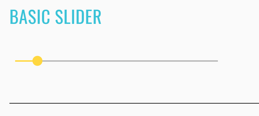
<slider-overview-example _nghost-ret-c263="" ng-version="9.1.0">
    <h2 _ngcontent-ret-c263="" class="example-h2">
        <a _ngcontent-ret-c263="" href="https://material.angular.io/components/slider/overview"> Basic slider </a>
    </h2>
    <mat-slider _ngcontent-ret-c263="" role="slider" id="mat-slider-basic" class="mat-slider mat-focus-indicator mat-accent mat-slider-horizontal mat-slider-min-value" tabindex="0" aria-disabled="false" aria-valuemax="100" aria-valuemin="0" aria-valuenow="0" aria-orientation="horizontal">
        <div class="mat-slider-wrapper">
            <div class="mat-slider-track-wrapper">
                <div class="mat-slider-track-background" style="transform: translateX(7px) scale3d(1, 1, 1);"/>
                <div class="mat-slider-track-fill" style="transform: translateX(-7px) scale3d(0, 1, 1); display: none;"/>
            </div>
            <div class="mat-slider-ticks-container" style="transform: translateX(0%);">
                <div class="mat-slider-ticks" style="background-size: 0% 2px; transform: translateZ(0px) translateX(0%); padding-left: 7px;"/>
            </div>
            <div class="mat-slider-thumb-container" style="transform: translateX(-100%);">
                <div class="mat-slider-focus-ring"/>
                <div class="mat-slider-thumb"/>
                <div class="mat-slider-thumb-label">
                    <span class="mat-slider-thumb-label-text">0</span>
                </div>
            </div>
        </div>
    </mat-slider>
</slider-overview-example>
Slider with custom thumb label formatting:
  //@FindBy(css = "#mat-slider-formatting")
  @UI("#mat-slider-formatting")
  public static Slider matSliderFormatting;

  @Test
  public void sliderFormattingGetValueTest() {
      matSliderFormatting.has().value(1.0);
      matSliderFormatting.show();
      matSliderFormatting.setupValue(2000);
      matSliderFormatting.has().value(2000.0);
  }
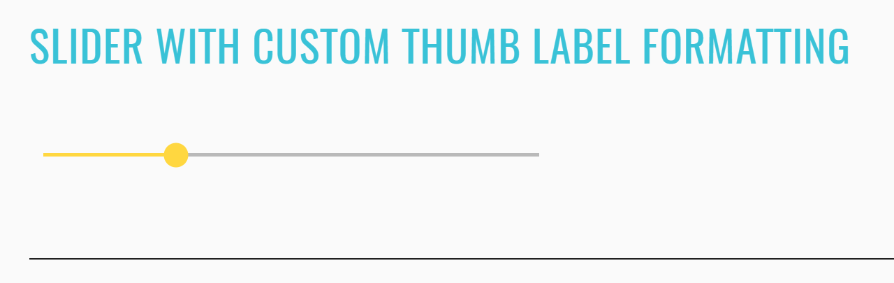
<slider-formatting-example _nghost-ret-c264="" ng-version="9.1.0">
    <h2 _ngcontent-ret-c264="" class="example-h2">
        <a _ngcontent-ret-c264="" href="https://material.angular.io/components/slider/overview#formatting-the-thumb-label"> Slider with custom thumb label formatting </a>
    </h2>
    <mat-slider _ngcontent-ret-c264="" role="slider" id="mat-slider-formatting" thumblabel="" tickinterval="1000" min="1" max="100000" class="mat-slider mat-focus-indicator mat-accent mat-slider-has-ticks mat-slider-horizontal mat-slider-thumb-label-showing mat-slider-min-value" tabindex="0" aria-disabled="false" aria-valuemax="100000" aria-valuemin="1" aria-valuenow="1" aria-orientation="horizontal">
        <div class="mat-slider-wrapper">
            <div class="mat-slider-track-wrapper">
                <div class="mat-slider-track-background" style="transform: translateX(0px) scale3d(1, 1, 1);"/>
                <div class="mat-slider-track-fill" style="transform: translateX(0px) scale3d(0, 1, 1); display: none;"/>
            </div>
            <div class="mat-slider-ticks-container" style="transform: translateX(-0.500005%);">
                <div class="mat-slider-ticks" style="background-size: 1.00001% 2px; transform: translateZ(0px) translateX(0.500005%);"/>
            </div>
            <div class="mat-slider-thumb-container" style="transform: translateX(-100%);">
                <div class="mat-slider-focus-ring"/>
                <div class="mat-slider-thumb"/>
                <div class="mat-slider-thumb-label">
                    <span class="mat-slider-thumb-label-text">1</span>
                </div>
            </div>
        </div>
    </mat-slider>
</slider-formatting-example>
Configurable slider:
  //@FindBy(css = "#mat-slider-configurable")
  @UI("#mat-slider-configurable")
  public static Slider matSliderConfigurable;

  @Test
  public void sliderConfigurableGetValueTest() {
      matSliderConfigurable.has().value(0.0);
      matSliderConfigurable.show();
      matSliderConfigurable.setupValue(60);
      matSliderConfigurable.has().value(60.0);
  }

  @Test
  public void sliderConfigurableSetupValueTest() {
      matSliderConfigurable.show();
      matSliderConfigurable.setupValue(35.5);
      matSliderConfigurable.has().value(35.5);
  }
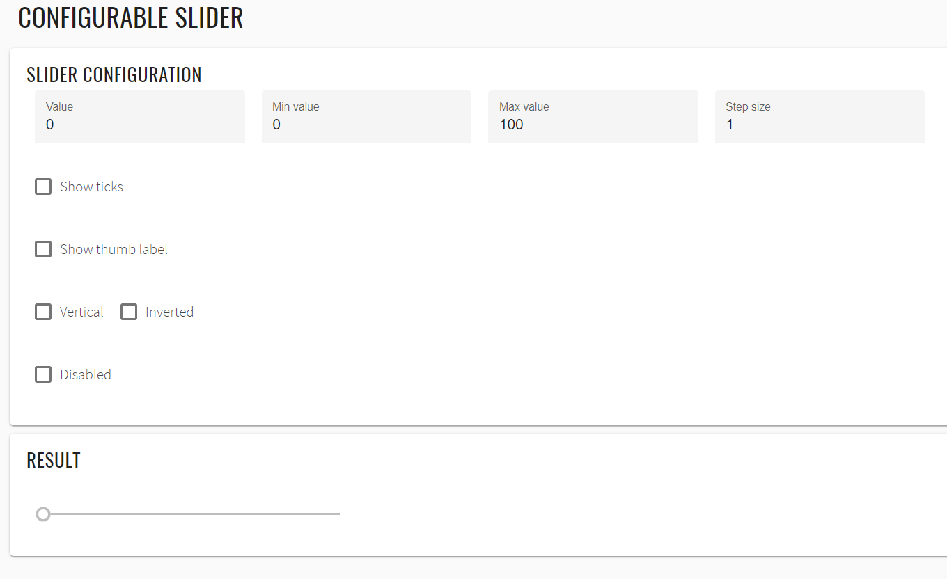
<slider-configurable-example _nghost-ret-c265="" ng-version="9.1.0">
<h2 _ngcontent-ret-c265="" class="example-h2">Configurable slider</h2>
<mat-card _ngcontent-ret-c265="" class="mat-card mat-focus-indicator">
<mat-card-content _ngcontent-ret-c265="" class="mat-card-content">
<h4 _ngcontent-ret-c265="">Slider configuration</h4>
<section _ngcontent-ret-c265="" class="example-section">
<mat-form-field _ngcontent-ret-c265="" class="mat-form-field example-margin ng-tns-c94-55 mat-primary mat-form-field-type-mat-input mat-form-field-appearance-fill mat-form-field-can-float mat-form-field-has-label ng-untouched ng-pristine ng-valid mat-form-field-should-float">
<div class="mat-form-field-wrapper ng-tns-c94-55">
<div class="mat-form-field-flex ng-tns-c94-55">
<div class="mat-form-field-infix ng-tns-c94-55">
<input _ngcontent-ret-c265="" matinput="" type="number" id="slider-configurable-value" class="mat-input-element mat-form-field-autofill-control ng-tns-c94-55 cdk-text-field-autofill-monitored ng-untouched ng-pristine ng-valid" aria-invalid="false" aria-required="false">
<span class="mat-form-field-label-wrapper ng-tns-c94-55">
<label class="mat-form-field-label ng-tns-c94-55 ng-star-inserted" id="mat-form-field-label-85" for="slider-configurable-value" aria-owns="slider-configurable-value">
<mat-label _ngcontent-ret-c265="" class="ng-tns-c94-55 ng-star-inserted">Value</mat-label>
</label>
</span>
</div>
</div>
<div class="mat-form-field-underline ng-tns-c94-55 ng-star-inserted">
<span class="mat-form-field-ripple ng-tns-c94-55"/>
</div>
<div class="mat-form-field-subscript-wrapper ng-tns-c94-55">
<div class="mat-form-field-hint-wrapper ng-tns-c94-55 ng-trigger ng-trigger-transitionMessages ng-star-inserted" style="opacity: 1; transform: translateY(0%);">
<div class="mat-form-field-hint-spacer ng-tns-c94-55"/>
</div>
</div>
</div>
</mat-form-field>
<mat-form-field _ngcontent-ret-c265="" class="mat-form-field example-margin ng-tns-c94-56 mat-primary mat-form-field-type-mat-input mat-form-field-appearance-fill mat-form-field-can-float mat-form-field-has-label ng-untouched ng-pristine ng-valid mat-form-field-should-float">
<div class="mat-form-field-wrapper ng-tns-c94-56">
<div class="mat-form-field-flex ng-tns-c94-56">
<div class="mat-form-field-infix ng-tns-c94-56">
<input _ngcontent-ret-c265="" matinput="" type="number" id="slider-configurable-min" class="mat-input-element mat-form-field-autofill-control ng-tns-c94-56 cdk-text-field-autofill-monitored ng-untouched ng-pristine ng-valid" aria-invalid="false" aria-required="false">
<span class="mat-form-field-label-wrapper ng-tns-c94-56">
<label class="mat-form-field-label ng-tns-c94-56 ng-star-inserted" id="mat-form-field-label-87" for="slider-configurable-min" aria-owns="slider-configurable-min">
<mat-label _ngcontent-ret-c265="" class="ng-tns-c94-56 ng-star-inserted">Min value</mat-label>
</label>
</span>
</div>
</div>
<div class="mat-form-field-underline ng-tns-c94-56 ng-star-inserted">
<span class="mat-form-field-ripple ng-tns-c94-56"/>
</div>
<div class="mat-form-field-subscript-wrapper ng-tns-c94-56">
<div class="mat-form-field-hint-wrapper ng-tns-c94-56 ng-trigger ng-trigger-transitionMessages ng-star-inserted" style="opacity: 1; transform: translateY(0%);">
<div class="mat-form-field-hint-spacer ng-tns-c94-56"/>
</div>
</div>
</div>
</mat-form-field>
<mat-form-field _ngcontent-ret-c265="" class="mat-form-field example-margin ng-tns-c94-57 mat-primary mat-form-field-type-mat-input mat-form-field-appearance-fill mat-form-field-can-float mat-form-field-has-label ng-untouched ng-pristine ng-valid mat-form-field-should-float">
<div class="mat-form-field-wrapper ng-tns-c94-57">
<div class="mat-form-field-flex ng-tns-c94-57">
<div class="mat-form-field-infix ng-tns-c94-57">
<input _ngcontent-ret-c265="" matinput="" type="number" id="slider-configurable-max" class="mat-input-element mat-form-field-autofill-control ng-tns-c94-57 cdk-text-field-autofill-monitored ng-untouched ng-pristine ng-valid" aria-invalid="false" aria-required="false">
<span class="mat-form-field-label-wrapper ng-tns-c94-57">
<label class="mat-form-field-label ng-tns-c94-57 ng-star-inserted" id="mat-form-field-label-89" for="slider-configurable-max" aria-owns="slider-configurable-max">
<mat-label _ngcontent-ret-c265="" class="ng-tns-c94-57 ng-star-inserted">Max value</mat-label>
</label>
</span>
</div>
</div>
<div class="mat-form-field-underline ng-tns-c94-57 ng-star-inserted">
<span class="mat-form-field-ripple ng-tns-c94-57"/>
</div>
<div class="mat-form-field-subscript-wrapper ng-tns-c94-57">
<div class="mat-form-field-hint-wrapper ng-tns-c94-57 ng-trigger ng-trigger-transitionMessages ng-star-inserted" style="opacity: 1; transform: translateY(0%);">
<div class="mat-form-field-hint-spacer ng-tns-c94-57"/>
</div>
</div>
</div>
</mat-form-field>
<mat-form-field _ngcontent-ret-c265="" class="mat-form-field example-margin ng-tns-c94-58 mat-primary mat-form-field-type-mat-input mat-form-field-appearance-fill mat-form-field-can-float mat-form-field-has-label ng-untouched ng-pristine ng-valid mat-form-field-should-float">
<div class="mat-form-field-wrapper ng-tns-c94-58">
<div class="mat-form-field-flex ng-tns-c94-58">
<div class="mat-form-field-infix ng-tns-c94-58">
<input _ngcontent-ret-c265="" matinput="" type="number" id="slider-configurable-step" class="mat-input-element mat-form-field-autofill-control ng-tns-c94-58 cdk-text-field-autofill-monitored ng-untouched ng-pristine ng-valid" aria-invalid="false" aria-required="false">
<span class="mat-form-field-label-wrapper ng-tns-c94-58">
<label class="mat-form-field-label ng-tns-c94-58 ng-star-inserted" id="mat-form-field-label-91" for="slider-configurable-step" aria-owns="slider-configurable-step">
<mat-label _ngcontent-ret-c265="" class="ng-tns-c94-58 ng-star-inserted">Step size</mat-label>
</label>
</span>
</div>
</div>
<div class="mat-form-field-underline ng-tns-c94-58 ng-star-inserted">
<span class="mat-form-field-ripple ng-tns-c94-58"/>
</div>
<div class="mat-form-field-subscript-wrapper ng-tns-c94-58">
<div class="mat-form-field-hint-wrapper ng-tns-c94-58 ng-trigger ng-trigger-transitionMessages ng-star-inserted" style="opacity: 1; transform: translateY(0%);">
<div class="mat-form-field-hint-spacer ng-tns-c94-58"/>
</div>
</div>
</div>
</mat-form-field>
</section>
<section _ngcontent-ret-c265="" class="example-section">
<mat-checkbox _ngcontent-ret-c265="" id="slider-configurable-showTicks" class="mat-checkbox example-margin mat-accent ng-untouched ng-pristine ng-valid">
<label class="mat-checkbox-layout" for="slider-configurable-showTicks-input">
<div class="mat-checkbox-inner-container">
<input type="checkbox" class="mat-checkbox-input cdk-visually-hidden" id="slider-configurable-showTicks-input" tabindex="0" aria-checked="false">
<div matripple="" class="mat-ripple mat-checkbox-ripple mat-focus-indicator">
<div class="mat-ripple-element mat-checkbox-persistent-ripple"/>
</div>
<div class="mat-checkbox-frame"/>
<div class="mat-checkbox-background">
<svg version="1.1" focusable="false" viewBox="0 0 24 24" xml:space="preserve" class="mat-checkbox-checkmark">
<path fill="none" stroke="white" d="M4.1,12.7 9,17.6 20.3,6.3" class="mat-checkbox-checkmark-path"/>
</svg>
<div class="mat-checkbox-mixedmark"/>
</div>
</div>
<span class="mat-checkbox-label">
<span style="display: none;"> </span>Show ticks</span>
</label>
</mat-checkbox>
</section>
<section _ngcontent-ret-c265="" class="example-section">
<mat-checkbox _ngcontent-ret-c265="" id="slider-configurable-thumb-label" class="mat-checkbox example-margin mat-accent ng-untouched ng-pristine ng-valid">
<label class="mat-checkbox-layout" for="slider-configurable-thumb-label-input">
<div class="mat-checkbox-inner-container">
<input type="checkbox" class="mat-checkbox-input cdk-visually-hidden" id="slider-configurable-thumb-label-input" tabindex="0" aria-checked="false">
<div matripple="" class="mat-ripple mat-checkbox-ripple mat-focus-indicator">
<div class="mat-ripple-element mat-checkbox-persistent-ripple"/>
</div>
<div class="mat-checkbox-frame"/>
<div class="mat-checkbox-background">
<svg version="1.1" focusable="false" viewBox="0 0 24 24" xml:space="preserve" class="mat-checkbox-checkmark">
<path fill="none" stroke="white" d="M4.1,12.7 9,17.6 20.3,6.3" class="mat-checkbox-checkmark-path"/>
</svg>
<div class="mat-checkbox-mixedmark"/>
</div>
</div>
<span class="mat-checkbox-label">
<span style="display: none;"> </span>Show thumb label</span>
</label>
</mat-checkbox>
</section>
<section _ngcontent-ret-c265="" class="example-section">
<mat-checkbox _ngcontent-ret-c265="" id="slider-configurable-vertical" class="mat-checkbox example-margin mat-accent ng-untouched ng-pristine ng-valid">
<label class="mat-checkbox-layout" for="slider-configurable-vertical-input">
<div class="mat-checkbox-inner-container">
<input type="checkbox" class="mat-checkbox-input cdk-visually-hidden" id="slider-configurable-vertical-input" tabindex="0" aria-checked="false">
<div matripple="" class="mat-ripple mat-checkbox-ripple mat-focus-indicator">
<div class="mat-ripple-element mat-checkbox-persistent-ripple"/>
</div>
<div class="mat-checkbox-frame"/>
<div class="mat-checkbox-background">
<svg version="1.1" focusable="false" viewBox="0 0 24 24" xml:space="preserve" class="mat-checkbox-checkmark">
<path fill="none" stroke="white" d="M4.1,12.7 9,17.6 20.3,6.3" class="mat-checkbox-checkmark-path"/>
</svg>
<div class="mat-checkbox-mixedmark"/>
</div>
</div>
<span class="mat-checkbox-label">
<span style="display: none;"> </span>Vertical</span>
</label>
</mat-checkbox>
<mat-checkbox _ngcontent-ret-c265="" id="slider-configurable-invert" class="mat-checkbox example-margin mat-accent ng-untouched ng-pristine ng-valid">
<label class="mat-checkbox-layout" for="slider-configurable-invert-input">
<div class="mat-checkbox-inner-container">
<input type="checkbox" class="mat-checkbox-input cdk-visually-hidden" id="slider-configurable-invert-input" tabindex="0" aria-checked="false">
<div matripple="" class="mat-ripple mat-checkbox-ripple mat-focus-indicator">
<div class="mat-ripple-element mat-checkbox-persistent-ripple"/>
</div>
<div class="mat-checkbox-frame"/>
<div class="mat-checkbox-background">
<svg version="1.1" focusable="false" viewBox="0 0 24 24" xml:space="preserve" class="mat-checkbox-checkmark">
<path fill="none" stroke="white" d="M4.1,12.7 9,17.6 20.3,6.3" class="mat-checkbox-checkmark-path"/>
</svg>
<div class="mat-checkbox-mixedmark"/>
</div>
</div>
<span class="mat-checkbox-label">
<span style="display: none;"> </span>Inverted</span>
</label>
</mat-checkbox>
</section>
<section _ngcontent-ret-c265="" class="example-section">
<mat-checkbox _ngcontent-ret-c265="" id="slider-configurable-disabled" class="mat-checkbox example-margin mat-accent ng-untouched ng-pristine ng-valid">
<label class="mat-checkbox-layout" for="slider-configurable-disabled-input">
<div class="mat-checkbox-inner-container">
<input type="checkbox" class="mat-checkbox-input cdk-visually-hidden" id="slider-configurable-disabled-input" tabindex="0" aria-checked="false">
<div matripple="" class="mat-ripple mat-checkbox-ripple mat-focus-indicator">
<div class="mat-ripple-element mat-checkbox-persistent-ripple"/>
</div>
<div class="mat-checkbox-frame"/>
<div class="mat-checkbox-background">
<svg version="1.1" focusable="false" viewBox="0 0 24 24" xml:space="preserve" class="mat-checkbox-checkmark">
<path fill="none" stroke="white" d="M4.1,12.7 9,17.6 20.3,6.3" class="mat-checkbox-checkmark-path"/>
</svg>
<div class="mat-checkbox-mixedmark"/>
</div>
</div>
<span class="mat-checkbox-label">
<span style="display: none;"> </span>Disabled</span>
</label>
</mat-checkbox>
</section>
</mat-card-content>
</mat-card>
<mat-card _ngcontent-ret-c265="" class="mat-card mat-focus-indicator example-result-card">
<mat-card-content _ngcontent-ret-c265="" class="mat-card-content">
<h4 _ngcontent-ret-c265="">Result</h4>
<mat-slider _ngcontent-ret-c265="" role="slider" id="mat-slider-configurable" class="mat-slider mat-focus-indicator example-margin mat-accent mat-slider-horizontal mat-slider-min-value ng-untouched ng-pristine ng-valid" tabindex="0" aria-disabled="false" aria-valuemax="100" aria-valuemin="0" aria-valuenow="0" aria-orientation="horizontal">
<div class="mat-slider-wrapper">
<div class="mat-slider-track-wrapper">
<div class="mat-slider-track-background" style="transform: translateX(7px) scale3d(1, 1, 1);"/>
<div class="mat-slider-track-fill" style="transform: translateX(-7px) scale3d(0, 1, 1); display: none;"/>
</div>
<div class="mat-slider-ticks-container" style="transform: translateX(0%);">
<div class="mat-slider-ticks" style="background-size: 0% 2px; transform: translateZ(0px) translateX(0%); padding-left: 7px;"/>
</div>
<div class="mat-slider-thumb-container" style="transform: translateX(-100%);">
<div class="mat-slider-focus-ring"/>
<div class="mat-slider-thumb"/>
<div class="mat-slider-thumb-label">
<span class="mat-slider-thumb-label-text">0</span>
</div>
</div>
</div>
</mat-slider>
</mat-card-content>
</mat-card>
</slider-configurable-example>
List of the available Slider methods:
| Method | Description | Return Type |
|---|---|---|
| min() | get min limit | double |
| max() | get max limit | double |
| value() | get value | double |
| orientation() | Returns element orientation | String |
| isInverted() | check if inverted | boolean |
| isThumbLabelDisplayed() | is thumblabel displayed | boolean |
| setValue(String) | Set value | void |
| moveRight() | move carriage to right | void |
| moveLeft() | move carriage to left | void |
| isDisabled() | Is disabled | boolean |
| isEnabled() | Is enabled | boolean |
| getValue() | Returns value | String |
| is() | Assert action | SliderAssert |
| has() | Assert action | SliderAssert |
| setupValue(double) | Set value | void |
| slide(double) | Drag & drop based on percentage length | void |
Slider java tests examples
2.1.12 Tooltip
The Angular Material tooltip provides a text label that is displayed when the user hovers over or longpresses an element.
Tooltip overview
Tooltip is located in the following class:
- Java: com.epam.jdi.light.angular.elements.common.Tooltip
//FindBy(css = ".mat-tooltip")
@UI(".mat-tooltip")
public static Tooltip tooltip;
@Test
public void basicTooltipTest() {
basicTooltipButton.hover();
tooltip.has().assertTooltipText("Petit a petit, l’oiseau fait son nid");
}
@Test
public void customPositionTooltipTest() {
Map<String, Tooltip.Position> position = new HashMap<>();
position.put("after", Tooltip.Position.RIGHT);
position.put("before", Tooltip.Position.LEFT);
position.put("above", Tooltip.Position.ABOVE);
position.put("below", Tooltip.Position.BELOW);
position.put("left", Tooltip.Position.LEFT);
position.put("right", Tooltip.Position.RIGHT);
positionTooltipButton.show();
position.forEach(
(k, v) -> {
positionTooltipSelector.click();
(new MaterialSelectorContainer()).select(k);
positionTooltipButton.hover();
tooltip.has().assertTooltipPosition(v, positionTooltipButton);
}
);
}
<button mat-raised-button
matTooltip="Info about the action"
aria-label="Button that displays a tooltip when focused or hovered over">
Action
</button>
| Method | Description | Return Type |
|---|---|---|
| text() | Get text | String |
| color() | Get color | String |
| position(UIBaseElement<?>) | Get position relative to element | Position |
| is() | Assert action | TooltipAssert |
Here you can find Tooltip tests
2.1.13 Spinner
Tooltip overview
Spinner is located in the following class:
- Java: com.epam.jdi.light.angular.elements.common.Spinner
There is 2 different spinners in Angular: Basic and Configurable:
//FindBy(css = "#basic-progress-spinner")
@UI("#basic-progress-spinner")
public static Spinner basicProgressSpinner;
//FindBy(css = "#show-spinner")
@UI("#show-spinner")
public static Button showSpinner;
@Test
public void disappear() {
showSpinner.click();
basicProgressSpinner.waitFor().disappear();
}
@Test
public void baseValidationTest() {
showSpinner.show();
showSpinner.click();
baseValidation(basicProgressSpinner);
}
@Test
public void checkSpinnerHidden() {
showSpinner.click();
basicProgressSpinner.assertThat().hidden();
}
<progress-spinner-overview-example _nghost-prk-c338="" ng-version="9.1.0">
<h2 _ngcontent-prk-c338="" class="example-h2">
<a _ngcontent-prk-c338="" href="https://material.angular.io/components/progress-spinner/overview"> Basic progress-spinner </a>
</h2>
<button _ngcontent-prk-c338="" mat-raised-button="" id="show-spinner" class="mat-focus-indicator mat-raised-button mat-button-base">
<span class="mat-button-wrapper"> Show progress-spinner for 5 seconds
</span>
<div matripple="" class="mat-ripple mat-button-ripple"/>
<div class="mat-button-focus-overlay"/>
</button>
<div _ngcontent-prk-c338="" hidden="">
<mat-spinner _ngcontent-prk-c338="" role="progressbar" mode="indeterminate" id="basic-progress-spinner" class="mat-spinner mat-progress-spinner mat-primary mat-progress-spinner-indeterminate-animation" style="width: 100px; height: 100px;">
<svg preserveAspectRatio="xMidYMid meet" focusable="false" viewBox="0 0 100 100" style="width: 100px; height: 100px;">
<circle cx="50%" cy="50%" r="45" class="ng-star-inserted" style="animation-name: mat-progress-spinner-stroke-rotate-100; stroke-dasharray: 282.743px; stroke-width: 10%;"/>
<!---->
<!---->
</svg>
</mat-spinner>
</div>
</progress-spinner-overview-example>
| Method | Description | Return Type |
|---|---|---|
| is() | Assert action | UIAssert |
| click() | Click action | void |
| isDisplayed() | Check that element is displayed | boolean |
| isHidden() | Check that element is hidden | boolean |
Here you can find Spinner tests
2.2 Angular Complex elements
2.2.1 Radio Buttons
Radio button overview
Element that can be represented with one or more clickable buttons aiming to choose only one button of the group.
Radio buttons locates in the following classes:
- Java: com.epam.jdi.light.angular.elements.complex.RadioButtons.java
There are two different radio buttons types in Angular: Basic radios and Radios with NGmodel.
//FindBy(id = "basic-radio-group")
@UI("basic-radio-group")
public static RadioButtons basicRadioGroup;
//FindBy(id = "season-radio-group")
@UI("season-radio-group")
public static RadioButtons seasonRadioGroup;
//FindBy(id = "your-favorit-season-text")
@UI("your-favorit-season-text")
public static Text yourFavoriteSeasonText;
@Test
public void basicRadioButtonsTest() {
basicRadioGroup.is().displayed();
basicRadioGroup.click("2");
basicRadioGroup.click("1");
basicRadioGroup.click("2");
basicRadioGroup.is().checked("2");
basicRadioGroup.is().notChecked("1");
}
@Test
public void seasonsRadioButtonsTest() {
seasonRadioGroup.is().displayed();
seasonRadioGroup.click(SUMMER);
seasonRadioGroup.click(WINTER);
seasonRadioGroup.click(AUTUMN);
seasonRadioGroup.click(SPRING);
seasonRadioGroup.is().checked(SPRING);
yourFavoriteSeasonText.has().text(format("Your favorite season is: %s", SPRING));
seasonRadioGroup.is().notChecked(WINTER);
seasonRadioGroup.is().notChecked(SUMMER);
seasonRadioGroup.is().notChecked(AUTUMN);
}
<mat-radio-group id="basic-radio-group" aria-label="Select an option">
<mat-radio-button id="{{'radio-option-one'}}" value="1">Option 1</mat-radio-button>
<mat-radio-button id="{{'radio-option-two'}}" value="2">Option 2</mat-radio-button>
</mat-radio-group>
<mat-radio-group id="season-radio-group" aria-labelledby="example-radio-group-label" class="example-radio-group" [(ngModel)]="favoriteSeason">
<mat-radio-button id="{{'favorite-season-' + season.toLowerCase()}}" class="example-radio-button" *ngFor="let season of seasons" [value]="season">
{{season}}
</mat-radio-button>
</mat-radio-group>
| Method | Description | Return Type |
|---|---|---|
| click(String) | Click the button by value | void |
| isChecked(String) | Checks if radio button contain value | boolean |
| is() | Assert action | RadioButtonsAssert |
Here you can find Radio Button tests
2.2.2 List
List overview
List is a container component that wraps and formats a series of line items.
List is located in the following classes:
- Java: com.epam.jdi.light.elements.complex.JList.java
There are two different lists in Angular: Basic list and List with sections.
See an example with HTML code describing basic list element.
//@FindBy(css = "#basic-list mat-list-item")
@UI("#basic-list mat-list-item")
public JList<Label> basicList;
//@FindBy(css = "#list-with-sections mat-list-item")
@UI("#list-with-sections mat-list-item")
public JList<Label> listWithSection;
@Test
public void basicListBasicTest() {
listSection.basicList.is().displayed();
}
@Test
public void basicListTextTest() {
listSection.basicList.get(1).is().text("Item 1");
listSection.basicList.get(2).is().text("Item 2");
listSection.basicList.get(3).is().text("Item 3");
}
@Test
public void listWithSectionsBasicTest() {
listSection.listWithSection.is().displayed();
}
@Test
public void listWithSectionsIconTest() {
listSection.listWithSection.get(1).children().get(3).is().text("folder");
listSection.listWithSection.get(2).children().get(3).is().text("folder");
listSection.listWithSection.get(3).children().get(3).is().text("folder");
listSection.listWithSection.get(4).children().get(3).is().text("note");
listSection.listWithSection.get(5).children().get(3).is().text("note");
}
<mat-list id="basic-list" role="list">
<mat-list-item id="basic-list-item-1" role="listitem">Item 1</mat-list-item>
<mat-list-item id="basic-list-item-2" role="listitem">Item 2</mat-list-item>
<mat-list-item id="basic-list-item-3" role="listitem">Item 3</mat-list-item>
</mat-list>
To add an icon to your list item, use the matListIcon attribute.
Subheader can be added to a list by annotating a heading tag with an matSubheader attribute. To add a divider, use
See an example with HTML code describing list with sections element.
<mat-list id="list-with-sections">
<div mat-subheader>Folders</div>
<mat-list-item id="{{ 'list-with-section-items-' + folder.name.toLowerCase() }}" *ngFor="let folder of folders">
<mat-icon mat-list-icon>folder</mat-icon>
<div mat-line>{{folder.name}}</div>
<div mat-line> {{folder.updated | date}} </div>
</mat-list-item>
<mat-divider></mat-divider>
<div mat-subheader>Notes</div>
<mat-list-item id="{{ 'list-with-section-items-' + note.name.toLowerCase().replace(' ','-') }}" *ngFor="let note of notes">
<mat-icon mat-list-icon>note</mat-icon>
<div mat-line>{{note.name}}</div>
<div mat-line> {{note.updated | date}} </div>
</mat-list-item>
</mat-list>
| Method | Description | Return Type |
|---|---|---|
| is() | Assert action | UISelectAssert |
| is(Matcher<? super List |
Assert action meets condition | UISelectAssert |
| assertThat(Matcher<? super List |
Assert action | UISelectAssert |
| wait(JFunc1 |
wait with condition | boolean |
List java tests examples
2.2.3 Grid list
Grid list overview
Grid list is a two-dimensional list view that arranges cells into grid-based layout.
Grid list is located in the following classes:
- Java: com.epam.jdi.light.elements.complex.JList.java
There are two different grid lists in Angular: Basic grid list and Dynamic grid list.
See an example with HTML code describing basic grid list element.
//@FindBy(css = "#basic-grid-list mat-grid-tile")
@UI("#basic-grid-list mat-grid-tile")
public JList<Label> basicGridList;
//@FindBy(css = "#dynamic-grid-list mat-grid-tile")
@UI("#dynamic-grid-list mat-grid-tile")
public JList<Label> dynamicGridList;
@Test
public void basicGridListBasicTest() {
gridListSection.basicGridList.is().displayed();
}
@Test
public void basicGridListTextTest() {
gridListSection.basicGridList.get(1).is().text("1");
}
@Test
public void basicGridListColorTest() {
gridListSection.basicGridList.get(1)
.has().css("background-color", "rgba(" + 173 + ", " + 216 + ", " + 230 + ", 1)");
}
@Test
public void dynamicGridListBasicTest() {
gridListSection.dynamicGridList.is().displayed();
}
@Test
public void dynamicGridListTextTest() {
gridListSection.dynamicGridList.get(1).is().text("One");
}
@Test
public void dynamicGridListColorTest() {
gridListSection.dynamicGridList.get(1)
.has().css("background-color", "rgba(" + 173 + ", " + 216 + ", " + 230 + ", 1)");
gridListSection.dynamicGridList.get(2)
.has().css("background-color", "rgba(" + 144 + ", " + 238 + ", " + 144 + ", 1)");
gridListSection.dynamicGridList.get(3)
.has().css("background-color", "rgba(" + 255 + ", " + 182 + ", " + 193 + ", 1)");
gridListSection.dynamicGridList.get(4)
.has().css("background-color", "rgba(" + 221 + ", " + 189 + ", " + 241 + ", 1)");
}
See an example with HTML code describing dynamic grid list element.
<mat-grid-list
id="basic-grid-list" cols="2" rowHeight="2:1">
<mat-grid-tile id="basic-grid-list-tile-1">1</mat-grid-tile>
<mat-grid-tile id="basic-grid-list-tile-2">2</mat-grid-tile>
<mat-grid-tile id="basic-grid-list-tile-3">3</mat-grid-tile>
<mat-grid-tile id="basic-grid-list-tile-4">4</mat-grid-tile>
</mat-grid-list>
See an example with HTML code describing dynamic grid list element.
<mat-grid-list id="dynamic-grid-list" cols="4" rowHeight="100px">
<mat-grid-tile
id="{{ 'dynamic-grid-list-' + tile.text.toLowerCase() }}"
*ngFor="let tile of tiles"
[colspan]="tile.cols"
[rowspan]="tile.rows"
[style.background]="tile.color">
{{tile.text}}
</mat-grid-tile>
</mat-grid-list>
| Method | Description | Return Type |
|---|---|---|
| is() | Assert action | UISelectAssert |
| is(Matcher<? super List |
Assert action meets condition | UISelectAssert |
| assertThat(Matcher<? super List |
Assert action | UISelectAssert |
| wait(JFunc1 |
wait with condition | boolean |
Grid list java tests examples
2.2.4 Card
Card overview
Card is a content container for text, photos, and actions in the context of a single subject
Card is located in the following classes:
- Java: com.epam.jdi.light.angular.elements.complex.Card
//FindBy(id = "simple-card")
@UI("#simple-card")
public static Card simpleCard;
//FindBy(id = "example-card")
@UI("#example-card")
public static Card card;
@Test
public void displayedBasicCardTest() {
simpleCard.is().displayed();
card.is().displayed();
}
@Test
public void attributeCardTest() {
simpleCard.is().assertCardText("Simple card");
card.is().assertAltImageAttribute("Photo of a Shiba Inu");
card.is().assertSrcImageAttribute("https://material.angular.io/assets/img/examples/shiba2.jpg");
}
@Test
public void displayedCardTest() {
card.getHeader().is().displayed();
card.getHeaderText().is().displayed();
card.getAvatar().is().displayed();
card.getTitle().is().displayed();
card.getTitle().is().text("Shiba Inu");
card.getSubtitle().is().displayed();
card.getSubtitle().is().text("Dog Breed");
card.getImage().is().displayed();
card.getContent().is().displayed();
card.getContent().is().displayed();
}
<mat-card id="simple-card" class="mat-card mat-focus-indicator">Simple card</mat-card>
| Method | Description | Return Type |
|---|---|---|
| getHeader() | Get header | UIElement |
| getAvatar() | Get avatar | UIElement |
| getHeaderText() | Get header text | UIElement |
| getTitle() | Get title | UIElement |
| getSubtitle() | Get subtitle | UIElement |
| getImage() | Get image | UIElement |
| getContent() | Get content | UIElement |
| getButtons() | Get buttons | UIElement |
| getCardText() | Get card text | UIElement |
| getButtonByText(String) | Get button by text | UIElement |
| getButtonByNumber(int) | Get button by number | UIElement |
| is() | Assert action | CardAssert |
Card java tests examples
2.2.5 Select
Select overview
Selectors are located in the following classes:
- Java: com.epam.jdi.light.angular.elements.complex.MaterialSelector
- Java: com.epam.jdi.light.angular.elements.complex.NativeSelector
There are two similar select elements in Angular: material and native element.
<mat-form-field> is a component used to wrap several Angular Material components and apply common Text field
styles such as the underline, floating label, and hint messages.
Angular Material also supports use of the native <select> element inside of <mat-form-field>. The native
control has several performance, accessibility, and usability advantages.
//@FindBy(css = "#basic-mat-select")
@UI("#basic-mat-select")
public static MaterialSelector basicMatSelect;
@Test
public void checkLabelValue() {
basicMatSelect.label().has().value("Favorite food");
}
@Test
public void checkSelectorExpanded() {
basicMatSelect.expand();
basicMatSelect.is().expanded();
basicMatSelect.collapse();
basicMatSelect.is().collapsed();
}
@Test
public void checkSelectorCollapsed() {
basicMatSelect.collapse();
basicMatSelect.is().collapsed();
}
//@FindBy(css = "#basic-native-select")
@UI("#basic-native-select")
public static NativeSelector basicNativeSelect;
@Test
public void checkPreselectedValue() {
basicNativeSelect.verify().selected(matchesPattern("[a-zA-Z]+"));
}
@Test
public void checkOptionCanBeSelectedByName() {
basicNativeSelect.select(SAAB);
basicNativeSelect.is().selected(SAAB);
}
@Test
public void checkListDisabledOptions() {
basicNativeSelect.has().listDisabled(Collections.EMPTY_LIST);
}
See examples with HTML code describing select elements.
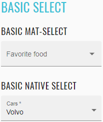
<mat-form-field _ngcontent-nsg-c244="" class="mat-form-field ng-tns-c95-6 mat-primary mat-form-field-type-mat-select mat-form-field-appearance-fill mat-form-field-can-float mat-form-field-has-label mat-form-field-hide-placeholder">
<div class="mat-form-field-wrapper ng-tns-c95-6">
<div class="mat-form-field-flex ng-tns-c95-6">
<div class="mat-form-field-infix ng-tns-c95-6">
<mat-select _ngcontent-nsg-c244="" role="listbox" id="basic-mat-select" class="mat-select ng-tns-c171-7 ng-tns-c95-6 ng-star-inserted mat-select-empty" tabindex="0" aria-labelledby="mat-form-field-label-13" aria-required="false" aria-disabled="false" aria-invalid="false" aria-multiselectable="false">
<div cdk-overlay-origin="" aria-hidden="true" class="mat-select-trigger ng-tns-c171-7">
<div class="mat-select-value ng-tns-c171-7">
<span class="mat-select-placeholder ng-tns-c171-7 ng-star-inserted"> </span>
</div>
<div class="mat-select-arrow-wrapper ng-tns-c171-7">
<div class="mat-select-arrow ng-tns-c171-7"/>
</div>
</div>
</mat-select>
<span class="mat-form-field-label-wrapper ng-tns-c95-6">
<label class="mat-form-field-label ng-tns-c95-6 mat-empty mat-form-field-empty ng-star-inserted" id="mat-form-field-label-13" for="basic-mat-select" aria-owns="basic-mat-select">
<mat-label _ngcontent-nsg-c244="" class="ng-tns-c95-6 ng-star-inserted">Favorite food</mat-label>
</label>
</span>
</div>
</div>
<div class="mat-form-field-underline ng-tns-c95-6 ng-star-inserted">
<span class="mat-form-field-ripple ng-tns-c95-6"/>
</div>
<div class="mat-form-field-subscript-wrapper ng-tns-c95-6">
<div class="mat-form-field-hint-wrapper ng-tns-c95-6 ng-trigger ng-trigger-transitionMessages ng-star-inserted" style="opacity: 1; transform: translateY(0%);">
<div class="mat-form-field-hint-spacer ng-tns-c95-6"/>
</div>
</div>
</div>
</mat-form-field>
<mat-form-field _ngcontent-nsg-c244="" class="mat-form-field ng-tns-c95-8 mat-primary mat-form-field-type-mat-native-select mat-form-field-appearance-fill mat-form-field-can-float mat-form-field-should-float mat-form-field-has-label">
<div class="mat-form-field-wrapper ng-tns-c95-8">
<div class="mat-form-field-flex ng-tns-c95-8">
<div class="mat-form-field-infix ng-tns-c95-8">
<select _ngcontent-nsg-c244="" matnativecontrol="" required="" id="basic-native-select" class="mat-input-element mat-form-field-autofill-control ng-tns-c95-8 cdk-text-field-autofill-monitored" aria-invalid="false" aria-required="true">
<option _ngcontent-nsg-c244="" value="volvo">Volvo</option>
<option _ngcontent-nsg-c244="" value="saab">Saab</option>
<option _ngcontent-nsg-c244="" value="mercedes">Mercedes</option>
<option _ngcontent-nsg-c244="" value="audi">Audi</option>
</select>
<span class="mat-form-field-label-wrapper ng-tns-c95-8">
<label class="mat-form-field-label ng-tns-c95-8 ng-star-inserted" id="mat-form-field-label-15" for="basic-native-select" aria-owns="basic-native-select">
<mat-label _ngcontent-nsg-c244="" class="ng-tns-c95-8 ng-star-inserted">Cars</mat-label>
<span aria-hidden="true" class="mat-placeholder-required mat-form-field-required-marker ng-tns-c95-8 ng-star-inserted"> *</span>
</label>
</span>
</div>
</div>
<div class="mat-form-field-underline ng-tns-c95-8 ng-star-inserted">
<span class="mat-form-field-ripple ng-tns-c95-8"/>
</div>
<div class="mat-form-field-subscript-wrapper ng-tns-c95-8">
<div class="mat-form-field-hint-wrapper ng-tns-c95-8 ng-trigger ng-trigger-transitionMessages ng-star-inserted" style="opacity: 1; transform: translateY(0%);">
<div class="mat-form-field-hint-spacer ng-tns-c95-8"/>
</div>
</div>
</div>
</mat-form-field>
The <mat-select> supports 2-way binding to the value property without the need for Angular forms.
//@FindBy(css = "#two-binding-select")
@UI("#two-binding-select")
public static MaterialSelector twoBindingSelect;
//@FindBy(css = "#select-binding-confirm")
@UI("#select-binding-confirm")
public static Text selectBindingConfirm;
@Test
public void checkLabelValue() {
twoBindingSelect.label().has().value("Select an option");
}
@Test
public void checkOptionCanBeSelectedByNameAndConfirmMessageWillAppear() {
twoBindingSelect.select(OPTION_1);
twoBindingSelect.is().selected(OPTION_1);
selectBindingConfirm.assertThat().text("You selected: option1");
}
@Test
public void checkNoneOptionCanBeSelectedByNameAndConfirmMessageWillBeEmpty() {
twoBindingSelect.select(NONE);
twoBindingSelect.is().selected(matchesPattern("\\W+"));
selectBindingConfirm.assertThat().text("You selected:");
}
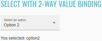
<mat-form-field _ngcontent-nsg-c245="" class="mat-form-field ng-tns-c95-9 mat-primary mat-form-field-type-mat-select mat-form-field-appearance-fill mat-form-field-can-float mat-form-field-has-label mat-form-field-should-float">
<div class="mat-form-field-wrapper ng-tns-c95-9">
<div class="mat-form-field-flex ng-tns-c95-9">
<div class="mat-form-field-infix ng-tns-c95-9">
<mat-select _ngcontent-nsg-c245="" role="listbox" id="two-binding-select" class="mat-select ng-tns-c171-10 ng-tns-c95-9 ng-star-inserted" tabindex="0" aria-labelledby="mat-form-field-label-17" aria-required="false" aria-disabled="false" aria-invalid="false" aria-multiselectable="false">
<div cdk-overlay-origin="" aria-hidden="true" class="mat-select-trigger ng-tns-c171-10">
<div class="mat-select-value ng-tns-c171-10">
<span class="mat-select-value-text ng-tns-c171-10 ng-star-inserted">
<span class="ng-tns-c171-10 ng-star-inserted">Option 2</span>
</span>
</div>
<div class="mat-select-arrow-wrapper ng-tns-c171-10">
<div class="mat-select-arrow ng-tns-c171-10"/>
</div>
</div>
</mat-select>
<span class="mat-form-field-label-wrapper ng-tns-c95-9">
<label class="mat-form-field-label ng-tns-c95-9 ng-star-inserted" id="mat-form-field-label-17" for="two-binding-select" aria-owns="two-binding-select">
<mat-label _ngcontent-nsg-c245="" class="ng-tns-c95-9 ng-star-inserted">Select an option</mat-label>
</label>
</span>
</div>
</div>
<div class="mat-form-field-underline ng-tns-c95-9 ng-star-inserted">
<span class="mat-form-field-ripple ng-tns-c95-9"/>
</div>
<div class="mat-form-field-subscript-wrapper ng-tns-c95-9">
<div class="mat-form-field-hint-wrapper ng-tns-c95-9 ng-trigger ng-trigger-transitionMessages ng-star-inserted" style="opacity: 1; transform: translateY(0%);">
<div class="mat-form-field-hint-spacer ng-tns-c95-9"/>
</div>
</div>
</div>
</mat-form-field>
<p id="select-binding-confirm">You selected: {{selected}}</p>
Both <mat-select> and <select> support all of the form directives from the core FormsModule (NgModel) and
ReactiveFormsModule (FormControl, FormGroup, etc.)
//@FindBy(css = "#form-mat-select")
@UI("#form-mat-select")
public static MaterialSelector formMatSelect;
//@FindBy(css = "#form-mat-select-confirm")
@UI("#form-mat-select-confirm")
public static Text formMatSelectConfirm;
@Test
public void checkLabelValue() {
formMatSelect.label().has().value("Favorite food");
}
@Test
public void checkOptionCanBeSelectedByIndexAndConfirmMessageWillAppear() {
formMatSelect.select(ELEMENT.startIndex + 2);
formMatSelect.is().selected(TACOS);
formMatSelectConfirm.assertThat().text("Selected food: tacos-2");
}
//@FindBy(css = "#form-native-select")
@UI("#form-native-select")
public static NativeSelector formNativeSelect;
//@FindBy(css = "#form-native-select-confirm")
@UI("#form-native-select-confirm")
public static Text formNativeSelectConfirm;
@Test
public void checkLabelValue() {
formMatSelect.label().has().value("Favorite food");
}
@Test
public void checkOptionCanBeSelectedByIndexAndConfirmMessageWillAppear() {
formMatSelect.select(ELEMENT.startIndex + 2);
formMatSelect.is().selected(TACOS);
formMatSelectConfirm.assertThat().text("Selected food: tacos-2");
}
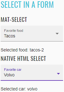
<select-form-example _nghost-nsg-c246="" ng-version="9.1.0">
<h2 _ngcontent-nsg-c246="" class="example-h2">
<a _ngcontent-nsg-c246="" href="https://material.angular.io/components/select/overview#getting-and-setting-the-select-value"> Select in a form </a>
</h2>
<form _ngcontent-nsg-c246="" novalidate="" class="ng-valid ng-touched ng-dirty">
<h4 _ngcontent-nsg-c246="">mat-select</h4>
<mat-form-field _ngcontent-nsg-c246="" class="mat-form-field ng-tns-c95-11 mat-primary mat-form-field-type-mat-select mat-form-field-appearance-fill mat-form-field-can-float mat-form-field-has-label ng-valid mat-form-field-should-float ng-touched ng-dirty">
<div class="mat-form-field-wrapper ng-tns-c95-11">
<div class="mat-form-field-flex ng-tns-c95-11">
<div class="mat-form-field-infix ng-tns-c95-11">
<mat-select _ngcontent-nsg-c246="" role="listbox" name="food" id="form-mat-select" class="mat-select ng-tns-c171-12 ng-tns-c95-11 ng-star-inserted ng-valid ng-touched ng-dirty" tabindex="0" aria-labelledby="mat-form-field-label-19" aria-required="false" aria-disabled="false" aria-invalid="false" aria-multiselectable="false">
<div cdk-overlay-origin="" aria-hidden="true" class="mat-select-trigger ng-tns-c171-12">
<div class="mat-select-value ng-tns-c171-12">
<span class="mat-select-value-text ng-tns-c171-12 ng-star-inserted">
<span class="ng-tns-c171-12 ng-star-inserted">Tacos</span>
</span>
</div>
<div class="mat-select-arrow-wrapper ng-tns-c171-12">
<div class="mat-select-arrow ng-tns-c171-12"/>
</div>
</div>
</mat-select>
<span class="mat-form-field-label-wrapper ng-tns-c95-11">
<label class="mat-form-field-label ng-tns-c95-11 ng-star-inserted" id="mat-form-field-label-19" for="form-mat-select" aria-owns="form-mat-select">
<mat-label _ngcontent-nsg-c246="" class="ng-tns-c95-11 ng-star-inserted">Favorite food</mat-label>
</label>
</span>
</div>
</div>
<div class="mat-form-field-underline ng-tns-c95-11 ng-star-inserted">
<span class="mat-form-field-ripple ng-tns-c95-11"/>
</div>
<div class="mat-form-field-subscript-wrapper ng-tns-c95-11">
<div class="mat-form-field-hint-wrapper ng-tns-c95-11 ng-trigger ng-trigger-transitionMessages ng-star-inserted" style="opacity: 1; transform: translateY(0%);">
<div class="mat-form-field-hint-spacer ng-tns-c95-11"/>
</div>
</div>
</div>
</mat-form-field>
<p _ngcontent-nsg-c246="" id="form-mat-select-confirm"> Selected food: tacos-2 </p>
<h4 _ngcontent-nsg-c246="">native html select</h4>
<mat-form-field _ngcontent-nsg-c246="" class="mat-form-field ng-tns-c95-13 mat-primary mat-form-field-type-mat-native-select mat-form-field-appearance-fill mat-form-field-can-float mat-form-field-has-label ng-valid mat-form-field-should-float ng-dirty ng-touched">
<div class="mat-form-field-wrapper ng-tns-c95-13">
<div class="mat-form-field-flex ng-tns-c95-13">
<div class="mat-form-field-infix ng-tns-c95-13">
<select _ngcontent-nsg-c246="" matnativecontrol="" name="car" id="form-native-select" class="mat-input-element mat-form-field-autofill-control ng-tns-c95-13 cdk-text-field-autofill-monitored ng-valid ng-dirty ng-touched" aria-invalid="false" aria-required="false">
<option _ngcontent-nsg-c246="" value="" selected=""/>
<option _ngcontent-nsg-c246="" value="volvo" class="ng-star-inserted"> Volvo </option>
<option _ngcontent-nsg-c246="" value="saab" class="ng-star-inserted"> Saab </option>
<option _ngcontent-nsg-c246="" value="mercedes" class="ng-star-inserted"> Mercedes </option>
</select>
<span class="mat-form-field-label-wrapper ng-tns-c95-13">
<label class="mat-form-field-label ng-tns-c95-13 ng-star-inserted" id="mat-form-field-label-21" for="form-native-select" aria-owns="form-native-select">
<mat-label _ngcontent-nsg-c246="" class="ng-tns-c95-13 ng-star-inserted">Favorite car</mat-label>
</label>
</span>
</div>
</div>
<div class="mat-form-field-underline ng-tns-c95-13 ng-star-inserted">
<span class="mat-form-field-ripple ng-tns-c95-13"/>
</div>
<div class="mat-form-field-subscript-wrapper ng-tns-c95-13">
<div class="mat-form-field-hint-wrapper ng-tns-c95-13 ng-trigger ng-trigger-transitionMessages ng-star-inserted" style="opacity: 1; transform: translateY(0%);">
<div class="mat-form-field-hint-spacer ng-tns-c95-13"/>
</div>
</div>
</div>
</mat-form-field>
<p _ngcontent-nsg-c246="" id="form-native-select-confirm"> Selected car: volvo </p>
</form>
</select-form-example>
There are a number of <mat-form-field> features that can be used with both <select> and <mat-select>.
These include error messages, hint text, prefix & suffix, and theming.
//@FindBy(css = "#form-mat-feature-select")
@UI("#form-mat-feature-select")
public static MaterialSelector formMatFeatureSelect;
@Test
public void checkLabelValue() {
formMatFeatureSelect.label().has().value("Favorite animal *");
}
@Test
public void checkOptionCanBeSelectedByNameAndHintMessageWillAppear() {
formMatFeatureSelect.select("Fox");
formMatFeatureSelect.is().selected("Fox");
formMatFeatureSelect.hint().assertThat().text("Wa-pa-pa-pa-pa-pa-pow!");
}
@Test
public void checkEmptyOptionCanBeSelectedByNameAndErrorMessageWillAppear() {
formMatFeatureSelect.select("--");
formMatFeatureSelect.is().selected(matchesPattern("\\W+"));
formMatFeatureSelect.error().assertThat().text("Please choose an animal");
}
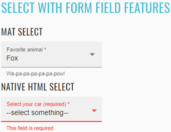
<select-hint-error-example _nghost-nsg-c247="" ng-version="9.1.0">
<h2 _ngcontent-nsg-c247="" class="example-h2">
<a _ngcontent-nsg-c247="" href="https://material.angular.io/components/select/overview#form-field-features"> Select with form field features </a>
</h2>
<h4 _ngcontent-nsg-c247="">mat select</h4>
<mat-form-field _ngcontent-nsg-c247="" class="mat-form-field ng-tns-c95-14 mat-primary mat-form-field-type-mat-select mat-form-field-appearance-fill mat-form-field-can-float mat-form-field-has-label mat-form-field-should-float ng-touched ng-dirty ng-valid">
<div class="mat-form-field-wrapper ng-tns-c95-14">
<div class="mat-form-field-flex ng-tns-c95-14">
<div class="mat-form-field-infix ng-tns-c95-14">
<mat-select _ngcontent-nsg-c247="" role="listbox" required="" id="form-mat-feature-select" class="mat-select ng-tns-c171-15 ng-tns-c95-14 ng-star-inserted mat-select-required ng-touched ng-dirty ng-valid" tabindex="0" aria-labelledby="mat-form-field-label-23" aria-required="true" aria-disabled="false" aria-invalid="false" aria-multiselectable="false" aria-describedby="form-mat-feature-hint">
<div cdk-overlay-origin="" aria-hidden="true" class="mat-select-trigger ng-tns-c171-15">
<div class="mat-select-value ng-tns-c171-15">
<span class="mat-select-value-text ng-tns-c171-15 ng-star-inserted">
<span class="ng-tns-c171-15 ng-star-inserted">Dog</span>
</span>
</div>
<div class="mat-select-arrow-wrapper ng-tns-c171-15">
<div class="mat-select-arrow ng-tns-c171-15"/>
</div>
</div>
</mat-select>
<span class="mat-form-field-label-wrapper ng-tns-c95-14">
<label class="mat-form-field-label ng-tns-c95-14 ng-star-inserted" id="mat-form-field-label-23" for="form-mat-feature-select" aria-owns="form-mat-feature-select">
<mat-label _ngcontent-nsg-c247="" class="ng-tns-c95-14 ng-star-inserted">Favorite animal</mat-label>
<span aria-hidden="true" class="mat-placeholder-required mat-form-field-required-marker ng-tns-c95-14 ng-star-inserted"> *</span>
</label>
</span>
</div>
</div>
<div class="mat-form-field-underline ng-tns-c95-14 ng-star-inserted">
<span class="mat-form-field-ripple ng-tns-c95-14"/>
</div>
<div class="mat-form-field-subscript-wrapper ng-tns-c95-14">
<div class="mat-form-field-hint-wrapper ng-tns-c95-14 ng-trigger ng-trigger-transitionMessages ng-star-inserted" style="opacity: 1; transform: translateY(0%);">
<mat-hint _ngcontent-nsg-c247="" id="form-mat-feature-hint" class="mat-hint ng-tns-c95-14">Woof!</mat-hint>
<div class="mat-form-field-hint-spacer ng-tns-c95-14"/>
</div>
</div>
</div>
</mat-form-field>
<h4 _ngcontent-nsg-c247="">native html select</h4>
<mat-form-field _ngcontent-nsg-c247="" class="mat-form-field ng-tns-c95-16 mat-primary mat-form-field-type-mat-native-select mat-form-field-appearance-fill mat-form-field-can-float mat-form-field-should-float mat-form-field-has-label ng-dirty ng-valid ng-touched">
<div class="mat-form-field-wrapper ng-tns-c95-16">
<div class="mat-form-field-flex ng-tns-c95-16">
<div class="mat-form-field-infix ng-tns-c95-16">
<select _ngcontent-nsg-c247="" matnativecontrol="" required="" id="form-native-feature-select" class="mat-input-element mat-form-field-autofill-control ng-tns-c95-16 cdk-text-field-autofill-monitored ng-dirty ng-valid ng-touched" aria-describedby="form-native-feature-hint" aria-invalid="false" aria-required="true">
<option _ngcontent-nsg-c247="" label="--select something--"/>
<option _ngcontent-nsg-c247="" value="saab">Saab</option>
<option _ngcontent-nsg-c247="" value="mercedes">Mercedes</option>
<option _ngcontent-nsg-c247="" value="audi">Audi</option>
</select>
<span class="mat-form-field-label-wrapper ng-tns-c95-16">
<label class="mat-form-field-label ng-tns-c95-16 ng-star-inserted" id="mat-form-field-label-25" for="form-native-feature-select" aria-owns="form-native-feature-select">
<mat-label _ngcontent-nsg-c247="" class="ng-tns-c95-16 ng-star-inserted">Select your car (required)</mat-label>
<span aria-hidden="true" class="mat-placeholder-required mat-form-field-required-marker ng-tns-c95-16 ng-star-inserted"> *</span>
</label>
</span>
</div>
</div>
<div class="mat-form-field-underline ng-tns-c95-16 ng-star-inserted">
<span class="mat-form-field-ripple ng-tns-c95-16"/>
</div>
<div class="mat-form-field-subscript-wrapper ng-tns-c95-16">
<div class="mat-form-field-hint-wrapper ng-tns-c95-16 ng-trigger ng-trigger-transitionMessages ng-star-inserted" style="opacity: 1; transform: translateY(0%);">
<mat-hint _ngcontent-nsg-c247="" id="form-native-feature-hint" class="mat-hint ng-tns-c95-16">You can pick up your favorite car here</mat-hint>
<div class="mat-form-field-hint-spacer ng-tns-c95-16"/>
</div>
</div>
</div>
</mat-form-field>
</select-hint-error-example>
It is possible to disable the entire select or individual options in the select by using the disabled property on the
<select> or <mat-select> and the <option> or <mat-option> elements respectively.
//@FindBy(css = "#disable-mat-select")
@UI("#disable-mat-select")
public static MaterialSelector disableMatSelect;
//@FindBy(css = "#disable-checkbox-select")
@UI("#disable-checkbox-select")
public static Checkbox disableCheckboxSelect;
@Test
public void checkLabelValue() {
disableMatSelect.label().has().value("Choose an option");
}
@Test
public void verifyCheckboxLabelValue() {
disableCheckboxSelect.label().has().value("Disable select");
}
@Test
public void verifyCheckboxCanDisableSelect() {
pickDisableSelectCheckboxAsChecked();
disableMatSelect.waitFor().attr(ARIA_DISABLED, "true");
}
//@FindBy(css = "#disable-native-select")
@UI("#disable-native-select")
public static NativeSelector disableNativeSelect;
@Test
public void checkLabelValue() {
disableNativeSelect.label().has().value("Choose an option");
}
@Test
public void verifyCheckboxCanDisableSelect() {
pickDisableSelectCheckboxAsChecked();
disableNativeSelect.waitFor().has().attr(DISABLED);
}
@Test
public void checkEnabledOptionCanBeSelectedByIndex() {
pickDisableSelectCheckboxAsUnchecked();
disableNativeSelect.waitFor().displayed();
disableNativeSelect.select(ELEMENT.startIndex + 1);
disableNativeSelect.is().selected(VOLVO);
}
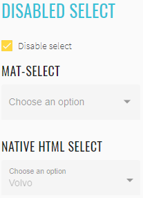
<select-disabled-example _nghost-nsg-c248="" ng-version="9.1.0">
<h2 _ngcontent-nsg-c248="" class="example-h2">
<a _ngcontent-nsg-c248="" href="https://material.angular.io/components/select/overview#disabling-the-select-or-individual-options"> Disabled select </a>
</h2>
<p _ngcontent-nsg-c248="">
<mat-checkbox _ngcontent-nsg-c248="" id="disable-checkbox-select" class="mat-checkbox mat-accent ng-valid ng-dirty ng-touched mat-checkbox-checked">
<label class="mat-checkbox-layout" for="disable-checkbox-select-input">
<div class="mat-checkbox-inner-container">
<input type="checkbox" class="mat-checkbox-input cdk-visually-hidden" id="disable-checkbox-select-input" tabindex="0" aria-checked="true">
<div matripple="" class="mat-ripple mat-checkbox-ripple mat-focus-indicator">
<div class="mat-ripple-element mat-checkbox-persistent-ripple"/>
</div>
<div class="mat-checkbox-frame"/>
<div class="mat-checkbox-background">
<svg version="1.1" focusable="false" viewBox="0 0 24 24" xml:space="preserve" class="mat-checkbox-checkmark">
<path fill="none" stroke="white" d="M4.1,12.7 9,17.6 20.3,6.3" class="mat-checkbox-checkmark-path"/>
</svg>
<div class="mat-checkbox-mixedmark"/>
</div>
</div>
<span class="mat-checkbox-label">
<span style="display: none;"> </span>Disable select</span>
</label>
</mat-checkbox>
</p>
<h4 _ngcontent-nsg-c248="">mat-select</h4>
<mat-form-field _ngcontent-nsg-c248="" class="mat-form-field ng-tns-c95-17 mat-primary mat-form-field-type-mat-select mat-form-field-appearance-fill mat-form-field-can-float mat-form-field-has-label mat-form-field-hide-placeholder mat-form-field-disabled">
<div class="mat-form-field-wrapper ng-tns-c95-17">
<div class="mat-form-field-flex ng-tns-c95-17">
<div class="mat-form-field-infix ng-tns-c95-17">
<mat-select _ngcontent-nsg-c248="" role="listbox" id="disable-mat-select" class="mat-select ng-tns-c171-18 ng-tns-c95-17 ng-star-inserted mat-select-empty mat-select-disabled" tabindex="-1" aria-labelledby="mat-form-field-label-27" aria-required="false" aria-disabled="true" aria-invalid="false" aria-multiselectable="false">
<div cdk-overlay-origin="" aria-hidden="true" class="mat-select-trigger ng-tns-c171-18">
<div class="mat-select-value ng-tns-c171-18">
<span class="mat-select-placeholder ng-tns-c171-18 ng-star-inserted"> </span>
</div>
<div class="mat-select-arrow-wrapper ng-tns-c171-18">
<div class="mat-select-arrow ng-tns-c171-18"/>
</div>
</div>
</mat-select>
<span class="mat-form-field-label-wrapper ng-tns-c95-17">
<label class="mat-form-field-label ng-tns-c95-17 mat-empty mat-form-field-empty ng-star-inserted" id="mat-form-field-label-27" for="disable-mat-select" aria-owns="disable-mat-select">
<mat-label _ngcontent-nsg-c248="" class="ng-tns-c95-17 ng-star-inserted">Choose an option</mat-label>
</label>
</span>
</div>
</div>
<div class="mat-form-field-underline ng-tns-c95-17 ng-star-inserted">
<span class="mat-form-field-ripple ng-tns-c95-17"/>
</div>
<div class="mat-form-field-subscript-wrapper ng-tns-c95-17">
<div class="mat-form-field-hint-wrapper ng-tns-c95-17 ng-trigger ng-trigger-transitionMessages ng-star-inserted" style="opacity: 1; transform: translateY(0%);">
<div class="mat-form-field-hint-spacer ng-tns-c95-17"/>
</div>
</div>
</div>
</mat-form-field>
<h4 _ngcontent-nsg-c248="">native html select</h4>
<mat-form-field _ngcontent-nsg-c248="" class="mat-form-field ng-tns-c95-19 mat-primary mat-form-field-type-mat-native-select mat-form-field-appearance-fill mat-form-field-can-float mat-form-field-has-label mat-form-field-should-float mat-form-field-disabled">
<div class="mat-form-field-wrapper ng-tns-c95-19">
<div class="mat-form-field-flex ng-tns-c95-19">
<div class="mat-form-field-infix ng-tns-c95-19">
<select _ngcontent-nsg-c248="" matnativecontrol="" id="disable-native-select" class="mat-input-element mat-form-field-autofill-control ng-tns-c95-19 cdk-text-field-autofill-monitored" aria-invalid="false" aria-required="false" disabled="">
<option _ngcontent-nsg-c248="" value="" selected="" disabled=""/>
<option _ngcontent-nsg-c248="" value="volvo">Volvo</option>
<option _ngcontent-nsg-c248="" value="saab" disabled="">Saab</option>
<option _ngcontent-nsg-c248="" value="mercedes">Mercedes</option>
<option _ngcontent-nsg-c248="" value="audi">Audi</option>
</select>
<span class="mat-form-field-label-wrapper ng-tns-c95-19">
<label class="mat-form-field-label ng-tns-c95-19 ng-star-inserted" id="mat-form-field-label-29" for="disable-native-select" aria-owns="disable-native-select">
<mat-label _ngcontent-nsg-c248="" class="ng-tns-c95-19 ng-star-inserted">Choose an option</mat-label>
</label>
</span>
</div>
</div>
<div class="mat-form-field-underline ng-tns-c95-19 ng-star-inserted">
<span class="mat-form-field-ripple ng-tns-c95-19"/>
</div>
<div class="mat-form-field-subscript-wrapper ng-tns-c95-19">
<div class="mat-form-field-hint-wrapper ng-tns-c95-19 ng-trigger ng-trigger-transitionMessages ng-star-inserted" style="opacity: 1; transform: translateY(0%);">
<div class="mat-form-field-hint-spacer ng-tns-c95-19"/>
</div>
</div>
</div>
</mat-form-field>
</select-disabled-example>
If you want one of your options to reset the select's value, you can omit specifying its value.
//@FindBy(css = "#reset-mat-select")
@UI("#reset-mat-select")
public static MaterialSelector resetMatSelect;
@Test
public void checkLabelValue() {
resetMatSelect.label().has().value("State");
}
@Test
public void checkResetOptionCanBeSelectedById() {
resetMatSelect.select(ELEMENT.startIndex);
resetMatSelect.is().selected(matchesPattern("\\W+"));
}
@Test
public void checkEnabledOptionCanBeSelectedByName() {
resetMatSelect.select("Montana");
resetMatSelect.is().selected("Montana");
}
@Test
public void checkListDisabledOptions() {
resetMatSelect.has().listDisabled();
}
//@FindBy(css = "#reset-native-select")
@UI("#reset-native-select")
public static NativeSelector resetNativeSelect;
@Test
public void checkLabelValue() {
resetNativeSelect.label().has().value("Select your car");
}
@Test
public void checkResetOptionCanBeSelectedById() {
resetNativeSelect.select(ELEMENT.startIndex);
resetNativeSelect.is().selected(matchesPattern("\\W*"));
}
@Test
public void checkEnabledOptionCanBeSelectedByName() {
resetNativeSelect.select(AUDI);
resetNativeSelect.is().selected(AUDI);
}
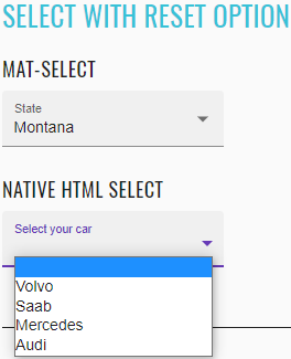
<select-reset-example _nghost-nsg-c249="" ng-version="9.1.0">
<h2 _ngcontent-nsg-c249="" class="example-h2">
<a _ngcontent-nsg-c249="" href="https://material.angular.io/components/select/overview#resetting-the-select-value"> Select with reset option </a>
</h2>
<h4 _ngcontent-nsg-c249="">mat-select</h4>
<mat-form-field _ngcontent-nsg-c249="" class="mat-form-field ng-tns-c95-20 mat-primary mat-form-field-type-mat-select mat-form-field-appearance-fill mat-form-field-can-float mat-form-field-has-label mat-form-field-should-float">
<div class="mat-form-field-wrapper ng-tns-c95-20">
<div class="mat-form-field-flex ng-tns-c95-20">
<div class="mat-form-field-infix ng-tns-c95-20">
<mat-select _ngcontent-nsg-c249="" role="listbox" id="reset-mat-select" class="mat-select ng-tns-c171-21 ng-tns-c95-20 ng-star-inserted" tabindex="0" aria-labelledby="mat-form-field-label-31" aria-required="false" aria-disabled="false" aria-invalid="false" aria-multiselectable="false">
<div cdk-overlay-origin="" aria-hidden="true" class="mat-select-trigger ng-tns-c171-21">
<div class="mat-select-value ng-tns-c171-21">
<span class="mat-select-value-text ng-tns-c171-21 ng-star-inserted">
<span class="ng-tns-c171-21 ng-star-inserted">Montana</span>
</span>
</div>
<div class="mat-select-arrow-wrapper ng-tns-c171-21">
<div class="mat-select-arrow ng-tns-c171-21"/>
</div>
</div>
</mat-select>
<span class="mat-form-field-label-wrapper ng-tns-c95-20">
<label class="mat-form-field-label ng-tns-c95-20 ng-star-inserted" id="mat-form-field-label-31" for="reset-mat-select" aria-owns="reset-mat-select">
<mat-label _ngcontent-nsg-c249="" class="ng-tns-c95-20 ng-star-inserted">State</mat-label>
</label>
</span>
</div>
</div>
<div class="mat-form-field-underline ng-tns-c95-20 ng-star-inserted">
<span class="mat-form-field-ripple ng-tns-c95-20"/>
</div>
<div class="mat-form-field-subscript-wrapper ng-tns-c95-20">
<div class="mat-form-field-hint-wrapper ng-tns-c95-20 ng-trigger ng-trigger-transitionMessages ng-star-inserted" style="opacity: 1; transform: translateY(0%);">
<div class="mat-form-field-hint-spacer ng-tns-c95-20"/>
</div>
</div>
</div>
</mat-form-field>
<h4 _ngcontent-nsg-c249="">native html select</h4>
<mat-form-field _ngcontent-nsg-c249="" class="mat-form-field ng-tns-c95-22 mat-primary mat-form-field-type-mat-native-select mat-form-field-appearance-fill mat-form-field-can-float mat-form-field-has-label mat-form-field-hide-placeholder">
<div class="mat-form-field-wrapper ng-tns-c95-22">
<div class="mat-form-field-flex ng-tns-c95-22">
<div class="mat-form-field-infix ng-tns-c95-22">
<select _ngcontent-nsg-c249="" matnativecontrol="" id="reset-native-select" class="mat-input-element mat-form-field-autofill-control ng-tns-c95-22 cdk-text-field-autofill-monitored" aria-invalid="false" aria-required="false">
<option _ngcontent-nsg-c249="" value="" selected=""/>
<option _ngcontent-nsg-c249="" value="volvo">Volvo</option>
<option _ngcontent-nsg-c249="" value="saab">Saab</option>
<option _ngcontent-nsg-c249="" value="mercedes">Mercedes</option>
<option _ngcontent-nsg-c249="" value="audi">Audi</option>
</select>
<span class="mat-form-field-label-wrapper ng-tns-c95-22">
<label class="mat-form-field-label ng-tns-c95-22 mat-empty mat-form-field-empty ng-star-inserted" id="mat-form-field-label-33" for="reset-native-select" aria-owns="reset-native-select">
<mat-label _ngcontent-nsg-c249="" class="ng-tns-c95-22 ng-star-inserted">Select your car</mat-label>
</label>
</span>
</div>
</div>
<div class="mat-form-field-underline ng-tns-c95-22 ng-star-inserted">
<span class="mat-form-field-ripple ng-tns-c95-22"/>
</div>
<div class="mat-form-field-subscript-wrapper ng-tns-c95-22">
<div class="mat-form-field-hint-wrapper ng-tns-c95-22 ng-trigger ng-trigger-transitionMessages ng-star-inserted" style="opacity: 1; transform: translateY(0%);">
<div class="mat-form-field-hint-spacer ng-tns-c95-22"/>
</div>
</div>
</div>
</mat-form-field>
</select-reset-example>
The <mat-optgroup> element can be used to group common options under a subheading. The name of the group can be
set using the label property of <mat-optgroup>.
//@FindBy(css = "#option-groups-mat-select")
@UI("#option-groups-mat-select")
public static MaterialSelector optionGroupsMatSelect;
@Test
public void checkLabelValue() {
optionGroupsMatSelect.label().has().value("Pokemon");
}
@Test
public void checkNoneOptionCanBeSelectedById() {
optionGroupsMatSelect.select(ELEMENT.startIndex);
optionGroupsMatSelect.is().selected(matchesPattern("\\W+"));
}
@Test
public void checkEnabledOptionCanBeSelectedByName() {
optionGroupsMatSelect.select(ODDISH);
optionGroupsMatSelect.is().selected(ODDISH);
}
//@FindBy(css = "#option-groups-native-select")
@UI("#option-groups-native-select")
public static NativeSelector optionGroupsNativeSelect;
@Test
public void checkLabelValue() {
optionGroupsNativeSelect.label().has().value("Cars");
}
@Test
public void checkEnabledOptionCanBeSelectedByName() {
optionGroupsNativeSelect.select(SAAB);
optionGroupsNativeSelect.is().selected(SAAB);
}
@Test
public void checkListDisabledOptions() {
optionGroupsNativeSelect.has().listDisabled();
}
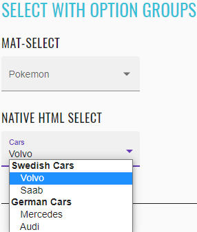
<select-optgroup-example _nghost-nsg-c250="" ng-version="9.1.0">
<h2 _ngcontent-nsg-c250="" class="example-h2">
<a _ngcontent-nsg-c250="" href="https://material.angular.io/components/select/overview#creating-groups-of-options"> Select with option groups </a>
</h2>
<h4 _ngcontent-nsg-c250="">mat-select</h4>
<mat-form-field _ngcontent-nsg-c250="" class="mat-form-field ng-tns-c95-23 mat-primary mat-form-field-type-mat-select mat-form-field-appearance-fill mat-form-field-can-float mat-form-field-has-label mat-form-field-hide-placeholder ng-untouched ng-pristine ng-valid">
<div class="mat-form-field-wrapper ng-tns-c95-23">
<div class="mat-form-field-flex ng-tns-c95-23">
<div class="mat-form-field-infix ng-tns-c95-23">
<mat-select _ngcontent-nsg-c250="" role="listbox" id="option-groups-mat-select" class="mat-select ng-tns-c171-24 ng-tns-c95-23 ng-star-inserted mat-select-empty ng-untouched ng-pristine ng-valid" tabindex="0" aria-labelledby="mat-form-field-label-35" aria-required="false" aria-disabled="false" aria-invalid="false" aria-multiselectable="false">
<div cdk-overlay-origin="" aria-hidden="true" class="mat-select-trigger ng-tns-c171-24">
<div class="mat-select-value ng-tns-c171-24">
<span class="mat-select-placeholder ng-tns-c171-24 ng-star-inserted"> </span>
</div>
<div class="mat-select-arrow-wrapper ng-tns-c171-24">
<div class="mat-select-arrow ng-tns-c171-24"/>
</div>
</div>
</mat-select>
<span class="mat-form-field-label-wrapper ng-tns-c95-23">
<label class="mat-form-field-label ng-tns-c95-23 mat-empty mat-form-field-empty ng-star-inserted" id="mat-form-field-label-35" for="option-groups-mat-select" aria-owns="option-groups-mat-select">
<mat-label _ngcontent-nsg-c250="" class="ng-tns-c95-23 ng-star-inserted">Pokemon</mat-label>
</label>
</span>
</div>
</div>
<div class="mat-form-field-underline ng-tns-c95-23 ng-star-inserted">
<span class="mat-form-field-ripple ng-tns-c95-23"/>
</div>
<div class="mat-form-field-subscript-wrapper ng-tns-c95-23">
<div class="mat-form-field-hint-wrapper ng-tns-c95-23 ng-trigger ng-trigger-transitionMessages ng-star-inserted" style="opacity: 1; transform: translateY(0%);">
<div class="mat-form-field-hint-spacer ng-tns-c95-23"/>
</div>
</div>
</div>
</mat-form-field>
<h4 _ngcontent-nsg-c250="">native html select</h4>
<mat-form-field _ngcontent-nsg-c250="" class="mat-form-field ng-tns-c95-25 mat-primary mat-form-field-type-mat-native-select mat-form-field-appearance-fill mat-form-field-can-float mat-form-field-should-float mat-form-field-has-label">
<div class="mat-form-field-wrapper ng-tns-c95-25">
<div class="mat-form-field-flex ng-tns-c95-25">
<div class="mat-form-field-infix ng-tns-c95-25">
<select _ngcontent-nsg-c250="" matnativecontrol="" id="option-groups-native-select" class="mat-input-element mat-form-field-autofill-control ng-tns-c95-25 cdk-text-field-autofill-monitored" aria-invalid="false" aria-required="false">
<optgroup _ngcontent-nsg-c250="" label="Swedish Cars">
<option _ngcontent-nsg-c250="" value="volvo">Volvo</option>
<option _ngcontent-nsg-c250="" value="saab">Saab</option>
</optgroup>
<optgroup _ngcontent-nsg-c250="" label="German Cars">
<option _ngcontent-nsg-c250="" value="mercedes">Mercedes</option>
<option _ngcontent-nsg-c250="" value="audi">Audi</option>
</optgroup>
</select>
<span class="mat-form-field-label-wrapper ng-tns-c95-25">
<label class="mat-form-field-label ng-tns-c95-25 ng-star-inserted" id="mat-form-field-label-37" for="option-groups-native-select" aria-owns="option-groups-native-select">
<mat-label _ngcontent-nsg-c250="" class="ng-tns-c95-25 ng-star-inserted">Cars</mat-label>
</label>
</span>
</div>
</div>
<div class="mat-form-field-underline ng-tns-c95-25 ng-star-inserted">
<span class="mat-form-field-ripple ng-tns-c95-25"/>
</div>
<div class="mat-form-field-subscript-wrapper ng-tns-c95-25">
<div class="mat-form-field-hint-wrapper ng-tns-c95-25 ng-trigger ng-trigger-transitionMessages ng-star-inserted" style="opacity: 1; transform: translateY(0%);">
<div class="mat-form-field-hint-spacer ng-tns-c95-25"/>
</div>
</div>
</div>
</mat-form-field>
</select-optgroup-example>
//@FindBy(css = "#multiple-select")
@UI("#multiple-select")
public static MaterialSelector multipleSelect;
@Test
public void checkLabelValue() {
multipleSelect.label().has().value("Toppings");
}
@Test
public void checkSingleOptionCanBeSelectedById() {
multiSelect[0] = 3;
multipleSelect.multipleSelect(multiSelect);
multipleSelect.is().selected(ONION);
}
@Test(enabled = false)
// ONION option is selected from previous test
// unselectAll doesn't work
public void checkThreeOptionsCanBeSelectedByName() {
multiOptions[0] = EXTRA_CHEESE;
multiOptions[1] = PEPPERONI;
multiOptions[2] = TOMATO;
multipleSelect.multipleSelect(multiOptions);
multipleSelect.is().selected(multiOptions[0] + ", " + multiOptions[1] + ", " + multiOptions[2]);
}
<mat-select> defaults to single-selection mode, but can be configured to allow multiple selection by setting the
multiple property. This will allow the user to select multiple values at once. When using the <mat-select> in
multiple selection mode, its value will be a sorted list of all selected values rather than a single value.
<select-multiple-example _nghost-nsg-c251="" ng-version="9.1.0">
<h2 _ngcontent-nsg-c251="" class="example-h2">
<a _ngcontent-nsg-c251="" href="https://material.angular.io/components/select/overview#multiple-selection"> Select with multiple selection </a>
</h2>
<mat-form-field _ngcontent-nsg-c251="" class="mat-form-field ng-tns-c95-26 mat-primary mat-form-field-type-mat-select mat-form-field-appearance-fill mat-form-field-can-float mat-form-field-has-label mat-form-field-hide-placeholder ng-untouched ng-pristine ng-valid">
<div class="mat-form-field-wrapper ng-tns-c95-26">
<div class="mat-form-field-flex ng-tns-c95-26">
<div class="mat-form-field-infix ng-tns-c95-26">
<mat-select _ngcontent-nsg-c251="" role="listbox" multiple="" id="multiple-select" class="mat-select ng-tns-c171-27 ng-tns-c95-26 ng-star-inserted mat-select-empty ng-untouched ng-pristine ng-valid" tabindex="0" aria-labelledby="mat-form-field-label-39" aria-required="false" aria-disabled="false" aria-invalid="false" aria-multiselectable="true">
<div cdk-overlay-origin="" aria-hidden="true" class="mat-select-trigger ng-tns-c171-27">
<div class="mat-select-value ng-tns-c171-27">
<span class="mat-select-placeholder ng-tns-c171-27 ng-star-inserted"> </span>
</div>
<div class="mat-select-arrow-wrapper ng-tns-c171-27">
<div class="mat-select-arrow ng-tns-c171-27"/>
</div>
</div>
</mat-select>
<span class="mat-form-field-label-wrapper ng-tns-c95-26">
<label class="mat-form-field-label ng-tns-c95-26 mat-empty mat-form-field-empty ng-star-inserted" id="mat-form-field-label-39" for="multiple-select" aria-owns="multiple-select">
<mat-label _ngcontent-nsg-c251="" class="ng-tns-c95-26 ng-star-inserted">Toppings</mat-label>
</label>
</span>
</div>
</div>
<div class="mat-form-field-underline ng-tns-c95-26 ng-star-inserted">
<span class="mat-form-field-ripple ng-tns-c95-26"/>
</div>
<div class="mat-form-field-subscript-wrapper ng-tns-c95-26">
<div class="mat-form-field-hint-wrapper ng-tns-c95-26 ng-trigger ng-trigger-transitionMessages ng-star-inserted" style="opacity: 1; transform: translateY(0%);">
<div class="mat-form-field-hint-spacer ng-tns-c95-26"/>
</div>
</div>
</div>
</mat-form-field>
</select-multiple-example>
If you want to display a custom trigger label inside a <mat-select>, you can use the <mat-select-trigger>
element.
//@FindBy(css = "#custom-trigger-text-select")
@UI("#custom-trigger-text-select")
public static MaterialSelector customTriggerTextSelect;
@Test
public void checkLabelValue() {
customTriggerTextSelect.label().has().value("Toppings");
}
@Test
public void checkOptionCanBeSelectedByName() {
multiOptions[0] = SAUSAGE;
customTriggerTextSelect.multipleSelect(multiOptions);
customTriggerTextSelect.is().selected(multiOptions[0]);
}
@Test
public void checkAllOptionsCanBeSelectedById() {
multiSelect = new int[] {1, 2, 3, 4, 5, 6};
customTriggerTextSelect.multipleSelect(multiSelect);
customTriggerTextSelect.verify().selected(EXTRA_CHEESE + " (+5 others)");
}
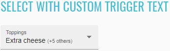
<select-custom-trigger-example _nghost-nsg-c252="" ng-version="9.1.0">
<h2 _ngcontent-nsg-c252="" class="example-h2">
<a _ngcontent-nsg-c252="" href=""> Select with custom trigger text </a>
</h2>
<mat-form-field _ngcontent-nsg-c252="" class="mat-form-field ng-tns-c95-28 mat-primary mat-form-field-type-mat-select mat-form-field-appearance-fill mat-form-field-can-float mat-form-field-has-label ng-valid mat-form-field-should-float ng-dirty ng-touched">
<div class="mat-form-field-wrapper ng-tns-c95-28">
<div class="mat-form-field-flex ng-tns-c95-28">
<div class="mat-form-field-infix ng-tns-c95-28">
<mat-select _ngcontent-nsg-c252="" role="listbox" multiple="" id="custom-trigger-text-select" class="mat-select ng-tns-c171-29 ng-tns-c95-28 ng-star-inserted ng-valid ng-dirty ng-touched" tabindex="0" aria-labelledby="mat-form-field-label-41" aria-required="false" aria-disabled="false" aria-invalid="false" aria-multiselectable="true">
<div cdk-overlay-origin="" aria-hidden="true" class="mat-select-trigger ng-tns-c171-29">
<div class="mat-select-value ng-tns-c171-29">
<span class="mat-select-value-text ng-tns-c171-29 ng-star-inserted">
<mat-select-trigger _ngcontent-nsg-c252="" class="ng-tns-c171-29 ng-star-inserted"> Extra cheese <span _ngcontent-nsg-c252="" class="example-additional-selection ng-star-inserted"> (+5 others) </span>
</mat-select-trigger>
</span>
</div>
<div class="mat-select-arrow-wrapper ng-tns-c171-29">
<div class="mat-select-arrow ng-tns-c171-29"/>
</div>
</div>
</mat-select>
<span class="mat-form-field-label-wrapper ng-tns-c95-28">
<label class="mat-form-field-label ng-tns-c95-28 ng-star-inserted" id="mat-form-field-label-41" for="custom-trigger-text-select" aria-owns="custom-trigger-text-select">
<mat-label _ngcontent-nsg-c252="" class="ng-tns-c95-28 ng-star-inserted">Toppings</mat-label>
</label>
</span>
</div>
</div>
<div class="mat-form-field-underline ng-tns-c95-28 ng-star-inserted">
<span class="mat-form-field-ripple ng-tns-c95-28"/>
</div>
<div class="mat-form-field-subscript-wrapper ng-tns-c95-28">
<div class="mat-form-field-hint-wrapper ng-tns-c95-28 ng-trigger ng-trigger-transitionMessages ng-star-inserted" style="opacity: 1; transform: translateY(0%);">
<div class="mat-form-field-hint-spacer ng-tns-c95-28"/>
</div>
</div>
</div>
</mat-form-field>
</select-custom-trigger-example>
By default, when a user clicks on a <mat-option>, a ripple animation is shown. This can be disabled by setting the
disableRipple property on <mat-select>.
//@FindBy(css = "#no-option-ripple-select")
@UI("#no-option-ripple-select")
public static MaterialSelector noOptionRippleSelect;
@Test
public void checkLabelValue() {
noOptionRippleSelect.label().has().value("Select an option");
}
@Test
public void checkOptionCanBeSelectedByName() {
noOptionRippleSelect.select(OPTION_1);
noOptionRippleSelect.is().selected(OPTION_1);
}
@Test
public void checkListDisabledOptions() {
noOptionRippleSelect.has().listDisabled();
}
<select-no-ripple-example _nghost-nsg-c253="" ng-version="9.1.0">
<h2 _ngcontent-nsg-c253="" class="example-h2">
<a _ngcontent-nsg-c253="" href="https://material.angular.io/components/select/overview#disabling-the-ripple-effect"> Select with no option ripple </a>
</h2>
<mat-form-field _ngcontent-nsg-c253="" class="mat-form-field ng-tns-c95-30 mat-primary mat-form-field-type-mat-select mat-form-field-appearance-fill mat-form-field-can-float mat-form-field-has-label mat-form-field-hide-placeholder">
<div class="mat-form-field-wrapper ng-tns-c95-30">
<div class="mat-form-field-flex ng-tns-c95-30">
<div class="mat-form-field-infix ng-tns-c95-30">
<mat-select _ngcontent-nsg-c253="" role="listbox" disableripple="" id="no-option-ripple-select" class="mat-select ng-tns-c171-31 ng-tns-c95-30 ng-star-inserted mat-select-empty" tabindex="0" aria-labelledby="mat-form-field-label-43" aria-required="false" aria-disabled="false" aria-invalid="false" aria-multiselectable="false">
<div cdk-overlay-origin="" aria-hidden="true" class="mat-select-trigger ng-tns-c171-31">
<div class="mat-select-value ng-tns-c171-31">
<span class="mat-select-placeholder ng-tns-c171-31 ng-star-inserted"> </span>
</div>
<div class="mat-select-arrow-wrapper ng-tns-c171-31">
<div class="mat-select-arrow ng-tns-c171-31"/>
</div>
</div>
</mat-select>
<span class="mat-form-field-label-wrapper ng-tns-c95-30">
<label class="mat-form-field-label ng-tns-c95-30 mat-empty mat-form-field-empty ng-star-inserted" id="mat-form-field-label-43" for="no-option-ripple-select" aria-owns="no-option-ripple-select">
<mat-label _ngcontent-nsg-c253="" class="ng-tns-c95-30 ng-star-inserted">Select an option</mat-label>
</label>
</span>
</div>
</div>
<div class="mat-form-field-underline ng-tns-c95-30 ng-star-inserted">
<span class="mat-form-field-ripple ng-tns-c95-30"/>
</div>
<div class="mat-form-field-subscript-wrapper ng-tns-c95-30">
<div class="mat-form-field-hint-wrapper ng-tns-c95-30 ng-trigger ng-trigger-transitionMessages ng-star-inserted" style="opacity: 1; transform: translateY(0%);">
<div class="mat-form-field-hint-spacer ng-tns-c95-30"/>
</div>
</div>
</div>
</mat-form-field>
</select-no-ripple-example>
//@FindBy(css = "#custom-panel-styling-select")
@UI("#custom-panel-styling-select")
public static MaterialSelector customPanelStylingSelect;
@Test
public void checkLabelValue() {
customPanelStylingSelect.label().has().value("Panel color");
}
@Test
public void checkRedOptionCanBeSelectedByName() {
customPanelStylingSelect.select(RED);
customPanelStylingSelect.is().selected(RED);
customPanelStylingSelect.has().color(255, 0, 0, 0.5);
}
@Test
public void checkGreenOptionCanBeSelectedByName() {
customPanelStylingSelect.select(GREEN);
customPanelStylingSelect.is().selected(GREEN);
customPanelStylingSelect.has().color(0, 255, 0, 0.5);
}
@Test
public void checkBlueOptionCanBeSelectedByName() {
customPanelStylingSelect.select(BLUE);
customPanelStylingSelect.is().selected(BLUE);
customPanelStylingSelect.has().color(0, 0, 255, 0.5);
}
In order to facilitate easily styling the dropdown panel, <mat-select> has a panelClass property which can be
used to apply additional CSS classes to the dropdown panel.
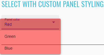
<select-panel-class-example ng-version="9.1.0">
<h2 class="example-h2">
<a href="https://material.angular.io/components/select/overview#adding-custom-styles-to-the-dropdown-panel"> Select with custom panel styling </a>
</h2>
<mat-form-field class="mat-form-field ng-tns-c95-32 mat-primary mat-form-field-type-mat-select mat-form-field-appearance-fill mat-form-field-can-float mat-form-field-has-label ng-pristine ng-valid mat-form-field-should-float ng-touched">
<div class="mat-form-field-wrapper ng-tns-c95-32">
<div class="mat-form-field-flex ng-tns-c95-32">
<div class="mat-form-field-infix ng-tns-c95-32">
<mat-select role="listbox" id="custom-panel-styling-select" class="mat-select ng-tns-c171-33 ng-tns-c95-32 ng-star-inserted ng-pristine ng-valid ng-touched" tabindex="0" aria-labelledby="mat-form-field-label-45" aria-required="false" aria-disabled="false" aria-invalid="false" aria-multiselectable="false">
<div cdk-overlay-origin="" aria-hidden="true" class="mat-select-trigger ng-tns-c171-33">
<div class="mat-select-value ng-tns-c171-33">
<span class="mat-select-value-text ng-tns-c171-33 ng-star-inserted">
<span class="ng-tns-c171-33 ng-star-inserted">Red</span>
</span>
</div>
<div class="mat-select-arrow-wrapper ng-tns-c171-33">
<div class="mat-select-arrow ng-tns-c171-33"/>
</div>
</div>
</mat-select>
<span class="mat-form-field-label-wrapper ng-tns-c95-32">
<label class="mat-form-field-label ng-tns-c95-32 ng-star-inserted" id="mat-form-field-label-45" for="custom-panel-styling-select" aria-owns="custom-panel-styling-select">
<mat-label class="ng-tns-c95-32 ng-star-inserted">Panel color</mat-label>
</label>
</span>
</div>
</div>
<div class="mat-form-field-underline ng-tns-c95-32 ng-star-inserted">
<span class="mat-form-field-ripple ng-tns-c95-32"/>
</div>
<div class="mat-form-field-subscript-wrapper ng-tns-c95-32">
<div class="mat-form-field-hint-wrapper ng-tns-c95-32 ng-trigger ng-trigger-transitionMessages ng-star-inserted" style="opacity: 1; transform: translateY(0%);">
<div class="mat-form-field-hint-spacer ng-tns-c95-32"/>
</div>
</div>
</div>
</mat-form-field>
</select-panel-class-example>
The <mat-form-field> allows you to associate error messages with your <select> or <mat-select>.
By default, these error messages are shown when the control is invalid and either the user has interacted with
(touched) the element or the parent form has been submitted. If you wish to override this behavior (e.g. to show the
error as soon as the invalid control is dirty or when a parent form group is invalid), you can use the
errorStateMatcher property of the <mat-select>.
//@FindBy(css = "#mat-error-state-matcher-select")
@UI("#mat-error-state-matcher-select")
public static MaterialSelector matErrorStateMatcherSelect;
@Test
public void checkLabelValue() {
matErrorStateMatcherSelect.label().has().value("Choose one");
}
@Test
public void checkValidOptionCanBeSelectedByNameAndHintMessageWillAppear() {
matErrorStateMatcherSelect.select(VALID_OPTION);
matErrorStateMatcherSelect.is().selected(VALID_OPTION);
matErrorStateMatcherSelect.hint().assertThat().text("Errors appear instantly!");
}
@Test
public void checkInvalidOptionCanBeSelectedByNameAndErrorMessageWillAppear() {
matErrorStateMatcherSelect.select(INVALID_OPTION);
matErrorStateMatcherSelect.is().selected(matchesPattern(INVALID_OPTION));
matErrorStateMatcherSelect.error().assertThat().text(INVALID_SELECTION);
}
//@FindBy(css = "#native-error-state-matcher-select")
@UI("#native-error-state-matcher-select")
public static NativeSelector nativeErrorStateMatcherSelect;
@Test
public void checkLabelValue() {
nativeErrorStateMatcherSelect.label().has().value("Choose one");
}
@Test
public void checkValidOptionCanBeSelectedByName() {
nativeErrorStateMatcherSelect.select(VALID_OPTION);
nativeErrorStateMatcherSelect.is().selected(VALID_OPTION);
}
@Test
public void checkInvalidOptionCanBeSelectedByNameAndErrorMessageWillAppear() {
nativeErrorStateMatcherSelect.select(INVALID_OPTION);
nativeErrorStateMatcherSelect.is().selected(matchesPattern(INVALID_OPTION));
nativeErrorStateMatcherSelect.error().assertThat().text(INVALID_SELECTION);
}
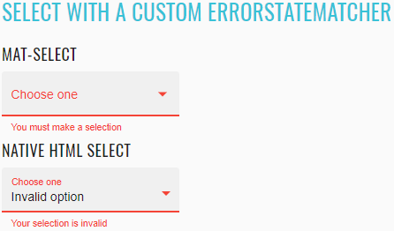
<select-error-state-matcher-example _nghost-nsg-c255="" ng-version="9.1.0">
<h2 _ngcontent-nsg-c255="" class="example-h2">
<a _ngcontent-nsg-c255="" href="https://material.angular.io/components/select/overview#changing-when-error-messages-are-shown"> Select with a custom ErrorStateMatcher </a>
</h2>
<h4 _ngcontent-nsg-c255="">mat-select</h4>
<mat-form-field _ngcontent-nsg-c255="" class="mat-form-field ng-tns-c95-36 mat-primary mat-form-field-type-mat-select mat-form-field-appearance-fill mat-form-field-can-float mat-form-field-has-label ng-untouched ng-pristine ng-valid mat-form-field-should-float">
<div class="mat-form-field-wrapper ng-tns-c95-36">
<div class="mat-form-field-flex ng-tns-c95-36">
<div class="mat-form-field-infix ng-tns-c95-36">
<mat-select _ngcontent-nsg-c255="" role="listbox" id="mat-error-state-matcher-select" class="mat-select ng-tns-c171-37 ng-tns-c95-36 ng-star-inserted ng-untouched ng-pristine ng-valid" tabindex="0" aria-labelledby="mat-form-field-label-51" aria-required="false" aria-disabled="false" aria-invalid="false" aria-multiselectable="false" aria-describedby="mat-error-state-matcher-hint">
<div cdk-overlay-origin="" aria-hidden="true" class="mat-select-trigger ng-tns-c171-37">
<div class="mat-select-value ng-tns-c171-37">
<span class="mat-select-value-text ng-tns-c171-37 ng-star-inserted">
<span class="ng-tns-c171-37 ng-star-inserted">Valid option</span>
</span>
</div>
<div class="mat-select-arrow-wrapper ng-tns-c171-37">
<div class="mat-select-arrow ng-tns-c171-37"/>
</div>
</div>
</mat-select>
<span class="mat-form-field-label-wrapper ng-tns-c95-36">
<label class="mat-form-field-label ng-tns-c95-36 ng-star-inserted" id="mat-form-field-label-51" for="mat-error-state-matcher-select" aria-owns="mat-error-state-matcher-select">
<mat-label _ngcontent-nsg-c255="" class="ng-tns-c95-36 ng-star-inserted">Choose one</mat-label>
</label>
</span>
</div>
</div>
<div class="mat-form-field-underline ng-tns-c95-36 ng-star-inserted">
<span class="mat-form-field-ripple ng-tns-c95-36"/>
</div>
<div class="mat-form-field-subscript-wrapper ng-tns-c95-36">
<div class="mat-form-field-hint-wrapper ng-tns-c95-36 ng-trigger ng-trigger-transitionMessages ng-star-inserted" style="opacity: 1; transform: translateY(0%);">
<mat-hint _ngcontent-nsg-c255="" id="mat-error-state-matcher-hint" class="mat-hint ng-tns-c95-36">Errors appear instantly!</mat-hint>
<div class="mat-form-field-hint-spacer ng-tns-c95-36"/>
</div>
</div>
</div>
</mat-form-field>
<h4 _ngcontent-nsg-c255="">native html select</h4>
<mat-form-field _ngcontent-nsg-c255="" class="mat-form-field demo-full-width ng-tns-c95-38 mat-primary mat-form-field-type-mat-native-select mat-form-field-appearance-fill mat-form-field-can-float mat-form-field-should-float mat-form-field-has-label ng-untouched ng-pristine ng-valid">
<div class="mat-form-field-wrapper ng-tns-c95-38">
<div class="mat-form-field-flex ng-tns-c95-38">
<div class="mat-form-field-infix ng-tns-c95-38">
<select _ngcontent-nsg-c255="" matnativecontrol="" id="native-error-state-matcher-select" class="mat-input-element mat-form-field-autofill-control ng-tns-c95-38 cdk-text-field-autofill-monitored ng-untouched ng-pristine ng-valid" aria-invalid="false" aria-required="false">
<option _ngcontent-nsg-c255="" value=""/>
<option _ngcontent-nsg-c255="" value="valid" selected="">Valid option</option>
<option _ngcontent-nsg-c255="" value="invalid">Invalid option</option>
</select>
<span class="mat-form-field-label-wrapper ng-tns-c95-38">
<label class="mat-form-field-label ng-tns-c95-38 ng-star-inserted" id="mat-form-field-label-53" for="native-error-state-matcher-select" aria-owns="native-error-state-matcher-select">
<mat-label _ngcontent-nsg-c255="" class="ng-tns-c95-38 ng-star-inserted">Choose one</mat-label>
</label>
</span>
</div>
</div>
<div class="mat-form-field-underline ng-tns-c95-38 ng-star-inserted">
<span class="mat-form-field-ripple ng-tns-c95-38"/>
</div>
<div class="mat-form-field-subscript-wrapper ng-tns-c95-38">
<div class="mat-form-field-hint-wrapper ng-tns-c95-38 ng-trigger ng-trigger-transitionMessages ng-star-inserted" style="opacity: 1; transform: translateY(0%);">
<div class="mat-form-field-hint-spacer ng-tns-c95-38"/>
</div>
</div>
</div>
</mat-form-field>
</select-error-state-matcher-example>
List of some available MaterialSelector methods:
| Method | Description | Return Type |
|---|---|---|
| is() | Assert action | MaterialSelectorAssert |
| expand() | Expand MaterialSelector list | void |
| collapse() | Collapse expanded MaterialSelector list | void |
| isExpanded() | Show that MaterialSelector expanded | boolean |
| isCollapsed() | Show that MaterialSelector collapsed | boolean |
| select(String/int) | Select an option from MaterialSelector | void |
| multipleSelect(String.../int...) | Select multiple options from MaterialSelector | void |
| selected(String) | Check if option has been selected | boolean |
| selected() | Returns selected value as string | String |
| values() | Returns all available MaterialSelector options | List |
| listEnabled() | Returns all enable MaterialSelector options | List |
| listDisabled() | Returns all disable MaterialSelector options | List |
| groups() | Returns existing MaterialSelector groups | List |
| groupsAndOptions() | Returns MaterialSelector map of the group and options if any | Map |
| color(int , int, int, double) | Check that rgba(red, green, blue, opacity) is the specified color | boolean |
| hint() | Ui hint message element. | UIElement |
| error() | Ui error message element. | UIElement |
List of some available NativeSelector methods:
| Method | Description | Return Type |
|---|---|---|
| is() | Assert action | NativeSelectorAssert |
| list() | Returns a WebList item representing a list of available NativeSelector options | WebList |
| select(String/int) | Select an option from NativeSelector | void |
| selected(String) | Check if option has been selected | boolean |
| selected() | Returns selected value as string | String |
| values() | Returns all available NativeSelector options | List |
| values(TextTypes) | Returns all available NativeSelector options by text type | List |
| listEnabled() | Returns all enable NativeSelector options | List |
| listDisabled() | Returns all disable NativeSelector options | List |
| groups() | Returns existing NativeSelector groups | List |
| groupsAndOptions() | Returns NativeSelector map of the group and options if any | Map |
| hint() | Ui hint message element. | UIElement |
| error() | Ui error message element. | UIElement |
Here you can find the Form Field tests
2.2.6 Form Field
Form Field overview
Form field combines different Angular materials within a single field.
- Java: com.epam.jdi.light.angular.elements.complex.FormField
The test methods below allow to discriminate fields in the form: input, mat-select, and textarea. For each type there are methods to get specific types from the form and proccess them. Test methods also allow to handle form fields in the form independently of the type just by accessing them using index.
See an example with HTML code describing a form field element.
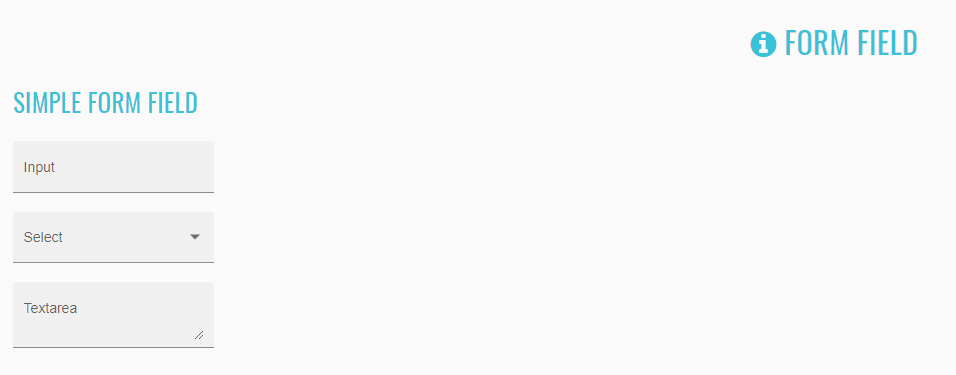
//@FindBy(css = "simple-form-field")
@UI("simple-form-field")
public static FormField simpleFormFieldInput;
@Test
public void simpleFormFieldTest() {
simpleFormFieldInput.show();
simpleFormFieldInput.has().inputLabel(1, "Input");
simpleFormFieldInput.has().textAreaLabel(1, "Textarea");
simpleFormFieldInput.has().dropdownLabel(1, "Select");
simpleFormFieldInput.set(1, "Test input value");
simpleFormFieldInput.has().value(1, "Test input value");
simpleFormFieldInput.set(2, "Option");
simpleFormFieldInput.has().value(2, "Option");
simpleFormFieldInput.set(3, "Test text area value");
simpleFormFieldInput.has().value(3, "Test text area value");
simpleFormFieldInput.input(1, "Input value");
simpleFormFieldInput.has().inputText(1, "Input value");
simpleFormFieldInput.has().inputText(1, containsString("Input"));
simpleFormFieldInput.select(1, "Option");
simpleFormFieldInput.has().dropdownText(1, "Option");
simpleFormFieldInput.has().dropdownText(1, containsString("tion"));
simpleFormFieldInput.setTextArea(1, "Text area value");
simpleFormFieldInput.has().textAreaText(1, "Text area value");
simpleFormFieldInput.has().textAreaText(1, containsString(" area v"));
simpleFormFieldInput.clearTextArea(1);
simpleFormFieldInput.has().textAreaText(1, "");
simpleFormFieldInput.set(3, "Another text area value");
simpleFormFieldInput.has().value(3, "Another text area value");
simpleFormFieldInput.clear(1);
simpleFormFieldInput.has().value(1, "");
simpleFormFieldInput.clear(3);
simpleFormFieldInput.has().value(3, "");
}
<div _ngcontent-vjc-c279>
<mat-form-field _ngcontent-vjc-c279 appearance="fill" id="simple-form-field-input">
<input _ngcontent-vjc-c279>
<mat-label _ngcontent-vjc-c279>Input</mat-label>
</mat-form-field>
<mat-form-field _ngcontent-vjc-c279 appearance="fill" id="simple-form-field-select">
<mat-select _ngcontent-vjc-c279>
<mat-label _ngcontent-vjc-c279>Select</mat-label>
</mat-form-field>
<mat-form-field _ngcontent-vjc-c279 appearance="fill" id="simple-form-field-textarea">
<textarea _ngcontent-vjc-c279>
<mat-label _ngcontent-vjc-c279>Textarea</mat-label>
</mat-form-field>
</div>
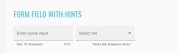
public static FormField formFieldExampleContainerInputLimited;
@Test
public void formFieldsWithHintsTest() {
formFieldExampleContainerInputLimited.show();
formFieldExampleContainerInputLimited.has().hint(1, "0/10");
formFieldExampleContainerInputLimited.has().hint(2, "Here's the dropdown arrow ^");
formFieldExampleContainerInputLimited.set(1, "12345678901");
formFieldExampleContainerInputLimited.has().hint(1, "10/10");
formFieldExampleContainerInputLimited.has().inputHint(1, "10/10");
formFieldExampleContainerInputLimited.has().value(1, "1234567890");
}
<div _ngcontent-tkf-c282>
<mat-form-field _ngcontent-tkf-c282 appearance="fill" id="simple-form-field-input">
<input _ngcontent-tkf-c282>
<div>Max 10 characters</div>
<mat-hint _ngcontent-tkf-c282>0/10</mat-label>
</mat-form-field>
<mat-form-field _ngcontent-tkf-c282 appearance="fill" id="simple-form-field-select">
<mat-select _ngcontent-tkf-c282>
<mat-hint _ngcontent-tkf-c282>Here's the dropdown arrow ^</mat-label>
</mat-form-field>
</div>
| Method | Description | Return Type |
|---|---|---|
| getInputs() | Gets the WebList of input elements presented in the form | WebList |
| getDropdowns() | Gets the WebList of dropdown elements presented in the form | WebList |
| getTextAreas() | Gets the WebList of text area elements presented in the form | WebList |
| input(int, String) | Inputs a value into the input with the provided index. This method counts inputs only | void |
| select(int, String) | Selects a value from the dropdown with the provided index. This method counts dropdowns only | void |
| setTextArea(int, String) | Inputs a value into the text area with the provided index. This method counts text areas only | void |
| set(int, String) | Sets the field with the provided index which is counted for all form fields in the form. Depending on the type of the field (input, mat-select, or textarea) it inputs or selects a value | void |
| value(int) | Sets the field with the provided index which is counted for all form fields in the form | String |
| clear(int) | Clears field with the provided index | void |
| clickIcon(int) | Clicks the icon in the form field with the provided index which is counted for all fields in the form | void |
| is() | Assert action | FormFieldsAssert |
| inputText(int) | Assert action: verifies text in the input with the provided index | String |
| getInputValue(int) | Get value for input with index | String |
| textAreaText(int) | verifies text in the text area with the provided index | String |
| getTextAreaValue(int) | Get value for text area with index | String |
| getDropdownValue(int) | Get value for dropdown with index | String |
| inputPlaceholder(int) | placeholder in the input with the provided index | String |
| inputLabel(int) | label in the input with the provided index | String |
| textAreaLabel(int) | label in the text area with the provided index | String |
| dropdownLabel(int) | dropdown in the text area with the provided index | String |
| inputHint(int) | hint in the input with the provided index | String |
| inputError(int) | error in the input with the provided index | String |
| hint(int) | hint in the field with the provided index in the form | String |
| font(int) | Returns font in the field with the provided index in the form | String |
| color(int) | Returns color in the field with the provided index in the form | String |
| placeholder(int) | placeholder in the field with the provided index in the form | String |
| label(int) | label in the field with the provided index in the form | String |
| error(int) | error in the field with the provided index in the form | String |
| focusOut() | Get focus out from element | void |
| clearInput(int) | Clear value from input in element with index | void |
| clearTextArea(int) | Clear value from text area in element with index | void |
| set(int,String) | Set value for element with index | void |
| value(int) | Returns value in the field with the provided index in the form | String |
| icon(int) | Get icon text in element with index | String |
Here you can find the Form Field tests
2.2.7 Autocomplete
Autocomplete overview
You can find the autocomplete methods in the following class:
- Java: com.epam.jdi.light.angular.elements.complex.AutoComplete
See the examples with HTML code describing autocomplete elements below.
Autocomplete element is identified by the input node wrapped inside the mat-form-field (see the test examples).
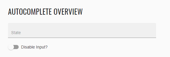 ```java
//@FindBy(css = "#autocomplete-overview-input")
@UI("#autocomplete-overview-input")
public AutoComplete autocompleteOverview;
@Test
public void verifyOnlyOneAutocompleteIsExpandedAtATime() {
autocompleteSection.autocompleteOverview.click();
autocompleteSection.autocompleteOverview.is().expanded();
autocompleteSection.simpleAutocomplete.is().collapsed();
autocompleteSection.displayValueAutocomplete.is().collapsed();
autocompleteSection.filterAutocomplete.is().collapsed();
autocompleteSection.optionGroupsAutocomplete.is().collapsed();
}
html

java
//@FindBy(css = "#autocomplete-overview-input")
@UI("#autocomplete-overview-input")
public static AutoComplete autocompleteOverviewInput;
//@FindBy(css = "#autocomplete-overview-slide-toggle") @UI("#autocomplete-overview-slide-toggle") public SlideToggle autocompleteDisableInput;
@Test public void verifyAutoCompleteOverview() { autocompleteSection.autocompleteOverview.clear(); autocompleteSection.autocompleteOverview.is().empty(); autocompleteSection.autocompleteOverview.is().notMandatory(); autocompleteSection.autocompleteOverview.has().placeholder("State"); autocompleteSection.autocompleteDisableInput.check(); autocompleteSection.autocompleteOverview.is().disabled(); autocompleteSection.autocompleteDisableInput.uncheck(); autocompleteSection.autocompleteOverview.is().enabled(); autocompleteSection.autocompleteOverview.setValue("F", "FloridaPopulation: 20.27M"); autocompleteSection.autocompleteOverview.is().collapsed(); autocompleteSection.autocompleteOverview.has().text("Florida"); autocompleteSection.autocompleteOverview.setValue("CaliforniaPopulation: 39.14M"); autocompleteSection.autocompleteOverview.is().collapsed(); autocompleteSection.autocompleteOverview.has().text("California"); } ```
<mat-form-field class="mat-form-field mat-form-field-disabled">
<div class="mat-form-field-wrapper">
<div class="mat-form-field-flex">
<div class="mat-form-field-infix">
<input
id="autocomplete-overview-input"
placeholder="State"
aria-label="State"
class="mat-input-element mat-form-field-autofill-control mat-autocomplete-trigger cdk-text-field-autofill-monitored ng-pristine ng-touched"
aria-invalid="false"
aria-required="false"
autocomplete="off"
role="combobox"
aria-autocomplete="list"
aria-expanded="false"
aria-haspopup="true"
disabled=""
/>
</div>
</div>
</mat-form-field>
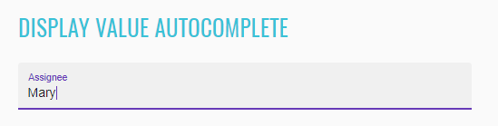 ```java
//@FindBy(css ="#autocomplete-display-value-input")
@UI("#autocomplete-display-value-input")
public AutoComplete displayValueAutocomplete
@Test public void verifyDisplayValueAutocomplete() { autocompleteSection.displayValueAutocomplete.has().displayValue("Assignee"); autocompleteSection.displayValueAutocomplete.has().placeholder(""); autocompleteSection.displayValueAutocomplete.is().enabled(); autocompleteSection.displayValueAutocomplete.is().notMandatory(); autocompleteSection.displayValueAutocomplete.is().valid(); autocompleteSection.displayValueAutocomplete.setValue("Sh", "Shelley"); autocompleteSection.displayValueAutocomplete.is().collapsed(); autocompleteSection.displayValueAutocomplete.has().text("Shelley"); autocompleteSection.displayValueAutocomplete.setValue("Mary"); autocompleteSection.displayValueAutocomplete.has().text("Mary"); autocompleteSection.displayValueAutocomplete.is().collapsed(); autocompleteSection.displayValueAutocomplete.is().valid(); } ```
<mat-form-field>
<div class="mat-form-field-wrapper">
<div class="mat-form-field-flex">
<div class="mat-form-field-infix">
<input
type="text"
id="autocomplete-display-value-input"
class="mat-input-element mat-form-field-autofill-control mat-autocomplete-trigger cdk-text-field-autofill-monitored ng-valid ng-touched ng-dirty"
aria-invalid="false"
aria-required="false"
autocomplete="off"
role="combobox"
aria-autocomplete="list"
aria-expanded="false"
aria-haspopup="true"
/>
<span class="mat-form-field-label-wrapper">
<label class="mat-form-field-label ng-star-inserted" id="mat-form-field-label-5" for="autocomplete-display-value-input" aria-owns="autocomplete-display-value-input">
<mat-label class="ng-star-inserted">Assignee</mat-label>
</label>
</span>
</div>
</div>
</div>
</mat-form-field>
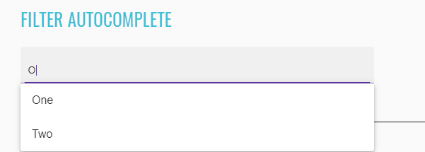 ```java
//@FindBy(css = "#autocomplete-filter-input")
@UI("#autocomplete-filter-input")
public AutoComplete filterAutocomplete
@Test
public void verifyFilterAutocomplete() {
String expectedValuesArray[] = {"One", "Two", "Three"};
List
autocompleteSection.filterAutocomplete.has().displayValue(""); autocompleteSection.filterAutocomplete.has().placeholder("Pick one"); autocompleteSection.filterAutocomplete.is().enabled(); autocompleteSection.filterAutocomplete.is().valid(); autocompleteSection.filterAutocomplete.is().notMandatory(); autocompleteSection.filterAutocomplete.click(); autocompleteSection.filterAutocomplete.has().options(expectedValues); autocompleteSection.filterAutocomplete.setValue("n", "One"); autocompleteSection.filterAutocomplete.has().text("One"); autocompleteSection.filterAutocomplete.setValue("Three"); autocompleteSection.filterAutocomplete.has().text("Three"); autocompleteSection.filterAutocomplete.setValue("o", "Two"); autocompleteSection.filterAutocomplete.has().text("Two"); autocompleteSection.filterAutocomplete.is().valid(); } ```
<mat-form-field>
<div class="mat-form-field-wrapper">
<div class="mat-form-field-flex">
<div class="mat-form-field-infix">
<input
type="text"
id="autocomplete-filter-input"
placeholder="Pick one"
aria-label="Number"
class="mat-input-element mat-form-field-autofill-control mat-autocomplete-trigger cdk-text-field-autofill-monitored ng-valid ng-touched ng-dirty"
aria-invalid="false"
aria-required="false"
autocomplete="off"
role="combobox"
aria-autocomplete="list"
aria-expanded="false"
aria-haspopup="true"
/>
</div>
</div>
</div>
</mat-form-field>
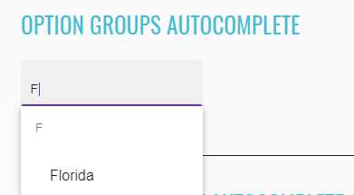
//@FindBy(css = "#autocomplete-filter-input")
@UI("#autocomplete-grouped-options-input")
public AutoComplete optionGroupsAutocomplete;
@Test
public void verifyOptionGroupsAutocomplete() {
String[] values = {"A", "C", "D", "F", "G", "H", "I", "K", "L", "M", "N", "O", "P", "R", "S", "T", "U", "V", "W"};
List<String> groupsValues = Arrays.asList(values);
Map<String, List<String>> groupAndOptionsValues = new HashMap<>();
String[] options = {"California", "Colorado", "Connecticut"};
List<String> optionsValues = Arrays.asList(options);
groupAndOptionsValues.put("C", optionsValues);
autocompleteSection.optionGroupsAutocomplete.has().placeholder("States Group");
autocompleteSection.optionGroupsAutocomplete.clear();
autocompleteSection.optionGroupsAutocomplete.is().mandatory();
autocompleteSection.optionGroupsAutocomplete.is().invalid();
autocompleteSection.optionGroupsAutocomplete.click();
autocompleteSection.optionGroupsAutocomplete.has().groups(groupsValues);
autocompleteSection.optionGroupsAutocomplete.input("C");
autocompleteSection.optionGroupsAutocomplete.has().groupsAndOptions(groupAndOptionsValues);
autocompleteSection.optionGroupsAutocomplete.setValue("C", "California");
autocompleteSection.optionGroupsAutocomplete.has().text("California");
autocompleteSection.optionGroupsAutocomplete.is().valid();
autocompleteSection.optionGroupsAutocomplete.input("C");
autocompleteSection.optionGroupsAutocomplete.setValue("Colorado");
autocompleteSection.optionGroupsAutocomplete.has().text("Colorado");
autocompleteSection.optionGroupsAutocomplete.setValue("New York");
autocompleteSection.optionGroupsAutocomplete.has().text("New York");
}
<mat-form-field _class="mat-form-field mat-form-field-invalid ng-invalid">
<div class="mat-form-field-wrapper">
<div class="mat-form-field-flex">
<div class="mat-form-field-infix">
<input
type="text"
id="autocomplete-grouped-options-input"
placeholder="States Group"
formcontrolname="stateGroup"
required
class="mat-input-element mat-form-field-autofill-control mat-autocomplete-trigger cdk-text-field-autofill-monitored ng-touched ng-dirty ng-invalid"
aria-invalid="true"
aria-required="true"
autocomplete="off"
role="combobox"
aria-autocomplete="list"
aria-expanded="false"
aria-haspopup="true"
/>
</div>
</div>
</div>
</mat-form-field>
List of the available AutoComplete methods:
| Method | Description | Return Type |
|---|---|---|
| is() | Assert action | AutoCompleteAssert |
| input(String) | Inputs the provided value | void |
| select(String) | Selects the required value from the autocomplete list | void |
| placeholder() | Returns the value of the displayed placeholder | String |
| displayValue() | Returns the display value | String |
| isOptionHighlighted(String) | Returns true if the provided option is highlighted in the displayed list | boolean |
| setValue(String,String) | Types in the inputValue and selects the corresponding selectValue (inputvalue,selectvalue) | void |
| setValue(String) | Selects the required selectValue | void |
| getValue() | Returns the value popualted into the autocomplete | String |
| text() | Returns the value popualted into the autocomplete | String |
| options() | Return the list of options avaialble for the particular autocomplete | List |
| options(String) | Returns the list of options which are displayed when the inputValue is provided | List |
| groups() | Returns the groups of options available in the autocomplete | List |
| groupsAndOptionsValues() | Returns the hash map where the keys are the groups and the values are the lists of options within each group | HashMap |
| isMandatory() | Returns true if the autocomplete field is mandatory | boolean |
| isInvalidated() | Returns true if the autocomplete is invalidated by the input | boolean |
| isEnabled() | Returns true if the autocomplete is enabled | boolean |
| isDisabled() | Returns true if the autocomplete is disabled | boolean |
| expanded() | Returns true if the autocomplete is expanded | Boolean |
| collapsed() | Returns true if the autocomplete is collapsed | Boolean |
| setUniqueAutoCompleteAttribute(String) | Sets value of autocomplete attribute | void |
| click() | clicks on element | void |
| focusOut() | Get focus out | void |
| clear() | clears value | void |
AutoComplete java tests examples
2.2.8 Snackbar
//@FindBy(id = "//simple-snack-bar")
@UI("//simple-snack-bar")
public Snackbar basicSnackbar;
//@FindBy(id = "#snack-bar-custom-component")
@UI("#snack-bar-custom-component")
public Snackbar customSnackbar;
@Test
public void checkBasicSnackbarTest() {
snackbarSection.messageInput.setValue(MESSAGE);
snackbarSection.actionInput.setValue(ACTION);
snackbarSection.openButton.click();
snackbarSection.basicSnackbar.is().displayed();
snackbarSection.basicSnackbar.has().message(MESSAGE);
snackbarSection.basicSnackbar.has().action(ACTION);
}
@Test
public void checkSnackbarDurationTest() {
final int DURATION = 5;
JAction action = () -> {
snackbarSection.customSnackbar.base().timer().wait(() -> snackbarSection.customSnackbar.isDisplayed());
snackbarSection.customSnackbar.base().timer().wait(() -> snackbarSection.customSnackbar.isHidden());
};
snackbarSection.durationInput.setValue(String.valueOf(DURATION));
snackbarSection.customSnackbarOpenButton.click();
duration(DURATION, 1000, action);
}
Snackbar overview
Snackbar is located in the following class:
- Java: com.epam.jdi.light.angular.elements.complex.Snackbar
<mat-form-field>
<mat-label>Message</mat-label>
<input matInput value="Disco party!" #message>
</mat-form-field>
<mat-form-field>
<mat-label>Action</mat-label>
<input matInput value="Dance" #action>
</mat-form-field>
<button mat-stroked-button (click)="openSnackBar(message.value, action.value)">Show snack-bar</button>
| Method | Description | Return Type |
|---|---|---|
| getMessageText() | Get message text | String |
| getActionText() | Get action text | String |
| clickAction() | Click button | void |
| isActionDisplayed() | Check that button is displayed | boolean |
| is() | Assert action | SnackbarAssert |
Here you can find Snackbar tests
2.2.9 Paginator
//@FindBy(id = "//paginator-configurable-example/mat-paginator")
@UI("//paginator-configurable-example/mat-paginator")
public Paginator paginator;
@Test
public void labelPaginationTest() {
paginator.has().label("Items per page:");
}
@Test
public void basicPaginatorTest() {
final int STEP = 10;
paginator.select(STEP);
paginator.is().range(1, STEP, TOTAL);
paginator.is().previousDisabled();
paginator.is().nextEnabled();
paginator.next();
for (int i = STEP + 1; i < TOTAL - STEP + 1; i += STEP) {
paginator.is().range(i, i + STEP - 1, TOTAL);
paginator.is().previousEnabled();
paginator.is().nextEnabled();
paginator.next();
}
paginator.is().range(TOTAL - STEP + 1, TOTAL, TOTAL);
paginator.is().previousEnabled();
paginator.is().nextDisabled();
paginator.previous();
for (int i = TOTAL - 2 * STEP + 1; i > 1; i -= STEP) {
paginator.is().range(i, i + STEP - 1, TOTAL);
paginator.is().previousEnabled();
paginator.is().nextEnabled();
paginator.previous();
}
paginator.is().range(1, STEP, TOTAL);
paginator.is().previousDisabled();
paginator.is().nextEnabled();
}
Paginator overview
Paginator is located in the following class:
- Java: com.epam.jdi.light.angular.elements.complex.Paginator
<mat-paginator _ngcontent-sjd-c362="" class="mat-paginator">
<div class="mat-paginator-outer-container">
<div class="mat-paginator-container">
<div class="mat-paginator-page-size ng-star-inserted">
<div class="mat-paginator-page-size-label"> Items per page: </div>
<mat-form-field class="mat-form-field mat-paginator-page-size-select ng-tns-c95-175 mat-primary mat-form-field-type-mat-select mat-form-field-appearance-fill mat-form-field-can-float ng-star-inserted mat-form-field-should-float">
<div class="mat-form-field-wrapper ng-tns-c95-175">
<div class="mat-form-field-flex ng-tns-c95-175">
<div class="mat-form-field-infix ng-tns-c95-175">
<mat-select role="listbox" class="mat-select ng-tns-c171-176 ng-tns-c95-175 ng-star-inserted" id="mat-select-19" tabindex="0" aria-label="Items per page:" aria-required="false" aria-disabled="false" aria-invalid="false" aria-multiselectable="false">
<div cdk-overlay-origin="" aria-hidden="true" class="mat-select-trigger ng-tns-c171-176">
<div class="mat-select-value ng-tns-c171-176">
<span class="mat-select-value-text ng-tns-c171-176 ng-star-inserted">
<span class="ng-tns-c171-176 ng-star-inserted">10</span>
</span>
</div>
<div class="mat-select-arrow-wrapper ng-tns-c171-176">
<div class="mat-select-arrow ng-tns-c171-176"/>
</div>
</div>
</mat-select>
<span class="mat-form-field-label-wrapper ng-tns-c95-175">
</span>
</div>
</div>
<div class="mat-form-field-underline ng-tns-c95-175 ng-star-inserted">
<span class="mat-form-field-ripple ng-tns-c95-175"/>
</div>
<div class="mat-form-field-subscript-wrapper ng-tns-c95-175">
<div class="mat-form-field-hint-wrapper ng-tns-c95-175 ng-trigger ng-trigger-transitionMessages ng-star-inserted" style="opacity: 1; transform: translateY(0%);">
<div class="mat-form-field-hint-spacer ng-tns-c95-175"/>
</div>
</div>
</div>
</mat-form-field>
</div>
<div class="mat-paginator-range-actions">
<div class="mat-paginator-range-label"> 1 – 10 of 100 </div>
<button mat-icon-button="" type="button" class="mat-focus-indicator mat-paginator-navigation-previous mat-icon-button mat-button-base" aria-label="Previous page" disabled="true">
<span class="mat-button-wrapper">
<svg viewBox="0 0 24 24" focusable="false" class="mat-paginator-icon">
<path d="M15.41 7.41L14 6l-6 6 6 6 1.41-1.41L10.83 12z"/>
</svg>
</span>
<div matripple="" class="mat-ripple mat-button-ripple mat-button-ripple-round"/>
<div class="mat-button-focus-overlay"/>
</button>
<button mat-icon-button="" type="button" class="mat-focus-indicator mat-paginator-navigation-next mat-icon-button mat-button-base" aria-label="Next page">
<span class="mat-button-wrapper">
<svg viewBox="0 0 24 24" focusable="false" class="mat-paginator-icon">
<path d="M10 6L8.59 7.41 13.17 12l-4.58 4.59L10 18l6-6z"/>
</svg>
</span>
<div matripple="" class="mat-ripple mat-button-ripple mat-button-ripple-round"/>
<div class="mat-button-focus-overlay"/>
</button>
</div>
</div>
</div>
</mat-paginator>
| Method | Description | Return Type |
|---|---|---|
| label() | Get label | String |
| select(int) | Select number of items per page | void |
| selected() | Get selected number of items per page | int |
| options() | Get list of number of items per page | List |
| range() | Get range | String |
| isPreviousEnabled() | Check if previous button enabled | boolean |
| previous() | Click previous button | void |
| isNextEnabled() | Check if next button enabled | boolean |
| next() | Click next button | void |
| is() | Assert action | PaginatorAssert |
Here you can find Paginator tests
2.2.10 Tab group
//@FindBy(id = "basic-tab")
@UI("#basic-tab")
public TabGroup basicTab;
@Test
public void verifyTabs() {
tabsSection.basicTab.is().displayed();
tabsSection.basicTab.has().attr(CLASS_ATTR, TAB_GROUP_DEFAULT_CLASS);
}
@Test
public void verifyTabsTitles() {
tabsSection.basicTab.is().assertTabsTitles(TITLES_DEFAULT_LIST);
}
@Test
public void verifyTabPanelContentByNumber() {
int tabNumberForTest = 3;
String stringForTest = format(DYNAMIC_CONTENT, tabNumberForTest);
tabsSection.basicTab.clickTab(tabNumberForTest);
tabsSection.basicTab.is().assertTabPanelContent(stringForTest);
}
Tabs overview
Angular Material tabs organize content into separate views where only one view can be visible at a time.
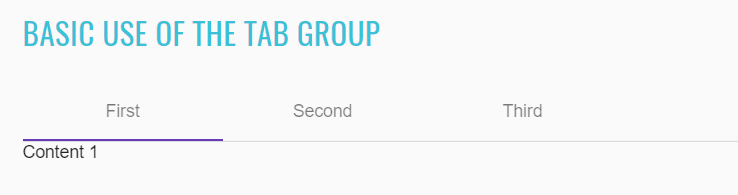
<mat-tab-group _ngcontent-sbh-c317 id="basic-tab" class="mat-tab-group mat-primary"></mat-tab-group>
//@FindBy(id = "tab-with-custom-label")
@UI("#tab-with-custom-label")
public TabGroup tabWithCustomLabel;
@Test
public void verifyCustomLabelTemplateTabs() {
tabsSection.tabWithCustomLabel.is().displayed();
tabsSection.tabWithCustomLabel.has().attr(CLASS_ATTR, TAB_GROUP_DEFAULT_CLASS);
}
@Test
public void verifyCustomLabelTemplateTabsTitles() {
List<String> listForTest = Arrays.asList("thumb_up\nFirst", "thumb_up\nSecond", "thumb_up\nThird");
tabsSection.tabWithCustomLabel.is().assertTabsTitles(listForTest);
}
If a tab's label is only text then the simple tab-group API can be used. For more complex labels, add a template with the mat-tab-label directive inside the mat-tab.
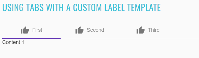
<mat-tab-group _ngcontent-ecm-c350 id="tab-with-custom-label" class="mat-tab-group mat-primary"></mat-tab-group>
<ng-template mat-tab-label>
<mat-icon class="example-tab-icon">thumb_up</mat-icon>
First
</ng-template>
//@FindBy(id = "tab-dynamic-height-based-on-content")
@UI("#tab-dynamic-height-based-on-content")
public TabGroup tabDynamicHeightBasedOnContent;
@Test
public void verifyDynamicHeightBasedOnContentsTabsTitles() {
List<String> listForTest = Arrays.asList("Short tab", "Long tab");
tabsSection.tabDynamicHeightBasedOnContent.is().assertTabsTitles(listForTest);
}
@Test
public void verifyDynamicHeightBasedOnContentsTabPanelContentByNumber() {
int tabNumberForTest = 2;
String stringForTest = "Large content";
tabsSection.tabDynamicHeightBasedOnContent.clickTab(tabNumberForTest);
tabsSection.tabDynamicHeightBasedOnContent.is().assertTabPanelContent(stringForTest);
}
By default, the tab group will not change its height to the height of the currently active tab. To change this, set the dynamicHeight input to true. The tab body will animate its height according to the height of the active tab.
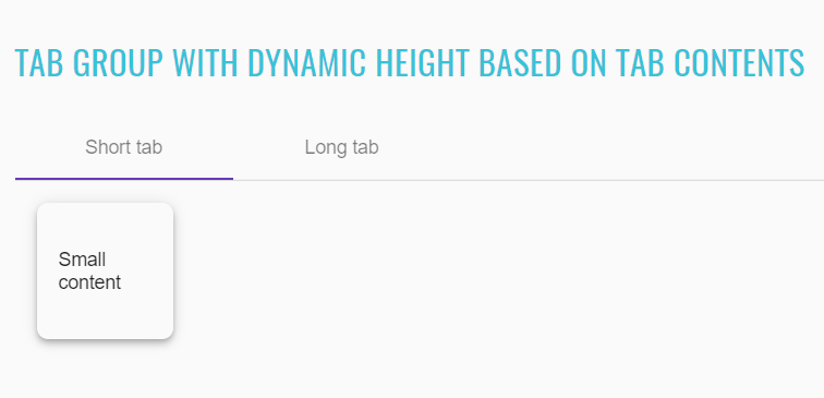
<mat-tab-group _ngcontent-sbh-c351 dynamicheight id="tab-dynamic-height-based-on-content" class="mat-tab-group
mat-primary mat-tab-group-dynamic-height"></mat-tab-group>
//@FindBy(id = "dynamically-changing-tabs")
@UI("#dynamically-changing-tabs")
public TabGroup dynamicallyChangingTabs;
@Test
public void selectedByIndexTabIsHighlighted() {
int indexForTest = 2;
int tabNumberForTest = indexForTest + 1;
tabsSection.selectByIndexInput.clear();
tabsSection.selectByIndexInput.sendKeys(String.valueOf(indexForTest));
tabsSection.dynamicallyChangingTabs.is().assertTabIsHighlighted(tabNumberForTest);
}
@Test
public void selectedByIndexTabIsNormalizedToTabsCount() {
int indexForTest = 10;
int tabNumberForTest = tabsSection.dynamicallyChangingTabs.getTabsCount();
tabsSection.selectByIndexInput.sendKeys(String.valueOf(indexForTest));
tabsSection.dynamicallyChangingTabs.is().assertTabIsHighlighted(tabNumberForTest);
}
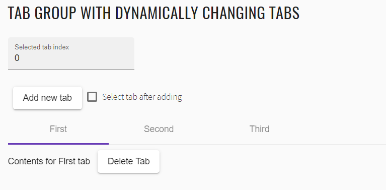
<mat-tab-group _ngcontent-sbh-c352 id="dynamically-changing-tabs" class="mat-tab-group mat-primary"></mat-tab-group>
//@FindBy(id = "tab-with-headers-on-the-bottom")
@UI("#tab-with-headers-on-the-bottom")
public TabGroup tabWithHeadersOnTheBottom;
@Test
public void verifyTabsWithHeadersOnTheBottomTitles() {
tabsSection.tabWithHeadersOnTheBottom.is().assertTabsTitles(TITLES_DEFAULT_LIST);
}
@Test
public void verifyTabWithHeadersOnTheBottomPanelContentByNumber() {
int tabNumberForTest = 3;
String stringForTest = format(DYNAMIC_CONTENT, tabNumberForTest);
tabsSection.tabWithHeadersOnTheBottom.clickTab(tabNumberForTest);
tabsSection.tabWithHeadersOnTheBottom.is().assertTabPanelContent(stringForTest);
}
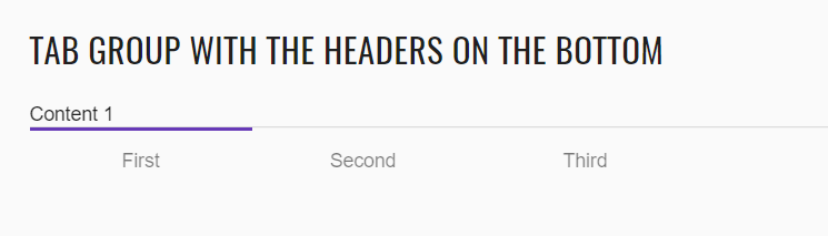
<mat-tab-group _ngcontent-sbh-c353 id="tab-with-headers-on-the-bottom" headerposition="below"
class="mat-tab-group mat-primary mat-tab-group-inverted-header"></mat-tab-group>
//@FindBy(id = "tabs-with-lazy-loaded-content")
@UI("#tabs-with-lazy-loaded-content")
public TabGroup tabsWithLazyLoadedContent;
@Test
public void verifyTabWithLazyLoadedContent() {
int tabNumberForTest = 3;
refresh();
tabsSection.tabsWithLazyLoadedContent.clickTab(tabNumberForTest);
SimpleDateFormat dateTimeInGMT = new SimpleDateFormat("MMM d, yyyy, h:mm:ss aa");
dateTimeInGMT.setTimeZone(TimeZone.getTimeZone("GMT+3"));
String timeForTest = dateTimeInGMT.format(new Date());
String stringForTest = format("Content %s - Loaded: %s", tabNumberForTest, timeForTest);
tabsSection.tabsWithLazyLoadedContent.is().assertTabPanelContent(stringForTest);
}
@Test
public void activeTabWithLazyLoadedContentIsHighlighted() {
int tabNumberForTest = 2;
tabsSection.tabsWithLazyLoadedContent.clickTab(tabNumberForTest);
tabsSection.tabsWithLazyLoadedContent.is().assertTabIsHighlighted(tabNumberForTest);
}
By default, the tab contents are eagerly loaded. Eagerly loaded tabs will initalize the child components but not inject them into the DOM until the tab is activated.
If the tab contains several complex child components or the tab's contents rely on DOM calculations during initialization, it is advised to lazy load the tab's content.
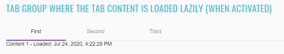
<mat-tab-group _ngcontent-sbh-c354 id="tabs-with-lazy-loaded-content" class="mat-tab-group mat-primary"></mat-tab-group>
//@FindBy(id = "tab-group-theme-example")
@UI("#tab-group-theme-example")
public TabGroup tabGroupThemeExample;
@Test
public void verifyCustomThemeTabPanelContentByNumber() {
int tabNumberForTest = 3;
String stringForTest = format(DYNAMIC_CONTENT, tabNumberForTest);
tabsSection.tabGroupThemeExample.clickTab(tabNumberForTest);
tabsSection.tabGroupThemeExample.is().assertTabPanelContent(stringForTest);
}
@Test
public void activeCustomThemeTabIsHighlighted() {
int tabNumberForTest = 2;
tabsSection.tabGroupThemeExample.clickTab(tabNumberForTest);
tabsSection.tabGroupThemeExample.is().assertTabIsHighlighted(tabNumberForTest);
}
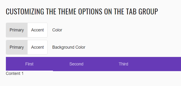
<mat-tab-group _ngcontent-sbh-c355 id="tab-group-theme-example" class="mat-tab-group mat-primary mat-background-primary"></mat-tab-group>
//@FindBy(id = "tabs-async-loading-content")
@UI("#tabs-async-loading-content")
public TabGroup tabsAsyncLoadingContent;
@Test
public void verifyTabsAsyncLoadingContent() {
tabsSection.tabsAsyncLoadingContent.is().displayed();
tabsSection.tabsAsyncLoadingContent.has().attr(CLASS_ATTR, TAB_GROUP_DEFAULT_CLASS);
}
@Test
public void verifyCustomThemeAsyncLoadingContentTabsTitles() {
tabsSection.tabsAsyncLoadingContent.is().assertTabsTitles(TITLES_DEFAULT_LIST);
}

<mat-tab-group _ngcontent-sbh-c356 id="tabs-async-loading-content" class="mat-tab-group mat-primary"></mat-tab-group>
//@FindBy(id = "tabs-nav-bar")
@UI("#tabs-nav-bar")
public TabGroup tabsNavBar;
@Test
public void verifyTabsWithLinks() {
String classForTest = "mat-tab-nav-bar mat-tab-header mat-primary mat-background-primary";
tabsSection.tabsNavBar.is().displayed();
tabsSection.tabsNavBar.has().attr(CLASS_ATTR, classForTest);
}
@Test
public void verifyTabsLinksTitles() {
List<String> listForTest = Arrays.asList("First", "Second", "Third", "Disabled Link");
tabsSection.tabsNavBar.is().assertTabsLinksTitles(listForTest);
}
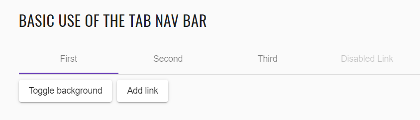
<nav _ngcontent-sbh-c357 id="tabs-nav-bar" class="mat-tab-nav-bar mat-tab-header mat-primary"></nav>
List of some available TabGroup methods:
| Method | Description | Return Type |
|---|---|---|
| is() | Assert action | TabGroupAssert |
| clickTab(int) | Click required tab by tab number | void |
| clickTab(String) | Click required tab by tab name | void |
| tabsTitlesContainValues(List |
Check if tabs titles contain values | boolean |
| tabIsHighlighted(int) | Check if tab number is highlited | boolean |
| tabPanelContainsValue(String) | Check if panel content value | boolean |
| clickTabLink(String) | Click tab-link by tab number | void |
| getTabLinksCount() | Click tab-link by tab number | int |
| getTabsCount() | Get tab link count | int |
| tabsLinksTitlesContainValues(List |
Check if tab-links contain values | boolean |
| tabWithLinkIsHighlighted(String) | Check if tab-link number is highlited | boolean |
| clear() | clear text aria | void |
Here you can find Tabs tests
2.2.11 Datepicker
Datepicker overview
The datepicker allows users to enter a date either through text input, or by choosing a date from the calendar. It is made up of several components and directives that work together. Datepicker is located in the following class:
- Java: com.epam.jdi.light.angular.elements.complex.Datepicker
A datepicker is composed of a text input and a calendar pop-up, connected via the matDatepicker property on the text
input. There is also an optional datepicker toggle button that gives the user an easy way to open the datepicker pop-up.
This works exactly the same with an input that is part of an <mat-form-field> and the toggle can easily be used as a
prefix or suffix on the Material input.
See examples with HTML code describing datepicker elements.
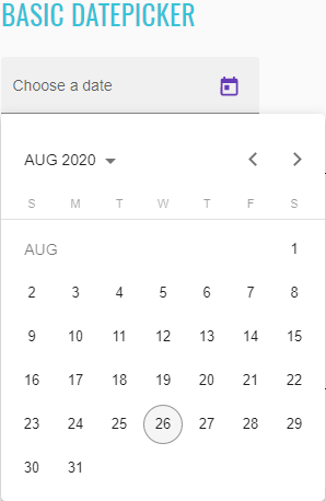
//@FindBy(css = "#basic-datepicker")
@UI("#basic-datepicker")
public static Datepicker basicDatepicker;
@Test
public void checkDisplayed() {
basicDatepicker.is().displayed();
}
@Test
public void checkExpanded() {
basicDatepicker.expand();
basicDatepicker.is().expanded();
basicDatepicker.collapse();
basicDatepicker.is().collapsed();
}
@Test
public void checkSelectDayValue() {
basicDatepicker.clear();
LocalDate now = LocalDate.now();
basicDatepicker.selectDay(now.getDayOfMonth());
basicDatepicker.has().day(now.getDayOfMonth()).month(now.getMonth()).year(Year.of(now.getYear()));
}
@Test
public void checkInputMonthDayYear() {
basicDatepicker.input("20-nov-2014");
basicDatepicker.is().month(Month.NOVEMBER).day(20).year(Year.of(2014));
}
<input _ngcontent-mwa-c267="" matinput="" id="basic-datepicker" class="mat-input-element mat-form-field-autofill-control ng-tns-c95-59 cdk-text-field-autofill-monitored" aria-invalid="false" aria-required="false" aria-haspopup="dialog">
<mat-datepicker _ngcontent-mwa-c267="" class="ng-tns-c95-59"/>
<span class="mat-form-field-label-wrapper ng-tns-c95-59">
<label class="mat-form-field-label ng-tns-c95-59 mat-empty mat-form-field-empty ng-star-inserted" id="mat-form-field-label-93" for="basic-datepicker" aria-owns="basic-datepicker">
<mat-label _ngcontent-mwa-c267="" class="ng-tns-c95-59 ng-star-inserted">Choose a date</mat-label>
</label>
</span>
The startView property of <mat-datepicker> can be used to set the view that will show up when the calendar first
opens. It can be set to month, year, or multi-year; by default it will open to month view.
The month, year, or range of years that the calendar opens to is determined by first checking if any date is currently selected, if so it will open to the month or year containing that date.
//@FindBy(css = "#start-date-datepicker")
@UI("#start-date-datepicker")
public static Datepicker startDateDatepicker;
@Test
public void checkLabelValue() {
startDateDatepicker.label().has().value(CHOOSE_A_DATE);
}
@Test
public void checkStartYearValue() {
startDateDatepicker.has().startYear(Year.of(1990));
}
@Test
public void checkStartMonthValue() {
startDateDatepicker.has().startMonth(Month.JANUARY);
}
@Test
public void checkStartDayValue() {
startDateDatepicker.has().startDay(1);
}
@Test
public void checkStartDayWithLocaleValue() {
startDateDatepicker.has().startDay(1, Locale.US);
}
<mat-form-field _ngcontent-mwa-c268="" class="mat-form-field ng-tns-c95-60 mat-primary mat-form-field-type-mat-input mat-form-field-appearance-fill mat-form-field-can-float mat-form-field-has-label mat-form-field-hide-placeholder">
<div class="mat-form-field-wrapper ng-tns-c95-60">
<div class="mat-form-field-flex ng-tns-c95-60">
<div class="mat-form-field-infix ng-tns-c95-60">
<input _ngcontent-mwa-c268="" matinput="" id="start-date-datepicker" class="mat-input-element mat-form-field-autofill-control ng-tns-c95-60 cdk-text-field-autofill-monitored" aria-invalid="false" aria-required="false" aria-haspopup="dialog">
<mat-datepicker _ngcontent-mwa-c268="" startview="year" class="ng-tns-c95-60"/>
<span class="mat-form-field-label-wrapper ng-tns-c95-60">
<label class="mat-form-field-label ng-tns-c95-60 mat-empty mat-form-field-empty ng-star-inserted" id="mat-form-field-label-95" for="start-date-datepicker" aria-owns="start-date-datepicker">
<mat-label _ngcontent-mwa-c268="" class="ng-tns-c95-60 ng-star-inserted">Choose a date</mat-label>
</label>
</span>
</div>
<div class="mat-form-field-suffix ng-tns-c95-60 ng-star-inserted">
<mat-datepicker-toggle _ngcontent-mwa-c268="" matsuffix="" id="start-date-datepicker-toggle" class="mat-datepicker-toggle ng-tns-c95-60" tabindex="-1">
<button mat-icon-button="" type="button" class="mat-focus-indicator mat-icon-button mat-button-base" aria-haspopup="dialog" aria-label="Open calendar" tabindex="0">
<span class="mat-button-wrapper">
<svg viewBox="0 0 24 24" width="24px" height="24px" fill="currentColor" focusable="false" class="mat-datepicker-toggle-default-icon ng-star-inserted">
<path d="M19 3h-1V1h-2v2H8V1H6v2H5c-1.11 0-1.99.9-1.99 2L3 19c0 1.1.89 2 2 2h14c1.1 0 2-.9 2-2V5c0-1.1-.9-2-2-2zm0 16H5V8h14v11zM7 10h5v5H7z"/>
</svg>
</span>
<div matripple="" class="mat-ripple mat-button-ripple mat-button-ripple-round"/>
<div class="mat-button-focus-overlay"/>
</button>
</mat-datepicker-toggle>
</div>
</div>
<div class="mat-form-field-underline ng-tns-c95-60 ng-star-inserted">
<span class="mat-form-field-ripple ng-tns-c95-60"/>
</div>
<div class="mat-form-field-subscript-wrapper ng-tns-c95-60">
<div class="mat-form-field-hint-wrapper ng-tns-c95-60 ng-trigger ng-trigger-transitionMessages ng-star-inserted" style="opacity: 1; transform: translateY(0%);">
<div class="mat-form-field-hint-spacer ng-tns-c95-60"/>
</div>
</div>
</div>
</mat-form-field>
//@FindBy(css = "#selected-datepicker")
@UI("#selected-datepicker")
public static Datepicker selectedDatepicker;
//@FindBy(css = "#deserialize-datepicker")
@UI("#deserialize-datepicker")
public static Datepicker deserializeDatepicker;
//@FindBy(css = "#binding-datepicker")
@UI("#binding-datepicker")
public static Datepicker bindingDatepicker;
@Test
public void checkTodayDayBindingValue() {
bindingDatepicker.clear();
selectedDatepicker.has().todayDay(LocalDate.now().getDayOfMonth());
bindingDatepicker.has().todayDay(LocalDate.now().getDayOfMonth());
}
@Test
public void checkInputDateBinding() {
selectedDatepicker.input("7/28/2014");
bindingDatepicker.is().date("7/28/2014");
}
@Test
public void checkSelectedDateBinding() {
selectedDatepicker.setDate(LocalDate.of(1988, 1, 12));
bindingDatepicker.is().selectedDate(LocalDate.of(1988, 1, 12));
}
@Test
public void checkInputMonthDayYearBinding() {
selectedDatepicker.input("2/15/1997");
bindingDatepicker.is().month(Month.FEBRUARY).day(15).year(Year.of(1997));
}
@Test
public void checkSelectDateBinding() {
selectedDatepicker.select(LocalDate.of(2017, 12, 24));
bindingDatepicker.is().text("12/24/2017");
}
@Test
public void checkHasNoReverseBinding() {
bindingDatepicker.select("1/1/2020");
selectedDatepicker.is().value("");
}
The type of values that the datepicker expects depends on the type of DateAdapter provided in your application.
The NativeDateAdapter, for example, works directly with plain JavaScript Date objects. When using the
MomentDateAdapter, however, the values will all be Moment.js instances. This use of the adapter pattern allows
the datepicker component to work with any arbitrary date representation with a custom DateAdapter.
Depending on the DateAdapter being used, the datepicker may automatically deserialize certain date formats for you as
well. For example, both the NativeDateAdapter and MomentDateAdapter allow ISO 8601 strings to be passed to the
datepicker and automatically converted to the proper object type. This can be convenient when binding data directly from
your backend to the datepicker. However, the datepicker will not accept date strings formatted in user format such as
"1/2/2017" as this is ambiguous and will mean different things depending on the locale of the browser running the code.
As with other types of <input>, the datepicker works with @angular/forms directives such as formGroup, formControl,
ngModel, etc.
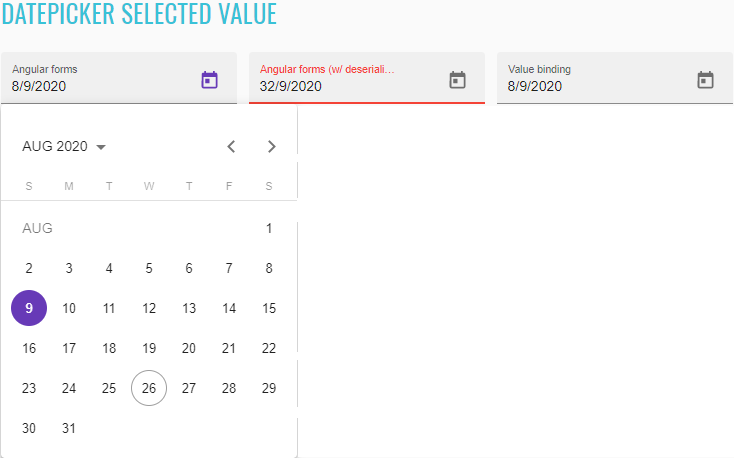
<mat-form-field>
<mat-label>Angular forms</mat-label>
<input matInput [matDatepicker]="picker1" [formControl]="date" id="selected-datepicker">
<mat-datepicker-toggle matSuffix [for]="picker1"></mat-datepicker-toggle>
<mat-datepicker #picker1></mat-datepicker>
</mat-form-field>
<mat-form-field>
<mat-label>Angular forms (w/ deserialization)</mat-label>
<input matInput [matDatepicker]="picker2"
[formControl]="serializedDate" id="deserialize-datepicker">
<mat-datepicker-toggle matSuffix [for]="picker2"></mat-datepicker-toggle>
<mat-datepicker #picker2></mat-datepicker>
</mat-form-field>
<mat-form-field>
<mat-label>Value binding</mat-label>
<input matInput [matDatepicker]="picker3" [value]="date.value" id="binding-datepicker">
<mat-datepicker-toggle matSuffix [for]="picker3"></mat-datepicker-toggle>
<mat-datepicker #picker3></mat-datepicker>
</mat-form-field>
There are three properties that add date validation to the datepicker input. The first two are the min and max
properties. In addition to enforcing validation on the input, these properties will disable all dates on the calendar
popup before or after the respective values and prevent the user from advancing the calendar past the month or year
(depending on current view) containing the min or max date.
//@FindBy(css = "#min-max-datepicker")
@UI("#min-max-datepicker")
public static Datepicker minMaxDatepicker;
@Test
public void checkTodayDayValue() {
minMaxDatepicker.has().todayDay(LocalDate.now().getDayOfMonth());
}
@Test
public void checkDisabledPreviousMonthNavigation() {
String minDate = getMinDate();
minMaxDatepicker.input(minDate);
minMaxDatepicker.is().date(minDate).and().disabledNavigation(PREVIOUS_MONTH.getName());
}
@Test
public void checkDisabledNextMonthNavigation() {
String maxDate = getMaxDate();
minMaxDatepicker.input(maxDate);
minMaxDatepicker.is().month(Month.DECEMBER).day(31).year(Year.of(LocalDate.now().getYear() + 1))
.and().disabledNavigation(NEXT_MONTH.getName());
}
@Test
public void checkDisabledMonthsAndYearsNavigation() {
String firstDisabledYearCell = format(CELL.getName(), MIN_YEAR - 2);
String secondDisabledYearCell = format(CELL.getName(), MIN_YEAR - 1);
minMaxDatepicker.openYearsView();
minMaxDatepicker.has().disabledNavigation(PREVIOUS_TWENTY_YEARS.getName(),
NEXT_TWENTY_YEARS.getName(), firstDisabledYearCell, secondDisabledYearCell);
}
<div class="mat-form-field-infix ng-tns-c95-64">
<input _ngcontent-mwa-c270="" matinput="" id="min-max-datepicker" class="mat-input-element mat-form-field-autofill-control ng-tns-c95-64 cdk-text-field-autofill-monitored" aria-invalid="false" aria-required="false" aria-haspopup="dialog" min="2001-12-31" max="2023-12-30" aria-owns="mat-datepicker-5">
<mat-datepicker _ngcontent-mwa-c270="" class="ng-tns-c95-64"/>
<span class="mat-form-field-label-wrapper ng-tns-c95-64">
<label class="mat-form-field-label ng-tns-c95-64 mat-empty mat-form-field-empty ng-star-inserted" id="mat-form-field-label-103" for="min-max-datepicker" aria-owns="min-max-datepicker">
<mat-label _ngcontent-mwa-c270="" class="ng-tns-c95-64 ng-star-inserted">Choose a date</mat-label>
</label>
</span>
</div>
The second way to add date validation is using the matDatepickerFilter property of the datepicker input.
//@FindBy(css = "#filter-datepicker")
@UI("#filter-datepicker")
public static Datepicker filterDatepicker;
@Test
public void checkLabelValue() {
filterDatepicker.label().has().value(CHOOSE_A_DATE);
}
@Test
public void checkTodayDayValue() {
filterDatepicker.has().todayDay(LocalDate.now().getDayOfMonth());
}
@Test
public void checkEmptyDateValue() {
filterDatepicker.clear();
filterDatepicker.has().value("");
}
@Test
public void checkDisabledSaturdays() {
filterDatepicker.has().disabledNavigation(filterDatepicker.getWeekDayNumbers(DatepickerNavigation.SATURDAY));
}
@Test
public void checkDisabledSundays() {
filterDatepicker.has().disabledNavigation(filterDatepicker.getWeekDayNumbers(DatepickerNavigation.SUNDAY));
}
This property accepts a function of <D> => boolean (where <D> is the date type used by the datepicker. A result of
true indicates that the date is valid and a result of false indicates that it is not. Again this will also disable
the dates on the calendar that are invalid. However, one important difference between using matDatepickerFilter vs
using min or max is that filtering out all dates before or after a certain point, will not prevent the user from
advancing the calendar past that point.
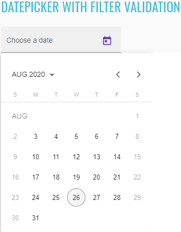
<div class="mat-form-field-wrapper ng-tns-c95-65">
<div class="mat-form-field-flex ng-tns-c95-65">
<div class="mat-form-field-infix ng-tns-c95-65">
<input _ngcontent-mwa-c271="" matinput="" id="filter-datepicker" class="mat-input-element mat-form-field-autofill-control ng-tns-c95-65 cdk-text-field-autofill-monitored" aria-invalid="false" aria-required="false" aria-haspopup="dialog">
<mat-datepicker _ngcontent-mwa-c271="" class="ng-tns-c95-65"/>
<span class="mat-form-field-label-wrapper ng-tns-c95-65">
<label class="mat-form-field-label ng-tns-c95-65 mat-empty mat-form-field-empty ng-star-inserted" id="mat-form-field-label-105" for="filter-datepicker" aria-owns="filter-datepicker">
<mat-label _ngcontent-mwa-c271="" class="ng-tns-c95-65 ng-star-inserted">Choose a date</mat-label>
</label>
</span>
</div>
<div class="mat-form-field-suffix ng-tns-c95-65 ng-star-inserted">
<mat-datepicker-toggle _ngcontent-mwa-c271="" matsuffix="" id="filter-datepicker-toggle" class="mat-datepicker-toggle ng-tns-c95-65" tabindex="-1">
<button mat-icon-button="" type="button" class="mat-focus-indicator mat-icon-button mat-button-base" aria-haspopup="dialog" aria-label="Open calendar" tabindex="0">
<span class="mat-button-wrapper">
<svg viewBox="0 0 24 24" width="24px" height="24px" fill="currentColor" focusable="false" class="mat-datepicker-toggle-default-icon ng-star-inserted">
<path d="M19 3h-1V1h-2v2H8V1H6v2H5c-1.11 0-1.99.9-1.99 2L3 19c0 1.1.89 2 2 2h14c1.1 0 2-.9 2-2V5c0-1.1-.9-2-2-2zm0 16H5V8h14v11zM7 10h5v5H7z"/>
</svg>
</span>
<div matripple="" class="mat-ripple mat-button-ripple mat-button-ripple-round"/>
<div class="mat-button-focus-overlay"/>
</button>
</mat-datepicker-toggle>
</div>
</div>
<div class="mat-form-field-underline ng-tns-c95-65 ng-star-inserted">
<span class="mat-form-field-ripple ng-tns-c95-65"/>
</div>
<div class="mat-form-field-subscript-wrapper ng-tns-c95-65">
<div class="mat-form-field-hint-wrapper ng-tns-c95-65 ng-trigger ng-trigger-transitionMessages ng-star-inserted" style="opacity: 1; transform: translateY(0%);">
<div class="mat-form-field-hint-spacer ng-tns-c95-65"/>
</div>
</div>
</div>
//@FindBy(css = "#input-change-events-datepicker")
@UI("#input-change-events-datepicker")
public static Datepicker inputChangeEventsDatepicker;
@Test
public void checkLabelValue() {
String inputChangeEvents = "Input & change events";
inputChangeEventsDatepicker.label().has().value(inputChangeEvents);
}
@Test
public void selectFirstInputChangeEventsTest() {
refresh();
LocalDate firstEventDate = LocalDate.now();
List<String> inputChangeEvents = getInputChangeEvents(firstEventDate);
inputChangeEventsDatepicker.select(firstEventDate);
inputChangeEventsDatepicker.select(LocalDate.of(2020, 8, 9));
inputChangeEventsDatepicker.is().firstInputChangeEvents(inputChangeEvents);
}
@Test
public void selectLastInputChangeEventsTest() {
LocalDate lastEventDate = LocalDate.now();
List<String> inputChangeEvents = getInputChangeEvents(lastEventDate);
inputChangeEventsDatepicker.select(LocalDate.of(2020, 8, 9));
inputChangeEventsDatepicker.select(lastEventDate);
inputChangeEventsDatepicker.is().lastInputChangeEvents(inputChangeEvents);
}
@Test
public void selectLastNullInputChangeEventsTest() {
LocalDate eventDate = LocalDate.now();
List<String> inputChangeEvents = new ArrayList<>(Arrays.asList("input: null", "change: null"));
inputChangeEventsDatepicker.select(eventDate);
inputChangeEventsDatepicker.clear();
inputChangeEventsDatepicker.is().lastInputChangeEvents(inputChangeEvents);
}
The input's native (input) and (change) events will only trigger due to user interaction with the input element;
they will not fire when the user selects a date from the calendar popup. Therefore, the datepicker input also has support
for (dateInput) and (dateChange) events. These trigger when the user interacts with either the input or the popup.
The (dateInput) event will fire whenever the value changes due to the user typing or selecting a date from the calendar.
The (dateChange) event will fire whenever the user finishes typing input (on <input> blur), or when the user chooses
a date from the calendar.
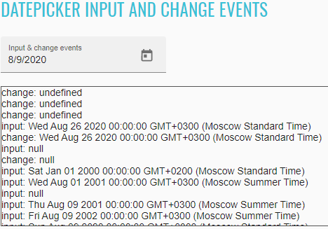
<mat-form-field>
<mat-label>Input & change events</mat-label>
<input matInput [matDatepicker]="picker"
(dateInput)="addEvent('input', $event)" (dateChange)="addEvent('change', $event)"
id="input-change-events-datepicker">
<mat-datepicker-toggle matSuffix [for]="picker"></mat-datepicker-toggle>
<mat-datepicker #picker></mat-datepicker>
</mat-form-field>
<div class="example-events">
<div *ngFor="let e of events">{{e}}</div>
</div>
As with any standard <input>, it is possible to disable the datepicker input by adding the disabled property.
By default, the <mat-datepicker> and <mat-datepicker-toggle> will inherit their disabled state from the <input>,
but this can be overridden by setting the disabled property on the datepicker or toggle elements.
//@FindBy(css = "#completely-disabled-datepicker")
@UI("#completely-disabled-datepicker")
public static Datepicker completelyDisabledDatepicker;
//@FindBy(css = "#popup-disabled-datepicker")
@UI("#popup-disabled-datepicker")
public static Datepicker popupDisabledDatepicker;
//@FindBy(css = "#input-disabled-datepicker")
@UI("#input-disabled-datepicker")
public static Datepicker inputDisabledDatepicker;
@Test
public void checkLabelValue() {
String completelyDisabled = "Completely disabled";
completelyDisabledDatepicker.label().has().value(completelyDisabled);
String popupDisabled = "Popup disabled";
popupDisabledDatepicker.label().has().value(popupDisabled);
String inputDisabled = "Input disabled";
inputDisabledDatepicker.label().has().value(inputDisabled);
}
@Test
public void checkCompletelyDisabled() {
completelyDisabledDatepicker.is().disabled();
}
@Test
public void checkToggleDisabled() {
completelyDisabledDatepicker.has().disabledToggle();
popupDisabledDatepicker.has().disabledToggle();
}
@Test
public void checkInputDisabled() {
completelyDisabledDatepicker.has().disabledInput();
inputDisabledDatepicker.has().disabledInput();
}
@Test
public void checkSetDateToEnabledInput() {
popupDisabledDatepicker.setDate(LocalDate.of(2030, 1, 19));
popupDisabledDatepicker.is().date("1/19/2030");
}
@Test
public void checkSelectDateByEnabledToggle() {
inputDisabledDatepicker.select(LocalDate.of(2029, 2, 28));
inputDisabledDatepicker.is().selectedDate(LocalDate.of(2029, 2, 28));
}
This can be useful if you want to disable text input but allow selection via the calendar or vice-versa.
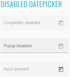
<p>
<mat-form-field>
<mat-label>Completely disabled</mat-label>
<input matInput [matDatepicker]="dp1" disabled id="completely-disabled-datepicker">
<mat-datepicker-toggle matSuffix [for]="dp1"></mat-datepicker-toggle>
<mat-datepicker #dp1></mat-datepicker>
</mat-form-field>
</p>
<p>
<mat-form-field>
<mat-label>Popup disabled</mat-label>
<input matInput [matDatepicker]="dp2" id="popup-disabled-datepicker">
<mat-datepicker-toggle matSuffix [for]="dp2" disabled></mat-datepicker-toggle>
<mat-datepicker #dp2></mat-datepicker>
</mat-form-field>
</p>
<p>
<mat-form-field>
<mat-label>Input disabled</mat-label>
<input matInput [matDatepicker]="dp3" disabled id="input-disabled-datepicker">
<mat-datepicker-toggle matSuffix [for]="dp3"></mat-datepicker-toggle>
<mat-datepicker #dp3 disabled="false"></mat-datepicker>
</mat-form-field>
</p>
The datepicker normally opens as a popup under the input. However this is not ideal for touch devices that don't have
as much screen real estate and need bigger click targets. For this reason <mat-datepicker> has a touchUi property
that can be set to true in order to enable a more touch friendly UI where the calendar opens in a large dialog.
//@FindBy(css = "#touch-ui-datepicker")
@UI("#touch-ui-datepicker")
public static Datepicker touchUiDatepicker;
@Test
public void checkSendKeysDate() {
touchUiDatepicker.sendKeys("11/25/2012");
touchUiDatepicker.is().date("11/25/2012");
}
@Test
public void checkSelectedDate() {
touchUiDatepicker.setDate(LocalDate.of(1990, 11, 16));
touchUiDatepicker.is().selectedDate(LocalDate.of(1990, 11, 16));
}
@Test
public void checkInputMonthDayYear() {
touchUiDatepicker.input("20-nov-2014");
touchUiDatepicker.is().month(Month.NOVEMBER).day(20).year(Year.of(2014));
}
@Test
public void checkSelectDate() {
touchUiDatepicker.select(LocalDate.of(2019, 12, 21));
touchUiDatepicker.is().text("12/21/2019");
}
@Test
public void checkSelectStringDate() {
touchUiDatepicker.select("11/25/2020");
touchUiDatepicker.is().value("11/25/2020");
}
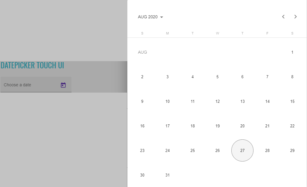
<mat-form-field class="example-full-width">
<mat-label>Choose a date</mat-label>
<input matInput [matDatepicker]="picker" id="touch-ui-datepicker">
<mat-datepicker-toggle matSuffix [for]="picker"></mat-datepicker-toggle>
<mat-datepicker touchUi #picker></mat-datepicker>
</mat-form-field>
//@FindBy(css = "#open-method-datepicker")
@UI("#open-method-datepicker")
public static Datepicker openMethodDatepicker;
@Test
public void checkSelectedDate() {
openMethodDatepicker.setDate(LocalDate.of(1997, 3, 10));
openMethodDatepicker.is().selectedDate(LocalDate.of(1997, 3, 10));
}
@Test
public void checkSelectDate() {
openMethodDatepicker.select(LocalDate.of(2017, 7, 2));
openMethodDatepicker.is().text("7/2/2017");
}
The calendar popup can be programmatically controlled using the open and close methods on the <mat-datepicker>.
It also has an opened property that reflects the status of the popup.
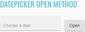
<mat-form-field class="example-full-width">
<input matInput [matDatepicker]="picker" placeholder="Choose a date" id="open-method-datepicker">
<mat-datepicker #picker></mat-datepicker>
</mat-form-field>
<button mat-raised-button (click)="picker.open()">Open</button>
By default, the MAT_DATE_LOCALE injection token will use the existing LOCALE_ID locale code from @angular/core.
If you want to override it, you can provide a new value for the MAT_DATE_LOCALE token:
//@FindBy(css = "#different-locale-datepicker")
@UI("#different-locale-datepicker")
public static Datepicker differentLocaleDatepicker;
@Test
public void checkSelectedDate() {
refresh();
differentLocaleDatepicker.select("09/16/2009", Locale.JAPAN);
differentLocaleDatepicker.is().selectedDate(LocalDate.of(2009, 9, 16), Locale.JAPAN);
}
@Test
public void checkSelectStringDate() {
differentLocaleDatepicker.switchLocale();
differentLocaleDatepicker.select("02/07/2015", Locale.FRANCE);
differentLocaleDatepicker.is().text("7/2/2015");
}
@Test
public void checkSelectDate() {
differentLocaleDatepicker.switchLocale();
differentLocaleDatepicker.select(LocalDate.of(2016, 7, 2), Locale.FRANCE);
differentLocaleDatepicker.is().value("2/7/2016");
}
<input _ngcontent-mwa-c276="" matinput="" id="different-locale-datepicker" class="mat-input-element mat-form-field-autofill-control ng-tns-c95-198 cdk-text-field-autofill-monitored" aria-invalid="false" aria-required="false" aria-haspopup="dialog">
<mat-datepicker _ngcontent-mwa-c276="" class="ng-tns-c95-198"/>
<span class="mat-form-field-label-wrapper ng-tns-c95-198">
<label class="mat-form-field-label ng-tns-c95-198 mat-empty mat-form-field-empty ng-star-inserted" id="mat-form-field-label-223" for="different-locale-datepicker" aria-owns="different-locale-datepicker">
<mat-label _ngcontent-mwa-c276="" class="ng-tns-c95-198 ng-star-inserted">Different locale</mat-label>
</label>
</span>
</div>
<div class="mat-form-field-suffix ng-tns-c95-198 ng-star-inserted">
<mat-datepicker-toggle _ngcontent-mwa-c276="" matsuffix="" id="different-locale-datepicker-toggle" class="mat-datepicker-toggle ng-tns-c95-198" tabindex="-1">
<button mat-icon-button="" type="button" class="mat-focus-indicator mat-icon-button mat-button-base" aria-haspopup="dialog" aria-label="Open calendar" tabindex="0">
<span class="mat-button-wrapper">
<svg viewBox="0 0 24 24" width="24px" height="24px" fill="currentColor" focusable="false" class="mat-datepicker-toggle-default-icon ng-star-inserted">
</svg>
</span>
It's also possible to set the locale at runtime using the setLocale method of the DateAdapter.
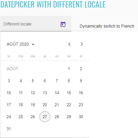
//@FindBy(css = "#moment-js-datepicker")
@UI("#moment-js-datepicker")
public static Datepicker momentJsDatepicker;
@Test
public void checkLabelValue() {
String momentDatepicker = "Moment.js datepicker";
momentJsDatepicker.label().has().value(momentDatepicker);
}
@Test
public void checkMomentDate() {
refresh();
momentJsDatepicker.is().selectedDate(LocalDate.of(2017, 1, 1));
}
@Test
public void checkInputDate() {
momentJsDatepicker.input("5/10/1996");
momentJsDatepicker.is().selectedDate(LocalDate.of(1996, 5, 10));
}
@Test
public void checkSetTextDate() {
momentJsDatepicker.setText("4/14/2009");
momentJsDatepicker.is().date("4/14/2009");
}
<mat-form-field>
<mat-label>Different locale</mat-label>
<input matInput [matDatepicker]="dp" id="different-locale-datepicker">
<mat-datepicker-toggle matSuffix [for]="dp"></mat-datepicker-toggle>
<mat-datepicker #dp></mat-datepicker>
</mat-form-field>
<button mat-button (click)="french()">Dynamically switch to French</button>
The datepicker was built to be date implementation agnostic. This means that it can be made to work with a variety of different date implementations. However it also means that developers need to make sure to provide the appropriate pieces for the datepicker to work with their chosen implementation.
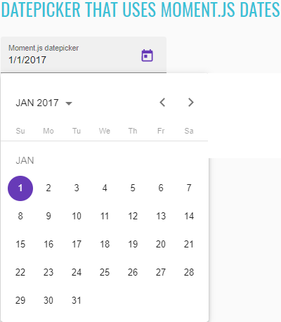
//@FindBy(css = "#custom-formats-datepicker")
@UI("#custom-formats-datepicker")
public static Datepicker customFormatsDatepicker;
@Test
public void checkLabelValue() {
String verboseDatepicker = "Verbose datepicker";
customFormatsDatepicker.label().has().value(verboseDatepicker);
}
@Test
public void checkInputDate() {
customFormatsDatepicker.input("MAR-10-1997");
customFormatsDatepicker.is().selectedDate(LocalDate.of(1997, 3, 10));
}
@Test
public void checkSetTextDate() {
customFormatsDatepicker.setText("January-31-2007");
customFormatsDatepicker.is().date("January 31, 2007");
}
<mat-form-field>
<mat-label>Moment.js datepicker</mat-label>
<input matInput [matDatepicker]="dp" [formControl]="date" id="moment-js-datepicker">
<mat-datepicker-toggle matSuffix [for]="dp"></mat-datepicker-toggle>
<mat-datepicker #dp></mat-datepicker>
</mat-form-field>
The MAT_DATE_FORMATS object is a collection of formats that the datepicker uses when parsing and displaying dates.
These formats are passed through to the DateAdapter so you will want to make sure that the format objects you're
using are compatible with the DateAdapter used in your app.
If you want use one of the DateAdapters that ships with Angular Material, but use your own MAT_DATE_FORMATS, you can
import the NativeDateModule or MomentDateModule. These modules are identical to the "Mat"-prefixed versions
(MatNativeDateModule and MatMomentDateModule) except they do not include the default formats.

<mat-form-field>
<mat-label>Verbose datepicker</mat-label>
<input matInput [matDatepicker]="dp" [formControl]="date" id="custom-formats-datepicker">
<mat-datepicker-toggle matSuffix [for]="dp"></mat-datepicker-toggle>
<mat-datepicker #dp></mat-datepicker>
</mat-form-field>
List of some available Datepicker methods:
| Method | Description | Return Type |
|---|---|---|
| is() | Assert action | DatepickerAssert |
| expand() | Expand Datepicker panel | void |
| collapse() | Collapse expanded Datepicker panel | void |
| isExpanded() | Shows that Datepicker has expanded | boolean |
| isCollapsed() | Shows that Datepicker has collapsed | boolean |
| isFocused() | Shows that Datepicker has focus | boolean |
| isValid() | Shows that Datepicker has a valid value | boolean |
| isInvalid() | Shows that Datepicker has an invalid value | boolean |
| isEnabled() | Shows Datepicker is enabled | boolean |
| isDisabled() | Shows Datepicker is disabled | boolean |
| isToggleEnabled() | Shows Datepicker toggle is enabled | boolean |
| isToggleDisabled() | Shows Datepicker toggle is disabled | boolean |
| isInputEnabled() | Shows Datepicker input is enabled | boolean |
| isInputDisabled() | Shows Datepicker input is disabled | boolean |
| isDisabledNavigationElements(String...) | Shows Datepicker elements is disabled | boolean |
| isEnabledNavigationElements(String...) | Shows Datepicker elements is enabled | boolean |
| clear() | clears field | void |
| value() | Returns value | String |
| sendKeys(CharSequence...) | Sets keys for date | void |
| setText(String) | Sets string for date | void |
| input(String) | input text | void |
| setDate(LocalDate) | Set date on input Datepicker | void |
| selectDayInPreviousMonth(int) | Select day in the previous month | void |
| selectDayInNextMonth(int) | Select day in the next month | void |
| navigateToDayInPreviousMonths(int, int) | Navigate to day in the defined previous month count (monthcount,day) | void |
| navigateToDayInNextMonths(int, int) | Navigate to day in the defined next month count (monthcount,day) | void |
| openYearsView() | Open Datepicker years view | void |
| getMonth() | Get Datepicker input month value | Month |
| startMonth() | Get Datepicker start month value | Month |
| getDay() | Get Datepicker input day value | int |
| startDay() | Get Datepicker start day value | int |
| startDay(Locale) | Get Datepicker start day value | int |
| getYear() | Get Datepicker input year value | Year |
| startYear() | Get Datepicker start year value | Year |
| select(String/LocalDate) | Select date in Datepicker | void |
| select(String /LocalDate, Locale) | Select date in Datepicker with specific Locale | void |
| selectedDate() | Get Datepicker selected date value | LocalDate |
| selectedDate(Locale) | Get Datepicker selected date value with specific Locale | LocalDate |
| selectedMonth() | Get Datepicker selected month value | Month |
| selectDay(int) | Select day in Datepicker | void |
| selectedDay() | Get Datepicker selected day value | int |
| todayDay() | Get Datepicker doday day value | int |
| selectedYear() | Get Datepicker selected year value | Year |
| getWeekDayNumbers(DatepickerNavigation) | Get Datepicker week day numbers | String[] |
| switchLocale() | Switch locale for Datepicker | void |
| isSelectedLocale(Locale) | Check Datepicker locale | boolean |
| isFirstInputChangeEvents(List |
Check Datepicker has first input & change events | boolean |
| isLastInputChangeEvents(List |
Check Datepicker has last input & change events | boolean |
| isLastChangeEvent(String) | Check Datepicker has last change event | boolean |
| isLastInputEvent(String) | Check Datepicker has last input event | boolean |
Datepicker java tests examples
2.2.12 Menu
Menu overview
Menu element represents a group of commands that a user can perform or activate.
Menu is located in the following classes:
- Java: com.epam.jdi.light.angular.elements.complex.NestedDropdownMenu
There are three different menu in Angular: basic menu, menu with icons and nested menu.
See an example with HTML code describing basic menu element.
//FindBy(css = "#basic-menu-button")
@UI("#basic-menu-button")
public static NestedDropdownMenu basicMenuButton;
//FindBy(css = "#basic-menu-selected-option")
@UI("#basic-menu-selected-option")
public static Text basicMenuSelectedOption;
@Test
public void basicMenuTest() {
basicMenu.is().displayed();
}
@Test
public void basicMenuSelectTest() {
basicMenuButton.select("Item 1");
basicMenuSelectedOption.is().text("Item 1");
}
@Test
public void checkBasicMenuAvailableOptionsTest() {
String[] expectedList = BASIC_MENU_VALUES;
basicMenuButton.expand();
List<String> actualList = basicMenuButton.values();
for (int i = 0; i < expectedList.length; i++) {
basicMenuButton.is().checkValue(expectedList[i], (actualList.get(i)));
}
<button _ngcontent-mwa-c289="" aria-haspopup="true" id="basic-menu-button" mat-button="" class="mat-focus-indicator mat-menu-trigger mat-button mat-button-base">
<span class="mat-button-wrapper">Menu</span>
<div matripple="" class="mat-ripple mat-button-ripple"/>
<div class="mat-button-focus-overlay"/>
</button>
See an example with HTML code describing menu with icons element.
//FindBy(css = "#menu-with-icons-button")
@UI("#menu-with-icons-button")
public static NestedDropdownMenu menuWithIconsButton;
//FindBy(css = "#icons-menu-selected-option")
@UI("#menu-with-icons-button")
public static Text iconsMenuSelectedOption;
@Test
public void menuWithIconsTest() {
menuWithIconsButton.is().displayed();
}
@Test
public void menuWithIconsSelectTest() {
menuWithIconsButton.expand();
menuWithIconsButton.selectForMenuWithIcons("Redial");
iconsMenuSelectedOption.is().text("Redial");
}
@Test
public void disabledMenuWithIconsOptionTest() {
menuWithIconsButton.expand();
menuWithIconsButton.is().isDisabledMenuWithIconsOption("Check voice mail");
}
@Test
public void checkMenuWithIconsAvailableOptionsTest() {
String[] expectedList = MENU_WITH_ICONS_VALUES;
List<String> actualList = menuWithIconsButton.valuesForMenuWithIcons();
menuWithIconsButton.expand();
for (int i = 0; i < expectedList.length; i++) {
menuWithIconsButton.checkValue(expectedList[i], actualList.get(i));
}
}
<button _ngcontent-mwa-c290="" aria-haspopup="true" id="menu-with-icons-button" mat-icon-button="" aria-label="Example icon-button with a menu" class="mat-focus-indicator mat-menu-trigger mat-icon-button mat-button-base">
<span class="mat-button-wrapper">
<mat-icon _ngcontent-mwa-c290="" role="img" class="mat-icon notranslate material-icons mat-icon-no-color" aria-hidden="true">more_vert</mat-icon>
</span>
<div matripple="" class="mat-ripple mat-button-ripple mat-button-ripple-round"/>
<div class="mat-button-focus-overlay"/>
</button>
<div class="mat-menu-content ng-tns-c168-95">
<button _ngcontent-mwa-c290="" mat-menu-item="" class="mat-focus-indicator mat-menu-item ng-tns-c168-95" role="menuitem" tabindex="0" aria-disabled="false">
<mat-icon _ngcontent-mwa-c290="" role="img" class="mat-icon notranslate material-icons mat-icon-no-color" aria-hidden="true">dialpad</mat-icon>
<span _ngcontent-mwa-c290="">Redial</span>
<div matripple="" class="mat-ripple mat-menu-ripple"/>
</button>
<button _ngcontent-mwa-c290="" mat-menu-item="" disabled="true" class="mat-focus-indicator mat-menu-item ng-tns-c168-95" role="menuitem" tabindex="-1" aria-disabled="true">
<mat-icon _ngcontent-mwa-c290="" role="img" class="mat-icon notranslate material-icons mat-icon-no-color" aria-hidden="true">voicemail</mat-icon>
<span _ngcontent-mwa-c290="">Check voice mail</span>
<div matripple="" class="mat-ripple mat-menu-ripple"/>
</button>
<button _ngcontent-mwa-c290="" mat-menu-item="" class="mat-focus-indicator mat-menu-item ng-tns-c168-95" role="menuitem" tabindex="0" aria-disabled="false">
<mat-icon _ngcontent-mwa-c290="" role="img" class="mat-icon notranslate material-icons mat-icon-no-color" aria-hidden="true">notifications_off</mat-icon>
<span _ngcontent-mwa-c290="">Disable alerts</span>
<div matripple="" class="mat-ripple mat-menu-ripple"/>
</button>
</div>
See an example with HTML code describing nested menu element.
//FindBy(css = "#nested-menu-button")
@UI("#nested-menu-button")
public static NestedDropdownMenu nestedMenuButton;
//FindBy(css = "#nested-menu-selected-option")
@UI("#nested-menu-selected-option")
public static Text nestedMenuSelectedOption;
@Test
public void nestedMenuTest() {
nestedMenuButton.is().displayed();
}
@Test
public void nestedMenuFirstNestingLayerSelectTest() {
nestedMenuButton.expand();
nestedMenuButton.select("Vertebrates ");
nestedMenuSelectedOption.is().text("Vertebrates");
}
@Test
public void nestedMenuSecondNestingLayerSelectTest() {
nestedMenuButton.expand();
nestedMenuButton.select("Vertebrates ", "Fishes");
nestedMenuSelectedOption.is().text("Fishes");
}
@Test
public void nestedMenuThirdNestingLayerSelectTest() {
nestedMenuButton.expand();
nestedMenuButton.select("Vertebrates ", "Fishes", "Bala shark");
nestedMenuSelectedOption.is().text("Bala shark");
}
@Test
public void disabledNestedMenuOptionTest() {
nestedMenuButton.expand();
nestedMenuButton.is().isDisabledNestedMenuOption("Vertebrates ", "Reptiles", "Velociraptor");
}
@Test
public void checkNestedMenuAvailableOptionsTest() {
String[] expectedList = NESTED_MENU_VALUES;
nestedMenuButton.expand();
List<String> actualList = nestedMenuButton.valuesForNestedMenu();
for (int i = 0; i < expectedList.length; i++) {
nestedMenuButton.is().checkValue(expectedList[i], actualList.get(i));
}
}
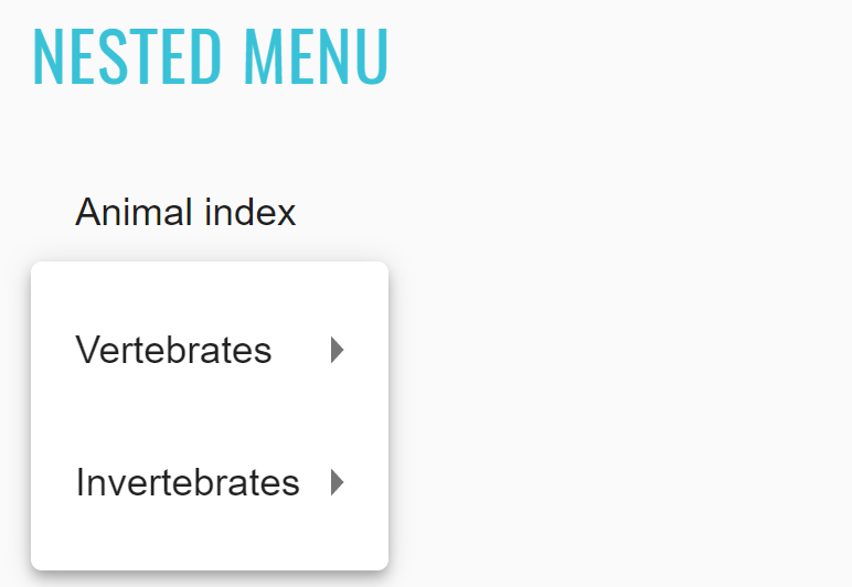
<button _ngcontent-mwa-c291="" aria-haspopup="true" id="nested-menu-button" mat-button="" class="mat-focus-indicator mat-menu-trigger mat-button mat-button-base">
<span class="mat-button-wrapper">Animal index</span>
<div matripple="" class="mat-ripple mat-button-ripple"/>
<div class="mat-button-focus-overlay"/>
</button>
<div class="mat-menu-content ng-tns-c168-96">
<button _ngcontent-mwa-c291="" aria-haspopup="true" mat-menu-item="" class="mat-focus-indicator mat-menu-trigger mat-menu-item mat-menu-item-submenu-trigger ng-tns-c168-96 mat-menu-item-highlighted" role="menuitem" tabindex="0" aria-disabled="false" aria-expanded="true" aria-controls="mat-menu-panel-3">Vertebrates <div matripple="" class="mat-ripple mat-menu-ripple"/>
</button>
<!---->
<button _ngcontent-mwa-c291="" aria-haspopup="true" mat-menu-item="" class="mat-focus-indicator mat-menu-trigger mat-menu-item mat-menu-item-submenu-trigger ng-tns-c168-96" role="menuitem" tabindex="0" aria-disabled="false"> Invertebrates <div matripple="" class="mat-ripple mat-menu-ripple"/>
</button>
<!---->
</div>
List of some available NestedDropdownMenu methods:
| Method | Description | Return Type |
|---|---|---|
| expand() | Expand menu | void |
| isExpanded() | Check if menu expanded | boolean |
| close() | Closing menu | void |
| isClosed() | Check if menu closed | boolean |
| select(String...) | Select a certain element | UIElement |
| values() | Get list of values | List |
| checkValue(String,String) | Check that element value is correct (expectedValue, actualValue) | boolean |
| valuesForNestedMenu() | Get list of values from nested menu | List |
| valuesForMenuWithIcons() | Get list of values from menu with icons | List |
| selectForMenuWithIcons(String) | Select a certain element for menu with icons | void |
| isDisabledMenuWithIconsOption(String) | Checks is option is disabled for menu with icons | boolean |
| isDisabledNestedMenuOption(String...) | Checks is option is disabled for nested menu | boolean |
| is() | Assert action | NestedDropdownMenuAssert |
Menu java tests examples
2.2.13 Ripple
Ripple overview
Connect user input to screen reactions by using ripples to both indicate the point of touch, and to confirm that touch input was received. For touch or mouse, this occurs at the point of contact.
The matRipple attribute directive defines an area in which a ripple animates on user interaction.
Ripple is located in the following class:
- Java: com.epam.jdi.light.angular.elements.complex.Ripple
By default, a ripple is activated when the host element of the matRipple directive receives mouse or touch events.
Upon being pressed, a ripple will begin fading in from the point of contact, radiating to cover the host element.
Each ripple will fade out only upon release of the mouse or touch.
Ripples can also be triggered programmatically by getting a reference to the MatRipple directive and calling its launch
method.
See examples with HTML code describing ripple element.
//@FindBy(css = "#ripple-container")
@UI("#ripple-container")
public static Ripple rippleContainer;
@Test
public void displayedTest() {
rippleContainer.is().displayed();
}
@Test
public void disabledTest() {
rippleContainer.disable();
rippleContainer.is().disabled();
rippleContainer.enable();
rippleContainer.is().enabled();
}
@Test
public void unboundedTest() {
rippleContainer.unbound();
rippleContainer.is().unbounded();
}
@Test
public void centeredTest() {
rippleContainer.center();
rippleContainer.is().centered();
}
@Test
public void rippleActionTest() {
rippleContainer.ripple();
rippleContainer.is().active();
}
@Test
public void radiusTest() {
int expectedRadius = 260;
rippleContainer.setRadius(expectedRadius);
rippleContainer.has().radius(expectedRadius);
}
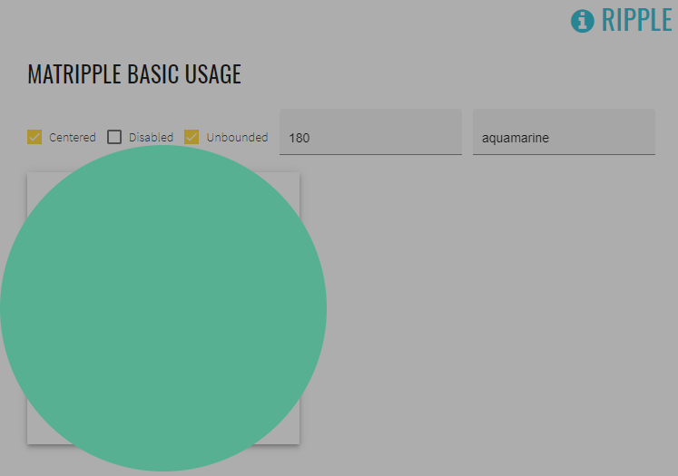
<mat-checkbox [(ngModel)]="centered" class="example-ripple-checkbox" id="ripple-centered-checkbox">Centered
</mat-checkbox>
<mat-checkbox [(ngModel)]="disabled" class="example-ripple-checkbox" id="ripple-disabled-checkbox">Disabled
</mat-checkbox>
<mat-checkbox [(ngModel)]="unbounded" class="example-ripple-checkbox" id="ripple-unbounded-checkbox">Unbounded
</mat-checkbox>
<mat-form-field class="example-ripple-form-field" id="ripple-radius-input">
<input matInput [(ngModel)]="radius" type="number" placeholder="Radius">
</mat-form-field>
<mat-form-field class="example-ripple-form-field" id="ripple-color-input">
<input matInput [(ngModel)]="color" type="text" placeholder="Color">
</mat-form-field>
<div class="example-ripple-container mat-elevation-z4" id="ripple-container"
matRipple
[matRippleCentered]="centered"
[matRippleDisabled]="disabled"
[matRippleUnbounded]="unbounded"
[matRippleRadius]="radius"
[matRippleColor]="color">
Click me
</div>
List of some available Ripple methods:
| Method | Description | Return Type |
|---|---|---|
| is() | Assert action | RippleAssert |
| isDisplayed() | Shows Ripple is displayed | boolean |
| ripple() | Activate Ripple | void |
| ripple(int , int ) | Activate Ripple by coordinates (x,y) | void |
| enable() | Enable Ripple | void |
| disable() | Disable Ripple | void |
| bound() | Bound Ripple | void |
| unbound() | Unbound Ripple | void |
| decentralize() | Decentralize Ripple | void |
| center() | Center Ripple | void |
| isDisabled() | Shows that Ripple has disabled | boolean |
| isUnbounded() | Shows that Ripple has unbounded | boolean |
| isCentered() | Shows that Ripple has centered | boolean |
| isActive() | Shows that Ripple is active | boolean |
| isRippleCenter(int, int) | Shows that Ripple has centered by coordinates (x,y) | boolean |
| setRadius(int) | Setup Ripple radius | void |
| setColor(String) | Setup Ripple color | void |
| isRadius(int) | Shows that Ripple has required radius | boolean |
| isColor(String) | Shows that Ripple has required color | boolean |
| color() | Get Ripple color | String |
| radius() | Get Ripple radius | int |
| isCorrectRadius() | Shows that Ripple input radius is correct | boolean |
| isCorrectColor() | Shows that Ripple input color is correct | boolean |
| clearRadius() | Clear Ripple input radius | void |
| clearColor() | Clear Ripple input color | void |
Ripple java tests examples
2.2.14 Expansion panel
Expansion panel overview
<mat-expansion-panel> provides an expandable details-summary view.
Expansion panel is located in the following class:
- Java: com.epam.jdi.light.angular.elements.complex.ExpansionPanel
Expansion-panel content
Header
//@FindBy(css = "#basic-expansion-panel")
@UI("#basic-expansion-panel")
public static ExpansionPanel basicExpansionPanel;
@Test
public void displayedTest() {
basicExpansionPanel.is().displayed();
}
@Test
public void expandByIndicatorTest() {
basicExpansionPanel.expand(1);
basicExpansionPanel.is().expanded(1);
}
@Test
public void collapseByIndicatorTest() {
basicExpansionPanel.expand(2);
basicExpansionPanel.collapse(2);
basicExpansionPanel.is().collapsed(2);
}
The <mat-expansion-panel-header> shows a summary of the panel content and acts as the control for expanding and collapsing.
This header may optionally contain an <mat-panel-title> and an <mat-panel-description>, which format the content of the
header to align with Material Design specifications.
By default, the expansion-panel header includes a toggle icon at the end of the header to indicate the expansion state.
This icon can be hidden via the hideToggle property.
Action bar
Actions may optionally be included at the bottom of the panel, visible only when the expansion is in its expanded state.
Disabling a panel
Expansion panels can be disabled using the disabled attribute. A disabled expansion panel can't be toggled by the user, but can still be manipulated programmatically.
Accordion
Multiple expansion-panels can be combined into an accordion. The multi="true" input allows the expansions state to be set
independently of each other. When multi="false" (default) just one panel can be expanded at a given time.
Lazy rendering
By default, the expansion panel content will be initialized even when the panel is closed. To instead defer initialization
until the panel is
open, the content should be provided as an ng-template.
Accessibility
The expansion-panel aims to mimic the experience of the native <details> and <summary> elements. The expansion panel
header has role="button" and also the attribute aria-controls with the expansion panel's id as value.
The expansion panel headers are buttons. Users can use the keyboard to activate the expansion panel header to switch between expanded state and collapsed state. Because the header acts as a button, additional interactive elements should not be put inside of the header.
See examples with HTML code describing expansion panel element.
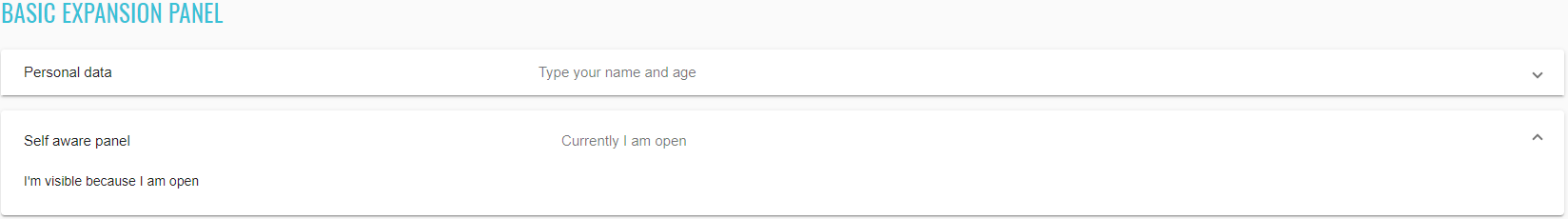
<mat-accordion id="basic-expansion-panel">
<mat-expansion-panel>
<mat-expansion-panel-header>
<mat-panel-title>
Personal data
</mat-panel-title>
<mat-panel-description>
Type your name and age
</mat-panel-description>
</mat-expansion-panel-header>
<mat-form-field>
<mat-label>First name</mat-label>
<input matInput id="basic-first-name-input">
</mat-form-field>
<mat-form-field>
<mat-label>Age</mat-label>
<input matInput type="number" min="1" id="basic-age-input">
</mat-form-field>
</mat-expansion-panel>
<mat-expansion-panel (opened)="panelOpenState = true"
(closed)="panelOpenState = false">
<mat-expansion-panel-header>
<mat-panel-title>
Self aware panel
</mat-panel-title>
<mat-panel-description>
Currently I am {{panelOpenState ? 'open' : 'closed'}}
</mat-panel-description>
</mat-expansion-panel-header>
<p>I'm visible because I am open</p>
</mat-expansion-panel>
</mat-accordion>
//@FindBy(css = "#accordion-expansion-panel")
@UI("#accordion-expansion-panel")
public static ExpansionPanel accordionExpansionPanel;
@Test
public void expandByIconTest() {
accordionExpansionPanel.show();
accordionExpansionPanel.expand(3);
accordionExpansionPanel.is().expanded(3);
}
@Test
public void collapseByIconTest() {
accordionExpansionPanel.show();
accordionExpansionPanel.expand(3);
accordionExpansionPanel.collapse(3);
accordionExpansionPanel.is().collapsed(3);
}
@Test
public void expandCollapseByIconTest() {
accordionExpansionPanel.show();
accordionExpansionPanel.expand(2);
accordionExpansionPanel.expand(1);
accordionExpansionPanel.expand(3);
accordionExpansionPanel.is().expanded(3).and().collapsed(1).and().collapsed(2);
}
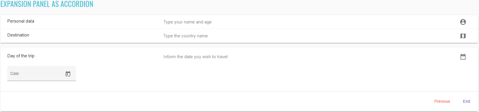
<mat-accordion _ngcontent-aid-c307="" id="accordion-expansion-panel" class="mat-accordion example-headers-align">
<mat-expansion-panel _ngcontent-aid-c307="" hidetoggle="" class="mat-expansion-panel ng-tns-c150-120 mat-expanded mat-expansion-panel-spacing">
<mat-expansion-panel-header _ngcontent-aid-c307="" role="button" class="mat-expansion-panel-header ng-tns-c152-121 ng-trigger ng-trigger-expansionHeight ng-tns-c150-120 ng-star-inserted mat-expanded mat-expansion-toggle-indicator-after" id="mat-expansion-panel-header-2" tabindex="0" aria-controls="cdk-accordion-child-2" aria-expanded="true" aria-disabled="false" style="height: 64px;">
<span class="mat-content ng-tns-c152-121">
<mat-panel-title _ngcontent-aid-c307="" class="mat-expansion-panel-header-title ng-tns-c152-121"> Personal data </mat-panel-title>
<mat-panel-description _ngcontent-aid-c307="" class="mat-expansion-panel-header-description ng-tns-c152-121"> Type your name and age <mat-icon _ngcontent-aid-c307="" role="img" class="mat-icon notranslate material-icons mat-icon-no-color" aria-hidden="true">account_circle</mat-icon>
</mat-panel-description>
</span>
<!---->
</mat-expansion-panel-header>
<div role="region" class="mat-expansion-panel-content ng-tns-c150-120 ng-trigger ng-trigger-bodyExpansion" id="cdk-accordion-child-2" aria-labelledby="mat-expansion-panel-header-2" style="visibility: visible;">
<div class="mat-expansion-panel-body ng-tns-c150-120">
<mat-form-field _ngcontent-aid-c307="" class="mat-form-field ng-tns-c95-122 mat-primary ng-tns-c150-120 ng-star-inserted mat-form-field-type-mat-input mat-form-field-appearance-fill mat-form-field-can-float mat-form-field-has-label mat-form-field-hide-placeholder">
<div class="mat-form-field-wrapper ng-tns-c95-122">
<div class="mat-form-field-flex ng-tns-c95-122">
<!---->
<!---->
<div class="mat-form-field-infix ng-tns-c95-122">
<input _ngcontent-aid-c307="" matinput="" id="accordion-first-name-input" class="mat-input-element mat-form-field-autofill-control ng-tns-c95-122 cdk-text-field-autofill-monitored" aria-invalid="false" aria-required="false">
<span class="mat-form-field-label-wrapper ng-tns-c95-122">
<label class="mat-form-field-label ng-tns-c95-122 mat-empty mat-form-field-empty ng-star-inserted" id="mat-form-field-label-163" for="accordion-first-name-input" aria-owns="accordion-first-name-input" style="">
<!---->
<mat-label _ngcontent-aid-c307="" class="ng-tns-c95-122 ng-star-inserted">First name</mat-label>
<!---->
<!---->
</label>
<!---->
</span>
</div>
<!---->
</div>
<div class="mat-form-field-underline ng-tns-c95-122 ng-star-inserted" style="">
<span class="mat-form-field-ripple ng-tns-c95-122"/>
</div>
<!---->
<div class="mat-form-field-subscript-wrapper ng-tns-c95-122">
<!---->
<div class="mat-form-field-hint-wrapper ng-tns-c95-122 ng-trigger ng-trigger-transitionMessages ng-star-inserted" style="opacity: 1; transform: translateY(0%);">
<!---->
<div class="mat-form-field-hint-spacer ng-tns-c95-122"/>
</div>
<!---->
</div>
</div>
</mat-form-field>
<mat-form-field _ngcontent-aid-c307="" class="mat-form-field ng-tns-c95-123 mat-primary ng-tns-c150-120 ng-star-inserted mat-form-field-type-mat-input mat-form-field-appearance-fill mat-form-field-can-float mat-form-field-has-label mat-form-field-hide-placeholder">
<div class="mat-form-field-wrapper ng-tns-c95-123">
<div class="mat-form-field-flex ng-tns-c95-123">
<!---->
<!---->
<div class="mat-form-field-infix ng-tns-c95-123">
<input _ngcontent-aid-c307="" matinput="" type="number" min="1" id="accordion-age-input" class="mat-input-element mat-form-field-autofill-control ng-tns-c95-123 cdk-text-field-autofill-monitored" aria-invalid="false" aria-required="false">
<span class="mat-form-field-label-wrapper ng-tns-c95-123">
<label class="mat-form-field-label ng-tns-c95-123 mat-empty mat-form-field-empty ng-star-inserted" id="mat-form-field-label-165" for="accordion-age-input" aria-owns="accordion-age-input" style="">
<!---->
<mat-label _ngcontent-aid-c307="" class="ng-tns-c95-123 ng-star-inserted">Age</mat-label>
<!---->
<!---->
</label>
<!---->
</span>
</div>
<!---->
</div>
<div class="mat-form-field-underline ng-tns-c95-123 ng-star-inserted" style="">
<span class="mat-form-field-ripple ng-tns-c95-123"/>
</div>
<!---->
<div class="mat-form-field-subscript-wrapper ng-tns-c95-123">
<!---->
<div class="mat-form-field-hint-wrapper ng-tns-c95-123 ng-trigger ng-trigger-transitionMessages ng-star-inserted" style="opacity: 1; transform: translateY(0%);">
<!---->
<div class="mat-form-field-hint-spacer ng-tns-c95-123"/>
</div>
<!---->
</div>
</div>
</mat-form-field>
<!---->
</div>
<mat-action-row _ngcontent-aid-c307="" class="mat-action-row ng-tns-c150-120">
<button _ngcontent-aid-c307="" mat-button="" color="primary" class="mat-focus-indicator mat-button mat-button-base mat-primary">
<span class="mat-button-wrapper">Next</span>
<div matripple="" class="mat-ripple mat-button-ripple"/>
<div class="mat-button-focus-overlay"/>
</button>
</mat-action-row>
</div>
</mat-expansion-panel>
<!---->
<mat-expansion-panel _ngcontent-aid-c307="" hidetoggle="" class="mat-expansion-panel ng-tns-c150-124">
<mat-expansion-panel-header _ngcontent-aid-c307="" role="button" class="mat-expansion-panel-header ng-tns-c152-125 ng-trigger ng-trigger-expansionHeight ng-tns-c150-124 ng-star-inserted mat-expansion-toggle-indicator-after" id="mat-expansion-panel-header-3" tabindex="0" aria-controls="cdk-accordion-child-3" aria-expanded="false" aria-disabled="false" style="height: 48px;">
<span class="mat-content ng-tns-c152-125">
<mat-panel-title _ngcontent-aid-c307="" class="mat-expansion-panel-header-title ng-tns-c152-125"> Destination </mat-panel-title>
<mat-panel-description _ngcontent-aid-c307="" class="mat-expansion-panel-header-description ng-tns-c152-125"> Type the country name <mat-icon _ngcontent-aid-c307="" role="img" class="mat-icon notranslate material-icons mat-icon-no-color" aria-hidden="true">map</mat-icon>
</mat-panel-description>
</span>
<!---->
</mat-expansion-panel-header>
<div role="region" class="mat-expansion-panel-content ng-tns-c150-124 ng-trigger ng-trigger-bodyExpansion" id="cdk-accordion-child-3" aria-labelledby="mat-expansion-panel-header-3" style="height: 0px; visibility: hidden;">
<div class="mat-expansion-panel-body ng-tns-c150-124">
<mat-form-field _ngcontent-aid-c307="" class="mat-form-field ng-tns-c95-126 mat-primary ng-tns-c150-124 ng-star-inserted mat-form-field-type-mat-input mat-form-field-appearance-fill mat-form-field-can-float mat-form-field-has-label mat-form-field-hide-placeholder">
<div class="mat-form-field-wrapper ng-tns-c95-126">
<div class="mat-form-field-flex ng-tns-c95-126">
<!---->
<!---->
<div class="mat-form-field-infix ng-tns-c95-126">
<input _ngcontent-aid-c307="" matinput="" id="accordion-country-input" class="mat-input-element mat-form-field-autofill-control ng-tns-c95-126 cdk-text-field-autofill-monitored" aria-invalid="false" aria-required="false">
<span class="mat-form-field-label-wrapper ng-tns-c95-126">
<label class="mat-form-field-label ng-tns-c95-126 mat-empty mat-form-field-empty ng-star-inserted" id="mat-form-field-label-167" for="accordion-country-input" aria-owns="accordion-country-input" style="">
<!---->
<mat-label _ngcontent-aid-c307="" class="ng-tns-c95-126 ng-star-inserted">Country</mat-label>
<!---->
<!---->
</label>
<!---->
</span>
</div>
<!---->
</div>
<div class="mat-form-field-underline ng-tns-c95-126 ng-star-inserted" style="">
<span class="mat-form-field-ripple ng-tns-c95-126"/>
</div>
<!---->
<div class="mat-form-field-subscript-wrapper ng-tns-c95-126">
<!---->
<div class="mat-form-field-hint-wrapper ng-tns-c95-126 ng-trigger ng-trigger-transitionMessages ng-star-inserted" style="opacity: 1; transform: translateY(0%);">
<!---->
<div class="mat-form-field-hint-spacer ng-tns-c95-126"/>
</div>
<!---->
</div>
</div>
</mat-form-field>
<!---->
</div>
<mat-action-row _ngcontent-aid-c307="" class="mat-action-row ng-tns-c150-124">
<button _ngcontent-aid-c307="" mat-button="" color="warn" class="mat-focus-indicator mat-button mat-button-base mat-warn">
<span class="mat-button-wrapper">Previous</span>
<div matripple="" class="mat-ripple mat-button-ripple"/>
<div class="mat-button-focus-overlay"/>
</button>
<button _ngcontent-aid-c307="" mat-button="" color="primary" class="mat-focus-indicator mat-button mat-button-base mat-primary">
<span class="mat-button-wrapper">Next</span>
<div matripple="" class="mat-ripple mat-button-ripple"/>
<div class="mat-button-focus-overlay"/>
</button>
</mat-action-row>
</div>
</mat-expansion-panel>
<!---->
<mat-expansion-panel _ngcontent-aid-c307="" hidetoggle="" class="mat-expansion-panel ng-tns-c150-127">
<mat-expansion-panel-header _ngcontent-aid-c307="" role="button" class="mat-expansion-panel-header ng-tns-c152-128 ng-trigger ng-trigger-expansionHeight ng-tns-c150-127 ng-star-inserted mat-expansion-toggle-indicator-after" id="mat-expansion-panel-header-4" tabindex="0" aria-controls="cdk-accordion-child-4" aria-expanded="false" aria-disabled="false" style="height: 48px;">
<span class="mat-content ng-tns-c152-128">
<mat-panel-title _ngcontent-aid-c307="" class="mat-expansion-panel-header-title ng-tns-c152-128"> Day of the trip </mat-panel-title>
<mat-panel-description _ngcontent-aid-c307="" class="mat-expansion-panel-header-description ng-tns-c152-128"> Inform the date you wish to travel <mat-icon _ngcontent-aid-c307="" role="img" class="mat-icon notranslate material-icons mat-icon-no-color" aria-hidden="true">date_range</mat-icon>
</mat-panel-description>
</span>
<!---->
</mat-expansion-panel-header>
<div role="region" class="mat-expansion-panel-content ng-tns-c150-127 ng-trigger ng-trigger-bodyExpansion" id="cdk-accordion-child-4" aria-labelledby="mat-expansion-panel-header-4" style="height: 0px; visibility: hidden;">
<div class="mat-expansion-panel-body ng-tns-c150-127">
<mat-form-field _ngcontent-aid-c307="" class="mat-form-field ng-tns-c95-129 mat-primary ng-tns-c150-127 ng-star-inserted mat-form-field-type-mat-input mat-form-field-appearance-fill mat-form-field-can-float mat-form-field-has-label mat-form-field-hide-placeholder">
<div class="mat-form-field-wrapper ng-tns-c95-129">
<div class="mat-form-field-flex ng-tns-c95-129">
<!---->
<!---->
<div class="mat-form-field-infix ng-tns-c95-129">
<input _ngcontent-aid-c307="" matinput="" readonly="true" id="accordion-date-input" class="mat-input-element mat-form-field-autofill-control ng-tns-c95-129 cdk-text-field-autofill-monitored" aria-invalid="false" aria-required="false" aria-haspopup="dialog">
<mat-datepicker _ngcontent-aid-c307="" class="ng-tns-c95-129"/>
<!---->
<span class="mat-form-field-label-wrapper ng-tns-c95-129">
<label class="mat-form-field-label ng-tns-c95-129 mat-empty mat-form-field-empty ng-star-inserted" id="mat-form-field-label-169" for="accordion-date-input" aria-owns="accordion-date-input" style="">
<!---->
<mat-label _ngcontent-aid-c307="" class="ng-tns-c95-129 ng-star-inserted">Date</mat-label>
<!---->
<!---->
</label>
<!---->
</span>
</div>
<div class="mat-form-field-suffix ng-tns-c95-129 ng-star-inserted" style="">
<mat-datepicker-toggle _ngcontent-aid-c307="" matsuffix="" class="mat-datepicker-toggle ng-tns-c95-129" tabindex="-1">
<button mat-icon-button="" type="button" class="mat-focus-indicator mat-icon-button mat-button-base" aria-haspopup="dialog" aria-label="Open calendar" tabindex="0">
<span class="mat-button-wrapper">
<svg viewBox="0 0 24 24" width="24px" height="24px" fill="currentColor" focusable="false" class="mat-datepicker-toggle-default-icon ng-star-inserted">
<path d="M19 3h-1V1h-2v2H8V1H6v2H5c-1.11 0-1.99.9-1.99 2L3 19c0 1.1.89 2 2 2h14c1.1 0 2-.9 2-2V5c0-1.1-.9-2-2-2zm0 16H5V8h14v11zM7 10h5v5H7z"/>
</svg>
<!---->
</span>
<div matripple="" class="mat-ripple mat-button-ripple mat-button-ripple-round"/>
<div class="mat-button-focus-overlay"/>
</button>
</mat-datepicker-toggle>
</div>
<!---->
</div>
<div class="mat-form-field-underline ng-tns-c95-129 ng-star-inserted" style="">
<span class="mat-form-field-ripple ng-tns-c95-129"/>
</div>
<!---->
<div class="mat-form-field-subscript-wrapper ng-tns-c95-129">
<!---->
<div class="mat-form-field-hint-wrapper ng-tns-c95-129 ng-trigger ng-trigger-transitionMessages ng-star-inserted" style="opacity: 1; transform: translateY(0%);">
<!---->
<div class="mat-form-field-hint-spacer ng-tns-c95-129"/>
</div>
<!---->
</div>
</div>
</mat-form-field>
<mat-datepicker _ngcontent-aid-c307="" class="ng-tns-c150-127"/>
<!---->
<!---->
</div>
<mat-action-row _ngcontent-aid-c307="" class="mat-action-row ng-tns-c150-127">
<button _ngcontent-aid-c307="" mat-button="" color="warn" class="mat-focus-indicator mat-button mat-button-base mat-warn">
<span class="mat-button-wrapper">Previous</span>
<div matripple="" class="mat-ripple mat-button-ripple"/>
<div class="mat-button-focus-overlay"/>
</button>
<button _ngcontent-aid-c307="" mat-button="" color="primary" class="mat-focus-indicator mat-button mat-button-base mat-primary">
<span class="mat-button-wrapper">End</span>
<div matripple="" class="mat-ripple mat-button-ripple"/>
<div class="mat-button-focus-overlay"/>
</button>
</mat-action-row>
</div>
</mat-expansion-panel>
<!---->
</mat-accordion>
List of some available ExpansionPanel methods:
| Method | Description | Return Type |
|---|---|---|
| is() | Assert action | ExpansionPanelAssert |
| expand(int) | Expand ExpansionPanel panel by index | void |
| collapse(int) | Collapse expanded ExpansionPanel panel by index | void |
| isExpanded(int) | Shows that ExpansionPanel has expanded by index | boolean |
| isCollapsed(int) | Shows that ExpansionPanel has collapsed by index | boolean |
| next(String) | Select next ExpansionPanel by title | void |
| previous(String) | Select previous ExpansionPanel by title | void |
| end(String) | Select end ExpansionPanel by title | void |
| input(String, String) | Input ExpansionPanel panel placeholder text | void |
| clear(String) | Clear ExpansionPanel field | void |
| value(String) | Get ExpansionPanel field value | String |
| title(int) | Get ExpansionPanel title value by index | String |
| description(int) | Get ExpansionPanel description value by index | String |
| content(int) | Get ExpansionPanel content value by index | String |
ExpansionPanel java tests examples
2.2.15 SideNav
SideNav
Sidenav is located in the following class:
- Java: com.epam.jdi.light.angular.elements.complex.SideNav
Sidenav content
Angular Material provides two sets of components designed to add collapsible side content (often navigation,
though it can be any content) alongside some primary content. These are the sidenav and drawer components.
The sidenav components are designed to add side content to a fullscreen app. To set up a sidenav we use three
components:
//@FindBy(css = "#basic-side-nav")
@UI("#basic-side-nav")
public static SideNav basicSideNav;
@Test
public void verifyBasicSideNavTest() {
basicSideNav.show();
basicSideNav.is().displayed();
basicSideNav.is().enabled();
basicSideNav.getSideNav().has().text("Sidenav content");
basicSideNav.getContent().has().text("Main content");
}
<mat-sidenav-container _ngcontent-aid-c294="" id="basic-side-nav" class="mat-drawer-container mat-sidenav-container example-container">
<div class="mat-drawer-backdrop ng-star-inserted"/>
<!---->
<div class="cdk-visually-hidden cdk-focus-trap-anchor" aria-hidden="true"/>
<mat-sidenav _ngcontent-aid-c294="" tabindex="-1" mode="side" opened="" class="mat-drawer mat-sidenav ng-tns-c184-102 ng-trigger ng-trigger-transform ng-star-inserted mat-drawer-side mat-drawer-opened" style="transform: none; visibility: visible;">
<div class="mat-drawer-inner-container ng-tns-c184-102">Sidenav content</div>
</mat-sidenav>
<div class="cdk-visually-hidden cdk-focus-trap-anchor" aria-hidden="true"/>
<mat-sidenav-content _ngcontent-aid-c294="" class="mat-drawer-content mat-sidenav-content" style="margin-left: 101px;">Main content</mat-sidenav-content>
<!---->
</mat-sidenav-container>
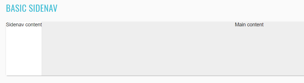
//@FindBy(css = "#basic-drawer")
@UI("#basic-drawer")
public static SideNav basicDrawer;
@Test
public void verifyBasicDrawerTest() {
basicDrawer.show();
basicDrawer.is().displayed();
basicDrawer.is().enabled();
basicDrawer.getMatDrawer().has().text("Drawer content");
basicDrawer.getMatDrawerContent().has().text("Main content");
}
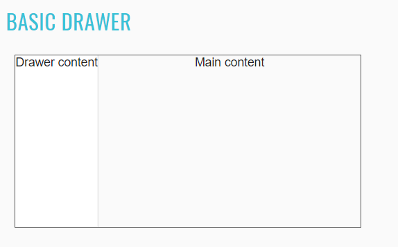
//@FindBy(css = "#implicit-main-content")
@UI("#implicit-main-content")
public static SideNav implicitMainContent;
@Test
public void verifyImplicitMainContentWithTwoSideNavTest() {
implicitMainContent.show();
UIElement startSideNav = implicitMainContent.getSideNav("start");
UIElement endSideNav = implicitMainContent.getSideNav("end");
startSideNav.has().attr("mode", "side");
startSideNav.has().attr("style", "transform: none; visibility: visible;");
startSideNav.has().text("Start content");
endSideNav.has().attr("mode", "side");
endSideNav.has().attr("style", "transform: none; visibility: visible;");
endSideNav.has().text("End content");
implicitMainContent.getContent().has().text("Implicit main content");
implicitMainContent.getContent().is().displayed();
implicitMainContent.getContent().is().enabled();
}
<mat-sidenav-container _ngcontent-aid-c296="" id="implicit-main-content" class="mat-drawer-container mat-sidenav-container example-container">
<!---->
<div class="cdk-visually-hidden cdk-focus-trap-anchor" aria-hidden="true"/>
<mat-sidenav _ngcontent-aid-c296="" tabindex="-1" opened="" mode="side" position="start" class="mat-drawer mat-sidenav ng-tns-c184-104 ng-trigger ng-trigger-transform ng-star-inserted mat-drawer-side mat-drawer-opened" style="transform: none; visibility: visible;">
<div class="mat-drawer-inner-container ng-tns-c184-104">Start content</div>
</mat-sidenav>
<div class="cdk-visually-hidden cdk-focus-trap-anchor" aria-hidden="true"/>
<div class="cdk-visually-hidden cdk-focus-trap-anchor" aria-hidden="true"/>
<mat-sidenav _ngcontent-aid-c296="" tabindex="-1" opened="" mode="side" position="end" class="mat-drawer mat-sidenav ng-tns-c184-105 ng-trigger ng-trigger-transform ng-star-inserted mat-drawer-end mat-drawer-side mat-drawer-opened" style="transform: none; visibility: visible;">
<div class="mat-drawer-inner-container ng-tns-c184-105">End content</div>
</mat-sidenav>
<div class="cdk-visually-hidden cdk-focus-trap-anchor" aria-hidden="true"/>
<mat-sidenav-content cdkscrollable="" class="mat-drawer-content mat-sidenav-content ng-star-inserted" style="margin-left: 80px; margin-right: 76px;"> Implicit main content </mat-sidenav-content>
<!---->
</mat-sidenav-container>
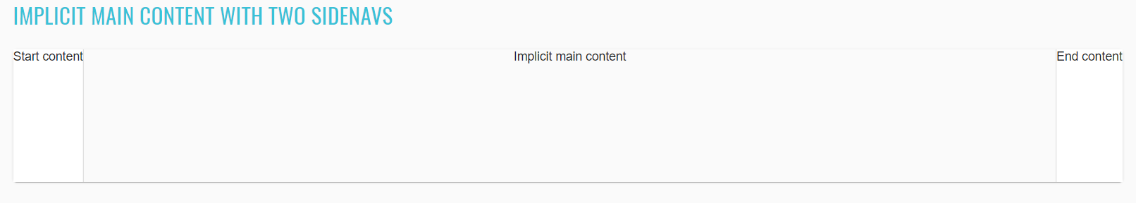
//@FindBy(css = "#open-close-behavior")
@UI("#open-close-behavior")
public static SideNav openCloseBehavior;
@Test
public void verifyOpenCloseBehaviorTest() {
openCloseBehavior.show();
openCloseBehavior.getContent().is().displayed();
openCloseBehavior.getContent().is().enabled();
sideNavToggle.click();
openCloseBehavior.getSideNav().has().text("Sidenav content");
sideNavOpened.click();
openCloseBehavior.base().timer().wait(() -> openCloseBehavior.isEnabled());
openCloseBehavior.getEvents().has().text("open!\nclose!");
}
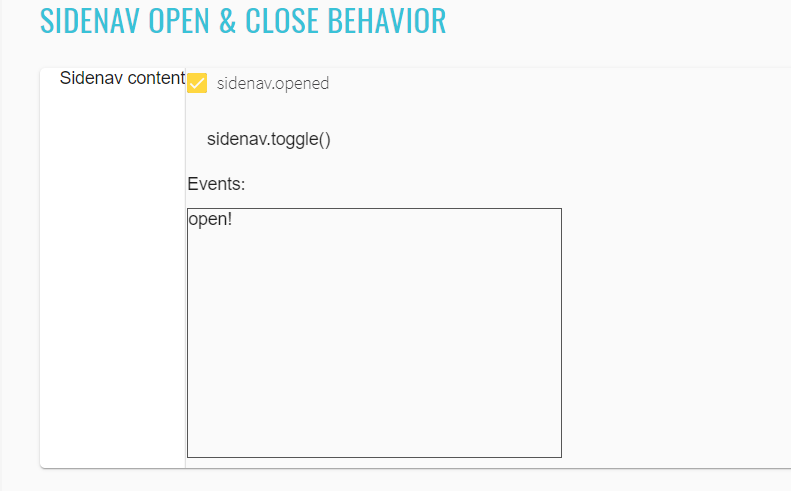
//@FindBy(css = "#configurable-mode")
@UI("#configurable-mode")
public static SideNav configurableMode;
@Test
public void toggleConfigurableSideNavTest() {
refresh();
configurableMode.show();
contentToggle.click();
configurableMode.base().timer().wait(() -> configurableMode.visualValidation(".mat-sidenav"));
configurableMode.getSideNav().has().attr(STYLE, STYLE_VISIBLE);
sideToggle.click();
configurableMode.base().timer().wait(() -> configurableMode.visualValidation(".mat-sidenav"));
configurableMode.getSideNav().has().attr(STYLE, STYLE_HIDDEN);
}
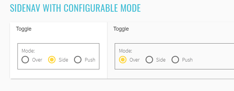
//@FindBy(css = "#custom-escape-backdrop")
@UI("#custom-escape-backdrop")
public static SideNav customEscapeBackdrop;
@Test
public void closeByToggleTest() {
refresh();
customEscapeBackdrop.show();
openSideNav.click();
toggleSideNav.click();
customEscapeBackdrop.getContent().has().text(containsString("toggle button"));
}
@Test
public void closeByBackdropTest() {
openSideNav.click();
customEscapeBackdrop.core().click();
customEscapeBackdrop.getContent().has().text(containsString("backdrop"));
}
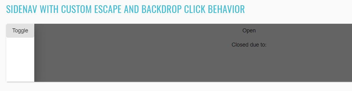
//@FindBy(css = "#auto-size-side-nav")
@UI("#auto-size-side-nav")
public static SideNav autoSizeSideNav;
@Test
public void verifyAutoSizeSideNav() {
autoSizeSideNav.show();
toggleAutoNav.click();
toggleExtraText.click();
autoSizeSideNav.getMatDrawer().has().text(containsString("Toggle extra text"));
autoSizeSideNav.getMatDrawerContent().has().attr(STYLE, "margin-left: 294px;");
}
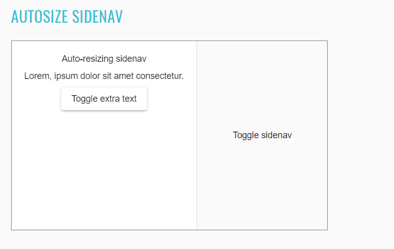
//@FindBy(css = "#fixed-position")
@UI("#fixed-position")
public static SideNav fixedPosition;
@Test
public void fixedSideNavTest() {
String testValue = "100";
fixedPosition.show();
topGap.click();
topGap.clear();
topGap.sendKeys(testValue);
bottomGap.click();
bottomGap.clear();
bottomGap.sendKeys(testValue);
fixSideNav.click();
fixedPosition.getSideNav().has().attr(STYLE, "transform: none; visibility: visible; top: 100px; bottom: " + "100px;");
toggleFixedSideNav.click();
fixedPosition.base().timer().wait(() -> fixedPosition.visualValidation(".mat-sidenav-content"));
fixedPosition.getSideNav().has().attr(STYLE, "top: 100px; bottom: 100px; box-shadow: none; visibility: " + "hidden;");
}
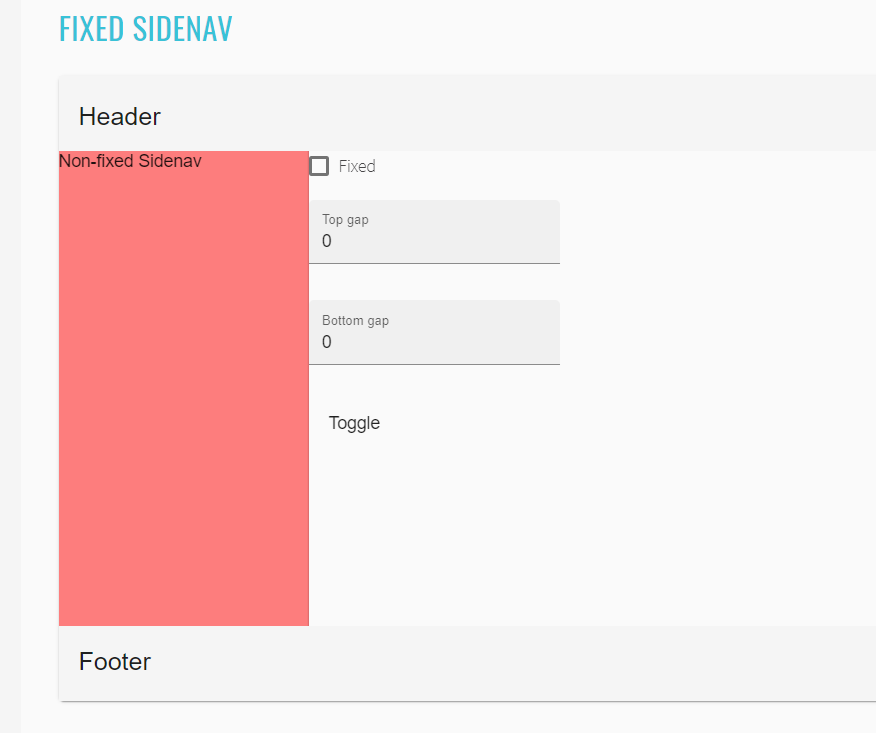
//@FindBy(css = "#responsive-content")
@UI("#responsive-content")
public static SideNav responsiveContent;
@Test
public void toggleResponsiveSideNavTest() {
int[] testValues = {1, 3};
responsiveContent.show();
toolbarToggle.click();
for (int value : testValues) {
responsiveContent.getSideNavLinks().get(value).click();
responsiveContent.getResponsiveResults().get(value).has().text(format("Selected Nav Item %d", value));
}
}
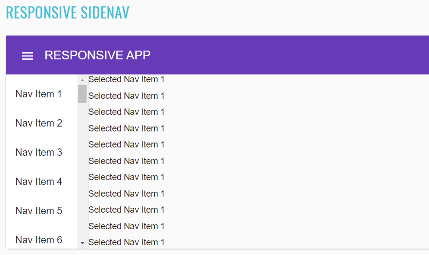
List of some available Sidenav methods:
| Method | Description | Return Type |
|---|---|---|
| getSideNav() | Get '{name}' side nav | UIElement |
| getSideNav(String) | Get '{name}' side nav by '{0}' position value | UIElement |
| getContent() | Get '{name}' side nav content | UIElement |
| getEvents() | Get '{name}' side nav content | UIElement |
| getSideNavLinks() | Get '{name}' side nav content | WebList |
| getResponsiveResults() | Get '{name}' side nav content | WebList |
| getSideNavItems() | Get '{name}' side nav content | WebList |
| getMatDrawer() | Get '{name}' mat drawer | UIElement |
| getMatDrawerContent() | Get '{name}' mat drawer content | UIElement |
Sidenav java tests examples
2.2.16 Bottom sheet
Bottom sheet overview
Bottom sheet locates in the following class:
The mat-bottom-sheet service can be used to open Material Design panels to the bottom of the screen. These panels are
intended primarily as an interaction on mobile devices where they can be used as an alternative to dialogs and menus.
- Java: com.epam.jdi.light.ui.angular.elements.complex.BottomSheet
<mat-bottom-sheet-container tabindex="-1" role="dialog" aria-modal="true" class="mat-bottom-sheet-container ng-tns-c99-206 ng-trigger ng-trigger-state ng-star-inserted" style="transform: translateY(0%);">
<bottom-sheet-overview-example-sheet class="ng-star-inserted">
<mat-nav-list role="navigation" id="bottom-sheet-container" class="mat-nav-list mat-list-base">
<a href="https://keep.google.com/" mat-list-item="" class="mat-list-item mat-focus-indicator mat-2-line">
<div class="mat-list-item-content">
<div mat-ripple="" class="mat-ripple mat-list-item-ripple"/>
<div class="mat-list-text">
<span mat-line="" class="mat-line">Google Keep</span>
<span mat-line="" class="mat-line">Add to a note</span>
</div>
</div>
</a>
<a href="https://docs.google.com/" mat-list-item="" class="mat-list-item mat-focus-indicator mat-2-line">
<div class="mat-list-item-content">
<div mat-ripple="" class="mat-ripple mat-list-item-ripple"/>
<div class="mat-list-text">
<span mat-line="" class="mat-line">Google Docs</span>
<span mat-line="" class="mat-line">Embed in a document</span>
</div>
</div>
</a>
<a href="https://plus.google.com/" mat-list-item="" class="mat-list-item mat-focus-indicator mat-2-line">
<div class="mat-list-item-content">
<div mat-ripple="" class="mat-ripple mat-list-item-ripple"/>
<div class="mat-list-text">
<span mat-line="" class="mat-line">Google Plus</span>
<span mat-line="" class="mat-line">Share with your friends</span>
</div>
</div>
</a>
<a href="https://hangouts.google.com/" mat-list-item="" class="mat-list-item mat-focus-indicator mat-2-line">
<div class="mat-list-item-content">
<div mat-ripple="" class="mat-ripple mat-list-item-ripple"/>
<div class="mat-list-text">
<span mat-line="" class="mat-line">Google Hangouts</span>
<span mat-line="" class="mat-line">Show to your coworkers</span>
</div>
</div>
</a>
</mat-nav-list>
</bottom-sheet-overview-example-sheet>
<!---->
</mat-bottom-sheet-container>
//@FindBy(css = "#bottom-sheet")
@UI("#bottom-sheet")
public static BottomSheet bottomSheet;
private static final List<String> BOTTOM_SHEET_VALUES = Arrays.asList("Google Keep", "Google Docs", "Google Plus", "Google Hangouts");
@Test
public void checkBottomSheetAvailableOptionsTest() {
bottomSheet.open();
bottomSheet.is().opened();
bottomSheet.is().values(BOTTOM_SHEET_VALUES);
bottomSheet.close();
bottomSheet.is().closed();
}
List of the available Bottom sheet methods:
| Method | Description | Return Type |
|---|---|---|
| is() | Assert action | BottomSheetAssert |
| open() | Open bottom sheet | void |
| close() | Close bottom sheet | void |
| opened() | Check that bottom sheet is opened | boolean |
| closed() | Check that bottom sheet is closed | boolean |
| values() | Get list of bottom sheet options | List |
Bottom sheet java tests examples
2.2.17 Dialog
Dialog overview
Bottom sheet locates in the following class:
The mat-dialog service can be used to open modal dialogs with Material Design styling and animations.
- Java: com.epam.jdi.light.ui.angular.elements.complex.Dialog
<button _ngcontent-rnx-c348="" id="dialog" mat-raised-button="" class="mat-focus-indicator mat-raised-button mat-button-base">
<span class="mat-button-wrapper">Pick one</span>
<div matripple="" class="mat-ripple mat-button-ripple"></div>
<div class="mat-button-focus-overlay"></div>
</button>
//@FindBy(css = "#dialog")
@UI("#dialog")
public static Dialog dialog;
@Test
public void basicDialogTest() {
dialog.sendKeysToNameFormField("EPAM Systems");
dialog.open();
dialog.is().opened();
dialog.is().nameText("EPAM Systems");
dialog.sendKeysToAnswerFormField("Lion");
dialog.submitAnswer();
dialog.is().closed();
dialog.is().answerText("Lion");
}
List of the available Dialog methods:
| Method | Description | Return Type |
|---|---|---|
| is() | Assert action | DialogAssert |
| clickOkButton() | Clicks "ok" button | void |
| clickNoThanksButton() | Clicks "no thanks" button | void |
| open() | Open dialog window | void |
| isOpened() | Check that dialog window is opened | boolean |
| isClosed() | Check that dialog window is closed | boolean |
| nameText(String) | Check that name is correct | boolean |
| sendKeysToAnswerFormField(String) | Enter answer | void |
| sendKeysToNameFormField(String) | Enter name | void |
| answerText(String) | Check that answer is correct | boolean |
| nameText(String) | Check that name is correct | boolean |
| submitAnswer() | Click "Ok" button | void |
| close() | Close dialog window | void |
| answerText() | Check that answer is correct | boolean |
Dialog java tests examples
2.2.18 MatTable
Table overview
Sort header locates in following class:
The mat-sort-header provide buttons to change table`s rows
- Java: com.epam.jdi.light.angular.elements.complex.SortingOverview
List of the available Sorting Header methods:
| Method | Description | Return Type |
|---|---|---|
| is() | Assert action | Assert |
| getTableHeaders() | Get table headers | WebList |
| clickButtonByText(String text) | Get header with by text | void |
| headerButtonIsClicked() | Is header clicked | boolean |
| isHeadersDisplayed() | Is header displayed | boolean |
<tr _ngcontent-rnx-c363="">
<th _ngcontent-rnx-c363="" mat-sort-header="name" class="mat-sort-header ng-tns-c191-177">
<div class="mat-sort-header-container ng-tns-c191-177">
<button type="button" class="mat-sort-header-button mat-focus-indicator ng-tns-c191-177" aria-label="Change sorting for name">Dessert (100g)</button>
<div class="mat-sort-header-arrow ng-trigger ng-trigger-arrowPosition ng-tns-c191-177 ng-star-inserted" style="transform: translateY(25%); opacity: 0;">
<div class="mat-sort-header-stem ng-tns-c191-177"></div>
<div class="mat-sort-header-indicator ng-tns-c191-177 ng-trigger ng-trigger-indicator" style="transform: translateY(0px);">
<div class="mat-sort-header-pointer-left ng-tns-c191-177 ng-trigger ng-trigger-leftPointer" style="transform: rotate(-45deg);"></div>
<div class="mat-sort-header-pointer-right ng-tns-c191-177 ng-trigger ng-trigger-rightPointer" style="transform: rotate(45deg);"></div>
<div class="mat-sort-header-pointer-middle ng-tns-c191-177"></div>
</div>
</div>
<!---->
</div>
</th>
<th _ngcontent-rnx-c363="" mat-sort-header="calories" class="mat-sort-header ng-tns-c191-178">
<div class="mat-sort-header-container ng-tns-c191-178">
<button type="button" class="mat-sort-header-button mat-focus-indicator ng-tns-c191-178" aria-label="Change sorting for calories">Calories</button>
<div class="mat-sort-header-arrow ng-trigger ng-trigger-arrowPosition ng-tns-c191-178 ng-star-inserted" style="transform: translateY(25%); opacity: 0;">
<div class="mat-sort-header-stem ng-tns-c191-178"></div>
<div class="mat-sort-header-indicator ng-tns-c191-178 ng-trigger ng-trigger-indicator" style="transform: translateY(0px);">
<div class="mat-sort-header-pointer-left ng-tns-c191-178 ng-trigger ng-trigger-leftPointer" style="transform: rotate(-45deg);"></div>
<div class="mat-sort-header-pointer-right ng-tns-c191-178 ng-trigger ng-trigger-rightPointer" style="transform: rotate(45deg);"></div>
<div class="mat-sort-header-pointer-middle ng-tns-c191-178"></div>
</div>
</div>
<!---->
</div>
</th>
<th _ngcontent-rnx-c363="" mat-sort-header="fat" class="mat-sort-header ng-tns-c191-179">
<div class="mat-sort-header-container ng-tns-c191-179">
<button type="button" class="mat-sort-header-button mat-focus-indicator ng-tns-c191-179" aria-label="Change sorting for fat">Fat (g)</button>
<div class="mat-sort-header-arrow ng-trigger ng-trigger-arrowPosition ng-tns-c191-179 ng-star-inserted" style="transform: translateY(25%); opacity: 0;">
<div class="mat-sort-header-stem ng-tns-c191-179"></div>
<div class="mat-sort-header-indicator ng-tns-c191-179 ng-trigger ng-trigger-indicator" style="transform: translateY(0px);">
<div class="mat-sort-header-pointer-left ng-tns-c191-179 ng-trigger ng-trigger-leftPointer" style="transform: rotate(-45deg);"></div>
<div class="mat-sort-header-pointer-right ng-tns-c191-179 ng-trigger ng-trigger-rightPointer" style="transform: rotate(45deg);"></div>
<div class="mat-sort-header-pointer-middle ng-tns-c191-179"></div>
</div>
</div>
<!---->
</div>
</th>
<th _ngcontent-rnx-c363="" mat-sort-header="carbs" class="mat-sort-header ng-tns-c191-180">
<div class="mat-sort-header-container ng-tns-c191-180">
<button type="button" class="mat-sort-header-button mat-focus-indicator ng-tns-c191-180" aria-label="Change sorting for carbs">Carbs (g)</button>
<div class="mat-sort-header-arrow ng-trigger ng-trigger-arrowPosition ng-tns-c191-180 ng-star-inserted" style="transform: translateY(25%); opacity: 0;">
<div class="mat-sort-header-stem ng-tns-c191-180"></div>
<div class="mat-sort-header-indicator ng-tns-c191-180 ng-trigger ng-trigger-indicator" style="transform: translateY(0px);">
<div class="mat-sort-header-pointer-left ng-tns-c191-180 ng-trigger ng-trigger-leftPointer" style="transform: rotate(-45deg);"></div>
<div class="mat-sort-header-pointer-right ng-tns-c191-180 ng-trigger ng-trigger-rightPointer" style="transform: rotate(45deg);"></div>
<div class="mat-sort-header-pointer-middle ng-tns-c191-180"></div>
</div>
</div>
<!---->
</div>
</th>
<th _ngcontent-rnx-c363="" mat-sort-header="protein" class="mat-sort-header ng-tns-c191-181">
<div class="mat-sort-header-container ng-tns-c191-181">
<button type="button" class="mat-sort-header-button mat-focus-indicator ng-tns-c191-181" aria-label="Change sorting for protein">Protein (g)</button>
<div class="mat-sort-header-arrow ng-trigger ng-trigger-arrowPosition ng-tns-c191-181 ng-star-inserted" style="transform: translateY(25%); opacity: 0;">
<div class="mat-sort-header-stem ng-tns-c191-181"></div>
<div class="mat-sort-header-indicator ng-tns-c191-181 ng-trigger ng-trigger-indicator" style="transform: translateY(0px);">
<div class="mat-sort-header-pointer-left ng-tns-c191-181 ng-trigger ng-trigger-leftPointer" style="transform: rotate(-45deg);"></div>
<div class="mat-sort-header-pointer-right ng-tns-c191-181 ng-trigger ng-trigger-rightPointer" style="transform: rotate(45deg);"></div>
<div class="mat-sort-header-pointer-middle ng-tns-c191-181"></div>
</div>
</div>
<!---->
</div>
</th>
</tr>
private static final String DESSERT = "Dessert (100g)";
private static final String CALORIES = "Calories";
private static final String FAT = "Fat (g)";
private static final String CARBS = "Carbs (g)";
private static final String PROTEIN = "Protein (g)";
//@FindBy(css="#sort-headers tr:nth-child(1)")
@UI("#sort-headers tr:nth-child(1)")
public static SortingOverview sortingOverview;
@Test
public void tableIsVisible() {
sortingOverview.is().tableIsVisible();
}
@Test
public void sortingTableByFirstColumn() {
sortingOverview.clickButtonByText(DESSERT);
sortingOverview.clickButtonByText(DESSERT);
sortingOverview.is().arrowButtonClicked();
}
@Test
public void sortingTableBySecondColumn() {
sortingOverview.clickButtonByText(CALORIES);
sortingOverview.clickButtonByText(CALORIES);
sortingOverview.is().arrowButtonClicked();
}
@Test
public void sortingTableByThirdColumn() {
sortingOverview.clickButtonByText(FAT);
sortingOverview.clickButtonByText(FAT);
sortingOverview.is().arrowButtonClicked();
}
@Test
public void sortingTableByFourthColumn() {
sortingOverview.clickButtonByText(CARBS);
sortingOverview.clickButtonByText(CARBS);
sortingOverview.is().arrowButtonClicked();
}
@Test
public void sortingTableByFifthColumn() {
sortingOverview.clickButtonByText(PROTEIN);
sortingOverview.clickButtonByText(PROTEIN);
sortingOverview.is().arrowButtonClicked();
}
List of the available Table methods:
| Method | Description | Return Type |
|---|---|---|
| is() | Assert action | TableAssert |
| elements(int) | Returns rows whose number is greater than or equal to the specified number | List |
| get(String) | Returns values of the specified row | String |
Sort header
Table locates in the following class:
The mat-table provides a Material Design styled data-table that can be used to display rows of data.
- Java: com.epam.jdi.light.elements.complex.table.Table

<table _ngcontent-nqb-c378="" mat-table="" class="mat-table cdk-table" role="grid">
<thead role="rowgroup">
<tr _ngcontent-nqb-c378="" role="row" mat-header-row="" class="mat-header-row cdk-header-row ng-star-inserted">
<th _ngcontent-nqb-c378="" role="columnheader" mat-header-cell="" class="mat-header-cell cdk-header-cell cdk-column-position mat-column-position ng-star-inserted"> No. </th>
<th _ngcontent-nqb-c378="" role="columnheader" mat-header-cell="" class="mat-header-cell cdk-header-cell cdk-column-name mat-column-name ng-star-inserted"> Name </th>
<th _ngcontent-nqb-c378="" role="columnheader" mat-header-cell="" class="mat-header-cell cdk-header-cell cdk-column-weight mat-column-weight ng-star-inserted"> Weight </th>
<th _ngcontent-nqb-c378="" role="columnheader" mat-header-cell="" class="mat-header-cell cdk-header-cell cdk-column-symbol mat-column-symbol ng-star-inserted"> Symbol </th>
<!---->
</tr>
<!---->
</thead>
<tbody>
<tr>
<td>1</td>
<td>Hydrogen</td>
<td>1.0079</td>
<td>H</td>
</tr>
<tr>
<td>2</td>
<td>Helium</td>
<td>4.0026</td>
<td>He</td>
</tr>
<tr>
<td>3</td>
<td>Lithium</td>
<td>6.941</td>
<td>Li</td>
</tr>
</tbody>
</table>
@JTable(root ="table-basic-example > table")
public static Table basicTable;
@JTable(
root = "//mat-table",
headers = "//mat-header-row/mat-header-cell",
column = "//mat-row/mat-cell[%s]",
row = "//mat-row[%s]/mat-cell",
cell = "//mat-row[{1}]/mat-cell[{0}]",
allCells = "//mat-cell",
size=4)
public static Table basicMatTable;
@Test
public void tableStructureTest() {
assertEquals(tableSection.basicMatTable.size(), 4);
assertEquals(tableSection.basicMatTable.count(), 5);
assertEquals(tableSection.basicMatTable.header(), asList("No.", "Name", "Weight", "Symbol"));
tableSection.basicMatTable.is().size(5);
}
JDI JTable annotation
Along with providing a Table type element JDI Light also provides a @JDropdown annotation for a better element locating. In addition to what Table type does @JDropdown also allows some kind of customization in the way the element is being located on the page.
This annotation has the following fields that can be used for locating a table element:
- String root() - value of this field points to the root locator of table element
- String[] header() - list of the columns names
- String headers() - locator of a table header
- String row() - locator representing a single row of a table
- String column() - locator representing a column of a table
- String cell() - locator representing a table cell
- String allCells() - locator representing all table cells
- String rowHeader() - the value of a table header corresponding to a particular raw
- int size() - amount of columns
- int count() - amount of rows
- int firstColumnIndex() - index of the first column
- int[] columnsMapping() - a collection containing indexes of the columns that are going to be used for processing, e.g. if one decides to work with not all columns but only with particular ones or if a column contains e.g. an icon or a checkbox and should not be processed then its index shouldn't be listed in columnsMapping field
Here is a list of available methods in Java:
| Method | Description | Return Type |
|---|---|---|
| getStartIndex() | Returns start index | int |
| setStartIndex(int) | Sets start index | void |
| core() | Returns a UIElement | UIElement |
| setHeader(List |
Sets header value | void |
| headerUI() | Returns a header name | WebList |
| footerUI() | Returns a footer name | WebList |
| rowHeader() | Returns a value of a table header corresponding to a particular raw | List |
| cell(int, int) | Returns a cell object of a table according to column number and row number | String |
| cell(int, String) | Returns a cell object of a table according to the row number and column name | String |
| cell(String, int) | Returns a cell object of a table according to the column name and row number | String |
| cell(String, String) | Returns a cell object of a table according column name and row name | String |
| column(Enum<?>) | Returns a column object of a table according to column name | Line |
| column(int) | Returns a column object of a table according to column number | Line |
| column(String) | Returns a column object of a table according to column name | Line |
| columns() | Returns a list of column objects of a table | List |
| count() | Returns amount of rows | int |
| filterRows(Matcher |
Sets and returns a list of filtered rows of a table according to matching column | List |
| filterRows(Pair |
Sets and returns a list of filtered rows of a table according to matching column | List |
| getValue() | Returns a string content of values for a particular row, where values are separated by ";" | String |
| header() | Returns a list of table's headers | List |
| isEmpty() | Asserts whether a table is empty | boolean |
| isNotEmpty() | Asserts whether a table is not empty | boolean |
| preview() | Returns table preview | String |
| row(Matcher |
Check that the table has rows that meet expected condition | Line |
| row(Enum<?>) | Returns a row object of a table according to row name | Line |
| row(int) | Returns a row object of a table according to row number | Line |
| row(Pair |
Returns a row object of a table according to matching column | Line |
| row(String) | Returns a row object of a table according to row name | Line |
| row(ColumnMatcher...) | Returns a row object of a table according to matcher | Line |
| rows() | Returns a list of rows of a table | List |
| rows(ColumnMatcher...) | Get all table rows that match criteria | List |
| rowsImages() | Get all table rows | List |
| setup(Field) | Initialize field | void |
| getTableJs() | Returns table | T |
| clear() | clears the text field | void |
| refresh() | Clears all data and lines | void |
| offCache() | Turns off cache usage | void |
| size() | Returns amount of columns | int |
| validateRowIndex(int) | Validates row index | void |
| webRow(int) | Returns all UIElements in the row according to row number | WebList |
| webRow(int,String) | Returns all UIElements in the row according to row number | WebList |
| webRow(String) | Returns all UIElements in the row according to row name | WebList |
| webRow(Enum<?>) | Returns all UIElements in the row according to row name | List |
| webColumn(int) | Returns all UIElements in the column according to column number | WebList |
| webColumn(String) | Returns all UIElements in the column according to column name | WebList |
| webColumn(Enum<?>) | Returns all UIElements in the column according to column name | WebList |
| webCell(int, int) | Returns all UIElements in the column according to cell position | UIElement |
| getJSValues(String) | Returns list of locators | List |
| jsCells() | Returns list of locators | List |
| jsColumn(int) | Returns list of column locators | List |
| jsColumn(String) | Returns list of column locators | List |
| jsRow(int) | Returns list of row locators | List |
| jsRow(String) | Returns list of row locators | List |
| jsRowIndexByName(String) | Returns row index by its name | int |
| getRowIndexByName(String) | Returns row index by its name | int |
| getRow(int) | Returns row by its row number | WebList |
| getColumn(int) | Returns column by its row number | WebList |
| getCell(int,int) | Returns cell by its column number and row number | UIElement |
| filter() | Filters a table | WebList |
| filterBy(String) | Filters a table with by a filterName | UIElement |
| searchBy(String) | Filter {name} by column {0} | UIElement |
MatTable java tests examples
2.2.19 Tree
Tree overview
The mat-tree provides a Material Design styled tree that can be used to display hierarchy data.
This tree builds on the foundation of the CDK tree and uses a similar interface for its data source input and template, except that its element and attribute selectors will be prefixed with mat- instead of cdk-.
There are two types of trees: Flat tree and nested tree. The DOM structures are different for these two types of trees. See an example with HTML code describing basic Tree element.
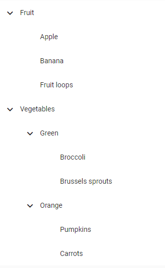
@UI("#tree-dynamic")
public static MaterialTree dynamicTree;
@UI("tree-checklist-example")
public static UIElement checkBoxesExample;
@Test
public void expandByNameTest() {
dynamicExample.show();
dynamicTree.waitExpandTree(dynamicTree.expand(FRUITS));
dynamicTree.is().collapsed(VEGETABLES);
}
@Test
public void turnOnOffNodeItemTest() {
checkBoxesExample.show();
checkBoxesTree.expand(GROCERIES);
checkBoxesTree.is().expanded(GROCERIES);
Checkbox checkbox = checkBoxesTree.getCheckbox(1, ORGANIC_GGS);
checkbox.is().enabled();
checkbox.check();
checkbox.is().selected();
checkbox.uncheck();
checkbox.show();
checkbox.is().deselected();
}
<mat-tree>
<mat-tree-node> parent node </mat-tree-node>
<mat-tree-node> -- child node1 </mat-tree-node>
<mat-tree-node> -- child node2 </mat-tree-node>
</mat-tree>
| Method | Description | Return Type |
|---|---|---|
| is() | Assert action | TextAssert |
| displayed() | Check that element is displayed | TextAssert |
| get(int index) | Select label by index | Label |
| show() | Scroll to element | void |
| text(String text) | Check whether a text matches a pattern | TextAssert |
| expand(String nodeName) | Expand node of tree by name | void |
| collapse(String nodeName) | Collapse expanded node of tree by name | void |
| isExpanded(String nodeName) | Shows that tree has expanded by name | boolean |
| isCollapsed(String nodeName) | Shows that tree has collapsed by name | boolean |
| waitExpandTree(UIElement node) | wait while work progress bar | void |
| getNodeItems(int level) | get list of items in the expanded node | List |
| getCheckbox(int level, String name) | get element of checkbox from expanded level | Checkbox |
| addNode(int level, String rootName, String newName) | add new node at expanded level | void |
2.2.20 Chips
Chips overview
Chips are located in the following class:
- Java: com.epam.jdi.light.angular.elements.complex.chips
The mat-chip-list displays a list of values as individual, keyboard accessible, chips.
There are four different Chips types in Angular: Basic Chips, Stacked Chips, Chips Autocomplete and Chips with input.
//@FindBy(css="#mat-chip-list-0")
@UI("#mat-chip-list-0")
public static Chips basicChipsRow;
//@FindBy(css="#basic-chips-label")
@UI("#basic-chips-label")
public static Text basicSelectedValue;
private static final String ONEFISH = "One fish";
private static final String TWOFISH = "Two fish";
private static final String PRIMARYFISH = "Primary fish";
private static final String ACCENTFISH = "Accent fish";
@Test
public void basicChipsTest() {
basicChipsRow.show();
basicChipsRow.is().displayed();
basicChipsRow.is().assertChipsIsEnabled();
basicChipsRow.clickChipsByTextValue(ONEFISH);
basicChipsRow.clickChipsByTextValue(TWOFISH);
basicChipsRow.clickChipsByTextValue(PRIMARYFISH);
basicChipsRow.clickChipsByTextValue(ACCENTFISH);
basicSelectedValue.has().text(format("You clicked: %s", ACCENTFISH));
}
<mat-chip-list aria-label="Fish selection" id="mat-chip-list-0" class="mat-chip-list" tabindex="0" aria-required="false" aria-disabled="false" aria-invalid="false" aria-multiselectable="false" role="listbox" aria-orientation="horizontal">
<div class="mat-chip-list-wrapper">
<mat-chip _ngcontent-rnx-c332="" role="option" class="mat-chip mat-focus-indicator mat-primary mat-standard-chip" tabindex="-1" aria-disabled="false">
<div class="mat-chip-ripple"/>
One fish
</mat-chip>
<mat-chip _ngcontent-rnx-c332="" role="option" class="mat-chip mat-focus-indicator mat-primary mat-standard-chip" tabindex="-1" aria-disabled="false">
<div class="mat-chip-ripple"/>
Two fish
</mat-chip>
<mat-chip _ngcontent-rnx-c332="" role="option" color="primary" selected="" class="mat-chip mat-focus-indicator mat-primary mat-standard-chip mat-chip-selected" tabindex="-1" aria-disabled="false" aria-selected="true">
<div class="mat-chip-ripple"/>
Primary fish
</mat-chip>
<mat-chip _ngcontent-rnx-c332="" role="option" color="accent" selected="" class="mat-chip mat-focus-indicator mat-standard-chip mat-accent mat-chip-selected" tabindex="-1" aria-disabled="false" aria-selected="true">
<div class="mat-chip-ripple"/>
Accent fish
</mat-chip>
</div>
</mat-chip-list>
//@FindBy(css="#mat-chip-list-1")
@UI("#mat-chip-list-1")
public static Chips stackedChipsList;
//@FindBy(css="#stacked-chips-label")
@UI("#stacked-chips-label")
public static Text stackedSelectedValue;
private static final String NONE = "none";
private static final String PRIMARY = "Primary";
private static final String ACCENT = "Accent";
private static final String WARN = "Warn";
@Test
public void stackedChipsTest() {
stackedChipsList.show();
stackedChipsList.is().displayed();
stackedChipsList.is().assertChipsIsEnabled();
stackedChipsList.clickChipsByTextValue(NONE);
stackedChipsList.clickChipsByTextValue(PRIMARY);
stackedChipsList.clickChipsByTextValue(ACCENT);
stackedChipsList.clickChipsByTextValue(WARN);
stackedSelectedValue.has().text(format("You clicked: %s", WARN));
}
<mat-chip-list aria-label="Color selection" id="mat-chip-list-1" class="mat-chip-list mat-chip-list-stacked" tabindex="0" aria-required="false" aria-disabled="false" aria-invalid="false" aria-multiselectable="false" role="listbox" aria-orientation="horizontal">
<div class="mat-chip-list-wrapper">
<mat-chip role="option" selected="" class="mat-chip mat-focus-indicator mat-primary mat-standard-chip mat-chip-selected ng-star-inserted" tabindex="-1" aria-disabled="false" aria-selected="true">
<div class="mat-chip-ripple"/>
none
</mat-chip>
<mat-chip role="option" selected="" class="mat-chip mat-focus-indicator mat-primary mat-standard-chip mat-chip-selected ng-star-inserted" tabindex="-1" aria-disabled="false" aria-selected="true">
<div class="mat-chip-ripple"/>
Primary
</mat-chip>
<mat-chip role="option" selected="" class="mat-chip mat-focus-indicator mat-standard-chip mat-accent mat-chip-selected ng-star-inserted" tabindex="-1" aria-disabled="false" aria-selected="true">
<div class="mat-chip-ripple"/>
Accent
</mat-chip>
<mat-chip role="option" selected="" class="mat-chip mat-focus-indicator mat-standard-chip mat-warn mat-chip-selected ng-star-inserted" tabindex="-1" aria-disabled="false" aria-selected="true">
<div class="mat-chip-ripple"/>
Warn
</mat-chip>
<!---->
</div>
</mat-chip-list>
//@FindBy(css="#chips-autocomplete-field")
public static Chips chipsAutocompleteField;
//@FindBy(css="#mat-chip-list-input-0")
@UI("#mat-chip-list-input-0")
public static Chips chipsAutocompleteInput;
private static final String PLACEHOLDER = "New fruit...";
private static final String APPLE = "Apple";
private static final String LEMON = "Lemon";
private static final String LIME = "Lime";
@Test
public void chipsAutocompleteTest() throws InterruptedException {
String[] expectedValuesArray = {
"Apple", "Lemon", "Lime", "Orange", "Strawberry"};
List<String> expectedValues = Arrays.asList(expectedValuesArray);
chipsAutocompleteField.show();
chipsAutocompleteField.is().displayed();
chipsAutocompleteInput.is().assertChipsIsEnabled();
chipsAutocompleteInput.has().assertChipsHasPlaceholder(PLACEHOLDER);
chipsAutocompleteInput.has().assertChipsHasOptions(expectedValues);
chipsAutocompleteInput.setValue(LEMON);
chipsAutocompleteField.collapseField();
chipsAutocompleteInput.setValue(APPLE);
chipsAutocompleteField.collapseField();
chipsAutocompleteInput.setValue(LIME);
chipsAutocompleteField.collapseField();
}
<mat-form-field id="chips-autocomplete-field" class="mat-form-field example-chip-list mat-primary mat-form-field-type-mat-chip-list mat-form-field-appearance-fill mat-form-field-can-float mat-form-field-should-float">
<div class="mat-form-field-wrapper">
<div class="mat-form-field-flex">
<div class="mat-form-field-infix">
<mat-chip-list aria-label="Fruit selection" class="mat-chip-list" id="mat-chip-list-2" tabindex="0" aria-required="false" aria-disabled="false" aria-invalid="false" aria-multiselectable="false" role="listbox" aria-orientation="horizontal">
<div class="mat-chip-list-wrapper">
<mat-chip role="option" class="mat-chip mat-focus-indicator mat-primary mat-standard-chip mat-chip-with-trailing-icon ng-star-inserted" tabindex="-1" aria-disabled="false">
<div class="mat-chip-ripple"></div>
Lemon
<mat-icon role="img" matchipremove="" class="mat-icon notranslate mat-chip-remove mat-chip-trailing-icon material-icons mat-icon-no-color ng-star-inserted" aria-hidden="true">cancel</mat-icon>
</mat-chip>
<input placeholder="New fruit..." class="mat-autocomplete-trigger mat-chip-input mat-input-element ng-untouched ng-pristine ng-valid" autocomplete="off" role="combobox" aria-autocomplete="list" aria-expanded="false" aria-haspopup="true" id="mat-chip-list-input-0">
</div>
</mat-chip-list>
<mat-autocomplete class="ng-tns-c95-157">
</mat-autocomplete>
<span class="mat-form-field-label-wrapper">
</span>
</div>
</div>
<div class="mat-form-field-underline ng-star-inserted"><span class="mat-form-field-ripple"></span></div>
<div class="mat-form-field-subscript-wrapper">
<div class="mat-form-field-hint-wrapper ng-trigger ng-trigger-transitionMessages ng-star-inserted" style="opacity: 1; transform: translateY(0%);">
<div class="mat-form-field-hint-spacer"></div>
</div>
</div>
</div>
</mat-form-field>
//@FindBy(css="#chips-with-input-field")
@UI("#chips-with-input-field")
public static Chips chipsWithInputField;
//@FindBy(css="#mat-chip-list-input-1")
@UI("#mat-chip-list-input-1")
public static Chips chipsWithInputInput;
@Test
public void chipsWithInputTest() {
chipsWithInputField.show();
chipsWithInputField.is().displayed();
chipsWithInputInput.is().assertChipsIsEnabled();
chipsWithInputInput.has().assertChipsHasPlaceholder(PLACEHOLDER);
chipsWithInputInput.input("Kiwi" + "\n");
chipsWithInputInput.input("Melon");
chipsWithInputInput.clearInputField();
chipsWithInputInput.input("Rockmelon" + "\n");
}
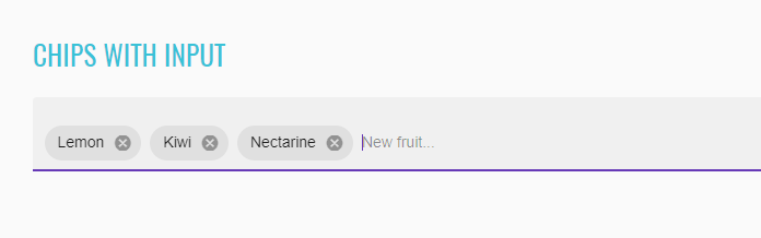
<mat-form-field id="chips-with-input-field" class="mat-form-field example-chip-list mat-primary mat-form-field-type-mat-chip-list mat-form-field-appearance-fill mat-form-field-can-float mat-form-field-should-float">
<div class="mat-form-field-wrapper">
<div class="mat-form-field-flex">
<div class="mat-form-field-infix">
<mat-chip-list aria-label="Fruit selection" class="mat-chip-list" id="mat-chip-list-3" tabindex="0" aria-required="false" aria-disabled="false" aria-invalid="false" aria-multiselectable="false" role="listbox" aria-orientation="horizontal">
<div class="mat-chip-list-wrapper">
<mat-chip role="option" class="mat-chip mat-focus-indicator mat-primary mat-standard-chip mat-chip-with-trailing-icon ng-star-inserted" tabindex="-1" aria-disabled="false">
<div class="mat-chip-ripple"></div>
Lemon
<mat-icon role="img" matchipremove="" class="mat-icon notranslate mat-chip-remove mat-chip-trailing-icon material-icons mat-icon-no-color ng-star-inserted" aria-hidden="true">cancel</mat-icon>
</mat-chip>
<mat-chip role="option" class="mat-chip mat-focus-indicator mat-primary mat-standard-chip mat-chip-with-trailing-icon ng-star-inserted" tabindex="-1" aria-disabled="false">
<div class="mat-chip-ripple"></div>
Lime
<mat-icon role="img" matchipremove="" class="mat-icon notranslate mat-chip-remove mat-chip-trailing-icon material-icons mat-icon-no-color ng-star-inserted" aria-hidden="true">cancel</mat-icon>
</mat-chip>
<mat-chip role="option" class="mat-chip mat-focus-indicator mat-primary mat-standard-chip mat-chip-with-trailing-icon ng-star-inserted" tabindex="-1" aria-disabled="false">
<div class="mat-chip-ripple"></div>
Apple
<mat-icon role="img" matchipremove="" class="mat-icon notranslate mat-chip-remove mat-chip-trailing-icon material-icons mat-icon-no-color ng-star-inserted" aria-hidden="true">cancel</mat-icon>
</mat-chip>
<input placeholder="New fruit..." class="mat-chip-input mat-input-element" id="mat-chip-list-input-1">
</div>
</mat-chip-list>
<span class="mat-form-field-label-wrapper">
</span>
</div>
</div>
<div class="mat-form-field-underline ng-star-inserted"><span class="mat-form-field-ripple"></span></div>
<div class="mat-form-field-subscript-wrapper">
<div class="mat-form-field-hint-wrapper ng-trigger ng-trigger-transitionMessages ng-star-inserted" style="opacity: 1; transform: translateY(0%);">
<div class="mat-form-field-hint-spacer"></div>
</div>
</div>
</div>
</mat-form-field>
List of the available Chips methods:
| Method | Description | Return Type |
|---|---|---|
| getChips() | Returns a list of chips | WebList |
| getChipsByText(String) | Returns a chip by text | UIElement |
| clickChipsByTextValue(String) | Clicks a chip by text | void |
| getPlaceholderForChips() | Returns a placeholder for an input field | String |
| chipsHasText(String) | Checks whether a chip has a corresponding text | boolean |
| setValue(String) | Selects a chosen value in autocomplete | void |
| setValue(String,String) | Selects a chosen value in autocomplete | void |
| options() | Returns a list of options available in autocomplete | List |
| input(String) | Inputs a value into an input field | void |
| clearInputField() | Removes an entered value from an input field | void |
| enabled() | Checks whether a chip is enabled | boolean |
| is() | Assert action | ChipsAssert |
| click() | click element | void |
| select(String) | selects value | void |
| getValue() | returns value | String |
| collapseField() | Collapse chips autocomplete field | void |
Here you can find Chips tests
3. Bootstrap elements
3.1 Bootstrap Common elements
3.1.1 Checkboxes and radios
Checkbox default
Checkbox is located in the following classes:
- Java: com.epam.jdi.light.ui.bootstrap.elements.common.Checkbox
Here is an example with provided Bootstrap v4.3 code:
// @FindBy(css = "body") public static CheckboxesDefault checkboxesDefault;
@UI("body") public static CheckboxesDefault checkboxesDefault;
public class CheckboxesDefault extends Section {
// @FindBy(css = "#check1") public Checkbox checkboxOne;
@UI("#check1") public Checkbox checkboxOne;
// @FindBy(css = "#check2") public Checkbox checkboxTwo;
@UI("#check1") public Checkbox checkboxTwo;
}
@Test
public void isValidationTests() {
checkboxesDefault.checkboxOne
.is()
.displayed()
.enabled()
.core()
.hasClass("form-check")
.tag(is("div"));
checkboxesDefault.checkboxOne.label()
.is()
.displayed()
.enabled()
.core()
.hasClass("form-check-label")
.text(is("Default checkbox"))
.tag(is("label"));
}
@Test
public void clickableTests() {
checkboxesDefault.checkboxOne.check();
checkboxesDefault.checkboxOne.is().selected();
checkboxesDefault.checkboxOne.uncheck();
checkboxesDefault.checkboxOne.is().deselected();
}
<div class="form-check" id="check1">
<input class="form-check-input" type="checkbox" value="" id="defaultCheck1">
<label class="form-check-label" for="defaultCheck1">
Default checkbox
</label>
</div>
<div class="form-check" id="check2">
<input class="form-check-input" type="checkbox" value="" id="defaultCheck2" disabled>
<label class="form-check-label" for="defaultCheck2">
Disabled checkbox
</label>
</div>
| Method | Description | Return Type |
|---|---|---|
| assertThat() | Assert action checkbox | CheckboxAssert |
| click() | Click the checkbox | void |
| check(String) | Set to checked on "true" (case insensitive) or unchecked otherwise | void |
| check() | Set to checked | void |
| is() | Assert action checkbox | CheckboxAssert |
| isSelected() | Verify value | boolean |
| isEnabled() | Verify state | boolean |
| uncheck() | Set to unchecked | void |
Button group is represented by Section class in Java:
Checkbox default inline
Checkbox is located in the following classes:
- Java: com.epam.jdi.light.ui.bootstrap.elements.common.Checkbox

Here is an example with provided Bootstrap v4.3 code:
// @FindBy(css = "body") public static CheckboxesDefaultInline checkboxesDefaultInline;
@UI("body") public static CheckboxesDefaultInline checkboxesDefaultInline;
public class CheckboxesDefaultInline {
// @FindBy(xpath = "//input[@id='inlineCheckbox1']/..") public Checkbox checkboxOne;
@UI("//input[@id='inlineCheckbox1']/..") public Checkbox checkboxOne;
// @FindBy(xpath = "//input[@id='inlineCheckbox2']/..") public Checkbox checkboxTwo;
@UI("//input[@id='inlineCheckbox2']/..") public Checkbox checkboxTwo;
// @FindBy(xpath = "//input[@id='inlineCheckbox3']/..") public Checkbox checkboxThree;
@UI("//input[@id='inlineCheckbox3']/..") public Checkbox checkboxThree;
}
@Test
public void isValidationTests() {
checkboxesDefaultInline.checkboxOne
.is()
.displayed()
.enabled()
.core()
.hasClass("form-check form-check-inline");
checkboxesDefaultInline.checkboxOne.label()
.is()
.displayed()
.enabled()
.core()
.hasClass("form-check-label")
.text(is("1"));
}
@Test
public void clickableTests() {
checkboxesDefaultInline.checkboxOne.check();
checkboxesDefaultInline.checkboxOne
.is()
.selected();
checkboxesDefaultInline.checkboxOne.uncheck();
checkboxesDefaultInline.checkboxOne
.is()
.deselected();
checkboxesDefaultInline.checkboxOne.label().click();
checkboxesDefaultInline.checkboxOne
.is()
.selected();
}
<div class="form-check form-check-inline">
<input class="form-check-input" type="checkbox" id="inlineCheckbox1" value="option1">
<label class="form-check-label" for="inlineCheckbox1">1</label>
</div>
<div class="form-check form-check-inline">
<input class="form-check-input" type="checkbox" id="inlineCheckbox2" value="option2">
<label class="form-check-label" for="inlineCheckbox2">2</label>
</div>
<div class="form-check form-check-inline">
<input class="form-check-input" type="checkbox" id="inlineCheckbox3" value="option3"
disabled>
<label class="form-check-label" for="inlineCheckbox3">3 (disabled)</label>
</div>
| Method | Description | Return Type |
|---|---|---|
| assertThat() | Assert action checkbox | CheckboxAssert |
| click() | Click the checkbox | void |
| check(String) | Set to checked on "true" (case insensitive) or unchecked otherwise | void |
| check() | Set to checked | void |
| is() | Assert action checkbox | CheckboxAssert |
| isEnabled() | Verify state | boolean |
| isSelected() | Verify value | boolean |
| uncheck() | Set to unchecked | void |
Button group is represented by Section class in Java:
Radio button
Element that can be represented with one or more clickable buttons aiming to choose only one button of the group.
Radio button is located in the following classes:
- Java: com.epam.jdi.light.ui.bootstrap.elements.complex.RadioButtons
Here is an example with provided Bootstrap v4.3 code:
//@FindBy(css = "#radio-buttons") public static RadioButtonGroup radioButtonGroup;
@UI("#radio-buttons") public static RadioButtonGroup radioButtonGroup;
public class RadioButtonGroup extends Section {
//@FindBy(css = "input[type='radio']")
@UI("input[type='radio']")
public RadioButtons radioButtons;
}
@Test
public void radioButtonByIndexTests() {
radioButtonGroup.radioButtons.list().get(2).click();
radioButtonGroup.radioButtons.list().get(2).is().selected();
radioButtonGroup.radioButtons.list().is().selected(2);
radioButtonGroup.radioButtons.is().selected(2);
radioButtonGroup.radioButtons.list().get(1).is().deselected();
radioButtonGroup.radioButtons.list().get(1).select();
radioButtonGroup.radioButtons.list().get(1).is().selected();
radioButtonGroup.radioButtons.list().is().selected(1);
radioButtonGroup.radioButtons.list().get(2).is().deselected();
radioButtonGroup.radioButtons.list().select(2);
radioButtonGroup.radioButtons.list().get(2).is().selected();
}
@Test
public void radioButtonByLabelTests() {
radioButtonGroup.radioButtons.list().select(labelText1);;
radioButtonGroup.radioButtons.list().is().selected(labelText1);
radioButtonGroup.radioButtons.is().selected(labelText1);
radioButtonGroup.radioButtons.list().get(1).is().text(is(value1));
radioButtonGroup.radioButtons.list().get(2).is().deselected();
radioButtonGroup.radioButtons.list().get(2).label().click();
radioButtonGroup.radioButtons.is().selected(labelText2);
radioButtonGroup.radioButtons.list().get(2).is().text(is(value2));
radioButtonGroup.radioButtons.list().get(1).is().deselected();
radioButtonGroup.radioButtons.select(labelText1);
radioButtonGroup.radioButtons.is().selected(labelText1);
radioButtonGroup.radioButtons.list().get(2).is().deselected();
}
<div class="btn-group-vertical mb-3" id="radio-buttons" role="group">
<div class="form-check">
<input class="form-check-input" type="radio" name="exampleRadios" id="exampleRadios1" value="option1" checked="">
<label class="form-check-label" for="exampleRadios1">Default radio</label>
</div>
<div class="form-check">
<input class="form-check-input" type="radio" name="exampleRadios" id="exampleRadios2" value="option2">
<label class="form-check-label" for="exampleRadios2">Second default radio</label>
</div>
<div class="form-check">
<input class="form-check-input" type="radio" name="exampleRadios" id="exampleRadios3" value="option3" disabled="">
<label class="form-check-label" for="exampleRadios3">Disabled radio</label>
</div>
</div>
| Method | Description | Return Type |
|---|---|---|
| assertThat() | Assert action | TextAssert |
| click() | Click the button | void |
| get() | Select button by index | action |
| getText() | Get button text | String |
| is() | Assert action | TextAssert |
| select() | Select button | void |
| selected() | Radio button is selected | TextAssert |
Button group is represented by Section class in Java:
Radio button inline
Radio button is located in the following classes:
- Java: com.epam.jdi.light.ui.bootstrap.elements.complex.RadioButtons
Here is an example with provided Bootstrap v4.3 code:
//@FindBy(css = "body") public static RadioButtonsDefaultInline radioButtonsDefaultInline;
@UI("body") public static RadioButtonsDefaultInline radioButtonsDefaultInline;
public class RadioButtonsDefaultInline extends Section {
//@FindBy(css = "input[name='inlineRadioOptions']")
@UI("input[name='inlineRadioOptions']")
public RadioButtons radioButtons;
}
@Test
public void baseInitTest() {
radioButtonsDefaultInline.radioButtons.is().size(3);
radioButtonsDefaultInline.radioButtons.list().get(1).is().deselected();
radioButtonsDefaultInline.radioButtons.list().get(2).is().deselected();
radioButtonsDefaultInline.radioButtons.list().get(3).is().deselected();
radioButtonsDefaultInline.radioButtons.list().get(3).is().disabled();
radioButtonsDefaultInline.radioButtons.list().get(1).label()
.is()
.core()
.hasClass("form-check-label")
.text(is(label1));
radioButtonsDefaultInline.radioButtons.list().get(2).label()
.is()
.core()
.hasClass("form-check-label")
.text(is(label2));
radioButtonsDefaultInline.radioButtons.list().get(3).label()
.is()
.core()
.hasClass("form-check-label")
.text(is(label3));
}
@Test
public void radioButtonByIndexTests() {
radioButtonsDefaultInline.radioButtons.select(2);
radioButtonsDefaultInline.radioButtons.is().selected(2);
radioButtonsDefaultInline.radioButtons.is().selected("2");
radioButtonsDefaultInline.radioButtons.list().get(2).is().selected();
radioButtonsDefaultInline.radioButtons.list().get(1).is().deselected();
radioButtonsDefaultInline.radioButtons.select(1);
radioButtonsDefaultInline.radioButtons.is().selected(1);
radioButtonsDefaultInline.radioButtons.is().selected("1");
radioButtonsDefaultInline.radioButtons.list().get(2).is().deselected();
radioButtonsDefaultInline.radioButtons.list().select("2");
radioButtonsDefaultInline.radioButtons.list().get(2).is().selected();
}
<div class="form-check form-check-inline">
<input class="form-check-input" type="radio" name="inlineRadioOptions" id="inlineRadio1" value="option1">
<label class="form-check-label" for="inlineRadio1">1</label>
</div>
<div class="form-check form-check-inline">
<input class="form-check-input" type="radio" name="inlineRadioOptions" id="inlineRadio2" value="option2">
<label class="form-check-label" for="inlineRadio2">2</label>
</div>
<div class="form-check form-check-inline">
<input class="form-check-input" type="radio" name="inlineRadioOptions" id="inlineRadio3" value="option3" disabled="">
<label class="form-check-label" for="inlineRadio3">3 (disabled)</label>
</div>
| Method | Description | Return Type |
|---|---|---|
| assertThat() | Assert action | TextAssert |
| click() | Click the button | void |
| get() | Select button by index | action |
| getText() | Get button text | String |
| is() | Assert action | TextAssert |
| select() | Select button | void |
| selected() | Radio button is selected | TextAssert |
Button group is represented by Section class in Java:
Radio button and checkbox without labels
Checkbox and Radio button are located in the following classes:
- Java: com.epam.jdi.light.ui.bootstrap.elements.complex.RadioButtons
- Java: com.epam.jdi.light.ui.bootstrap.elements.common.Checkbox

Here is an example with provided Bootstrap v4.3 code:
//@FindBy(css = "body")
@UI("body")
public static CheckboxesAndRadiosWithoutLabels checkboxesAndRadiosWithoutLabels;
//@FindBy(xpath = "//input[@id='blankCheckbox']/..")
@UI("//input[@id='blankCheckbox']/..")
public Checkbox checkbox;
//@FindBy(css = "#blankRadio1")
@UI("#blankRadio1")
public RadioButtons radioButtons;
}
@Test
public void isValidationTests() {
checkboxesAndRadiosWithoutLabels.checkbox
.is()
.displayed()
.enabled()
.core()
.hasClass("form-check")
.tag(is("div"));
checkboxesAndRadiosWithoutLabels.radioButtons
.is()
.displayed()
.enabled()
.core()
.value("option1")
.attr("type", "radio")
.attr("aria-label", "...");
}
@Test
public void checkboxClickableTests() {
checkboxesAndRadiosWithoutLabels.checkbox.check();
checkboxesAndRadiosWithoutLabels.checkbox
.is()
.selected();
checkboxesAndRadiosWithoutLabels.checkbox.uncheck();
checkboxesAndRadiosWithoutLabels.checkbox
.is()
.deselected();
}
@Test
public void radioButtonTests() {
checkboxesAndRadiosWithoutLabels.radioButtons.select(1);
checkboxesAndRadiosWithoutLabels.radioButtons.list()
.is()
.selected(1);
checkboxesAndRadiosWithoutLabels.radioButtons
.is()
.selected(1);
}
<div class="form-check">
<input class="form-check-input position-static" type="checkbox" id="blankCheckbox" value="option1" aria-label="...">
</div>
<div class="form-check">
<input class="form-check-input position-static" type="radio" name="blankRadio" id="blankRadio1" value="option1" aria-label="...">
</div>
| Method | Description | Return Type |
|---|---|---|
| assertThat() | Assert action | TextAssert |
| check() | Click the element | void |
| click() | Click the element | void |
| is() | Assert action | TextAssert |
Button group is represented by Section class in Java:
Checkbox custom
Checkbox is located in the following classes:
- Java: com.epam.jdi.light.ui.bootstrap.elements.common.Checkbox
Here is an example with provided Bootstrap v4.3 code:
// @FindBy(css = "body") public static CheckboxesCustom checkboxesCustom;
@UI("body") public static CheckboxesCustom checkboxesCustom;
public class CheckboxesCustom extends Section {
// @FindBy(css = "#customCheck1-div") public Checkbox checkbox;
@UI("#customCheck1-div") public Checkbox checkbox;
}
@Test
public void isValidationTests() {
checkboxesCustom.checkbox
.is()
.displayed()
.enabled()
.core()
.hasClass("custom-control custom-checkbox")
.tag(is("div"));
checkboxesCustom.checkbox.label()
.is()
.displayed()
.enabled()
.core()
.hasClass("custom-control-label")
.text(is("Check this custom checkbox"))
.tag(is("label"));
}
@Test
public void clickableTests() {
checkboxesCustom.checkbox.check();
checkboxesCustom.checkbox.is().selected();
checkboxesCustom.checkbox.click();
checkboxesCustom.checkbox.is().deselected();
}
<div class="custom-control custom-checkbox" id="customCheck1-div">
<input type="checkbox" class="custom-control-input" id="customCheck1">
<label class="custom-control-label" for="customCheck1">Check this custom checkbox</label>
</div>
| Method | Description | Return Type |
|---|---|---|
| assertThat() | Assert action checkbox | CheckboxAssert |
| check(String) | Set to checked on "true" (case insensitive) or unchecked otherwise | void |
| check() | Set to checked | void |
| click() | Click the checkbox | void |
| is() | Assert action checkbox | CheckboxAssert |
| isSelected() | Verify value | boolean |
| isEnabled() | Verify state | boolean |
| uncheck() | Set to unchecked | void |
Button group is represented by Section class in Java:
Radio button custom
Radio button is located in the following classes:
- Java: com.epam.jdi.light.ui.bootstrap.elements.complex.RadioButtons
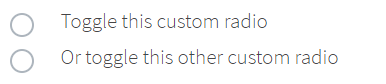
Here is an example with provided Bootstrap v4.3 code:
public class RadioButtonsCustom extends Section {
//@FindBy(css = "[name='customRadio']")
@UI("[name='customRadio']")
public RadioButtons radioButtons;
}
@Test
public void radioButtonByIndexTests() {
radioButtonCustom.radioButtons.list().get(1).select();
radioButtonCustom.radioButtons.list().get(1).core().waitFor().selected();
radioButtonCustom.radioButtons.list().get(1).is().selected();
radioButtonCustom.radioButtons.list().get(2).is().deselected();
radioButtonCustom.radioButtons.list().get(2).select();
radioButtonCustom.radioButtons.list().get(2).core().waitFor().selected();
radioButtonCustom.radioButtons.list().get(2).is().selected();
radioButtonCustom.radioButtons.list().select(label1);
radioButtonCustom.radioButtons.list().is().selected(label1);
radioButtonCustom.radioButtons.list().get(2).is().deselected();
radioButtonCustom.radioButtons.list().get(1).click();
radioButtonCustom.radioButtons.list().get(1).is().selected();
radioButtonCustom.radioButtons.list().get(2).is().deselected();
}
@Test
public void radioButtonByIndexInSelectTests() {
radioButtonCustom.radioButtons.select(1);
radioButtonCustom.radioButtons.is().selected(label1);
radioButtonCustom.radioButtons.select(2);
radioButtonCustom.radioButtons.is().selected(label2);
radioButtonCustom.radioButtons.select(label1);
radioButtonCustom.radioButtons.is().selected(label1);
radioButtonCustom.radioButtons.is().selected(1);
radioButtonCustom.radioButtons.select(label2);
radioButtonCustom.radioButtons.is().selected(2);
}
<div class="html-left" id="custom-radio-con">
<div class="custom-control custom-radio" id="customRadio1-div">
<input type="radio" id="customRadio1" name="customRadio" class="custom-control-input">
<label class="custom-control-label" for="customRadio1">Toggle this custom radio</label>
</div>
<div class="custom-control custom-radio" id="customRadio2-div">
<input type="radio" id="customRadio2" name="customRadio" class="custom-control-input">
<label class="custom-control-label" for="customRadio2">Or toggle this other custom radio</label>
</div>
</div>
| Method | Description | Return Type |
|---|---|---|
| assertThat() | Assert action | TextAssert |
| click() | Click the button | void |
| get() | Select button by index | action |
| getText() | Get button text | String |
| is() | Assert action | TextAssert |
| select() | Select button | void |
| selected() | Radio button is selected | TextAssert |
Button group is represented by Section class in Java:
Radio button custom inline
Radio button is located in the following classes:
- Java: com.epam.jdi.light.ui.bootstrap.elements.complex.RadioButtons
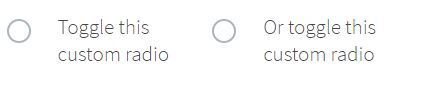
Here is an example with provided Bootstrap v4.3 code:
// @FindBy(css = "body") public static RadioButtonsCustomInline radioButtonsCustomInline;
@UI("body") public static RadioButtonsCustomInline radioButtonsCustomInline;
public class RadioButtonsCustomInline extends Section {
//@FindBy(css = ".custom-control-inline .custom-control-input")
@UI(".custom-control-inline .custom-control-input")
public RadioButtons radioButtons;
}
@Test
public void radioButtonByIndexTests() {
radioButtonsCustomInline.radioButtons.select(1);
radioButtonsCustomInline.radioButtons.is().selected(1);
radioButtonsCustomInline.radioButtons.list().get(2).select();
radioButtonsCustomInline.radioButtons.list().is().selected(2);
radioButtonsCustomInline.radioButtons.list().get(2).is().selected();
radioButtonsCustomInline.radioButtons.list().get(1).click();
radioButtonsCustomInline.radioButtons.list().get(1).is().selected();
radioButtonsCustomInline.radioButtons.list().get(2).is().deselected();
}
@Test
public void radioButtonByLabelTests() {
radioButtonsCustomInline.radioButtons.list().get(1).label().click();
radioButtonsCustomInline.radioButtons.is().selected(1);
radioButtonsCustomInline.radioButtons.list().get(2).label().click();
radioButtonsCustomInline.radioButtons.is().selected(2);
radioButtonsCustomInline.radioButtons.list().get(1).label().click();
radioButtonsCustomInline.radioButtons.is().selected(text1);
radioButtonsCustomInline.radioButtons.list().is().selected(text1);
radioButtonsCustomInline.radioButtons.select(text2);
radioButtonsCustomInline.radioButtons.list().is().selected(text2);
radioButtonsCustomInline.radioButtons.list().get(1).label().is().text(text1);
radioButtonsCustomInline.radioButtons.list().get(2).label().is().text(text2);
}
<div class="custom-control custom-radio custom-control-inline" id="customRadioInline1-div">
<input type="radio" id="customRadioInline1" name="customRadioInline1" class="custom-control-input">
<label class="custom-control-label" for="customRadioInline1">Toggle this <br> custom
radio</label>
</div>
<div class="custom-control custom-radio custom-control-inline" id="customRadioInline2-div">
<input type="radio" id="customRadioInline2" name="customRadioInline1" class="custom-control-input">
<label class="custom-control-label" for="customRadioInline2">Or toggle this <br> custom
radio</label>
</div>
| Method | Description | Return Type |
|---|---|---|
| assertThat() | Assert action | TextAssert |
| click() | Click the button | void |
| get() | Select button by index | action |
| getText() | Get button text | String |
| is() | Assert action | TextAssert |
| select() | Select button | void |
| selected() | Radio button is selected | TextAssert |
Button group is represented by Section class in Java:
Custom disabled
Checkbox and Radio button is located in the following classes:
Java: - com.epam.jdi.light.ui.bootstrap.elements.complex.RadioButtons_ - com.epam.jdi.light.ui.bootstrap.elements.common.Checkbox_

Here is an example with provided Bootstrap v4.3 code:
// @FindBy(css = "body") public static CheckboxAndRadioButtonCustomDisabled checkboxAndRadioButtonCustomDisabled;
@UI("body") public static CheckboxAndRadioButtonCustomDisabled checkboxAndRadioButtonCustomDisabled;
public class CheckboxAndRadioButtonCustomDisabled extends Section {
//FindBy(css = "#customCheckDisabled1-div")
@UI("#customCheckDisabled1-div")
public Checkbox checkbox;
//FindBy(css = "#customRadioDisabled2")
@UI("#customRadioDisabled2")
public RadioButtons radioButtons;
}
@Test
public void radioButtonIsValidationTests() {
checkboxAndRadioButtonCustomDisabled.radioButtons.list().get(1).is()
.hidden()
.disabled()
.core()
.attr("type", "radio")
.attr("name", "radioDisabled")
.hasClass("custom-control-input")
.tag(Matchers.is("input"));
}
@Test
public void baseInitTest() {
checkboxAndRadioButtonCustomDisabled.radioButtons.is().size(1);
checkboxAndRadioButtonCustomDisabled.radioButtons.list().get(1)
.is()
.deselected();
checkboxAndRadioButtonCustomDisabled.radioButtons.list().get(1).label()
.is()
.text(is(label1));
}
<div class="custom-control custom-checkbox" id="customCheckDisabled1-div">
<input type="checkbox" class="custom-control-input" id="customCheckDisabled1" disabled="">
<label class="custom-control-label" for="customCheckDisabled1">Check this custom checkbox</label>
</div>
<div class="custom-control custom-radio" id="customRadioDisabled2-div">
<input type="radio" name="radioDisabled" id="customRadioDisabled2" class="custom-control-input" disabled="">
<label class="custom-control-label" for="customRadioDisabled2">Toggle this custom radio</label>
</div>
| Method | Description | Return Type |
|---|---|---|
| assertThat() | Assert action | TextAssert |
| check() | Click the element | void |
| click() | Click the element | void |
| is() | Assert action | TextAssert |
Button group is represented by Section class in Java:
Switches custom
Checkbox is located in the following classes:
- Java: com.epam.jdi.light.ui.bootstrap.elements.common.Checkbox
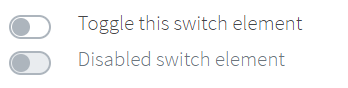
Here is an example with provided Bootstrap v4.3 code:
// @FindBy(css = "body") public static Switches switches;
@UI("body") public static Switches switches;
public class Switches extends Section {
// @FindBy(css = "#customSwitch1-div") public Checkbox checkbox;
@UI("#customSwitch1-div") public Checkbox checkbox;
// @FindBy(css = "#customSwitch2-div") public Checkbox checkboxDisabled;
@UI("#customSwitch2-div") public Checkbox checkboxDisabled;
}
@Test
public void isValidationTests() {
switches.checkbox
.is()
.displayed()
.enabled()
.core()
.hasClass("custom-control custom-switch")
.tag(is("div"));
switches.checkbox.label()
.is()
.displayed()
.enabled()
.core()
.hasClass("custom-control-label")
.text(is("Toggle this switch element"))
.tag(is("label"));
}
@Test
public void clickableTests() {
switches.checkbox.check();
switches.checkbox.is().selected();
switches.checkbox.check();
switches.checkbox.is().deselected();
}
<div class="custom-control custom-switch" id="customSwitch1-div">
<input type="checkbox" class="custom-control-input" id="customSwitch1">
<label class="custom-control-label" for="customSwitch1">Toggle this switch
element</label>
</div>
<div class="custom-control custom-switch" id="customSwitch2-div">
<input type="checkbox" class="custom-control-input" disabled id="customSwitch2">
<label class="custom-control-label" for="customSwitch2">Disabled switch element</label>
</div>
| Method | Description | Return Type |
|---|---|---|
| assertThat() | Assert action checkbox | CheckboxAssert |
| check(String) | Set to checked on "true" (case insensitive) or unchecked otherwise | void |
| check() | Set to checked | void |
| click() | Click the checkbox | void |
| is() | Assert action checkbox | CheckboxAssert |
| isEnabled() | Verify state | boolean |
| isSelected() | Verify value | boolean |
| uncheck() | Set to unchecked | void |
Button group is represented by Section class in Java:
3.1.2 Button group
Button group – Element that groups a series of buttons together on a single line with the button group, and super-power them with JavaScript.
Button group is located in the following packages:
- Java: io.github.epam.bootstrap.tests.composite.section.buttonGroup
- C#:
Button group is represented by Section class in Java:
Button Group Basic
Wrap a series of buttons with .btn in .btn-group.
Here is an example with provided Bootstrap v4.3 code:
// @FindBy(css = "#basic-example") public static ButtonGroupBasic buttonGroupBasic;
@UI("#basic-example")
public static ButtonGroupBasic buttonGroupBasic;
public class ButtonGroupBasic extends Section {
@UI("//button[text()='Left']")
public Button leftButton;
@UI("//button[text()='Middle']")
public Button middleButton;
@UI("//button[text()='Right']")
public Button rightButton;
}
@Test
public void leftButtonTests() {
buttonGroupBasic.leftButton.is()
.displayed()
.enabled()
.core()
.hasClass("btn btn-secondary")
.css("font-size", "16px");
buttonGroupBasic.leftButton.click();
validateAlert(is(leftButtonClickAlert));
}
<div id="btn-md-group" class="btn-group mb-3" role="group" aria-label="Default button group">
<button type="button" class="btn btn-secondary" ondblclick="alert('Left Button Double Clicked!');"
oncontextmenu="alert('Left Button Right Clicked!');">Left
</button>
<button type="button" class="btn btn-secondary" ondblclick="alert('Middle Button Double Clicked!');"
oncontextmenu="alert('Middle Button Right Clicked!');">Middle
</button>
<button type="button" class="btn btn-secondary" ondblclick="alert('Right Button Double Clicked!');"
oncontextmenu="alert('Right Button Right Clicked!');">Right
</button>
</div>
Available methods in Java JDI Light:
| Method | Description | Return Type |
|---|---|---|
| assertThat() | Assert action | TextAssert |
| click() | Click the button | void |
| displayed() | Check that element is displayed | TextAssert |
| enabled() | Check that element is enabled | TextAssert |
| getText() | Get button text | String |
| is() | Assert action | TextAssert |
Button Group Basic Tests Example
Button toolbar
Combine sets of button groups into button toolbars for more complex components. Use utility classes as needed to space out groups, buttons, and more.
Here is an example with provided Bootstrap v4.3 code:
// @FindBy(css = ".btn-toolbar") public static ButtonToolbar buttonToolbar;
@UI(".btn-toolbar")
public static ButtonToolbar buttonToolbar;
public class ButtonGroupToolbar extends Section {
@UI("button")
public WebList buttonsInToolbar;
@UI("input")
public TextField inputAreaInToolbar;
@Test
public void buttonsInButtonToolbarTest() {
buttonToolbar.buttonsInToolbar.forEach(button -> {
button.is().displayed();
button.is().enabled();
button.assertThat().css("background-color", backgroundColorBeforeHovering);
button.core().hover();
button.assertThat().css("background-color", backgroundColorAfterHovering);
button.assertThat().css("border-color", borderColorBeforeClicking);
button.click();
validateAlert(containsString("button is clicked"));
button.assertThat().css("border-color", borderColorAfterClicking);
});
}
}
<div class="btn-toolbar" id="buttonToolbar1" role="toolbar" aria-label="Toolbar with button groups">
<div class="btn-group mr-2" role="group" aria-label="First group">
<button type="button" class="btn btn-secondary" onclick="alert('1st button is clicked');">1
</button>
<button type="button" class="btn btn-secondary" onclick="alert('2nd button is clicked');">2
</button>
<button type="button" class="btn btn-secondary" onclick="alert('3rd button is clicked');">3
</button>
<button type="button" class="btn btn-secondary" onclick="alert('4th button is clicked');">4
</button>
</div>
<div class="btn-group mr-2" role="group" aria-label="Second group">
<button type="button" class="btn btn-secondary" onclick="alert('5th button is clicked');">5
</button>
<button type="button" class="btn btn-secondary" onclick="alert('6th button is clicked');">6
</button>
<button type="button" class="btn btn-secondary" onclick="alert('7th button is clicked');">7
</button>
</div>
<div class="btn-group" role="group" aria-label="Third group">
<button type="button" class="btn btn-secondary" onclick="alert('8th button is clicked');">8
</button>
</div>
</div>
It is possible to mix input groups with button groups in your toolbars.
Here is an example with provided Bootstrap v4.3 code:
@Test
public void inputFieldInButtonToolbarTest() {
buttonToolbar.inputAreaInToolbar.is().displayed();
buttonToolbar.inputAreaInToolbar.is().enabled();
buttonToolbar.inputAreaInToolbar.is().core().attr("placeholder", placeholderForInputField);
buttonToolbar.inputAreaInToolbar.setValue(textForTestingInputField);
assertEquals(buttonToolbar.inputAreaInToolbar.getValue(), textForTestingInputField);
}
<div class="btn-toolbar mb-3" id="buttonToolbar2" role="toolbar"
aria-label="Toolbar with button groups">
<div class="btn-group mr-2" role="group" aria-label="First group">
<button type="button" class="btn btn-secondary"
onclick="alert('1st button is clicked');">1
</button>
</div>
<div class="input-group">
<div class="input-group-prepend">
<div class="input-group-text" id="btnGroupAddon">@</div>
</div>
<input type="text" class="form-control" placeholder="Input group example"
aria-label="Input group example" aria-describedby="btnGroupAddon">
</div>
</div>
Available methods in Java JDI Light:
| Method | Description | Return Type |
|---|---|---|
| assertThat() | Assert action | TextAssert |
| click() | Click the button | void |
| displayed() | Check that element is displayed | TextAssert |
| enabled() | Check that element is enabled | TextAssert |
| getText() | Get button text | String |
| is() | Assert action | TextAssert |
Button Group Sizing
Instead of applying button sizing classes to every button in a group,
just add .btn-group-* to each .btn-group, including each one when nesting multiple groups.
@UI("#btn-lg-group") // @FindBy(id = "btn-lg-group")
public static ButtonGroupSizing largeBtnGroup;
public class ButtonGroupSizing extends Section {
@UI("//button[contains(text(), 'Left')]")
public Button leftBtn;
@UI("//button[contains(text(), 'Middle')]")
public Button midBtn;
@UI("//button[contains(text(), 'Right')]")
public Button rightBtn;
String leftBtnText = "Left";
@Test
public void isValidationTest() {
largeBtnGroup.highlight();
largeBtnGroup.is().displayed();
largeBtnGroup.is().enabled();
largeBtnGroup.leftBtn.is().text(is(leftBtnText));
largeBtnGroup.leftBtn.is().text(containsString("Le"));
assertThat(largeBtnGroup.leftBtn.core().css("font-size"), is("20px"));
largeBtnGroup.leftBtn.assertThat().displayed()
.and().text(is(leftBtnText))
.core()
.css("font-size", is("20px"))
.cssClass("btn btn-secondary")
.attr("type", "button")
.tag(is("button"));
}
}
Here is an example with provided Bootstrap v4.3 code:
<div id="btn-lg-group" class="btn-group btn-group-lg mb-3" role="group"
aria-label="Large button group">
<button type="button" class="btn btn-secondary"
onclick="alert('Lg Left Button Clicked!');"
ondblclick="alert('Lg Left Button Double Clicked!');"
oncontextmenu="alert('Lg Left Button Right Clicked!');">Left
</button>
<button type="button" class="btn btn-secondary"
onclick="alert('Lg Middle Button Clicked!');"
ondblclick="alert('Lg Middle Button Double Clicked!');"
oncontextmenu="alert('Lg Middle Button Right Clicked!');">Middle
</button>
<button type="button" class="btn btn-secondary"
onclick="alert('Lg Right Button Clicked!');"
ondblclick="alert('Lg Right Button Double Clicked!');"
oncontextmenu="alert('Lg Right Button Right Clicked!');">Right
</button>
</div>
Available methods in Java JDI Light:
| Method | Description | Return Type |
|---|---|---|
| assertThat() | Assert action | TextAssert |
| click() | Click the button | void |
| displayed() | Check that element is displayed | TextAssert |
| enabled() | Check that element is enabled | TextAssert |
| getText() | Get button text | String |
| is() | Assert action | TextAssert |
Button Group Nesting
Place a .btn-group within another .btn-group when you want dropdown menus mixed with a series of buttons.
Here is an example with provided Bootstrap v4.3 code:
// @FindBy(css = "#button-group-nesting") public static ButtonGroupNesting buttonGroupNesting;
@UI("#button-group-nesting")
public static ButtonGroupNesting buttonGroupNesting;
public class ButtonGroupNesting extends Section {
@UI("button[onclick*='Button 1']")
public Button one;
@UI("button[onclick*='Button 2']")
public Button two;
@JDropdown(expand = ".btn-group",
value = ".dropdown-menu",
list = ".dropdown-item")
public Dropdown dropdownMenu;
}
@Test
public void buttonOneTests() {
buttonGroupNesting.one.is()
.displayed()
.enabled()
.core()
.hasClass("btn btn-secondary")
.css("font-size", "16px");
buttonGroupNesting.one.click();
validateAlert(is(buttonOneClickAlert));
}
@Test
public void dropdownMenuTests() {
buttonGroupNesting.dropdownMenu.expand();
buttonGroupNesting.dropdownMenu.is().expanded();
buttonGroupNesting.dropdownMenu.is().size(2);
buttonGroupNesting.dropdownMenu.list().get(0).is().text(dropdownMenuLinkOne);
buttonGroupNesting.dropdownMenu.select(dropdownMenuLinkOne);
newWindowTitleCheck(linkOnePageTitle);
}
<div class="btn-group" id="button-group-nesting" role="group"
aria-label="Button group with nested dropdown">
<button type="button" class="btn btn-secondary" onclick="alert('Button 1 Clicked!');">
1
</button>
<button type="button" class="btn btn-secondary" onclick="alert('Button 2 Clicked!');">
2
</button>
<div class="btn-group" role="group">
<button id="btnGroupDr1" type="button" class="btn btn-secondary dropdown-toggle"
data-toggle="dropdown" aria-haspopup="true" aria-expanded="false">
Dropdown
</button>
<div class="dropdown-menu" aria-labelledby="btnGroupDr1">
<a class="dropdown-item" href="https://github.com/jdi-testing/jdi-light"
target="_blank">JDI Github</a>
<a class="dropdown-item"
href="https://jdi-docs.github.io/jdi-light/#jdi-light-framework"
target="_blank">JDI Docs</a>
</div>
</div>
</div>
| Method | Description | Return Type |
|---|---|---|
| assertThat() | Assert action | TextAssert |
| click() | Click the button | void |
| displayed() | Check that element is displayed | TextAssert |
| enabled() | Check that element is enabled | TextAssert |
| expand() | Dropdown expand | void |
| expanded() | Check that dropdown is expanded | TextAssert |
| getText() | Get button text | String |
| getValue() | Get button value | String |
| is() | Assert action | TextAssert |
| select(String option) | Select option by text | void |
| select(int option) | Select option by index | void |
Inner elements represented by the following classes:
Button Group Nesting Tests Example
Button Group Vertical Variation
Make a set of buttons appear vertically stacked rather than horizontally.
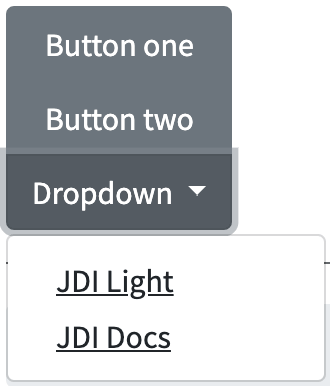
Here is an example with provided Bootstrap v4.3 code:
// @FindBy(css = "#vertical-variation") public static ButtonGroupVerticalVariation buttonGroupVerticalVariation;
@UI("#vertical-variation")
public static ButtonGroupVerticalVariation buttonGroupVerticalVariation;
public class ButtonGroupVerticalVariation extends Section {
@UI("button[onclick*='Button One']")
public Button buttonOne;
@UI("button[onclick*='Button Two']")
public Button buttonTwo;
@JDropdown(expand = ".btn-group",
value = ".dropdown-menu",
list = ".dropdown-item")
public Dropdown dropdownMenu;
}
@Test
public void buttonOneTests() {
buttonGroupVerticalVariation.buttonOne.is()
.displayed()
.enabled()
.core()
.hasClass("btn btn-secondary")
.css("font-size", "16px");
buttonGroupVerticalVariation.buttonOne.click();
validateAlert(is(buttonOneClickAlert));
@Test
public void dropdownMenuTests() {
buttonGroupVerticalVariation.dropdownMenu.expand();
buttonGroupVerticalVariation.dropdownMenu.is().expanded();
buttonGroupVerticalVariation.dropdownMenu.is().size(2);
buttonGroupVerticalVariation.dropdownMenu.list().get(1).is().text(dropdownMenuLinkTwo);
buttonGroupVerticalVariation.dropdownMenu.select(dropdownMenuLinkTwo);
newWindowTitleCheck(linkTwoPageTitle);
}
<div class="btn-group-vertical mb-3" id="vertical-variation" role="group"
aria-label="Vertical button group">
<button type="button" class="btn btn-secondary" onclick="alert('Button One Clicked!');">
Button one
</button>
<button type="button" class="btn btn-secondary" onclick="alert('Button Two Clicked!');">
Button two
</button>
<div class="btn-group" role="group">
<button id="btnGroupVerticalDrop1" type="button"
class="btn btn-secondary dropdown-toggle" data-toggle="dropdown"
aria-haspopup="true" aria-expanded="false">
Dropdown
</button>
<div class="dropdown-menu" aria-labelledby="btnGroupVerticalDrop1"
x-placement="bottom-start"
style="position: absolute; will-change: transform; top: 0px; left: 0px; transform: translate3d(0px, 38px, 0px);">
<a class="dropdown-item" href="https://github.com/jdi-testing/jdi-light"
target="_blank">JDI Light</a>
<a class="dropdown-item"
href="https://jdi-docs.github.io/jdi-light/#jdi-light-framework"
target="_blank">JDI Docs</a>
</div>
</div>
</div>
| Method | Description | Return Type |
|---|---|---|
| assertThat() | Assert action | TextAssert |
| click() | Click the button | void |
| displayed() | Check that element is displayed | TextAssert |
| enabled() | Check that element is enabled | TextAssert |
| expand() | Dropdown expand | void |
| expanded() | Check that dropdown is expanded | TextAssert |
| getText() | Get button text | String |
| getValue() | Get button value | String |
| is() | Assert action | TextAssert |
| select(String option) | Select option by text | void |
| select(int option) | Select option by index | void |
Inner elements represented by the following classes:
Button Group Vertical Variation Tests Example
3.1.3 Alert
Alert is located in the following class:
- Java: com.epam.jdi.light.ui.bootstrap.common.Alert
Alert – Element that provides contextual feedback messages for typical user actions with the handful of available and flexible alert messages.
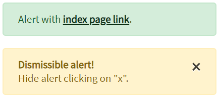
Here is an example with provided Bootstrap v4.3 code:
// @FindBy(css = "#simple-alert") public static Alert simpleAlert;
@Css("#simple-alert")
public static Alert simpleAlert;
// @FindBy(css = "#dismissible-alert") public static Alert dismissibleAlert;
@Css("#dismissible-alert")
public static Alert dismissibleAlert;
@Test
public void simpleAlertExistingTest() {
simpleAlert.is().displayed();
simpleAlert.is().enabled();
dismissibleAlert.is().displayed();
dismissibleAlert.is().enabled();
}
@Test
public void simpleAlertLinkClickableTest() {
simpleAlert.click();
switchToNewWindow();
assertEquals(getTitle(), pageTitle);
closeWindow();
}
@Test
public void dismissibleAlertButtonIsValidationTest() {
dismissibleAlert.dismissButton().is().displayed()
.enabled()
.core()
.attr("type", "button")
.attr("data-dismiss", "alert")
.attr("aria-label", "Close")
.tag(is("button"));
}
@Test (priority = 1)
public void dismissibleAlertButtonClickTest() {
dismissibleAlert.dismissButton().click();
dismissibleAlert.base().waitSec(1);
dismissibleAlert.is().hidden();
}
<div class="alert alert-success" id="simple-alert" role="alert">
Alert with <a
href="https://jdi-testing.github.io/jdi-light/index.html"
class="alert-link" target="_blank">index page link</a>.
</div>
<div class="alert alert-warning alert-dismissible fade show" id="dismissible-alert"
role="alert">
<strong>Dismissible alert!</strong><br> Hide alert clicking on "x".
<button type="button" class="close" id="dismissible-alert-close-button"
data-dismiss="alert" aria-label="Close">
<span aria-hidden="true">×</span>
</button>
</div>
Available methods in Java JDI Light:
| Method | Description | Return Type |
|---|---|---|
| assertThat() | Assert action | TextAssert |
| click() | Click to hide alert | Action |
| displayed() | Check that element is displayed | TextAssert |
| hidden() | Check that element is hidden | TextAssert |
| is() | Assert action | TextAssert |
3.1.4 Badge
1) Badge - Element that scale to match the size of the immediate parent element by using relative font sizing and em units.
Here is an example badge with provided Bootstrap v4.3 code:
// @FindBy(css = "#badge-secondary")
@UI("#badge-secondary") public static Text badgeSecondary;
// @FindBy(css = "#btn-primary")
@UI("#btn-primary") public static ButtonWithBadge buttonWithBadge;
@Test
public void getTextTest() {
assertEquals(badgeSecondary.getText(), badgeSecondaryText);
assertEquals(badgeSecondary.getValue(), badgeSecondaryText);
}
@Test
public void simpleVisibilityTest() {
assertTrue(badgeSecondary.isDisplayed());
}
@Test
public void checkBadgeInButton(){
buttonWithBadge.badge.is().displayed();
buttonWithBadge.badge.is().text(badgeInButtonText);
}
<h1>Heading
<span class="badge badge-secondary" id="badge-secondary">Badge</span>
</h1>
An example nested badge in button with provided Bootstrap v4.3 code:
<button type="button" class="btn btn-primary" id="btn-primary" onclick="alert('Button with badge');">
Profile
<span class="badge badge-light">9</span>
<span class="sr-only">unread messages</span>
</button>
In this case Badge is represented by the following class:
Available methods in Java JDI Light:
| Method | Description | Return Type |
|---|---|---|
| assertThat() | Assert action | TextAssert |
| displayed() | Check that element is displayed | TextAssert |
| getText() | Get button text | String |
| is() | Assert action | TextAssert |
2) Badge - .badge-* classes on an link element quickly provide actionable badges with hover and focus states.
Here is an example with provided Bootstrap v4.3 code:
// @FindBy(css = "#badge-success")
@UI("#badge-success") public static Link badgeSuccess;
@Test
public void getTextTest() {
assertEquals(badgeSuccess.getText(), badgeSuccessText);
assertEquals(badgeSuccess.getValue(), badgeSuccessText);
}
@Test
public void simpleVisibilityTest() {
assertTrue(badgeSuccess.isDisplayed());
}
<a href="https://github.com/jdi-testing" style="font-size: 16px;"class="badge badge-success" id="badge-success" alt="Github JDI Link">Github JDI</a>
In this case Badge is represented by Text class in Java:
Available methods in Java JDI Light:
| Method | Description | Return Type |
|---|---|---|
| alt() | Returns the alternate text | String |
| assertThat() | Returns object for work with assertions | LinkAssert |
| click() | Follow the link | void |
| getText() | Returns the link text | String |
| is() | Returns object for work with assertions | LinkAssert |
| ref() | Returns the reference | String |
| url() | Returns the URL | URL |
3.1.5 Breadcrumb
Breadcrumb is a control element used for navigational on web pages
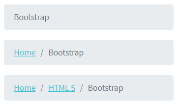
// @FindBy(css = "#breadcrumb")
@UI("#breadcrumb") public static Breadcrumb breadcrumb;
@Test
public void getTextTest() {
breadcrumb.items.has().size(3);
breadcrumb.items
.assertThat()
.values(TEXT, hasItems(ITEMS_VALUES));
}
@Test
public void getCurrectItemTest() {
breadcrumb.items.last().has().value(BOOTSTRAP);
breadcrumb.items.last().has().text(BOOTSTRAP);
}
Here is an example with provided Bootstrap v4.3 code:
<nav aria-label="breadcrumb">
<ol class="breadcrumb" id="breadcrumb">
<li class="breadcrumb-item"><a
href="https://jdi-testing.github.io/jdi-light/index.html" target="_blank">Home</a>
</li>
<li class="breadcrumb-item"><a
href="https://jdi-testing.github.io/jdi-light/html5.html" target="_blank">HTML
5</a></li>
<li class="breadcrumb-item active" aria-current="page">Bootstrap</li>
</ol>
</nav>
Breadcrumb is represented by the following class:
- UIBaseElement
Inner elements are represented by the following class:
- Weblist
Available methods in Java JDI Light:
| Method/Property | Description | Return Type |
|---|---|---|
| assertThat() | Assert action | UIAssert |
| click() | Click the item | void |
| first() | Get first item | UIElement |
| getText() | Get item text | String |
| getValue() | Get item value | String |
| get(String option) | Get item by text | UIElement |
| get(int index) | Get item by index | UIElement |
| is() | Assert action | UIAssert |
| last() | Get last item | UIElement |
| shouldBe() | Assert action | UIAssert |
3.1.6 Navbar
Supported content
Navbars come with built-in support for a handful of sub-components.
Choose from the following as needed:
.navbar-brandfor your company, product, or project name..navbar-navfor a full-height and lightweight navigation (including support for dropdowns)..navbar-togglerfor use with our collapse plugin and other navigation toggling behaviors..form-inlinefor any form controls and actions..navbar-textfor adding vertically centered strings of text..collapse.navbar-collapsefor grouping and hiding navbar contents by a parent breakpoint.
Here’s an example of all the sub-components included in a responsive light-themed navbar
that automatically collapses at the lg (large) breakpoint.
- Navbar with content

- Collapsed navbar

- Expanded navbar
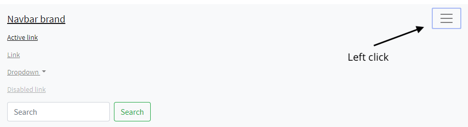
// @FindBy(id = "navbar-supported-content")
@UI("#navbar-supported-content")
public static NavbarSupportedContent navbarSupportedContent
// @FindBy(tagName = "button[data-toggle=collapse]")
@UI("button[data-toggle=collapse]")
public Button navExpand;
@JDropdown(root = ".navbar-nav",
list = "a")
public Collapse nav;
private static final String bootstrapNavPageUrl = "https://getbootstrap.com/docs/4.3/components/navbar/#nav";
private static final String jdiPageUrl = "https://github.com/jdi-testing/jdi-light/";
private static final String jdiBootstrapPageUrl = "https://jdi-testing.github.io/jdi-light/bootstrap.html#";
private static final String activeLinkText = "Active link";
private static final String jdiLinkText = "JDI Light";
private static final String dropdownLinkText = "Dropdown";
private static final String dropdownAction = "Action";
private static final String dropdownAnotherAction = "Another action";
private static final String dropdownSmthElse = "Something else here";
private static final String disabledLinkText = "Disabled link";
@Test(dataProvider = "navbarLinkData")
public void navLinkContentsTest(String elementName,
String elementText,
String elementUrl) {
navbarSupportedContent.nav.show();
navbarSupportedContent.nav.list().get(elementName)
.is()
.text(elementText)
.and()
.attr("href", elementUrl);
}
@Test(dataProvider = "collapseLinkTextData")
public void collapseLinkTextTest(String linkText) {
WindowsManager.resizeWindow(900, 600);
navbarSupportedContent.navExpand.show();
navbarSupportedContent.navExpand.click();
navbarSupportedContent.nav.is().expanded();
assertTrue(navbarSupportedContent.nav.list().values().contains(linkText));
}
<nav id="navbar-nav-with-disabled" class="navbar navbar-expand-lg navbar-light bg-light">
<a class="navbar-brand" href="https://getbootstrap.com/docs/4.3/components/navbar/#nav"
target="_blank">Navbar</a>
<button class="navbar-toggler" type="button" data-toggle="collapse"
data-target="#navbarNavAltMarkup" aria-controls="navbarNavAltMarkup"
aria-expanded="false" aria-label="Toggle navigation">
<span class="navbar-toggler-icon"></span>
</button>
<div class="collapse navbar-collapse" id="navbarNavAltMarkup">
<div class="navbar-nav">
<a class="nav-item nav-link active"
href="https://jdi-testing.github.io/jdi-light/index.html" target="_blank">Home
<span class="sr-only">(current)</span></a>
<a class="nav-item nav-link"
href="https://jdi-testing.github.io/jdi-light/html5.html" target="_blank">HTML
5</a>
<a class="nav-item nav-link"
href="https://jdi-testing.github.io/jdi-light/bootstrap.html" target="_blank">Bootstrap</a>
<a class="nav-item nav-link disabled"
href="https://jdi-testing.github.io/jdi-light/bootstrap.html" tabindex="-1"
aria-disabled="true" target="_blank">Disabled</a>
</div>
</div>
</nav>
Navbar is represented by Section class in Java:
Inner elements of jumbotron can be represented by the following classes:
Available methods in Java JDI Light:
| Method | Description | Return Type |
|---|---|---|
| attr() | Check whether an element has attribute of specified name and with given value | IsAssert |
| click() | Click on element | void |
| displayed() | Asserts element is displayed | UIAssert |
| expanded() | Check whether a dropdown is expanded | void |
| getValue() | Get value from input group | String |
| hasClass() | Checks whether element has class | boolean |
| is() | Asserts element | UIAssert |
| select() | Select a dropdown element | void |
| setValue() | Set a value for input group | void |
| text() | Check whether a text matches a pattern | IsAssert |
| toggle() | Toggle collapse | void |
Brand
The .navbar-brand can be applied to most elements, but an anchor works best as some elements might require utility classes or custom styles.
Navbar brand as a link

Navbar brand as heading

Adding images to the .navbar-brand will likely always require custom styles or utilities to properly size. Here are some examples to demonstrate.
//FindBy(css = "#brand-heading")
@UI("#brand-heading")
public UIElement navbarBrandHeading;
//FindBy(css = "#brand-link")
@UI("#brand-link")
public UIElement navbarBrandLink;
//FindBy(css = "#brand-as-image")
@UI("#brand-as-image")
public UIElement navbarBrandAsImage;
//FindBy(css = "#brand-as-image-and-link")
@UI("#brand-as-image-and-link")
public UIElement navbarBrandAsImageAndLink;
@Test (dataProvider = "navbarBrandsWithLink")
public void checkNavbarLink(UIElement brandAsLink) {
brandAsLink.is().core().hasAttr("href");
brandAsLink.highlight("blue");
brandAsLink.unhighlight();
int winNumber = WindowsManager.windowsCount();
brandAsLink.click();
WindowsManager.switchToWindow(winNumber + 1);
assertThat(getUrl(), is(navbarUrl));
WindowsManager.closeWindow();
WindowsManager.switchToWindow(winNumber);
}
@Test(dataProvider = "navbarBrands")
public void checkNavbarText(UIElement uiBaseElement, String navbarText) {
uiBaseElement.highlight();
uiBaseElement.is().core().text(navbarText);
uiBaseElement.unhighlight();
}
@Test(dataProvider = "navbarBrandsWithImage")
public void checkNavbarImage(UIElement brandWithImage) {
UIElement imgFromNavbar = brandWithImage.children().get(1);
imgFromNavbar.highlight("blue");
imgFromNavbar.is().core().tag("img").attr("src", containsString(imgPath));
imgFromNavbar.unhighlight();
int winNumber = WindowsManager.windowsCount();
imgFromNavbar.click();
WindowsManager.switchToWindow(winNumber + 1);
assertThat(getUrl(), is(navbarUrl));
WindowsManager.closeWindow();
WindowsManager.switchToWindow(winNumber);
}
<div id="navbar-base-for-brand">
<p>Navbar - Brand as link</p>
<nav class="navbar navbar-light bg-light">
<a class="navbar-brand" id="brand-link" href="https://getbootstrap.com/docs/4.3/components/navbar/#nav" target="_blank">Brand link</a>
</nav>
<br>
<p>Navbar - Brand as heading</p>
<nav class="navbar navbar-light bg-light">
<span class="navbar-brand mb-0 h1" id="brand-heading">Brand heading</span>
</nav>
<br>
<p>Navbar - Brand as image</p>
<nav class="navbar navbar-light bg-light">
<a class="navbar-brand" id="brand-as-image" href="https://getbootstrap.com/docs/4.3/components/navbar/#nav" target="_blank">
<img src="images/wolverin.jpg" width="20" height="30" alt="">
</a>
</nav>
<br>
<p>Navbar - Brand as image and link</p>
<nav class="navbar navbar-light bg-light mb-3">
<a class="navbar-brand" id="brand-as-image-and-link" href="https://getbootstrap.com/docs/4.3/components/navbar/#nav" target="_blank">
<img src="images/wolverin.jpg" width="20" height="30" class="d-inline-block align-top" alt="">Brand link</a>
</nav>
</div>
Available methods in Java JDI Light:
| Method | Description | Return Type |
|---|---|---|
| assertThat() | Assert action | UIAssert |
| is() | Assert action | UIAssert |
| hasAttr() | Assert action | UIAssert |
Nav
Navbar navigation links build on our .nav options with their own modifier class and require the use of toggler classes for proper responsive styling.
public class NavbarNav extends Section {
@UI("#navbar-nav-with-disabled") public NavbarSimpleLinks navLinks1;
@UI("#navbar-nav-with-dropdown") public NavbarComplexLinks navbarComplexLinks;
}
public class NavbarSimpleLinks extends Section {
@UI(".navbar-brand") public Link brand;
@UI(".navbar-nav a") public ListGroup listPages;
}
public class NavbarComplexLinks extends Section {
@UI(".navbar-brand")
public Link brand;
@UI("ul li")
public ListGroup listPages;
@JDropdown(root = ".dropdown",
expand = "#navbarDropdownMenuLink",
list = "a")
public Dropdown dropdown;
public void selectMenu(String item) {
dropdown.list().select(item);
}
}
@Test
public void isDisabledItemNavWithDisabled(){
navbarNav.navLinks1.listPages.get(4)
.is()
.displayed();
navbarNav.navLinks1.listPages.get(4)
.is()
.disabled();
}
@Test
public void clickNavbarNavWithDropdownLinksTest() {
navbarNav.navbarComplexLinks.listPages.get(4)
.is()
.displayed();
UIElement dropdown = navbarNav.navbarComplexLinks.listPages.get(4);
dropdown.click();
navbarNav.navbarComplexLinks.selectMenu(ITEM_BRAND);
newWindowTitleCheck(NAVBAR_BOOTSTRAP);
dropdown.click();
navbarNav.navbarComplexLinks.selectMenu(ITEM_NAV);
newWindowTitleCheck(NAVBAR_BOOTSTRAP);
dropdown.click();
navbarNav.navbarComplexLinks.selectMenu(ITEM_FORMS);
newWindowTitleCheck(NAVBAR_BOOTSTRAP);
}

Here is an example with provided Bootstrap v4.3 code:
<nav id="navbar-nav-with-disabled" class="navbar navbar-expand-lg navbar-light bg-light">
<a class="navbar-brand" href="https://getbootstrap.com/docs/4.3/components/navbar/#nav"
target="_blank">Navbar</a>
<button class="navbar-toggler" type="button" data-toggle="collapse"
data-target="#navbarNavAltMarkup" aria-controls="navbarNavAltMarkup"
aria-expanded="false" aria-label="Toggle navigation">
<span class="navbar-toggler-icon"></span>
</button>
<div class="collapse navbar-collapse" id="navbarNavAltMarkup">
<div class="navbar-nav">
<a class="nav-item nav-link active"
href="https://jdi-testing.github.io/jdi-light/index.html" target="_blank">Home
<span class="sr-only">(current)</span></a>
<a class="nav-item nav-link"
href="https://jdi-testing.github.io/jdi-light/html5.html" target="_blank">HTML
5</a>
<a class="nav-item nav-link"
href="https://jdi-testing.github.io/jdi-light/bootstrap.html" target="_blank">Bootstrap</a>
<a class="nav-item nav-link disabled"
href="https://jdi-testing.github.io/jdi-light/bootstrap.html" tabindex="-1"
aria-disabled="true" target="_blank">Disabled</a>
</div>
</div>
</nav>
With dropdown
Here is an example with provided Bootstrap v4.3 code:
<nav id="navbar-nav-with-dropdown" class="navbar navbar-expand-lg navbar-light bg-light">
<a class="navbar-brand" href="https://getbootstrap.com/docs/4.3/components/navbar/#nav"
target="_blank">Navbar</a>
<button class="navbar-toggler" type="button" data-toggle="collapse"
data-target="#navbarNavDropdown" aria-controls="navbarNavDropdown"
aria-expanded="false" aria-label="Toggle navigation">
<span class="navbar-toggler-icon"></span>
</button>
<div class="collapse navbar-collapse" id="navbarNavDropdown">
<ul class="navbar-nav">
<li class="nav-item active">
<a class="nav-link" href="https://jdi-testing.github.io/jdi-light/index.html"
target="_blank">Home <span class="sr-only">(current)</span></a>
</li>
<li class="nav-item">
<a class="nav-link" href="https://jdi-testing.github.io/jdi-light/html5.html"
target="_blank">HTML 5</a>
</li>
<li class="nav-item">
<a class="nav-link"
href="https://jdi-testing.github.io/jdi-light/bootstrap.html"
target="_blank">Bootstrap</a>
</li>
<li class="nav-item dropdown">
<a class="nav-link dropdown-toggle"
href="https://getbootstrap.com/docs/4.3/components/navbar/"
id="navbarDropdownMenuLink" role="button" data-toggle="dropdown"
aria-haspopup="true" aria-expanded="false" target="_blank">
Navbar
</a>
<div class="dropdown-menu" aria-labelledby="navbarDropdownMenuLink">
<a class="dropdown-item"
href="https://getbootstrap.com/docs/4.3/components/navbar/#brand"
target="_blank">Brand</a>
<a class="dropdown-item"
href="https://getbootstrap.com/docs/4.3/components/navbar/#nav"
target="_blank">Nav</a>
<a class="dropdown-item"
href="https://getbootstrap.com/docs/4.3/components/navbar/#forms"
target="_blank">Forms</a>
</div>
</li>
</ul>
</div>
</nav>
Nav is represented by Section class in Java:
Inner elements of media object can be represented by the following classes:
Available methods in Java JDI Light:
| Method | Description | Return Type |
|---|---|---|
| click() | Click the item | void |
| is() | Assert action | TextAssert |
Forms
Place various form controls and components within a navbar with .form-inline.
//FindBy(id = "#navbar-form-2")
@UI("#navbar-form-2")
public static NavbarForm navbarFormWithText;
//FindBy(id = "#navbar-form-3")
@UI("#navbar-form-3")
public static NavbarWithInputGroupForm navbarFormWithInputGroup;
@Test
public void checkSetValueInputGroup() {
navbarFormWithInputGroup.inputGroup.input.setValue(inputText);
navbarFormWithInputGroup.inputGroup.input.assertThat().text(is(inputText));
}
@Test
public void checkFormElements() {
UIElement input = navbarFormWithText.form.core().find((By.tagName("input")));
UIElement button = navbarFormWithText.form.core().find((By.tagName("button")));
input.shouldBe().enabled();
button.shouldBe().enabled().text(is(buttonText));
navbarFormWithText.form.click();
}
Here is an example with provided Bootstrap v4.3 code:
<nav class="navbar navbar-light bg-light" id="navbar-form-1">
<form class="form-inline">
<input class="form-control mr-sm-2" type="search" placeholder="Search"
aria-label="Search" style="width: 135px">
<button class="btn btn-outline-success my-2 my-sm-0"
type="submit"
onclick="alert('Search Main Button Clicked!');">Search
</button>
</form>
</nav>
Immediate children elements in .navbar use flex layout and will default to justify-content: between.
Here is an example with provided Bootstrap v4.3 code:
<nav class="navbar navbar-light bg-light" id="navbar-form-2">
<a class="navbar-brand">Navbar</a>
<form class="form-inline">
<input class="form-control mr-sm-2" type="search" placeholder="Search"
aria-label="Search" style="width: 135px">
<button class="btn btn-sm btn-outline-secondary my-2 my-sm-0"
type="submit"
onclick="alert('Search Smaller Button Clicked!');">Search
</button>
</form>
</nav>
Input groups work, too:
Here is an example with provided Bootstrap v4.3 code:
<nav class="navbar navbar-light bg-light" id="navbar-form-3">
<form class="form-inline">
<div class="input-group">
<div class="input-group-prepend">
<span class="input-group-text" id="basic-addon1">@</span>
</div>
<input type="text" class="form-control" placeholder="Username"
aria-label="Username" aria-describedby="basic-addon1">
</div>
</form>
</nav>
Media object is represented by Section class in Java:
Inner elements of media object can be represented by the following classes:
Text
Navbars may contain bits of text with the help of .navbar-text.
This class adjusts vertical alignment and horizontal spacing for strings of text.

Here is an example with provided Bootstrap v4.3 code:
//@FindBy(xpath = "//h4[.='Navbar - Text']/../..") public static NavbarText navbarText;
@UI("//h4[.='Navbar - Text']/../..") public static NavbarText navbarText;
public class NavbarText extends Section {
@UI("nav:nth-child(1)") public Text simpleText;
@UI("nav.navbar.navbar-expand-lg.navbar-light.bg-light") public NavbarTextLinks complexNavbar;
}
@Test
public void verifySimpleNavbarTextTest() {
navbarText.simpleText
.is()
.text(is(inlineElement));
}
<nav class="navbar navbar-light bg-light">
<span class="navbar-text">
Navbar text with an inline element
</span>
</nav>
Mix and match with other components and utilities as needed.

Here is an example with provided Bootstrap v4.3 code:
public class NavbarTextLinks extends Section {
@UI(".navbar-brand") public Link brand;
@UI("ul li") public ListGroup listPages;
@UI(".navbar-text") public Text simpleText;
}
@Test
public void verifyComplexNavbarHomeTest() {
navbarText.complexNavbar.listPages.get(1)
.is()
.text(is(linkName1));
navbarText.complexNavbar.listPages.get(1).click();
newWindowTitleCheck(page1);
navbarText.complexNavbar.listPages.get(2)
.is()
.text(is(linkName2));
navbarText.complexNavbar.listPages.get(2).click();
newWindowTitleCheck(page2);
navbarText.complexNavbar.listPages.get(3)
.is()
.text(is(linkName3));
navbarText.complexNavbar.listPages.get(3).click();
newWindowTitleCheck(page3);
}
<nav class="navbar navbar-expand-lg navbar-light bg-light">
<a class="navbar-brand" href="https://getbootstrap.com/docs/4.3/components/navbar/#nav"
target="_blank">Navbar w/ text</a>
<button class="navbar-toggler" type="button" data-toggle="collapse"
data-target="#navbarText"
aria-controls="navbarText" aria-expanded="false" aria-label="Toggle navigation">
<span class="navbar-toggler-icon"></span>
</button>
<div class="collapse navbar-collapse" id="navbarText">
<ul class="navbar-nav mr-auto">
<li class="nav-item active">
<a class="nav-link" href="https://jdi-testing.github.io/jdi-light/index.html"
target="_blank">Home <span class="sr-only">(current)</span></a>
</li>
<li class="nav-item">
<a class="nav-link" href="https://jdi-testing.github.io/jdi-light/html5.html"
target="_blank">HTML 5</a>
</li>
<li class="nav-item">
<a class="nav-link"
href="https://jdi-testing.github.io/jdi-light/bootstrap.html"
target="_blank">Bootstrap</a>
</li>
</ul>
<span class="navbar-text">
Navbar text with an inline element
</span>
</div>
</nav>
Available methods in Java JDI Light:
| Method | Description | Return Type |
|---|---|---|
| assertThat() | Assert action | TextAssert |
| click() | Click the button | void |
| get() | Select button by index | action |
| getText() | Get button text | String |
| is() | Assert action | TextAssert |
Available methods and properties in C# JDI Light:
| Method/Property | Description | Return Type |
|---|---|---|
Color schemes
Theming the navbar has never been easier thanks to the combination of theming classes and background-color utilities
Choose from .navbar-light for use with light background colors, or .navbar-dark for dark background colors. Then, customize with .bg-* utilities.
Here is an example with provided Bootstrap v4.3 code:
public class NavbarColorScheme extends Navbar {
//@FindBy(className = "navbar-brand")
@UI(".navbar-brand")
public Link navbarLink;
//@FindBy(linkText = "Home\n(current)")
@ByText("Home")
public Link homeLink;
//@FindBy(linkText = "Contact form")
@ByText("Contact form")
public Link contactFormLink;
//@FindBy(linkText = "Metals & Colors")
@ByText("Metals & Colors")
public Link metalsAndColorsLink;
//@FindBy(xpath = "//form/button")
@UI("form button")
public Button searchButton;
}
@Test(dataProvider = "navbarColorSchemesWithColors")
public void colorSchemeAccordanceTest(NavbarColorScheme navbarColorScheme, String bgColor,
String navbarAndHomeColor, String contactAndMetalsColor, String searchColor) {
navbarColorScheme.core().is()
.css("background-color", bgColor);
checkColorOfElement(navbarColorScheme.navbarLink, navbarAndHomeColor);
checkColorOfElement(navbarColorScheme.homeLink, navbarAndHomeColor);
checkColorOfElement(navbarColorScheme.contactFormLink, contactAndMetalsColor);
checkColorOfElement(navbarColorScheme.metalsAndColorsLink, contactAndMetalsColor);
checkColorOfElement(navbarColorScheme.searchButton,
String.format("rgba%s, 1)", searchColor));
navbarColorScheme.searchButton.core().is()
.css("border-color", String.format("rgb%s)", searchColor));
}
private void checkColorOfElement(ICoreElement elem, String color) {
elem.core().is()
.css("color", color);
}
<nav id="navbar-dark-colorscheme" class="navbar navbar-expand-lg navbar-dark bg-dark mb-1">
<a class="navbar-brand"
href="https://getbootstrap.com/docs/4.0/components/navbar/#color-schemes"
target="_blank">Navbar</a>
<button class="navbar-toggler collapsed" type="button" data-toggle="collapse"
data-target="#navbarColor01" aria-controls="navbarColor01" aria-expanded="false"
aria-label="Toggle navigation">
<span class="navbar-toggler-icon"></span>
</button>
<div class="navbar-collapse collapse" id="navbarColor01" style="">
<ul class="navbar-nav mr-auto">
<li class="nav-item active">
<a class="nav-link" href="https://jdi-testing.github.io/jdi-light/index.html"
target="_blank">Home <span class="sr-only">(current)</span></a>
</li>
<li class="nav-item">
<a class="nav-link" href="https://jdi-testing.github.io/jdi-light/contacts.html"
target="_blank">Contact form</a>
</li>
<li class="nav-item">
<a class="nav-link"
href="https://jdi-testing.github.io/jdi-light/metals-colors.html"
target="_blank">Metals & Colors</a>
</li>
</ul>
<form class="form-inline">
<input class="form-control mr-sm-2" type="search" placeholder="Search"
aria-label="Search">
<button class="btn btn-outline-info my-2 my-sm-0" type="button"
onclick="alert('Search');">Search
</button>
</form>
</div>
</nav>
Available methods in Java JDI Light:
| Method | Description | Return Type |
|---|---|---|
| assertThat() | Assert action | TextAssert |
| click() | Click the button | void |
| getText() | Get button text | String |
| is() | Assert action | TextAssert |
Containers
Although it’s not required, you can wrap a navbar in a .container to center it on a page or add one within to only center the contents of a fixed or static top navbar.
public class NavbarContainer extends Section {
//@FindBy(id = "navbar-containers-centred")
@UI("#navbar-containers-centred") public NavbarSimpleLinks navLinks1;
//@FindBy(id = "navbar-containers-expanded")
@UI("#navbar-containers-expanded") public NavbarComplexLinks navbarComplexLinks;
}
@Test
public void getNameNavbarContainerBrandTest() {
navbarContainers.navLinks1.brand.is().text(textNavbarCentredContainer);
navbarContainers.navbarComplexLinks.brand.is().text(textNavbarExpandedConteiner);
}
@Test
public void clickNavbarCentredContainerLinksTest() {
navbarContainers.navLinks1.brand.click();
assertThat(WindowsManager.windowsCount(), is(2));
WindowsManager.switchToWindow(2);
assertThat(getUrl(), is(url));
WindowsManager.closeWindow();
}
Here is an example with provided Bootstrap v4.3 code:
<div class="container" id="navbar-containers-centred">
<nav class="navbar navbar-expand-lg navbar-light bg-light mb-1">
<a class="navbar-brand"
href="https://getbootstrap.com/docs/4.3/components/navbar/#containers"
target="_blank">Navbar</a>
</nav>
</div>
When the container is within your navbar, its horizontal padding is removed at breakpoints lower than your specified .navbar-expand{-sm|-md|-lg|-xl} class.
This ensures we’re not doubling up on padding unnecessarily on lower viewports when your navbar is collapsed.
<nav class="navbar navbar-expand-lg navbar-light bg-light mb-3"
id="navbar-containers-expanded">
<div class="container">
<a class="navbar-brand"
href="https://getbootstrap.com/docs/4.3/components/navbar/#containers"
target="_blank">Navbar</a>
</div>
</nav>
Container is represented by Section class in Java:
Inner elements of media object can be represented by the following classes:
Placement
Use our position utilities to place navbars in non-static positions. Choose from fixed to the top, fixed to the bottom, or stickied to the top (scrolls with the page until it reaches the top, then stays there). Fixed navbars use position: fixed, meaning they’re pulled from the normal flow of the DOM and may require custom CSS (e.g., padding-top on the <body>) to prevent overlap with other elements.
Also note that .sticky-top uses position: sticky, which isn’t fully supported in every browser.
Here is an example with provided Bootstrap v4.3 code:
//@FindBy(id = "navbar-sticky-top")
@UI("#navbar-sticky-top")
public static NavbarPlacement navbarPlacementStickyTop;
@Test
public void navbarPositionTest() {
navbarPlacementStickyTop.show();
navbarPlacementStickyTop.core()
.is()
.css("position", "sticky")
.css("top", "0px");
}
<nav class="navbar navbar-expand-lg sticky-top navbar-light bg-light" id="navbar-sticky-top">
<a class="navbar-brand" href="https://getbootstrap.com/docs/4.3/components/navbar/#placement">Sticky Top</a>
<button class="navbar-toggler" type="button" data-toggle="collapse" data-target="#navbarNav"
aria-controls="navbarNav" aria-expanded="false" aria-label="Toggle navigation">
<span class="navbar-toggler-icon"></span>
</button>
<div class="collapse navbar-collapse" id="navbarNav">
<ul class="navbar-nav">
<li class="nav-item active">
<a class="nav-link" href="javascript: void();"> <span class="sr-only"></span>Home</a>
</li>
<li class="nav-item">
<a class="nav-link" href="javascript: void();">Features</a>
</li>
<li class="nav-item">
<a class="nav-link" href="javascript: void();">Pricing</a>
</li>
<li class="nav-item">
<a class="nav-link disabled" href="javascript: void();" tabindex="-1" aria-disabled="true">Disabled</a>
</li>
</ul>
</div>
</nav>
Available methods in Java JDI Light:
| Method | Description | Return Type |
|---|---|---|
| click() | Click a link | void |
| css() | Match passed value with the element css | isAssert |
| getRect() | Get element rectangle | Rectangle |
| is() | Assertelement | isAssert |
| jsExecute() | Execute javascript | String |
| text() | Check whether a text matches a pattern | isAssert |
Responsive behaviors
Navbars can utilize .navbar-toggler, .navbar-collapse, and .navbar-expand{-sm|-md|-lg|-xl} classes to change when their content collapses behind a button.
In combination with other utilities, you can easily choose when to show or hide particular elements.
For navbars that never collapse, add the .navbar-expand class on the navbar.
For navbars that always collapse, don’t add any .navbar-expand class.
Navbar Toggler
Navbar togglers are left-aligned by default, but should they follow a sibling element like a .navbar-brand, they’ll automatically be aligned to the far right.
Reversing your markup will reverse the placement of the toggler.
Below are examples of different toggle styles.
1. With no .navbar-brand shown in lowest breakpoint
FullScreen

Collapsed

Expanded
Here is an example with provided Bootstrap v4.3 code:
<nav class="navbar navbar-expand-lg navbar-dark bg-primary mb-2">
<button class="navbar-toggler collapsed" type="button" data-toggle="collapse"
data-target="#navbarTogglerDemo01" aria-controls="navbarTogglerDemo01"
aria-expanded="false" aria-label="Toggle navigation">
<span class="navbar-toggler-icon"></span>
</button>
<div class="navbar-collapse collapse" id="navbarTogglerDemo01" style="">
<a class="navbar-brand" href="javascript:void();">Hidden brand</a>
<ul class="navbar-nav mr-auto mt-2 mt-lg-0">
<li class="nav-item active">
<a class="nav-link" href="https://github.com/jdi-testing/jdi-light"
target="_blank">JDI <span class="sr-only">(current)</span></a>
</li>
<li class="nav-item">
<a class="nav-link" href="https://jdi-docs.github.io/jdi-light/#navbar"
target="_blank">JDI Docs</a>
</li>
<li class="nav-item">
<a class="nav-link disabled" href="#" tabindex="-1"
aria-disabled="true">Disabled</a>
</li>
</ul>
<form class="form-inline my-2 my-lg-0">
<input class="form-control mr-sm-2" type="search" placeholder="Search"
aria-label="Search">
<button class="btn btn-outline-light my-2 my-sm-0" type="submit"
onclick="alert('Search Button Clicked!');">Search
</button>
</form>
</div>
</nav>
2. With a brand name shown on the left and toggler on the right
FullScreen

Collapsed

Expanded
Here is an example with provided Bootstrap v4.3 code:
<nav class="navbar navbar-expand-lg navbar-dark bg-success mb-2">
<a class="navbar-brand" href="javascript:void();">Navbar</a>
<button class="navbar-toggler" type="button" data-toggle="collapse"
data-target="#navbarTogglerDemo02" aria-controls="navbarTogglerDemo02"
aria-expanded="false" aria-label="Toggle navigation">
<span class="navbar-toggler-icon"></span>
</button>
<div class="collapse navbar-collapse" id="navbarTogglerDemo02">
<ul class="navbar-nav mr-auto mt-2 mt-lg-0">
<li class="nav-item active">
<a class="nav-link" href="https://github.com/jdi-testing/jdi-light"
target="_blank">JDI <span class="sr-only">(current)</span></a>
</li>
<li class="nav-item">
<a class="nav-link" href="https://jdi-docs.github.io/jdi-light/#navbar"
target="_blank">JDI Docs</a>
</li>
<li class="nav-item">
<a class="nav-link disabled" href="#" tabindex="-1"
aria-disabled="true">Disabled</a>
</li>
</ul>
<form class="form-inline my-2 my-lg-0">
<input class="form-control mr-sm-2" type="search" placeholder="Search">
<button class="btn btn-outline-light my-2 my-sm-0" type="submit"
onclick="alert('Search Button Clicked!');">Search
</button>
</form>
</div>
</nav>
3. With a toggler on the left and brand name on the right
FullScreen

Collapsed

Expanded
Here is an example with provided Bootstrap v4.3 code:
<nav class="navbar navbar-expand-lg navbar-dark mb-3 bg-dark">
<button class="navbar-toggler collapsed" type="button" data-toggle="collapse"
data-target="#navbarTogglerDemo03" aria-controls="navbarTogglerDemo03"
aria-expanded="false" aria-label="Toggle navigation">
<span class="navbar-toggler-icon"></span>
</button>
<a class="navbar-brand" href="javascript:void();">Navbar</a>
<div class="navbar-collapse collapse" id="navbarTogglerDemo03" style="">
<ul class="navbar-nav mr-auto mt-2 mt-lg-0">
<li class="nav-item active">
<a class="nav-link" href="https://github.com/jdi-testing/jdi-light"
target="_blank">JDI <span class="sr-only">(current)</span></a>
</li>
<li class="nav-item">
<a class="nav-link" href="https://jdi-docs.github.io/jdi-light/#navbar"
target="_blank">JDI Docs</a>
</li>
<li class="nav-item">
<a class="nav-link disabled" href="#" tabindex="-1"
aria-disabled="true">Disabled</a>
</li>
</ul>
<form class="form-inline my-2 my-lg-0">
<input class="form-control mr-sm-2" type="search" placeholder="Search"
aria-label="Search">
<button class="btn btn-outline-light my-2 my-sm-0" type="submit"
onclick="alert('Search Button Clicked!');">Search
</button>
</form>
</div>
</nav>
External content
Plugin to trigger hidden content elsewhere on the page.
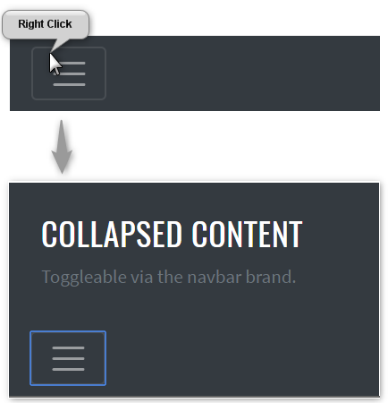
Here is an example with provided Bootstrap v4.3 code:
@UI("#navbar-external-content") //FindBy(css = "#navbar-external-content")
public static NavbarExternalContent navbarExternalContent;
@Test
public void expandingTest() {
navbarExternalContent.toggler.expander().is().core().attr(ariaExpanded, "false");
navbarExternalContent.toggler.expand();
navbarExternalContent.toggler.expander().is().core().attr(ariaExpanded, "true");
navbarExternalContent.toggler.collapse();
navbarExternalContent.toggler.expander().is().core().attr(ariaExpanded, "false");
}
@Test
public void getTextTest() {
navbarExternalContent.toggler.expand();
navbarExternalContent.toggler.value().children().get(1).is()
.displayed()
.text(text);
navbarExternalContent.toggler.value().children().get(2).is()
.displayed()
.text(mutedText);
navbarExternalContent.toggler.collapse();
}
<div class="pos-f-t" id="navbar-external-content">
<div class="collapse" id="navbarToggleExternalContent">
<div class="bg-dark p-4">
<h5 class="text-white h4">Collapsed content</h5>
<span class="text-muted">Toggleable via the navbar brand.</span>
</div>
</div>
<nav class="navbar navbar-dark bg-dark">
<button class="navbar-toggler" type="button" data-toggle="collapse"
data-target="#navbarToggleExternalContent"
aria-controls="navbarToggleExternalContent" aria-expanded="false"
aria-label="Toggle navigation">
<span class="navbar-toggler-icon"></span>
</button>
</nav>
</div>
Navbar - External content is represented by Section class in Java:
Inner elements of Navbar - External content can be represented by the following classes:
Available methods in Java JDI Light:
| Method/Property | Description | Return Type |
|---|---|---|
| assertThat() | Assert action | TextAssert |
| collapse() | Collapses element | void |
| expand() | Expands element | void |
| getText() | Get current value | String |
| is() | Assert action | TextAssert |
3.1.7 Progress
Progress is located in the following class:
- Java: com.epam.jdi.light.ui.bootstrap.elements.common.Progress
Progress is custom progress bar featuring support for stacked bars, animated backgrounds, and text labels.
There is also a complex element MultiplebarsProgress which may consist of several progress bars.
Here is an example with provided Bootstrap v4.3 code:_
//FindBy(css = "#progress-bar-base-width-25 .progress-bar"
@UI("#progress-bar-base-width-25 .progress-bar")
public static Progress progressBaseWidth25;
@Test(dataProvider = "progressWidth")
public void getWidthTest(Progress progress, String width) {
progress.is().value(width);
}
@Test(dataProvider = "progressColor")
public void getColorTest(Progress progress, String color) {
progress.is().color(color);
}
<div id="progress-base">
<p>base</p>
<div class="progress" id="progress-bar-base-width-0">
<div class="progress-bar" role="progressbar" aria-valuenow="0" aria-valuemin="0" aria-valuemax="100"></div>
</div>
<div class="progress" id="progress-bar-base-width-25">
<div class="progress-bar" role="progressbar" style="width: 25%" aria-valuenow="25" aria-valuemin="0" aria-valuemax="100"></div>
</div>
<div class="progress" id="progress-bar-base-width-50">
<div class="progress-bar" role="progressbar" style="width: 50%" aria-valuenow="50" aria-valuemin="0" aria-valuemax="100"></div>
</div>
<div class="progress" id="progress-bar-base-width-75">
<div class="progress-bar" role="progressbar" style="width: 75%" aria-valuenow="75" aria-valuemin="0" aria-valuemax="100"></div>
</div>
<div class="progress" id="progress-bar-base-width-100">
<div class="progress-bar" role="progressbar" style="width: 100%" aria-valuenow="100" aria-valuemin="0" aria-valuemax="100"></div>
</div>
</div>
Available methods in Java JDI Light:
| Method/Property | Description | Return Type |
|---|---|---|
| animated() | Match passed value with the progress css 'animation-name' | ProgressAssert |
| color() | Match passed value with the progress css 'background-color' | ProgressAssert |
| getValue() | Get aria value of the bar | String |
| getMaxValue() | Get max value of the bar | String |
| getMinValue() | Get min value of the bar | String |
| getColor() | Get color of the bar | String |
| getStyle() | Get style of the bar | String |
| height() | Match passed value with the progress height | ProgressAssert |
| is() | Various assert actions for Progress | ProgressAssert |
| maxValue() | Match passed value with the progress value 'aria-valuemax' | ProgressAssert |
| minValue() | Match passed value with the progress value 'aria-valuemin' | ProgressAssert |
| value() | Match passed value with the progress value 'aria-valuenow' | ProgressAssert |
Labels
Add labels to your progress bars by placing text within the .progress-bar.

Here is an example with provided Bootstrap v4.3 code:
//@FindBy(css = "#progress-with-labels")
@UI("#progress-with-labels")
public static Progress progressWithLabels;
@Test
public void getDefaultPercentTest() {
assertThat(progressWithLabels.core().getText(), is(defaultPercent));
}
@Test
public void getPercentTest() {
progressWithLabels.core().is().text(defaultPercent);
minus.click();
progressWithLabels.core().is().text("20%");
for (int i = 0; i < 10; i++) {
minus.click();
}
progressWithLabels.core().is().text(minPercent);
plus.click();
progressWithLabels.core().is().text("5%");
for (int i = 0; i < 30; i++) {
plus.click();
}
progressWithLabels.core().is().text(maxPercent);
}
<div class="progress">
<div id="progress-with-labels" class="progress-bar" role="progressbar" style="width: 25%;" aria-valuenow="25" aria-valuemin="0" aria-valuemax="100">25%</div>
</div>
Height
We only set a height value on the .progress, so if you change that value the inner .progress-bar will automatically resize accordingly.
Here is an example with provided Bootstrap v4.3 code:
//@FindBy(css = "#progress-height .progress")
@UI("#progress-height .progress")
public static JList<ProgressSection> progressHeightSections;
@Test
public void heightOfSectionShouldBeValid() {
for (ProgressSection section : progressHeightSections) {
int actualHeight = section.core().getSize().getHeight();
int expectedHeight = section.getProgressSectionHeightValueInPx();
assertEquals(actualHeight, expectedHeight);
}
}
@Test
public void heightOfBarShouldBeValid() {
for (ProgressSection section : progressHeightSections) {
int expectedBarHeight = section.getProgressSectionHeightValueInPx();
section.progress.is().height(expectedBarHeight);
}
}
<div id="progress-height">
<p>various heights</p>
<div class="progress" id="progress-height-20px" style="height: 20px;">
<div class="progress-bar bg-success" role="progressbar" style="width: 25%" aria-valuenow="25" aria-valuemin="0" aria-valuemax="100"></div>
</div>
<div class="progress" id="progress-height-40px" style="height: 40px;">
<div class="progress-bar bg-info" role="progressbar" style="width: 50%" aria-valuenow="50" aria-valuemin="0" aria-valuemax="100"></div>
</div>
<div class="progress" id="progress-height-60px" style="height: 60px;">
<div class="progress-bar bg-warning" role="progressbar" style="width: 75%" aria-valuenow="75" aria-valuemin="0" aria-valuemax="100"></div>
</div>
<div class="progress" id="progress-height-80px" style="height: 80px;">
<div class="progress-bar bg-danger" role="progressbar" style="width: 100%" aria-valuenow="100" aria-valuemin="0" aria-valuemax="100"></div>
</div>
</div>
Backgrounds
Use background utility classes to change the appearance of individual progress bars.
Here is an example with provided Bootstrap v4.3 code:
//@FindBy(css = "#progress-background-green")
@UI("#progress-backgrounds-green") public static Progress progressBackgroundGreen;
//@FindBy(css = "#progress-background-blue")
@UI("#progress-backgrounds-blue") public static Progress progressBackgroundBlue;
//@FindBy(css = "#progress-background-yellow")
@UI("#progress-backgrounds-yellow") public static Progress progressBackgroundYellow;
//@FindBy(css = "#progress-background-red")
@UI("#progress-backgrounds-red") public static Progress progressBackgroundRed;
@DataProvider(name = "progressBackgroundsWithAttributes")
public static Object[][] progressBackgroundsWithAttributes() {
return new Object[][]{
{progressBackgroundGreen, 25, "rgba(40, 167, 69, 1)"},
{progressBackgroundBlue, 50, "rgba(23, 162, 184, 1)"},
{progressBackgroundYellow, 75, "rgba(255, 193, 7, 1)"},
{progressBackgroundRed, 100, "rgba(220, 53, 69, 1)"}
};
}
@Test(dataProvider = "progressBackgroundsWithAttributes")
public void isValidationTest(ICoreElement progressBackground, int widthNumber, String color) {
progressBackground.core().is()
.tag(is("div"))
.attr("role", "progressbar")
.attr("style", String.format("width: %s%%;", widthNumber))
.attr("aria-valuenow", widthNumber + "")
.attr("aria-valuemin", "0")
.attr("aria-valuemax", "100")
.css("background-color", color);
}
<div class="progress">
<div id="progress-backgrounds-green" class="progress-bar bg-success" role="progressbar" style="width: 25%" aria-valuenow="25" aria-valuemin="0" aria-valuemax="100"></div>
</div>
<div class="progress">
<div id="progress-backgrounds-blue" class="progress-bar bg-info" role="progressbar" style="width: 50%" aria-valuenow="50" aria-valuemin="0" aria-valuemax="100"></div>
</div>
<div class="progress">
<div id="progress-backgrounds-yellow" class="progress-bar bg-warning" role="progressbar" style="width: 75%" aria-valuenow="75" aria-valuemin="0" aria-valuemax="100"></div>
</div>
<div class="progress">
<div id="progress-backgrounds-red" class="progress-bar bg-danger" role="progressbar" style="width: 100%" aria-valuenow="100" aria-valuemin="0" aria-valuemax="100"></div>
</div>
Striped
Add .progress-bar-striped to any .progress-bar to apply a stripe via CSS gradient over the progress bar’s background color.
Here is an example with provided Bootstrap v4.3 code:
//@FindBy(css = "#striped-base .progress")
@UI("#striped-base .progress")
public static JList<ProgressSection> progressSections;
@Test(dataProvider = "progressData")
public void checkProgressData(String progressId, String value, String color,
String min, String max, String classStriped
progressSections.stream().filter(progressSection ->
progressSection.progress.attr("id").equals(progressId)).forEach(
progressSection -> {
progressSection.progress.is().core().hasClass(classStriped);
progressSection.progress.is().value(value)
.color(color)
.minValue(min)
.maxValue(max);
});
}
<div id="striped-base">
<br>
<p>striped</p>
<div class="progress">
<div class="progress-bar progress-bar-striped" id="striped_ordinary" role="progressbar" style="width: 10%" aria-valuenow="10" aria-valuemin="0" aria-valuemax="100"></div>
</div>
<div class="progress">
<div class="progress-bar progress-bar-striped bg-success" id="striped_success" role="progressbar" style="width: 25%" aria-valuenow="25" aria-valuemin="0" aria-valuemax="100"></div>
</div>
<div class="progress">
<div class="progress-bar progress-bar-striped bg-info" id="striped_info" role="progressbar" style="width: 50%" aria-valuenow="50" aria-valuemin="0" aria-valuemax="100"></div>
</div>
<div class="progress">
<div class="progress-bar progress-bar-striped bg-warning" id="striped_warning" role="progressbar" style="width: 75%" aria-valuenow="75" aria-valuemin="0" aria-valuemax="100"></div>
</div>
<div class="progress">
<div class="progress-bar progress-bar-striped bg-danger" id="striped_danger" role="progressbar" style="width: 100%" aria-valuenow="100" aria-valuemin="0" aria-valuemax="100"></div>
</div>
</div>
Animated stripes
The striped gradient can also be animated. Add .progress-bar-animated to .progress-bar to animate the stripes right to left via CSS3 animations.
Here is an example with provided Bootstrap v4.3 code:
//FindBy(css = "#progress-animated")
@UI("#progress-animated")
public static Progress progressAnimated;
@Test
public void isValidationTest() {
progressAnimated.is()
.animated("progress-bar-stripes")
.color("rgba(0, 123, 255, 1)")
.value("75");
}
<div class="progress">
<div class="progress-bar progress-bar-striped progress-bar-animated" id="progress-animated" role="progressbar" aria-valuenow="75" aria-valuemin="0" aria-valuemax="100" style="width: 75%"></div>
</div>
3.1.8 Spinners
Bootstrap “spinners” can be used to show the loading state in your projects. They’re built only with HTML and CSS, meaning you don’t need any JavaScript to create them. You will, however, need some custom JavaScript to toggle their visibility. Their appearance, alignment, and sizing can be easily customized with Bootstrap utility classes.
For accessibility purposes, each loader in the examples below includes role="status" and a nested <span class="sr-only">Loading...</span>.
Spinners are represented by the following class in JDI:
- Java: Spinner
- C#: TBD
Available methods in Java JDI Light:
| Method/Property | Description | Return Type |
|---|---|---|
| color() | Assert action | SpinnerAssert |
| disappearAfter(int sec) | Wait when spinner disappear | Spinner |
| getColor() | Get item color | String |
| is() | Assert action | SpinnerAssert |
Border Spinner
// @FindBy(id = "button-show-spinner-border")
@UI("#button-show-spinner-border")
public static Button buttonSpinnerBorder;
// @FindBy(css = "#spinner-border")
@UI("#spinner-border") public static Spinner spinnerBorder;
@Test()
public void checkSpinnerClass() {
spinnerBorder.assertThat().core().hasClass("spinner-border");
}
@Test(priority = 1)
public void checkSpinnerAppearAndThenDisappear() {
buttonSpinnerBorder.click();
spinnerBorder.disappearAfter(4);
}
Border Spinner - use the border spinners for a lightweight loading indicator.

Here is an example with provided Bootstrap v4.3 code:
<div class="spinner-border" role="status">
<span class="sr-only">Loading...</span>
</div>
Colors
// @FindBy(id = "spinner-text-primary")
@UI("#spinner-text-primary")
public static Spinner spinnerWithTextPrimary;
// @FindBy(css = "#spinner-text-light")
@UI("#spinner-text-light")
public static Spinner spinnerWithTextLight;
@Test(dataProvider = "Color Spinners")
public void assertColorTests(Spinner colorSpinner, String color)
{
colorSpinner.is().color(color);
}
@Test(dataProvider = "Color Spinners")
public void assertSpinnerColorTests(Spinner colorSpinner,
String color){
colorSpinner.is()
.core()
.cssClass(containsString(color));
}
@Test(dataProvider = "Color Spinners")
public void assertColorByHasClassTests(Spinner colorSpinner,
String color){
colorSpinner.core().hasClass("spinner-border" + color);
}
@Test(dataProvider = "Color Spinners")
public void isValidationTest(Spinner colorSpinner, String __){
colorSpinner.is()
.displayed()
.core()
.css("font-size", is("14px"))
.cssClass(containsString("spinner-border"))
.attr("role", "status");
}
The border spinner uses currentColor for its border-color, meaning you can customize the color with text color utilities. You can use any of our text color utilities on the standard spinner.
 Here is an example with provided Bootstrap v4.3 code:
<div class="spinner-border text-primary" role="status" id="spinner-text-primary">
<span class="sr-only">Loading...</span>
</div>
<div class="spinner-border text-secondary" role="status" id="spinner-text-secondary">
<span class="sr-only">Loading...</span>
</div>
<div class="spinner-border text-success" role="status" id="spinner-text-success">
<span class="sr-only">Loading...</span>
</div>
<div class="spinner-border text-danger" role="status" id="spinner-text-danger">
<span class="sr-only">Loading...</span>
</div>
<div class="spinner-border text-warning" role="status" id="spinner-text-warning">
<span class="sr-only">Loading...</span>
</div>
<div class="spinner-border text-info" role="status" id="spinner-text-info">
<span class="sr-only">Loading...</span>
</div>
<div class="spinner-border text-light" role="status" id="spinner-text-light">
<span class="sr-only">Loading...</span>
</div>
<div class="spinner-border text-dark" role="status" id="spinner-text-dark">
<span class="sr-only">Loading...</span>
</div>
Bootstrap test example with colored spinners
Growing Spinners
// @FindBy(id = "growing-spinners")
@UI("#growing-spinners")
public static GrowingSpinnersSection growingSpinners;
// @FindBy(css = ".text-primary")
@UI(".text-primary")
public Spinner primarySpinner;
// @FindBy(css = ".text-secondary")
@UI(".text-secondary")
public Spinner secondarySpinner;
// @FindBy(css = ".text-success")
@UI(".text-success")
public Spinner successSpinner;
// @FindBy(css = ".text-danger")
@UI(".text-danger")
public Spinner dangerSpinner;
private static final String spinnerGrowClass = "spinner-grow";
@DataProvider
public Object[][] spinnerData() {
return new Object[][] {
{growingSpinners.primarySpinner},
{growingSpinners.secondarySpinner},
{growingSpinners.successSpinner},
{growingSpinners.dangerSpinner}
};
}
@Test(dataProvider = "spinnerData")
public void spinnerHasGrowClassTest(Spinner spinner) {
spinner.highlight();
spinner.is().core().hasClass(spinnerGrowClass);
}
@Test(dataProvider = "spinnerData")
public void isValidationTest(Spinner spinner) {
spinner.highlight();
spinner
.is()
.displayed()
.and()
.enabled();
}
If you don’t fancy a border spinner, switch to the grow spinner.
Once again, this spinner is built with currentColor, so you can easily change its appearance with text color utilities. Below it is in blue, along with the supported variants.

Here is an example with provided Bootstrap v4.3 code:
<div id="growing-spinners">
<div class="spinner-grow text-primary" role="status">
<span class="sr-only">Loading...</span>
</div>
<div class="spinner-grow text-secondary" role="status">
<span class="sr-only">Loading...</span>
</div>
<div class="spinner-grow text-success" role="status">
<span class="sr-only">Loading...</span>
</div>
<div class="spinner-grow text-danger" role="status">
<span class="sr-only">Loading...</span>
</div>
<div class="spinner-grow text-warning" role="status">
<span class="sr-only">Loading...</span>
</div>
<div class="spinner-grow text-info" role="status">
<span class="sr-only">Loading...</span>
</div>
<div class="spinner-grow text-light" role="status">
<span class="sr-only">Loading...</span>
</div>
<div class="spinner-grow text-dark" role="status">
<span class="sr-only">Loading...</span>
</div>
</div>
Spinner Alignment
Spinners in Bootstrap are built with rems, currentColor, and display: inline-flex.
This means they can easily be resized, recolored, and quickly aligned.
Spinner Margin
// @FindBy(id = "spinner-alignment")
@UI("#spinner-alignment")
public static SpinnerAlignmentSection spinnerAlignment
@Test(dataProvider = "spinnerData")
public void isValidationTest(Spinner spinner) {
spinner.children().get(0).highlight();
spinner
.is()
.enabled()
.and()
.displayed();
}
@Test(dataProvider = "spinnerStyleData")
public void spinnerAlignmentStyleTest(Spinner spinner,
String style) {
spinner.is().core().hasClass(style);
}
Use margin utilities like .m-5 for easy spacing.
Here is an example with provided Bootstrap v4.3 code:
<div class="border mb-3 p-3">
<div class="spinner-border" role="status">
<span class="sr-only">Loading...</span>
</div>
</div>
Spinner Placement
Use flexbox utilities, float utilities, or text alignment utilities to place spinners exactly where you need them in any situation.
Spinner Flex

Here are the examples with provided Bootstrap v4.3 code:
<div class="d-flex justify-content-center border mb-3 p-3">
<div class="spinner-border" role="status">
<span class="sr-only">Loading...</span>
</div>
</div>
<div class="d-flex align-items-center border mb-3 p-3">
<div class="spinner-border ml-auto" role="status"
aria-hidden="true"></div>
</div>
Spinner Floats
Here is an example with provided Bootstrap v4.3 code:
<div class="clearfix border mb-3 p-3">
<div class="spinner-border float-right" role="status">
<span class="sr-only">Loading...</span>
</div>
</div>
Spinner Text Align
Here is an example with provided Bootstrap v4.3 code:
<div class="text-center mb-3 border p-3">
<div class="spinner-border" role="status">
<span class="sr-only">Loading...</span>
</div>
</div>
Spinner Size
// @FindBy(id = "spinner-size")
@UI("#spinner-size")
public static SpinnerSizeSection spinnerSize;
// @FindBy(css = ".spinner-border-sm")
@UI(".spinner-border-sm")
public Spinner smallSpinner;
// @FindBy(css = ".spinner-grow-sm")
@UI(".spinner-grow-sm")
public Spinner smallGrowingSpinner;
// @FindBy(id = "spinBorder")
@UI("#spinBorder")
public Spinner spinner;
// @FindBy(id = "spinGrow")
@UI("#spinGrow")
public Spinner growingSpinner;
private static final String smallSpinnerClass =
"spinner-border-sm";
private static final String smallGrowingSpinnerClass =
"spinner-grow-sm";
private static final String spinnerStyleValue =
"width: 3rem; height: 3rem; border: 3px dashed red";
@DataProvider
public Object[][] spinnerData() {
return new Object[][] {
{spinnerSize.smallSpinner},
{spinnerSize.smallGrowingSpinner},
{spinnerSize.spinner},
{spinnerSize.growingSpinner}
};
}
@Test(dataProvider = "spinnerData")
public void isValidationTest(Spinner spinner) {
spinner.highlight();
spinner.is().enabled().and().displayed();
}
@Test
public void spinnerClassTest() {
spinnerSize.smallSpinner.is().core().
hasClass(smallSpinnerClass);
spinnerSize.smallGrowingSpinner.
is().
core().
hasClass(smallGrowingSpinnerClass);
}
@Test
public void spinnerStylingTest() {
spinnerSize.spinner.
is().core().
attr("style", spinnerStyleValue);
spinnerSize.growingSpinner.is().core().
attr("style", spinnerStyleValue);
}
Add .spinner-border-sm and .spinner-grow-sm
to make a smaller spinner
that can quickly be used within other components.
Here is an example with provided Bootstrap v4.3 code:
<div class="border mb-3 p-3 text-center">
<div class="spinner-border spinner-border-sm" role="status">
<span class="sr-only">Loading...</span>
</div>
<div class="spinner-grow spinner-grow-sm" role="status">
<span class="sr-only">Loading...</span>
</div>
</div>
Or, use custom CSS or inline styles to change the dimensions as needed.

Here is an example with provided Bootstrap v4.3 code:
<div id="spinner-size">
<div class="border mb-3 p-3 text-center">
<div class="spinner-border" id="spinBorder"
style="width: 3rem; height: 3rem;"
role="status">
<span class="sr-only">Loading...</span>
</div>
<div class="spinner-grow" id="spinGrow"
style="width: 3rem; height: 3rem;"
role="status">
<span class="sr-only">Loading...</span>
</div>
</div>
</div>
3.1.9 Spinner Buttons
Use spinners within buttons to indicate an action is currently processing or taking place. You may also swap the text out of the spinner element and utilize button text as needed.
Buttons with spinner are represented by ButtonWithSpinner class in Java:
- Java: ButtonWithSpinner
- C#: TBD
Available methods in Java JDI Light for ButtonWithSpinner:
| Method | Description | Return Type |
|---|---|---|
| click() | Click the button | void |
| getText() | Get button text | String |
| is() | Assert action | TextAssert |
The inner element is Spinner
public class ButtonWithSpinner extends Button{
// @FindBy(css = "[class*='spinner']")
public @UI("[class*='spinner']") Spinner spinner;
}
// @FindBy(id = "#button-with-spinner-and-text")
@UI("#button-with-spinner-and-text")
public static ButtonWithSpinner buttonWithSpinnerAndText;
private final String spinnerClassName = "spinner-border";
@Test()
public void checkButtonText() {
assertTrue(buttonWithSpinnerAndText.isDisplayed());
buttonWithSpinnerAndText.assertThat().text(is(buttonText));
}
@Test()
public void checkSpinnerInButtonWithText() {
buttonWithSpinnerAndText.spinner.is().core()
.hasClass(spinnerClassName);
buttonWithSpinnerAndText.spinner
.is()
.displayed()
.and()
.enabled();
}
Here is an example with provided Bootstrap v4.3 code:
<div class="border text-center p-3 mb-3">
<button class="btn btn-primary" type="button"
disabled="" id="button-with-spinner">
<span class="spinner-border spinner-border-sm"
role="status"
id=spinner-in-button" aria-hidden="true">
</span>
<span class="sr-only">Loading...</span>
</button>
<button class="btn btn-primary"
type="button" disabled=""
id="button-with-spinner-and-text">
<span class="spinner-border spinner-border-sm"
role="status"
id=spinner-in-button-with-text"
aria-hidden="true"></span>
Loading...
</button>
</div>
<div class="border text-center p-3 mb-3">
<button class="btn btn-primary"
type="button" disabled=""
id="button-with-growing-spinner">
<span class="spinner-grow spinner-grow-sm"
role="status"
id=growing-spinner-in-button"
aria-hidden="true">
</span>
<span class="sr-only">Loading...</span>
</button>
<button class="btn btn-primary"
type="button" disabled=""
id="button-with-growing-spinner-and-text">
<span class="spinner-grow spinner-grow-sm"
role="status"
id=growing-spinner-in-button-with-text"
aria-hidden="true"></span>
Loading...
</button>
</div>
3.1.10 Tooltip
Tooltip is a hint that used in conjuction with a pointer.


@UI("#tooltipOnTop") public static Tooltip tooltipOnTopButton; //@FindBy(css = "#tooltipOnTop")
@UI("#tooltipOnLeft") public static Tooltip tooltipOnLeftButton; //@FindBy(css = "#tooltipOnLeft")
@Test(dataProvider = "Tooltips")
public void getTooltipTextTests(Tooltip tooltip, String tooltipText) {
assertEquals(tooltip.getTooltipText(), tooltipText);
}
@Test(dataProvider = "TooltipsPlacements")
public void tooltipPlacementTests(Tooltip tooltip, String placement) {
assertEquals(tooltip.getTooltipPlacement(), placement);
}
@Test(dataProvider = "Tooltips")
public void tooltipIsVisibleByHoverTests(Tooltip tooltip, String __)
tooltip.core().hover();
tooltip.assertThat().isVisible();
}
@Test(dataProvider = "Tooltips")
public void tooltipIsInvisibleTests(Tooltip tooltip, String __) {
tooltip.is().hidden();
}
@Test
public void tooltipWithHtmlTest() {
assertTrue(tooltipWithHTML.isTooltipWithHTML());
}
Here is an example with provided Bootstrap v4.3 code:
<button type="button" class="btn btn-info btn-block" id="tooltipOnTop" data-toggle="tooltip"
data-placement="top" title="Tooltip on top">Tooltip on top
</button>
<hr>
<button type="button" class="btn btn-info btn-block" id="tooltipOnRight" data-toggle="tooltip"
data-placement="right" title="Tooltip on right">Tooltip on right
</button>
<hr>
<button type="button" class="btn btn-info btn-block" id="tooltipOnBottom" data-toggle="tooltip"
data-placement="bottom" title="Tooltip on bottom">Tooltip on bottom
</button>
<hr>
<button type="button" class="btn btn-info btn-block" id="tooltipOnLeft" data-toggle="tooltip"
data-placement="left" title="Tooltip on left">Tooltip on left
</button>
<hr>
<button type="button" class="btn btn-info btn-block" id="tooltipWithHTML" data-toggle="tooltip"
data-html="true" title="<em>Tooltip</em> <u>with</u> <b>HTML</b>">Tooltip with HTML
</button>
<hr>
<span class="d-inline-block" id="wrapperForDisabledButton" tabindex="0" data-toggle="tooltip"
title="Disabled tooltip">
<button class="btn btn-info btn-block" id="tooltipOnDisabledButton"
style="pointer-events: none;" type="button" disabled>Disabled button</button>
</span>
Available methods in Java JDI Light:
| Method/Property | Description | Return Type |
|---|---|---|
| assertThat() | Assert action | TooltipAssert |
| click() | Click the item | void |
| getText() | Get item text | String |
| getValue() | Get item value | String |
| getTooltipText() | Get tooltip text | String |
| getTooltipPlacement() | Get tooltip placement | String |
| isTooltipWithHTML() | Check that tooltip contains html text | boolean |
| is() | Assert action | UIAssert |
Bootstrap test example with tooltips
3.1.11 Image
Images is a hint that used in conjuction with a pointer.
//@FindBy(css = "#card-image")
@UI("#card-image")
public static CardImage cardImage;
public class CardImage extends Card {
@UI(".card-text") public Text text;
@UI("#bs-card-image") public Image image;
}
@Test
public void availabilityTest() {
cardImage.image.is()
.displayed()
.enabled();
}
@Test
public void getAltTest() {
assertEquals(cardImage.image.alt(), ALT_ATTR_EXPECTED);
}
@Test
public void isValidationTest() {
cardImage.image.is().src(is(SRC_ATTR_EXPECTED));
cardImage.image.is().alt(is(ALT_ATTR_EXPECTED));
cardImage.image.unhighlight();
cardImage.image.assertThat().width(is(WIDTH));
cardImage.image.assertThat().height(is(HEIGHT));
}
@Test
public void imageClassTest() {
cardImage.image.is().core().hasClass(IMAGE_TOP_CLASS);
cardImage.image.assertThat().core().hasClass(IMAGE_TOP_CLASS);
}
Here is an example with provided Bootstrap v4.3 code:
<div class="card mb-3" id="card-image-caps-1" style="width: 18rem;">
<img style="width: 30%; margin: 0 auto;" src="images/captain-america.jpg" class="card-img-top"
alt="Captain America image">
</div>
Available methods in Java JDI Light:
| Method/Property | Description | Return Type |
|---|---|---|
| alt() | Assert alt image attribute | ImageAssert |
| assertThat() | Assert action | ImageAssert |
| getText() | Get item text | String |
| getValue() | Get item value | String |
| height() | Assert image height | ImageAssert |
| is() | Assert action | UIAssert |
| width() | Assert image width | ImageAssert |
Bootstrap test example with tooltips
3.2 Bootstrap Complex elements
3.2.1 Collapse
The collapse is used to show and hide content. Buttons or anchors are used as triggers that are mapped to specific elements you toggle.
Collapse extends JDI Light's DropdownExpand, thus inheriting its methods.
You can use a @JDropdown annotation to declare a Collapse within your Page Object.
Here is an example with provided Bootstrap v4.3 code:
@JDropdown(expand = "#bs-group-toggle-one",
value = "#bs-group-one",
list = "#bs-group-one-body")
public static Collapse collapseGroupOne;
String groupOneText = "You probably haven't heard of them accusamus labore sustainable VHS.";
@Test
public void collapseGroupOneTest() {
collapseGroupOne.highlight();
collapseGroupOne.expand();
collapseGroupOne.is().expanded();
collapseGroupOne.value().is().text(groupOneText);
collapseGroupOne.collapse();
collapseGroupOne.is().collapsed();
}
@Test
public void collapseGroupOneListTest() {
collapseGroupOne.highlight();
collapseGroupOne.expand();
collapseGroupOne.is().expanded();
collapseGroupOne.list().is().size(1);
collapseGroupOne.list().get(1).is().text(groupOneText);
collapseGroupOne.collapse();
collapseGroupOne.is().collapsed();
}
<div class="accordion mb-3" id="accordionExample">
<div class="card">
<div class="card-header" id="headingOne">
<h2 class="mb-0">
<button id="bs-group-toggle-one" class="btn btn-link" type="button"
data-toggle="collapse" data-target="#bs-group-one"
aria-expanded="true" aria-controls="collapseOne">
Collapsible Group Item #1
</button>
</h2>
</div>
<div class="collapse"
aria-labelledby="headingOne" data-parent="#accordionExample" id="bs-group-one">
<div class="card-body" id="bs-group-one-body">You probably haven't heard of
them accusamus labore sustainable VHS.
</div>
</div>
</div>
</div>
Available methods in Java JDI Light:
| Method | Description | Return Type |
|---|---|---|
| assertThat() | Assert action | UISelectAssert |
| collapse() | Collapses element | void |
| expand() | Expands element | void |
| is() | Various assert actions | UISelectAssert |
| list() | Returns collapse list() property |
WebList |
| value() | Returns collapse value() property |
UIElement |
3.2.2 Carousel
Carousel - a slideshow component for cycling through elements—images or slides of text—like a carousel.
Slides only
Here’s a carousel with slides only. Note the presence of the .d-block and .w-100 on carousel images to prevent browser default image alignment.
Here is an example with provided Bootstrap v4.3 code:
@UI("#carousel-example-slides-only")
public static Carousel carouselWithSlidesOnly;
@Test
public void getSlidesTextTest() {
carouselWithSlidesOnly.is().text(firstSlideText);
carouselWithSlidesOnly.is().text(secondSlideText);
}
<div id="carousel-example-slides-only" class="carousel slide mb-2" data-ride="carousel">
<div class="carousel-inner">
<div class="carousel-item active">
<svg class="bd-placeholder-img bd-placeholder-img-lg d-block w-100" width="800"
height="400" xmlns="http://www.w3.org/2000/svg"
preserveAspectRatio="xMidYMid slice" focusable="false" role="img"
aria-label="Placeholder: First slide"><title>Placeholder</title>
<rect width="100%" height="100%" fill="#777"></rect>
<text x="34%" y="27%" fill="#555" dy=".3em" style="font-size:25px;">First
slide
</text>
</svg>
</div>
<div class="carousel-item">
<svg class="bd-placeholder-img bd-placeholder-img-lg d-block w-100" width="800"
height="400" xmlns="http://www.w3.org/2000/svg"
preserveAspectRatio="xMidYMid slice" focusable="false" role="img"
aria-label="Placeholder: First slide"><title>Placeholder</title>
<rect width="100%" height="100%" fill="#33AAFF"></rect>
<text x="27%" y="27%" fill="#555" dy=".3em" style="font-size:25px;">Second
slide
</text>
</svg>
</div>
<div class="carousel-item">
<svg class="bd-placeholder-img bd-placeholder-img-lg d-block w-100" width="800"
height="400" xmlns="http://www.w3.org/2000/svg"
preserveAspectRatio="xMidYMid slice" focusable="false" role="img"
aria-label="Placeholder: First slide"><title>Placeholder</title>
<rect width="100%" height="100%" fill="#20AD1E"></rect>
<text x="31%" y="27%" fill="#555" dy=".3em" style="font-size:25px;">Third
slide
</text>
</svg>
</div>
</div>
</div>
With controls
Adding in the previous and next controls:
Here is an example with provided Bootstrap v4.3 code:
@UI("#carousel-example-controls") // @FindBy(css = "#carousel-example-controls")
public static Carousel carouselWithControls;
@Test
public void prevTest() {
carouselWithControls.prev();
carouselWithControls.is().text(firstSlideText);
carouselWithControls.prevControl().is().text(prevText);
carouselWithControls.next();
carouselWithControls.is().text(secondSlideText);
carouselWithControls.nextControl().is().text(prevText);
}
@Test
public void getTextTest() {
assertEquals(carouselWithControls.getText(), thirdSlideText);
}
<div id="carousel-example-controls" class="carousel slide mb-2" data-ride="carousel">
<div class="carousel-inner">
<div class="carousel-item">
<svg class="bd-placeholder-img bd-placeholder-img-lg d-block w-100" width="800"
height="400" xmlns="http://www.w3.org/2000/svg"
preserveAspectRatio="xMidYMid slice" focusable="false" role="img"
aria-label="Placeholder: First slide"><title>Placeholder</title>
<rect width="100%" height="100%" fill="#777"></rect>
<text x="34%" y="27%" fill="#555" dy=".3em" style="font-size:25px;">First
slide
</text>
</svg>
</div>
<div class="carousel-item">
<svg class="bd-placeholder-img bd-placeholder-img-lg d-block w-100" width="800"
height="400" xmlns="http://www.w3.org/2000/svg"
preserveAspectRatio="xMidYMid slice" focusable="false" role="img"
aria-label="Placeholder: First slide"><title>Placeholder</title>
<rect width="100%" height="100%" fill="#33AAFF"></rect>
<text x="27%" y="27%" fill="#555" dy=".3em" style="font-size:25px;">Second
slide
</text>
</svg>
</div>
<div class="carousel-item active">
<svg class="bd-placeholder-img bd-placeholder-img-lg d-block w-100" width="800"
height="400" xmlns="http://www.w3.org/2000/svg"
preserveAspectRatio="xMidYMid slice" focusable="false" role="img"
aria-label="Placeholder: First slide"><title>Placeholder</title>
<rect width="100%" height="100%" fill="#20AD1E"></rect>
<text x="31%" y="27%" fill="#555" dy=".3em" style="font-size:25px;">Third
slide
</text>
</svg>
</div>
</div>
<a class="carousel-control-prev" href="#carousel-example-controls" role="button"
data-slide="prev">
<span class="carousel-control-prev-icon" aria-hidden="true"></span>
<span class="sr-only">Previous</span>
</a>
<a class="carousel-control-next" href="#carousel-example-controls" role="button"
data-slide="next">
<span class="carousel-control-next-icon" aria-hidden="true"></span>
<span class="sr-only">Next</span>
</a>
</div>
With indicators
You can also add the indicators to the carousel, alongside the controls, too.
Here is an example with provided Bootstrap v4.3 code:
@UI("#carousel-example-indicators")
public static Carousel carouselWithIndicators;
@Test
public void selectTest() {
carouselWithIndicators.select(1);
carouselWithIndicators.is().text(firstSlideFullText);
carouselWithIndicators.get(1).is().selected();
carouselWithIndicators.get(2).is().deselected();
}
<div id="carousel-example-indicators" class="carousel slide mb-2" data-ride="carousel">
<ol class="carousel-indicators">
<li data-target="#carousel-example-indicators" data-slide-to="0"
class="active"></li>
<li data-target="#carousel-example-indicators" data-slide-to="1" class=""></li>
<li data-target="#carousel-example-indicators" data-slide-to="2" class=""></li>
</ol>
<div class="carousel-inner">
<div class="carousel-item active">
<svg class="bd-placeholder-img bd-placeholder-img-lg d-block w-100" width="800"
height="400" xmlns="http://www.w3.org/2000/svg"
preserveAspectRatio="xMidYMid slice" focusable="false" role="img"
aria-label="Placeholder: First slide"><title>Placeholder</title>
<rect width="100%" height="100%" fill="#777"></rect>
<text x="34%" y="27%" fill="#555" dy=".3em" style="font-size:25px;">First
slide
</text>
</svg>
</div>
<div class="carousel-item">
<svg class="bd-placeholder-img bd-placeholder-img-lg d-block w-100" width="800"
height="400" xmlns="http://www.w3.org/2000/svg"
preserveAspectRatio="xMidYMid slice" focusable="false" role="img"
aria-label="Placeholder: First slide"><title>Placeholder</title>
<rect width="100%" height="100%" fill="#33AAFF"></rect>
<text x="27%" y="27%" fill="#555" dy=".3em" style="font-size:25px;">Second
slide
</text>
</svg>
</div>
<div class="carousel-item">
<svg class="bd-placeholder-img bd-placeholder-img-lg d-block w-100" width="800"
height="400" xmlns="http://www.w3.org/2000/svg"
preserveAspectRatio="xMidYMid slice" focusable="false" role="img"
aria-label="Placeholder: First slide"><title>Placeholder</title>
<rect width="100%" height="100%" fill="#20AD1E"></rect>
<text x="31%" y="27%" fill="#555" dy=".3em" style="font-size:25px;">Third
slide
</text>
</svg>
</div>
</div>
<a class="carousel-control-prev" href="#carousel-example-indicators" role="button"
data-slide="prev">
<span class="carousel-control-prev-icon" aria-hidden="true"></span>
<span class="sr-only">Previous</span>
</a>
<a class="carousel-control-next" href="#carousel-example-indicators" role="button"
data-slide="next">
<span class="carousel-control-next-icon" aria-hidden="true"></span>
<span class="sr-only">Next</span>
</a>
</div>
With captions
Add captions to your slides easily with the .carousel-caption element within any .carousel-item.
They can be easily hidden on smaller viewports, as shown below, with optional display utilities.
We hide them initially with .d-none and bring them back on medium-sized devices with .d-md-block.
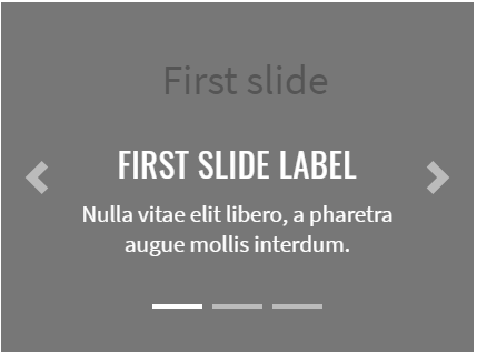
Here is an example with provided Bootstrap v4.3 code:
@UI("#carousel-example-captions")
public static Carousel carouselWithCaptions;
@Test
public void captionTest() {
carouselWithCaptions.select(1);
carouselWithCaptions.is().text(firstSlideWithLabelText);
carouselWithCaptions.select(2);
carouselWithCaptions.is().text(secondSlideWithLabelText);
carouselWithCaptions.select(3);
carouselWithCaptions.is().text(thirdSlideWithLabelText);
}
<div id="carousel-example-captions" class="carousel slide mb-2" data-ride="carousel">
<ol class="carousel-indicators">
<li data-target="#carousel-example-captions" data-slide-to="0" class=""></li>
<li data-target="#carousel-example-captions" data-slide-to="1" class="active"></li>
<li data-target="#carousel-example-captions" data-slide-to="2" class=""></li>
</ol>
<div class="carousel-inner">
<div class="carousel-item">
<svg class="bd-placeholder-img bd-placeholder-img-lg d-block w-100" width="800"
height="400" xmlns="http://www.w3.org/2000/svg"
preserveAspectRatio="xMidYMid slice" focusable="false" role="img"
aria-label="Placeholder: First slide"><title>Placeholder</title>
<rect width="100%" height="100%" fill="#777"></rect>
<text x="34%" y="12%" fill="#555" dy=".3em" style="font-size:25px;">First
slide
</text>
</svg>
<div class="carousel-caption d-none d-md-block">
<h5>First slide label</h5>
<p>Nulla vitae elit libero, a pharetra augue mollis interdum.</p>
</div>
</div>
<div class="carousel-item active">
<svg class="bd-placeholder-img bd-placeholder-img-lg d-block w-100" width="800"
height="400" xmlns="http://www.w3.org/2000/svg"
preserveAspectRatio="xMidYMid slice" focusable="false" role="img"
aria-label="Placeholder: First slide"><title>Placeholder</title>
<rect width="100%" height="100%" fill="#33AAFF"></rect>
<text x="27%" y="12%" fill="#555" dy=".3em" style="font-size:25px;">Second
slide
</text>
</svg>
<div class="carousel-caption d-none d-md-block">
<h5>Second slide label</h5>
<p>Lorem ipsum dolor sit amet, consectetur adipiscing elit.</p>
</div>
</div>
<div class="carousel-item">
<svg class="bd-placeholder-img bd-placeholder-img-lg d-block w-100" width="800"
height="400" xmlns="http://www.w3.org/2000/svg"
preserveAspectRatio="xMidYMid slice" focusable="false" role="img"
aria-label="Placeholder: First slide"><title>Placeholder</title>
<rect width="100%" height="100%" fill="#20AD1E"></rect>
<text x="31%" y="12%" fill="#555" dy=".3em" style="font-size:25px;">Third
slide
</text>
</svg>
<div class="carousel-caption d-none d-md-block">
<h5>Third slide label</h5>
<p>Praesent commodo cursus magna, vel scelerisque nisl consectetur.</p>
</div>
</div>
</div>
<a class="carousel-control-prev" href="#carousel-example-captions" role="button"
data-slide="prev">
<span class="carousel-control-prev-icon" aria-hidden="true"></span>
<span class="sr-only">Previous</span>
</a>
<a class="carousel-control-next" href="#carousel-example-captions" role="button"
data-slide="next">
<span class="carousel-control-next-icon" aria-hidden="true"></span>
<span class="sr-only">Next</span>
</a>
</div>
Crossfade
Add .carousel-fade to your carousel to animate slides with a fade transition instead of a slide.
Here is an example with provided Bootstrap v4.3 code:
@UI("#carousel-example-fade")
public static Carousel carouselWithFadeTransition;
@Test
public void fadePrevTest() {
carouselWithFadeTransition.prev();
carouselWithFadeTransition.is().text(thirdSlideFullText);
carouselWithFadeTransition.prev();
carouselWithFadeTransition.is().text(secondSlideFullText);
carouselWithFadeTransition.prevControl().is().text(prevText);
}
<div id="carousel-example-fade" class="carousel slide mb-2 carousel-fade"
data-ride="carousel">
<div class="carousel-inner">
<div class="carousel-item active">
<svg class="bd-placeholder-img bd-placeholder-img-lg d-block w-100" width="800"
height="400" xmlns="http://www.w3.org/2000/svg"
preserveAspectRatio="xMidYMid slice" focusable="false" role="img"
aria-label="Placeholder: First slide"><title>Placeholder</title>
<rect width="100%" height="100%" fill="#777"></rect>
<text x="34%" y="27%" fill="#555" dy=".3em" style="font-size:25px;">First
slide
</text>
</svg>
</div>
<div class="carousel-item">
<svg class="bd-placeholder-img bd-placeholder-img-lg d-block w-100" width="800"
height="400" xmlns="http://www.w3.org/2000/svg"
preserveAspectRatio="xMidYMid slice" focusable="false" role="img"
aria-label="Placeholder: First slide"><title>Placeholder</title>
<rect width="100%" height="100%" fill="#33AAFF"></rect>
<text x="27%" y="27%" fill="#555" dy=".3em" style="font-size:25px;">Second
slide
</text>
</svg>
</div>
<div class="carousel-item">
<svg class="bd-placeholder-img bd-placeholder-img-lg d-block w-100" width="800"
height="400" xmlns="http://www.w3.org/2000/svg"
preserveAspectRatio="xMidYMid slice" focusable="false" role="img"
aria-label="Placeholder: First slide"><title>Placeholder</title>
<rect width="100%" height="100%" fill="#20AD1E"></rect>
<text x="31%" y="27%" fill="#555" dy=".3em" style="font-size:25px;">Third
slide
</text>
</svg>
</div>
</div>
<a class="carousel-control-prev" href="#carousel-example-fade" role="button"
data-slide="prev">
<span class="carousel-control-prev-icon" aria-hidden="true"></span>
<span class="sr-only">Previous</span>
</a>
<a class="carousel-control-next" href="#carousel-example-fade" role="button"
data-slide="next">
<span class="carousel-control-next-icon" aria-hidden="true"></span>
<span class="sr-only">Next</span>
</a>
</div>
Individual .carousel-item interval
Add data-interval="" to a .carousel-item to change the amount of time to delay between automatically cycling to the next item.
Here is an example with provided Bootstrap v4.3 code:
@Test
public void intervalTest() {
int customInterval = 1;
WebPage.reload();
durationMoreThan(interval, () -> carouselWithCustomInterval.is().text(secondSlideFullText));
customInterval = carouselWithCustomInterval.interval() / 1000;
durationMoreThan(customInterval, () -> carouselWithCustomInterval.is().text(thirdSlideFullText));
}
<div id="carousel-example-interval" class="carousel slide mb-3" data-ride="carousel">
<div class="carousel-inner">
<div class="carousel-item active" data-interval="3000">
<svg class="bd-placeholder-img bd-placeholder-img-lg d-block w-100" width="800"
height="400" xmlns="http://www.w3.org/2000/svg"
preserveAspectRatio="xMidYMid slice" focusable="false" role="img"
aria-label="Placeholder: First slide"><title>Placeholder</title>
<rect width="100%" height="100%" fill="#777"></rect>
<text x="34%" y="27%" fill="#555" dy=".3em" style="font-size:25px;">First
slide
</text>
</svg>
</div>
<div class="carousel-item" data-interval="3000">
<svg class="bd-placeholder-img bd-placeholder-img-lg d-block w-100" width="800"
height="400" xmlns="http://www.w3.org/2000/svg"
preserveAspectRatio="xMidYMid slice" focusable="false" role="img"
aria-label="Placeholder: First slide"><title>Placeholder</title>
<rect width="100%" height="100%" fill="#33AAFF"></rect>
<text x="27%" y="27%" fill="#555" dy=".3em" style="font-size:25px;">Second
slide
</text>
</svg>
</div>
<div class="carousel-item" data-interval="3000">
<svg class="bd-placeholder-img bd-placeholder-img-lg d-block w-100" width="800"
height="400" xmlns="http://www.w3.org/2000/svg"
preserveAspectRatio="xMidYMid slice" focusable="false" role="img"
aria-label="Placeholder: First slide"><title>Placeholder</title>
<rect width="100%" height="100%" fill="#20AD1E"></rect>
<text x="31%" y="27%" fill="#555" dy=".3em" style="font-size:25px;">Third
slide
</text>
</svg>
</div>
</div>
<a class="carousel-control-prev" href="#carousel-example-interval" role="button"
data-slide="prev">
<span class="carousel-control-prev-icon" aria-hidden="true"></span>
<span class="sr-only">Previous</span>
</a>
<a class="carousel-control-next" href="#carousel-example-interval" role="button"
data-slide="next">
<span class="carousel-control-next-icon" aria-hidden="true"></span>
<span class="sr-only">Next</span>
</a>
</div>
Carousel is located in the following classes:
- Java: com.epam.jdi.light.ui.bootstrap.elements.complex.Carousel
Available methods in Java JDI Light:
| Method/Property | Description | Return Type |
|---|---|---|
| assertThat() | Assert action | TextAssert |
| currentSlide() | Return current slide | UIElement |
| get(int i) | Return slide by index | UIElement |
| getText() | Get carousel text | String |
| indicators() | Return list of carousel indicators | WebList |
| interval() | Return current slide interval | int |
| isDisplayed() | Check that carousel is displayed | boolean |
| is() | Assert action | TextAssert |
| next() | Move to the next slide | void |
| nextControl() | Return 'next' control | UIElement |
| prev() | Move to the previous slide | void |
| prevControl() | Return 'previous' control | UIElement |
| select(int i) | Select slide by index | void |
3.2.3 Multiple progress bars
Include multiple progress bars in a progress component if you need.
There is a common element Progress which includes only one progress bar.

Here is an example with provided Bootstrap v4.3 code:
@UI("#progress-multiple-bars") //FindBy(css = "#progress-multiple-bars")
public static MultipleProgressBars multipleProgressBars;
@Test(dataProvider = "multipleProgressBarsData")
public void separateBarTest(Progress progress, String color, String value, String minValue, String maxValue) {
progress.is()
.displayed()
.enabled()
.color(color)
.value(value)
.minValue(minValue)
.maxValue(maxValue);
}
@Test
public void entireMultipleProgressBarsTest() {
multipleProgressBars.getProgresses().is().size(3);
multipleProgressBars.is()
.displayed()
.enabled();
assertThat(multipleProgressBars.core().css("background-color"), is("rgba(233, 236, 239, 1)"));
baseValidation(multipleProgressBars);
}
@Test
public void getValuesTest() {
assertThat(multipleProgressBars.getValues(), is(multipleprogressValues));
assertThat(multipleProgressBars.getValues().get(1), is("30"));
}
<div id="progress-multiple-bars" class="progress">
<div id="progress-multiple-ordinary" class="progress-bar" role="progressbar" style="width: 15%" aria-valuenow="15" aria-valuemin="0" aria-valuemax="100"></div>
<div id="progress-multiple-success" class="progress-bar bg-success" role="progressbar" style="width: 30%" aria-valuenow="30" aria-valuemin="0" aria-valuemax="100"></div>
<div id="progress-multiple-info" class="progress-bar bg-info" role="progressbar" style="width: 20%" aria-valuenow="20" aria-valuemin="0" aria-valuemax="100"></div>
</div>
Available methods in Java JDI Light:
| Method | Description | Return Type |
|---|---|---|
| assertThat() | Assert action | UIAssert |
| getProgress(int Index) | Returns progressbar by index | Progress |
| getProgresses() | Returns list of progressbars | JList<Progress> |
| getValues() | Returns list of values of each progressbar | List<String> |
| is() | Various assert actions | UIAssert |
3.2.4 Navs
Navs - Different types of combination of navigation components.
Base
Here is an example with provided Bootstrap v4.3 code:
// @FindBy(css = "#nav-base-li") public static NavsBaseLi navsBaseLi;
@UI("#nav-base-li") public static NavsBaseLi navsBaseLi;
public class NavsBaseLi extends Section {
// @FindBy(css = "li") public ListGroup navItem;
@UI("li") public ListGroup navItem;
// @FindBy(css = "li a") public ListGroup navItemLink;
@UI("li a") public ListGroup navItemLink;
}
@Test(dataProvider = "clickValidate")
public void linkClickableLiTests(int index, String pageTitle) {
navsBaseLi.navItem.get(index).highlight();
navsBaseLi.navItem.get(index).click();
newWindowTitleCheck(pageTitle);
navsBaseLi.navItem.get(index).unhighlight();
}
@Test(dataProvider = "listData")
public void itemsIsValidationTests(int index, String linkText) {
navsBaseLi.navItemLink.get(index).is()
.core()
.hasClass("nav-link")
.text(is(linkText));
}
@Test
public void isValidationTests() {
navsBaseLi.navItem.is()
.size(4);
navsBaseLi.navItemLink.get(1)
.is()
.core()
.hasClass("active");
navsBaseLi.navItemLink.get(4)
.is()
.core()
.hasClass("disabled");
}
<ul class="nav" id="nav-base-li">
<li class="nav-item">
<a class="nav-link active" href="https://jdi-testing.github.io/jdi-light/index.html"
target="_blank">Active</a>
</li>
<li class="nav-item">
<a class="nav-link" href="https://github.com/jdi-docs" target="_blank">JDI Docs</a>
</li>
<li class="nav-item">
<a class="nav-link" href="https://github.com/jdi-testing" target="_blank">JDI -
testing tool</a>
</li>
<li class="nav-item">
<a class="nav-link disabled" href="https://getbootstrap.com" tabindex="-1"
aria-disabled="true" target="_blank">Disabled</a>
</li>
</ul>
<nav class="nav" id="nav-base-a">
<a class="nav-link active" href="https://jdi-testing.github.io/jdi-light/index.html"
target="_blank">Active</a>
<a class="nav-link" href="https://github.com/jdi-docs" target="_blank">JDI Docs</a>
<a class="nav-link" href="https://github.com/jdi-testing" target="_blank">JDI - testing
tool</a>
<a class="nav-link disabled" href="https://getbootstrap.com" tabindex="-1"
aria-disabled="true" target="_blank">Disabled</a>
</nav>
Available methods in Java JDI Light:
All methods are inherited from base element - UIElement
Most applicable methods:
| Method | Description | Return Type |
|---|---|---|
| assertThat() | Assert action | TextAssert |
| click() | Get button text | void |
| get() | Select button by index | UIElement |
| getText() | Get button text | String |
| highlight() | Get button text | void |
| is() | Assert action | TextAssert |
| unhighlight() | Get button text | void |
Nav group is represented by Section class in Java:
Horizontal alignment
Here is an example with provided Bootstrap v4.3 code:
// @FindBy(css = "#nav-center") public static NavsAlignmentCenter navsAlignmentCenter;
@UI("#nav-center") public static NavsAlignmentCenter navsAlignmentCenter;
public class NavsAlignmentCenter extends Section {
// @FindBy(css = "li") public ListGroup navItem;
@UI("li") public ListGroup navItem;
// @FindBy(css = "li a") public ListGroup navItemLink;
@UI("li a") public ListGroup navItemLink;
}
@Test
public void isValidationTests() {
navsAlignmentCenter.navItem.is()
.size(4);
navsAlignmentCenter.is()
.displayed()
.enabled()
.core()
.hasClass("nav justify-content-center");
navsAlignmentCenter.navItemLink.get(1)
.is()
.core()
.hasClass("active");
}
@Test(dataProvider = "listData")
public void itemsIsValidationTests(int index, String linkText) {
navsAlignmentCenter.navItem.get(index)
.is()
.core()
.hasClass("nav-item")
.text(is(linkText));
}
@Test(dataProvider = "clickValidate")
public void linkClickableLiTests(int index, String pageTitle) {
navsAlignmentCenter.navItem.get(index).highlight();
navsAlignmentCenter.navItem.get(index).click();
newWindowTitleCheck(pageTitle);
navsAlignmentCenter.navItem.get(index).unhighlight();
}
<ul class="nav justify-content-center" id="nav-center">
<li class="nav-item">
<a class="nav-link active" href="https://jdi-testing.github.io/jdi-light/index.html"
target="_blank">Active</a>
</li>
<li class="nav-item">
<a class="nav-link" href="https://github.com/jdi-docs" target="_blank">JDI Docs</a>
</li>
<li class="nav-item">
<a class="nav-link" href="https://github.com/jdi-testing" target="_blank">JDI -
testing tool</a>
</li>
<li class="nav-item">
<a class="nav-link disabled" href="https://getbootstrap.com" tabindex="-1"
aria-disabled="true" target="_blank">Disabled</a>
</li>
</ul>
<ul class="nav justify-content-end" id="nav-end">
<li class="nav-item">
<a class="nav-link active" href="https://jdi-testing.github.io/jdi-light/index.html"
target="_blank">Active</a>
</li>
<li class="nav-item">
<a class="nav-link" href="https://github.com/jdi-docs" target="_blank">JDI Docs</a>
</li>
<li class="nav-item">
<a class="nav-link" href="https://github.com/jdi-testing" target="_blank">JDI -
testing tool</a>
</li>
<li class="nav-item">
<a class="nav-link disabled" href="https://getbootstrap.com" tabindex="-1"
aria-disabled="true" target="_blank">Disabled</a>
</li>
</ul>
Available methods in Java JDI Light:
All methods are inherited from base element - UIElement
Most applicable methods:
| Method | Description | Return Type |
|---|---|---|
| assertThat() | Assert action | TextAssert |
| click() | Get button text | void |
| get() | Select button by index | UIElement |
| getText() | Get button text | String |
| highlight() | Get button text | void |
| is() | Assert action | TextAssert |
| unhighlight() | Get button text | void |
Nav group is represented by Section class in Java:
Vertical alignment

Here is an example with provided Bootstrap v4.3 code:
// @FindBy(css = "#nav-vert-li") public static NavsVerticalLi navsVerticalLi;
@UI("#nav-vert-li") public static NavsVerticalLi navsVerticalLi;
public class NavsVerticalLi extends Section {
// @FindBy(css = "li") public ListGroup navItem;
@UI("li") public ListGroup navItem;
// @FindBy(css = "li a") public ListGroup navItemLink;
@UI("li a") public ListGroup navItemLink;
}
@Test
public void isValidationTests() {
navsVerticalLi.navItem.is()
.size(4);
navsVerticalLi.is()
.displayed()
.enabled()
.core()
.hasClass("nav flex-column");
navsVerticalLi.navItemLink.get(1)
.is()
.core()
.hasClass("active");
navsVerticalLi.navItemLink.get(4)
.is()
.core()
.hasClass("disabled");
}
@Test(dataProvider = "clickValidate")
public void linkClickableLiTests(int index, String pageTitle) {
navsVerticalLi.navItem.get(index).highlight();
navsVerticalLi.navItem.get(index).click();
newWindowTitleCheck(pageTitle);
navsVerticalLi.navItem.get(index).unhighlight();
}
<ul class="nav flex-column" id="nav-vert-li">
<li class="nav-item">
<a class="nav-link active" href="https://jdi-testing.github.io/jdi-light/index.html"
target="_blank">Active</a>
</li>
<li class="nav-item">
<a class="nav-link" href="https://github.com/jdi-docs" target="_blank">JDI Docs</a>
</li>
<li class="nav-item">
<a class="nav-link" href="https://github.com/jdi-testing" target="_blank">JDI -
testing tool</a>
</li>
<li class="nav-item">
<a class="nav-link disabled" href="https://getbootstrap.com" tabindex="-1"
aria-disabled="true" target="_blank">Disabled</a>
</li>
</ul>
<nav class="nav flex-column" id="nav-vert-a">
<a class="nav-link active" href="https://jdi-testing.github.io/jdi-light/index.html"
target="_blank">Active</a>
<a class="nav-link" href="https://github.com/jdi-docs" target="_blank">JDI Docs</a>
<a class="nav-link" href="https://github.com/jdi-testing" target="_blank">JDI - testing
tool</a>
<a class="nav-link disabled" href="https://getbootstrap.com" tabindex="-1"
aria-disabled="true" target="_blank">Disabled</a>
</nav>
Available methods in Java JDI Light:
All methods are inherited from base element - UIElement
Most applicable methods:
| Method | Description | Return Type |
|---|---|---|
| assertThat() | Assert action | TextAssert |
| click() | Get button text | void |
| get() | Select button by index | UIElement |
| getText() | Get button text | String |
| highlight() | Get button text | void |
| is() | Assert action | TextAssert |
| unhighlight() | Get button text | void |
Nav group is represented by Section class in Java:
Tabs
Here is an example with provided Bootstrap v4.3 code:
// @FindBy(css = "#nav-tabs") public static NavsTabs navsTabs;
@UI("#nav-tabs") public static NavsTabs navsTabs;
public class NavsTabs extends Section {
// @FindBy(css = "li") public ListGroup navItem;
@UI("li") public ListGroup navItem;
// @FindBy(css = "li a") public ListGroup navItemLink;
@UI("li a") public ListGroup navItemLink;
}
@Test
public void isValidationTests() {
navsTabs.navItem.is()
.size(4);
navsTabs.is()
.displayed()
.enabled()
.core()
.hasClass("nav nav-tabs");
navsTabs.navItemLink.get(1)
.is()
.core()
.hasClass("active");
navsTabs.navItemLink.get(4)
.is()
.core()
.hasClass("disabled");
}
@Test(dataProvider = "clickValidate")
public void linkClickableLiTests(int index, String pageTitle) {
navsTabs.navItem.get(index).highlight();
navsTabs.navItem.get(index).click();
newWindowTitleCheck(pageTitle);
navsTabs.navItem.get(index).unhighlight();
}
<ul class="nav nav-tabs" id="nav-tabs">
<li class="nav-item">
<a class="nav-link active" href="https://jdi-testing.github.io/jdi-light/index.html"
target="_blank">Active</a>
</li>
<li class="nav-item">
<a class="nav-link" href="https://github.com/jdi-docs" target="_blank">JDI Docs</a>
</li>
<li class="nav-item">
<a class="nav-link" href="https://github.com/jdi-testing" target="_blank">JDI -
testing tool</a>
</li>
<li class="nav-item">
<a class="nav-link disabled" href="https://getbootstrap.com" tabindex="-1"
aria-disabled="true" target="_blank">Disabled</a>
</li>
</ul>
Available methods in Java JDI Light:
All methods are inherited from base element - UIElement
Most applicable methods:
| Method | Description | Return Type |
|---|---|---|
| assertThat() | Assert action | TextAssert |
| click() | Get button text | void |
| get() | Select button by index | UIElement |
| getText() | Get button text | String |
| highlight() | Get button text | void |
| is() | Assert action | TextAssert |
| unhighlight() | Get button text | void |
Nav group is represented by Section class in Java:
Pills
Here is an example with provided Bootstrap v4.3 code:
// @FindBy(css = "#nav-pills") public static NavsPills navsPills;
@UI("#nav-pills") public static NavsPills navsPills;
public class NavsPills extends Section {
// @FindBy(css = "li") public ListGroup navItem;
@UI("li") public ListGroup navItem;
// @FindBy(css = "li a") public ListGroup navItemLink;
@UI("li a") public ListGroup navItemLink;
}
@Test(dataProvider = "listData")
public void itemsIsValidationTests(int index, String linkText) {
navsPills.navItem.get(index)
.is()
.core()
.hasClass("nav-item")
.text(is(linkText));
navsPills.navItemLink.get(index)
.is()
.core()
.hasClass("nav-link")
.text(is(linkText));
}
@Test(dataProvider = "clickValidate")
public void linkClickableLiTests(int index, String pageTitle) {
navsPills.navItem.get(index).highlight();
navsPills.navItem.get(index).click();
newWindowTitleCheck(pageTitle);
navsPills.navItem.get(index).unhighlight();
}
<ul class="nav nav-pills" id="nav-pills">
<li class="nav-item">
<a class="nav-link active" href="https://jdi-testing.github.io/jdi-light/index.html"
target="_blank">Active</a>
</li>
<li class="nav-item">
<a class="nav-link" href="https://github.com/jdi-docs" target="_blank">JDI Docs</a>
</li>
<li class="nav-item">
<a class="nav-link" href="https://github.com/jdi-testing" target="_blank">JDI -
testing tool</a>
</li>
<li class="nav-item">
<a class="nav-link disabled" href="https://getbootstrap.com" tabindex="-1"
aria-disabled="true" target="_blank">Disabled</a>
</li>
</ul>
Available methods in Java JDI Light:
All methods are inherited from base element - UIElement
Most applicable methods:
| Method | Description | Return Type |
|---|---|---|
| assertThat() | Assert action | TextAssert |
| click() | Get button text | void |
| get() | Select button by index | UIElement |
| getText() | Get button text | String |
| highlight() | Get button text | void |
| is() | Assert action | TextAssert |
| unhighlight() | Get button text | void |
Nav group is represented by Section class in Java:
Fill and justify

Here is an example with provided Bootstrap v4.3 code:
// @FindBy(css = "#nav-justify") public static NavsJustify navsJustify;
@UI("#nav-justify") public static NavsJustify navsJustify;
public class NavsJustify extends Section {
// @FindBy(css = "li") public ListGroup navItem;
@UI("li") public ListGroup navItem;
// @FindBy(css = "li a") public ListGroup navItemLink;
@UI("li a") public ListGroup navItemLink;
}
@Test(dataProvider = "listData")
public void itemsIsValidationTests(int index, String linkText) {
navsJustify.navItem.get(index)
.is()
.core()
.hasClass("nav-item")
.text(is(linkText));
navsJustify.navItemLink.get(index)
.is()
.core()
.hasClass("nav-link")
.text(is(linkText));
}
@Test(dataProvider = "clickValidate")
public void linkClickableLiTests(int index, String pageTitle) {
navsJustify.navItem.get(index).highlight();
navsJustify.navItem.get(index).click();
newWindowTitleCheck(pageTitle);
navsJustify.navItem.get(index).unhighlight();
}
<ul class="nav nav-pills nav-fill" id="nav-justify">
<li class="nav-item">
<a class="nav-link active" href="https://jdi-testing.github.io/jdi-light/index.html"
target="_blank">Active</a>
</li>
<li class="nav-item">
<a class="nav-link" href="https://github.com/jdi-docs" target="_blank">JDI Docs</a>
</li>
<li class="nav-item">
<a class="nav-link" href="https://github.com/jdi-testing" target="_blank">JDI - testing
tool</a>
</li>
<li class="nav-item">
<a class="nav-link disabled" href="https://getbootstrap.com" tabindex="-1"
aria-disabled="true" target="_blank">Disabled</a>
</li>
</ul>
Available methods in Java JDI Light:
All methods are inherited from base element - UIElement
Most applicable methods:
| Method | Description | Return Type |
|---|---|---|
| assertThat() | Assert action | TextAssert |
| click() | Get button text | void |
| get() | Select button by index | UIElement |
| getText() | Get button text | String |
| highlight() | Get button text | void |
| is() | Assert action | TextAssert |
| unhighlight() | Get button text | void |
Nav group is represented by Section class in Java:
Tabs with dropdowns
Here is an example with provided Bootstrap v4.3 code:
// @FindBy(css = "#nav-with-dropdown") public static NavsTabsWithDropdown navsTabsWithDropdown;
@UI("#nav-with-dropdown") public static NavsTabsWithDropdown navsTabsWithDropdown;
public class NavsTabsWithDropdown extends Section {
// @FindBy(css = "li") public ListGroup navItem;
@UI("li") public ListGroup navItem;
// @FindBy(css = "a.nav-link") public ListGroup navItemLink;
@UI("a.nav-link") public ListGroup navItemLink;
@JDropdown(expand = ".dropdown-toggle",
value = ".dropdown-toggle",
list = ".dropdown-item")
public Dropdown dropdownMenu;
}
@Test
public void isValidationTests() {
navsTabsWithDropdown.navItem.is()
.size(4);
navsTabsWithDropdown.is()
.displayed()
.enabled()
.core()
.hasClass("nav nav-tabs");
navsTabsWithDropdown.navItemLink.get(1)
.is()
.core()
.hasClass("active");
navsTabsWithDropdown.navItemLink.get(4)
.is()
.core()
.hasClass("disabled");
}
@Test
public void dropdownIsValidationTests() {
navsTabsWithDropdown.dropdownMenu.expand();
navsTabsWithDropdown.dropdownMenu
.is()
.displayed()
.expanded()
.enabled()
.size(4);
navsTabsWithDropdown.dropdownMenu
.is()
.core()
.attr("data-toggle", "dropdown")
.attr("aria-haspopup", "true")
.attr("aria-expanded", "true")
.attr("role", "button")
.tag("a");
}
<ul class="nav nav-tabs" id="nav-with-dropdown">
<li class="nav-item">
<a class="nav-link active" href="https://jdi-testing.github.io/jdi-light/index.html"
target="_blank">Active</a>
</li>
<li class="nav-item dropdown">
<a class="nav-link dropdown-toggle" data-toggle="dropdown" href="#" role="button"
aria-haspopup="true" aria-expanded="false">Dropdown</a>
<div class="dropdown-menu">
<a class="dropdown-item"
href="https://jdi-testing.github.io/jdi-light/index.html" target="_blank">JDI
home</a>
<a class="dropdown-item" href="https://github.com/jdi-docs" target="_blank">JDI
Docs</a>
<a class="dropdown-item" href="https://github.com/jdi-testing" target="_blank">JDI
- testing tool</a>
<div class="dropdown-divider"></div>
<a class="dropdown-item" href="https://getbootstrap.com" target="_blank">Bootstrap</a>
</div>
</li>
<li class="nav-item">
<a class="nav-link" href="https://github.com/jdi-testing" target="_blank">JDI -
testing tool</a>
</li>
<li class="nav-item">
<a class="nav-link disabled" href="https://getbootstrap.com" tabindex="-1"
aria-disabled="true" target="_blank">Disabled</a>
</li>
</ul>
Available methods in Java JDI Light:
All methods are inherited from base element - UIElement
Most applicable methods:
| Method | Description | Return Type |
|---|---|---|
| assertThat() | Assert action | TextAssert |
| click() | Get button text | void |
| expand() | Get button text | void |
| expanded() | Get button text | TextAssert |
| get() | Select button by index | UIElement |
| getText() | Get button text | String |
| highlight() | Get button text | void |
| is() | Assert action | TextAssert |
| unhighlight() | Get button text | void |
Nav group is represented by Section class in Java:
Pills with dropdowns
Here is an example with provided Bootstrap v4.3 code:
// @FindBy(css = "#nav-pills-drop") public static NavsPillsWithDropdown navsPillsWithDropdown;
@UI("#nav-pills-drop") public static NavsPillsWithDropdown navsPillsWithDropdown;
public class NavsPillsWithDropdown extends Section {
// @FindBy(css = "li") public ListGroup navItem;
@UI("li") public ListGroup navItem;
// @FindBy(css = "a.nav-link") public ListGroup navItemLink;
@UI("a.nav-link") public ListGroup navItemLink;
@JDropdown(expand = ".dropdown-toggle",
value = ".dropdown-toggle",
list = ".dropdown-item")
public Dropdown dropdownMenu;
}
@Test
public void dropdownIsValidationTests() {
navsPillsWithDropdown.dropdownMenu.expand();
navsPillsWithDropdown.dropdownMenu
.is()
.expanded()
.size(4)
.core()
.attr("data-toggle", "dropdown")
.attr("aria-haspopup", "true")
.attr("aria-expanded", "true")
.attr("role", "button")
.tag("a");
navsPillsWithDropdown.dropdownMenu.expand();
}
@Test
public void dropdownClickableTests() {
navsPillsWithDropdown.dropdownMenu.select(linkDrop1);
newWindowTitleCheck(pageTitle1);
navsPillsWithDropdown.dropdownMenu.select(linkDrop2);
newWindowTitleCheck(pageTitle2);
navsPillsWithDropdown.dropdownMenu.select(linkDrop3);
newWindowTitleCheck(pageTitle3);
navsPillsWithDropdown.dropdownMenu.select(linkDrop4);
newWindowTitleCheck(pageTitle4);
}
<ul class="nav nav-pills" id="nav-pills-drop">
<li class="nav-item">
<a class="nav-link active" href="https://jdi-testing.github.io/jdi-light/index.html"
target="_blank">Active</a>
</li>
<li class="nav-item dropdown">
<a class="nav-link dropdown-toggle" data-toggle="dropdown" href="#" role="button"
aria-haspopup="true" aria-expanded="false">Dropdown</a>
<div class="dropdown-menu">
<a class="dropdown-item"
href="https://jdi-testing.github.io/jdi-light/index.html" target="_blank">JDI
home</a>
<a class="dropdown-item" href="https://github.com/jdi-docs" target="_blank">JDI
Docs</a>
<a class="dropdown-item" href="https://github.com/jdi-testing" target="_blank">JDI
- testing tool</a>
<div class="dropdown-divider"></div>
<a class="dropdown-item" href="https://getbootstrap.com" target="_blank">Bootstrap</a>
</div>
</li>
<li class="nav-item">
<a class="nav-link" href="https://github.com/jdi-testing" target="_blank">JDI -
testing tool</a>
</li>
<li class="nav-item">
<a class="nav-link disabled" href="https://getbootstrap.com" tabindex="-1"
aria-disabled="true" target="_blank">Disabled</a>
</li>
</ul>
Available methods in Java JDI Light:
All methods are inherited from base element - UIElement
Most applicable methods:
| Method | Description | Return Type |
|---|---|---|
| assertThat() | Assert action | TextAssert |
| click() | Get button text | void |
| expand() | Get button text | void |
| expanded() | Get button text | TextAssert |
| get() | Select button by index | UIElement |
| getText() | Get button text | String |
| highlight() | Get button text | void |
| is() | Assert action | TextAssert |
| unhighlight() | Get button text | void |
Nav group is represented by Section class in Java:
3.2.5 RadioButtons
RadioButtons – extends from HTML 5 RadioButtons class.
Bootstrap RadioButtons class is represented by the following class:
- Java: com.epam.jdi.light.ui.bootstrap.elements.complex.RadioButtons
Is similar to the parent class but overrides its list() method and adds list(JFunc1
3.3 Bootstrap Composite elements
3.3.1 Forms
Forms – logical part of a web page that represents an HTML form. Form can consists of:
- Textual form controls(inputs, selects, and textareas)
- File inputs
- Range inputs
- Checkboxes and Radiobuttons
- Help text
- Fieldsets(which can disable all the controls within)
Available methods in Java JDI Light:
| Method | Description | Return Type |
|---|---|---|
| add(T entity) | Fills all settable elements and clicks “add” Button or ”addButton” | void |
| back(T entity) | Fills all settable elements and clicks “back” Button or ”backButton” | void |
| cancel(T entity) | Fills all settable elements and clicks “cancel” Button or ”cancelButton” | void |
| check(T entity) | Verifies that form has been filled correctly. If not, throws an exception | void |
| close(T entity) | Fills all settable elements and clicks “close” Button or ”closeButton” | void |
| fill(T entity) | Fills all settable elements of the form that can be matched with fields of the input entity | void |
| fillAction(Field field, Object element, Object parent, String setValue) | Defines the specifics of how form elements will be filled | void |
| getAction(Field field, Object element, Object parent) | Defines the specifics of how form elements will be obtained for verification and checks | String |
| is() | Asserts element | UIAssert |
| login() | Clicks "login" Button or "loginButton" | void |
| login(T entity) | Fills all settable elements and clicks “login” Button or ”loginButton” | void |
| loginAs(T entity) | Fills all settable elements and clicks “login” Button or ”loginButton” | void |
| next(T entity) | Fills all settable elements and clicks “next” Button or ”nextButton” | void |
| onlyMandatory() | Sets form filter option to MANDATORY, meaning that only mandatory form elements are filled/submitted or verified/checked for the duration of a single form action | void |
| onlyOptional() | Sets form filter option to OPTIONAL, meaning that only optional form elements are filled/submitted or verified/checked for the duration of a single form action | void |
| pressButton(String buttonName) | Clicks “buttonName” Button or "buttonNamebutton". Allows different buttons to send one form, e.g. save/publish/cancel/search/update/... | void |
| publish(T entity) | Fills all settable elements and clicks “publish” Button or ”publishButton” | void |
| save(T entity) | Fills all settable elements and clicks “save” Button or ”saveButton” | void |
| search(T entity) | Fills all settable elements and clicks “search” Button or ”searchButton” | void |
| select(T entity) | Fills all settable elements and clicks “select” Button or ”selectButton” | void |
| send() | Sends the form by clicking “send” Button or "sendButton" | void |
| send(T entity) | Fills all settable elements and clicks “send” Button or ”sendButton” | void |
| submit() | Sends the form by clicking "submit" Button or "submitButton" | void |
| submit(String text) | Fills first settable form field with value and clicks "submit" Button or "submitButton" | void |
| submit(T entity) | Fills all settable elements and clicks "submit" Button or "submitButton" | void |
| submit(String text, String buttonName) | Fills first settable field with value and clicks “buttonName” Button or "buttonNamebutton" | void |
| submit(T entity, String buttonName) | Fills all settable elements and clicks “buttonName” Button or "buttonNamebutton" | void |
| update(T entity) | Fills all settable elements and clicks “update” Button or ”updateButton” | void |
| verify(T entity) | Verifies that form has been filled correctly. If not, returns a list of keys where verification has failed | List |
Simple form
This is an example of simple form consisting of some basic elements.
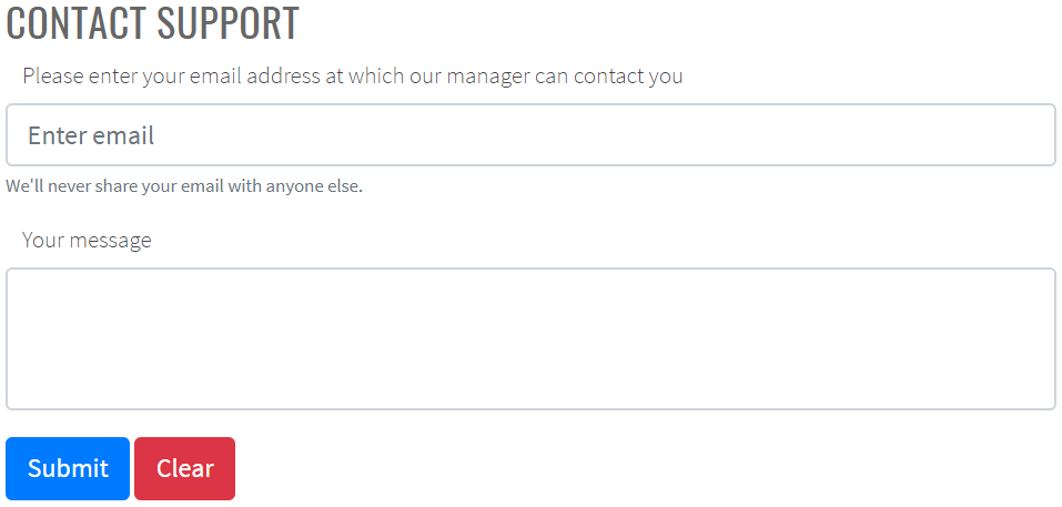
Here is an example with provided Bootstrap v4.3 code:
public class BootstrapFormsPage extends WebPage {
// FindBy(css = "#support-form")
@UI("#support-form")
public static SupportMessageForm supportMessageForm;
}
@Test
public void submitButtonTest() {
supportMessageForm.supportButtonSubmit.click();
lastLogEntry.has().text(containsString(logLineSubmit));
}
@Test
public void clearButtonTest() {
supportMessageForm.supportButtonClear.click();
lastLogEntry.has().text(containsString(logLineClear));
}
@Test
public void submitFormTest() {
setDefaultValues();
supportMessageForm.submit(EXAMPLE_MESSAGE);
lastLogEntry.has().text(containsString(logLineSubmit));
supportMessageForm.check(EXAMPLE_MESSAGE);
}
@Test
public void fillFormTest() {
setDefaultValues();
supportMessageForm.fill(EXAMPLE_MESSAGE);
supportMessageForm.supportEmail.has().text(EXAMPLE_MESSAGE.supportEmail);
supportMessageForm.supportMessage.has().text(EXAMPLE_MESSAGE.supportMessage);
supportMessageForm.check(EXAMPLE_MESSAGE);
}
@Test
public void clearFormTest() {
setDefaultValues();
supportMessageForm.clear(EXAMPLE_MESSAGE);
lastLogEntry.has().text(containsString(logLineClear));
supportMessageForm.check(TEMPLATE_MESSAGE);
}
<form id="support-form">
<div class="form-group">
<label for="support-email">Please enter your email address at which
our manager can contact you</label>
<input type="email" class="form-control" id="support-email" aria-describedby="emailHelp" placeholder="Enter email">
<small id="emailHelp" class="form-text text-muted">We'll never share your email with anyone
else.</small>
</div>
<div class="form-group">
<label for="support-message">Your message</label>
<textarea class="form-control" id="support-message" rows="3"></textarea>
</div>
<button type="submit" class="btn btn-primary" id="support-button-submit">Submit</button>
<button type="reset" class="btn btn-danger" id="support-button-clear">Clear</button>
</form>
Complicated form
This is an example of complicated form consisting of various specific elements.
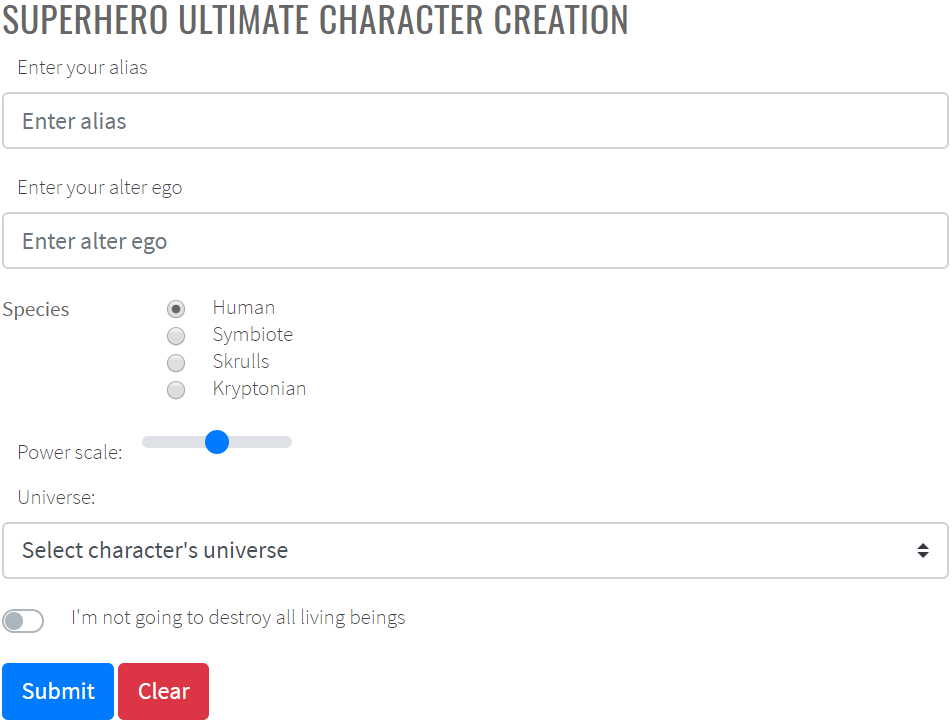
Here is an example with provided Bootstrap v4.3 code:
public class BootstrapFormsPage extends WebPage {
// @FindBy(css = "#superhero-creation-form")
@UI("#superhero-creation-form")
public static SuperheroForm superheroForm;
// @FindBy(css = ".logs li:first-child")
@UI(".logs li:first-child")
public static Text lastLogEntry;
}
@Test
public void submitButtonTest() {
superheroForm.superheroButtonSubmit.click();
lastLogEntry.has().text(containsString(logLineSubmit));
}
@Test
public void clearButtonTest() {
superheroForm.superheroButtonClear.click();
lastLogEntry.has().text(containsString(logLineClear));
}
@Test
public void submitFormTest() {
superheroForm.submit(EXAMPLE_HERO);
lastLogEntry.has().text(containsString(logLineSubmit));
superheroForm.check(EXAMPLE_HERO);
}
@Test
public void clearFormTest() {
superheroForm.clear(EXAMPLE_HERO);
lastLogEntry.has().text(containsString(logLineClear));
superheroForm.check(TEMPLATE_HERO);
}
<form id="superhero-creation-form">
<div class="form-group">
<label for="current-alias">Enter your alias</label>
<input type="text" class="form-control" id="current-alias" aria-describedby="emailHelp" placeholder="Enter alias">
</div>
<div class="form-group">
<label for="alter-ego">Enter your alter ego</label>
<input type="text" class="form-control" id="alter-ego" aria-describedby="emailHelp" placeholder="Enter alter ego">
</div>
<!-- Radios start -->
<fieldset class="form-group">
<div class="row">
<legend class="col-form-label col-sm-2 pt-0">Species</legend>
<div class="col-sm-10">
<div class="form-check">
<input class="form-check-input" type="radio" name="superheroSpecies" id="human" value="option1" checked="">
<label class="form-check-label" for="human">
Human
</label>
</div>
<div class="form-check">
<input class="form-check-input" type="radio" name="superheroSpecies" id="symbiote" value="option2">
<label class="form-check-label" for="symbiote">
Symbiote
</label>
</div>
<div class="form-check">
<input class="form-check-input" type="radio" name="superheroSpecies" id="skrulls" value="option3">
<label class="form-check-label" for="skrulls">
Skrulls
</label>
</div>
<div class="form-check">
<input class="form-check-input" type="radio" name="superheroSpecies" id="kryptonian" value="option4">
<label class="form-check-label" for="kryptonian">
Kryptonian
</label>
</div>
</div>
</div>
</fieldset>
<!-- Radios end -->
<div>
<label for="superhero-range">Power scale:</label>
<input type="range" class="custom-range mb-3" min="0" max="100" id="superhero-range">
</div>
<label for="select-universe">Universe:</label>
<select class="custom-select mb-3" id="select-universe">
<option selected="">Select character's universe</option>
<option value="1">DC</option>
<option value="2">Marvel Earth-616</option>
<option value="3">Marvel Cinematic Universe</option>
</select>
<div class="custom-control custom-switch mb-3" id="superhero-switch-div">
<input type="checkbox" class="custom-control-input" id="superhero-switch">
<label class="custom-control-label" for="superhero-switch">I'm not going to destroy all living beings</label>
</div>
<button type="submit" class="btn btn-primary" id="superhero-button-submit">Submit</button>
<button type="reset" class="btn btn-danger" id="superhero-button-clear">Clear</button>
</form>
Sizing
Set heights using classes like .form-control-lg and .form-control-sm.
Here is an example with provided Bootstrap v4.3 code:
@UI("#forms-sizing") //@FindBy(css = "#forms-sizing")
public static FormsSizing formsSizing;
@UI("#form-sizing-lg") //@FindBy(css = "#form-sizing-lg")
public TextField largeTextField;
@UI("#form-sizing-select-lg") //@FindBy(css = "#form-sizing-select-lg")
public DropdownSelect largeSelect;
private String text = "TextField";
private String placeholderLarge = ".form-control-lg";
private String placeholderDefault = "Default input";
private String placeholderSmall = ".form-control-sm";
@Test
public void sendKeysTest() {
formsSizing.largeTextField.sendKeys("Test");
assertEquals(formsSizing.largeTextField.getText(), text+"Test");
}
@Test
public void selectOptionTest() {
formsSizing.largeSelect.select("Large select");
assertEquals(formsSizing.largeSelect.getValue(), "Large select");
}
@Test
public void isValidationTest() {
formsSizing.largeTextField.is()
.enabled()
.text(is(text));
formsSizing.largeSelect.is()
.displayed()
.selected("Large option");
formsSizing.largeTextField.is()
.enabled()
.placeholder(placeholderLarge);
}
<div class="html-left" id="forms-sizing">
<div class="mb-3">
<input class="form-control form-control-lg mb-3" id="form-sizing-lg" type="text"
placeholder=".form-control-lg">
<input class="form-control mb-3" id="form-sizing-default" type="text"
placeholder="Default input">
<input class="form-control form-control-sm mb-3" id="form-sizing-sm" type="text"
placeholder=".form-control-sm">
</div>
<div class="mb-3">
<select class="form-control form-control-lg mb-3" id="form-sizing-select-lg">
<option>Large select</option>
<option>Large option</option>
</select>
<select class="form-control mb-3" id="form-sizing-select-default">
<option>Default select</option>
<option>Default option</option>
</select>
<select class="form-control form-control-sm mb-3" id="form-sizing-select-sm">
<option>Small select</option>
<option>Small option</option>
</select>
</div>
</div>
Form group is represented by Section class in Java:
Inner elements of Forms - Sizing are represented by the following classes:
DropdownSelect TBD
| Method / Property | Description | Return Type |
|---|---|---|
| AssertThat | Assert action | TextAssert |
| GetText() | returns text from the text field | String |
| GetValue() | returns text from the text field | String |
| Is | Assert action | TextAssert |
| select(string/int) | Select data by value/index | void |
| SendKeys(string value) | adds text to the field | void |
| SetText(String value) | sets new text | void |
Readonly
Add the readonly boolean attribute on an input to prevent modification of the input’s value. Read-only inputs appear lighter (just like disabled inputs), but retain the standard cursor.

Here is an example with provided Bootstrap v4.3 code:
//@FindBy(css = "#forms-readonly-input")
@UI("#forms-readonly-input")
public static TextField readonlyInput;
@Test
public void checkReadonlyAttribute() {
assertTrue(readonlyInput.attrs().has("readonly"));
readonlyInput.highlight();
readonlyInput.is()
.displayed()
.enabled();
}
@Test(expectedExceptions = {InvalidElementStateException.class})
public void check() {
readonlyInput.setValue(text);
readonlyInput.sendKeys(text);
}
<input class="form-control mb-3" id="forms-readonly-input" type="text"
placeholder="Readonly input here..." readonly>
Available methods in Java JDI Light:
| Method / Property | Description | Return Type |
|---|---|---|
| AssertThat() | property that returns object for work with assertions | TextAssert |
| Focus() | places cursor within the text field | void |
| GetText() | returns text from the text field | String |
| GetValue() | returns text from the text field | String |
| Is() | property that returns object for work with assertions | TextAssert |
| Input(string text) | sets new text | void |
| Placeholder | returns value of the placeholder attribute | String |
| SendKeys(string value) | adds text to the field | void |
| SetText(String value) | sets new text | void |
Readonly plain text
If you want to have input readonly elements in your form styled as plain text, use the .form-control-plaintext class to remove the default form field styling and preserve the correct margin and padding. Compare items with plaintext mark (upper) and without it (lower):
Here is an example with provided Bootstrap v4.3 code:
//@FindBy(css = "#readonlyPlainText1")
@UI("#readonlyPlainText1")
public static ReadonlyPlainText readonlyPlainText1;
@Test
public void isValidationTest() {
readonlyPlainText1.is().core().hasClass("form-control-plaintext");
assertTrue(readonlyPlainText1.hasAttribute("readonly"));
readonlyPlainText1.is().core().attr("type", "text");
@Test
public void textValidationTest() {
readonlyPlainText1.is().text("email@example.com");
}
@Test
public void labelTest() {
readonlyPlainText1.label().is().text("Email");
}
<div class="form-group row">
<label for="readonlyPlainText1" class="col-sm-2 col-form-label">Email</label>
<div class="col-sm-10">
<input type="text" readonly class="form-control-plaintext" id="readonlyPlainText1"
value="email@example.com">
</div>
</div>
Available methods in Java JDI Light:
| Method/Property | Description | Return Type |
|---|---|---|
| assertThat() | Assert action | TextAssert |
| attr() | Match passed value with element attribute | ICoreElement |
| getValue() | Get item value | String |
| hasClass() | Match passed value with element class | ICoreElement |
| is() | Various assert actions for Progress | ProgressAssert |
| label() | Get label associated with an item | Label |
| labelText() | Get text of a label associated with an item | String |
Range input
Set horizontally scrollable range inputs using .form-control-range.
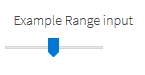
Here is an example with provided Bootstrap v4.3 code:
//@FindBy(css = "#formControlRange")
@UI("#formControlRange")
public static RangeInput rangeInput;
@Test
public void itemHasProperClass() {
rangeInput.is().core().hasClass("form-control-range");
}
@Test
public void itemHasProperType() {
rangeInput.is().core().attr("type", "range");
}
@Test
public void labelValidationTest() {
rangeInput.label().is().text("Example Range input");
}
<form class="mb-3">
<div class="form-group">
<label for="formControlRange">Example Range input</label>
<input type="range" class="form-control-range" id="formControlRange">
</div>
</form>
Available methods in Java JDI Light:
| Method/Property | Description | Return Type |
|---|---|---|
| assertThat() | Assert action | UIAssert |
| attr() | Match passed value with element attribute | String |
| hasClass() | Match passed value with element class | boolean |
| is() | Various assert actions for Progress | UIAssert |
| label() | Get label associated with an item | Label |
| labelText() | Get text of a label associated with an item | String |
Select menu
public class SelectMenu extends Form implements ISelector {
//FindBy(css = "option")
@UI("option") public WebList optionsSelectMenu;
//FindBy(css = "option[selected]")
@UI("option[selected]") public UIElement selectedOptionsSelectMenu;
@Override
public WebList list() { return optionsSelectMenu; }
}
//FindBy(id = "forms-select-menu")
@UI("#forms-select-menu")
public static SelectMenu formsSelectMenu;
@Test
public void getSelectedOptionFormsSelectMenuTest() {
formsSelectMenu.selectedOptionsSelectMenu.is().text("Open this select menu");
}
//FindBy(id = "forms-select-menu-large")
@UI("#forms-select-menu-large")
public static SelectMenu formsSelectMenuLarge;
@Test(dataProvider = "optionFormSelectMenuTest")
public void getTextFormsSelectMenuTest(int i, String optionText, String value) {
formsSelectMenuLarge.optionsSelectMenu.get(i).is().text(optionText);
formsSelectMenuLarge.optionsSelectMenu.get(i).assertThat().attr("value", value);
}
//FindBy(id = "forms-select-menu-small")
@UI("#forms-select-menu-small")
public static SelectMenu formsSelectMenuSmall;
//FindBy(id = "forms-select-menu-multiple")
@UI("#forms-select-menu-multiple")
public static SelectMenu formsSelectMenuMultiple;
//FindBy(id = "forms-select-menu-size")
@UI("#forms-select-menu-size")
public static SelectMenu formsSelectMenuSize;
@Test
public void selectOptionFormsSelectMenuTest() {
formsSelectMenuSize.optionsSelectMenu.get(4).click();
assertEquals(formsSelectMenuSize.getValue(), "Three");
}
You can use custom select menus.
Select menu is located in the following classes:
- Java: com.epam.jdi.light.ui.bootstrap.elements.common.SelectMenu*
Here is an example with provided Bootstrap v4.3 code:
<select class="custom-select mb-3" id="forms-select-menu">
<option selected>Open this select menu</option>
<option value="1">One</option>
<option value="2">Two</option>
<option value="3">Three</option>
</select>
Large select menu
Here is an example with provided Bootstrap v4.3 code:
<select class="custom-select custom-select-lg mb-3" id="forms-select-menu-large">
<option selected>Open this select menu</option>
<option value="1">One</option>
<option value="2">Two</option>
<option value="3">Three</option>
</select>
Small select menu
Here is an example with provided Bootstrap v4.3 code:
<select class="custom-select custom-select-sm mb-3" id="forms-select-menu-small">
<option selected>Open this select menu</option>
<option value="1">One</option>
<option value="2">Two</option>
<option value="3">Three</option>
</select>
Select menu multiple
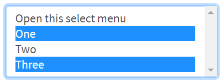
Here is an example with provided Bootstrap v4.3 code:
<select class="custom-select mb-3" multiple id="forms-select-menu-multiple">
<option selected>Open this select menu</option>
<option value="1">One</option>
<option value="2">Two</option>
<option value="3">Three</option>
</select>
Select menu size
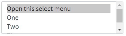
Here is an example with provided Bootstrap v4.3 code:
<select class="custom-select mb-3" size="3" id="forms-select-menu-size">
<option selected>Open this select menu</option>
<option value="1">One</option>
<option value="2">Two</option>
<option value="3">Three</option>
</select>
Available methods in Java JDI Light:
| Method | Description | Return Type |
|---|---|---|
| assertThat() | Assert action | TextAssert |
| click() | Click the button | void |
| is() | Assert action | TextAssert |
Range
Create custom range
controls (<input type="range">) with .custom-range. The track (the background) and thumb (the value) are both styled to appear the same across browsers.
Range inputs have implicit values for min and max: 0 and 100, respectively. You may specify new values for those using the min and max attributes.
Here is an example with provided Bootstrap v4.3 code:
//@FindBy(css = "#customRange3")
@UI("#customRange3")
public static Range range;
@Test
public void labelTest() {\
range.label().is().text(labelText);
}
@Test
public void validateThumbMinMaxAndStepValuesTest() {
range.is().thumbValue(2.5);
range.is().minValue(0);
range.is().maxValue(5);
range.is().step(0.5);
}
@Test
public void setThumbValueTest() {
range3.setThumbValue(5);
range3.is().thumbValue(5);
}
<div class="html-left">
<label for="customRange1">Example range</label>
<input type="range" class="custom-range" id="customRange1">
<label for="customRange2">Example range</label>
<input type="range" class="custom-range" min="0" max="5" id="customRange2">
<label for="customRange3">Example range</label>
<input type="range" class="custom-range" min="0" max="5" step="0.5" id="customRange3">
</div>
Available methods in Java JDI Light:
| Method/Property | Description | Return Type |
|---|---|---|
| assertThat() | Assert action | UIAssert |
| getValue() | Get thumb value as String | String |
| is() | Various assert actions for Progress | RangeAssert |
| label() | Get label associated with an item | Label |
| labelText() | Get text of a label associated with an item | String |
| max() | Get maximal limit of range | double |
| min() | Get minimal limit of range | double |
| step() | Get incremental step of range | double |
| setThumbValue() | Set thumb value with a "double" parameter | void |
| setValue() | Set thumb value with a String parameter | void |
| thumbValue() | Get thumb value | double |
Form Validation
Custom style
You can use custom Bootstrap form validation messages.
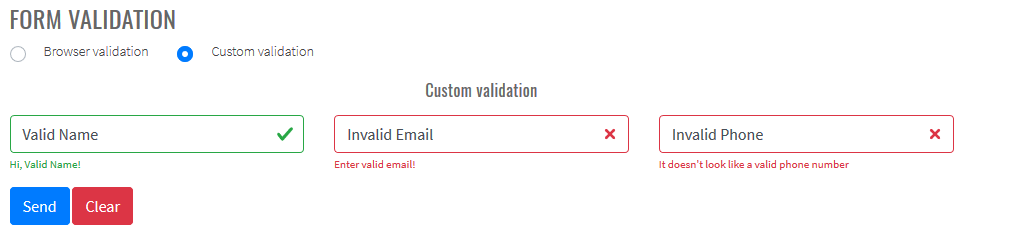
Here is an example with provided Bootstrap v4.3 code:
@UI("#validated-form")
public FormValidationForm form;
@Test
public void bootstrapValidationTest() {
String name = "ValidName";
String email = "InvalidEmail";
String phone = "InvalidPhone";
SimpleContact entity = new SimpleContact(name, email, phone);
form.fill(entity);
form.submit();
Map<String, String> validFeedback = form.getValidFeedback();
MatcherAssert.assertThat("Number of valid feedbacks not equals 1", validFeedback.size() == 1);
MatcherAssert.assertThat(validFeedback.keySet(), Matchers.hasItems("Name"));
MatcherAssert.assertThat(validFeedback.values(), Matchers.hasItem("Hi, " + name + "!"));
Map<String, String> invalidFeedback = form.getInvalidFeedback();
MatcherAssert.assertThat("Number of invalid feedbacks not equals 2", invalidFeedback.size() == 2);
MatcherAssert.assertThat(invalidFeedback.keySet(),
Matchers.hasItems("Email", "Phone"));
MatcherAssert.assertThat(invalidFeedback.values(),
Matchers.hasItems("Enter valid email!", "It doesn't look like a valid phone number"));
}
<form id="validated-form" class="" novalidate="">
<div class="row">
<div class="col">
<div class="form-group">
<input id="validated-form-name-field" type="text" class="form-control" placeholder="Enter name" required="">
<div id="name-valid-feedback" class="valid-feedback">Hi, Valid Name!</div>
<div class="invalid-feedback">Enter your name!</div>
</div>
</div>
<div class="col">
<div class="form-group">
<input type="email" class="form-control" id="validated-form-email" placeholder="Enter email" required="">
<div class="valid-feedback">Looks good!</div>
<div class="invalid-feedback">Enter valid email!</div>
</div>
</div>
<div class="col">
<div class="form-group">
<input type="text" class="form-control" id="validated-form-phone" placeholder="Enter phone" pattern="^[-+0-9()\s]+$">
<div class="valid-feedback">Looks good!</div>
<div class="invalid-feedback">It doesn't look like a valid phone number</div>
</div>
</div>
</div>
<div class="row">
<div class="col">
<button type="submit" class="btn btn-primary" id="validated-form-submit">Send</button>
<button type="reset" class="btn btn-danger" id="validated-form-reset">Clear</button>
</div>
</div>
</form>
Additional JavaScript code to use Bootstrap validation:
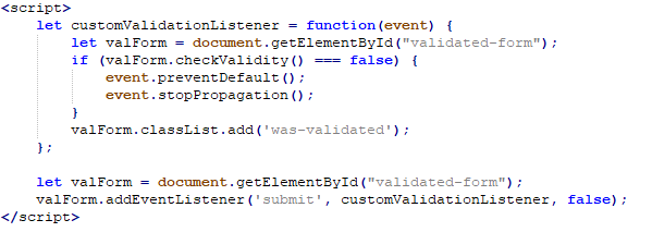
Browser default
Also you can use browser default validation.
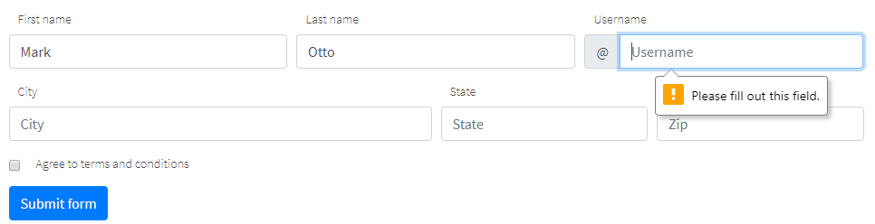
Here is an example with provided Bootstrap v4.3 code:
@UI("#validated-form")
public FormValidationForm form;
@Test
public void browserValidationTest() {
String name = "ValidName";
String email = "InvalidEmail";
String phone = "InvalidPhone";
SimpleContact entity = new SimpleContact(name, email, phone);
form.fill(entity);
form.submit();
Map<String, String> validFeedback = form.getValidationMessages();
MatcherAssert.assertThat("", validFeedback.get("Email"),
Matchers.is("Please include an '@' in the email address. 'InvalidEmail' is missing an '@'.")); //Browser dependent message
MatcherAssert.assertThat("", validFeedback.get("Phone"),
Matchers.is("Please match the requested format.")); //Browser dependent message
MatcherAssert.assertThat("", validFeedback.get("Name"), Matchers.is(""));
}
<form id="validated-form"">
<div class="row">
<div class="col">
<div class="form-group">
<input id="validated-form-name-field" type="text" class="form-control" placeholder="Enter name" required="">
</div>
</div>
<div class="col">
<div class="form-group">
<input type="email" class="form-control" id="validated-form-email" placeholder="Enter email" required="">
</div>
</div>
<div class="col">
<div class="form-group">
<input type="text" class="form-control" id="validated-form-phone" placeholder="Enter phone" pattern="^[-+0-9()\s]+$">
</div>
</div>
</div>
<div class="row">
<div class="col">
<button type="submit" class="btn btn-primary" id="validated-form-submit">Send</button>
<button type="reset" class="btn btn-danger" id="validated-form-reset">Clear</button>
</div>
</div>
</form>
Available methods for form validation in Java JDI Light:
| Method/Property | Description | Return Type |
|---|---|---|
| isValid() | Return if form valid | boolean |
| getValidationMessages() | Return map field names to browser validation messages | Map |
| getValidFeedback() | Return map field names to visible valid bootstrap feedback text | Map |
| getInvalidFeedback() | Return map field names to visible invalid bootstrap feedback text | Map |
| getFeedbackElements() | Return map field names to visible bootstrap feedback elements | Map |
3.3.2 Scrollspy
Scrollspy – automatically update Bootstrap navigation or list group components based on scroll position to indicate which link is currently active in the viewport.
- Scrollspy in navbar
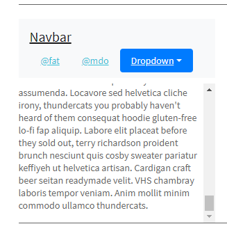
// @FindBy(css = "#navbar-example2")
@UI("#navbar-example2") public static NavbarWithDropdown navbarWithDropdown;
// @FindBy(css = "#navbar-example2~div")
@UI("#navbar-example2~div") public static ScrollSpyNav scrollSpyInNavbar;
public class NavbarWithDropdown extends Section {
// @FindBy(css = "ul>li")
@UI("ul>li")
public ListGroup navGroup;
// @FindBy(css ="ul>li>a")
@UI("ul>li>a")
public ListGroup navItemLink;
@JDropdown(expand = ".dropdown-toggle",
value = ".dropdown-toggle",
list = ".dropdown-item")
public Dropdown dropdownMenu;
// @FindBy(css = ".navbar-brand")
@UI(".navbar-brand")
public Link navbarLink;
}
public class ScrollSpyNav extends Section {
// @FindBy(xpath = ".//h4 | .//h5")
@UI(".//h4 | .//h5") public ListGroup header;
// @FindBy(css = "p")
@UI("p") public ListGroup mainText;
public void scrollParagraph(ListGroup listGroup, int index, String className){
mainText.get(index).show();
if (!listGroup.get(index).core().hasClass(className) &&
index < header.size()) {
header.get(index + 1).show();
}
}
}
private String itemLink = "https://jdi-testing.github.io/jdi-light/bootstrap.html#";
@DataProvider
public Object[][] dropdownCheck() {
return new Object[][]{
{3, itemLink + "one", "one"},
{4, itemLink + "two", "two"},
{5, itemLink + "three", "three"}
};
}
@Test(dataProvider = "dropdownCheck", priority = 1)
public void dropdownCheckTests(int _index, String link, String header) {
navbarWithDropdown.dropdownMenu.expand();
navbarWithDropdown.dropdownMenu.list().get(header).is()
.core()
.displayed()
.enabled()
.text(is(header))
.value(is(header))
.attr(ATTR_NAME_HREF, is(link));
}
@Test
public void navbarLinkClickableTests() {
navbarWithDropdown.navbarLink.click();
newWindowTitleCheck(pageTitle);
}
@Test
public void isValidationTests() {
navbarWithDropdown.navItemLink.get(3).is().text(dropdown);
navbarWithDropdown.navItemLink.get(3).is().value(dropdown);
navbarWithDropdown.navItemLink.is().size(3);
navbarWithDropdown.navGroup.is().size(3);
navbarWithDropdown.dropdownMenu.expand();
navbarWithDropdown.dropdownMenu.is().size(3);
navbarWithDropdown.find(By.className("dropdown-divider")).is()
.core()
.displayed()
.enabled()
.attr("role", "separator");
}
<nav id="navbar-example2" class="navbar navbar-light bg-light">
<a class="navbar-brand"
href="https://getbootstrap.com/docs/4.3/components/scrollspy/#example-in-navbar"
target="_blank">Navbar</a>
<ul class="nav nav-pills">
<li class="nav-item"><a class="nav-link" href="#fat">@fat</a>
</li>
<li class="nav-item"><a class="nav-link" href="#mdo">@mdo</a>
</li>
<li class="nav-item dropdown"><a
class="nav-link dropdown-toggle" data-toggle="dropdown"
href="#" role="button" aria-haspopup="true"
aria-expanded="false">Dropdown</a>
<div class="dropdown-menu">
<a class="dropdown-item" href="#one">one</a> <a
class="dropdown-item" href="#two">two</a>
<div role="separator" class="dropdown-divider"></div>
<a class="dropdown-item" href="#three">three</a>
</div>
</li>
</ul>
</nav>
<div data-spy="scroll" data-target="#navbar-example2"
data-offset="0" class="scrollspy-example">
<h4 id="fat">@fat</h4>
<p>...</p>
<h4 id="mdo">@mdo</h4>
<p>...</p>
<h4 id="one">one</h4>
<p>...</p>
<h4 id="two">two</h4>
<p>...</p>
<h4 id="three">three</h4>
<p>...</p>
</div>
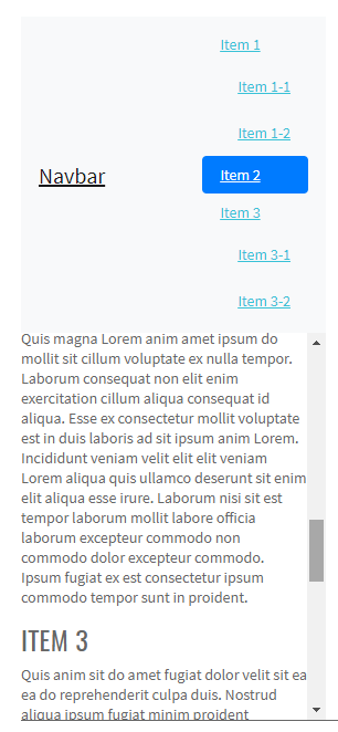
// @FindBy(css = "#navbar-example3")
@UI("#navbar-example3") public static NestedNav nestedNav;
// @FindBy(css = "#navbar-example3~div")
@UI("#navbar-example3~div") public static ScrollSpyNav scrollSpyWithNestedNav;
public class NestedNav extends Section {
// @FindBy(css = "nav")
@UI("nav") public ListGroup navGroup;
// @FindBy(css = "nav nav a")
@UI("nav nav a") public ListGroup navItemLink;
// @FindBy(css = ".navbar-brand")
@UI(".navbar-brand") public Link navbarLink;
}
public class ScrollSpyNav extends Section {
// @FindBy(xpath = ".//h4 | .//h5")
@UI(".//h4 | .//h5") public ListGroup header;
// @FindBy(css = "p")
@UI("p") public ListGroup mainText;
public void scrollParagraph(ListGroup listGroup, int index, String className){
mainText.get(index).show();
if (!listGroup.get(index).core().hasClass(className) &&
index < header.size()) {
header.get(index + 1).show();
}
}
}
@DataProvider
public Object[][] itemsCheck() {
return new Object[][]{
{1}, {2}, {3}, {4}, {5}, {6}, {7}
};
}
@Test(dataProvider = "itemsCheck")
public void paragraphClickableTests(int index) {
scrollSpyWithNestedNav.mainText.get(index).highlight();
scrollSpyWithNestedNav.scrollParagraph(nestedNav.navItemLink, index, CLASS_NAME_ACTIVE);
assertTrue(nestedNav.navItemLink.get(index).hasClass(CLASS_NAME_ACTIVE));
nestedNav.navItemLink.get(index).unhighlight();
}
@Test
public void isValidationTests() {
nestedNav.navItemLink.is().size(7);
nestedNav.navGroup.is().size(3);
scrollSpyWithNestedNav.mainText.is().size(7);
scrollSpyWithNestedNav.header.is().size(7);
}
<nav id="navbar-example3" class="navbar navbar-light bg-light">
<a class="navbar-brand"
href="https://getbootstrap.com/docs/4.3/components/scrollspy/#example-with-nested-nav"
target="_blank">Navbar</a>
<nav class="nav nav-pills flex-column">
<a class="nav-link" href="#item-1">Item 1</a>
<nav class="nav nav-pills flex-column">
<a class="nav-link ml-3 my-1" href="#item-1-1">Item 1-1</a> <a
class="nav-link ml-3 my-1" href="#item-1-2">Item 1-2</a>
</nav>
<a class="nav-link" href="#item-2">Item 2</a> <a
class="nav-link" href="#item-3">Item 3</a>
<nav class="nav nav-pills flex-column">
<a class="nav-link ml-3 my-1" href="#item-3-1">Item 3-1</a> <a
class="nav-link ml-3 my-1" href="#item-3-2">Item 3-2</a>
</nav>
</nav>
</nav>
<div data-spy="scroll" data-target="#navbar-example3"
data-offset="0" class="scrollspy-example-2">
<h4 id="item-1">Item 1</h4>
<p>...</p>
<h5 id="item-1-1">Item 1-1</h5>
<p>...</p>
<h5 id="item-1-2">Item 1-2</h5>
<p>...</p>
<h4 id="item-2">Item 2</h4>
<p>...</p>
<h4 id="item-3">Item 3</h4>
<p>...</p>
<h5 id="item-3-1">Item 3-1</h5>
<p>...</p>
<h5 id="item-3-2">Item 3-2</h5>
<p>...</p>
</div>
// @FindBy(css = "#list-example>a")
@UI("#list-example>a") public static ListGroup listGroupForScrollSpy;
// @FindBy(css = "#list-example~div")
@UI("#list-example~div") public static ScrollSpyNav scrollSpyWithListGroup;
public class ScrollSpyNav extends Section {
// @FindBy(xpath = ".//h4 | .//h5")
@UI(".//h4 | .//h5") public ListGroup header;
// @FindBy(css = "p")
@UI("p") public ListGroup mainText;
public void scrollParagraph(ListGroup listGroup, int index, String className){
mainText.get(index).show();
if (!listGroup.get(index).core().hasClass(className) &&
index < header.size()) {
header.get(index + 1).show();
}
}
}
@DataProvider
public Object[][] itemsCheck() {
return new Object[][]{
{1}, {2}, {3}, {4}
};
}
@Test(dataProvider = "itemsCheck")
public void paragraphClickableTests(int index) {
scrollSpyWithListGroup.mainText.get(index).highlight();
scrollSpyWithListGroup.scrollParagraph(listGroupForScrollSpy, index, CLASS_NAME_ACTIVE);
listGroupForScrollSpy.get(index)
.is()
.core()
.displayed()
.enabled()
.cssClass(CLASS_NAME_LIST_GROUP_ITEM_LIST_GROUP_ITEM_ACTION_ACTIVE)
.css(CSS_NAME_BACKGROUND_COLOR, "rgba(0, 123, 255, 1)")//#007bff Color Hex
.css(CSS_NAME_BORDER_COLOR, "rgb(0, 123, 255)");//#007bff Color Hex
listGroupForScrollSpy.get(index).unhighlight();
}
@Test
public void isValidationTests() {
scrollSpyWithListGroup.header.is().size(4);
scrollSpyWithListGroup.mainText.is().size(4);
listGroupForScrollSpy.is().size(4);
}
<div id="list-example" class="list-group">
<a class="list-group-item list-group-item-action"
href="#list-item-1">Item 1</a> <a
class="list-group-item list-group-item-action"
href="#list-item-2">Item 2</a> <a
class="list-group-item list-group-item-action"
href="#list-item-3">Item 3</a> <a
class="list-group-item list-group-item-action"
href="#list-item-4">Item 4</a>
</div>
<div data-spy="scroll" data-target="#list-example"
data-offset="0" class="scrollspy-example">
<h4 id="list-item-1">Item 1</h4>
<p>...</p>
<h4 id="list-item-2">Item 2</h4>
<p>...</p>
<h4 id="list-item-3">Item 3</h4>
<p>...</p>
<h4 id="list-item-4">Item 4</h4>
<p>...</p>
</div>
Available methods in Java JDI Light:
| Method | Description | Return Type |
|---|---|---|
| assertThat() | Assert action | TextAssert |
| click() | Click element | void |
| expand() | Expand dropdown | void |
| get(int) | Select element by index | UIElement |
| get(String) | Select element by text | UIElement |
| getText() | Get text | String |
| getValue() | Get value | String |
| is() | Assert action | TextAssert |
| list() | Get list of dropdown | WebList |
| show () | Scroll to element | void |
| size() | Get WebList size | int |
In these java test cases examples next classes have been used:
Java: com.epam.jdi.light.elements.composite.Section
Java: com.epam.jdi.light.elements.complex.ListGroup
Java: com.epam.jdi.light.ui.bootstrap.elements.common.Link
Java: com.epam.jdi.light.elements.complex.dropdown.Dropdown
Scrollspy in navbar Tests Example
Scrollspy with nested nav Tests Example
Scrollspy with list-group Tests Example
3.3.3 Media object
public class MediaObject extends Section {
}
Media object helps build complex and repetitive components where some media is positioned alongside content that doesn’t wrap around said media.
Media object sample
Here is an example with provided Bootstrap v4.3 code:
// @FindBy(css = "#media-object-sample")
@UI("#media-object-sample") public static MediaObjectSample mediaObjectSample;
public class MediaObjectSample extends MediaObject {
@UI("img") public Image imageOfMediaObject;
@Title
@UI("h5") public Text headingOfMediaObject;
@UI(".media-body") public Text bodyOfMediaObject;
}
@Test
public void isValidationTestSample() {
mediaObjectSample.is().displayed();
mediaObjectSample.is().enabled();
mediaObjectSample.bodyOfMediaObject.is().text(is(bodyTextOfMediaObjectSample));
mediaObjectSample.bodyOfMediaObject.is().text(containsString("American comic books"));
assertThat(mediaObjectSample.headingOfMediaObject.core().css("font-size"), is("20px"));
assertThat(mediaObjectSample.bodyOfMediaObject.core().css("font-size"), is("14px"));
mediaObjectSample.bodyOfMediaObject.assertThat().displayed()
.and().text(is(bodyTextOfMediaObjectSample))
.core()
.css("font-size", is("14px"))
.cssClass("media-body")
;
}
<div class="media" id="media-object-sample">
<img src="images/wolverin.jpg" class="mr-3" alt="...">
<div class="media-body">
<h5 class="mt-0">WOLVERINE</h5>
Wolverine is a fictional character appearing in American comic books published by Marvel
Comics, mostly in association with the X-Men. He is a mutant who possesses animal-keen
senses, enhanced physical capabilities, powerful regenerative ability known as a healing
factor, and three retractable claws in each hand.
</div>
</div>
Media object nesting
Here is an example with provided Bootstrap v4.3 code:
// @FindBy(css = "#media-object-nesting")
@UI("#media-object-nesting") public static MediaObjectNesting mediaObjectNesting;
public class MediaObjectNesting extends MediaObject {
@UI("img") public Image imageOfMediaObject;
@Title
@UI("h5") public Text headingOfMediaObject;
@UI(".media-body") public Text bodyOfMediaObject;
@UI("div.media div.media") public MediaObjectSample nestingMediaObject;
}
@Test
public void isValidationTestNesting() {
mediaObjectNesting.is().displayed();
mediaObjectNesting.is().enabled();
mediaObjectNesting.nestingMediaObject.bodyOfMediaObject.is().text(is(bodyTextOfMediaObjectNesting));
mediaObjectNesting.nestingMediaObject.bodyOfMediaObject.is().text(containsString("vel eu leo"));
assertThat(mediaObjectNesting.nestingMediaObject.headingOfMediaObject.core().css("font-size"), is("20px"));
assertThat(mediaObjectNesting.nestingMediaObject.bodyOfMediaObject.core().css("font-size"), is("14px"));
mediaObjectNesting.nestingMediaObject.bodyOfMediaObject.assertThat().displayed()
.and().text(is(bodyTextOfMediaObjectNesting))
.core()
.css("font-size", is("14px"))
.cssClass("media-body")
;
}
<div class="media" id="media-object-nesting">
<img src="images/wolverin.jpg" class="mr-3" alt="...">
<div class="media-body">
<h5 class="mt-0">Media heading</h5>
Cras sit amet nibh libero, in gravida nulla. Nulla vel metus scelerisque ante
sollicitudin.
<div class="media mt-3">
<a class="mr-3" href="https://jdi-testing.github.io/jdi-light/index.html"
target="_blank">
<img src="images/punisher.jpg" class="mr-3" alt="...">
</a>
<div class="media-body">
<h5 class="mt-0">IRON MAN</h5>
Donec sed odio dui. Nullam quis risus eget urna mollis ornare vel eu leo.
</div>
</div>
</div>
</div>
Media object list
Here is an example with provided Bootstrap v4.3 code:
// @FindBy(css = "#media-object-list")
@UI("#media-object-list") public static JList<MediaObjectSample> mediaObjectList;
@Test
public void isValidationTestListMediaObject() {
mediaObjectList.is().displayed();
mediaObjectList.is().enabled();
mediaObjectList.get(1).headingOfMediaObject.is().text(is(listOfHeading.get(0)));
mediaObjectList.get(2).bodyOfMediaObject.is().text(containsString("Stark requires"));
assertThat(mediaObjectList.get(2).headingOfMediaObject.core().css("font-size"), is("20px"));
assertThat(mediaObjectList.get(1).bodyOfMediaObject.core().css("font-size"), is("14px"));
mediaObjectList.assertThat().displayed()
.core()
.css("font-size", is("14px"));
}
<ul class="list-unstyled" id="media-object-list">
<li class="media">
<img src="images/wolverin.jpg" class="mr-3" alt="...">
<div class="media-body">
<h5 class="mt-0 mb-1">WOLVERINE first</h5>
Wolverine is a fictional character appearing in American comic books published by
Marvel Comics
</div>
</li>
<li class="media my-4">
<img src="images/punisher.jpg" class="mr-3" alt="...">
<div class="media-body">
<h5 class="mt-0 mb-1">IRON MAN second</h5>
I do anything and everything that Mr. Stark requires — including occasionally taking
out the trash
</div>
</li>
<li class="media">
<img src="images/spider-man.jpg" class="mr-3" alt="...">
<div class="media-body">
<h5 class="mt-0 mb-1">SPIDER MAN third</h5>
Spider-Man is a fictional superhero created by writer-editor Stan Lee and
writer-artist Steve Ditko.
</div>
</li>
</ul>
Media object is represented by MediaObject class:
MediaObject class is inherited from Section class:
Inner elements of media object can be represented by the following classes:
3.3.4 Modal
Modal is a dialog box/popup window that is displayed on page.
Modal Live demo
Toggle a working modal demo by clicking the button below. It will slide down and fade in from the top of the page.
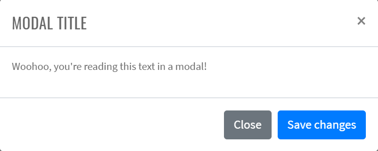
Here is an example with provided Bootstrap v4.3 code:
//FindBy(css = "#modal-live-demo .bd-example .btn")
@UI("#modal-live-demo .bd-example .btn")
public static Button modalLiveDemoLaunchButton;
//FindBy(css = "#exampleModalLive")
@UI("#exampleModalLive")
public static ModalLiveDemo modalLiveDemo;
public class ModalLiveDemo extends Modal {
@UI(".modal-body") public Text body;
@UI("//div[@class='modal-footer']//button[1]") public Button closeButton;
@UI("//div[@class='modal-footer']//button[2]") public Button saveButton;
@UI(".modal-header .close") public Button closeX;
}
@Test
public void modalContentTextTest() {
modalLiveDemoLaunchButton.is().text(is(launchButtonText));
modalLiveDemoLaunchButton.click();
modalLiveDemo.title.is().text(is(titleText));
modalLiveDemo.body.is().text(is(bodyText));
modalLiveDemo.saveButton.is().text(is(saveButtonText));
modalLiveDemo.closeButton.is().text(is(closeButtonText));
modalLiveDemo.close();
}
@Test
public void saveAndCloseButtonsTest() {
modalLiveDemoLaunchButton.click();
modalLiveDemo.is().displayed();
modalLiveDemo.saveButton.click();
modalLiveDemo.is().displayed();
modalLiveDemo.closeButton.click();
modalLiveDemo.is().hidden();
}
<div id="exampleModalLive" class="modal fade" tabindex="-1" role="dialog"
aria-labelledby="exampleModalLiveLabel" aria-hidden="true">
<div class="modal-dialog" role="document">
<div class="modal-content">
<div class="modal-header">
<h5 class="modal-title" id="exampleModalLiveLabel">Modal title</h5>
<button type="button" class="close" data-dismiss="modal" aria-label="Close">
<span aria-hidden="true">×</span>
</button>
</div>
<div class="modal-body">
<p>Woohoo, you're reading this text in a modal!</p>
</div>
<div class="modal-footer">
<button type="button" class="btn btn-secondary" data-dismiss="modal">Close
</button>
<button type="button" class="btn btn-primary">Save changes</button>
</div>
</div>
</div>
</div>
Modal is represented by Section class in Java:
- Section #BS
Inner elements of Modal - Live demo are represented by the following classes:
Available methods in Java JDI Light:
| Method | Description | Return Type |
|---|---|---|
| close() | Close modal | void |
| click() | Click the button | void |
| getText() | Returns text | String |
| is() | Asserts element | UIAssert |
Scrolling Long Content Modal
When modals become too long for the user’s viewport or device, they scroll independent of the page itself.
Here is an example with provided Bootstrap v4.3 code:
// @FindBy(id = "modal-scroll-long")
@UI("#modal-scroll-long")
public static SectionModalLongScrolling sectionModalLongScrolling;
// @FindBy(id = "exampleModalLong")
@UI("#exampleModalLong")
public ModalWithButtons modalLong;
// @FindBy(id = "exampleModalScrollable")
@UI("#exampleModalScrollable")
public ModalWithButtons modalScrollable;
// @FindBy(css = "#modal-scroll-long div:nth-child(2) button")
@UI("div:nth-child(2) button")
public Button buttonLongScroll;
// @FindBy(css = "#modal-scroll-long div:nth-child(4) button")
@UI("div:nth-child(4) button")
public Button buttonLongScrollable;
@DataProvider
public Object[][] listData() {
return new Object[][]{
{sectionModalLongScrolling.buttonLongScroll, sectionModalLongScrolling.modalLong},
{sectionModalLongScrolling.buttonLongScrollable, sectionModalLongScrolling.modalScrollable}
};
}
@Test(dataProvider = "listData")
public void bottomButtonsTest(Button showModal, ModalWithButtons modal) {
showModal.click();
modal.is().displayed();
modal.bottomSave();
modal.bottomClose();
modal.is().disappear();
}
<!-- Button trigger modal -->
<button type="button" class="btn btn-primary" data-toggle="modal" data-target="#exampleModalLong">
Launch demo modal
</button>
<!-- Modal -->
<div class="modal fade" id="exampleModalLong" tabindex="-1" role="dialog" aria-labelledby="exampleModalLongTitle" aria-hidden="true">
<div class="modal-dialog" role="document">
<div class="modal-content">
<div class="modal-header">
<h5 class="modal-title" id="exampleModalLongTitle">Modal title</h5>
<button type="button" class="close" data-dismiss="modal" aria-label="Close">
<span aria-hidden="true">×</span>
</button>
</div>
<div class="modal-body">
...
</div>
<div class="modal-footer">
<button type="button" class="btn btn-secondary" data-dismiss="modal">Close</button>
<button type="button" class="btn btn-primary">Save changes</button>
</div>
</div>
</div>
</div>
Here is an example with provided Bootstrap v4.3 code:
<!-- Button trigger modal -->
<button type="button" class="btn btn-primary" data-toggle="modal" data-target="#exampleModalScrollable">
Launch demo modal
</button>
<!-- Modal -->
<div class="modal fade" id="exampleModalScrollable" tabindex="-1" role="dialog" aria-labelledby="exampleModalScrollableTitle" aria-hidden="true">
<div class="modal-dialog modal-dialog-scrollable" role="document">
<div class="modal-content">
<div class="modal-header">
<h5 class="modal-title" id="exampleModalScrollableTitle">Modal title</h5>
<button type="button" class="close" data-dismiss="modal" aria-label="Close">
<span aria-hidden="true">×</span>
</button>
</div>
<div class="modal-body">
...
</div>
<div class="modal-footer">
<button type="button" class="btn btn-secondary" data-dismiss="modal">Close</button>
<button type="button" class="btn btn-primary">Save changes</button>
</div>
</div>
</div>
</div>
Modal is represented by Section class in Java:
- Section #BS
Available methods in Java JDI Light:
| Method | Description | Return Type |
|---|---|---|
| close() | Close modal | void |
| displayed() | Asserts element is displayed | UIAssert |
| is() | Asserts element | UIAssert |
| hidden() | Asserts element is hidden | UIAssert |
Vertically Centered Modal
Add .modal-dialog-centered to .modal-dialog to vertically center the modal.
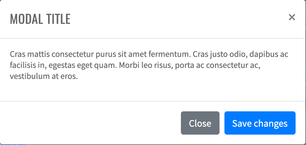
// @FindBy(id = "modal-vertically-centered")
@UI("#modal-vertically-centered")
public static ModalVerticallyCentered modalVerticallyCentered;
@Test(dataProvider = "modalBasicData")
public void modalBasicFunctionalityTest(Button showButton,
Button dismissButton,
Modal modal,
String modalId) {
WebDriverWait wait = new WebDriverWait(WebDriverFactory.getDriver(), 5);
showButton.show();
showButton.click();
wait.until(ExpectedConditions.visibilityOfElementLocated(By.id(modalId)));
modal.is().displayed();
dismissButton.show();
dismissButton.click();
modal.is().hidden();
}
Here is an example with provided Bootstrap v4.3 code:
<div id="exModalCenter" class="modal fade" tabindex="-1" role="dialog"
aria-labelledby="exampleModalCenterTitle" aria-hidden="true">
<div class="modal-dialog modal-dialog-centered" role="document">
<div id="modal-vertical-content-1" class="modal-content">
<div class="modal-header">
<h5 class="modal-title" id="exModalCenterTitle">Modal title</h5>
<button type="button" class="close" data-dismiss="modal" aria-label="Close">
<span aria-hidden="true">×</span>
</button>
</div>
<div class="modal-body">
<p>Cras mattis consectetur purus sit amet fermentum. Cras justo odio, dapibus ac
facilisis in, egestas eget quam. Morbi leo risus, porta ac consectetur ac,
vestibulum at eros.</p>
</div>
<div class="modal-footer">
<button type="button" class="btn btn-secondary" data-dismiss="modal">Close
</button>
<button type="button" class="btn btn-primary">Save changes</button>
</div>
</div>
</div>
</div>
Modal is represented by Section class in Java:
- Section #BS
Available methods in Java JDI Light:
| Method | Description | Return Type |
|---|---|---|
| close() | Close modal | void |
| displayed() | Asserts element is displayed | UIAssert |
| hidden() | Asserts element is hidden | UIAssert |
| is() | Asserts element | UIAssert |
Modal - Tooltips and popovers
Modal - Tooltips and popovers
Tooltips and popovers can be placed within modals as needed. When modals are closed, any tooltips and popovers within are also automatically dismissed.
Here is an example with provided Bootstrap v4.3 code:
//@Findby(xpath="//h4[.='Modal - Tooltips and popovers']/../..")
@UI("//h4[.='Modal - Tooltips and popovers']/../..")
public static ModalTooltipsAndPopovers modalTooltipsAndPopovers;
public class ModalTooltipsAndPopovers extends Section {
//@Findby(xpath="//button")
@UI("//button") public Button demoModalButton;
public ModalTooltipsAndPopoversDialog modalDlg;
}
public class ModalTooltipsAndPopoversDialog extends Modal {
//@Findby(css=".modal-body")
@UI(".modal-body")
public ModalTooltipsAndPopoversBody body;
@UI("//div[@class='modal-footer']//button[1]")
public Button closeButton;
@UI("//div[@class='modal-footer']//button[2]")
public Button saveButton;
}
public class ModalTooltipsAndPopoversBody extends Section {
//@Findby(css="h5:nth-child(1)")
@UI("h5:nth-child(1)") public Text title1;
public Popover popover;
@UI("h5:nth-child(4)") public Text title2;
@UI("p:nth-child(5) > a:nth-child(1)") public Link thisLink;
public Tooltip tooltipOnLink;
@UI("p:nth-child(5) > a:nth-child(2)") public Link thatLink;
}
@Test
public void verifyOpenModalDialogTooltips() {
modalTooltipsAndPopovers.demoModalButton.click();
modalTooltipsAndPopovers.modalDlg.title.is().text(is(TITLE));
modalTooltipsAndPopovers.modalDlg.body.title1.is().text(is(BODY_TITLE1));
modalTooltipsAndPopovers.modalDlg.body.title2.is().text(is(BODY_TITLE2));
modalTooltipsAndPopovers.modalDlg.body.thisLink.is().text(is(THIS_LINK));
modalTooltipsAndPopovers.modalDlg.body.thatLink.is().text(is(THAT_LINK));
modalTooltipsAndPopovers.modalDlg.saveButton.is().text(is(SAVE_BUTTON));
modalTooltipsAndPopovers.modalDlg.closeButton.is().text(is(CLOSE_BUTTON));
modalTooltipsAndPopovers.modalDlg.closeButton.click();
}
<div id="exampleModalPopovers" class="modal fade" tabindex="-1" role="dialog"
aria-labelledby="exampleModalPopoversLabel" aria-hidden="true">
<div class="modal-dialog" role="document">
<div class="modal-content">
<div class="modal-header">
<h5 class="modal-title" id="exampleModalPopoversLabel">Modal title</h5>
<button type="button" class="close" data-dismiss="modal" aria-label="Close">
<span aria-hidden="true">×</span>
</button>
</div>
<div class="modal-body">
<h5>Popover in a modal</h5>
<p>This <a href="#exampleModalPopovers" role="button" class="btn btn-secondary popover-test"
title="Popover title" data-toggle="popover"
data-content="Popover body content is set in this attribute."
data-container="#exampleModalPopovers">button</a> triggers a popover on click.
</p>
<hr/>
<h5>Tooltips in a modal</h5>
<p><a href="#exampleModalPopovers" class="tooltip-test" title="Tooltip" data-toggle="tooltip"
data-container="#exampleModalPopovers">This link</a> and
<a href="#exampleModalPopovers" class="tooltip-test" title="Tooltip" data-toggle="tooltip"
data-container="#exampleModalPopovers">that link</a> have tooltips on hover.
</p>
</div>
<div class="modal-footer">
<button type="button" class="btn btn-secondary" data-dismiss="modal">Close
</button>
<button type="button" class="btn btn-primary">Save changes</button>
</div>
</div>
</div>
</div>
Modal is represented by Section class in Java:
- Section #BS
Available methods in Java JDI Light:
| Method | Description | Return Type |
|---|---|---|
| close() | Close modal | void |
| displayed() | Asserts element is displayed | UIAssert |
| hidden() | Asserts element is hidden | UIAssert |
| is() | Asserts element | UIAssert |
Modal using grid
Here is an example with provided Bootstrap v4.3 code:
public class GridModalBody extends Section {
//FindBy(css = ".row")
@UI(".row")
private JList<GridRow> allGridRows;
//FindBy(css = '[class*='col']')
@UI("[class*='col']")
private JList<GridCell> allGridCells;
public JList<GridCell> getAllCells() {
return allGridCells;
}
public JList<GridRow> getAllRows() {
return allGridRows;
}
public GridRow getGridRow(int rowN) {
return allGridRows.get(rowN);
}
public GridCell getCellInRow(int rowN, int cellN) {
return getGridRow(rowN).getCell(cellN);
}
public String getTextFromCellInRow(int rowN, int cellN) {
return getCellInRow(rowN, cellN).getText();
}
}
@Test(dataProvider = "gridData")
public void checkTextInCell(int rowN, int cellN, String textExpected, String max_width) {
GridCell cell = gridModalSection.getGridModalWindow().getBody()
.getCellInRow(rowN, cellN);
cell.highlight("blue");
cell.is().core()
.text(textExpected)
.and()
.css("max-width", startsWith(max_width));
cell.unhighlight();
}
@Test
public void checkCloseXModalButton() {
gridModalSection.getGridModalWindow().getBtnCloseX().highlight("red");
gridModalSection.getGridModalWindow().close();
gridModalSection.getGridModalWindow().is().disappear();
}
@Test
public void checkCloseByEscapeButton() {
gridModalSection.getGridModalWindow().core().sendKeys(Keys.ESCAPE);
gridModalSection.getGridModalWindow().is().disappear();
}
<div id="grid-modal-base" class="html-left mb-3">
<div id="gridSystemModal" class="modal fade" tabindex="-1" role="dialog"
aria-labelledby="gridModalLabel" aria-hidden="true">
<div class="modal-dialog" role="document">
<div class="modal-content">
<div class="modal-header">
<h5 class="modal-title" id="gridModalLabel">Grids in modals</h5>
<button id="close-modal-cross" type="button" class="close" data-dismiss="modal"
aria-label="Close"><span aria-hidden="true">×</span></button>
</div>
<div class="modal-body">
<div class="container-fluid bd-example-row">
<div class="row">
<div class="col-md-4">.col-md-4</div>
<div class="col-md-4 ml-auto">.col-md-4 .ml-auto</div>
</div>
<div class="row">
<div class="col-md-3 ml-auto">.col-md-3 .ml-auto</div>
<div class="col-md-2 ml-auto">.col-md-2 .ml-auto</div>
</div>
<div class="row">
<div class="col-md-6 ml-auto">.col-md-6 .ml-auto</div>
</div>
<div class="row">
<div class="col-sm-9">
Level 1: .col-sm-9
<div class="row">
<div class="col-8 col-sm-6">
Level 2: .col-8 .col-sm-6
</div>
<div class="col-4 col-sm-6">
Level 2: .col-4 .col-sm-6
</div>
</div>
</div>
</div>
</div>
</div>
<div class="modal-footer">
<button id="close-modal" type="button" class="btn btn-secondary"
data-dismiss="modal">Close
</button>
<button id="save-modal" type="button" class="btn btn-primary">Save changes
</button>
</div>
</div>
</div>
</div>
<div class="bd-example">
<button id="btn-modal-using-grid" type="button" class="btn btn-primary" data-toggle="modal"
data-target="#gridSystemModal">Launch demo modal
</button>
</div>
</div>
Available methods in Java JDI Light:
| Method/Property | Description | Return Type |
|---|---|---|
| close() | Close Modal Window using X control | void |
| clickBtnClose() | Close Modal Window | void |
| displayed() | Asserts element is displayed | UIAssert |
| disappear() | Asserts element is not displayed | UIAssert |
| getCellInRow(int rowN, int cellN) | Get cellN from rowN | GridCell |
| getGridRow(int rowN) | Get rowN | GridRow |
| getTitle() | Get Modal Window Title | Text |
Varying modal content
Have a bunch of buttons that all trigger the same modal with slightly different contents? Use event.relatedTarget and HTML data-* attributes (possibly via jQuery) to vary the contents of the modal depending on which button was clicked.
Here is an example with provided Bootstrap v4.3 code:
public class Modal extends Section {
//@FindBy(xpath = "div/h5[@class='modal-title']")
@UI(".modal-header .modal-title")
public Text title;
}
public class ModalVaryingContent extends Modal {
//@FindBy(xpath = "div/button[@class='close']")
@UI(".modal-header .close")
public Button closeX;
}
@Test(dataProvider = "modalVaryingContentButtonsWithRecipients")
public void modalButtonsTest(Button modalButton, String recipient) {
checkButton(modalButton, String.format("Open modal for @%s", recipient),
whiteColor, blueColorBackground, blueColorBorder);
}
@Test(dataProvider = "modalVaryingContentButtonsWithRecipients")
public void headerValidationTest(Button modalButton, String recipient) {
modalButton.click();
modalVaryingContentWindow.is().displayed();
modalVaryingContentWindow.title.core().is()
.text(String.format("NEW MESSAGE TO @%s", recipient.toUpperCase()));
modalVaryingContentWindow.closeX.click();
modalVaryingContentWindow.is().hidden();
}
private void checkButton(Button button, String text, String color,
String backgroundColor, String borderColor) {
button.is().core()
.text(text)
.tag("button")
.css("color", color)
.css("background-color", backgroundColor)
.css("border-color", borderColor);
}
<div class="modal fade" id="exampleModal" tabindex="-1" role="dialog"
aria-labelledby="exampleModalLabel" aria-hidden="true">
<div class="modal-dialog" role="document">
<div id="modalVaryingContentWindow" class="modal-content">
<div class="modal-header">
<h5 class="modal-title" id="exampleModalLabel">New message</h5>
<button type="button" class="close" data-dismiss="modal" aria-label="Close">
<span aria-hidden="true">×</span>
</button>
</div>
<div class="modal-body">
<form>
<div class="form-group">
<label for="recipient-name"
class="col-form-label">Recipient:</label>
<input type="text" class="form-control" id="recipient-name"/>
</div>
<div class="form-group">
<label for="message-text" class="col-form-label">Message:</label>
<textarea class="form-control" id="message-text"></textarea>
</div>
</form>
</div>
<div class="modal-footer">
<button type="button" class="btn btn-secondary" data-dismiss="modal">Close
</button>
<button type="button" class="btn btn-primary">Send message</button>
</div>
</div>
</div>
</div>
Available methods in Java JDI Light:
| Method/Property | Description | Return Type |
|---|---|---|
| assertThat() | Assert action | TextAssert |
| click() | Click button | void |
| displayed() | Assert is displayed | void |
| getTitle() | Get Modal Window Title | Text |
| getText() | Get text value of the element | String |
Embedding YouTube videos
Embedding YouTube videos in modals requires additional JavaScript not in Bootstrap to automatically stop playback and more. See this helpful Stack Overflow post for more information.
Here is an example with provided Bootstrap v4.3 code:
@UI("#modal-youtube button.btn-primary")
public static Button modalEmbeddedVideoButton;
@UI("#youTubeModalLabel")
public static EmbeddedVideoModal embeddedVideoModal;
private final static String VIDEO_TITLE = "Forget about Selenium. May the JDI Light force be with you";
private final static String VIDEO_URL = "https://www.youtube.com/watch?v=lw4g9ItC7Sc";
@Test
public void videoTitleTest() {
modalEmbeddedVideoButton.click();
embeddedVideoModal.getVideoModalFrame().getVideoTitle().is()
.displayed()
.enabled()
.ref(VIDEO_URL)
.text(VIDEO_TITLE);
embeddedVideoModal.close();
}
@Test
public void playVideoTest() {
modalEmbeddedVideoButton.click();
embeddedVideoModal.getVideoModalFrame().getPlayButton().click();
embeddedVideoModal.getVideoModalFrame().getProgressBar().assertThat()
.displayed()
.attr("aria-valuenow", Matchers.matchesPattern("[1-9]{1}[0-9]*"));
embeddedVideoModal.close();
}
<div id="modal-youtube" class="html-left mb-3">
<div class="bd-example">
<button type="button" class="btn btn-primary mb-3" data-toggle="modal"
data-target="#youTubeModalLabel">Embedding YouTube video
</button>
</div>
<div class="modal fade" tabindex="-1" role="dialog" aria-labelledby="youTubeModalLabel"
id="youTubeModalLabel" aria-hidden="true">
<div class="modal-dialog modal-xl">
<div class="modal-content">
<div class="modal-header">
<h5 class="modal-title h4">Embedding YouTube video</h5>
<button type="button" class="close" data-dismiss="modal" aria-label="Close">
<span aria-hidden="true">×</span>
</button>
</div>
<div class="modal-body">
<iframe allow="accelerometer; autoplay; encrypted-media; gyroscope; picture-in-picture"
allowfullscreen="" src="https://www.youtube.com/embed/lw4g9ItC7Sc"
width="1120" height="630" frameborder="0"></iframe>
</div>
</div>
</div>
</div>
</div>
Available methods in Java JDI Light:
| Method/Property | Description | Return Type |
|---|---|---|
| close() | Close Modal Window using X control | void |
| displayed() | Asserts element is displayed | UIAssert |
| disappear() | Asserts element is not displayed | UIAssert |
| waitFor() | Assert action | UIAssert |
Optional Sizes
Modals have three optional sizes, available via modifier classes to be placed on a .modal-dialog.
These sizes kick in at certain breakpoints to avoid horizontal scrollbars on narrower viewports.
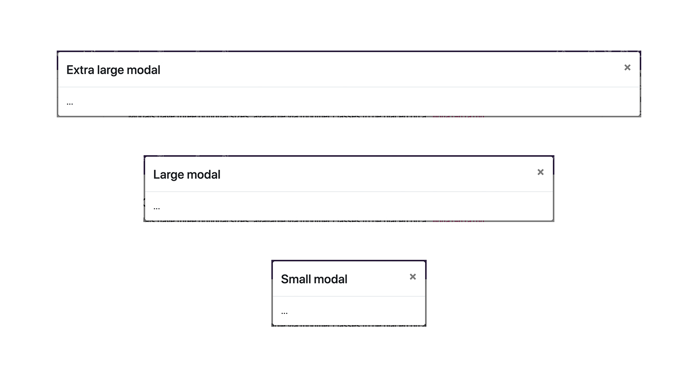
// @FindBy(id = "modal-optional-sizes")
@UI("#modal-optional-sizes")
public static ModalOptionalSizes modalOptionalSizes;
// @FindBy(css = "button:nth-of-type(1)")
@UI("button:nth-of-type(1)")
public Button xlButton;
// @FindBy(css = "button:nth-of-type(2)")
@UI("button:nth-of-type(2)")
public Button lgButton;
// @FindBy(css = "button:nth-of-type(3)")
@UI("button:nth-of-type(3)")
public Button smButton;
@Test(dataProvider = "modalCssData")
public void modalCssTest(Button button, Modal modal, String modalCss) {
button.show();
button.click();
modal.is().displayed();
modal.children().get(1).core().is().hasClass(modalCss);
modal.close();
}
@Test(dataProvider = "modalSizeData")
public void modalSizeTest(Button button,
Modal modal,
int modalWidth) {
button.show();
button.click();
modal.is().displayed();
assertThat(modal.children().get(2).core().getRect().width, equalTo(modalWidth));
modal.close();
}
Here is an example with provided Bootstrap v4.3 code:
<div class="modal fade bd-example-modal-xl" tabindex="-1" role="dialog"
aria-labelledby="myExtraLargeModalLabel" aria-hidden="true">
<div class="modal-dialog modal-xl">
<div class="modal-content">
<div class="modal-header">
<h5 class="modal-title h4" id="myExtraLargeModalLabel">Extra large modal</h5>
<button type="button" class="close" data-dismiss="modal" aria-label="Close">
<span aria-hidden="true">×</span>
</button>
</div>
<div class="modal-body">
...
</div>
</div>
</div>
</div>
Modal is represented by Section class in Java:
- Section #BS
Available methods in Java JDI Light:
| Method | Description | Return Type |
|---|---|---|
| close() | Close modal | void |
| displayed() | Asserts element is displayed | UIAssert |
| hidden() | Asserts element is hidden | UIAssert |
| hasClass() | Matches passed value with the element class | IsAssert |
| is() | Asserts element | UIAssert |
3.3.5 Popovers
Example

Here is an example with provided Bootstrap v4.3 code:
// @FindBy(css = "body") public static Popover popover;
@UI("body") public static Popover popover;
@Test
public void isValidationTests() {
popover.getPopover(locator);
popover.popoverButton.is()
.displayed()
.enabled()
.core()
.attr("data-toggle", "popover")
.attr("data-content", popoverBody)
.attr("data-original-title", popoverHeader)
.text(is(buttonText));
popover.container
.is()
.enabled()
.core()
.hasClass("popover fade bs-popover-right show")
.attr("role", "tooltip")
.attr("x-placement", "right");
popover.body
.is()
.enabled()
.core()
.hasClass("popover-body")
.text(is(popoverBody));
popover.header
.is()
.core()
.hasClass("popover-header")
.text(is(popoverHeader.toUpperCase()));
popover.popoverButton.click();
}
@Test()
public void clickableTests() {
popover.getPopover(locator);
popover.popoverButton.click();
popover.popoverButton
.is()
.core()
.attr("aria-describedby", containsString("popover"));
popover.container
.is()
.enabled();
popover.container.click();
popover.popoverButton
.is()
.core()
.attr("aria-describedby", "");
assertFalse(popover.container.isDisplayed());
}
<button type="button" class="btn btn-lg btn-danger btn-block mb-3" id="popover-title"
data-toggle="popover" title="Popover title"
data-content="And here's some amazing content. It's very engaging. Right?">Click to
toggle popover
</button>
<div class="popover fade bs-popover-right show" role="tooltip" id="popover757247" style="will-change:
transform; position: absolute; transform: translate3d(542px, 39291px, 0px); top: 0px; left: 0px;" x-placement=
"right">
<div class="arrow" style="top: 35px;"></div>
<h3 class="popover-header">Popover title</h3><div class="popover-body">And here's some amazing content. It's very engaging. Right?</div>
</div>
| Method | Description | Return Type |
|---|---|---|
| assertThat() | Assert action | TextAssert |
| click() | Get button text | void |
| disabled() | assert is disabled | TextAssert |
| displayed() | assert is displayed | TextAssert |
| get() | Select button by index | UIElement |
| getText() | Get button text | String |
| getPopover(String locator) | Get the popover click | void |
| getBody() | Get body of popover | String |
| getContainer() | Get container of popover | String |
| getHeader() | Get header of popover | String |
| enabled() | assert is enabled | TextAssert |
| highlight() | Get button text | void |
| is() | Assert action | TextAssert |
| unhighlight() | Get button text | void |
Popover group is represented by Section class in Java:
Inner elements of input group can be represented by following classes:
Four directions popovers
Popover top
Here is an example with provided Bootstrap v4.3 code:
// @FindBy(css = "body") public static Popover popover;
@UI("body") public static Popover popover;
@Test
public void isValidationTests() {
popover.getPopover(locator);
popover.popoverButton.is()
.displayed()
.enabled()
.core()
.attr("data-toggle", "popover")
.attr("data-content", popoverBody)
.attr("data-original-title", popoverHeader)
.text(is(buttonText));
popover.container
.is()
.enabled()
.core()
.hasClass("popover fade bs-popover-right show")
.attr("role", "tooltip")
.attr("x-placement", "right");
popover.body
.is()
.enabled()
.core()
.hasClass("popover-body")
.text(is(popoverBody));
popover.header
.is()
.core()
.hasClass("popover-header")
.text(is(popoverHeader.toUpperCase()));
popover.popoverButton.click();
}
@Test()
public void clickableTests() {
popover.getPopover(locator);
popover.popoverButton.click();
popover.popoverButton
.is()
.core()
.attr("aria-describedby", containsString("popover"));
popover.container
.is()
.enabled();
popover.container.click();
popover.popoverButton
.is()
.core()
.attr("aria-describedby", "");
assertFalse(popover.container.isDisplayed());
}
<button type="button" class="btn btn-secondary btn-block mb-3" id="popover-top"
data-container="body" data-toggle="popover" data-placement="top"
data-content="Top popover is visible.">
Popover on top
</button>
<div class="popover fade show bs-popover-top" role="tooltip" id="popover561586" x-placement="top"
style="position: absolute; transform: translate3d(320px, 39051px, 0px); top: 0px; left: 0px; will-change:
transform;">
<div class="arrow" style="left: 68px;"></div>
<h3 class="popover-header"></h3><div class="popover-body">Top popover is visible.</div>
</div>
Popover right

Here is an example with provided Bootstrap v4.3 code:
<button type="button" class="btn btn-secondary btn-block mb-3" id="popover-right"
data-container="body" data-toggle="popover" data-placement="right"
data-content="Right popover is visible.">
Popover on right
</button>
<div class="popover fade bs-popover-right show" role="tooltip" id="popover525348" x-placement="right"
style="position: absolute; transform: translate3d(542px, 39152px, 0px); top: 0px; left: 0px; will-change:
transform;">
<div class="arrow" style="top: 7px;"></div>
<h3 class="popover-header"></h3>
<div class="popover-body">Right popover is visible.</div>
</div>
Popover bottom
Here is an example with provided Bootstrap v4.3 code:
<button type="button" class="btn btn-secondary btn-block mb-3" id="popover-bottom"
data-container="body" data-toggle="popover" data-placement="bottom"
data-content="Bottom popover is visible.">
Popover on bottom
</button>
<div class="popover fade show bs-popover-bottom" role="tooltip" id="popover24015" x-placement="bottom"
style="position: absolute; transform: translate3d(308px, 39244px, 0px); top: 0px; left: 0px; will-change:
transform;">
<div class="arrow" style="left: 80px;"></div>
<h3 class="popover-header"></h3>
<div class="popover-body">Bottom popover is visible.</div>
</div>
Popover left
Here is an example with provided Bootstrap v4.3 code:
<button type="button" class="btn btn-secondary btn-block mb-3" id="popover-left"
data-container="body" data-toggle="popover" data-placement="left"
data-content="Left popover is visible.">
Popover on left
</button>
<div class="popover fade bs-popover-left show" role="tooltip" id="popover587895" x-placement="left"
style="position: absolute; transform: translate3d(88px, 39260px, 0px); top: 0px; left: 0px; will-change:
transform;">
<div class="arrow" style="top: 7px;"></div>
<h3 class="popover-header"></h3>
<div class="popover-body">Left popover is visible.</div>
</div>
| Method | Description | Return Type |
|---|---|---|
| assertThat() | Assert action | TextAssert |
| click() | Get button text | void |
| enabled() | assert is enabled | TextAssert |
| disabled() | assert is disabled | TextAssert |
| displayed() | assert is displayed | TextAssert |
| get() | Select button by index | UIElement |
| getText() | Get button text | String |
| highlight() | Get button text | void |
| is() | Assert action | TextAssert |
| unhighlight() | Get button text | void |
Popover group is represented by Section class in Java:
Inner elements of input group can be represented by following classes:
Dismissible
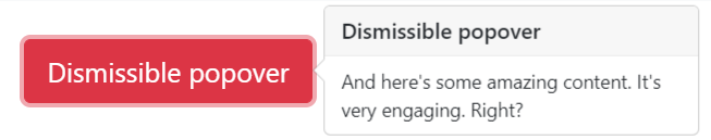
Here is an example with provided Bootstrap v4.3 code:
// @FindBy(css = "body") public static Popover popover;
@UI("body") public static Popover popover;
@Test
public void isValidationTests() {
popover.getPopover(locator);
popover.popoverButton.is()
.displayed()
.enabled()
.core()
.attr("data-toggle", "popover")
.attr("data-content", popoverBody)
.attr("data-original-title", popoverHeader)
.text(is(buttonText));
popover.container
.is()
.enabled()
.core()
.hasClass("popover fade bs-popover-right show")
.attr("role", "tooltip")
.attr("x-placement", "right");
popover.body
.is()
.enabled()
.core()
.hasClass("popover-body")
.text(is(popoverBody));
popover.header
.is()
.core()
.hasClass("popover-header")
.text(is(popoverHeader.toUpperCase()));
popover.popoverButton.click();
}
@Test()
public void clickableTests() {
popover.getPopover(locator);
popover.popoverButton.click();
popover.popoverButton
.is()
.core()
.attr("aria-describedby", containsString("popover"));
popover.container
.is()
.enabled();
popover.container.click();
popover.popoverButton
.is()
.core()
.attr("aria-describedby", "");
assertFalse(popover.container.isDisplayed());
}
<a tabindex="0" class="btn btn-lg btn-danger btn-block mb-3" role="button"
id="popover-dismissible" data-toggle="popover" data-trigger="focus"
title="Dismissible popover"
data-content="And here's some amazing content. It's very engaging. Right?">Dismissible
popover</a>
<div class="popover fade bs-popover-right" role="tooltip" id="popover278744"
style="will-change: transform; position: absolute; transform: translate3d(542px, 39355px, 0px); top: 0px; left: 0px;"
x-placement="right">
<div class="arrow" style="top: 35px;"></div>
<h3 class="popover-header">Dismissible popover</h3>
<div class="popover-body">And here's some amazing content. It's very engaging. Right?</div>
</div>
| Method | Description | Return Type |
|---|---|---|
| assertThat() | Assert action | TextAssert |
| click() | Get button text | void |
| disabled() | assert is disabled | TextAssert |
| displayed() | assert is displayed | TextAssert |
| enabled() | assert is enabled | TextAssert |
| get() | Select button by index | UIElement |
| getText() | Get button text | String |
| highlight() | Get button text | void |
| is() | Assert action | TextAssert |
| unhighlight() | Get button text | void |
Popover group is represented by Section class in Java:
Inner elements of input group can be represented by following classes:
Disabled elements popover

Here is an example with provided Bootstrap v4.3 code:
// @FindBy(css = "body") public static Popover popover;
@UI("body") public static Popover popover;
@Test
public void isValidationTests() {
popover.getPopover(locator);
popover.popoverButton.is()
.displayed()
.enabled()
.core()
.attr("data-toggle", "popover")
.attr("data-content", popoverBody)
.attr("data-original-title", popoverHeader)
.text(is(buttonText));
popover.container
.is()
.enabled()
.core()
.hasClass("popover fade bs-popover-right show")
.attr("role", "tooltip")
.attr("x-placement", "right");
popover.body
.is()
.enabled()
.core()
.hasClass("popover-body")
.text(is(popoverBody));
popover.header
.is()
.core()
.hasClass("popover-header")
.text(is(popoverHeader.toUpperCase()));
popover.popoverButton.click();
}
@Test()
public void clickableTests() {
popover.getPopover(locator);
popover.popoverButton.click();
popover.popoverButton
.is()
.core()
.attr("aria-describedby", containsString("popover"));
popover.container
.is()
.enabled();
popover.container.click();
popover.popoverButton
.is()
.core()
.attr("aria-describedby", "");
assertFalse(popover.container.isDisplayed());
}
<span class="d-inline-block mb-3" style="width:100%;" data-toggle="popover"
id="popover-disabled" data-content="Disabled popover">
<button class="btn btn-primary btn-block" style="pointer-events: none;" type="button"
disabled>Disabled button</button>
</span>
<div class="popover fade show bs-popover-right" role="tooltip" id="popover180279" x-placement="right"
style="will-change: transform; position: absolute; transform: translate3d(542px, 39442px, 0px); top: 0px; left: 0px;">
<div class="arrow" style="top: 7px;"></div>
<h3 class="popover-header"></h3>
<div class="popover-body">Disabled popover</div>
</div>
| Method | Description | Return Type |
|---|---|---|
| assertThat() | Assert action | TextAssert |
| click() | Get button text | void |
| disabled() | assert is disabled | TextAssert |
| displayed() | assert is displayed | TextAssert |
| enabled() | assert is enabled | TextAssert |
| get() | Select button by index | UIElement |
| getText() | Get button text | String |
| highlight() | Get button text | void |
| is() | Assert action | TextAssert |
| unhighlight() | Get button text | void |
Popover group is represented by Section class in Java:
Inner elements of input group can be represented by following classes:
3.3.6 List group
List groups are a flexible and powerful component for displaying a series of content. Modify and extend them to support just about any content within.
Basic Example
List group basic example - an unordered list with list items and the proper classes.
List Group is located in the following classes:
- Java: com.epam.jdi.light.ui.bootstrap.elements.complex.ListGroup
Here is an example with provided Bootstrap v4.3 code:
@UI("#list-group-basic-example") public static ListGroupBasicExample listGroupBasicExample;
// @FindBy(css = "#list-group-basic-example") public static ListGroupBasicExample listGroupBasicExample;
public class ListGroupBasicExample extends Section {
@UI("li") public ListGroup listGroup;
}
public void listGroupIsValidationTest() {
listGroupBasicExample.listGroup.is()
.size(5);
}
@Test(dataProvider = "listData")
public void listGroupTests(int num, String text) {
listGroupBasicExample.listGroup.get(num).is()
.text(is(text))
.css("font-size", is("14px"));
}
<ul class="list-group mb-3" id="list-group-basic-example">
<li class="list-group-item">Cras justo odio</li>
<li class="list-group-item">Dapibus ac facilisis in</li>
<li class="list-group-item">Morbi leo risus</li>
<li class="list-group-item">Porta ac consectetur ac</li>
<li class="list-group-item">Vestibulum at eros</li>
</ul>
| Method | Description | Return Type |
|---|---|---|
| assertThat() | Assert action | TextAssert |
| get() | Select button by index | action |
| getText() | Get button text | String |
| is() | Assert action | TextAssert |
Button group is represented by Section class in Java:
Active Items
List Group is located in the following classes:
- Java: com.epam.jdi.light.ui.bootstrap.elements.complex.ListGroup
Here is an example with provided Bootstrap v4.3 code:
@UI("#list-group-active-items") public static ListGroupActiveItems listGroupActiveItems;
// @FindBy(css = "#list-group-active-items") public static ListGroupActiveItems listGroupActiveItems;)
public class ListGroupActiveItems extends Section {
@UI("li") public ListGroup listGroup;
}
@Test(dataProvider = "listData")
public void listGroupTextTests(int num, String text) {
listGroupActiveItems.listGroup.get(num).is()
.text(text)
.css("font-size", is("14px"));
}
@Test
public void isValidationTests() {
listGroupActiveItems.listGroup.is()
.size(5);
listGroupActiveItems.is()
.displayed()
.enabled()
.core()
.hasClass("list-group");
listGroupActiveItems.listGroup.get(1).is()
.hasClass(listClass + " active");
}
<ul class="list-group mb-3" id="list-group-active-items">
<li class="list-group-item active">Cras justo odio</li>
<li class="list-group-item">Dapibus ac facilisis in</li>
<li class="list-group-item">Morbi leo risus</li>
<li class="list-group-item">Porta ac consectetur ac</li>
<li class="list-group-item">Vestibulum at eros</li>
</ul>
| Method | Description | Return Type |
|---|---|---|
| assertThat() | Assert action | TextAssert |
| get() | Select button by index | action |
| getText() | Get button text | String |
| is() | Assert action | TextAssert |
Button group is represented by Section class in Java:
Disabled Items
List Group is located in the following classes:
- Java: com.epam.jdi.light.ui.bootstrap.elements.complex.ListGroup
Here is an example with provided Bootstrap v4.3 code:
@UI("#disabled-items") public static ListGroupDisabledItems listGroupDisabledItems;
// @FindBy(css = "#disabled-items") public static ListGroupDisabledItems listGroupDisabledItems;
public class ListGroupDisabledItems extends Section {
@UI("li") public ListGroup listGroup;
}
@Test
public void isValidationTests() {
listGroupDisabledItems.listGroup.is()
.size(5);
listGroupDisabledItems.is()
.displayed()
.enabled()
.core()
.hasClass("list-group");
listGroupDisabledItems.listGroup.get(1).is()
.hasClass(listClass + " disabled")
.attr("aria-disabled", "true");
}
@Test(dataProvider = "listData")
public void listGroupTextTests(int num, String text) {
listGroupDisabledItems.listGroup.get(num).is()
.text(text)
.css("font-size", is("14px"));
}
<ul class="list-group mb-3" id="disabled-items">
<li class="list-group-item disabled" aria-disabled="true">Cras justo odio</li>
<li class="list-group-item">Dapibus ac facilisis in</li>
<li class="list-group-item">Morbi leo risus</li>
<li class="list-group-item">Porta ac consectetur ac</li>
<li class="list-group-item">Vestibulum at eros</li>
</ul>
| Method | Description | Return Type |
|---|---|---|
| assertThat() | Assert action | TextAssert |
| get() | Select button by index | action |
| getText() | Get button text | String |
| is() | Assert action | TextAssert |
Button group is represented by Section class in Java:
Links
List Group is located in the following classes:
- Java: com.epam.jdi.light.ui.bootstrap.elements.complex.ListGroup
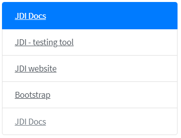
Here is an example with provided Bootstrap v4.3 code:
@UI("#list-group-links") public static ListGroupLinks listGroupLinks;
// @FindBy(css = "#list-group-links") public static ListGroupLinks listGroupLinks;
public class ListGroupLinks extends Section {
@UI("a") public ListGroup listGroup;
}
@Test(dataProvider = "clickValidate")
public void linkClickableTests(int index, String pageTitle) {
listGroupLinks.listGroup.get(index).highlight();
listGroupLinks.listGroup.get(index).click();
newWindowTitleCheck(pageTitle);
listGroupLinks.listGroup.get(index).unhighlight();
}
@Test
public void isValidationTests() {
listGroupLinks.listGroup.is()
.size(5);
listGroupLinks.is()
.displayed()
.enabled()
.core()
.hasClass("list-group");
listGroupLinks.listGroup.get(1).is()
.hasClass(listClass + " active");
listGroupLinks.listGroup.get(5).is()
.hasClass(listClass + " disabled");
assertFalse(listGroupLinks.listGroup.get(5).isClickable());
}
<div class="list-group mb-3" id="list-group-links">
<a href="https://github.com/jdi-docs"
class="list-group-item list-group-item-action active" target="_blank">
JDI Docs
</a>
<a href="https://github.com/jdi-testing" class="list-group-item list-group-item-action"
target="_blank">JDI - testing tool</a>
<a href="https://jdi-testing.github.io/jdi-light/index.html"
class="list-group-item list-group-item-action" target="_blank">JDI website</a>
<a href="https://getbootstrap.com/docs/4.3/components/list-group/#links-and-buttons"
class="list-group-item list-group-item-action" target="_blank">Bootstrap</a>
<a href="https://github.com/jdi-docs"
class="list-group-item list-group-item-action disabled" tabindex="-1"
aria-disabled="true" target="_blank">JDI Docs</a>
</div>
| Method | Description | Return Type |
|---|---|---|
| assertThat() | Assert action | TextAssert |
| click() | Click the button | void |
| get() | Select button by index | action |
| getText() | Get button text | String |
| is() | Assert action | TextAssert |
Button group is represented by Section class in Java:
Buttons
List Group is located in the following classes:
- Java: com.epam.jdi.light.ui.bootstrap.elements.complex.ListGroup

Here is an example with provided Bootstrap v4.3 code:
@UI("#list-group-buttons") public static ListGroupButtons listGroupButtons;
// @FindBy(css = "#list-group-buttons") public static ListGroupButtons listGroupButtons;
public class ListGroupButtons extends Section {
@UI("button") public ListGroup listGroup;
}
@Test
public void isValidationTests() {
listGroupButtons.listGroup.is()
.size(5);
listGroupButtons.is()
.displayed()
.enabled()
.core()
.hasClass("list-group");
listGroupButtons.listGroup.get(1).is()
.hasClass(listClass + " active");
listGroupButtons.listGroup.get(5).is()
.disabled();
}
@Test(dataProvider = "clickValidate")
public void buttonClickableTests(int index, String text) {
listGroupButtons.listGroup.get(index).highlight();
listGroupButtons.listGroup.get(index).click();
validateAlert(is(text));
listGroupButtons.listGroup.get(index).unhighlight();
}
<div class="list-group mb-3" id="list-group-buttons">
<button type="button" class="list-group-item list-group-item-action active"
onclick="alert('Cras justo odio');">Cras justo odio
</button>
<button type="button" class="list-group-item list-group-item-action"
onclick="alert('Dapibus ac facilisis in');">Dapibus ac facilisis in
</button>
<button type="button" class="list-group-item list-group-item-action"
onclick="alert('Morbi leo risus');">Morbi leo risus
</button>
<button type="button" class="list-group-item list-group-item-action"
onclick="alert('Porta ac consectetur ac');">Porta ac consectetur ac
</button>
<button type="button" class="list-group-item list-group-item-action"
onclick="alert('Vestibulum at eros');" disabled>Vestibulum at eros
</button>
</div>
| Method | Description | Return Type |
|---|---|---|
| assertThat() | Assert action | TextAssert |
| click() | Click the button | void |
| get() | Select button by index | action |
| getText() | Get button text | String |
| is() | Assert action | TextAssert |
Button group is represented by Section class in Java:
Flush
List Group is located in the following classes:
- Java: com.epam.jdi.light.ui.bootstrap.elements.complex.ListGroup
Here is an example with provided Bootstrap v4.3 code:
@UI("#list-group-flush") public static ListGroupFlush listGroupFlush;
// @FindBy(css = "#list-group-flush") public static ListGroupFlush listGroupFlush;
public class ListGroupFlush extends Section {
@UI("li") public ListGroup listGroup;
}
@Test(dataProvider = "listData")
public void listGroupTests(int num, String text) {
listGroupFlush.listGroup.get(num).is()
.text(text)
.css("font-size", is("14px"));
}
@Test
public void initTests() {
listGroupFlush.listGroup.is().size(5);
listGroupFlush.is()
.displayed()
.enabled()
.core()
.hasClass("list-group list-group-flush");
}
<div class="html-left">
<ul class="list-group list-group-flush mb-3" id="list-group-flush">
<li class="list-group-item">Cras justo odio</li>
<li class="list-group-item">Dapibus ac facilisis in</li>
<li class="list-group-item">Morbi leo risus</li>
<li class="list-group-item">Porta ac consectetur ac</li>
<li class="list-group-item">Vestibulum at eros</li>
</ul>
</div>
| Method | Description | Return Type |
|---|---|---|
| assertThat() | Assert action | TextAssert |
| get() | Select button by index | action |
| getText() | Get button text | String |
| is() | Assert action | TextAssert |
Button group is represented by Section class in Java:
Horizontal
List Group is located in the following classes:
- Java: com.epam.jdi.light.ui.bootstrap.elements.complex.ListGroup
Here is an example with provided Bootstrap v4.3 code:
@UI("#list-group-horizontal") public static ListGroupHorizontal listGroupHorizontal;
// @FindBy(css = "#list-group-horizontal") public static ListGroupHorizontal listGroupHorizontal;
public class ListGroupHorizontal extends Section {
@UI("li") public ListGroup listGroup;
}
@Test
public void initTests() {
listGroupHorizontal.listGroup.is()
.size(3);
}
@Test(dataProvider = "listData")
public void listGroupTests(int num, String text) {
listGroupHorizontal.listGroup.get(num).is()
.text(text)
.css("font-size", is("14px"));
}
<ul class="list-group list-group-horizontal mb-3" id="list-group-horizontal">
<li class="list-group-item">Cras justo odio</li>
<li class="list-group-item">Dapibus ac facilisis in</li>
<li class="list-group-item">Morbi leo risus</li>
</ul>
| Method | Description | Return Type |
|---|---|---|
| assertThat() | Assert action | TextAssert |
| get() | Select button by index | action |
| getText() | Get button text | String |
| is() | Assert action | TextAssert |
Button group is represented by Section class in Java:
With Badges
List Group is located in the following classes:
- Java: com.epam.jdi.light.ui.bootstrap.elements.complex.ListGroup
Here is an example with provided Bootstrap v4.3 code:
@UI("#list-group-with-badges") public static ListGroupWithBadges listGroupWithBadges;
// @FindBy(css = "#list-group-with-badges") public static ListGroupWithBadges listGroupWithBadges;
public class ListGroupWithBadges extends Section {
@UI("li") public ListGroup listGroup;
@UI("li span") public ListGroup badge;
}
@Test
public void initTests() {
listGroupWithBadges.listGroup.is()
.size(3);
listGroupWithBadges.badge.is()
.size(3);
}
@Test(dataProvider = "listData")
public void listGroupTests(int num, String text) {
listGroupWithBadges.listGroup.get(num).is()
.text(containsString(text))
.css("font-size", is("14px"))
.hasClass("list-group-item d-flex justify-content-between align-items-center");
}
<ul class="list-group mb-3" id="list-group-with-badges">
<li class="list-group-item d-flex justify-content-between align-items-center">
Cras justo odio
<span class="badge badge-primary badge-pill">14</span>
</li>
<li class="list-group-item d-flex justify-content-between align-items-center">
Dapibus ac facilisis in
<span class="badge badge-primary badge-pill">2</span>
</li>
<li class="list-group-item d-flex justify-content-between align-items-center">
Morbi leo risus
<span class="badge badge-primary badge-pill">1</span>
</li>
</ul>
| Method | Description | Return Type |
|---|---|---|
| assertThat() | Assert action | TextAssert |
| get() | Select button by index | action |
| getText() | Get button text | String |
| is() | Assert action | TextAssert |
Button group is represented by Section class in Java:
Custom Content
List Group is located in the following classes:
- Java: com.epam.jdi.light.ui.bootstrap.elements.complex.ListGroup
Here is an example with provided Bootstrap v4.3 code:
@UI("#list-group-custom-content") public static ListGroupCustomContent listGroupCustomContent;
// @FindBy(css = "#list-group-custom-content") public static ListGroupCustomContent listGroupCustomContent;
public class ListGroupCustomContent extends Section {
@UI("a") public ListGroup listGroup;
@UI("a div h5") public ListGroup header;
@UI("a div small") public ListGroup dateText;
@UI("a p") public ListGroup mainText;
@UI("small.footer") public ListGroup footer;
@UI("a div") public ListGroup container;
}
@Test
public void isValidationTests() {
listGroupCustomContent.listGroup.is()
.size(3);
listGroupCustomContent.container.is()
.size(3);
}
@Test(dataProvider = "clickValidate")
public void linkClickableTests(int index, String pageTitle) {
listGroupCustomContent.listGroup.get(index).highlight();
listGroupCustomContent.listGroup.get(index).click();
newWindowTitleCheck(pageTitle);
listGroupCustomContent.listGroup.get(index).unhighlight();
}
<div class="list-group mb-3" id="list-group-custom-content">
<a href="https://jdi-testing.github.io/jdi-light/index.html"
class="list-group-item list-group-item-action active" target="_blank">
<div class="d-flex w-100 justify-content-between">
<h5 class="mb-1">List group item heading one</h5>
<small>3 days ago</small>
</div>
<p class="mb-1">Some simple text for first section of custom list group.</p>
<small class="footer">JDI website</small>
</a>
<a href="https://github.com/jdi-testing" class="list-group-item list-group-item-action"
target="_blank">
<div class="d-flex w-100 justify-content-between">
<h5 class="mb-1">List group item heading two</h5>
<small class="text-muted">3 days ago</small>
</div>
<p class="mb-1">Some simple text for second section of custom list group.</p>
<small class="text-muted footer">JDI - testing tool</small>
</a>
<a href="https://github.com/jdi-docs" class="list-group-item list-group-item-action"
target="_blank">
<div class="d-flex w-100 justify-content-between">
<h5 class="mb-1">List group item heading three</h5>
<small class="text-muted">3 days ago</small>
</div>
<p class="mb-1">Some simple text for third section of custom list group.</p>
<small class="text-muted footer">JDI Docs</small>
</a>
</div>
| Method | Description | Return Type |
|---|---|---|
| assertThat() | Assert action | TextAssert |
| click() | Click the button | void |
| get() | Select button by index | action |
| getText() | Get button text | String |
| is() | Assert action | TextAssert |
| select() | Select button | void |
| selected() | Radio button is selected | TextAssert |
Button group is represented by Section class in Java:
3.3.7 Toast
Toast - Toasts are lightweight notifications designed to mimic the push notifications.
Options for toasts:
- Animation
- Autohide
- Delay
Events for toasts:
- show.bs.toast - this event fires immediately when the show instance method is called.
- shown.bs.toast - this event is fired when the toast has been made visible to the user
- hide.bs.toast - this event is fired immediately when the hide instance method has been called.
- hidden.bs.toast - this event is fired when the toast has finished being hidden from the user
Here is an example with provided Bootstrap v4.3 code:
//@FindBy(id="simpleToast")
@UI("#simpleToast") public static Toast simpleToast;
@Test
public void simpleToastValidationTest() {
simpleToastButton.click();
simpleToast.is().displayed();
simpleToast.headerText.is().text(toastHeaderText);
simpleToast.body.is().text(toastBodyText);
}
<div class="toast" role="alert" data-animation="false" aria-live="assertive"
aria-atomic="true" id="simpleToast">
<div class="toast-header">
<img src="images/range-circle.png" class="rounded mr-2" alt="...">
<strong class="mr-auto">Bootstrap</strong>
<small class="text-muted">11 mins ago</small>
<button type="button" class="ml-2 mb-1 close" data-dismiss="toast"
aria-label="Close">
<span aria-hidden="true">×</span>
</button>
</div>
<div class="toast-body">
Hello, world! This is a toast message.
</div>
</div>
Here is an example with provided Bootstrap v4.3 code:
//@FindBy(id="translucentToast")
@UI("#translucentToast") public static Toast translucentToast;
@Test
public void translucentToastValidationTest() {
translucentToastButton.click();
translucentToast.is().displayed();
translucentToast.headerText.is().text(toastHeaderText);
translucentToast.body.is().text(toastBodyText);
}
<div aria-live="polite" aria-atomic="true"
style="min-height: 200px;background-color: grey;">
<div class="toast" role="alert" data-animation="false" aria-live="assertive"
aria-atomic="true" id="translucentToast">
<div class="toast-header">
<img src="images/range-circle.png" class="rounded mr-2" alt="...">
<strong class="mr-auto">Bootstrap</strong>
<small class="text-muted">11 mins ago</small>
<button type="button" class="ml-2 mb-1 close" data-dismiss="toast"
aria-label="Close">
<span aria-hidden="true">×</span>
</button>
</div>
<div class="toast-body">
Hello, world! This is a toast message.
</div>
</div>
</div>
When you have multiple toasts, we default to vertically stacking them in a readable manner
Here is an example with provided Bootstrap v4.3 code:
//@FindBy(id="firstMultipleToast")
@UI("#firstMultipleToast") public static Toast firstStackToast;
//@FindBy(id="secondMultipleToast")
@UI("#secondMultipleToast") public static Toast secondStackToast;
@Test
public void stackOfToastsValidationTest() {
stackOfToastsButton.click();
firstStackToast.is().displayed();
secondStackToast.is().displayed();
firstStackToast.headerText.is().text(toastHeaderText);
firstStackToast.body.is().text(stackToastBodyText);
secondStackToast.headerText.is().text(toastHeaderText);
secondStackToast.body.is().text(secondStackToastBodyText);
}
<div aria-live="polite" aria-atomic="true"
style="min-height: 200px;background-color: grey;">
<div class="toast several" role="alert" aria-live="assertive" id="firstMultipleToast"
aria-atomic="true">
<div class="toast-header">
<img src="images/range-circle.png" class="rounded mr-2" alt="...">
<strong class="mr-auto">Bootstrap</strong>
<small class="text-muted">just now</small>
<button type="button" class="ml-2 mb-1 close" data-dismiss="toast"
aria-label="Close">
<span aria-hidden="true">×</span>
</button>
</div>
<div class="toast-body">
See? Just like this.
</div>
</div>
<div class="toast several" role="alert" aria-live="assertive" id="secondMultipleToast"
aria-atomic="true">
<div class="toast-header">
<img src="images/range-circle.png" class="rounded mr-2" alt="...">
<strong class="mr-auto">Bootstrap</strong>
<small class="text-muted">2 seconds ago</small>
<button type="button" class="ml-2 mb-1 close" data-dismiss="toast"
aria-label="Close">
<span aria-hidden="true">×</span>
</button>
</div>
<div class="toast-body">
Heads up, toasts will stack automatically
</div>
</div>
</div>
Place toasts with custom CSS as you need them. The top right is often used for notifications, as is the top middle.
Example with top right align:
Here is an example with provided Bootstrap v4.3 code:
//@FindBy(id="toastRightTop")
@UI("#toastRightTop") public static Toast toastWithTopAlign;
@Test
public void toastWithTopAlignValidationTest() {
toastWithTopAlignButton.click();
toastWithTopAlign.is().displayed();
toastWithTopAlign.headerText.is().text(toastHeaderText);
toastWithTopAlign.body.is().text(toastBodyText);
toastWithTopAlign.closeButton.click();
toastWithTopAlign.base().waitSec(1);
toastWithTopAlign.is().hidden();
}
<div aria-live="polite" aria-atomic="true"
style="position: relative; min-height: 200px;background-color: grey;">
<div class="toast" id="toastRightTop" style="position: absolute; top: 0; right: 0;"
data-autohide="false">
<div class="toast-header">
<img src="images/range-circle.png" class="rounded mr-2" alt="...">
<strong class="mr-auto">Bootstrap</strong>
<small>11 mins ago</small>
<button type="button" class="ml-2 mb-1 close" data-dismiss="toast"
aria-label="Close">
<span aria-hidden="true">×</span>
</button>
</div>
<div class="toast-body">
Hello, world! This is a toast message.
</div>
</div>
</div>
Example with top right align stack of toasts:
Here is an example with provided Bootstrap v4.3 code:
//@FindBy(id="firstStackToast")
@UI("#firstStackToast") public static Toast firstTopAlignStackToast;
//@FindBy(id="secondStackToast")
@UI("#secondStackToast") public static Toast secondTopAlignStackToast;
@Test
public void stackOfTopAlignToastsValidationTest() {
stackOfToastsWithTopAlignButton.click();
firstTopAlignStackToast.headerText.is().text(toastHeaderText);
firstTopAlignStackToast.body.is().text(stackToastBodyText);
secondTopAlignStackToast.headerText.is().text(toastHeaderText);
secondTopAlignStackToast.body.is().text(secondStackToastBodyText);
firstTopAlignStackToast.is().displayed();
secondTopAlignStackToast.is().displayed();
}
<div aria-live="polite" aria-atomic="true"
style="position: relative; min-height: 200px; background-color: grey;">
<!-- Position it -->
<div style="position: absolute; top: 0; right: 0;">
<!-- Then put toasts within -->
<div class="toast severalWithPosition" role="alert" aria-live="assertive"
id="firstStackToast" aria-atomic="true">
<div class="toast-header">
<img src="images/range-circle.png" class="rounded mr-2" alt="...">
<strong class="mr-auto">Bootstrap</strong>
<small class="text-muted">just now</small>
<button type="button" class="ml-2 mb-1 close" data-dismiss="toast"
aria-label="Close">
<span aria-hidden="true">×</span>
</button>
</div>
<div class="toast-body">
See? Just like this.
</div>
</div>
<div class="toast severalWithPosition" role="alert" aria-live="assertive"
id="secondStackToast" aria-atomic="true">
<div class="toast-header">
<img src="images/range-circle.png" class="rounded mr-2" alt="...">
<strong class="mr-auto">Bootstrap</strong>
<small class="text-muted">2 seconds ago</small>
<button type="button" class="ml-2 mb-1 close" data-dismiss="toast"
aria-label="Close">
<span aria-hidden="true">×</span>
</button>
</div>
<div class="toast-body">
Heads up, toasts will stack automatically
</div>
</div>
</div>
</div>
Example with center align toast:
Here is an example with provided Bootstrap v4.3 code:
//@FindBy(id="toastCenterTop")
@UI("#toastCenterTop") public static Toast toastWithCenterAlign;
//@FindBy(id="toastRightTop")
@UI("#toastRightTop") public static Toast toastWithTopAlign;
@Test
public void toastWithCenterAlignValidationTest() {
toastWithCenterAlignButton.click();
toastWithCenterAlign.is().displayed();
toastWithCenterAlign.headerText.is().text(toastHeaderText);
toastWithCenterAlign.body.is().text(toastBodyText);
toastWithCenterAlign.closeButton.click();
toastWithCenterAlign.base().waitSec(1);
toastWithCenterAlign.is().hidden();
}
<div aria-live="polite" aria-atomic="true"
class="d-flex justify-content-center align-items-center"
style="min-height: 200px;background-color: grey;">
<!-- Then put toasts within -->
<div class="toast" role="alert" id="toastCenterTop" aria-live="assertive"
aria-atomic="true" data-delay="3000">
<div class="toast-header">
<img src="images/range-circle.png" class="rounded mr-2" alt="...">
<strong class="mr-auto">Bootstrap</strong>
<small>11 mins ago</small>
<button type="button" class="ml-2 mb-1 close" data-dismiss="toast"
aria-label="Close">
<span aria-hidden="true">×</span>
</button>
</div>
<div class="toast-body">
Hello, world! This is a toast message.
</div>
</div>
</div>
Available methods in Java JDI Light:
| Method | Description | Return Type |
|---|---|---|
| assertThat() | Assert action | TextAssert |
| close() | Close toast | void |
| getText() | Get toast text | String |
| getTitle() | Get toast title | String |
| is() | Assert action | TextAssert |
| isDisplayed() | Show\wait that toast element displayed on the screen | Boolean |
3.3.8 Pagination
Overview
Pagination is located in the following classes:
- Java: com.epam.jdi.light.ui.bootstrap.elements.complex.Pagination

Here is an example with provided Bootstrap v4.3 code:
// @FindBy(css = "#pagination-overview") public static PaginationOverview paginationOverview;
@UI("#pagination-overview") public static PaginationOverview paginationOverview;
public class PaginationOverview extends Section {
@UI("li") public Pagination paginationItems; // @FindBy(css = "li") public Pagination paginationItems;
}
@Test
public void isValidationTests() {
paginationOverview.paginationItems.is()
.size(5);
paginationOverview.is()
.core()
.hasClass("pagination");
}
@Test(dataProvider = "listData")
public void linkTextTests(int index, String linkText) {
paginationOverview.paginationItems.get(index).is()
.displayed()
.enabled()
.css("font-size", is("14px"))
.hasClass("page-item")
.text(is(linkText));
}
@Test(dataProvider = "listPageTitles")
public void linkClickableTests(int index, String pageTitle) {
paginationOverview.paginationItems.get(index).hover();
paginationOverview.paginationItems.get(index).highlight();
paginationOverview.paginationItems.get(index).click();
newWindowTitleCheck(pageTitle);
paginationOverview.paginationItems.get(index).unhighlight();
}
<nav aria-label="Page navigation example">
<ul class="pagination" id="pagination-overview">
<li class="page-item"><a class="page-link" href="https://github.com/jdi-docs"
target="_blank">Previous</a></li>
<li class="page-item"><a class="page-link" href="https://github.com/jdi-testing"
target="_blank">1</a></li>
<li class="page-item"><a class="page-link"
href="https://jdi-testing.github.io/jdi-light/index.html"
target="_blank">2</a></li>
<li class="page-item"><a class="page-link" href="https://getbootstrap.com"
target="_blank">3</a></li>
<li class="page-item"><a class="page-link"
href="https://jdi-docs.github.io/jdi-light/"
target="_blank">Next</a></li>
</ul>
</nav>
| Method | Description | Return Type |
|---|---|---|
| assertThat() | Assert action | TextAssert |
| click() | Click the element | void |
| get() | Select button by index | UIElement |
| getText() | Get button text | String |
| highlight() | Highlight element | void |
| hover() | Hover on the element | void |
| is() | Assert action | TextAssert |
| unhighlight() | Unhighlight element | void |
Button group is represented by Section class in Java:
Working with icons
Pagination is located in the following classes:
- Java: com.epam.jdi.light.ui.bootstrap.elements.complex.Pagination
Here is an example with provided Bootstrap v4.3 code:
// @FindBy(css = "#pagination-icons") public static PaginationIcons paginationIcons;
@UI("#pagination-icons") public static PaginationIcons paginationIcons;
public class PaginationIcons extends Section {
@UI("li") public Pagination paginationItems; // @FindBy(css = "li") public Pagination paginationItems;
}
@Test
public void isValidationTests() {
paginationIcons.paginationItems.is()
.size(5);
paginationIcons.is()
.core()
.hasClass("pagination");
}
@Test(dataProvider = "listPageTitles")
public void linkClickableTests(int index, String pageTitle) {
paginationIcons.paginationItems.get(index).hover();
paginationIcons.paginationItems.get(index).highlight();
paginationIcons.paginationItems.get(index).click();
newWindowTitleCheck(pageTitle);
paginationIcons.paginationItems.get(index).unhighlight();
}
<nav aria-label="Page navigation example">
<ul class="pagination" id="pagination-icons">
<li class="page-item">
<a class="page-link" href="https://github.com/jdi-docs" target="_blank"
aria-label="Previous">
<span aria-hidden="true">«</span>
</a>
</li>
<li class="page-item"><a class="page-link" href="https://github.com/jdi-testing"
target="_blank">1</a></li>
<li class="page-item"><a class="page-link"
href="https://jdi-testing.github.io/jdi-light/index.html"
target="_blank">2</a></li>
<li class="page-item"><a class="page-link" href="https://getbootstrap.com"
target="_blank">3</a></li>
<li class="page-item">
<a class="page-link" href="https://jdi-docs.github.io/jdi-light/"
target="_blank" aria-label="Next">
<span aria-hidden="true">»</span>
</a>
</li>
</ul>
</nav>
| Method | Description | Return Type |
|---|---|---|
| assertThat() | Assert action | TextAssert |
| click() | Click the element | void |
| get() | Select button by index | UIElement |
| getText() | Get button text | String |
| highlight() | Highlight element | void |
| hover() | Hover on the element | void |
| is() | Assert action | TextAssert |
| unhighlight() | Unhighlight element | void |
Button group is represented by Section class in Java:
Disabled and active states
Pagination disabled and active states
Pagination is located in the following classes:
- Java: com.epam.jdi.light.ui.bootstrap.elements.complex.Pagination
Here is an example with provided Bootstrap v4.3 code:
// @FindBy(css = "#pagination-states") public static PaginationStates paginationStates;
@UI("#pagination-states") public static PaginationStates paginationStates;
public class PaginationStates extends Section {
@UI("li") public Pagination paginationItems; // @FindBy(css = "li") public Pagination paginationItems;
}
@Test
public void isValidationTests() {
paginationStates.paginationItems.is()
.size(5);
paginationStates.is()
.core()
.hasClass("pagination");
paginationStates.paginationItems.get(1).is()
.core()
.hasClass("disabled");
paginationStates.paginationItems.get(3).is()
.core()
.hasClass("active");
}
@Test(dataProvider = "listPageTitles")
public void linkClickableTests(int index, String pageTitle) {
paginationStates.paginationItems.get(index).hover();
paginationStates.paginationItems.get(index).highlight();
paginationStates.paginationItems.get(index).click();
newWindowTitleCheck(pageTitle);
paginationStates.paginationItems.get(index).unhighlight();
}
<nav aria-label="disabled-and-active-states">
<ul class="pagination" id="pagination-states">
<li class="page-item disabled">
<a class="page-link" href="https://github.com/jdi-docs" target="_blank"
tabindex="-1" aria-disabled="true">Previous</a>
</li>
<li class="page-item"><a class="page-link" href="https://github.com/jdi-testing"
target="_blank">1</a></li>
<li class="page-item active" aria-current="page">
<a class="page-link" href="https://jdi-testing.github.io/jdi-light/index.html"
target="_blank">2 <span class="sr-only">(current)</span></a>
</li>
<li class="page-item"><a class="page-link" href="https://getbootstrap.com"
target="_blank">3</a></li>
<li class="page-item">
<a class="page-link" href="https://jdi-docs.github.io/jdi-light/"
target="_blank">Next</a>
</li>
</ul>
</nav>
| Method | Description | Return Type |
|---|---|---|
| assertThat() | Assert action | TextAssert |
| click() | Click the element | void |
| get() | Select button by index | UIElement |
| getText() | Get button text | String |
| highlight() | Highlight element | void |
| hover() | Hover on the element | void |
| is() | Assert action | TextAssert |
| unhighlight() | Unhighlight element | void |
Button group is represented by Section class in Java:
Sizing
Pagination is located in the following classes:
- Java: com.epam.jdi.light.ui.bootstrap.elements.complex.Pagination
Here is an example with provided Bootstrap v4.3 code:
// @FindBy(css = "#pagination-big") public static PaginationSizeBig paginationSizeBig;
// @FindBy(css = "#pagination-small") public static PaginationSizeSmall paginationSizeSmall;
@UI("#pagination-big") public static PaginationSizeBig paginationSizeBig;
@UI("#pagination-small") public static PaginationSizeSmall paginationSizeSmall;
public class PaginationSizeBig extends Section {
@UI("li") public Pagination paginationItems; // @FindBy(css = "li") public Pagination paginationItems;
@UI(".page-link") public Pagination paginationItemsText; // @FindBy(css = ".page-link") public Pagination paginationItemsText;
}
public class PaginationSizeSmall extends Section {
@UI("li") public Pagination paginationItems; // @FindBy(css = "li") public Pagination paginationItems;
@UI(".page-link") public Pagination paginationItemsText; // @FindBy(css = ".page-link") public Pagination paginationItemsText;
}
@Test
public void isValidationTests() {
paginationSizeBig.paginationItems.is()
.size(3);
paginationSizeBig.is()
.core()
.hasClass("pagination pagination-lg");
paginationSizeSmall.paginationItems.is()
.size(3);
paginationSizeSmall.is()
.core()
.hasClass("pagination pagination-sm");
}
@Test(dataProvider = "listData")
public void linkTextTests(int index, String linkText) {
paginationSizeBig.paginationItemsText.get(index).is()
.core()
.css("font-size", is("20px"));
paginationSizeSmall.paginationItemsText.get(index).is()
.core()
.css("font-size", is("14px"));
}
<nav aria-label="sizing-big">
<ul class="pagination pagination-lg" id="pagination-big">
<li class="page-item active" aria-current="page">
<span class="page-link">1<span class="sr-only">(current)</span></span>
</li>
<li class="page-item"><a class="page-link"
href="https://jdi-testing.github.io/jdi-light/index.html"
target="_blank">2</a></li>
<li class="page-item"><a class="page-link" href="https://getbootstrap.com"
target="_blank">3</a></li>
</ul>
</nav>
<nav aria-label="sizing-small">
<ul class="pagination pagination-sm" id="pagination-small">
<li class="page-item active" aria-current="page">
<span class="page-link">1<span class="sr-only">(current)</span></span>
</li>
<li class="page-item"><a class="page-link"
href="https://jdi-testing.github.io/jdi-light/index.html"
target="_blank">2</a></li>
<li class="page-item"><a class="page-link" href="https://getbootstrap.com"
target="_blank">3</a></li>
</ul>
</nav>
| Method | Description | Return Type |
|---|---|---|
| assertThat() | Assert action | TextAssert |
| click() | Click the element | void |
| get() | Select button by index | UIElement |
| getText() | Get button text | String |
| highlight() | Highlight element | void |
| hover() | Hover on the element | void |
| is() | Assert action | TextAssert |
| unhighlight() | Unhighlight element | void |
Button group is represented by Section class in Java:
Alignment
Pagination is located in the following classes:
- Java: com.epam.jdi.light.ui.bootstrap.elements.complex.Pagination
Here is an example with provided Bootstrap v4.3 code:
// @FindBy(css = "#pagination-center") public static PaginationAlignCenter paginationAlignCenter;
// @FindBy(css = "#pagination-end") public static PaginationAlignEnd paginationAlignEnd;
@UI("#pagination-center") public static PaginationAlignCenter paginationAlignCenter;
@UI("#pagination-end") public static PaginationAlignEnd paginationAlignEnd;
public class PaginationAlignCenter extends Section {
@UI("li") public Pagination paginationItems; // @FindBy(css = "li") public Pagination paginationItems;
}
public class PaginationAlignEnd extends Section {
@UI("li") public Pagination paginationItems; // @FindBy(css = "li") public Pagination paginationItems;
}
@Test
public void isValidationTests() {
paginationAlignCenter.paginationItems.is()
.size(5);
paginationAlignCenter.is()
.core()
.hasClass("pagination justify-content-center");
paginationAlignCenter.paginationItems.get(1).is()
.core()
.hasClass("disabled");
paginationAlignEnd.paginationItems.is()
.size(5);
paginationAlignEnd.is()
.core()
.hasClass("pagination justify-content-end");
paginationAlignEnd.paginationItems.get(1).is()
.core()
.hasClass("disabled");
}
@Test(dataProvider = "listPageTitles")
public void linkClickableCenterTests(int index, String pageTitle) {
paginationAlignCenter.paginationItems.get(index).hover();
paginationAlignCenter.paginationItems.get(index).highlight();
paginationAlignCenter.paginationItems.get(index).click();
newWindowTitleCheck(pageTitle);
paginationAlignCenter.paginationItems.get(index).unhighlight();
}
<nav aria-label="Page navigation example">
<ul class="pagination justify-content-center" id="pagination-center">
<li class="page-item disabled">
<a class="page-link" href="https://github.com/jdi-docs" target="_blank"
tabindex="-1" aria-disabled="true">Previous</a>
</li>
<li class="page-item"><a class="page-link" href="https://github.com/jdi-testing"
target="_blank">1</a></li>
<li class="page-item"><a class="page-link"
href="https://jdi-testing.github.io/jdi-light/index.html"
target="_blank">2</a></li>
<li class="page-item"><a class="page-link" href="https://getbootstrap.com"
target="_blank">3</a></li>
<li class="page-item">
<a class="page-link" href="https://jdi-docs.github.io/jdi-light/"
target="_blank">Next</a>
</li>
</ul>
</nav>
<nav aria-label="Page navigation example">
<ul class="pagination justify-content-end" id="pagination-end">
<li class="page-item disabled">
<a class="page-link" href="https://github.com/jdi-docs" target="_blank"
tabindex="-1" aria-disabled="true">Previous</a>
</li>
<li class="page-item"><a class="page-link" href="https://github.com/jdi-testing"
target="_blank">1</a></li>
<li class="page-item"><a class="page-link"
href="https://jdi-testing.github.io/jdi-light/index.html"
target="_blank">2</a></li>
<li class="page-item"><a class="page-link" href="https://getbootstrap.com"
target="_blank">3</a></li>
<li class="page-item">
<a class="page-link" href="https://jdi-docs.github.io/jdi-light/"
target="_blank">Next</a>
</li>
</ul>
</nav>
| Method | Description | Return Type |
|---|---|---|
| assertThat() | Assert action | TextAssert |
| click() | Click the element | void |
| get() | Select button by index | UIElement |
| getText() | Get button text | String |
| highlight() | Highlight element | void |
| hover() | Hover on the element | void |
| is() | Assert action | TextAssert |
| unhighlight() | Unhighlight element | void |
Button group is represented by Section class in Java:
3.3.9 Input group
Basic Example
Input group – Place one add-on or button on either side of an input. You may also place one on both sides of an input.
//@FindBy(css = "#input-group-basic-example1")
@UI("#input-group-basic-example1") public static InputGroupInputWithText inputGroupBasicExample1;
public class InputGroupInputWithText extends Section{
@UI(".input-group-text") public Text text;
@UI(".form-control") public TextField input;
}
@Test(priority = 1)
public void setTextTestExample1() {
inputGroupBasicExample1.input.setText(textExample1);
inputGroupBasicExample1.input.is().text(is(textExample1));
}
1.Input group example - Input + left span
Here is an example with provided Bootstrap v4.3 code:
<div class="input-group mb-3" id="input-group-basic-example1">
<div class="input-group-prepend">
<span class="input-group-text" id="basic-addon">@</span>
</div>
<input type="text" class="form-control" placeholder="Username" aria-label="Username"
aria-describedby="basic-addon1">
</div>
//@FindBy(css = "#input-group-basic-example2")
@UI("#input-group-basic-example2") public static InputGroupInputWithText inputGroupBasicExample2;
public class InputGroupInputWithText extends Section{
@UI(".input-group-text") public Text text;
@UI(".form-control") public TextField input;
}
@Test(priority = 4)
public void checkAddonConsistTextTestExample2() {
inputGroupBasicExample2.text.is().text(containsString(partOfAddonExample2));
}
2.Input group example - Input + right span
Here is an example with provided Bootstrap v4.3 code:
<div class="input-group mb-3" id="input-group-basic-example2">
<input type="text" class="form-control" placeholder="Recipient's username"
aria-label="Recipient's username" aria-describedby="basic-addon2">
<div class="input-group-append">
<span class="input-group-text" id="basic-addon2">@example.com</span>
</div>
</div>
//@FindBy(css = "#input-group-basic-example3")
@UI("#input-group-basic-example3") public static InputGroupInputWithLabelAndText inputGroupBasicExample3;
public class InputGroupInputWithLabelAndText extends Section{
@UI(".input-group-text") public Text text;
@UI("#basic-url") public TextField input;
}
@Test(priority = 6)
public void checkLabelExample3() {
assertEquals(inputGroupBasicExample3.input.core().label().getText(), labelExample3);
}
3.Input group example - Input + label + left span
Here is an example with provided Bootstrap v4.3 code:
<div class="input-group mb-3" id="input-group-basic-example3">
<div class="input-group-prepend">
<span class="input-group-text" id="basic-addon3">https://example.com/users/</span>
</div>
<input type="text" class="form-control" id="basic-url" aria-describedby="basic-addon3">
</div>
//@FindBy(css = "#input-group-basic-example4")
@UI("#input-group-basic-example4") public static InputGroupInputWithTwoText inputGroupBasicExample4;
public class InputGroupInputWithTwoText extends Section{
@UI(".input-group-prepend .input-group-text") public Text text_pretend;
@UI(".input-group-append .input-group-text") public Text text_append;
@UI(".form-control") public TextField input;
}
@Test(priority = 7)
public void checkAddonsExample4() {
inputGroupBasicExample4.text_append.is().enabled();
inputGroupBasicExample4.text_append.is().text(is(addonAppendExample4));
inputGroupBasicExample4.text_pretend.is().enabled();
inputGroupBasicExample4.text_pretend.is().text(is(addonPretendExample4));
}
4.Input group example - Input + left and right span
Here is an example with provided Bootstrap v4.3 code:
<div class="input-group mb-3" id="input-group-basic-example4">
<div class="input-group-prepend">
<span class="input-group-text">$</span>
</div>
<input type="text" class="form-control" aria-label="Amount (to the nearest dollar)">
<div class="input-group-append">
<span class="input-group-text">.00</span>
</div>
</div>
//@FindBy(css = "#input-group-basic-example5")
@UI("#input-group-basic-example5") public static InputGroupTextareaWithText inputGroupBasicExample5;
public class InputGroupTextareaWithText extends Section{
@UI(".input-group-text") public Text text;
@UI(".form-control") public TextArea area;
}
@Test(priority = 9)
public void getLinesTestExample5() {
inputGroupBasicExample5.area.setLines(linesTextArea);
assertEquals(inputGroupBasicExample5.area.getLines(), asList(linesTextArea));
}
5.Input group example - Input + textarea
Here is an example with provided Bootstrap v4.3 code:
<div class="input-group" id="input-group-basic-example5">
<div class="input-group-prepend">
<span class="input-group-text">With textarea</span>
</div>
<textarea class="form-control" aria-label="With textarea"></textarea>
</div>
Input group are represented by Section class in Java:
Inner elements of input group can be represented by following classes:
Sizing
Sizing – Add the relative form sizing classes to the .input-group itself and contents within will automatically resize—no need for repeating the form control size classes on each element.
@UI("#input-group-default") public static InputGroupSizing inputGroupDefaultSizing;
@UI("#input-group-small") public static InputGroupSizing inputGroupSmallSizing;
@UI("#input-group-large") public static InputGroupSizing inputGroupLargeSizing;
//@FindBy(css = "#input-group-default")
//@FindBy(css = "#input-group-small")
//@FindBy(css = "#input-group-large")
@Test
public void getTextFromSizingTest() {
assertEquals(inputGroupDefaultSizing.input.getText(), text);
assertEquals(inputGroupSmallSizing.input.getText(), text);
assertEquals(inputGroupLargeSizing.input.getText(), text);
}
@Test
public void clearSizingTest() {
inputGroupDefaultSizing.input.clear();
assertEquals(inputGroupDefaultSizing.input.getText(), "");
inputGroupSmallSizing.input.clear();
assertEquals(inputGroupDefaultSizing.input.getText(), "");
inputGroupLargeSizing.input.clear();
assertEquals(inputGroupDefaultSizing.input.getText(), "");
}
Sizing on the individual input group elements isn’t supported.
Here is an example with provided Bootstrap v4.3 code:
<div class="input-group input-group-sm mb-3" id="input-group-small">
<div class="input-group-prepend">
<span class="input-group-text" id="inputGroup-sizing-sm">Small</span>
</div>
<input type="text" class="form-control" aria-label="Sizing example input"
aria-describedby="inputGroup-sizing-sm">
</div>
<div class="input-group mb-3" id="input-group-default">
<div class="input-group-prepend">
<span class="input-group-text" id="inputGroup-sizing-default">Default</span>
</div>
<input type="text" class="form-control" aria-label="Sizing example input"
aria-describedby="inputGroup-sizing-default">
</div>
<div class="input-group input-group-lg" id="input-group-large">
<div class="input-group-prepend">
<span class="input-group-text" id="inputGroup-sizing-lg">Large</span>
</div>
<input type="text" class="form-control" aria-label="Sizing example input"
aria-describedby="inputGroup-sizing-lg">
</div>
And here are methods available in Java:
| Method / Property | Description | Return Type |
|---|---|---|
| assertThat() | property that returns object for work with assertions | TextAssert |
| clear() | clears the text field | void |
| focus() | places cursor within the text field | void |
| getText() | returns text from the text field | String |
| getValue() | returns text from the text field | String |
| is() | property that returns object for work with assertions | TextAssert |
| setText(String value) | adds text to the field | void |
Wrapping
public static UIElement inputGroupWrap,inputGroupNowrap;//@FindBy(css = "#input-group-wrap")
@Test
public void checkWrapping() {
assertFalse(inputGroupWrap.hasClass("flex-nowrap"));
inputGroupWrap.assertThat().core().css("flex-wrap", "wrap");
}
@Test
public void checkNoWrapping() {
assertTrue(inputGroupNowrap.hasClass("flex-nowrap"));
inputGroupNowrap.assertThat().core().css("flex-wrap", "nowrap");
}
Wrapping – Input groups wrap by default via flex-wrap: wrap in order to accommodate custom form field validation within an input group. You may disable this with .flex-nowrap.
Here is an example with provided Bootstrap v4.3 code:
<div class="input-group flex-nowrap" id="input-group-nowrap">
<div class="input-group-prepend">
<span class="input-group-text" id="addon-wrapping1">@</span>
</div>
<input type="text" class="form-control" placeholder="Input group with nowrap"
aria-label="Username" aria-describedby="addon-wrapping">
</div>
Wrapping property can be checked by using following class:
- com.epam.jdi.light.elements.common.UIElement
Bootstrap test example wrapping
Checkboxes and radios
Checkboxes and radios – Place any checkbox or radio option within an input group’s addon instead of text.
Example with radio
@UI("#input-group-radio") public static InputGroupInputWithRadio inputGroupRadio;// @FindBy(css = "#input-group-radio")
public class InputGroupInputWithRadio extends Section{
@Css("[type=\"radio\"]") public RadioButtons radio;
@Css(".form-control") public TextField input;
}
@Test
public void getSizeRadioButtons() {
inputGroupRadio.radio.is().size(1);
}
@Test
public void inputTest() {
inputGroupRadio.input.input(new_text);
inputGroupRadio.input.assertThat().text(is(new_text));
}
Here is an example with provided Bootstrap v4.3 code:
<div class="input-group" id="input-group-radio">
<div class="input-group-prepend">
<div class="input-group-text">
<input type="radio" name="radio-button" id="radio-button"
aria-label="Radio button for following text input">
</div>
</div>
<input type="text" class="form-control" aria-label="Text input with radio button">
</div>
This input group example is represented by the following classes in Java:
Bootstrap test example with radio
@UI("#input-group-checkbox") public static InputGroupInputWithCheckBox inputGroupCheckBox;// @FindBy(css = "#input-group-checkbox")
public class InputGroupInputWithCheckBox extends Section{
@Css("[type=\"checkbox\"]") public Checkbox checkbox;
@Css(".form-control") public TextField input;
}
@Test
public void checkCheckboxTest() {
inputGroupCheckBox.checkbox.check();
inputGroupCheckBox.checkbox.isSelected();
}
@Test
public void inputTest() {
inputGroupRadio.input.input(new_text);
inputGroupRadio.input.assertThat().text(is(new_text));
}
Example with checkbox
Here is an example with provided Bootstrap v4.3 code:
<div class="input-group mb-3" id="input-group-checkbox">
<div class="input-group-prepend">
<div class="input-group-text">
<input type="checkbox" aria-label="Checkbox for following text input">
</div>
</div>
<input type="text" class="form-control" aria-label="Text input with checkbox">
</div>
This input group example is represented by the following classes in Java:
Bootstrap test example with checkbox
Multiple inputs
Multiple inputs – While multiple inputs are supported visually, validation styles are only available for input groups with a single input.
//FindBy(css = "#multiple-inputs"")
@UI("#multiple-inputs") public static MultipleInputs multipleInputs;
@Test
public void getTextTest() {
int index = 1;
String name = multipleInputs.getText(index);
assertEquals(name, inputData.get(index));
String surname = multipleInputs.getText("#mi-i-2");
assertEquals(surname, inputData.get(2));
String text = multipleInputs.getText();
assertEquals(text, inputData.get(1));
}
@Test
public void getTextAllTest() {
assertEquals(multipleInputs.getAllTexts(), inputDataList);
}
@Test
public void setValueTest() {
multipleInputs.clearAll();
String value = inputData.get(1);
multipleInputs.setValue(value);
multipleInputs.is().text(value, 1);
int index = 2;
String name = inputData.get(index);
multipleInputs.setValue(name, index);
multipleInputs.is().text(name, index);
String locator = "#mi-i-2";
String surname = inputData.get(2);
multipleInputs.clear(locator);
multipleInputs.setValue(surname, locator);
multipleInputs.is().text(surname, locator);
}
@Test
public void setAllValuesTest() {
multipleInputs.clearAll();
multipleInputs.setAllValues(inputDataList);
multipleInputs.is().texts(inputDataList);
}
Here is an example with provided Bootstrap v4.3 code:
<div class="input-group" id="multiple-inputs">
<div class="input-group-prepend">
<span class="input-group-text">First and last name</span>
</div>
<input type="text" aria-label="First name" class="form-control" id="mi-i-1">
<input type="text" aria-label="Last name" class="form-control" id="mi-i-2">
</div>
And here are methods available in Java:
| Method | Description | Return Type |
|---|---|---|
| assertThat() | Property that returns object for work with assertions | MultipleInputsAssert |
| clear() | Clear first input within element | void |
| clear(String locator) | Clear input within element with locator | void |
| clear(int index) | Clear input within element with index | void |
| clearAll() | Clear all inputs within element | void |
| focus() | Focus on first input within element | void |
| focus(String locator) | Focus on input within element with locator | void |
| focus(int index) | Focus on input within element with index | void |
| getAllText() | Return texts for all inputs within element | List<String> |
| getAllValue() | Return values for all inputs within element | List<String> |
| getText() | Return text for first input within element | String |
| getText(String locator) | Return text for input within element with locator | String |
| getText(int index) | Return text for input within element with index | String |
| getValue() | Return value for first input within element | String |
| getValue(String locator) | Return value for input within element with locator | String |
| getValue(int index) | Return value for input within element with index | String |
| input(String value) | Set text for first input within element | void |
| input(String value, String locator) | Set text for input within element with locator | void |
| input(String value, int index) | Set text for input within element with index | void |
| inputAll() | Set texts for all inputs within element | void |
| is() | Property that returns object for work with assertions | MultipleInputsAssert |
| placeholder() | Return placeholder from first input within element | String |
| placeholder(String locator) | Return placeholder from input within element with locator | String |
| placeholder(int index) | Return placeholder from input within element with index | String |
| placeholderAll() | Return placeholders for all inputs within element | List<String> |
| sendKeys(String value) | Send text to first input within element | void |
| sendKeys(String value, String locator) | Send text to input within element with locator | void |
| sendKeys(String value, int index) | Send text to input within element with index | void |
| sendKeysAll(List<String> values) | Send texts to all inputs within element | void |
| setAllValue(List<String> values) | Set values for all inputs within element | void |
| setValue(String value) | Set value for first input within element | void |
| setValue(String value, String locator) | Set value for input within element with locator | void |
| setValue(String value, int index) | Set value for input within element with index | void |
Bootstrap test example with multiple inputs
Multiple addons
Multiple addons are supported and can be mixed with checkbox and radio input versions.
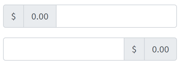
@UI("#multiple-addons-1") public static InputGroupMultipleAddonsUpper multipleAddonUpper; //@FindBy(css = "#multiple-addons-1")
@UI("#multiple-addons-2") public static InputGroupMultipleAddonsLower multipleAddonLower; //@FindBy(css = "#multiple-addons-2")
public class InputGroupMultipleAddonsUpper extends Section {
@UI("#left-sign") public Label firstLabel; //@FindBy(css = "#left-sign")
@UI("#left-nil") public Label secondLabel; //@FindBy(css = "#left-nil")
@UI(".form-control") public TextField textField; //@FindBy(css = ".form-control")
}
@Test(dataProvider = "InputGroupMultipleAddonsLabels")
public void assertTextFromValueTest(Label multipleAddonsLabel, String labelValue) {
multipleAddonsLabel.is().text(labelValue);
}
@Test(dataProvider = "InputGroupMultipleAddonsLabels")
public void isValidationTest(Label multipleAddonsLabel, String labelValue) {
multipleAddonsLabel.is()
.displayed()
.core()
.hasClass("input-group-text")
.text(labelValue);
}
@Test(dataProvider = "InputGroupMultipleAddonsTextFields")
public void inputTest(TextField textField) {
textField.input(text);
textField.assertThat().text(is(text));
}
@Test(dataProvider = "InputGroupMultipleAddonsTextFields")
public void textFieldTests(TextField textField) {
textField.setText(text);
textField.is().text(text);
textField.is().text(containsString(partOfText));
textField.clear();
textField.is().text(emptyText);
}
Here is an example with provided Bootstrap v4.3 code:
<div class="input-group mb-3" id="multiple-addons-1">
<div class="input-group-prepend">
<span class="input-group-text" id="left-sign">$</span>
<span class="input-group-text" id="left-nil">0.00</span>
</div>
<input type="text" class="form-control"
aria-label="Dollar amount (with dot and two decimal places)">
</div>
<div class="input-group mb-3" id="multiple-addons-2">
<input type="text" class="form-control"
aria-label="Dollar amount (with dot and two decimal places)">
<div class="input-group-append">
<span class="input-group-text" id="right-sign">$</span>
<span class="input-group-text" id="right-nil">0.00</span>
</div>
</div>
Multiple input is represented by Section class in Java:
Inner elements of multiple input can be represented by the following classes:
Bootstrap test example with multiple addons
Button addons
Button addons – Multiple buttons have no detailed information on Bootstrap website
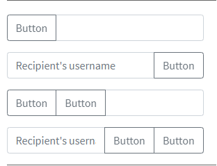
Here is an example with provided Bootstrap v4.3 code:
//@FindBy(css = "#input-group-button-addon4") public static ButtonAddons inputGroupButtonAddons4;
@UI("#input-group-button-addon1") public static ButtonAddons inputGroupButtonAddons1;
@UI("#input-group-button-addon2") public static ButtonAddons inputGroupButtonAddons2;
@UI("#input-group-button-addon3") public static ButtonAddons inputGroupButtonAddons3;
@UI("#input-group-button-addon4") public static ButtonAddons inputGroupButtonAddons4;
public class ButtonAddons extends Section {
@UI("button") public Button button;
@UI("input") public TextField input;
@UI("button") public ListGroup listButtons;
@UI("input") public TextField inputField;
}
@Test
public void checkButtonAddon2Test() {
inputGroupButtonAddons2.input.input(text);
inputGroupButtonAddons2.button.click();
inputGroupButtonAddons2.input.input(placeholder_text);
inputGroupButtonAddons2.input.assertThat().text(placeholder_text);
}
@Test
public void checkButtonAddon4Test() {
inputGroupButtonAddons4.inputField.input(text);
inputGroupButtonAddons4.listButtons.get(1).click();
inputGroupButtonAddons4.inputField.input(placeholder_text);
inputGroupButtonAddons4.listButtons.get(2).click();
inputGroupButtonAddons4.inputField.assertThat().text(placeholder_text);
}
<div class="input-group mb-3" id="input-group-button-addon1">
<div class="input-group-prepend">
<button class="btn btn-outline-secondary" type="button" id="button-addon1">Button
</button>
</div>
<input type="text" class="form-control" placeholder=""
aria-label="Example text with button addon" aria-describedby="button-addon1">
</div>
<div class="input-group mb-3" id="input-group-button-addon2">
<input type="text" class="form-control" placeholder="Recipient's username"
aria-label="Recipient's username" aria-describedby="button-addon2">
<div class="input-group-append">
<button class="btn btn-outline-secondary" type="button" id="button-addon2">Button
</button>
</div>
</div>
<div class="input-group mb-3" id="input-group-button-addon3">
<div class="input-group-prepend" id="button-addon3">
<button class="btn btn-outline-secondary" type="button">Button</button>
<button class="btn btn-outline-secondary" type="button">Button</button>
</div>
<input type="text" class="form-control" placeholder=""
aria-label="Example text with two button addons"
aria-describedby="button-addon3">
</div>
<div class="input-group" id="input-group-button-addon4">
<input type="text" class="form-control" placeholder="Recipient's username"
aria-label="Recipient's username with two button addons"
aria-describedby="button-addon4">
<div class="input-group-append" id="button-addon4">
<button class="btn btn-outline-secondary" type="button">Button</button>
<button class="btn btn-outline-secondary" type="button">Button</button>
</div>
</div>
And here are methods available in Java:
| Method | Description | Return Type |
|---|---|---|
| assertThat() | property that returns object for work with assertions | TextAssert |
| clear() | clears the text field | void |
| click() | click on button | void |
| displayed() | check item is displayed | TextAssert |
| enabled() | check item is enabled | TextAssert |
| expand() | expand dropdown menu | void |
| expanded() | check that dropdown is expanded | TextAssert |
| focus() | places cursor within the text field | void |
| getText() | returns text from the text field | String |
| getValue() | returns text from the text field | String |
| input(String value) | adds text to the field | void |
| is() | property that returns object for work with assertions | TextAssert |
| sendKeys(String value) | adds text to the field | void |
| setText(String value) | adds text to the field | void |
Input group are represented by Section class in Java:
Inner elements of input group can be represented by following classes:
Buttons with dropdowns
Buttons with dropdowns – Buttons with dropdowns have no detailed information on Bootstrap website
Here is an example with provided Bootstrap v4.3 code:
@UI("#button-with-dropdown") public static ButtonWithDropdown buttonWithDropdown;
// @FindBy(css = "#button-with-dropdown") public static ButtonWithDropdown buttonWithDropdown;
public class ButtonWithDropdown extends Section {
@UI("input") public TextField textInputArea;
@UI("button") public Button dropdownButton;
@JDropdown(expand = ".input-group-prepend",
value = ".dropdown-toggle",
list = ".dropdown-item")
public Dropdown dropdownMenu;
}
@Test
public void dropdownMenuTests() {
buttonWithDropdown.dropdownMenu.expand();
buttonWithDropdown.dropdownMenu.is().expanded();
buttonWithDropdown.dropdownMenu.is().size(4);
buttonWithDropdown.dropdownMenu.list().get(0).is().text(action);
}
@Test
public void textInputAreaTests() {
buttonWithDropdown.textInputArea.sendKeys(testText);
buttonWithDropdown.textInputArea.is().text(testText);
buttonWithDropdown.textInputArea.clear();
buttonWithDropdown.textInputArea.is().text("");
}
@Test
public void dropdownButtonTests() {
buttonWithDropdown.dropdownButton.is().displayed();
buttonWithDropdown.dropdownButton.is().enabled();
buttonWithDropdown.dropdownButton.is().text(dropdownButton);
}
<div class="input-group mb-3" id="button-with-dropdown">
<div class="input-group-prepend">
<button class="btn btn-outline-secondary dropdown-toggle" type="button"
data-toggle="dropdown" aria-haspopup="true" aria-expanded="false">Dropdown
</button>
<div class="dropdown-menu">
<a class="dropdown-item" href="#">Action</a>
<a class="dropdown-item" href="#">Another action</a>
<a class="dropdown-item" href="#">Something else here</a>
<div role="separator" class="dropdown-divider"></div>
<a class="dropdown-item" href="#">Separated link</a>
</div>
</div>
<input type="text" class="form-control" aria-label="Text input with dropdown button">
</div>
And here are methods available in Java:
| Method | Description | Return Type |
|---|---|---|
| assertThat() | property that returns object for work with assertions | TextAssert |
| clear() | clears the text field | void |
| click() | click on button | void |
| displayed() | check item is displayed | TextAssert |
| enabled() | check item is enabled | TextAssert |
| expand() | expand dropdown menu | void |
| expanded() | check that dropdown is expanded | TextAssert |
| focus() | places cursor within the text field | void |
| getText() | returns text from the text field | String |
| getValue() | returns text from the text field | String |
| is() | property that returns object for work with assertions | TextAssert |
| sendKeys(String value) | adds text to the field | void |
| setText(String value) | adds text to the field | void |
Input group are represented by Section class in Java:
Inner elements of input group can be represented by following classes:
Buttons with dropdowns test examples
Segmented buttons
Segmented buttons – Segmented buttons have no detailed information on Bootstrap website
Here is an example with provided Bootstrap v4.3 code:
@UI("#segmented-button") public static SegmentedButton segmentedButton;
// @FindBy(css = "#segmented-button") public static SegmentedButton segmentedButton;
public class SegmentedButton extends Section {
@UI("#Segmented-action-button") public Button actionButton;
@UI("input") public TextField textInputArea;
@JDropdown(expand = ".dropdown-toggle",
value = ".sr-only",
list = ".dropdown-item")
public Dropdown dropdownMenu;
}
@Test
public void textInputAreaTests() {
segmentedButton.textInputArea.is()
.displayed()
.enabled();
segmentedButton.textInputArea.sendKeys(testText);
segmentedButton.textInputArea.is().text(testText);
segmentedButton.textInputArea.clear();
segmentedButton.textInputArea.is().text("");
}
@Test
public void dropdownMenuTests() {
segmentedButton.dropdownMenu.expand();
segmentedButton.dropdownMenu.is().expanded();
segmentedButton.dropdownMenu.is().size(4);
segmentedButton.dropdownMenu.list().get(0).is().text(action);
segmentedButton.dropdownMenu.select(action);
newWindowTitleCheck();
}
@Test
public void actionButtonTests() {
segmentedButton.actionButton.is().displayed();
segmentedButton.actionButton.is().enabled();
segmentedButton.actionButton.is().text(action);
segmentedButton.actionButton.click();
validateAlert(is(actionButtonClickAlert));
}
<div class="input-group mb-3" id="segmented-button">
<div class="input-group-prepend">
<button type="button" class="btn btn-outline-secondary" id="Segmented-action-button"
onclick="alert('Action Button Alert');">Action
</button>
<button type="button"
class="btn btn-outline-secondary dropdown-toggle dropdown-toggle-split"
data-toggle="dropdown" aria-haspopup="true" aria-expanded="false">
<span class="sr-only">Toggle Dropdown</span>
</button>
<div class="dropdown-menu">
<a class="dropdown-item"
href="https://jdi-testing.github.io/jdi-light/index.html"
target="_blank">Action</a>
<a class="dropdown-item"
href="https://jdi-testing.github.io/jdi-light/index.html" target="_blank">Another
action</a>
<a class="dropdown-item"
href="https://jdi-testing.github.io/jdi-light/index.html" target="_blank">Something
else here</a>
<div role="separator" class="dropdown-divider"></div>
<a class="dropdown-item"
href="https://jdi-testing.github.io/jdi-light/index.html" target="_blank">Separated
link</a>
</div>
</div>
<input type="text" class="form-control"
aria-label="Text input with segmented dropdown button">
</div>
And here are methods available in Java:
| Method | Description | Return Type |
|---|---|---|
| assertThat() | property that returns object for work with assertions | TextAssert |
| clear() | clears the text field | void |
| click() | click on button | void |
| displayed() | check item is displayed | TextAssert |
| enabled() | check item is enabled | TextAssert |
| expand() | expand dropdown menu | void |
| expanded() | check that dropdown is expanded | TextAssert |
| focus() | places cursor within the text field | void |
| getText() | returns text from the text field | String |
| getValue() | returns text from the text field | String |
| is() | property that returns object for work with assertions | TextAssert |
| sendKeys(String value) | adds text to the field | void |
| setText(String value) | adds text to the field | void |
Input group are represented by Section class in Java:
Inner elements of input group can be represented by following classes:
Segmented buttons test examples
Custom select
Custom select – Input groups include support for custom selects and text field. Browser default versions of these are not supported.
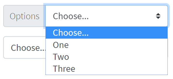
Here is an example with provided Bootstrap v4.3 code:
@UI("#custom-select-01") public static CustomSelect customSelect;
// @FindBy(css = "#custom-select-01") public static CustomSelect customSelect;
public class CustomSelect extends Section {
@UI(".input-group-prepend") public Text optionText;
@UI("#inputGroupSelect01") public Selector selector;
}
@Test
public void isValidationOptionsSectionTests() {
customSelect.optionText.is().text(optionText);
}
@Test
public void selectorByIndexTests() {
customSelect.selector.is().selected(selectChoose);
customSelect.selector.select(2);
customSelect.selector.is().selected(selectOne);
customSelect.selector.select(1);
customSelect.selector.is().selected(selectChoose);
}
@Test(priority = 1)
public void selectorByValueTests() {
customSelect.selector.select(selectOne);
customSelect.selector.is().selected(selectOne);
customSelect.selector.select(selectTwo);
customSelect.selector.is().selected(selectTwo);
}
@Test
public void selectorIsValidationTests() {
customSelect.selector.is().displayed()
.enabled();
customSelect.selector.is().size(4);
}
<div class="input-group mb-3" id="custom-select-01">
<div class="input-group-prepend">
<label class="input-group-text" for="inputGroupSelect01">Options</label>
</div>
<select class="custom-select" id="inputGroupSelect01">
<option selected>Choose...</option>
<option value="1">One</option>
<option value="2">Two</option>
<option value="3">Three</option>
</select>
</div>
<div class="input-group mb-3" id="custom-select-02">
<select class="custom-select" id="inputGroupSelect02">
<option selected>Choose...</option>
<option value="1">One</option>
<option value="2">Two</option>
<option value="3">Three</option>
</select>
<div class="input-group-append">
<label class="input-group-text" for="inputGroupSelect02">Options</label>
</div>
</div>
Custom select with button – Input groups include support for custom selects and button. Browser default versions of these are not supported.
Here is an example with provided Bootstrap v4.3 code:
@UI("#custom-select-button-01") public static CustomSelectWithButton customSelectWithButton;
// @FindBy(css = "#custom-select-button-01") public static CustomSelect customSelect;
public class CustomSelectWithButton extends Section {
@UI("#inputGroupSelect03") public Selector selector;
@UI("button") public Button button;
}
@Test
public void buttonTests() {
customSelectWithButton.button.is().displayed();
customSelectWithButton.button.is().enabled();
customSelectWithButton.button.is().text(buttonText);
customSelectWithButton.button.hover();
customSelectWithButton.button.click();
validateAlert(is(buttonClickAlert));
}
@Test
public void selectorByIndexTests() {
customSelectWithButton.selector.is().selected(selectChoose);
customSelectWithButton.selector.select(2);
customSelectWithButton.selector.is().selected(selectOne);
customSelectWithButton.selector.select(3);
customSelectWithButton.selector.is().selected(selectTwo);
}
@Test(priority = 1)
public void selectorByValueTests() {
customSelectWithButton.selector.select(selectTwo);
customSelectWithButton.selector.is().selected(selectTwo);
customSelectWithButton.selector.select(selectThree);
customSelectWithButton.selector.is().selected(selectThree);
}
@Test
public void selectorIsValidationTests() {
customSelectWithButton.selector.is().displayed()
.enabled();
customSelectWithButton.selector.is().size(4);
}
<div class="input-group mb-3" id="custom-select-button-01">
<div class="input-group-prepend">
<button class="btn btn-outline-secondary" type="button"
onclick="alert('Button clicked, thank you!');">Button
</button>
</div>
<select class="custom-select" id="inputGroupSelect03"
aria-label="Example select with button addon">
<option selected>Choose...</option>
<option value="1">One</option>
<option value="2">Two</option>
<option value="3">Three</option>
</select>
</div>
<div class="input-group mb-3" id="custom-select-button-02">
<select class="custom-select" id="inputGroupSelect04"
aria-label="Example select with button addon">
<option selected>Choose...</option>
<option value="1">One</option>
<option value="2">Two</option>
<option value="3">Three</option>
</select>
<div class="input-group-append">
<button class="btn btn-outline-secondary" type="button"
onclick="alert('Button clicked, thank you!');">Button
</button>
</div>
</div>
And here are methods available in Java:
| Method | Description | Return Type |
|---|---|---|
| assertThat() | property that returns object for work with assertions | TextAssert |
| clear() | clears the text field | void |
| click() | click on button | void |
| displayed() | check item is displayed | TextAssert |
| enabled() | check item is enabled | TextAssert |
| focus() | places cursor within the text field | void |
| getText() | returns text from the text field | String |
| getValue() | returns text from the text field | String |
| is() | property that returns object for work with assertions | TextAssert |
| select(int value) | choose item by index | void |
| selected | returns text from the selected item | TextAssert |
| sendKeys(String value) | adds text to the field | void |
| setText(String value) | adds text to the field | void |
Input group are represented by Section class in Java:
Inner elements of input group can be represented by following classes:
Custom select test examples
Custom select with button test examples
Custom file input
Custom file input – Input groups include support for custom selects and custom file inputs. Browser default versions of these are not supported.
public class InputGroupCustomUploadFile extends Section {
@UI("label[for='upload-file-c']") //@FindBy(css ="label[for='upload-file-c']")
public Label labelInputFile;
@UI("input#upload-file-c") //@FindBy(css ="input#upload-file-c")
public FileInput fileInput;
@UI("button") //@FindBy(css = "button")
public Button btnSubmit;
public void clickSubmitButton() {
btnSubmit.click();
}
}
public class InputGroupCustomFileInput extends Section {
@UI("label[for='file-input-c']") //@FindBy(css ="label[for='file-input-c']")
public Label labelInputFile;
@UI("input#file-input-c") //@FindBy(css ="input#file-input-c")
public FileInput fileInput;
}
@BeforeMethod
public void before() {
States.shouldBeLoggedIn();
bsPage.shouldBeOpened();
inputGroupCustomFileInput.fileInput.core().
setup(jdiB -> jdiB.setSearchRule(ANY_ELEMENT));
inputGroupCustomFileInput.fileInput.core().setClickArea(ACTION_CLICK);
inputGroupCustomUploadFile.fileInput.core().
setup(jdiB -> jdiB.setSearchRule(ANY_ELEMENT));
inputGroupCustomUploadFile.fileInput.core().setClickArea(ACTION_CLICK);
}
@Test
public void uploadTest() {
clearInput();
inputGroupCustomFileInput.fileInput.uploadFile(mergePath(PROJECT_PATH,
"/src/test/resources/general.xml"));
inputGroupCustomFileInput.fileInput.is().text(containsString("general.xml"));
inputGroupCustomFileInput.fileInput.is().value(containsString("general.xml"));
}
@Test
public void buttonUploadFileTest() {
inputGroupCustomUploadFile.btnSubmit.is().text("Submit");
inputGroupCustomUploadFile.clickSubmitButton();
validateAlert(is(alertMessage));
}
<div class="input-group mb-3" id="file-input">
<div class="custom-file">
<input type="file" class="custom-file-input" id="file-input-c">
<label class="custom-file-label" for="file-input-c">Choose file</label>
</div>
</div>
<div class="input-group" id="upload-file">
<div class="custom-file">
<input type="file" class="custom-file-input" id="upload-file-c">
<label class="custom-file-label" for="upload-file-c">Choose file</label>
</div>
<div class="input-group-append">
<button class="btn btn-outline-secondary" type="button"
onclick="alert('Button clicked, thank you!');">Submit</button>
</div>
</div>
And here are methods available in Java:
| Method | Description | Return Type |
|---|---|---|
| assertThat() | property that returns object for work with assertions | UIAssert |
| click() | click on element | void |
| getValue() | Get file name | String |
| hover() | hover on element | void |
| is() | property that returns object for work with assertions | UIAssert |
| label() | Get label | Label |
| setValue(String value) | set file path to input | void |
| text() | returns text of input field | String |
| uploadFile(String path) | set file path to input | void |
| uploadFileRobot(String path, long mSecDelay) | set file path to input | void |
The Custom file input is defined as a section and uses additional web elements: Button, FileInput and Label.
They are located in the following Java classes:
com.epam.jdi.light.ui.html.common.Button
com.epam.jdi.light.elements.common;
com.epam.jdi.light.ui.bootstrap.elements.common;
3.3.10 Card
Cards in Bootstrap provide a flexible and extensible content container with multiple variants and options.
Card Example
Card Example - basic card with mixed content and a fixed width. Cards have no fixed width to start, so they’ll naturally fill the full width of its parent element. This is easily customized with our various sizing options.
Here is an example with provided Bootstrap v4.3 code:
// @FindBy(css = "#card-example")
@UI("#card-example")
public static CardExample cardExample;
public class CardExample extends Card {
@UI(".card-title")
public Text title;
@UI(".card-text")
public Text text;
@UI(".btn")
public Button button;
@UI("#bs-card-example-image")
public Image image;
}
@Test
public void isValidationTest() {
cardExample.image.is().src(is(imageSrc));
cardExample.image.is().alt(is(imageAlt));
cardExample.image.unhighlight();
cardExample.image.assertThat().width(is(86));
cardExample.image.assertThat().height(is(137));
cardExample.title.is().text(is(titleText));
cardExample.text.is().text(is(mainText));
cardExample.button.is().displayed()
.and().text(is(buttonText))
.core()
.attr("type", "submit")
.tag(is("button"));
cardExample.button.is().enabled();
}
@Test
public void clickTest() {
cardExample.button.click();
Alerts.validateAlert(is(alertText));
}
<div class="card mb-3" id="card-example" style="width: 18rem;">
<img style="width: 30%; margin: 0 auto;" id="bs-card-example-image"
src="https://jdi-testing.github.io/jdi-light/images/wolverin.jpg" class="card-img-top" alt="image">
<div class="card-body">
<h5 class="card-title">Card title</h5>
<p class="card-text">Some quick example text to build on the card title and make up
the bulk of the card's content.</p>
<button href="#" class="btn btn-primary" onclick="alert('Card Button Clicked!')">
Click Me!
</button>
</div>
</div>
Card is represented by Section class in Java:
Inner elements of Card Example represented by the following classes:
Available methods in Java JDI Light:
| Method | Description | Return Type |
|---|---|---|
| alt() | Assert alt image attribute | ImageAssert |
| assertThat() | Assert action | UIAssert |
| getText() | Returns text | String |
| height() | Assert image height | ImageAssert |
| is() | Assert action | UIAssert |
| src() | Assert image src | ImageAssert |
| width() | Assert image width | ImageAssert |
Card Body
Card Body - the building block of a card is the .card-body.
Use it whenever you need a padded section within a card.
Here is an example with provided Bootstrap v4.3 code:
//@FindBy(css = ".card-body")
@UI(".card-body")
public static CardBody cardBody;
public class CardBody extends Card {
@UI(".card-body")
public Text text;
}
@Test
public void getBodyTextTest() {
assertEquals(cardBody.text.getText(), text);
}
<div class="card" id="card-body">
<div class="card-body">
This is some text within a card body.
</div>
</div>
Card is represented by Section class in Java:
Inner elements of Card Body represented by the following classes:
Available methods in Java JDI Light:
| Method | Description | Return Type |
|---|---|---|
| assertThat() | Assert action | UIAssert |
| getText() | Returns text | String |
| is() | Assert action | UIAssert |
Card Titles, Text and Links
Card Titles, Text and Links - card titles
are used by adding .card-title to a <h*> tag. In the same way, links are added and placed next to each other
by adding .card-link to an <a> tag.
Subtitles are used by adding a .card-subtitle to a <h*> tag. If the .card-title and the .card-subtitle items
are placed in a .card-body item, the card title and subtitle are aligned nicely.
Here is an example with provided Bootstrap v4.3 code:
// @FindBy(css = "#card-subtitle-link")
@UI("#card-subtitle-link")
public static CardWithSubtitlesAndLinks cardWithSubtitlesAndLinks;
public class CardWithSubtitlesAndLinks extends Card {
@UI(".card-title") public Text title;
@UI(".card-subtitle") public Text subtitle;
@UI(".card-text") public Text mainText;
@UI("#bs-card-2-link1") public Link link1;
@UI("#bs-card-2-link2") public Link link2;
}
@Test
public void getLink1TextTest() {
assertEquals(cardWithSubtitlesAndLinks.link1.getText(), link1Text);
}
@Test
public void clickLink1Test() {
cardWithSubtitlesAndLinks.link1.click();
ArrayList<String> tabs = new ArrayList<>(WebDriverFactory.getDriver().getWindowHandles());
WebDriver driver = WebDriverFactory.getDriver();
driver.switchTo().window(tabs.get(1));
assertEquals(getUrl(), link1Ref);
driver.close();
driver.switchTo().window(tabs.get(0));
}
<div class="card" id="card-subtitle-link" style="width: 18rem;">
<div class="card-body">
<h5 class="card-title">Card title</h5>
<h6 class="card-subtitle mb-2 text-muted">Card subtitle</h6>
<p class="card-text">Some quick example text to build on the card title and
make up the bulk of the card's content.</p>
<a href="https://github.com/jdi-testing/jdi-light" target="_blank" class="card-link" id="bs-card-2-link1">
JDI Light Github</a>
<a href="https://jdi-testing.github.io/jdi-light/index.html" target="_blank" class="card-link"
id="bs-card-2-link2">JDI Website</a>
</div>
</div>
Card is represented by Section class in Java:
Inner elements of Card with Titles and Links represented by the following classes:
Available methods in Java JDI Light:
| Method | Description | Return Type |
|---|---|---|
| assertThat() | Assert action | UIAssert |
| getText() | Returns text | String |
| is() | Assert action | UIAssert |
| ref() | Returns the reference | String |
| url() | Returns the URL | URL |
Card Images
Card Images are used with .card-img-top to place an image
to the top of the card. With .card-text, text can be added to the card. Text within .card-text can also be styled
with the standard HTML tags.
Here is an example with provided Bootstrap v4.3 code:
//@FindBy(css = "#card-image")
@UI("#card-image")
public static CardImage cardImage;
public class CardImage extends Card {
@UI(".card-text") public Text text;
@UI("#bs-card-image") public Image image;
}
@Test
public void getSrcTest() {
assertEquals(cardImage.image.src(), SRC_ATTR_EXPECTED);
}
@Test
public void getAltTest() {
assertEquals(cardImage.image.alt(), ALT_ATTR_EXPECTED);
}
@Test
public void imageClassTest() {
cardImage.image.is().core().hasClass(IMAGE_TOP_CLASS);
cardImage.image.assertThat().core().hasClass(IMAGE_TOP_CLASS);
}
<div class="card mb-3" id="card-image-caps-1" style="width: 18rem;">
<img style="width: 30%; margin: 0 auto;" src="images/captain-america.jpg" class="card-img-top"
alt="Captain America image">
<div class="card-body">
<h5 class="card-title">Card title</h5>
<p class="card-text">This is a wider card with supporting text below as a natural
lead-in to additional content. This content is a little bit longer.</p>
<p class="card-text"><small class="text-muted">Last updated 3 mins ago</small></p>
</div>
</div>
Card is represented by Section class in Java:
Inner elements of Card Image represented by the following classes:
And here are methods available in Java:
| Method | Description | Return Type |
|---|---|---|
| alt() | get attribute alt | String |
| assertThat() | property that returns object for work with assertions | TextAssert |
| displayed() | check item is displayed | TextAssert |
| enabled() | check item is enabled | TextAssert |
| hasClass(String className) | check that expected className is presented | IsAssert |
| is() | property that returns object for work with assertions | TextAssert |
| src() | get attribute src | String |
Card List Groups
Card List Groups Example – create lists of content in a card with a flush list group.
Here is an example with provided Bootstrap v4.3 code:
//@FindBy(css = "#card-list-groups")
@UI("#card-list-groups")
public static CardListGroups cardListGroups;
public class CardListGroups extends Card {
@UI(".card-header") public Label cardHeader;
@UI(".list-group-item") public WebList listGroups;
}
@Test
public void checkCardListHeaderTest() {
cardListGroups.cardHeader.assertThat().text(cardHeaderText);
}
@Test
public void checkCardListCellsQuantity() {
assertEquals(cardListGroups.listGroups.size(), cardListGroupsSize);
}
@Test
public void checkCardListGroupsValues() {
int checkedValues = 0;
for (WebElement s : cardListGroups.listGroups) {
if (cardListGroupsValues.contains(s.getText())) {
checkedValues++;
}
}
assertEquals(cardListGroupsValues.size(), checkedValues);
}
<div class="card mb-3" id="card-list-groups" style="width: 18rem;">
<div class="card-header">
Featured
</div>
<ul class="list-group list-group-flush">
<li class="list-group-item">Cras justo odio</li>
<li class="list-group-item">Dapibus ac facilisis in</li>
<li class="list-group-item">Vestibulum at eros</li>
</ul>
</div>
Card is represented by Section class in Java:
Inner elements of Card List Groups represented by the following classes:
| Method | Description | Return Type |
|---|---|---|
| assertThat() | Assert action | TextAssert |
| getText() | Returns text of list cell | String |
| is() | Assert action | TextAssert |
| size() | Returns cells quantity of list groups | int |
Card Kitchen Sink
Card Kitchen Sink – Mix and match multiple content types to create the card you need, or throw everything in there. Shown below are image styles, blocks, text styles, and a list group—all wrapped in a fixed-width card.
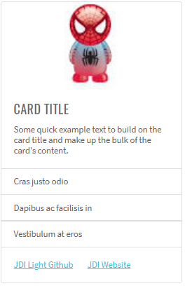
Here is an example with provided Bootstrap v4.3 code:
//@FindBy(css = "#card-kitchen-sink")
@UI("#card-kitchen-sink")
public static CardKitchenSink cardKitchenSink;
public class CardKitchenSink extends Card {
@UI(".card-img-top") public Image image;
@UI(".card-title") public Text title;
@UI(".card-text") public Text text;
@UI(".card-body") public WebList body;
@UI(".list-group") public WebList list;
}
@Test
public void itemsTest() {
assertEquals(cardKitchenSink.list.size(), 3);
cardKitchenSink.list.get(1).is().text(is(item1Text));
cardKitchenSink.list.get(2).is().text(is(item2Text));
cardKitchenSink.list.get(3).is().text(is(item3Text));
cardKitchenSink.list.get(1).is().text(containsString(item1Text));
cardKitchenSink.list.get(2).is().text(containsString(item2Text));
cardKitchenSink.list.get(3).is().text(containsString(item3Text));
}
@Test
public void isValidationTest() {
cardKitchenSink.image.is().src(is(imgSrc));
cardKitchenSink.image.is().alt(is(imgAlt));
cardKitchenSink.image.unhighlight();
cardKitchenSink.image.assertThat().width(is(86));
cardKitchenSink.image.assertThat().height(is(137));
cardKitchenSink.title.is().text(is(titleText));
cardKitchenSink.title.is().text(containsString(titleText));
cardKitchenSink.text.is().text(is(cardText));
cardKitchenSink.text.is().text(containsString(cardText));
}
<div class="card mb-3" id="card-kitchen-sink" style="width: 18rem;">
<img src="images/spider-man.jpg" class="card-img-top" alt="Spider Man" style="width: 30%; margin: 0 auto;">
<div class="card-body">
<h5 class="card-title">Card title</h5>
<p class="card-text">Some quick example text to build on the card title and make up
the bulk of the card's content.</p>
</div>
<ul class="list-group list-group-flush">
<li class="list-group-item">Cras justo odio</li>
<li class="list-group-item">Dapibus ac facilisis in</li>
<li class="list-group-item">Vestibulum at eros</li>
</ul>
<div class="card-body">
<a href="https://github.com/jdi-testing/jdi-light" target="_blank" class="card-link">JDI Light Github</a>
<a href="https://jdi-testing.github.io/jdi-light/index.html" target="_blank" class="card-link">JDI Website</a>
</div>
</div>
Card is represented by Section class in Java:
Inner elements of Card Kitchen Sink represented by the following classes:
Available methods in Java JDI Light:
| Method | Description | Return Type |
|---|---|---|
| alt() | Assert alt image attribute | ImageAssert |
| assertThat() | Assert action | UIAssert |
| getName() | Returns name of kitchen sink | String |
| getText() | Returns text of kitchen sink | String |
| height() | Assert image height | ImageAssert |
| is() | Assert action | UIAssert |
| isDisplayed() | Returns true if kitchen sink is displayed, false if not | boolean |
| src() | Assert image src | ImageAssert |
| width() | Assert image width | ImageAssert |
Card with Header and Footer
Card with Header and Footer - add an optional header and/or footer within a card.

Here is an example with provided Bootstrap v4.3 code:
//@FindBy(css = "#card-with-header-and-footer")
@UI("#card-with-header-and-footer")
public static CardWithHeaderAndFooter cardWithHeaderAndFooter;
public class CardWithHeaderAndFooter extends Card {
@UI(".card-title") public Text title;
@UI(".card-body p") public Text paragraph;
@UI("button") public Button button;
@UI(".card-header") public Text header;
@UI("//*[contains(@class, 'footer')]") public Text footer;
}
@Test
public void getFooterTextCardWithHeaderAndFooterTest() {
cardWithHeaderAndFooter.footer.is().text(textFooterCardWithHeaderAndFooter);
}
@Test
public void getHeaderTextCardWithHeaderAndFooterTest() {
cardWithHeaderAndFooter.header.is().text(textHeaderCardWithHeaderAndFooter);
}
<div class="card mb-3 text-center" id="card-with-header-and-footer">
<div class="card-header">
Featured
</div>
<div class="card-body">
<h5 class="card-title">Special title treatment</h5>
<p class="card-text">With supporting text below as a natural lead-in to additional
content.</p>
<button href="#" class="btn btn-primary" onclick="alert('Button Clicked!');">Click
Me!
</button>
</div>
<div class="card-footer text-muted">
2 days ago
</div>
</div>
Card is represented by Section class in Java:
Inner elements of Card with Header and Footer represented by the following classes:
Available methods in Java JDI Light:
| Method | Description | Return Type |
|---|---|---|
| assertThat() | Assert action | UIAssert |
| click() | Click the button | void |
| is() | Assert action | UIAssert |
| text() | Assert text | TextAssert |
Card with Grid Markup
Card with Grid Markup - using the grid, wrap cards in columns and rows as needed.
Here is an example with provided Bootstrap v4.3 code:
//@FindBy(css = "#card-with-grid-markup")
@UI("#card-with-grid-markup")
public static CardWithGridMarkup cardWithGridMarkup;
public class CardWithGridMarkup extends Card {
@UI(".card-title") public Text title;
@UI(".card-body p") public Text paragraph;
@UI("button") public Button button;
@UI(".row .col-sm-6") public JList<CardWithHeaderAndFooter> listCard;
}
@Test
public void getTitleTextCardWithGridMarkup11Test() {
cardWithGridMarkup.listCard.get(0).title.is().text(textTitleCardWithGridMarkup11);
}
@Test
public void getButtonTextCardWithGridMarkup22Test() {
cardWithGridMarkup.listCard.get(3).button.is().text(textButtonCardWithGridMarkup22);
cardWithGridMarkup.listCard.get(3).button.click();
validateAlert(is(textAlert));
cardWithGridMarkup.listCard.get(3).button.is()
.enabled()
.displayed();
}
<div id="card-with-grid-markup">
<div class="row mb-3">
<div class="col-sm-6">
<div class="card">
<div class="card-body">
<h5 class="card-title">Title</h5>
<p class="card-text">1st row 1st cell</p>
<button href="#" class="btn btn-primary" onclick="alert('Button Clicked!');">Click me
</button>
</div>
</div>
</div>
<div class="col-sm-6">
<div class="card">
<div class="card-body">
<h5 class="card-title">Title</h5>
<p class="card-text">1st row 2nd cell</p>
<button href="#" class="btn btn-primary" onclick="alert('Button Clicked!');">Click me
</button>
</div>
</div>
</div>
</div>
<div class="row mb-3">
<div class="col-sm-6">
<div class="card">
<div class="card-body">
<h5 class="card-title">Title</h5>
<p class="card-text">2nd row 1st cell</p>
<button href="#" class="btn btn-primary" onclick="alert('Button Clicked!');">Click me
</button>
</div>
</div>
</div>
<div class="col-sm-6">
<div class="card">
<div class="card-body">
<h5 class="card-title">Title</h5>
<p class="card-text">2nd row 2nd cell</p>
<button href="#" class="btn btn-primary" onclick="alert('Button Clicked!');">Click me
</button>
</div>
</div>
</div>
</div>
</div>
Card is represented by Section class in Java:
Inner elements of Card with Grid Markup represented by the following classes:
Available methods in Java JDI Light:
| Method | Description | Return Type |
|---|---|---|
| assertThat() | Assert action | UIAssert |
| click() | Click the button | void |
| is() | Assert action | UIAssert |
| text() | Assert text | TextAssert |
Card Utilities
Card Utilities - use handful of available sizing utilities to quickly set a card’s width.

Here is an example with provided Bootstrap v4.3 code:
//@FindBy(className = ".w-75")
@UI(".w-75")
public static CardUtilities cardWidth75;
public class CardUtilities extends Card {
@UI(".card-title") public Text cardTitle;
@UI(".card-text") public Text cardText;
@UI(".btn") public Button cardButton;
}
@Test(dataProvider = "cardUtilitiesElementsWithWidth")
public void cardValidationTest(CardUtilities cardUtilitiesElem,
int widthInPercent, String widthInPixels) {
cardUtilitiesElem.core().is()
.hasClass(String.format("card w-%d", widthInPercent))
.css("width", widthInPixels)
.css("background-color", whiteColor);
}
<div class="card w-75" style="margin-bottom: 10px;">
<div class="card-body">
<h5 class="card-title">Spider man (w-75)</h5>
<p class="card-text">Spider-Man is a fictional superhero created by writer-editor
Stan Lee and writer-artist Steve Ditko.</p>
<a href="https://en.wikipedia.org/wiki/Spider-Man" class="btn btn-primary" target="_blank">Read more</a>
</div>
</div>
Available methods in Java JDI Light:
| Method | Description | Return Type |
|---|---|---|
| assertThat() | Assert action | TextAssert |
| css() | Get element's css value | int |
| hasClass() | Assert class | String |
| is() | Assert action | TextAssert |
Card Using Custom CSS
Card Using Custom CSS - use custom CSS in your stylesheets or as inline styles to set a width.

Here is an example with provided Bootstrap v4.3 code:
//@FindBy(css = "#card-custom-css-1")
@UI("#card-custom-css-1")
public static CardWithCustomCss cardWithCustomCss13Rem;
public class CardWithCustomCss extends Card {
@UI(".card-title") public Text title;
@UI(".card-text") public Text text;
@UI(".btn") public Button button;
}
@Test
public void getTextTest() {
assertEquals(cardWithCustomCss13Rem.text.getText(), text);
}
@Test
public void isValidationTest() {
cardWithCustomCss13Rem.title.is().text(is(title));
cardWithCustomCss13Rem.text.is().text(is(text));
cardWithCustomCss13Rem.button.is().displayed()
.and().text(is(buttonText))
.core()
.css("font-size", is("16px"))
.cssClass("btn btn-primary")
.tag(is("a"))
.attr("href", link);
cardWithCustomCss13Rem.button.is().enabled();
cardWithCustomCss13Rem.is().displayed()
.core()
.css("width", is("208px"))
.css("margin-bottom", is("10px"));
}
<div class="card" id="card-custom-css-1" style="width: 13rem; margin-bottom: 10px;">
<div class="card-body">
<h5 class="card-title">Spider man (13rem)</h5>
<p class="card-text">Spider-Man is a fictional superhero created by writer-editor
Stan Lee and writer-artist Steve Ditko.</p>
<a href="https://en.wikipedia.org/wiki/Spider-Man" class="btn btn-primary" target="_blank">Read more</a>
</div>
</div>
Card is represented by Section class in Java:
Inner elements of Card with custom CSS represented by the following classes:
Available methods in Java JDI Light:
| Method | Description | Return Type |
|---|---|---|
| assertThat() | Assert action | UIAssert |
| click() | Click the button | void |
| is() | Assert action | UIAssert |
| text() | Assert text | TextAssert |
Card Text Alignment
Card Text Alignment - You can quickly change the text alignment of any card — in it's entirety or specific parts — with Bootstrap's text align classes.
Here is an example with provided Bootstrap v4.3 code:
//@FindBy(css = "#card-text-left")
@UI("#card-text-left")
public static CardTextAlignment cardLeftTextAlignment;
//@FindBy(css = "#card-text-center")
@UI("#card-text-center")
public static CardTextAlignment cardCenterTextAlignment;
//@FindBy(css = "#card-text-right")
@UI("#card-text-right")
public static CardTextAlignment cardRightTextAlignment;
public class CardTextAlignment extends Card {
@UI(".card-title") public Text cardTitle;
@UI(".card-text") public Text cardDescription;
@UI("button") public Button cardButton;
}
String alertText = "Button Clicked!";
@Test
public void clickTest() {
cardLeftTextAlignment.highlight();
cardLeftTextAlignment.cardButton.click();
validateAlert(is(alertText));
cardCenterTextAlignment.highlight();
cardCenterTextAlignment.cardButton.click();
validateAlert(is(alertText));
cardRightTextAlignment.highlight();
cardRightTextAlignment.cardButton.click();
validateAlert(is(alertText));
}
<div id="card-text-center" class="card mb-2 text-center" style="width: 18rem;">
<div class="card-body">
<h5 class="card-title">Special title treatment</h5>
<p class="card-text">With supporting text below as a natural lead-in to additional
content.</p>
<button href="#" class="btn btn-success" onclick="alert('Button Clicked!');">Click
Me!
</button>
</div>
</div>
Card is represented by Section class in Java:
Inner elements of Card Text Alignment represented by the following classes:
Available methods in Java JDI Light:
| Method | Description | Return Type |
|---|---|---|
| assertThat() | Assert action | TextAssert |
| attr() | Assert button attribute | IsAssert |
| click() | Click button | void |
| css() | Get button css value | String |
| cssClass() | Assert button css class | IsAssert |
| displayed() | Check that element is displayed | TextAssert |
| getText() | Get button text | String |
| getValue() | Get button value | String |
| is() | Assert action | TextAssert |
| tag() | Assert button tag | IsAssert |
Card Navigation
Card Navigation adds some navigation to a card’s header (or block) with Bootstrap’s nav components.

Here is an example with provided Bootstrap v4.3 code:
@UI("#card-navigation") // @FindBy(id = "card-navigation")
public static CardNavigation cardNavigation;
public class CardNavigation extends Card {
@UI(".nav") public Menu nav;
@UI("#activeLink") public Link activeLink;
@UI("#jdiLink") public Link jdiLink;
@UI("#disabledLink") public Link disabledLink;
@UI("h5") public Text title;
@UI(".card-text") public Text subtitle;
@UI("button") public Button button;
}
@Test
public void getLinkTextTest() {
cardNavigation.nav.highlight();
assertEquals(cardNavigation.activeLink.getText(), activeLinkText);
assertEquals(cardNavigation.jdiLink.getText(), jdiLinkText);
assertEquals(cardNavigation.disabledLink.getText(), disabledLinkText);
}
@Test
public void isValidationTest() {
cardNavigation.highlight();
cardNavigation.title.is().text(titleText);
cardNavigation.title.is().displayed();
cardNavigation.subtitle.is().text(subtitleText);
cardNavigation.subtitle.is().displayed();
cardNavigation.activeLink.is().displayed();
cardNavigation.activeLink.is().enabled();
cardNavigation.jdiLink.is().displayed();
cardNavigation.jdiLink.is().enabled();
cardNavigation.disabledLink.is().displayed();
cardNavigation.disabledLink.is().disabled();
cardNavigation.activeLink.assertThat().text(is(activeLinkText));
cardNavigation.jdiLink.assertThat().text(is(jdiLinkText));
cardNavigation.disabledLink.assertThat().text(is(disabledLinkText));
cardNavigation.activeLink.is().ref(activeLinkRef);
cardNavigation.jdiLink.is().ref(jdiLinkRef);
cardNavigation.disabledLink.is().ref(disabledLinkRef);
cardNavigation.button.is().text(is(buttonText));
cardNavigation.button.is().text(containsString("Click"));
assertThat(cardNavigation.button.core().css("font-size"), is("16px"));
cardNavigation.button.assertThat().displayed()
.and()
.core()
.cssClass("btn btn-primary")
.attr("onclick", "alert('Button Clicked!');")
.tag(is("button"));
}
<div id="card-navigation" class="card text-center mb-3">
<div class="card-header">
<ul class="nav nav-tabs card-header-tabs">
<li class="nav-item">
<a id="activeLink" class="nav-link active" href="javascript: void()"
onclick="alert('Active Tab Clicked!');">Active</a>
</li>
<li class="nav-item">
<a id="jdiLink" class="nav-link" href="https://github.com/jdi-testing/jdi-light" target="_blank">JDI</a>
</li>
<li class="nav-item">
<a id="disabledLink" class="nav-link disabled" href="javascript: void()" tabindex="-1"
aria-disabled="true">Disabled</a>
</li>
</ul>
</div>
<div class="card-body">
<h5 class="card-title">Special title treatment</h5>
<p class="card-text">With supporting text below as a natural lead-in to additional
content.</p>
<button href="#" class="btn btn-primary" onclick="alert('Button Clicked!');">Click
Me!
</button>
</div>
</div>
Card is represented by Section class in Java:
Inner elements of Card Navigation represented by the following classes:
Available methods in Java JDI Light:
| Method | Description | Return Type |
|---|---|---|
| attr() | Assert element attribute | IsAssert |
| click() | Click element | void |
| css() | Get button css value | String |
| cssClass() | Assert element css class | IsAssert |
| disabled() | Check that element is disabled | UIAssert |
| displayed() | Check that element is displayed | TextAssert |
| enabled() | Check that element is enabled | UIAssert |
| getText() | Get element text | String |
| getValue() | Get element value | String |
| is() | Assert action | TextAssert |
| ref() | Get link ref attribute value | String |
| tag() | Assert element tag | IsAssert |
Card Image Caps
Card Image Caps - similar to headers and footers, cards can include top and bottom “image caps” — images at the top or bottom of a card.
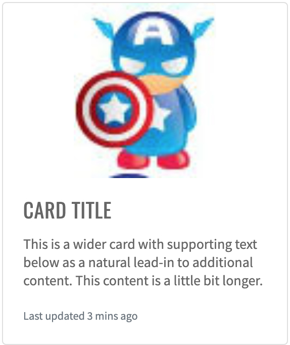
Here is an example with provided Bootstrap v4.3 code:
//@FindBy(id = "card-image-caps-1")
@UI("#card-image-caps-1")
public static CardImageCaps cardImageOnTop;
public class CardImageCaps extends Card {
@UI(".card-img-top") public Image image;
@UI(".card-body") public Text text;
}
@Test
public void getSrcTest() {
assertEquals(cardImageOnTop.image.src(), topCardData.getSrcAttr());
assertEquals(cardImageOnBottom.image.src(), bottomCardData.getSrcAttr());
}
@Test
public void getAltTest() {
assertEquals(cardImageOnTop.image.alt(), topCardData.getAltAttr());
assertEquals(cardImageOnBottom.image.alt(), bottomCardData.getAltAttr());
}
<div class="card mb-3" id="card-image-caps-1" style="width: 18rem;">
<img style="width: 30%; margin: 0 auto;" src="images/captain-america.jpg" class="card-img-top"
alt="Captain America image">
<div class="card-body">
<h5 class="card-title">Card title</h5>
<p class="card-text">This is a wider card with supporting text below as a natural
lead-in to additional content. This content is a little bit longer.</p>
<p class="card-text"><small class="text-muted">Last updated 3 mins ago</small></p>
</div>
</div>
Card is represented by Section class in Java:
Inner elements of Card Image Caps represented by the following classes:
Available methods in Java JDI Light:
| Method | Description | Return Type |
|---|---|---|
| assertThat() | Assert action | UIAssert |
| getName() | Returns name of card | String |
| getText() | Returns text of card | String |
| is() | Assert action | UIAssert |
| isDisplayed() | Returns true if card is displayed, false if not | boolean |
Card Image Overlays
Card Image Overlays turn an image into a card background and overlay your card’s text. Depending on the image, you may or may not need additional styles or utilities.
Here is an example with provided Bootstrap v4.3 code:
//@FindBy(css = "#card-image-overlay")
@UI("#card-image-overlay")
public static CardImageOverlays cardImageOverlays;
public class CardImageOverlays extends Card {
@UI("#card-svg") public VectorImage vectorImage;
@UI("#card-overlay-section") public OverlaySection overlaySection;
}
@Test
public void availabilityTest() {
cardImageOverlays.overlaySection.title.is()
.displayed()
.enabled();
cardImageOverlays.overlaySection.title.is()
.displayed()
.enabled();
}
@Test
public void isValidationTest() {
cardImageOverlays.overlaySection.title.is().text(is(TITLE));
cardImageOverlays.vectorImage.assertThat().height(is(HEIGHT));
cardImageOverlays.vectorImage.assertThat().width(is(WIDTH));
}
@Test
public void classTest() {
cardImageOverlays.overlaySection.is().core().hasClass(OVERLAY_CLASS);
cardImageOverlays.overlaySection.assertThat().core().hasClass(OVERLAY_CLASS);
cardImageOverlays.vectorImage.is().core().hasClass(IMAGE_TOP_CLASS);
cardImageOverlays.vectorImage.assertThat().core().hasClass(IMAGE_TOP_CLASS);
}
@Test
public void vectorInternalElementsTest() {
assertEquals(cardImageOverlays.vectorImage.getText(VECTOR_TEXT_TAG), VECTOR_TEXT);
assertEquals(cardImageOverlays.vectorImage.getAttribute(VECTOR_TEXT_TAG, VECTOR_TEXT_ATTR), VECTOR_TEXT_VALUE);
}
<div class="card bg-dark text-dark mb-3">
<img src="images/captain-america.jpg" class="card-img" alt="Captain America image">
<div class="card-img-overlay">
<h5 class="card-title">Card title</h5>
<p class="card-text">This is a wider card with supporting text below as a natural
lead-in to additional content. This content is a little bit longer.</p>
<p class="card-text">Last updated 3 mins ago</p>
</div>
</div>
Card is represented by Section class in Java:
Inner elements of Card Image Overlays represented by the following classes:
- Text
- VectorImage <---No such element--->
And here are methods available in Java:
| Method | Description | Return Type |
|---|---|---|
| assertThat() | property that returns object for work with assertions | TextAssert |
| displayed() | check item is displayed | TextAssert |
| enabled() | check item is enabled | TextAssert |
| getAttribute(String tagName, String attr) | get attribute of an element inside vector image by tag | String |
| getText(String tagName) | get text of an element inside vector image by tag | String |
| hasClass(String className) | check that expected className is presented | IsAssert |
| is() | property that returns object for work with assertions | TextAssert |
Card Horizontal
Card Horizontal - using a combination of grid and utility classes, cards can be made horizontal in a mobile-friendly and responsive way.
Here is an example with provided Bootstrap v4.3 code:
//FindBy(css = "#card-horizontal")
@UI("#card-horizontal")
public static CardHorizontal cardHorizontal;
public class CardHorizontal extends Card {
@UI(".card-title") public Text title;
@UI("//p[contains(text(), 'fictional character')]") public Text mainText;
@UI(".text-muted") public Text smallText;
@UI(".card-img") public Image image;
}
@Test
public void getSrcTest() {
assertEquals(cardHorizontal.image.src(), imageSrc);
}
@Test
public void isValidationTest() {
cardHorizontal.title.is().text(is(titleText));
cardHorizontal.mainText.is().text(is(mainText));
cardHorizontal.smallText.is().displayed()
.and().text(is(smallText))
.core()
.css("font-size", is("11.2px"))
.tag(is("small"));
cardHorizontal.image.is().displayed()
.and().src(is(imageSrc))
.core()
.attr("title", imageTitle);
cardHorizontal.image.unhighlight();
cardHorizontal.image.assertThat().width(anyOf(is(91), is(94)));
cardHorizontal.image.assertThat().height(anyOf(is(146), is(150)));
}
<div class="card mb-3" id="card-horizontal" style="max-width: 540px;">
<div class="row no-gutters">
<div class="col-md-4">
<img src="images/wolverin.jpg" class="card-img" id="card-horizontal-img" title="Wolverine icon">
</div>
<div class="col-md-8">
<div class="card-body">
<h5 class="card-title" id="card-horizontal-title">Wolverine</h5>
<p class="card-text">Wolverine is a fictional character appearing in
American comic books published by Marvel Comics, mostly in association
with the X-Men. He is a mutant who possesses animal-keen senses,
enhanced physical capabilities, powerful regenerative ability known as a
healing factor, and three retractable claws in each hand. Wolverine has
been depicted variously as a member of the X-Men, Alpha Flight, and the
Avengers.</p>
<p class="card-text"><small class="text-muted">The character appeared in
#180 (1974)</small></p>
</div>
</div>
</div>
</div>
Card is represented by Section class in Java:
Inner elements of Card Horizontal represented by the following classes:
Available methods in Java JDI Light:
| Method | Description | Return Type |
|---|---|---|
| alt() | Assert alt image attribute | ImageAssert |
| assertThat() | Assert action | UIAssert |
| getText() | Returns text | String |
| height() | Assert image height | ImageAssert |
| is() | Assert action | UIAssert |
| src() | Assert image src | ImageAssert |
| width() | Assert image width | ImageAssert |
Card Background And Color
Card Background And Color - use text and background utilities to change the appearance of a card.
Here is an example with provided Bootstrap v4.3 code:
//@FindBy(css = "#card-bright-blue")
@UI("#card-bright-blue")
public static CardStyled cardBrightBlue;
public class CardStyled extends Card {
@UI(".card-header") public Text header;
@UI(".card-title") public Text title;
@UI(".card-text") public Text body;
}
@Test(dataProvider = "cardColors")
public void checkColorCardsTest(CardWithHeaderAndFooter card, String cssClass, String color) {
card.is()
.core()
.hasClass(cssClass)
.css("background-color", is(color));
card.header.is()
.displayed().and()
.core().css("background-color", is("rgba(0, 0, 0, 0.03)"));
card.paragraph.is()
.displayed().and()
.core().css("background-color", is("rgba(0, 0, 0, 0)"));
}
<div class="card text-white bg-primary mb-3" style="max-width: 18rem;" id="card-bright-blue">
<div class="card-header">Header</div>
<div class="card-body">
<h5 class="card-title">Primary card title</h5>
<p class="card-text">Some quick example text to build on the card title and make up
the bulk of the card's content.</p>
</div>
</div>
Card is represented by Section class in Java:
Inner elements of Card Background Color can be represented by the following classes:
Available methods in Java JDI Light:
| Method | Description | Return Type |
|---|---|---|
| assertThat() | Assert action | UIAssert |
| css() | Get element css value | String |
| displayed() | Check that element is displayed | TextAssert |
| is() | Assert action | UIAssert |
Card Border
Card Border - use border utilities to change just the
border-color of a card. Note that you can put .text-{color} classes on the parent .card or a subset of the card’s
contents as shown below.
Here is an example with provided Bootstrap v4.3 code:
//@FindBy(css = "#card-border-primatry")
@UI("#card-border-primary")//@FindBy(css = "#card-border-primatry")
public static CardStyled cardBorderPrimary;
public class CardStyled extends Card {
@UI(".card-header") public Text header;
@UI(".card-title") public Text title;
@UI(".card-text") public Text body;
}
@Test(dataProvider = "cardBorderColor")
public void getBorderColorTest(CardBorder cardBorder, String color) {
cardBorder.is().core().css("border-bottom-color", is(color));
cardBorder.is().core().css("border-left-color", is(color));
cardBorder.is().core().css("border-right-color", is(color));
cardBorder.is().core().css("border-top-color", is(color));
}
@Test(dataProvider = "cardBorderHeaderText")
public void getHeaderTextTest(CardBorder cardBorder, String headerText) {
assertEquals(cardBorder.border.getText(), headerText);
}
<div class="card border-primary mb-3" id="card-border-primary" style="max-width: 18rem;">
<div class="card-header">Card with primary border</div>
<div class="card-body text-primary">
<h5 class="card-title">Primary card title</h5>
<p class="card-text">Some quick example text to build on the card title and make up
the bulk of the card's content.</p>
</div>
</div>
Card is represented by Section class in Java:
Inner elements of Card Border represented by the following classes:
Available methods in Java JDI Light:
| Method | Description | Return Type |
|---|---|---|
| assertThat() | Assert action | UIAssert |
| css() | Get element css value | String |
| is() | Assert action | UIAssert |
| text() | Assert text | TextAssert |
Card Mixins Utilities
Card Mixins Utilities - you can also change
the borders on the card header and footer as needed, and even remove their background-color with .bg-transparent.
Here is an example with provided Bootstrap v4.3 code:
//@FindBy(css = "#card-mixins-utilities")
@UI("#card-mixins-utilities")
public static CardMixinsUtilities cardMixinsUtilities;
public class CardMixinsUtilities extends Card {
@UI(".card-header") public Text header;
@UI(".card-footer") public Text footer;
@UI(".card-title") public Text title;
@UI(".card-text") public Text text;
}
@Test
public void getHeaderTextTest() {
assertEquals(cardMixinsUtilities.header.getText(), header);
}
@Test
public void isValidationTest() {
cardMixinsUtilities.is().displayed()
.and().core().css("border-color", "rgb(40, 167, 69)");
}
<div class="card border-success mb-3" id="card-mixins-utilities" style="max-width: 18rem;">
<div class="card-header bg-transparent border-success">According To Samuel L. Jackson
</div>
<div class="card-body text-success">
<h5 class="card-title">The Secret To Marvel Studios’ Success</h5>
<p class="card-text">Because while the Marvel Cinematic Universe always includes
plenty of spectacle and pulse pounding action, each blockbuster tells a very
human story. The heroes of the world are flawed and funny, allowing audiences to
connect with characters who are super powered and dealing with situations we
truly can't comprehend.</p>
</div>
<div class="card-footer bg-transparent border-success">For Cinema Blend</div>
</div>
Card is represented by Section class in Java:
Inner elements of Card Mixing Utilities represented by the following classes:
Available methods in Java JDI Light:
| Method | Description | Return Type |
|---|---|---|
| assertThat() | Assert action | UIAssert |
| css() | Get element css value | String |
| is() | Assert action | UIAssert |
| text() | Assert text | TextAssert |
Card Groups
Card Groups - use card groups to render cards as a single, attached element with equal width and height columns.
Here is an example with provided Bootstrap v4.3 code:
//@FindBy(css = ".card-group:nth-of-type(1)")
@UI(".card-group:nth-of-type(1)")
public static CardGroupedSection cardGroupSectionWithoutFooter;
public class CardGroupSection extends Section {
@UI(".card:nth-of-type(1)") public CardGrouped card1;
@UI(".card:nth-of-type(2)") public CardGrouped card2;
}
public class CardGrouped extends Card {
@UI(".card-title") public Text title;
@UI(".card-text:nth-of-type(1)") public Text mainText;
@UI(".card-text .text-muted") public Text mutedText;
@UI(".card-img-top") public Image image;
@UI(".card-footer small") public Text footerText;
}
private String card1ImageSrc = "https://jdi-testing.github.io/jdi-light/images/spider-man.jpg";
private String card2ImageSrc = "https://jdi-testing.github.io/jdi-light/images/hulk.jpg";
private String card1ImageAlt = "spider-man";
private String card2ImageAlt = "hulk";
@Test
public void getSrcTest() {
assertEquals(cardGroupSectionWithoutFooter.card1.image.src(), card1ImageSrc);
assertEquals(cardGroupSectionWithoutFooter.card2.image.src(), card2ImageSrc);
}
@Test
public void getAltTest() {
assertEquals(cardGroupSectionWithoutFooter.card1.image.alt(), card1ImageAlt);
assertEquals(cardGroupSectionWithoutFooter.card2.image.alt(), card2ImageAlt);
}
<div class="card-group" style="margin-bottom: 10px;">
<div class="card">
<p style="text-align: center;"><img src="images/spider-man.jpg" class="card-img-top" alt="spider-man"
style="width: 75px; height: 120px;"></p>
<div class="card-body">
<h5 class="card-title">Spider man</h5>
<p class="card-text">Spider-Man is a fictional superhero created by
writer-editor Stan Lee and writer-artist Steve Ditko.</p>
<p class="card-text"><small class="text-muted">Peter Parker</small></p>
</div>
</div>
<div class="card">
<p style="text-align: center;"><img src="images/hulk.jpg" class="card-img-top" alt="hulk"
style="width: 98px; height: 120px;">
</p>
<div class="card-body">
<h5 class="card-title">Hulk</h5>
<p class="card-text">The Hulk is a fictional superhero appearing in publications
by the American publisher Marvel Comics.</p>
<p class="card-text"><small class="text-muted">Bruce Banner</small></p>
</div>
</div>
</div>
Card Groups with Footer
Here is an example with provided Bootstrap v4.3 code:
//@FindBy(css = ".card-group:nth-of-type(2)")
@UI(".card-group:nth-of-type(2)")
public static CardGroupedSection cardGroupWithFooter;
public class CardGroupSection extends Section {
@UI(".card:nth-of-type(1)") public CardGrouped card1;
@UI(".card:nth-of-type(2)") public CardGrouped card2;
}
public class CardGrouped extends Card {
@UI(".card-title") public Text title;
@UI(".card-text:nth-of-type(1)") public Text mainText;
@UI(".card-text .text-muted") public Text mutedText;
@UI(".card-img-top") public Image image;
@UI(".card-footer small") public Text footerText;
}
private String card1ImageSrc = "https://jdi-testing.github.io/jdi-light/images/spider-man.jpg";
private String card2ImageSrc = "https://jdi-testing.github.io/jdi-light/images/hulk.jpg";
private String card1ImageAlt = "spider-man";
private String card2ImageAlt = "hulk";
@Test
public void getSrcTest() {
assertEquals(cardGroupWithFooter.card1.image.src(), card1ImageSrc);
assertEquals(cardGroupWithFooter.card2.image.src(), card2ImageSrc);
}
@Test
public void getAltTest() {
assertEquals(cardGroupWithFooter.card1.image.alt(), card1ImageAlt);
assertEquals(cardGroupWithFooter.card2.image.alt(), card2ImageAlt);
}
<div class="card-group" style="margin-bottom: 10px;">
<div class="card">
<p style="text-align: center;"><img src="images/spider-man.jpg" class="card-img-top" alt="spider-man"
style="width: 75px; height: 120px;"></p>
<div class="card-body">
<h5 class="card-title">Spider man</h5>
<p class="card-text">Spider-Man is a fictional superhero created by
writer-editor Stan Lee and writer-artist Steve Ditko.</p>
</div>
<div class="card-footer">
<small class="text-muted">Peter Parker</small>
</div>
</div>
<div class="card">
<p style="text-align: center;"><img src="images/hulk.jpg" class="card-img-top" alt="hulk"
style="width: 98px; height: 120px;">
</p>
<div class="card-body">
<h5 class="card-title">Hulk</h5>
<p class="card-text">The Hulk is a fictional superhero appearing in publications
by the American publisher Marvel Comics.</p>
</div>
<div class="card-footer">
<small class="text-muted">Bruce Banner</small>
</div>
</div>
</div>
Card is represented by Section class in Java:
Inner elements of Card Grouped represented by the following classes:
Card Decks
Card Decks - use card decks for a set of equal width and height cards that aren't attached to one another.
Here is an example with provided Bootstrap v4.3 code:
//@FindBy(css = ".card-deck:nth-of-type(1)")
@UI(".card-deck:nth-of-type(1)")
public static CardDeckSection cardDeckSectionWithoutFooter;
public class CardDeckSection extends Section {
@UI(".card:nth-of-type(1)") public CardGrouped card1;
@UI(".card:nth-of-type(2)") public CardGrouped card2;
}
public class CardGrouped extends Card {
@UI(".card-title") public Text title;
@UI(".card-text:nth-of-type(1)") public Text mainText;
@UI(".card-text .text-muted") public Text mutedText;
@UI(".card-img-top") public Image image;
@UI(".card-footer small") public Text footerText;
}
private static final String card1Title = "SPIDER MAN";
private static final String card2Title = "HULK";
private static final String card1MainText = "Spider-Man is a fictional superhero created by writer-editor Stan Lee and writer-artist Steve Ditko.";
private static final String card2MainText = "The Hulk is a fictional superhero appearing in publications by the American publisher Marvel Comics.";
@Test
public void getTitleTextTest() {
cardDeckSectionWithoutFooter.highlight();
assertEquals(cardDeckSectionWithoutFooter.card1.title.getText(), card1Title);
assertEquals(cardDeckSectionWithoutFooter.card2.title.getText(), card2Title);
}
@Test
public void getMainTextTest() {
cardDeckSectionWithoutFooter.highlight();
assertEquals(cardDeckSectionWithoutFooter.card1.mainText.getText(), card1MainText);
assertEquals(cardDeckSectionWithoutFooter.card2.mainText.getText(), card2MainText);
}
<div class="card-deck" style="margin-bottom: 10px;">
<div class="card">
<p style="text-align: center;"><img src="images/spider-man.jpg" class="card-img-top" alt="spider-man"
style="width: 75px; height: 120px;"></p>
<div class="card-body">
<h5 class="card-title">Spider man</h5>
<p class="card-text">Spider-Man is a fictional superhero created by
writer-editor Stan Lee and writer-artist Steve Ditko.</p>
<p class="card-text"><small class="text-muted">Peter Parker</small></p>
</div>
</div>
<div class="card">
<p style="text-align: center;"><img src="images/hulk.jpg" class="card-img-top" alt="hulk"
style="width: 98px; height: 120px;">
</p>
<div class="card-body">
<h5 class="card-title">Hulk</h5>
<p class="card-text">The Hulk is a fictional superhero appearing in publications
by the American publisher Marvel Comics.</p>
<p class="card-text"><small class="text-muted">Bruce Banner</small></p>
</div>
</div>
</div>
Card Decks with Footer
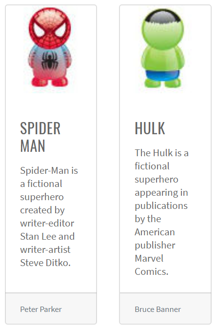
Here is an example with provided Bootstrap v4.3 code:
//@FindBy(css = ".card-deck:nth-of-type(2)")
@UI(".card-deck:nth-of-type(2)")
public static CardDeckSection cardDeckSectionWithFooter;
public class CardGroupSection extends Section {
@UI(".card:nth-of-type(1)") public CardGrouped card1;
@UI(".card:nth-of-type(2)") public CardGrouped card2;
}
public class CardGrouped extends Card {
@UI(".card-title") public Text title;
@UI(".card-text:nth-of-type(1)") public Text mainText;
@UI(".card-text .text-muted") public Text mutedText;
@UI(".card-img-top") public Image image;
@UI(".card-footer small") public Text footerText;
}
private static final String card1Title = "SPIDER MAN";
private static final String card2Title = "HULK";
private static final String card1MainText = "Spider-Man is a fictional superhero created by writer-editor Stan Lee and writer-artist Steve Ditko.";
private static final String card2MainText = "The Hulk is a fictional superhero appearing in publications by the American publisher Marvel Comics.";
@Test
public void getTitleTextTest() {
cardDeckSectionWithFooter.highlight();
assertEquals(cardDeckSectionWithFooter.card1.title.getText(), card1Title);
assertEquals(cardDeckSectionWithFooter.card2.title.getText(), card2Title);
}
@Test
public void getMainTextTest() {
cardDeckSectionWithFooter.highlight();
assertEquals(cardDeckSectionWithFooter.card1.mainText.getText(), card1MainText);
assertEquals(cardDeckSectionWithFooter.card2.mainText.getText(), card2MainText);
}
<div class="card-deck" style="margin-bottom: 10px;">
<div class="card">
<p style="text-align: center;"><img src="images/spider-man.jpg" class="card-img-top" alt="spider-man"
style="width: 75px; height: 120px;"></p>
<div class="card-body">
<h5 class="card-title">Spider man</h5>
<p class="card-text">Spider-Man is a fictional superhero created by
writer-editor Stan Lee and writer-artist Steve Ditko.</p>
</div>
<div class="card-footer">
<small class="text-muted">Peter Parker</small>
</div>
</div>
<div class="card">
<p style="text-align: center;"><img src="images/hulk.jpg" class="card-img-top" alt="hulk"
style="width: 98px; height: 120px;">
</p>
<div class="card-body">
<h5 class="card-title">Hulk</h5>
<p class="card-text">The Hulk is a fictional superhero appearing in publications
by the American publisher Marvel Comics.</p>
</div>
<div class="card-footer">
<small class="text-muted">Bruce Banner</small>
</div>
</div>
</div>
Card are represented by Section class in Java:
Inner elements of Card Grouped can be represented by the following classes:
Available methods in Java JDI Light:
| Method | Description | Return Type |
|---|---|---|
| alt() | Get image alt() value | String |
| assertThat() | Assert action | TextAssert |
| attr() | Assert element attribute | IsAssert |
| css() | Get element css value | String |
| displayed() | Check that element is displayed | TextAssert |
| getText() | Get element text | String |
| is() | Assert action | TextAssert |
| src() | Get image source path | String |
Card Columns
Card Columns can also be extended and customized
with some additional code. For example .card-columns class to generate a set of responsive tiers for changing
the number of columns.
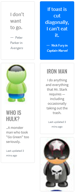
Here is an example with provided Bootstrap v4.3 code:
//@FindBy(css = ".card-columns")
@UI(".card-columns")
public static CardColumns cardColumns;
public class CardColumnsSection extends Section {
@UI(".card:nth-of-type(1)") public CardWithinCardColumns topLeftCard;
@UI(".card:nth-of-type(2)") public CardWithinCardColumns bottomLeftCard;
@UI(".card:nth-of-type(3)") public CardWithinCardColumns topRightCard;
@UI(".card:nth-of-type(4)") public CardWithinCardColumns middleRightCard;
@UI(".card:nth-of-type(5)") public CardWithinCardColumns bottomRightCard;
}
public class CardWithinCardColumns extends Card {
@UI(".card-title") public Text title;
@UI("p:nth-of-type(1)") public Text mainText;
@UI(".card-text small") public Text mutedText;
@UI("footer small") public Text footerText;
@UI(".card-img-top") public Image image;
}
@Test
public void checkElementsPositionTest() {
assertTrue(cardColumnsSection.topLeftCard.core().getLocation().x <
cardColumnsSection.topRightCard.core().getLocation().x);
assertTrue(cardColumnsSection.topLeftCard.core().getLocation().y <
cardColumnsSection.bottomLeftCard.core().getLocation().y);
assertTrue(cardColumnsSection.topRightCard.core().getLocation().y <
cardColumnsSection.middleRightCard.core().getLocation().y);
assertTrue(cardColumnsSection.middleRightCard.core().getLocation().y <
cardColumnsSection.bottomRightCard.core().getLocation().y);
assertTrue(cardColumnsSection.bottomLeftCard.core().getLocation().x <
cardColumnsSection.bottomRightCard.core().getLocation().x);
assertTrue(cardColumnsSection.bottomLeftCard.core().getLocation().x <
cardColumnsSection.middleRightCard.core().getLocation().x);
}
<div class="card-columns" style="column-count: 2">
<div class="card p-3">
<blockquote class="blockquote mb-0 card-body">
<p>I don’t want to go.</p>
<footer class="blockquote-footer">
<small class="text-muted">
Peter Parker in <cite title="Source Title">Avengers</cite>
</small>
</footer>
</blockquote>
</div>
<div class="card">
<img src="images/hulk.jpg" class="card-img-top" alt="hulk">
<div class="card-body">
<h5 class="card-title">Who is Hulk?</h5>
<p class="card-text">..A monster man who took "Go Green" too seriously.</p>
<p class="card-text"><small class="text-muted">Last updated 3 mins ago</small>
</p>
</div>
</div>
<div class="card bg-primary text-white text-center p-3">
<blockquote class="blockquote mb-0">
<p>If toast is cut diagonally, I can’t eat it.</p>
<footer class="blockquote-footer text-white">
<small>
Nick Fury in <cite title="Source Title">Captain Marvel</cite>
</small>
</footer>
</blockquote>
</div>
<div class="card text-center">
<div class="card-body">
<h5 class="card-title">Iron Man</h5>
<p class="card-text">I do anything and everything that Mr. Stark requires —
including occasionally taking out the trash.</p>
<p class="card-text"><small class="text-muted">Last updated 3 mins ago</small>
</p>
</div>
</div>
<div class="card">
<img src="images/punisher.jpg" class="card-img-top" alt="punisher">
</div>
</div>
Card are represented by Section class in Java:
Inner elements of Card Columns can be represented by the following classes:
Available methods in Java JDI Light:
| Method | Description | Return Type |
|---|---|---|
| alt() | Assert alt image attribute | ImageAssert |
| assertThat() | Assert action | UIAssert |
| getText() | Returns text | String |
| height() | Assert image height | ImageAssert |
| is() | Assert action | UIAssert |
| src() | Assert image src | ImageAssert |
| width() | Assert image width | ImageAssert |
3.3.11 Jumbotron
Jumbotron – Lightweight, flexible component for showcasing hero
Here is an example with provided Bootstrap v4.3 code:
// @FindBy(css = "#jumbotron")
@Css("#jumbotron")
public static Jumbotron jumbotron;
public class Jumbotron extends Section implements IsJumbotron {
@Css(".display-4") public Text title;
@Css(".lead") public Text description;
@Css(".btn") public Button learnMoreBtn;
}
@Test
public void getTextTest() {
assertEquals(jumbotron.getText(), mJumbotronWithButton);
}
@Test
public void clickTest() {
jumbotron.learnMoreBtn.click();
ArrayList<String> tabs = new ArrayList<>(WebDriverFactory.getDriver().getWindowHandles());
WebDriver driver = WebDriverFactory.getDriver();
driver.switchTo().window(tabs.get(1));
assertEquals(getUrl(), mJumbotronUrl);
driver.close();
driver.switchTo().window(tabs.get(0));
}
<div class="jumbotron" id="jumbotron">
<h1 class="display-4">Hello, world!</h1>
<p class="lead">This is a simple hero unit, a simple
jumbotron-style component for calling extra attention to
featured content or information.</p>
<hr class="my-4">
<p>It uses utility classes for typography and spacing to
space content out within the larger container.</p>
<a class="btn btn-primary btn-lg"
href="https://getbootstrap.com/docs/4.3/components/jumbotron/"
target="_blank" role="button">Learn more</a>
</div>
Jumbotron is represented by Section class in Java:
Inner elements of jumbotron can be represented by the following classes:
3.3.12 Dropdown
Dropdowns are toggleable, contextual overlays for displaying lists of links and more.
For working with Dropdown there are two classes available in JDI:
- Java: BootstrapDropdown, DropdownMenu
- C#: TBD
BootstrapDropdown class is designed to work with Dropdown element. DropdownMenu class extends BootstrapDropdown class providing additional methods for working with the Dropdown menu items elements
Methods available for BootstrapDropdown class in Java JDI Light:
| Method/Property | Description | Return Type |
|---|---|---|
| assertThat() | Assert action | BootstrapDropdownAssert |
| collapse() | Collapse dropdown | void |
| collapsed() | Assert that dropdown is collapsed | BootstrapDropdownAssert |
| expand() | Expand dropdown | void |
| expanded() | Assert that dropdown is expanded | BootstrapDropdownAssert |
| expander() | Get dropdown expander | Button |
| has() | Assert action | BootstrapDropdownAssert |
| is() | Assert action | BootstrapDropdownAssert |
| isCollapsed() | Return if dropdown expanded | boolean |
| isExpanded() | Return if dropdown expanded | boolean |
| menu() | Get dropdown menu | UIElement |
| shouldBe() | Assert action | BootstrapDropdownAssert |
| verify() | Soft assert action | BootstrapDropdownAssert |
| waitFor() | Assert action | BootstrapDropdownAssert |
Additional methods available for DropdownMenu class in Java JDI Light:
| Method | Description | Return Type |
|---|---|---|
| active(int itemIndex) | Check if item in dropdown menu is active | DropdownMenuAssert |
| assertThat() | Assert action | DropdownMenuAssert |
| has() | Assert action | DropdownMenuAssert |
| hasItems(String... item) | Return if dropdown contains all items | boolean |
| hasItems(String... values) | Asserts whether dropdown has all items from arguments | DropdownMenuAssert |
| is() | Assert action | DropdownMenuAssert |
| itemValues() | Get items text values | List |
| itemValues(String... values) | Asserts whether dropdown are exactly match arguments | DropdownMenuAssert |
| list() | Get dropdown items | WebList |
| select(String item) | Click at dropdown item | void |
| select(int index) | Click at dropdown item | void |
| shouldBe() | Assert action | DropdownMenuAssert |
| verify() | Soft assert action | DropdownMenuAssert |
| waitFor() | Assert action | DropdownMenuAssert |
Single button
Any single .btn can be turned into a dropdown toggle with some markup changes. Here’s how you can put them to work with either <button> elements:
Here is an example with provided Bootstrap v4.3 code for <button> elements:
//@FindBy(id = "simpleDropdown")
@UI("#simpleDropdown")
public static DropdownMenu simpleDropdown;
@Test
public void textTest() {
simpleDropdown.assertThat()
.core()
.text(DROPDOWN);
assertThat(simpleDropdown.core().getText(), is(DROPDOWN));
}
@Test
public void itemsTest() {
simpleDropdown.expand();
simpleDropdown.assertThat()
.itemValues(is(Arrays.asList(ITEMS_ARR)))
.hasItems(FIRSTITEM)
.hasItems(SECONDITEM)
.hasItems(LASTITEM)
.hasItems(FIRSTITEM, LASTITEM);
assertThat(simpleDropdown.itemValues(), is(Arrays.asList(ITEMS_ARR)));
}
@Test
public void clickTest() {
simpleDropdown.expand();
simpleDropdown.is()
.expanded();
simpleDropdown.collapse();
simpleDropdown.is()
.collapsed();
}
<div id="simpleDropdown" class="dropdown">
<button class="btn btn-primary dropdown-toggle" type="button"
id="dropdownMenuButton" data-toggle="dropdown" aria-haspopup="true"
aria-expanded="false" style="margin-bottom: 5px;">
Dropdown
</button>
<div class="dropdown-menu" aria-labelledby="dropdownMenuButton" x-placement=
"bottom-start" style="position: absolute; transform: translate3d(0px, 38px, 0px);
top: 0px; left: 0px; will-change: transform;">
<a class="dropdown-item" href="https://getbootstrap.com/" target="_blank">Action</a>
<a class="dropdown-item" href="https://getbootstrap.com/docs/4.0/components/dropdowns/" target="_blank">Another
action</a>
<a class="dropdown-item" href="https://getbootstrap.com/docs/4.3/getting
-started/introduction/" target="_blank">Separated link</a>
</div>
</div>
And with <a> elements:
//@FindBy(id = "linkDropdown")
@UI("#linkDropdown")
public static DropdownMenu linkDropdown;
@Test
public void linkDropdownIsValidationTest() {
linkDropdown.expander().is()
.core()
.tag(is("a"));
}
<div id="linkDropdown" class="dropdown show">
<a class="btn btn-primary dropdown-toggle" href="https://
getbootstrap.com/" role="button" id="dropdownMenuLink" data-toggle=
"dropdown" aria-haspopup="true" aria-expanded="false" style="margin-bottom: 5px;">
Dropdown link
</a>
<div class="dropdown-menu" aria-labelledby="dropdownMenuLink">
<a class="dropdown-item" href="https://getbootstrap.com/docs/4.0/
components/dropdowns/" target="_blank">Action</a>
<a class="dropdown-item" href="https://getbootstrap.com/docs/4.0/
components/dropdowns/" target="_blank">Another
action</a>
<a class="dropdown-item" href="https://getbootstrap.com/docs/4.3/
getting-started/introduction/" target="_blank">Something else here</a>
</div>
</div>
Split button
Similarly, create split button dropdowns with virtually the same markup as single button dropdowns, but with the addition of .dropdown-toggle-split for proper spacing around the dropdown caret.
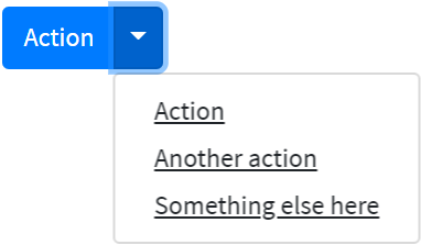
Here is an example with provided Bootstrap v4.3 code:
//@FindBy(id = "splitDropdown")
@UI("#splitDropdown")
public static DropdownMenu splitDropdown;
@Test
public void splitDropdownIsValidationTest() {
splitDropdown.expander().is()
.core()
.hasClass("dropdown-toggle-split");
}
<div id="splitDropdown" class="btn-group">
<button type="button" class="btn btn-primary" style="margin-bottom: 5px;">Action
</button>
<button type="button" class="btn btn-primary dropdown-toggle dropdown-toggle-split"
data-toggle="dropdown" aria-haspopup="true" aria-expanded="false"
style="margin-bottom: 5px;">
<span class="sr-only">Toggle Dropdown</span>
</button>
<div class="dropdown-menu">
<a class="dropdown-item"
href="https://getbootstrap.com/docs/4.0/components/dropdowns/"
target="_blank">Action</a>
<a class="dropdown-item"
href="https://getbootstrap.com/docs/4.0/components/dropdowns/" target="_blank">Another
action</a>
<a class="dropdown-item"
href="https://getbootstrap.com/docs/4.3/getting-started/introduction/"
target="_blank">Something else here</a>
</div>
</div>
Sizing
Button dropdowns work with buttons of all sizes, including default and split dropdown buttons.
Here is an example of Large button code:
//@FindBy(id = "largeDropdown")
public static DropdownMenu largeDropdown;
@UI("#largeSplitDropdown")
@Test
public void largeDropdownIsValidationTest() {
largeDropdown.expander().is()
.core()
.hasClass("btn-lg")
.css(PADDING, is("8px 16px"))
.css(FONTSIZE, is("20px"))
.css(LINEHEIGHT, is("30px"))
.css(BORDERRADIUS, is("4.8px"));
}
<div id="largeDropdown" class="btn-group show">
<button class="btn btn-primary btn-lg dropdown-toggle" type="button" data-
toggle="dropdown" aria-haspopup="true" aria-expanded="true" style="margin-
bottom: 5px;">
Large button
</button>
<div class="dropdown-menu show" x-placement="bottom-start" style="position:
absolute; transform: translate3d(0px, 48px, 0px); top: 0px; left: 0px; will-
change: transform;">
<a class="dropdown-item" href="https://getbootstrap.com/
docs/4.0/components/dropdowns/" target="_blank">Action</a>
<a class="dropdown-item" href="https://getbootstrap.com/
docs/4.0/components/dropdowns/" target="_blank">Another
action</a>
<a class="dropdown-item" href="https://getbootstrap.com/
docs/4.3/getting-started/introduction/"
target="_blank">Something else here</a>
</div>
</div>
Here is an example of Large split button code:
//@FindBy(id = "largeSplitDropdown")
@UI("#largeSplitDropdown")
public static DropdownMenu largeSplitDropdown;
@Test
public void largeSplitDropdownIsValidationTest() {
largeSplitDropdown.expander().is()
.core()
.hasClass("btn-lg")
.hasClass("dropdown-toggle-split")
.css(PADDING, is("8px 12px"))
.css(FONTSIZE, is("20px"))
.css(LINEHEIGHT, is("30px"))
.css(BORDERRADIUS, is("0px 4.8px 4.8px 0px"));
}
<div id="largeSplitDropdown" class="btn-group">
<button class="btn btn-primary btn-lg" type="button" style="margin-bottom: 5px;">
Large split button
</button>
<button type="button" class="btn btn-lg btn-primary dropdown-toggle dropdown-toggle-split" data-toggle="dropdown" aria-haspopup="true" aria-expanded="false" style="margin-bottom: 5px;">
<span class="sr-only">Toggle Dropdown</span>
</button>
<div class="dropdown-menu" x-placement="bottom-start"
style="position: absolute; transform: translate3d(180px, 48px, 0px);
top: 0px; left: 0px; will-change: transform;">
<a class="dropdown-item" href="https://getbootstrap.com/
docs/4.0/components/dropdowns/" target="_blank">Action</a>
<a class="dropdown-item" href="https://getbootstrap.com/
docs/4.0/components/dropdowns/"
target="_blank">Another action</a>
<a class="dropdown-item" href="https://getbootstrap.com/
docs/4.3/getting-started
/introduction/" target="_blank">Something else here</a>
</div>
</div>
Directions
Trigger dropdown menus above elements by adding .dropup to the parent element.
Trigger dropdown menus at the right of the elements by adding .dropright to the parent element.
Trigger dropdown menus at the left of the elements by adding .dropleft to the parent element.
Here is an example of Dropup code:
//@FindBy(id = "dropUpDropdown")
@UI("#dropUpDropdown")
public static DropdownMenu dropUpDropdown;
@Test
public void dropUpDropdownIsValidationTest() {
dropUpDropdown.is()
.core()
.hasClass("dropup");
dropUpDropdown.menu().is()
.core()
.css(TOP, is("auto"))
.css(BOTTOM, is("100%"));
}
<div id="dropUpDropdown" class="btn-group dropup">
<button type="button" class="btn btn-primary dropdown-toggle" data-toggle="dropdown"
aria-haspopup="true" aria-expanded="false" style="margin-bottom: 5px;">
Dropup
</button>
<div class="dropdown-menu">
<a class="dropdown-item"
href="https://getbootstrap.com/docs/4.0/components/dropdowns/"
target="_blank">Action</a>
<a class="dropdown-item"
href="https://getbootstrap.com/docs/4.0/components/dropdowns/" target="_blank">Another
action</a>
<a class="dropdown-item"
href="https://getbootstrap.com/docs/4.3/getting-started/introduction/"
target="_blank">Something else here</a>
</div>
</div>
Here is an example of Dropup split code:
//@FindBy(id = "dropUpSplitDropdown")
@UI("#dropUpSplitDropdown")
public static DropdownMenu dropUpSplitDropdown;
@Test
public void dropUpSplitDropdownIsValidationTest() {
dropUpSplitDropdown.is()
.core()
.hasClass("dropup");
dropUpSplitDropdown.menu().is()
.core()
.css(TOP, is("auto"))
.css(BOTTOM, is("100%"));
}
<div id="dropUpSplitDropdown" class="btn-group dropup">
<button type="button" class="btn btn-primary" style="margin-bottom: 5px;">
Split dropup
</button>
<button type="button" class="btn btn-primary dropdown-toggle dropdown-toggle-split"
data-toggle="dropdown" aria-haspopup="true" aria-expanded="false"
style="margin-bottom: 5px;">
<span class="sr-only">Toggle Dropdown</span>
</button>
<div class="dropdown-menu">
<a class="dropdown-item"
href="https://getbootstrap.com/docs/4.0/components/dropdowns/"
target="_blank">Action</a>
<a class="dropdown-item"
href="https://getbootstrap.com/docs/4.0/components/dropdowns/" target="_blank">Another
action</a>
<a class="dropdown-item"
href="https://getbootstrap.com/docs/4.3/getting-started/introduction/"
target="_blank">Something else here</a>
</div>
</div>
Here is an example of Dropright code:
//@FindBy(id = "dropRightDropdown")
@UI("#dropRightDropdown")
public static DropdownMenu dropRightDropdown;
@Test
public void dropRightDropdownIsValidationTest() {
dropRightDropdown.is()
.core()
.hasClass("dropright");
dropRightDropdown.menu().is()
.core()
.css(RIGHT, is("auto"))
.css(LEFT, is("100%"));
}
<div id="dropRightDropdown" class="btn-group dropright">
<button type="button" class="btn btn-primary dropdown-toggle" data-toggle="dropdown"
aria-haspopup="true" aria-expanded="false" style="margin-bottom: 5px;">
Dropright
</button>
<div class="dropdown-menu">
<a class="dropdown-item"
href="https://getbootstrap.com/docs/4.0/components/dropdowns/"
target="_blank">Action</a>
<a class="dropdown-item"
href="https://getbootstrap.com/docs/4.0/components/dropdowns/" target="_blank">Another
action</a>
<a class="dropdown-item"
href="https://getbootstrap.com/docs/4.3/getting-started/introduction/"
target="_blank">Something else here</a>
</div>
</div>
Here is an example of Dropright split code:
//@FindBy(id = "dropRightSplitDropdown")
@UI("#dropRightSplitDropdown")
public static DropdownMenu dropRightSplitDropdown;
@Test
public void dropRightSplitDropdownIsValidationTest() {
dropRightSplitDropdown.is()
.core()
.hasClass("dropright");
dropRightSplitDropdown.menu().is()
.core()
.css(RIGHT, is("auto"))
.css(LEFT, is("100%"));
}
<div id="dropRightSplitDropdown" class="btn-group dropright">
<button type="button" class="btn btn-primary" style="margin-bottom: 5px;">
Split dropright
</button>
<button type="button" class="btn btn-primary dropdown-toggle dropdown-toggle-split"
data-toggle="dropdown" aria-haspopup="true" aria-expanded="false"
style="margin-bottom: 5px;">
<span class="sr-only">Toggle Dropright</span>
</button>
<div class="dropdown-menu">
<a class="dropdown-item"
href="https://getbootstrap.com/docs/4.0/components/dropdowns/"
target="_blank">Action</a>
<a class="dropdown-item"
href="https://getbootstrap.com/docs/4.0/components/dropdowns/" target="_blank">Another
action</a>
<a class="dropdown-item"
href="https://getbootstrap.com/docs/4.3/getting-started/introduction/"
target="_blank">Something else here</a>
</div>
</div>
Here is an example of Dropleft code:
//@FindBy(id = "dropLeftDropdown")
@UI("#dropLeftDropdown")
public static DropdownMenu dropLeftDropdown;
@Test
public void dropLeftDropdownIsValidationTest() {
dropLeftDropdown.is()
.core()
.hasClass("dropleft");
dropLeftDropdown.menu().is()
.core()
.css(LEFT, is("auto"))
.css(RIGHT, is("100%"));
}
<div id="dropLeftDropdown" class="btn-group dropleft">
<button type="button" class="btn btn-primary dropdown-toggle" data-toggle="dropdown"
aria-haspopup="true" aria-expanded="false" style="margin-bottom: 5px;">
Dropleft
</button>
<div class="dropdown-menu">
<a class="dropdown-item"
href="https://getbootstrap.com/docs/4.0/components/dropdowns/"
target="_blank">Action</a>
<a class="dropdown-item"
href="https://getbootstrap.com/docs/4.0/components/dropdowns/" target="_blank">Another
action</a>
<a class="dropdown-item"
href="https://getbootstrap.com/docs/4.3/getting-started/introduction/"
target="_blank">Something else here</a>
</div>
</div>
Here is an example of Dropleft split code:
//@FindBy(id = "dropLeftSplitDropdown")
@UI("#dropLeftSplitDropdown")
public static DropdownMenu dropLeftSplitDropdown;
@Test
public void dropLeftSplitDropdownIsValidationTest() {
dropLeftSplitDropdown.menu().is()
.core()
.css(LEFT, is("auto"))
.css(RIGHT, is("100%"));
}
<div id="dropLeftSplitDropdown" class="btn-group">
<div class="btn-group dropleft" role="group">
<button type="button" class="btn btn-primary dropdown-toggle dropdown-toggle-split" data-toggle="dropdown" aria-haspopup="true" aria-expanded="false" style="margin-bottom: 5px;">
<span class="sr-only">Toggle Dropleft</span>
</button>
<div class="dropdown-menu" x-placement="left-start" style="position: absolute; transform: translate3d(-2px, 0px, 0px); top: 0px; left: 0px; will-change: transform;">
<a class="dropdown-item" href="https://getbootstrap.com/docs/4.0/components/dropdowns/" target="_blank">Action</a>
<a class="dropdown-item" href="https://getbootstrap.com/docs/4.0/components/dropdowns/" target="_blank">Another action</a>
<a class="dropdown-item" href="https://getbootstrap.com/docs/4.3/getting-started/introduction/" target="_blank">Something else here</a>
</div>
</div>
<button type="button" class="btn btn-primary" style="margin-bottom: 5px;">
Split dropleft
</button>
</div>
Menu items
Historically dropdown menu contents had to be links, but that’s no longer the case with v4.
Now you can optionally use <button> elements in your dropdowns instead of just <a>s.
Here is an example of Menu items code:
//@FindBy(css = "#dropdown-menu-items")
@UI("#dropdown-menu-items")
public static DropdownMenu dropdownMenuItems;
@DataProvider(name = "actionsDataProvider")
public Object[][] actionsDataProvider() {
return new Object[][]{
{"Action", "Action"},
{"Another action", "Another action"},
{"Something else here", "One more action"}
};
}
@Test(dataProvider = "actionsDataProvider")
public void menuItemsActionsTest(String itemText, String alertText) {
dropdownMenuItems.expand();
dropdownMenuItems.select(itemText);
Alerts.validateAlert(Matchers.is(alertText));
dropdownMenuItems.collapse();
}
<div class="dropdown" id="dropdown-menu-items">
<button class="btn btn-primary dropdown-toggle" type="button" id="dropdownMenu2" data-toggle="dropdown" aria-haspopup="true" aria-expanded="false" style="margin-bottom: 5px;">
Menu items
</button>
<div class="dropdown-menu" aria-labelledby="dropdownMenu2">
<button class="dropdown-item" type="button" onclick="alert('Action');">
Action
</button>
<button class="dropdown-item" type="button" onclick="alert('Another action');">
Another action
</button>
<button class="dropdown-item" type="button" onclick="alert('One more action');">
Something else here
</button>
</div>
</div>
You can also create non-interactive dropdown items with .dropdown-item-text. Feel free to style further with custom CSS or text utilities.
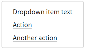
Here is an example of non-interactive dropdown items code:
//@FindBy(css = "dropdown-menu-text-item")
@UI("#dropdown-menu-text-item")
public static DropdownMenu dropdownMenuTextItem;
@Test(expectedExceptions = RuntimeException.class,
expectedExceptionsMessageRegExp = ".*Expected: an array containing \"href\".*")
public void textItemTest() {
dropdownMenuTextItem.expand();
UIElement textItem = dropdownMenuTextItem.list().get("Dropdown item text");
textItem.waitFor().enabled();
textItem.assertThat()
.tag("span");
textItem.waitSec(1);
textItem.assertThat()
.hasAttr("href");
}
<div class="dropdown" id="dropdown-menu-text-item">
<button class="btn btn-primary dropdown-toggle" type="button" data-toggle="dropdown" aria-haspopup="true" aria-expanded="false" style="margin-bottom: 5px;">
Menu items with non-interactive
</button>
<div class="dropdown-menu" x-placement="bottom-start"
style="position: absolute; transform: translate3d(0px, 37px, 0px);
top: 0px; left: 0px; will-change: transform;">
<span class="dropdown-item-text">Dropdown item text</span>
<a class="dropdown-item" href="https://getbootstrap.com/
docs/4.3/components/dropdowns/" target="_blank">Action</a>
<a class="dropdown-item" href="https://getbootstrap.com/
docs/4.3/getting-started/introduction/"
target="_blank">Another action</a>
</div>
</div>
Add .active to items in the dropdown to style them as active.
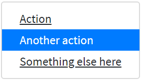
Here is a code example of items in the dropdown which are styled as active:
//@FindBy(css = "#dropdown-menu-items-active")
@UI("#dropdown-menu-items-active")
public static DropdownMenu dropdownMenuItemsActive;
@Test(dataProvider = "dropdownMenu")
public void dropdownMenuTest(String itemText, String itemHref) {
dropdownMenuItemsActive.expand();
int currWindowNum = WindowsManager.windowsCount();
dropdownMenuItemsActive.select(itemText);
WindowsManager.switchToWindow(currWindowNum + 1);
String Url = WebPage.getUrl();
assertEquals(Url, itemHref);
WindowsManager.closeWindow();
WindowsManager.switchToWindow(currWindowNum);
dropdownMenuItemsActive.collapse();
}
@Test
public void isActiveTest() {
dropdownMenuItemsActive.expand();
dropdownMenuItemsActive.is().active(2);
dropdownMenuItemsActive.collapse();
}
<div class="dropdown" id="dropdown-menu-items-active">
<button class="btn btn-primary dropdown-toggle" type="button" data-toggle="dropdown" aria-haspopup="true" aria-expanded="false" style="margin-bottom: 5px;">
Menu items with active
</button>
<div class="dropdown-menu">
<a class="dropdown-item" href="https://getbootstrap.com/
docs/4.3/components/dropdowns/#active"
target="_blank">Action</a>
<a class="dropdown-item active"
href="https://getbootstrap.com/docs/4.3/components/dropdowns/"
target="_blank">Another action</a>
<a class="dropdown-item" href="https://getbootstrap.com/
docs/4.3/getting-started/introduction/"
target="_blank">Something else here</a>
</div>
</div>
Bootstrap test examples
Disabled
Add .disabled to items in the dropdown to style them as disabled.
Here is a code example of items in the dropdown which are styled as disabled:
//@FindBy(css = "#dropdown-menu-disabled-item")
@UI("#dropdown-menu-disabled-item")
public static DropdownMenu dropdownMenuDisabledItem;
private final String DISABLED_ITEM_TEXT = "Disabled link";
private final String DISABLED_ITEM_HREF = "https://getbootstrap.com/docs/4.3/components/dropdowns/";
@Test
public void itemTest() {
dropdownMenuDisabledItem.expand();
dropdownMenuDisabledItem.list()
.get(DISABLED_ITEM_TEXT)
.assertThat()
.tag("a")
.attr("href", DISABLED_ITEM_HREF)
.disabled();
dropdownMenuDisabledItem.collapse();
}
<div class="dropdown" id="dropdown-menu-disabled-item">
<button class="btn btn-primary dropdown-toggle" type="button" data-toggle="dropdown" aria-haspopup="true" aria-expanded="false" style="margin-bottom: 5px;">
Menu items with disabled
</button>
<div class="dropdown-menu">
<a class="dropdown-item" href="https://getbootstrap.com/
docs/4.3/components/dropdowns/"
target="_blank">Regular link</a>
<a class="dropdown-item disabled"
href="https://getbootstrap.com/docs/4.3/components/
dropdowns/" target="_blank">Disabled link</a>
<a class="dropdown-item" href="https://getbootstrap.com/
docs/4.3/getting-started/introduction/"
target="_blank">Another link</a>
</div>
</div>
Menu alignment
By default, a dropdown menu is automatically positioned 100% from the top and along the left side of its parent. Add .dropdown-menu-right to a .dropdown-menu to right align the dropdown menu.
Here is an example of right-aligned menu:
Here is an example of right-aligned menu code:
//@FindBy(id = "rightAllignedDropdown")
@UI("#rightAllignedDropdown")
public static DropdownMenu rightAllignedDropdown;
@Test
public void rightAllignedDropdownIsValidationTest() {
rightAllignedDropdown.menu().is()
.core()
.hasClass("dropdown-menu-right");
}
<div id="rightAllignedDropdown" class="btn-group">
<button type="button" class="btn btn-primary dropdown-toggle" data-toggle="dropdown"
aria-haspopup="true" aria-expanded="false" style="margin-bottom: 5px;">
Right-aligned menu example
</button>
<div class="dropdown-menu dropdown-menu-right">
<button class="dropdown-item" type="button" onclick="alert('Action');">Action
</button>
<button class="dropdown-item" type="button" onclick="alert('Another action');">
Another action
</button>
<button class="dropdown-item" type="button" onclick="alert('One more action');">
Something else here
</button>
</div>
</div>
If you want to use responsive alignment, disable dynamic positioning by adding the
data-display="static" attribute and use the responsive variation classes.
To align right the dropdown menu with the given breakpoint or larger, add
.dropdown-menu{-sm|-md|-lg|-xl}-right.
Here is an example of left-aligned but right aligned when large screen:
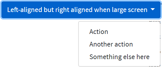
Here is an example of left-aligned but right aligned when large screen code:
<div class="btn-group">
<button type="button" class="btn btn-primary dropdown-toggle"
data-toggle="dropdown" data-display="static" aria-haspopup="true" aria-expanded="false" style="margin-bottom: 5px;">
Right aligned when large screen
</button>
<div class="dropdown-menu dropdown-menu-lg-right">
<button class="dropdown-item" type="button" onclick="alert('Action');">Action
</button>
<button class="dropdown-item" type="button" onclick="alert('Another action');">
Another action
</button>
<button class="dropdown-item" type="button" onclick="alert('One more action');">
Something else here
</button>
</div>
</div>
To align left the dropdown menu with the given breakpoint or larger, add
.dropdown-menu-right and .dropdown-menu{-sm|-md|-lg|-xl}-left.
Here is an example of right-aligned but left aligned when large screen code:
//@FindBy(id = "leftAllignedDropdown")
@UI("#leftAllignedDropdown")
public static DropdownMenu leftAllignedDropdown;
@Test
public void leftAllignedDropdownIsValidationTest() {
leftAllignedDropdown.menu().is()
.core()
.hasClass("dropdown-menu-lg-left")
.css(RIGHT, is("auto"))
.css(LEFT, is("0px"));
}
<div id="leftAllignedDropdown" class="btn-group">
<button type="button" class="btn btn-primary dropdown-toggle" data-toggle="dropdown" data-display="static" aria-haspopup="true" aria-expanded="false" style="margin-bottom: 5px;">
Left aligned when large screen
</button>
<div class="dropdown-menu dropdown-menu-right dropdown-menu-lg-left">
<button class="dropdown-item" type="button" onclick="alert('Action');">Action
</button>
<button class="dropdown-item" type="button" onclick="alert('Another action');">
Another action
</button>
<button class="dropdown-item" type="button" onclick="alert('One more action');">
Something else here
</button>
</div>
</div>
Menu content
Add a header to label sections of actions in any dropdown menu.
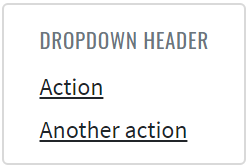
Here is an example headers code in the menu items:
//@FindBy(id = "dropdown-content-header")
@UI("#dropdown-content-header")
public static DropdownMenuContent dropdownMenuContentHeader;
@Test
public void checkHeaderTest() {
dropdownMenuContentHeader.show();
dropdownMenuContentHeader.is().displayed();
dropdownMenuContentHeader.expand();
dropdownMenuContentHeader.menu().children().is().size(2);
dropdownMenuContentHeader.header.is().core()
.displayed()
.tag("h6")
.hasClass("dropdown-header")
.text("DROPDOWN HEADER");
}
<div class="dropdown-menu" id="dropdown-content-header">
<h6 class="dropdown-header">Dropdown header</h6>
<a class="dropdown-item" href="https://getbootstrap.com/"
target="_blank">Action</a>
<a class="dropdown-item" href="https://getbootstrap.com/docs/
4.0/components/dropdowns/"
target="_blank">Another action</a>
</div>
Separate groups of related menu items with a divider.
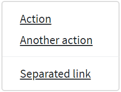
Here is an example dividers code in the menu items:
//@FindBy(id = "dropdown-content-divider")
@UI("#dropdown-content-divider")
public static DropdownMenuContent dropdownMenuContentDivider;
@Test
public void checkDividerTest() {
dropdownMenuContentDivider.show();
dropdownMenuContentDivider.is().displayed();
dropdownMenuContentDivider.expand();
dropdownMenuContentDivider.menu().children().is().size(4);
dropdownMenuContentDivider.divider.is().core()
.displayed()
.tag("div")
.hasClass("dropdown-divider");
}
<div class="dropdown-menu" id="dropdown-content-divider">
<a class="dropdown-item" href="https://getbootstrap.com/"
target="_blank">Action</a>
<a class="dropdown-item" href="https://getbootstrap.com/docs
/4.0/components/dropdowns/"
target="_blank">Another action</a>
<div class="dropdown-divider"></div>
<a class="dropdown-item"
href="https://getbootstrap.com/docs/4.3/getting-started/
introduction/"
target="_blank">Separated link</a>
</div>
Place any freeform text within a dropdown menu with text and use spacing utilities. Note that you’ll likely need additional sizing styles to constrain the menu width.
Here is an example text code in the menu items:
//@FindBy(id = "dropdown-content-text")
@UI("#dropdown-content-text")
public static DropdownMenuContent dropdownMenuContentText;
@Test
public void checkTextTest() {
dropdownMenuContentText.show();
dropdownMenuContentText.is().displayed();
dropdownMenuContentText.expand();
dropdownMenuContentText.menu().children().is().size(2);
dropdownMenuContentText.text.is()
.values(TextTypes.TEXT, hasItems("Some example text that's free-flowing within the dropdown menu."));
dropdownMenuContentText.text.is()
.values(TextTypes.TEXT, hasItems("And this is more example text."));
}
<div class="dropdown-menu p-4 text-muted" style="max-width: 200px;" id="dropdown-content-text">
<p>
Some example text that's free-flowing within the dropdown menu.
</p>
<p class="mb-0">
And this is more example text.
</p>
</div>
Put a form within a dropdown menu, or make it into a dropdown menu, and use margin or padding utilities to give it the negative space you require.
Here is an example form code in the menu items:
public class DropdownForm extends DropdownMenu {
@UI("//form") public FormDropdownLogin form;
}
@Test
public void fillTest() {
dropdownForm.expand();
dropdownForm.form.fill(USER);
dropdownForm.form.check(USER);
dropdownForm.collapse();
}
@Test
public void checkboxTests() {
dropdownForm.expand();
dropdownForm.form.remember.check();
dropdownForm.form.remember.is().selected();
dropdownForm.form.remember.uncheck();
dropdownForm.form.remember.is().deselected();
dropdownForm.collapse();
}
@Test
public void testButton(){
dropdownForm.expand();
dropdownForm.form.submit();
validateAlert(is("Sign in"));
dropdownForm.collapse();
}
<div class="dropdown-menu">
<form class="px-4 py-3">
<div class="form-group">
<label for="exampleDropdownFormEmail1">Email address</label>
<input type="email" class="form-control" id="exampleDropdownFormEmail1"
placeholder="email@example.com">
</div>
<div class="form-group">
<label for="exampleDropdownFormPassword1">Password</label>
<input type="password" class="form-control" id="exampleDropdownFormPassword1"
placeholder="Password">
</div>
<div class="form-group">
<div class="form-check">
<input type="checkbox" class="form-check-input" id="dropdownCheck">
<label class="form-check-label" for="dropdownCheck">
Remember me
</label>
</div>
</div>
<button type="button" class="btn btn-primary" onclick="alert('Sign in');">Sign in
</button>
</form>
<div class="dropdown-divider"></div>
<a class="dropdown-item" href="https://jdi-testing.github.io/jdi-light/index.html"
target="_blank">New around here? Sign up</a>
<a class="dropdown-item" href="https://jdi-testing.github.io/jdi-light/index.html"
target="_blank">Forgot password?</a>
</div>
Use data-offset or data-reference to change the location of the dropdown.
//@FindBy(id = "offsetDropdown")
@UI("#offsetDropdown")
public static DropdownMenu offsetDropdown;
//@FindBy(id = "referenceDropdown")
@UI("#referenceDropdown")
public static DropdownMenu referenceDropdown;
@Test(dataProvider = "dropdownData")
public void expandCollapseTest(BootstrapDropdown dropdown) {
dropdown.expand();
dropdown.is().expanded();
dropdown.collapse();
dropdown.is().collapsed();
}
@Test
public void optionsCssTest() {
offsetDropdown.expand();
assertThat(offsetDropdown.core().children().get(1).getAttribute(DATA_OFFSET), is(DATA_OFFSET_VALUE));
offsetDropdown.collapse();
referenceDropdown.expand();
assertThat(referenceDropdown.core().children().get(2).getAttribute(DATA_REFERENCE), is(DATA_REFERENCE_VALUE));
referenceDropdown.collapse();
}
Here is an example with Bootstrap v4.3 code:
<div id="referenceDropdown" class="btn-group">
<button type="button" class="btn btn-secondary">Reference</button>
<button type="button" class="btn btn-secondary dropdown-toggle dropdown-toggle-split" id="dropdownMenuReference" data-toggle="dropdown" aria-haspopup="true" aria-expanded="false" data-reference="parent">
<span class="sr-only">Toggle Dropdown</span>
</button>
<div class="dropdown-menu" aria-labelledby="dropdownMenuReference">
<a class="dropdown-item" href="javascript: void();" onclick="alert('Action clicked!');">Action</a>
<a class="dropdown-item" href="javascript: void();" onclick="alert('Another action clicked!');">Another action</a>
<a class="dropdown-item" href="javascript: void();" onclick="alert('Something else here clicked!');">Something else here</a>
<div class="dropdown-divider"></div>
<a class="dropdown-item" href="javascript: void();" onclick="alert('Separated link clicked!');">Separated link</a>
</div>
</div>
4. Material UI elements
4.1 Checkbox
// @FindBy(xpath = "//h2[text()='Basic checkboxes']/following-sibling::div/span[contains(@class,'MuiCheckbox-root')]")
@UI("//h2[text()='Basic checkboxes']/following-sibling::div/span[contains(@class,'MuiCheckbox-root')]")
public static List<Checkbox> basicCheckboxes;
@Test
public void basicCheckboxTests() {
basicCheckboxes.forEach(this::basicCheckboxTestLogic);
}
private void basicCheckboxTestLogic(Checkbox checkbox) {
if (checkbox.isDisabled()) {
checkbox.is().disabled();
if (checkbox.isChecked()) {
checkbox.is().checked();
} else {
checkbox.is().unchecked();
}
} else {
checkbox.is().enabled();
if (checkbox.isUnchecked()) {
checkbox.is().unchecked();
checkbox.check();
checkbox.is().checked();
} else {
checkbox.is().checked();
checkbox.uncheck();
checkbox.is().unchecked();
}
}
if (checkbox.isIndeterminate()) {
checkbox.is().indeterminate();
}
checkbox.has().css("color", "rgba(0, 0, 0, 0)");
}
Checkbox overview
Checkbox is located in the following class:
- Java: com.epam.jdi.light.material.elements.inputs.Checkbox
Checkbox - element that allows the user to select one or more items from a set. It can be used to turn an option on or off.
Here is an example with provided Material-UI v4.12.3 code:
<span class="MuiButtonBase-root MuiIconButton-root jss165 MuiCheckbox-root MuiCheckbox-colorSecondary jss166 Mui-checked MuiIconButton-colorSecondary" aria-disabled="false">
<span class="MuiIconButton-label">
<input class="jss168" type="checkbox" data-indeterminate="false" aria-label="primary checkbox" value="" checked="">
<svg class="MuiSvgIcon-root" focusable="false" viewBox="0 0 24 24" aria-hidden="true">
<path d="M19 3H5c-1.11 0-2 .9-2 2v14c0 1.1.89 2 2 2h14c1.11 0 2-.9 2-2V5c0-1.1-.89-2-2-2zm-9 14l-5-5 1.41-1.41L10 14.17l7.59-7.59L19 8l-9 9z"></path>
</svg>
</span>
<span class="MuiTouchRipple-root"></span>
</span>
Available methods in Java JDI Light:
| Field / Method | Description | Return Type |
|---|---|---|
| icon | Returns checkbox icon | Icon |
| is() | Returns object for work with assertions | CheckboxAssert |
| isChecked() | Checks whether checkbox is checked | boolean |
| isUnchecked() | Checks whether checkbox is unchecked | boolean |
| isEnabled() | Checks whether checkbox is enabled | boolean |
| check() | Checks checkbox | void |
| uncheck() | Unchecks checkbox | void |
| label() | Returns checkboxes label | Label |
| isIndeterminate() | Checks whether checkbox is indeterminate | boolean |
| labelPosition() | Returns checkbox label's position (top, bottom start, end) | Position |
Here you can find Checkbox tests
4.2 Chips
// @FindBy(xpath = "//h2[text()='Chip array']/following-sibling::div//div[contains(@class, 'MuiChip-root')]")
@UI("//h2[text()='Chip array']/following-sibling::div//div[contains(@class, 'MuiChip-root')]")
public static List<Chip> arrayChips;
@Test(dataProvider = "arrayChipsTestsDataProvider",
dataProviderClass = ChipDataProvider.class)
public void arrayChipsTests(int index, String text) {
arrayChipsTestLogic(arrayChips.get(index), text);
}
public void arrayChipsTestLogic(Chip chip, String text) {
String clickInfoText = String.format(basicClickText + " %s", text).trim();
chip.is().displayed();
chip.label().has().text(text);
chip.is().enabled();
chip.is().clickable();
chip.click();
lastClickArrayInfo.has().text(clickInfoText);
if (chip.icon().isDisplayed()) {
chip.icon().is().displayed();
chip.icon().click();
lastClickArrayInfo.has().text(basicClickText);
}
if (chip.isDeletable()) {
chip.is().deletable();
}
}
Chips overview
Chip is located in the following class:
- Java: com.epam.jdi.light.material.elements.displaydata.Chip
Chips - compact elements that represent an input, attribute, or action. Chips allow users to enter information, make selections, filter content, or trigger actions.
Here is an example with provided Material-UI v4.12.3 code:
<h2>Chip array</h2>
<div>
<ul class="MuiPaper-root jss13 MuiPaper-elevation1 MuiPaper-rounded">
<li>
<div class="MuiButtonBase-root MuiChip-root jss14 MuiChip-clickable MuiChip-deletable" tabindex="0" role="button">
<span class="MuiChip-label">Angular</span>
<svg class="MuiSvgIcon-root MuiChip-deleteIcon" focusable="false" viewBox="0 0 24 24" aria-hidden="true">...</svg>
<span class="MuiTouchRipple-root"></span>
</div>
</li>
<li>
<div class="MuiButtonBase-root MuiChip-root jss14 MuiChip-clickable MuiChip-deletable" tabindex="0" role="button">
<span class="MuiChip-label">jQuery</span>
<svg class="MuiSvgIcon-root MuiChip-deleteIcon" focusable="false" viewBox="0 0 24 24" aria-hidden="true">...</svg>
<span class="MuiTouchRipple-root"></span>
</div>
</li>
<li>
<div class="MuiButtonBase-root MuiChip-root jss14 MuiChip-clickable MuiChip-deletable" tabindex="0" role="button">
<span class="MuiChip-label">Polymer</span>
<svg class="MuiSvgIcon-root MuiChip-deleteIcon" focusable="false" viewBox="0 0 24 24" aria-hidden="true">...</svg>
<span class="MuiTouchRipple-root"></span>
</div>
</li>
<li>
<div class="MuiButtonBase-root MuiChip-root jss14 MuiChip-clickable" tabindex="0" role="button">
<svg class="MuiSvgIcon-root MuiChip-icon" focusable="false" viewBox="0 0 24 24" aria-hidden="true">
<path d="M11.99 2C6.47 2 2 6.48 2 12s4.47 10 9.99 10C17.52 22 22 17.52 22 12S17.52 2 11.99 2zM12 20c-4.42 0-8-3.58-8-8s3.58-8 8-8 8 3.58 8 8-3.58 8-8 8zm3.5-9c.83 0 1.5-.67 1.5-1.5S16.33 8 15.5 8 14 8.67 14 9.5s.67 1.5 1.5 1.5zm-7 0c.83 0 1.5-.67 1.5-1.5S9.33 8 8.5 8 7 8.67 7 9.5 7.67 11 8.5 11zm3.5 6.5c2.33 0 4.31-1.46 5.11-3.5H6.89c.8 2.04 2.78 3.5 5.11 3.5z"></path>
</svg>
<span class="MuiChip-label">React</span><span class="MuiTouchRipple-root"></span>
</div>
</li>
<li>
<div class="MuiButtonBase-root MuiChip-root jss14 MuiChip-clickable MuiChip-deletable" tabindex="0" role="button">
<span class="MuiChip-label">Vue.js</span>
<svg class="MuiSvgIcon-root MuiChip-deleteIcon" focusable="false" viewBox="0 0 24 24" aria-hidden="true">...</svg>
<span class="MuiTouchRipple-root"></span>
</div>
</li>
</ul>
<p id="lastChipArrayClickInfo">You clicked on: jQuery</p>
</div>
Available methods in Java JDI Light:
| Field / Method | Description | Return Type |
|---|---|---|
| deleteIcon | Returns chip's delete icon | Icon |
| avatar | Returns chip's avatar | Avatar |
| icon | Returns chip's icon | Icon |
| is() | Returns object for work with assertions | ChipAssert |
| label() | Returns chip's label | Label |
| isClickable() | Checks whether chip is clickable | boolean |
| isDeletable() | Checks whether chip is deletable | boolean |
| isLink() | Checks whether chip is link | boolean |
| href() | Returns chip's href attribute | String |
| delete() | Deletes chip | void |
Here you can find Chips tests
4.3 Tooltip
// @FindBy(xpath = "//h2[text()='Simple tooltips']/following-sibling::div[1]/button")
@UI("//h2[text()='Simple tooltips']/following-sibling::div[1]/button")
public static List<TooltipButton> simpleTooltipsButton;
@Test(dataProvider = "simpleTooltipsTestData")
public void simpleTooltipsTest(int number, String text) {
checkTooltip(simpleTooltipsButton.get(number), text);
}
private static void checkTooltip(TooltipButton tooltipButton, String expectedText) {
tooltipButton.hover();
tooltipButton.tooltip().is().visible();
tooltipButton.tooltip().has().text(containsString(expectedText));
}
@DataProvider
public Object[][] simpleTooltipsTestData() {
return new Object[][]{
{1, "Delete"}, {2, "Add"}, {3, "Add"}
};
}
public interface HasTooltip extends ICoreElement {
default Tooltip tooltip() {
return new Tooltip();
}
}
Tooltip overview
Tooltip is located in the following class:
- Java: com.epam.jdi.light.material.elements.displaydata.Tooltip
Tooltips - elements that display informative text when users hover over, focus on, or tap an element.
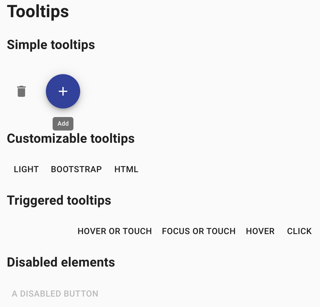
Here is an example with provided Material-UI v4.12.3 code:
<button class="MuiButtonBase-root MuiFab-root jss183 MuiFab-primary" tabindex="0" type="button" aria-label="add" title="Add">
<span class="MuiFab-label">
<svg class="MuiSvgIcon-root" focusable="false" viewBox="0 0 24 24" aria-hidden="true">...</svg>
</span>
<span class="MuiTouchRipple-root"></span>
</button>
Available methods in Java JDI Light:
| Method | Description | Return Type |
|---|---|---|
| is() | Returns object for work with assertions | TooltipAssert |
| isVisible() | Checks whether element is displayed | boolean |
| isInteractive() | Checks whether element is interactive | boolean |
| getValue() | Gets tooltip text | String |
Here you can find Tooltip tests
4.4 Container
// @FindBy(css = ".MuiContainer-root.MuiContainer-maxWidthSm")
@UI(".MuiContainer-root.MuiContainer-maxWidthSm")
public static Container container;
@Test
public void fluidContainerTest() {
container.has().maxWidth("600px");
container.is().fluid();
container.is().displayed();
container.is().enabled();
}
Container overview
Container is located in the following class:
- Java: com.epam.jdi.light.material.elements.layout.Container
Container - the most basic layout element. It centers your content horizontally.
Here is an example with provided Material-UI v4.12.3 code:
<div class="MuiContainer-root MuiContainer-maxWidthSm">
<div class="MuiTypography-root MuiTypography-body1" style="background-color: rgb(207, 232, 252); height: 20vh;">
Example text
</div>
</div>
Available methods in Java JDI Light:
| Method | Description | Return Type |
|---|---|---|
| is() | Returns object for work with assertions | ContainerAssert |
| isFixed() | Check whether container is fixed | boolean |
| isFluid() | Check whether container is fluid | boolean |
| maxWidth() | Returns max width of container | int |
Here you can find Container tests
4.5 Avatar
// @FindBy(className = "MuiAvatar-root")
@UI(".MuiAvatar-root")
public static List<Avatar> avatarsWithPhoto;
@Test
public void avatarsWithPhotoTests() {
for(Avatar avatar : avatarsWithPhoto) {
avatar.is().displayed();
avatar.image().is().displayed();
}
}
Avatars overview
Avatar is located in the following class:
- Java: com.epam.jdi.light.material.elements.displaydata.Avatar
Avatars - graphical representations of users.
Here is an example with provided Material-UI v4.12.3 code:
<span class="MuiBadge-root">
<div class="MuiAvatar-root MuiAvatar-circular">
<img alt="Remy Sharp" src="https://v4.mui.com/static/images/avatar/1.jpg" class="MuiAvatar-img"></div>
<span class="MuiBadge-badge jss347 MuiBadge-anchorOriginBottomRightCircular MuiBadge-dot"></span>
</span>
Available methods in Java JDI Light:
| Method | Description | Return Type |
|---|---|---|
| is() | Returns object for work with assertions | AvatarAssert |
| icon() | Returns avatar's icon | Icon |
| variant() | Returns avatar's variant type | VariantType |
Here you can find Avatar tests
4.6 Divider
// @FindBy(css = "hr.MuiDivider-root")
@UI("hr.MuiDivider-root")
public static Divider insetDivider;
@Test
public void insetDividerTest() {
insetDivider.is().inset();
}
Divider overview
Divider is located in the following class:
- Java: com.epam.jdi.light.material.elements.displaydata.Divider
Divider - a thin line that groups content in lists and layouts.
Here is an example with provided Material-UI v4.12.3 code:
<ul class="MuiList-root jss46 MuiList-padding">
<li class="MuiListItem-root MuiListItem-gutters">...</li>
<li class="MuiDivider-root MuiDivider-inset" role="separator"></li>
<li class="MuiListItem-root MuiListItem-gutters">...</li>
<li class="MuiDivider-root MuiDivider-inset" role="separator"></li>
<li class="MuiListItem-root MuiListItem-gutters">...</li>
</ul>
Available methods in Java JDI Light:
| Method | Description | Return Type |
|---|---|---|
| is() | Returns object for work with assertions | DividerAssert |
| isInset() | Assert inset divider | boolean |
| isVertical() | Assert vertical divider | boolean |
Here you can find Inset Divider tests
Here you can find Vertical Divider tests
4.7 Card
// @FindBy(id = "simpleCard")
@UI("#simpleCard")
public static SimpleCard simpleCard;
@Test
public void simpleCardTest() {
simpleCard.is().displayed();
simpleCard.has().title(Matchers.equalTo("be•nev•o•lent"));
simpleCard.primaryText().has().text(containsString("a benevolent smile"));
simpleCard.learnMoreButton().click();
}
Card overview
Card is located in the following class:
- Java: com.epam.jdi.light.material.elements.surfaces.Card
SimpleCard subclass is located in the following class: - Java: io.github.com.custom.elements.cards.SimpleCard
ComplexInteractionCard subclass is located in the following class: - Java: io.github.com.custom.elements.cards.ComplexInteractionCard
Card - element that contains content and actions about a single subject.
Here is an example with provided Material-UI v4.12.3 code:
<div class="MuiPaper-root MuiCard-root jss160 MuiPaper-elevation1
MuiPaper-rounded" id="simpleCard">
<div class="MuiCardContent-root">
<p class="MuiTypography-root jss162 MuiTypography-body1 MuiTypography-colorTextSecondary MuiTypography-gutterBottom">
Word of the Day
</p>
<h2 class="MuiTypography-root MuiTypography-h5">
be
<span class="jss161">•</span>
nev
<span class="jss161">•</span>
o
<span class="jss161">•</span>
lent
</h2>
<p class="MuiTypography-root jss163 MuiTypography-body1 MuiTypography-colorTextSecondary">
adjective
</p>
<p class="MuiTypography-root MuiTypography-body2">
well meaning and kindly.<br>a benevolent smile
</p>
</div>
<div class="MuiCardActions-root MuiCardActions-spacing">
<button class="MuiButtonBase-root MuiButton-root MuiButton-text MuiButton-textSizeSmall MuiButton-sizeSmall" tabindex="0" type="button">
<span class="MuiButton-label">Learn More</span>
<span class="MuiTouchRipple-root"></span>
</button>
</div>
</div>
Available methods in Java JDI Light for Card:
| Method | Description | Return Type |
|---|---|---|
| is() | Returns object for work with assertions | CardAssert |
| actions() | Returns element's part with action buttons | UIElement |
| title() | Returns element's title | UIElement |
| subHeader() | Returns element's sub header | UIElement |
Available methods in Java JDI Light for SimpleCard:
| Method | Description | Return Type |
|---|---|---|
| primaryText() | Returns element's primary body | UIElement |
| learnMoreButton() | Returns element's 'Learn More' button | Button |
Available methods in Java JDI Light for ComplexInteractionCard:
| Method | Description | Return Type |
|---|---|---|
| textUnderImage() | Returns element's text under image | Text |
| addToFavoritesButton() | Returns element's 'Add to Favorites' button | Button |
| addToFavoritesSvgIcon() | Returns element's 'Add to Favorites' icon | Icon |
| shareButton() | Returns element's 'Share' button | Button |
| expandButton() | Returns element's 'Expand' button | Button |
Here you can find Card tests
4.8 Radio
// @FindBy(css = "#simpleRadio .MuiRadio-root")
@UI("#simpleRadio .MuiRadio-root")
public static RadioButtons simpleRadioButtons;
@Test
public void simpleRadioTest() {
simpleRadioButtons.has().values("First", "Second", "Third", "Disabled");
simpleRadioButtons.has().enabled("First", "Second", "Third");
simpleRadioButtons.has().disabled("Disabled");
asList("First", "Second", "Third").forEach(label -> {
simpleRadioButtons.select(label);
simpleRadioButtons.has().selected(label);
lastRadioText.has().text(containsString(label));
});
}
Radio overview
Radio is located in the following class:
- Java: com.epam.jdi.light.material.elements.inputs.RadioButtons
Radio buttons - elements that allow the user to select one option from a set.
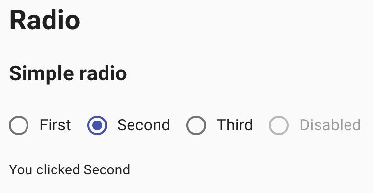
Here is an example with provided Material-UI v4.12.3 code:
<fieldset class="MuiFormControl-root" id="simpleRadio">
<div class="MuiFormGroup-root" role="radiogroup" aria-label="gender">
<label class="MuiFormControlLabel-root">
<span class="MuiButtonBase-root MuiIconButton-root jss215 MuiRadio-root MuiRadio-colorSecondary MuiIconButton-colorSecondary" aria-disabled="false">...</span>
<span class="MuiTypography-root MuiFormControlLabel-label MuiTypography-body1">First</span>
</label>
<label class="MuiFormControlLabel-root">
<span class="MuiButtonBase-root MuiIconButton-root jss215 MuiRadio-root MuiRadio-colorSecondary jss216 Mui-checked MuiIconButton-colorSecondary" aria-disabled="false">...</span>
<span class="MuiTypography-root MuiFormControlLabel-label MuiTypography-body1">Second</span>
</label>
<label class="MuiFormControlLabel-root">
<span class="MuiButtonBase-root MuiIconButton-root jss215 MuiRadio-root MuiRadio-colorSecondary MuiIconButton-colorSecondary" aria-disabled="false">...</span>
<span class="MuiTypography-root MuiFormControlLabel-label MuiTypography-body1">Third</span>
</label>
<label class="MuiFormControlLabel-root Mui-disabled">
<span class="MuiButtonBase-root MuiIconButton-root jss215 MuiRadio-root MuiRadio-colorSecondary jss217 Mui-disabled MuiIconButton-colorSecondary Mui-disabled Mui-disabled" tabindex="-1" aria-disabled="true">...</span>
<span class="MuiTypography-root MuiFormControlLabel-label Mui-disabled MuiTypography-body1">Disabled</span>
</label>
</div>
</fieldset>
Available methods in Java JDI Light:
| Method | Description | Return Type |
|---|---|---|
| is() | Returns object for work with assertions | RadioAssert |
| label(String) | Get label of radiobutton by value | UIElement |
| labels() | Returns list of labels | List |
| values() | Returns list of values | List |
| get(String) | Returns radio button by value | UIElement |
| select(String) | Select radiobutton by value | void |
| selected() | Get selected radiobutton value | String |
| selected(String/int) | Check whether specified radio button is selected | boolean |
| listEnabled() | Returns list of enabled values | List |
| listDisabled() | Returns list of disabled values | List |
Here you can find Radio tests
4.9 App Bar
// @FindBy(css = ".MuiAppBar-root[1]")
@UI(".MuiAppBar-root[1]")
public static AppBar simpleAppBar;
@Test
public void simpleAppBarTest() {
simpleAppBar.is().displayed();
simpleAppBar.title().has().text("News");
simpleAppBar.buttonGroup().is().displayed().and().has().buttons(2);
}
App Bar overview
App Bar is located in the following class:
- Java: com.epam.jdi.light.material.elements.surfaces.AppBar
App Bar - element that displays information and actions relating to the current screen.
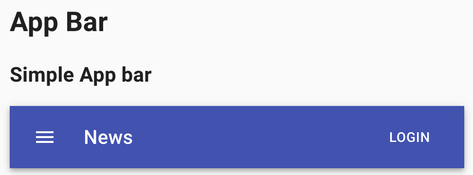
Here is an example with provided Material-UI v4.12.3 code:
<header class="MuiPaper-root MuiAppBar-root MuiAppBar-positionStatic MuiAppBar-colorPrimary MuiPaper-elevation4">
<div class="MuiToolbar-root MuiToolbar-regular MuiToolbar-gutters">
<button class="MuiButtonBase-root MuiIconButton-root jss172 MuiIconButton-colorInherit MuiIconButton-edgeStart" tabindex="0" type="button" aria-label="menu">...</button>
<h6 class="MuiTypography-root jss173 MuiTypography-h6">News</h6>
<button class="MuiButtonBase-root MuiButton-root MuiButton-text MuiButton-colorInherit" tabindex="0" type="button">
<span class="MuiButton-label">Login</span>
<span class="MuiTouchRipple-root"></span>
</button>
</div>
</header>
Available methods in Java JDI Light:
| Method | Description | Return Type |
|---|---|---|
| buttonGroup() | Returns the app bar buttons | ButtonGroup |
| title() | Returns app bar title | Text |
| searchField() | Returns app bar search field | TextField |
| is() | Returns object for work with assertions | TextAssert |
Here you can find AppBar tests
4.10 Transitions
// @FindBy(xpath = "//h2[text()='Collapse']/following::div[contains(@class,'MuiCollapse-root')]")
@UI("//h2[text()='Collapse']/following::div[contains(@class,'MuiCollapse-root')]")
public static List<Transition> collapseTransitions;
// @FindBy(css = "span.MuiSwitch-root")
@UI("span.MuiSwitch-root")
public static List<Switch> switches;
@Test
public void collapseDisplayTest() {
switches.get(1).check();
collapseTransitions.get(1).is().displayed();
collapseTransitions.get(2).is().displayed();
switches.get(1).uncheck();
collapseTransitions.get(1).is().hidden();
collapseTransitions.get(2).is().displayed();
}
Transitions overview
Transitions is located in the following class:
- Java: com.epam.jdi.light.material.elements.utils.Transition
Transitions - element that can be used to introduce some basic motion to your applications.
It helps make a UI expressive and easy to use.
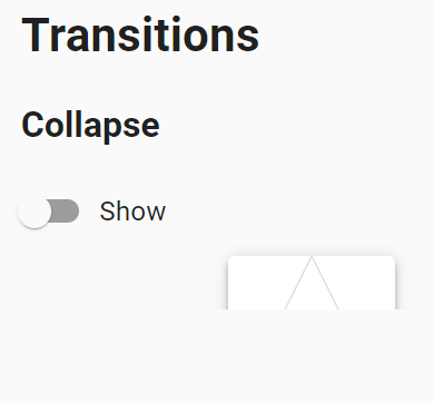
Here is an example with provided Material-UI v4.12.3 code:
<div class="jss257">
<label class="MuiFormControlLabel-root">
<span class="MuiSwitch-root">
<span class="MuiButtonBase-root MuiIconButton-root jss262 MuiSwitch-switchBase MuiSwitch-colorSecondary" aria-disabled="false">
<span class="MuiIconButton-label">
<input class="jss265 MuiSwitch-input" type="checkbox" value="">
<span class="MuiTypography-root MuiFormControlLabel-label MuiTypography-body1">Show</span>
</label>
<div class="jss258">
<div class="MuiCollapse-root MuiCollapse-hidden" style="min-height: 0px; height: 0px; transition-duration: 300ms;">
<div class="MuiCollapse-wrapper">...</div>
</div>
<div class="MuiCollapse-root" style="min-height: 40px; height: 40px; transition-duration: 300ms;">
<div class="MuiCollapse-wrapper">...</div>
</div>
</div>
</div>
Available methods in Java JDI Light:
| Method | Description | Return Type |
|---|---|---|
| is() | Returns object for work with assertions | TransitionAssert |
| isEntered() | Checks whether transition is entered | boolean |
| isHidden() | Checks whether transition is hidden | boolean |
| isExited() | Checks whether transition is exited | boolean |
| isDisplayed() | Checks whether transition is displayed | boolean |
Here you can find Transitions tests
4.11 Material Icons
// @FindBy(xpath = "//h2[text()='Access Alarm']/following::*[name()='svg']")
@UI("//h2[text()='Access Alarm']/following::*[name()='svg']")
public static List<Icon> iconsList;
// @FindBy(id = "miconLastClick")
@UI("#miconLastClick")
public static Text lastClick;
// @FindBy(id = "miconLastHover")
@UI("#miconLastHover")
public static Text lastHover;
@Test(dataProvider = "defaultMaterialIconTestDataProvider")
public void defaultMaterialIconTest(int elNum, String elType) {
lastClick.is().text("Last click:");
lastHover.is().text("Last hover:");
iconsList.get(elNum).click();
lastClick.is().text("Last click: " + elType);
iconsList.get(elNum).hover();
lastHover.is().text("Last hover: " + elType);
}
@DataProvider(name = "defaultMaterialIconTestDataProvider")
public static Object[][] defaultMaterialIconTestData() {
return new Object[][]{
{1, "default"},
{2, "large"},
{3, "secondary"},
};
}
Material Icons overview
Material Icons - set of icons provided by npm package, @material-ui/icons, that includes the 1,100+ official Material icons converted to SvgIcon components.
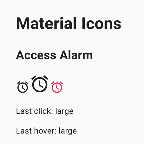
Here is an example with provided Material-UI v4.12.3 code:
<svg class="MuiSvgIcon-root jss225" focusable="false" viewBox="0 0 24 24" aria-hidden="true" tabindex="-1" title="AccessAlarm" data-ga-event-category="material-icons" data-ga-event-action="click" data-ga-event-label="AccessAlarm">
<path d="M22 5.72l-4.6-3.86-1.29 1.53 4.6 3.86L22 5.72zM7.88 3.39L6.6 1.86 2 5.71l1.29 1.53 4.59-3.85zM12.5 8H11v6l4.75 2.85.75-1.23-4-2.37V8zM12 4c-4.97 0-9 4.03-9 9s4.02 9 9 9c4.97 0 9-4.03 9-9s-4.03-9-9-9zm0 16c-3.87 0-7-3.13-7-7s3.13-7 7-7 7 3.13 7 7-3.13 7-7 7z"></path>
</svg>
Here you can find Material Icons tests
4.12 Icons
// FindBy(xpath = "//div[contains(@class, 'MuiGrid-grid-xs-8')]/*[local-name()='svg']")
@UI(".MuiGrid-grid-xs-8 > svg")
public static List<Icon> simpleIcons;
// @FindBy(id = "simpleLastClick")
@UI("#simpleLastClick")
public static Text simpleLastClick;
// @FindBy(id = "simpleLastHover")
@UI("#simpleLastHover")
public static Text simpleLastHover;
@Test
public void simpleIconsTest() {
simpleIcons.get(1).is().displayed();
simpleIcons.get(1).hover();
simpleLastHover.has().text("Last hover: DeleteIcon");
simpleIcons.get(2).click();
simpleLastClick.has().text("Last click: DeleteForeverIcon");
}
Icons overview
Icon is located in the following class:
- Java: com.epam.jdi.light.material.elements.displaydata.Icon
Icon - element that represents a small clickable picture.
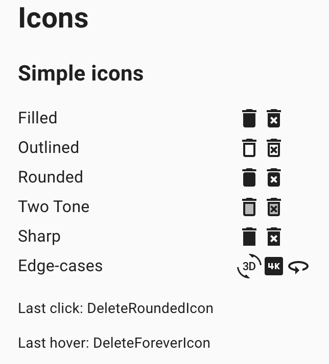
Here is an example with provided Material-UI v4.12.3 code:
<div class="MuiGrid-root MuiGrid-item MuiGrid-grid-xs-8">
<svg class="MuiSvgIcon-root" focusable="false" viewBox="0 0 24 24" aria-hidden="true">...</svg>
<svg class="MuiSvgIcon-root" focusable="false" viewBox="0 0 24 24" aria-hidden="true">...</svg>
</div>
<p id="simpleLastClick">Last click: DeleteOutlinedIcon</p>
<p id="simpleLastHover">Last hover: DeleteForeverIcon</p>
Available methods in Java JDI Light:
| Method | Description | Return Type |
|---|---|---|
| is() | Returns object for work with assertions | IconAssert |
Here you can find Icons tests
4.13 Floating Action Button
// @FindBy(xpath = "//button[@aria-label='add']")
@UI("//button[@aria-label='add']")
public static Button buttonAdd;
// @FindBy(xpath = "//button[@aria-label='like']")
@UI("//button[@aria-label='like']")
public static Button buttonLike;
@Test
public void basicButtonsTest() {
buttonAdd.is().displayed().and().is().enabled();
buttonLike.is().displayed().and().is().disabled();
}
Floating Action Button overview
Floating Action Button - element that appears in front of all screen content, typically as a circular shape with an icon in its center.
Here is an example with provided Material-UI v4.12.3 code:
<div class="jss150">
<button class="MuiButtonBase-root MuiFab-root MuiFab-primary" tabindex="0" type="button" aria-label="add">
<span class="MuiFab-label">
<svg class="MuiSvgIcon-root" focusable="false" viewBox="0 0 24 24" aria-hidden="true">...</svg>
</span>
<span class="MuiTouchRipple-root"></span>
</button>
<button class="MuiButtonBase-root MuiFab-root Mui-disabled Mui-disabled" tabindex="-1" type="button" disabled="" aria-label="like">
<span class="MuiFab-label">
<svg class="MuiSvgIcon-root" focusable="false" viewBox="0 0 24 24" aria-hidden="true">...</svg>
</span>
</button>
</div>
Here you can find Floating Action Button tests
4.14 Hidden
// @FindBy(className = "MuiTypography-subtitle1")
@UI(".MuiTypography-subtitle1")
public static Text currentWidth;
// @FindBy(className = "MuiPaper-root")
@UI(".MuiPaper-root")
public static WebList papers;
@Test(dataProvider = "Screen Width")
public void hiddenTestWithScreenWidthDifferentScreenWidth(int width, int size, String expectedWidth) {
setWidth(width);
papers.has().size(size);
if (size > 0) {
papers.is().displayed();
} else {
papers.is().hidden();
}
currentWidth.has().text("Current width: " + expectedWidth);
}
@DataProvider(name = "Screen Width")
public Object[][] screenWidthDividers() {
return new Object[][]{
{599, 0, "xs"},
{600, 1, "sm"},
{959, 1, "sm"},
{960, 2, "md"},
{1279, 2, "md"},
{1280, 3, "lg"},
{1919, 3, "lg"},
{1920, 4, "xl"}};
}
Hidden overview
Hidden - element that allows you to quickly and responsively toggle the visibility value of components and much more.
Here is an example with provided Material-UI v4.12.3 code:
<div class="jss145">
<h6 class="MuiTypography-root MuiTypography-subtitle1">Current width: lg</h6>
<div class="jss146">
<div class="MuiPaper-root jss147 MuiPaper-elevation1 MuiPaper-rounded">xsDown</div>
<div class="MuiPaper-root jss147 MuiPaper-elevation1 MuiPaper-rounded">smDown</div>
<div class="MuiPaper-root jss147 MuiPaper-elevation1 MuiPaper-rounded">mdDown</div>
</div>
</div>
Here you can find Hidden tests
4.15 Stepper
// @FindBy(class = "MuiStep-root")
@UI(".MuiStep-root")
public static DesktopStepper nonlinearStepper;
@Test
public void nonlinearStepperForwardTest() {
String[] stepsLabels = {"Step #1", "Step #2", "Step #3"};
nonlinearStepper.show();
nonlinearStepper.is().displayed().and().has().steps(stepsLabels);
nonlinearStepper.step(stepsLabels[0]).is().enabled().and().incomplete();
nonlinearStepper.step(stepsLabels[1]).is().disabled().and().incomplete();
nonlinearStepper.step(stepsLabels[2]).is().disabled().and().incomplete();
nonlinearStepper.buttonGroup().button(3).click();
nonlinearStepper.buttonGroup().button(3).click();
nonlinearStepper.buttonGroup().button(2).click();
nonlinearStepper.step(stepsLabels[0]).is().enabled().and().completed();
nonlinearStepper.step(stepsLabels[1]).is().enabled().and().completed();
nonlinearStepper.step(stepsLabels[2]).is().enabled().and().incomplete();
nonlinearStepper.step(stepsLabels[1]).click();
nonlinearStepper.step(stepsLabels[0]).is().enabled().and().completed();
nonlinearStepper.step(stepsLabels[1]).is().enabled().and().completed();
nonlinearStepper.step(stepsLabels[2]).is().disabled().and().incomplete();
}
Stepper overview
Stepper is located in the following class:
- Java: com.epam.jdi.light.material.elements.navigation.Stepper
Stepper - element that allows you to convey progress through numbered steps.
Here is an example with provided Material-UI v4.12.3 code:
<div class="jss220">
<div class="MuiPaper-root MuiStepper-root MuiStepper-horizontal MuiPaper-elevation0">
<div class="MuiStep-root MuiStep-horizontal">
<button class="MuiButtonBase-root MuiStepButton-root MuiStepButton-horizontal" tabindex="0" type="button">
...
<span class="MuiTouchRipple-root MuiStepButton-touchRipple"></span>
</button>
</div>
<div class="MuiStepConnector-root MuiStepConnector-horizontal">
<span class="MuiStepConnector-line MuiStepConnector-lineHorizontal"></span>
</div>
<div class="MuiStep-root MuiStep-horizontal">
<button class="MuiButtonBase-root MuiStepButton-root MuiStepButton-horizontal" tabindex="0" type="button">
<span class="MuiStepLabel-root MuiStepLabel-horizontal">
...
<span class="MuiStepLabel-labelContainer">
<span class="MuiTypography-root MuiStepLabel-label MuiTypography-body2 MuiTypography-displayBlock">Step #2</span>
</span>
</span>
<span class="MuiTouchRipple-root MuiStepButton-touchRipple"></span>
</button>
</div>
<div class="MuiStepConnector-root MuiStepConnector-horizontal"><span class="MuiStepConnector-line MuiStepConnector-lineHorizontal"></span></div>
<div class="MuiStep-root MuiStep-horizontal">
<button class="MuiButtonBase-root MuiStepButton-root MuiStepButton-horizontal" tabindex="0" type="button">
<span class="MuiStepLabel-root MuiStepLabel-horizontal">
...
<span class="MuiStepLabel-labelContainer">
<span class="MuiTypography-root MuiStepLabel-label MuiTypography-body2 MuiTypography-displayBlock">Step #3</span>
</span>
</span>
<span class="MuiTouchRipple-root MuiStepButton-touchRipple"></span>
</button>
</div>
</div>
<div>
<div>
<p class="MuiTypography-root jss223 MuiTypography-body1">You are on Step #1</p>
<div><button class="MuiButtonBase-root MuiButton-root MuiButton-text jss221 Mui-disabled Mui-disabled" tabindex="-1" type="button" disabled=""><span class="MuiButton-label">Back</span></button><button class="MuiButtonBase-root MuiButton-root MuiButton-contained jss221 MuiButton-containedPrimary" tabindex="0" type="button"><span class="MuiButton-label">Next</span><span class="MuiTouchRipple-root"></span></button><button class="MuiButtonBase-root MuiButton-root MuiButton-contained MuiButton-containedPrimary" tabindex="0" type="button"><span class="MuiButton-label">Complete Step</span><span class="MuiTouchRipple-root"></span></button></div>
</div>
</div>
</div>
Available methods in Java JDI Light for DesktopStepper:
| Method | Description | Return Type |
|---|---|---|
| currentIndex() | Get current step index | int |
| maxIndex() | Get max steps number | int |
| buttonGroup() | Get element's buttons | ButtonGroup |
| step(int) | Get step by index | Step |
| step(String) | Get step by label | Step |
| steps() | Get all steps | List |
| hasStep(int) | Check that step with given index exists | boolean |
| hasStep(String) | Check that step with given label exists | boolean |
| hasAllStepsCompleted() | Check that all steps are completed | boolean |
| hasAllStepsIncomplete() | Check that all steps are incomplete | boolean |
| hasStepCompleted(int) | Check that step with given index is completed | boolean |
| is() | Returns object for work with assertions | DesktopStepperAssert |
Available methods in Java JDI Light for MobileStepper:
| Method | Description | Return Type |
|---|---|---|
| currentIndex() | Get current step index | int |
| maxIndex() | Get max steps number | int |
| backButton() | Get 'Back' button | Button |
| nextButton() | Get 'Next' button | Button |
| is() | Returns object for work with assertions | MobileStepperAssert |
Here you can find Stepper tests
4.16 Slider
// @FindBy(id = "continuousSlider")
@UI("#continuousSlider")
public static Slider continuousSlider;
@Test
public void continuousSliderTest() {
continuousSlider.show();
continuousSlider.is().enabled()
.and().value("30");
continuousSlider.track().is().visible();
continuousSlider.setValue("71");
continuousSlider.has().value("71");
}
Slider overview
Slider is located in the following class:
- Java: com.epam.jdi.light.material.elements.inputs.Slider
Slider - element that reflects a range of values along a bar, from which users may select a single value.
It is ideal for adjusting settings such as volume, brightness, or applying image filters.
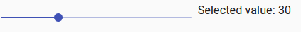
Here is an example with provided Material-UI v4.12.3 code:
<div class="MuiGrid-root MuiGrid-item MuiGrid-grid-xs-true">
<span class="MuiSlider-root MuiSlider-colorPrimary" id="continuousSlider">
<span class="MuiSlider-rail"></span>
<span class="MuiSlider-track" style="left: 0%; width: 40%;"></span>
<input type="hidden" value="40">
<span class="MuiSlider-thumb MuiSlider-thumbColorPrimary" tabindex="0" role="slider" data-index="0" aria-labelledby="continuous-slider" aria-orientation="horizontal" aria-valuemax="100" aria-valuemin="0" aria-valuenow="40" style="left: 40%;"></span>
</span>
</div>
Available methods in Java JDI Light:
| Method | Description | Return Type |
|---|---|---|
| thumb() | Returns slider thumb | UIElement |
| setValue(int) | Set new value | void |
| setValue(double) | Set new value | void |
| setValue(String) | Set new value | void |
| value() | Get thumb value | String |
| dragAndDropThumbTo(String) | Perform drag and drop to given value | void |
| is() | Returns object for work with assertions | SliderAssert |
Here you can find Slider tests
4.17 Tabs
// @FindBy(class = "MuiTab-root")
@UI(".MuiTab-root")
public static Tabs simpleTabs;
@Test
public void simpleTabTest() {
simpleTabs.has().values(equalTo(asList("ITEM ONE", "ITEM TWO", "ITEM THREE")));
simpleTabs.has().selected(1);
simpleTabs.select(2);
simpleTabs.has().selected(2);
simpleTabs.has().disabled(3);
simpleTabs.has().size(3);
}
Tabs overview
Tabs is located in the following class:
- Java: com.epam.jdi.light.material.elements.navigation.Tabs
Tabs - elements that organize and allow navigation between groups of content that are related and at the same level of hierarchy.
Here is an example with provided Material-UI v4.12.3 code:
<div aria-label="simple tabs example" class="MuiTabs-flexContainer" role="tablist">
<button class="MuiButtonBase-root MuiTab-root MuiTab-textColorInherit Mui-selected" tabindex="0" type="button" role="tab" aria-selected="true" id="simple-tab-0" aria-controls="simple-tabpanel-0">
<span class="MuiTab-wrapper">Item One</span><span class="MuiTouchRipple-root"></span>
</button>
<button class="MuiButtonBase-root MuiTab-root MuiTab-textColorInherit" tabindex="-1" type="button" role="tab" aria-selected="false" id="simple-tab-1" aria-controls="simple-tabpanel-1">
<span class="MuiTab-wrapper">Item Two</span><span class="MuiTouchRipple-root"></span>
</button>
<button class="MuiButtonBase-root MuiTab-root Mui-disabled MuiTab-textColorInherit" tabindex="-1" type="button" role="tab" aria-selected="false" id="simple-tab-2" aria-controls="simple-tabpanel-2">
<span class="MuiTab-wrapper">Item Three</span><span class="MuiTouchRipple-root"></span>
</button>
</div>
Available methods in Java JDI Light:
| Method | Description | Return Type |
|---|---|---|
| is() | Returns object for work with assertions | TabsAssert |
| leftScroll() | Returns left scroll button | Button |
| rightScroll() | Returns right scroll button | Button |
| enabled(int) | Check whether tab is enabled | boolean |
| disabled(int) | Check whether tab is disabled | boolean |
| selected(int) | Check whether tab is selected | boolean |
Here you can find Tabs tests
4.18 Table
// Root @FindBy(id = "basicTable")
// Row @FindBy(xpath = "//tbody/tr[%s]/*")
// Cell @FindBy(xpath = "//tbody/tr[{1}]/td[{0}]")
// Headers @FindBy(class = "MuiTableCell-head")
@JTable(
root = "#basicTable",
row = "//tbody/tr[%s]/*",
cell = "//tbody/tr[{1}]/td[{0}]",
headers = ".MuiTableCell-head"
)
public static Table basicTable;
private static final List<String> EXPECTED_TABLE_HEADERS = ImmutableList.of("Dessert (100g serving)", "Calories", "Fat (g)", "Carbs (g)", "Protein (g)");
@Test
public void basicTableTest() {
basicTable.has().columns(EXPECTED_TABLE_HEADERS)
.and().size(13);
basicTable.getCell(1, 1).has().text("305");
basicTable.show();
basicTable.headerUI().is().size(EXPECTED_TABLE_HEADERS.size());
basicTable.has().columns(EXPECTED_TABLE_HEADERS);
basicTable.getCell(1, 1).has().text("159");
basicTable.getCell(4, 5).has().text("3.9");
}
Table overview
Table is located in the following class:
- Java: com.epam.jdi.light.elements.complex.table.Table
Table - element that displays sets of data.
Here is an example with provided Material-UI v4.12.3 code:
<table class="MuiTable-root jss589" aria-label="simple table" id="basicTable">
<thead class="MuiTableHead-root">
<tr class="MuiTableRow-root MuiTableRow-head">
<th class="MuiTableCell-root MuiTableCell-head" scope="col">Dessert (100g serving)</th>
<th class="MuiTableCell-root MuiTableCell-head MuiTableCell-alignRight" scope="col">Calories</th>
<th class="MuiTableCell-root MuiTableCell-head MuiTableCell-alignRight" scope="col">Fat (g)</th>
<th class="MuiTableCell-root MuiTableCell-head MuiTableCell-alignRight" scope="col">Carbs (g)</th>
<th class="MuiTableCell-root MuiTableCell-head MuiTableCell-alignRight" scope="col">Protein (g)</th>
</tr>
</thead>
<tbody class="MuiTableBody-root">
<tr class="MuiTableRow-root">
<th class="MuiTableCell-root MuiTableCell-body" role="cell" scope="row">Frozen yoghurt</th>
<td class="MuiTableCell-root MuiTableCell-body MuiTableCell-alignRight">159</td>
<td class="MuiTableCell-root MuiTableCell-body MuiTableCell-alignRight">6</td>
<td class="MuiTableCell-root MuiTableCell-body MuiTableCell-alignRight">24</td>
<td class="MuiTableCell-root MuiTableCell-body MuiTableCell-alignRight">4</td>
</tr>
...
</tbody>
</table>
Available methods in Java JDI Light:
| Method | Description | Return Type |
|---|---|---|
| is() | Returns object for work with assertions | TableAssert |
| elements(int) | Returns rows whose number is greater than or equal to the specified number | List |
| get(String) | Returns values of the specified row | String |
Here you can find Tables tests
4.19 Typography
// @FindBy(css = ".MuiBox-root .MuiTypography-root")
@UI(".MuiBox-root .MuiTypography-root")
public static List<Typography> typographyTexts;
@Test(dataProvider = "typographyTestData")
public static void typographyTest(int number, String text, String style) {
typographyTexts.get(number).has().text(text).and().style(style);
}
@DataProvider
public Object[][] typographyTestData() {
return new Object[][] {
{1, "Head 1", "h1"},
{2, "Head 2", "h2"},
{3, "Head 3", "h3"},
{4, "Head 4", "h4"},
{5, "Head 5", "h5"},
{6, "Head 6", "h6"},
{7, "Subtitle 1", "subtitle1"},
{8, "Subtitle 2", "subtitle2"},
{9, "Body 1", "body1"},
{10, "Body 2", "body2"},
{11, "BUTTON TEXT", "button"},
{12, "Caption text", "caption"},
{13, "OVERLINE TEXT", "overline"}
};
}
Typography overview
Typography is located in the following class:
- Java: com.epam.jdi.light.material.elements.displaydata.Typography
Typography - element that is used to present your design and content as clearly and efficiently as possible.
Here is an example with provided Material-UI v4.12.3 code:
<div class="MuiGrid-root MuiGrid-item MuiGrid-grid-xs-10">
<div class="MuiContainer-root MuiContainer-maxWidthXl">
<div class="MuiBox-root jss271">
<div class="jss642">
<h2 class="MuiTypography-root MuiTypography-h1 MuiTypography-gutterBottom">h1. Heading</h2>
<h2 class="MuiTypography-root MuiTypography-h2 MuiTypography-gutterBottom">h2. Heading</h2>
<h3 class="MuiTypography-root MuiTypography-h3 MuiTypography-gutterBottom">h3. Heading</h3>
<h4 class="MuiTypography-root MuiTypography-h4 MuiTypography-gutterBottom">h4. Heading</h4>
<h5 class="MuiTypography-root MuiTypography-h5 MuiTypography-gutterBottom">h5. Heading</h5>
<h6 class="MuiTypography-root MuiTypography-h6 MuiTypography-gutterBottom">h6. Heading</h6>
<h6 class="MuiTypography-root MuiTypography-subtitle1 MuiTypography-gutterBottom">subtitle1. Lorem ipsum dolor sit amet, consectetur adipisicing elit. Quos blanditiis tenetur</h6>
<h6 class="MuiTypography-root MuiTypography-subtitle2 MuiTypography-gutterBottom">subtitle2. Lorem ipsum dolor sit amet, consectetur adipisicing elit. Quos blanditiis tenetur</h6>
<p class="MuiTypography-root MuiTypography-body1 MuiTypography-gutterBottom">body1. Lorem ipsum dolor sit amet, consectetur adipisicing elit. Quos blanditiis tenetur unde suscipit, quam beatae rerum inventore consectetur, neque doloribus, cupiditate numquam dignissimos laborum fugiat deleniti? Eum quasi quidem quibusdam.</p>
<p class="MuiTypography-root MuiTypography-body2 MuiTypography-gutterBottom">body2. Lorem ipsum dolor sit amet, consectetur adipisicing elit. Quos blanditiis tenetur unde suscipit, quam beatae rerum inventore consectetur, neque doloribus, cupiditate numquam dignissimos laborum fugiat deleniti? Eum quasi quidem quibusdam.</p>
<span class="MuiTypography-root MuiTypography-button MuiTypography-gutterBottom MuiTypography-displayBlock">button text</span>
<span class="MuiTypography-root MuiTypography-caption MuiTypography-gutterBottom MuiTypography-displayBlock">caption text</span>
<span class="MuiTypography-root MuiTypography-overline MuiTypography-gutterBottom MuiTypography-displayBlock">overline text</span>
</div>
</div>
</div>
</div>
Available methods in Java JDI Light:
| Method | Description | Return Type |
|---|---|---|
| is() | Returns object for work with assertions | TypographyAssert |
| getStyle() | Returns style of component | TypographyStyles |
Here you can find Typography tests
4.20 Badge
// @FindBy(css = "#primaryColorBadge .MuiBadge-badge")
@UI("#primaryColorBadge .MuiBadge-badge")
public static Badge primaryColorBadge;
@Test
public void simpleBadgeTest() {
primaryColorBadge.icon().is().displayed();
primaryColorBadge.is().displayed()
.and().has().text(Matchers.equalTo("4"))
.and().has().position("topRight");
}
Badge overview
Badge is located in the following class:
- Java: com.epam.jdi.light.material.elements.displaydata.Badge
Badge - element that generates a small badge to the top-right of its children.
Here is an example with provided Material-UI v4.12.3 code:
<span class="MuiBadge-root" id="primaryColorBadge">
<svg class="MuiSvgIcon-root" focusable="false" viewBox="0 0 24 24" aria-hidden="true">
<path d="M20 4H4c-1.1 0-1.99.9-1.99 2L2 18c0 1.1.9 2 2 2h16c1.1 0 2-.9 2-2V6c0-1.1-.9-2-2-2zm0 4l-8 5-8-5V6l8 5 8-5v2z"></path>
</svg>
<span class="MuiBadge-badge MuiBadge-anchorOriginTopRightRectangular MuiBadge-colorPrimary">4</span>
</span>
Available methods in Java JDI Light:
| Method | Description | Return Type |
|---|---|---|
| is() | Returns object for work with assertions | BadgeAssert |
| dot() | Returns dot as element | UIElement |
| content() | Returns content as element | UIElement |
| avatar() | Returns avatar as element | Avatar |
| position() | Returns element's position | Position |
| hasDot() | Checks that element has a dot | boolean |
| isVisible() | Checks whether element is visible | boolean |
| isNotVisible() | Checks whether element is not visible | boolean |
Here you can find Badge tests
4.21 Snackbars
// @FindBy(xpath = "//span[text()='Open simple snackbar']/parent::button")
@UI("//span[text()='Open simple snackbar']/parent::button")
public static Button simpleSnackbarButton;
// @FindBy(css = "[direction='up']")
@UI("[direction='up']")
public static Snackbar simpleSnackbar;
@Test
public void simpleSnackbarTest() {
simpleSnackbar.is().notVisible();
simpleSnackbarButton.click();
simpleSnackbar.is().displayed().and().has().text("Note archived");
simpleSnackbar.snackbarButton("UNDO").click();
simpleSnackbar.is().hidden().and().is().notVisible();
simpleSnackbarButton.click();
simpleSnackbar.is().displayed();
simpleSnackbar.close();
simpleSnackbar.is().notVisible();
}
Snackbars overview
Snackbar is located in the following class:
- Java: com.epam.jdi.light.material.elements.feedback.Snackbar
Snackbars - elements that provide brief messages about app processes. The component is also known as a toast.
Here is an example with provided Material-UI v4.12.3 code:
<button class="MuiButtonBase-root MuiButton-root MuiButton-text" tabindex="0" type="button">
<span class="MuiButton-label">Open simple snackbar</span>
<span class="MuiTouchRipple-root"></span>
</button>
<div class="MuiPaper-root MuiSnackbarContent-root MuiPaper-elevation6" role="alert" direction="up" style="opacity: 1; transform: none; transition: opacity 225ms cubic-bezier(0.4, 0, 0.2, 1) 0ms, transform 150ms cubic-bezier(0.4, 0, 0.2, 1) 0ms;">
<div class="MuiSnackbarContent-message">Note archived</div>
<div class="MuiSnackbarContent-action">
<button class="MuiButtonBase-root MuiButton-root MuiButton-text MuiButton-textSecondary MuiButton-textSizeSmall MuiButton-sizeSmall" tabindex="0" type="button">
<span class="MuiButton-label">UNDO</span>
<span class="MuiTouchRipple-root"></span>
</button>
<button class="MuiButtonBase-root MuiIconButton-root MuiIconButton-colorInherit MuiIconButton-sizeSmall" tabindex="0" type="button" aria-label="close">
<span class="MuiIconButton-label">
<svg class="MuiSvgIcon-root MuiSvgIcon-fontSizeSmall" focusable="false" viewBox="0 0 24 24" aria-hidden="true">...</svg>
</span>
<span class="MuiTouchRipple-root"></span>
</button>
</div>
</div>
Available methods in Java JDI Light:
| Method | Description | Return Type |
|---|---|---|
| is() | Returns object for work with assertions | SnackbarAssert |
| snackbarButton(String) | Returns element's button | Button |
| text() | Returns component's text | String |
| close() | Closes element | void |
| messageType() | Returns message type of the element | MessageType |
| position() | Returns position of the element | Position |
Here you can find Snackbars tests
4.22 Backdrop
// @FindBy(className = "MuiButton-root")
@UI(".MuiButton-root")
public static MaterialButton showBackdropButton;
// @FindBy(className = "MuiBackdrop-root")
@UI(".MuiBackdrop-root")
public static Backdrop backdrop;
@Test
public void defaultBackdropTest() {
showBackdropButton.click();
backdrop.is().visible();
backdrop.core().click();
backdrop.is().hidden();
}
Backdrop overview
Backdrop is located in the following class:
- Java: com.epam.jdi.light.material.elements.feedback.Backdrop
Backdrop - element that is used to provide emphasis on a particular element or parts of it.
Here is an example with provided Material-UI v4.12.3 code:
<button class="MuiButtonBase-root MuiButton-root MuiButton-outlined MuiButton-outlinedPrimary" tabindex="0" type="button">
<span class="MuiButton-label">Show backdrop</span>
<span class="MuiTouchRipple-root"></span>
</button>
<div class="MuiBackdrop-root jss63" aria-hidden="true" style="opacity: 1; transition: opacity 225ms cubic-bezier(0.4, 0, 0.2, 1) 0ms;">
<div class="MuiCircularProgress-root MuiCircularProgress-indeterminate" style="width: 40px; height: 40px;" role="progressbar">
<svg class="MuiCircularProgress-svg" viewBox="22 22 44 44">
<circle class="MuiCircularProgress-circle MuiCircularProgress-circleIndeterminate" cx="44" cy="44" r="20.2" fill="none" stroke-width="3.6"></circle>
</svg>
</div>
</div>
Available methods in Java JDI Light:
| Method | Description | Return Type |
|---|---|---|
| is() | Returns object for work with assertions | BackdropAssert |
Here you can find Backdrop tests
4.23 Dialog
//Button containing dialog @FindBy(xpath = "//span[text()='Open simple dialog']/parent::button")
//Dialog @FindBy(xpath = "//div[@aria-labelledby = 'simple-dialog-title']/parent::div[contains(@class, 'MuiDialog-container')]")
//Text reflecting last action @FindBy(id = "simpleDialogSelection")
@JButtonWithDialog(root = "//span[text()='Open simple dialog']/parent::button",
dialog = "//div[@aria-labelledby = 'simple-dialog-title']/parent::div[contains(@class, 'MuiDialog-container')]",
actionText = "#simpleDialogSelection")
public static ButtonWithDialog simpleDialogButton;
@Test(dataProvider = "simpleDialogDataProvider")
public void simpleDialogTest(String titleText, int index, String text) {
simpleDialogButton.click();
simpleDialogButton.dialog().is().displayed();
simpleDialogButton.dialog().title().has().text(titleText);
simpleDialogButton.dialog().list().has().size(3);
simpleDialogButton.dialog().list().items().get(index).has().text(text);
simpleDialogButton.dialog().list().items().get(index).click();
simpleDialogButton.dialog().is().hidden();
simpleDialogButton.actionText().has()
.text(equalToIgnoringCase("Selected: " + text.replaceAll(" ", "")));
}
@DataProvider(name = "simpleDialogDataProvider")
public Object[][] simpleDialogData() {
return new Object[][]{
{"Set backup account", 0, "username@gmail.com"},
{"Set backup account", 1, "user02@gmail.com"},
{"Set backup account", 2, "Add account"}
};
}
Dialog overview
Dialog is located in the following class:
- Java: com.epam.jdi.light.material.elements.feedback.Dialog
Dialog - element that informs users about a task and can contain critical information, require decisions, or involve multiple tasks.
Here is an example with provided Material-UI v4.12.3 code:
<h6 class="MuiTypography-root MuiTypography-subtitle1" id="simpleDialogSelection">Selected: user02@gmail.com</h6>
<button class="MuiButtonBase-root MuiButton-root MuiButton-outlined MuiButton-outlinedPrimary" tabindex="0" type="button">
<span class="MuiButton-label">Open simple dialog</span>
<span class="MuiTouchRipple-root"></span>
</button>
<div class="MuiDialog-container MuiDialog-scrollPaper" role="none presentation" tabindex="-1" style="opacity: 1; transition: opacity 225ms cubic-bezier(0.4, 0, 0.2, 1) 0ms;">
<div class="MuiPaper-root MuiDialog-paper MuiDialog-paperScrollPaper MuiDialog-paperWidthSm MuiPaper-elevation24 MuiPaper-rounded" role="dialog" aria-labelledby="simple-dialog-title">
<div class="MuiDialogTitle-root" id="simple-dialog-title">
<h2 class="MuiTypography-root MuiTypography-h6">Set backup account</h2>
</div>
<ul class="MuiList-root MuiList-padding">
<div class="MuiButtonBase-root MuiListItem-root MuiListItem-gutters MuiListItem-button" tabindex="0" role="button" aria-disabled="false">
<div class="MuiListItemAvatar-root">...</div>
<div class="MuiListItemText-root">
<span class="MuiTypography-root MuiListItemText-primary MuiTypography-body1 MuiTypography-displayBlock">username@gmail.com</span>
</div>
<span class="MuiTouchRipple-root"></span>
</div>
...
</div>
</ul>
</div>
</div>
Available methods in Java JDI Light for ButtonWithDialog:
| Method | Description | Return Type |
|---|---|---|
| dialog() | Returns dialog as element | Dialog |
| actionText() | Returns action text | Text |
Available methods in Java JDI Light for Dialog:
| Method | Description | Return Type |
|---|---|---|
| is() | Returns object for work with assertions | DialogAssert |
| title() | Returns element's title | Text |
| list() | Returns list of element's items | List |
| textContent() | Returns element's text content | Text |
| actionButtons() | Returns element's action buttons | ButtonGroup |
| radioButtons() | Returns element's radio buttons | RadioButtons |
| textField() | Return element's text field | TextField |
| hasScrollableContent() | Shows that element has scrollable content | boolean |
| scrollContentTo(int) | Scrolls dialog content to targeted position | void |
| hasScrollableBody() | Shows that element has scrollable body | boolean |
| scrollDialogBodyTo(int) | Scrolls dialog body to targeted position | void |
| close() | Closes element by pressing 'close' if exists | void |
| clickBuutton(String) | Clicks button by its name | void |
| confirm() | Confirms and closes element by pressing 'ok' if exists | void |
| cancel() | Closes element by pressing 'cancel' if exists | void |
Here you can find Dialog tests
4.24 Date / Time pickers
// @FindBy(xpath = "//*[@id = 'date-picker-inline']/parent::div")
@UI("//*[@id = 'date-picker-inline']/parent::div")
public static DateTimePicker inlineDatePicker;
@Test
public void datePickerInlineTest() {
inlineDatePicker.has().title("Date picker inline");
inlineDatePicker.value("10/10/2022");
inlineDatePicker.has().text("10/10/2022");
}
Date / Time pickers overview
DateTimePicker is located in the following class:
- Java: com.epam.jdi.light.material.elements.inputs.DateTimePicker
Date / Time Picker - element that provides a simple way to select a single value from a pre-determined set.
Here is an example with provided Material-UI v4.12.3 code:
<div class="MuiFormControl-root MuiTextField-root MuiFormControl-marginNormal">
<label class="MuiFormLabel-root MuiInputLabel-root MuiInputLabel-formControl MuiInputLabel-animated MuiInputLabel-shrink MuiFormLabel-filled" data-shrink="true" for="date-picker-inline" id="date-picker-inline-label">Date picker inline</label>
<div class="MuiInputBase-root MuiInput-root MuiInput-underline MuiInputBase-formControl MuiInput-formControl MuiInputBase-adornedEnd">
<input aria-invalid="false" id="date-picker-inline" type="text" class="MuiInputBase-input MuiInput-input MuiInputBase-inputAdornedEnd" value="08/18/2014" />
<div class="MuiInputAdornment-root MuiInputAdornment-positionEnd">
<button class="MuiButtonBase-root MuiIconButton-root" tabindex="0" type="button" aria-label="change date">...</button>
</div>
</div>
</div>
<div class="MuiPickersBasePicker-container">
<div class="MuiPickersBasePicker-pickerView">
<div>
<div class="MuiPickersCalendarHeader-switchHeader">...</div>
<div class="MuiPickersCalendarHeader-daysHeader">...</div>
</div>
<div class="MuiPickersSlideTransition-transitionContainer MuiPickersCalendar-transitionContainer">
<div>
<div class="MuiPickersCalendar-week">
<div role="presentation">
<button class="MuiButtonBase-root MuiIconButton-root MuiPickersDay-day MuiPickersDay-hidden" tabindex="-1" type="button">
<span class="MuiIconButton-label"><p class="MuiTypography-root MuiTypography-body2 MuiTypography-colorInherit">27</p></span><span class="MuiTouchRipple-root"></span>
</button>
</div>
...
</div>
...
</div>
</div>
</div>
</div>
Available methods in Java JDI Light:
| Method | Description | Return Type |
|---|---|---|
| is() | Returns object for work with assertions | DateTimePickerAssert |
| value(String) | Sets required date | void |
Here you can find Date/Time Pickers tests
4.25 Select
// @FindBy(xpath = "//*[@id = 'demo-simple-select']/ancestor::*[1]")
@JDropdown(root = "//*[@id = 'demo-simple-select']/ancestor::*[1]")
public static Select simpleSelect;
@Test
public void simpleSelectTest() {
String age = "Ten";
simpleSelect.show();
simpleSelect.is().collapsed();
simpleSelect.expand();
simpleSelect.is().expanded();
simpleSelect.close();
simpleSelect.is().collapsed();
simpleSelect.select(age);
simpleSelect.has().selected(age);
}
Select overview
Select is located in the following class:
- Java: com.epam.jdi.light.material.elements.inputs.Select
Select - element that is used for collecting user provided information from a list of options.
Here is an example with provided Material-UI v4.12.3 code:
<div class="MuiInputBase-root MuiInput-root MuiInput-underline MuiInputBase-formControl MuiInput-formControl">
<div class="MuiSelect-root MuiSelect-select MuiSelect-selectMenu MuiInputBase-input MuiInput-input" tabindex="0" role="button" aria-haspopup="listbox" aria-labelledby="demo-simple-select-label demo-simple-select" id="demo-simple-select">
Ten
</div>
<input value="20" aria-hidden="true" tabindex="-1" class="MuiSelect-nativeInput" />
<svg class="MuiSvgIcon-root MuiSelect-icon" focusable="false" viewBox="0 0 24 24" aria-hidden="true">
<path d="M7 10l5 5 5-5z"></path>
</svg>
</div>
Available methods in Java JDI Light:
| Method | Description | Return Type |
|---|---|---|
| is() | Returns object for work with assertions | SelectAssert |
| list() | Returns list of options | WebList |
| close() | Closes select by pressing 'Esc' | void |
| select(String...) | Selects list of values in element | void |
| selected() | Returns value of selected element | String |
| getText() | Returns value of selected element | String |
| text() | Returns value of selected element | String |
| isEnabled() | Checks that element is enabled | boolean |
| isDisabled() | Checks that element is disabled | boolean |
Here you can find Select tests
4.26 Switch
// @FindBy(class = "MuiSwitch-root")
@UI(".MuiSwitch-root")
public static Switch basicSwitch;
@Test
public void switchesWithFormGroupTest(int index, String fullName) {
basicSwitch.show();
basicSwitch.uncheck();
basicSwitch.is().unchecked();
basicSwitch.check();
basicSwitch.is().checked();
}
Switch overview
Switch is located in the following class:
- Java: com.epam.jdi.light.material.elements.inputs.Switch
Switch - element that toggles the state of a single setting on or off.
Here is an example with provided Material-UI v4.12.3 code:
<span class="MuiSwitch-root">
<span class="MuiButtonBase-root MuiIconButton-root jss63 MuiSwitch-switchBase MuiSwitch-colorSecondary jss64 Mui-checked" aria-disabled="false">
<span class="MuiIconButton-label"><input type="checkbox" checked="" class="jss66 MuiSwitch-input" name="checkedA" aria-label="secondary checkbox" value="" />
<span class="MuiSwitch-thumb"></span></span>
<span class="MuiTouchRipple-root"></span>
</span>
<span class="MuiSwitch-track"></span>
</span>
Available methods in Java JDI Light:
| Method | Description | Return Type |
|---|---|---|
| is() | Returns object for work with assertions | SwitchAssert |
| isChecked() | Shows that element is checked | boolean |
| isUnchecked() | Shows that element is unchecked | boolean |
| check() | Checks element or does nothing if checked | void |
| uncheck() | Unchecks element or does nothing if unchecked | void |
| label() | Returns element's label | Label |
| labelText() | Returns label's text | String |
| isDisabled() | Checks that element is disabled | boolean |
Here you can find Switch tests
4.27 Button
// @FindBy(id = "contained-button-default")
@UI("#contained-button-default")
public static MUIButton defaultContainedButton;
// @FindBy(id = "contained-button-last-click")
@UI("#contained-button-last-click")
public static Text containedButtonLastClick;
@Test
public void defaultButtonTest() {
defaultContainedButton.label().has().text("DEFAULT");
defaultContainedButton.click();
containedButtonLastClick.has().text("Last click: Default");
}
Button overview
Button is located in the following class:
- Java: com.epam.jdi.light.ui.material.elements.inputs.MUIButton
Button - element that allows users to take actions and make choices with a single tap.
Here is an example with provided Material-UI v4.12.3 code:
<button class="MuiButtonBase-root MuiButton-root MuiButton-contained" tabindex="0" type="button" id="contained-button-default">
<span class="MuiButton-label">Default</span>
<span class="MuiTouchRipple-root"></span>
</button>
<p id="contained-button-last-click">Last click: Default</p>
Available methods in Java JDI Light:
| Method | Description | Return Type |
|---|---|---|
| is() | Returns object for work with assertions | TextAssert |
| label() | Returns button's label | Label |
Here you can find Buttons tests
4.28 ButtonGroup
// @FindBy(xpath = "//div[@aria-label = 'outlined primary button group']")
@UI("//div[@aria-label = 'outlined primary button group']")
@JDIButtonGroup(list = ".MuiButtonGroup-root")
public static ButtonGroup basicButtonGroup;
// @FindBy(xpath = "//div[@aria-label = 'split button']")
@UI("//div[@aria-label = 'split button']")
@JDIButtonGroup(list = ".MuiButtonGroup-root")
public static ButtonGroup splitButtonGroup;
@Test
public void basicButtonGroupTest(){
basicButtonGroup.has().buttons(3)
.and().buttonsTexts(Matchers.containsInAnyOrder("THREE", "ONE", "TWO"));
basicButtonGroup.button(1).is().enabled().and().has().text("ONE");
basicButtonGroup.button(1).click();
basicButtonGroup.button(2).click();
basicButtonGroup.button(3).click();
basicLastClick.has().text("Last click: Three");
basicButtonGroup.button("Three").click();
basicButtonGroup.button("Two").click();
basicButtonGroup.button("One").click();
}
@Test
public void splitButtonGroupTest() {
String firstMenuItem = "Create a merge commit";
String secondMenuItem = "Squash and merge";
String thirdMenuItem = "Rebase and merge";
splitButtonGroup.button(1).is().enabled()
.and().has().text(Matchers.equalToIgnoringCase(secondMenuItem));
splitButtonGroup.button(2).click();
Timer.waitCondition(() -> splitButtonMenu.item(1).isDisplayed());
splitButtonMenu.item(firstMenuItem).click();
splitButtonGroup.button(1).has().text(Matchers.equalToIgnoringCase(firstMenuItem));
splitButtonGroup.button(2).click();
splitButtonMenu.item(thirdMenuItem).is().disabled();
splitButtonMenu.item(secondMenuItem).click();
splitButtonGroup.button(1).has().text(Matchers.equalToIgnoringCase(secondMenuItem));
}
ButtonGroup overview
ButtonGroup is located in the following class:
- Java: com.epam.jdi.light.material.elements.inputs.ButtonGroup
ButtonGroup - element that represents a group of clickable button. The ButtonGroup component can be used to group related buttons.

Here are examples with provided MaterialUI v4.12.3 code:
<div role="group" class="MuiButtonGroup-root" aria-label="outlined primary button group">
<button class="MuiButtonBase-root MuiButton-root MuiButton-outlined MuiButtonGroup-grouped MuiButtonGroup-groupedHorizontal MuiButtonGroup-groupedOutlined MuiButtonGroup-groupedOutlinedHorizontal MuiButtonGroup-groupedOutlinedPrimary MuiButton-outlinedPrimary" tabindex="0" type="button">
<span class="MuiButton-label">One</span>
<span class="MuiTouchRipple-root"/>
</button>
<button class="MuiButtonBase-root MuiButton-root MuiButton-outlined MuiButtonGroup-grouped MuiButtonGroup-groupedHorizontal MuiButtonGroup-groupedOutlined MuiButtonGroup-groupedOutlinedHorizontal MuiButtonGroup-groupedOutlinedPrimary MuiButton-outlinedPrimary" tabindex="0" type="button">
<span class="MuiButton-label">Two</span>
<span class="MuiTouchRipple-root"/>
</button>
<button class="MuiButtonBase-root MuiButton-root MuiButton-outlined MuiButtonGroup-grouped MuiButtonGroup-groupedHorizontal MuiButtonGroup-groupedOutlined MuiButtonGroup-groupedOutlinedHorizontal MuiButtonGroup-groupedOutlinedPrimary MuiButton-outlinedPrimary" tabindex="0" type="button">
<span class="MuiButton-label">Three</span>
<span class="MuiTouchRipple-root"/>
</button>
</div>
<div role="group" class="MuiButtonGroup-root MuiButtonGroup-contained" aria-label="split button">
<button class="MuiButtonBase-root MuiButton-root MuiButton-contained MuiButtonGroup-grouped MuiButtonGroup-groupedHorizontal MuiButtonGroup-groupedContained MuiButtonGroup-groupedContainedHorizontal MuiButtonGroup-groupedContainedPrimary MuiButton-containedPrimary" tabindex="0" type="button">
<span class="MuiButton-label">Create a merge commit</span>
<span class="MuiTouchRipple-root"/>
</button>
<button class="MuiButtonBase-root MuiButton-root MuiButton-contained MuiButtonGroup-grouped MuiButtonGroup-groupedHorizontal MuiButtonGroup-groupedContained MuiButtonGroup-groupedContainedHorizontal MuiButtonGroup-groupedContainedPrimary MuiButton-containedPrimary MuiButton-containedSizeSmall MuiButton-sizeSmall" tabindex="0" type="button" aria-label="select merge strategy" aria-haspopup="menu" aria-controls="split-button-menu" aria-expanded="true">
<span class="MuiButton-label">
<svg class="MuiSvgIcon-root" focusable="false" viewBox="0 0 24 24" aria-hidden="true">
<path d="M7 10l5 5 5-5z"/>
</svg>
</span>
<span class="MuiTouchRipple-root"/>
</button>
</div>
Available methods in Java JDI Light:
| Method | Description | Return Type |
|---|---|---|
| button(int) | Get button by index | Button |
| button(String) | Get button by text | Button |
| getAllButtons | Get all buttons in a block | List<Button> |
| is() | Returns object for work with assertions | ButtonGroupAssert |
Here you can find Button group tests
4.29 Grid
// @FindBy(className = "MuiGrid-container")
@UI(".MuiGrid-container")
public static Grid basicGrid;
@Test(dataProvider = "basicGridItems")
public void basicGridItemsTest(int itemIndex, String itemWidth, String itemClass) {
basicGrid.show();
basicGrid.items().get(itemIndex)
.has().cssClass(itemClass)
.and().css("max-width", itemWidth);
}
@DataProvider
public Object[][] basicGridItems() {
return new Object[][]{
{1, "100%", "MuiGrid-grid-xs-12"},
{2, "50%", "MuiGrid-grid-xs-6"},
{3, "50%", "MuiGrid-grid-xs-6"},
{4, "25%", "MuiGrid-grid-xs-3"},
{5, "25%", "MuiGrid-grid-xs-3"},
{6, "25%", "MuiGrid-grid-xs-3"},
{7, "25%", "MuiGrid-grid-xs-3"},
};
}
Grid overview
Grid is located in the following class:
- Java: com.epam.jdi.light.material.elements.layout.Grid
The grid adapts to screen size and orientation, creates visual consistency between layouts while allowing flexibility across a wide variety of designs.
Here is an example with provided MaterialUI v4.12.3 code:
<div class="MuiGrid-root MuiGrid-container MuiGrid-spacing-xs-3">
<div class="MuiGrid-root MuiGrid-item MuiGrid-grid-xs-12">
<div class="MuiPaper-root jss97 MuiPaper-elevation1 MuiPaper-rounded">xs=12</div>
</div>
<div class="MuiGrid-root MuiGrid-item MuiGrid-grid-xs-6">
<div class="MuiPaper-root jss97 MuiPaper-elevation1 MuiPaper-rounded">xs=6</div>
</div>
<div class="MuiGrid-root MuiGrid-item MuiGrid-grid-xs-6">
<div class="MuiPaper-root jss97 MuiPaper-elevation1 MuiPaper-rounded">xs=6</div>
</div>
<div class="MuiGrid-root MuiGrid-item MuiGrid-grid-xs-3">
<div class="MuiPaper-root jss97 MuiPaper-elevation1 MuiPaper-rounded">xs=3</div>
</div>
<div class="MuiGrid-root MuiGrid-item MuiGrid-grid-xs-3">
<div class="MuiPaper-root jss97 MuiPaper-elevation1 MuiPaper-rounded">xs=3</div>
</div>
<div class="MuiGrid-root MuiGrid-item MuiGrid-grid-xs-3">
<div class="MuiPaper-root jss97 MuiPaper-elevation1 MuiPaper-rounded">xs=3</div>
</div>
<div class="MuiGrid-root MuiGrid-item MuiGrid-grid-xs-3">
<div class="MuiPaper-root jss97 MuiPaper-elevation1 MuiPaper-rounded">xs=3</div>
</div>
</div>
Available methods in Java JDI Light:
| Method | Description | Return Type |
|---|---|---|
| is() | Returns object for work with assertions | GridAssert |
| items() | Returns list of items in grid | WebList |
Here you can find Grid tests
4.30 Drawer
//root - @FindBy(xpath = "//span[text() = 'left']/parent::button")
//drawer - @FindBy(css = ".MuiDrawer-paperAnchorLeft")
@JButtonWithDrawer(
root = "//span[text() = 'left']/parent::button",
drawer = ".MuiDrawer-paperAnchorLeft"
)
public static ButtonWithDrawer leftDrawerButton;
//@FindBy(css = ".MuiDrawer-paper")
@UI(".MuiDrawer-paper")
public static Drawer clippedDrawer;
@Test
public void leftTemporaryDrawerTest() {
leftDrawerButton.click();
leftDrawerButton.drawer().is().displayed().and().has().position("left");
leftDrawerButton.drawer().close();
leftDrawerButton.drawer().is().notExist();
}
@Test
public void clippedDrawerTest() {
clippedDrawer.is().displayed()
.and().has().position("left")
.and().has().totalSize(7);
SimpleList testList = clippedDrawer.topList();
testList.has().size(4);
testList.items().get(1).has().text("Starred");
testList.items().get(0).with(CustomSiteListItem.class).icon().is().displayed();
testList.has().itemsWithTexts(Arrays.asList("Inbox", "Starred", "Send email", "Drafts"));
Drawer overview
Drawer is located in the following class:
- Java: com.epam.jdi.light.material.elements.navigation.Drawer
Navigation drawers provide access to destinations in your app. Side sheets are surfaces containing supplementary content that are anchored to the left or right edge of the screen.
Here is an example with provided MaterialUI v4.12.3 code:
<div role="presentation" class="MuiDrawer-root MuiDrawer-modal" style="position: fixed; z-index: 1300; inset: 0px;">
<div class="MuiBackdrop-root" aria-hidden="true" style="opacity: 1; transition: opacity 225ms cubic-bezier(0.4, 0, 0.2, 1) 0ms;"/>
<div tabindex="0" data-test="sentinelStart"/>
<div class="MuiPaper-root MuiDrawer-paper MuiDrawer-paperAnchorLeft MuiPaper-elevation16" tabindex="-1" style="transform: none; transition: transform 225ms cubic-bezier(0, 0, 0.2, 1) 0ms;">
<div class="jss63" role="presentation">
<ul class="MuiList-root MuiList-padding">
<div class="MuiButtonBase-root MuiListItem-root MuiListItem-gutters MuiListItem-button" tabindex="0" role="button" aria-disabled="false">1</div>
<div class="MuiButtonBase-root MuiListItem-root MuiListItem-gutters MuiListItem-button" tabindex="0" role="button" aria-disabled="false">2</div>
<div class="MuiButtonBase-root MuiListItem-root MuiListItem-gutters MuiListItem-button" tabindex="0" role="button" aria-disabled="false">3</div>
</ul>
</div>
</div>
<div tabindex="0" data-test="sentinelEnd"/>
</div>
Available methods in Java JDI Light:
| Method | Description | Return Type |
|---|---|---|
| content() | Returns element's content | UIElement |
| lists() | Returns List of element's elements | List |
| list(int) | Returns {i} element's list of items | SimpleList |
| topList() | Returns element's top list | SimpleList |
| bottomList() | Returns element's bottom list | SimpleList |
| isDisplayed | Checks that element is displayed | boolean |
| close() | Closes element | void |
| position() | Returns element's position | Position |
| is() | Returns object for work with assertions | DrawerAssert |
Here you can find Drawer tests
4.31 Breadcrumbs
//@FindBy(css = ".MuiBreadcrumbs-root")
@JDIBreadcrumbs(root = ".MuiBreadcrumbs-root")
public static Breadcrumbs routerBreadcrumbs;
You can specify locators for the root, items and separators
explicitly through a JBreadcrumbs annotation:
@JBreadcrumbs(
root = ".MuiBreadcrumbs-root",
items = ".MuiBreadcrumbs-li .MuiTypography-root",
separators = ".MuiBreadcrumbs-separator"
)
public static Breadcrumbs simpleBreadcrumbs;
@Test
public void routerIntegrationBreadcrumbsTest() {
routerBreadcrumbs.has().values("Home", "Inbox");
mailBoxList.item("Important").click();
routerBreadcrumbs.has().values("Home", "Inbox", "Important");
mailBoxList.item("Trash").click();
routerBreadcrumbs.has().values("Home", "Trash");
mailBoxList.item("Spam").click();
routerBreadcrumbs.has().values("Home", "Spam");
mailBoxList.item("Inbox").click();
routerBreadcrumbs.has().values("Home", "Inbox");
}
@Test
public void simpleBreadcrumbsTest() {
simpleBreadcrumbs.has().values("Material-UI", "Core", "Breadcrumb");
simpleBreadcrumbs.get("Material-UI").has().attr("href", containsString("#materialUI"));
simpleBreadcrumbs.get("Material-UI").click();
simpleBreadcrumbs.has().currentUrl(endsWith("#materialUI"));
simpleBreadcrumbs.get("Core").has().attr("href", endsWith("#core"));
simpleBreadcrumbs.get("Core").click();
simpleBreadcrumbs.has().currentUrl(endsWith("#core"));
simpleBreadcrumbs.separators().foreach(separator -> separator.has().text("/"));
}
Breadcrumbs overview
Breadcrumbs is located in the following class:
- Java: com.epam.jdi.light.material.elements.navigation.Breadcrumbs
Breadcrumbs allow users to make selections from a range of values.
Here is an example with provided MaterialUI v4.12.3 code:
<nav class="MuiTypography-root MuiBreadcrumbs-root MuiTypography-body1 MuiTypography-colorTextSecondary" aria-label="breadcrumb">
<ol class="MuiBreadcrumbs-ol">
<li class="MuiBreadcrumbs-li">...</li>
<li aria-hidden="true" class="MuiBreadcrumbs-separator">/</li>
<li class="MuiBreadcrumbs-li">...</li>
<li aria-hidden="true" class="MuiBreadcrumbs-separator">/</li>
<li class="MuiBreadcrumbs-li">...</li>
</ol>
</nav>
Available methods in Java JDI Light:
| Method | Description | Return Type |
|---|---|---|
| list() | Returns element's list | WebList |
| separators() | Returns element's separator list | WebList |
| Method | Description | Return Type |
|---|---|---|
| list() | Returns list of elements | WebList |
| separators() | Returns list of separators | WebList |
| currentUrl() | Returns current url | String |
| setup(Field) | Initializes | void |
| is() | Returns object for work with assertions | BreadcrumbAssert |
Here and here you can find Breadcrumbs tests
4.32 Bottom Navigation
// @FindBy(css = ".MuiBottomNavigationAction-root")
@UI(".MuiBottomNavigationAction-root")
public static BottomNavigation bottomNavigationItems;
@Test(dataProvider = "bottomNavigationButtons")
public void defaultBottomNavigationTest(int index, String buttonText, String positionText) {
bottomNavigationItems.select(index);
bottomNavigationItems.has().selected(index);
currentPosition.has().text(positionText);
bottomNavigationItemsText.get(index).has().text(buttonText);
}
@DataProvider(name = "bottomNavigationButtons")
public Object[][] bottomNavigationButtons() {
return new Object[][] {
{1, "Recents", "Current isRecents(0)"},
{2, "Favorites", "Current isFavorites(1)"},
{3, "Nearby", "Current isNearby(2)"},
};
}
BottomNavigation overview
BottomNavigation is located in the following class:
- Java: com.epam.jdi.light.material.elements.navigation.BottomNavigation
Bottom navigation bars allow movement between primary destinations in an app.
Here is an example with provided MaterialUI v4.12.3 code:
<div class="MuiBottomNavigation-root jss166">
<button class="MuiButtonBase-root MuiBottomNavigationAction-root Mui-selected" tabindex="0" type="button">
<span class="MuiBottomNavigationAction-wrapper">
<svg class="MuiSvgIcon-root" focusable="false" viewBox="0 0 24 24" aria-hidden="true">...</svg>
<span class="MuiBottomNavigationAction-label Mui-selected">Recents</span>
</span>
<span class="MuiTouchRipple-root"/>
</button>
<button class="MuiButtonBase-root MuiBottomNavigationAction-root" tabindex="0" type="button">
<span class="MuiBottomNavigationAction-wrapper">
<svg class="MuiSvgIcon-root" focusable="false" viewBox="0 0 24 24" aria-hidden="true">...</svg>
<span class="MuiBottomNavigationAction-label">Favorites</span>
</span>
<span class="MuiTouchRipple-root"/>
</button>
</div>
Available methods in Java JDI Light:
| Method | Description | Return Type |
|---|---|---|
| is() | Returns object for work with assertions | UISelectAssert<?, ?> |
| selected | Check if item is selected | boolean |
Here you can find Bottom Navigation tests
4.33 Paper
// @FindBy(css = ".MuiPaper-elevation3")
@UI(".MuiPaper-elevation3")
public static Paper elevationThreePaper;
@Test
public void elevationThreePaperTest() {
elevationThreePaper.is().displayed();
elevationThreePaper.has().elevation(3);
elevationThreePaper.is().rounded();
}
Paper overview
Paper is located in the following class:
- Java: com.epam.jdi.light.material.elements.surfaces.Paper
In Material Design, the physical properties of paper are translated to the screen.
Here is an example with provided MaterialUI v4.12.3 code:
<div class="MuiPaper-root MuiPaper-elevation3 MuiPaper-rounded" id="paperElevation3">
Paper with elevation = 3
</div>
Available methods in Java JDI Light:
| Method | Description | Return Type |
|---|---|---|
| is() | Returns object for work with assertions | PaperAssert |
Here you can find Paper tests
4.34 Accordion
// UIElement @FindBy(css = ".MuiAccordion-root")
// UIElement @FindBy(css = ".MuiButtonBase-root.MuiAccordionSummary-root")
// List<UIElement> @FindBy(className = "MuiAccordionDetails-root")
// Button @FindBy(className = "MuiIconButton-label")
public static Accordion generalSettingsAccordion;
@Test
public void accordionExpandTest() {
generalSettingsAccordion.is().enabled();
generalSettingsAccordion.content.is().hidden();
generalSettingsAccordion.expand();
generalSettingsAccordion.is().expanded();
generalSettingsAccordion.content.is().displayed()
.and().has().text(containsString("Nulla facilisi. Phasellus sollicitudin"));
generalSettingsAccordion.collapse();
generalSettingsAccordion.is().collapsed();
generalSettingsAccordion.content.is().hidden();
}
Accordion overview
Accordion is located in the following class:
- Java: com.epam.jdi.light.material.elements.surfaces.Accordion
The Accordion component allows the user to show and hide sections of related content on a page.
Accordions contain creation flows and allow lightweight editing of an element.
Here is an example with provided MaterialUI v4.12.3 code:
<div class="MuiPaper-root MuiAccordion-root MuiAccordion-rounded MuiPaper-elevation1 MuiPaper-rounded">
<div class="MuiButtonBase-root MuiAccordionSummary-root" tabindex="0" role="button" aria-disabled="false" aria-expanded="false" aria-controls="panel1a-content" id="panel1a-header">
<div class="MuiAccordionSummary-content">
<p class="MuiTypography-root jss3 MuiTypography-body1">General settings</p>
<p class="MuiTypography-root jss4 MuiTypography-body1">I am an accordion</p>
</div>
<div class="MuiButtonBase-root MuiIconButton-root MuiAccordionSummary-expandIcon MuiIconButton-edgeEnd" aria-disabled="false" aria-hidden="true">
<span class="MuiIconButton-label">
<svg class="MuiSvgIcon-root" focusable="false" viewBox="0 0 24 24" aria-hidden="true">
<path d="M16.59 8.59L12 13.17 7.41 8.59 6 10l6 6 6-6z"/>
</svg>
</span>
<span class="MuiTouchRipple-root"/>
</div>
</div>
<div class="MuiCollapse-root MuiCollapse-hidden" style="min-height:0px">
<div class="MuiCollapse-wrapper">
<div class="MuiCollapse-wrapperInner">
<div aria-labelledby="panel1a-header" id="panel1a-content" role="region">
<div class="MuiAccordionDetails-root">
<p class="MuiTypography-root MuiTypography-body1">Nulla facilisi. Phasellus sollicitudin nulla et quam mattis feugiat. Aliquam eget maximus est, id dignissim quam.</p>
</div>
</div>
</div>
</div>
</div>
</div>
Available methods in Java JDI Light:
| Method | Description | Return Type |
|---|---|---|
| expand() | Expands this accordion, if possible. If not possible, does nothing. | void |
| collapse() | Collapses this accordion, if possible. If not possible, does nothing. | void |
| isExpanded() | Checks if this accordion is expanded or not. | boolean |
| isCollapsed() | Checks if this accordion is collapsed or not. | boolean |
| is() | Returns object for work with assertions | AccordionAssert |
Here you can find Accordion tests
4.35 Portal
// @FindBy(css = ".MuiBox-root")
@UI(".MuiBox-root")
public static Portal portal;
@Test
public void portalTest() {
Button button = portal.button();
Text textFirst = portal.text(1);
Text textSecond = portal.text(2);
button.has().text("Mount children");
textFirst.has().text("It looks like I will render here.");
textSecond.has().text(StringUtils.EMPTY);
button.click();
button.has().text("Unmount children");
textFirst.has().text("It looks like I will render here.");
textSecond.has().text("But I actually render here!");
button.click();
button.has().text("Mount children");
textFirst.has().text("It looks like I will render here.");
textSecond.has().text(StringUtils.EMPTY);
}
Portal overview
Portal is located in the following class:
- Java: com.epam.jdi.light.material.elements.utils.Portal
The Portal component renders its children into a new "subtree" outside of current DOM hierarchy.
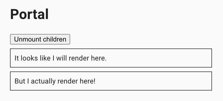
Here is an example with provided MaterialUI v4.12.3 code:
<div class="MuiBox-root jss183">
<div><h1>Portal</h1>
<div>
<button type="button">Unmount children</button>
<div class="jss184">It looks like I will render here.</div>
<div class="jss184"><span>But I actually render here!</span></div>
</div>
</div>
</div>
Available methods in Java JDI Light:
| Method | Description | Return Type |
|---|---|---|
| text(int) | Gets text of this portal with given index. | Text |
| button() | Gets button of this portal. | Button |
Here you can find Portal tests
4.36 Textarea Autosize
// @FindBy(xpath = "//textarea[@aria-label = 'empty textarea']")
@UI("//textarea[@aria-label = 'empty textarea']")
public static TextArea emptyTextArea;
// @FindBy(xpath = "//textarea[@aria-label = 'minimum height']")
@UI("//textarea[@aria-label = 'minimum height']")
public static TextArea minArea;
// @FindBy(xpath = "//textarea[@aria-label = 'maximum height']")
@UI("//textarea[@aria-label = 'maximum height']")
public static TextArea maxArea;
@Test
public void emptyAreaHeightIncreasesTest() {
initialHeight = emptyTextArea.getSize().height;
emptyTextArea.setLines("1\n2\n3\n4");
assertThat(emptyTextArea.getSize().height, greaterThanOrEqualTo(initialHeight));
}
@Test
public void emptyAreaHeightDecreasesTest() {
emptyTextArea.setLines("1\n2\n3\n4");
initialHeight = emptyTextArea.getSize().height;
emptyTextArea.clear();
emptyTextArea.setLines("1");
assertThat(emptyTextArea.getSize().height, lessThan(initialHeight));
}
TextArea Autosize overview
TextArea is located in the following class:
- Java: com.epam.jdi.light.ui.html.elements.common.TextArea
The Textarea component for React which grows with content.
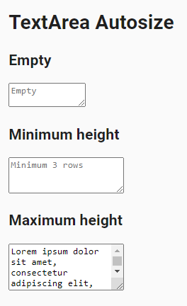
Here is an example with provided MaterialUI v4.12.3 code:
<textarea rows="1" aria-label="empty textarea" placeholder="Empty" style="height: 21px; overflow: hidden;">
</textarea>
Available methods in Java JDI Light you can find in html TextArea class.
Here you can find TextAreaAutosize tests
4.37 Popover
// @FindBy(css = ".MuiPopover-root .MuiPaper-root")
@UI(".MuiPopover-root .MuiPaper-root")
public static Popover popover;
// @FindBy(css = ".MuiButton-root")
@UI(".MuiButton-root")
public static Button popoverButton;
@Test
public void clickPopoverTest() {
popoverButton.click();
popover.has().text("Popover content");
popover.close();
popover.is().notVisible();
}
@Test
public void hoverPopoverTest() {
popoverButtonHover.click();
popoverButtonHover.has().attr("aria-owns", "mouse-over-popover");
popover.has().text("Popover content");
popover.close();
popover.is().notVisible();
}
Popover overview
Popover is located in the following class:
- Java: com.epam.jdi.light.material.elements.utils.Popover
The Popover can be used to display some content on top of another.
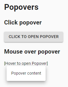
Here is an example with provided MaterialUI v4.12.3 code:
<div class="MuiPaper-root MuiPopover-paper MuiPaper-elevation8 MuiPaper-rounded" tabindex="-1" style="opacity: 1; transform: none; transition: opacity 207ms cubic-bezier(0.4, 0, 0.2, 1) 0ms, transform 138ms cubic-bezier(0.4, 0, 0.2, 1) 0ms; top: 175px; left: 141px; transform-origin: 68px 0px;">
<div class="jss37">Popover content</div>
</div>
Available methods in Java JDI Light:
| Method | Description | Return Type |
|---|---|---|
| is() | Returns object for work with assertions. | PopoverAssert |
| close() | Closes this popover. | void |
Here you can find Popover tests
4.38 Modal
// @FindBy(xpath = "//*[@role='presentation' and not(@aria-hidden='true')]")
@UI("//*[@role='presentation' and not(@aria-hidden='true')]")
public static Modal modal;
// @FindBy(css = "button")
@UI("button")
public static MaterialButton buttonModal;
@Test
public void modalTests() {
modal.show();
buttonModal.click();
for (int i = 0; i <= MAX_MODAL - 1; i++) {
modal.is().displayed();
modal.title().has().text("Text in a modal");
modal.description().has().text(EXPECTED_DESCRIPTION);
modal.find("button").click();
}
for (int i = 0; i <= MAX_MODAL; i++) {
modal.close();
}
modal.is().hidden();
}
Modal overview
Modal is located in the following class:
- Java: com.epam.jdi.light.material.elements.utils.Modal
The Modal component provides a solid foundation for creating dialogs, popovers, lightboxes, or whatever else.
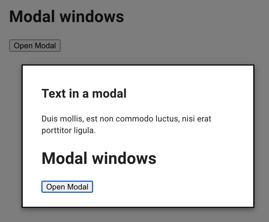
Here is an example with provided MaterialUI v4.12.3 code:
<div class="jss35" tabindex="-1" style="top: 54%; left: 52%; transform: translate(-54%, -52%);">
<h2 id="simple-modal-title7">Text in a modal</h2>
<p id="simple-modal-description7">Duis mollis, est non commodo luctus, nisi erat porttitor ligula.</p>
<div>
<h1>Modal windows</h1>
<div>
<button type="button">Open Modal</button>
</div>
</div>
</div>
Available methods in Java JDI Light:
| Method | Description | Return Type |
|---|---|---|
| is() | Returns object for work with assertions | ModalAssert |
| description() | Returns element's description | Text |
| title() | Returns element's title | Text |
| close() | Closes element | void |
Here you can find Modal tests
4.39 Popper
// @FindBy(css = "[type=button]")
@UI("[type=button]")
public static List<TooltipButton> popperButton;
@Test(dataProviderClass = PopperDataProvider.class, dataProvider = "positionedPopperDataProvider")
public void positionedPoppersTest(int number, String buttonText, String position) {
TooltipButton tooltipButton = popperButton.get(number);
tooltipButton.has().text(buttonText);
tooltipButton.click();
tooltipButton.popper().is().displayed().and().has().text("The content of the Popper.").and().has().position(position);
tooltipButton.click();
tooltipButton.popper().is().notVisible();
}
@DataProvider
public Object[][] positionedPopperDataProvider() {
return new Object[][] {
{1, "TOP", TOP.toString()},
{2, "LEFT", LEFT.toString()},
{3, "RIGHT", RIGHT.toString()},
{4, "BOTTOM", BOTTOM.toString()}
};
}
Popper overview
Popper is located in the following class:
- Java: com.epam.jdi.light.material.elements.utils.Popper
A Popper can be used to display some content on top of another. It's an alternative to react-popper.
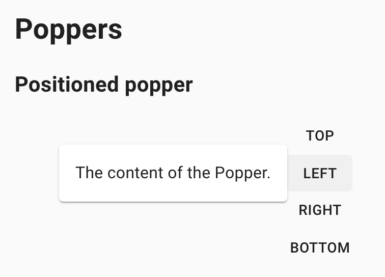
Here is an example with provided MaterialUI v4.12.3 code:
<div class="MuiGrid-root MuiGrid-item">
<button class="MuiButtonBase-root MuiButton-root MuiButton-text" tabindex="0" type="button">
<span class="MuiButton-label">left</span>
<span class="MuiTouchRipple-root"/>
</button>
</div>
Available methods in Java JDI Light:
| Method | Description | Return Type |
|---|---|---|
| is() | Returns object for work with assertions | PopperAssert |
| position() | Returns popper's position | String |
Here you can find Popper tests
4.40 Progress
// @FindBy(xpath = "(//div[@aria-valuenow='100']/following-sibling::div[1])")
@JProgress(root = "(//div[@aria-valuenow='100']/following-sibling::div[1])")
public static CircularProgress circularProgressDeterminate;
@Test
public void circularDeterminateTest() {
circularProgressDeterminateWithValue25.core().show();
circularProgressDeterminateWithValue25.is().displayed().and().determinate()
.and().has().value(25);
circularProgressDeterminateWithValue50.is().displayed().and().determinate()
.and().has().value(50);
circularProgressDeterminateWithValue75.is().displayed().and().determinate()
.and().has().value(75);
circularProgressDeterminateWithValue100.is().displayed().and().determinate()
.and().has().value(100);
circularProgressDeterminate.is().displayed().and().determinate();
int valueNow = circularProgressDeterminate.getValueNow();
timer.wait(() -> circularProgressDeterminate.has().value(valueNow + 10));
circularProgressDeterminateIndeterminate.is().displayed().and().indeterminate();
circularProgressDeterminateIndeterminate.circle()
.has().cssClass("MuiCircularProgress-circleDisableShrink");
}
Progress overview
Abstract Progress and its descendants are located in the following classes:
- Java:
- com.epam.jdi.light.material.elements.feedback.progress.Progress
- com.epam.jdi.light.material.elements.feedback.progress.CircularProgress
- com.epam.jdi.light.material.elements.feedback.progress.LinearProgress
Progress indicators commonly known as spinners, express an unspecified wait time or display the length of a process. The animation works with CSS, not JavaScript.
Here is an example with provided MaterialUI v4.12.3 code:
<div class="MuiCircularProgress-root MuiCircularProgress-colorPrimary MuiCircularProgress-indeterminate" role="progressbar" id="circularIndeterminateProgress" style="width: 40px; height: 40px;">
<svg class="MuiCircularProgress-svg" viewBox="22 22 44 44">
<circle class="MuiCircularProgress-circle MuiCircularProgress-circleIndeterminate" cx="44" cy="44" r="20.2" fill="none" stroke-width="3.6"/>
</svg>
</div>
Available methods in Java JDI Light:
- Progress
| Method | Description | Return Type |
|---|---|---|
| is() | Returns object for work with assertions | ProgressAssert |
| label() | Returns progress label | Label |
| getValueNow() | Returns current element's value | int |
| maxValue() | Returns element's max limit | int |
| minValue() | Returns element's min limit | int |
| isIndeterminate() | Shows that element is indeterminate | boolean |
| isDeterminate() | Shows that element is determinate | boolean |
| setup(Field) | Initialize field | void |
- additional methods of Circular Progress
| Method | Description | Return Type |
|---|---|---|
| circle() | Returns progress circle | UIElement |
- additional methods of Linear Progress
| Method | Description | Return Type |
|---|---|---|
| is() | Returns object for work with assertions | LinearProgressAssert |
| firstBar() | Returns progress first bar | UIElement |
| secondBar() | Returns progress second bar | UIElement |
| isBuffer() | Checks whether the progress is buffer | boolean |
| setup(Field) | Initialize field | void |
Here you can find Progress tests
4.41 Link
// @FindBy(xpath = "//a[text()='Link']")
@UI("//a[text()='Link']")
public static Link link;
// @FindBy(css = "div a[href='#link2']")
@Css("div a[href='#link2']")
public static Link inheritColorLink;
@Test
public void defaultLinkTest() {
link.is().displayed().and().enabled()
.and().has().text("Link");
link.has().cssClass("MuiLink-underlineHover");
link.hover();
link.is().underlined();
inheritColorLink.hover();
link.is().notUnderlined();
link.click();
}
@Test
public void colorInheritLinkTest() {
inheritColorLink.is().displayed().and().enabled()
.and().has().text(containsString("inherit"));
inheritColorLink.has().cssClass("MuiTypography-colorInherit");
inheritColorLink.has().color("rgba(0, 0, 0, 0.87)");
inheritColorLink.click();
}
Link overview
Link is located in the following class:
- Java: com.epam.jdi.light.material.elements.navigation.Link
The Link component allows you to easily customize anchor elements with your theme colors and typography styles
Here is an example with provided MaterialUI v4.12.3 code:
<a class="MuiTypography-root MuiLink-root MuiLink-underlineHover MuiTypography-colorPrimary" href="#">Link</a>
<a class="MuiTypography-root MuiLink-root MuiLink-underlineHover MuiTypography-colorInherit" href="#">color="inherit"</a>
Available methods in Java JDI Light:
| Method | Description | Return type |
|---|---|---|
| is() | Returns object for work with assertions | LinkAssert |
| isUnderlined() | Checks that link is underlined | boolean |
| isNotUnderlined() | Checks that link is not underlined | boolean |
Here you can find Link tests
4.42 Menus
// @FindBy(css = "span.MuiButton-label")
@UI("span.MuiButton-label")
public static Menu menu;
// @FindBy(css = "#selectedItem")
@UI("#selectedItem")
public static Text selectedSimpleMenuItem;
// @FindBy(css = "p.MuiTypography-root")
@UI("p.MuiTypography-root")
public static Text pageText;
// @FindBy(css = ".MuiMenuItem-root")
@UI(".MuiMenuItem-root")
public static Menu contextMenuList;
@Test
public void simpleMenuTest() {
simpleMenuButton.show();
simpleMenuButton.has().text("OPEN MENU");
simpleMenuButton.click();
String option = "Profile";
menu.select(option);
selectedSimpleMenuItem.has().text("Selected menu: " + option);
}
@Test
public void contextMenuTest() {
contextMenuPage.open();
contextMenuPage.isOpened();
pageText.is().displayed();
pageText.rightClick();
menu.is().displayed().and().has().itemsTexts(Arrays.asList("Copy", "Print", "Highlight", "Email"));
contextMenuList.select("Print");
waitCondition(() -> menu.isHidden());
menu.is().hidden();
}
Menus overview
Menu is located in the following class:
- Java: com.epam.jdi.light.material.elements.navigation.Menu
Menus display a list of choices on temporary surfaces.
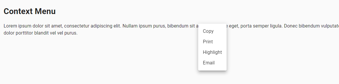
Here is an example with provided MaterialUI v4.12.3 code:
<div class="MuiPaper-root MuiMenu-paper MuiPopover-paper MuiPaper-elevation8 MuiPaper-rounded" tabindex="-1" style="opacity: 1; transform: none; transition: opacity 251ms cubic-bezier(0.4, 0, 0.2, 1) 0ms, transform 167ms cubic-bezier(0.4, 0, 0.2, 1) 0ms; top: 387px; left: 277px; transform-origin: 0px 26px;">
<ul class="MuiList-root MuiMenu-list MuiList-padding" role="menu" tabindex="-1">
<li class="MuiButtonBase-root MuiListItem-root MuiMenuItem-root MuiMenuItem-gutters MuiListItem-gutters MuiListItem-button" tabindex="0" role="menuitem" aria-disabled="false">Profile<span class="MuiTouchRipple-root"/>
</li>
<li class="MuiButtonBase-root MuiListItem-root MuiMenuItem-root MuiMenuItem-gutters MuiListItem-gutters MuiListItem-button" tabindex="-1" role="menuitem" aria-disabled="false">My account<span class="MuiTouchRipple-root"/>
</li>
<li class="MuiButtonBase-root MuiListItem-root MuiMenuItem-root MuiMenuItem-gutters MuiListItem-gutters MuiListItem-button" tabindex="-1" role="menuitem" aria-disabled="false">Logout<span class="MuiTouchRipple-root"/>
</li>
</ul>
</div>
Available methods in Java JDI Light:
| Method | Description | Return type |
|---|---|---|
| item(String) | Gets item of this menu matching given name (full equality is used by searching). | ListItem |
| item(int) | Gets specific item of this menu using its index. | ListItem |
| items() | Gets a list of this menu items. | List |
| itemsTexts() | Gets items texts | List |
| selected() | Gets selected item name | String |
| scrollToItem(String) | Scrolls menu to the item with given name. The given name and item text must match exactly. | void |
| is() | Returns object for work with assertions | MenuAssert |
Here you can find Menu tests
4.43 Lists
// @FindBy(css = ".MuiList-root")
@UI(".MuiList-root")
public static SimpleList simpleList;
// @FindBy(id = "lastClickInfo")
@UI("#lastClickInfo")
public static Text simpleListLastClickInfo;
@Test
public void simpleListTests() {
simpleList.show();
simpleList.is().visible();
simpleList.has().size(2);
simpleList.item(0).has().text("List item 1");
simpleList.item("List item 2").is().visible();
simpleList.items().get(1).click();
String clickedOn = simpleList.items().get(1).getText();
simpleListLastClickInfo.has().text(format("You clicked on: %s", clickedOn));
}
Lists overview
List is located in the following class:
- Java: _com.epam.jdi.light.material.elements.displaydata.list.MUIList
- Java: _com.epam.jdi.light.material.elements.displaydata.list.SimpleList
Lists are continuous groups of text or images. They are composed of items containing primary and supplemental actions, which are represented by icons and text.
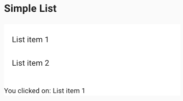
Here are examples with provided MaterialUI v4.12.3 code:
<nav class="MuiList-root MuiList-padding" aria-label="secondary mailbox folders">
<div class="MuiButtonBase-root MuiListItem-root MuiListItem-gutters MuiListItem-button" tabindex="0" role="button" aria-disabled="false">
<div class="MuiListItemText-root">
<span class="MuiTypography-root MuiListItemText-primary MuiTypography-body1 MuiTypography-displayBlock">Trash</span>
</div>
<span class="MuiTouchRipple-root"/>
</div>
<a class="MuiButtonBase-root MuiListItem-root MuiListItem-gutters MuiListItem-button" tabindex="0" aria-disabled="false" href="#simple-list">
<div class="MuiListItemText-root">
<span class="MuiTypography-root MuiListItemText-primary MuiTypography-body1 MuiTypography-displayBlock">Spam</span>
</div>
<span class="MuiTouchRipple-root"/>
</a>
</nav>
Available methods in Java JDI Light for SimpleList:
| Method | Description | Return type |
|---|---|---|
| is() | Returns object for work with assertions | SimpleListAssert |
| items() | Returns a Java list of list items | List |
| itemLocator() | Returns a itemlocator string | String |
Available methods in Java JDI Light for MUIList:
| Method | Description | Return type |
|---|---|---|
| is() | Returns object for work with assertions | ContainerListAssert |
| items() | Returns a Java list of list items | List |
| itemLocator() | Returns a itemlocator string | String |
| headerLocator() | Returns a headerlocator string | String |
| setup(Field) | Updates values of itemlocator and headerlocator | void |
Here you can find List tests
4.43.1 List Items
List Item is located in the following class:
- Java: _com.epam.jdi.light.material.elements.displaydata.ListItem
List Items represent elements collected in a Material UI List.
List item has a "primary area" which may contain an icon/avatar/checkbox, primary and secondary text. It can also support a primary action invoked by clicking on this area, like selecting the item.
List item also might have a "secondary area" containing a switch or button used to invoke a distinct secondary action.
Available methods in Java JDI Light:
| Method | Description | Return type |
|---|---|---|
| is() | Returns object for work with assertions | ListItemAssert |
| getText() | Returns primary text of list item as string | String |
| getPrimaryText() | Returns properly marked primary text of list item as Text | Text |
| getSecondaryText() | Returns secondary text of list item | Text |
| icon() | Returns icon of list item | Icon |
| avatar() | Returns avatar of list item | Avatar |
| checkbox() | Returns checkbox of list item | Checkbox |
| isSelected() | Checks if a list item is selected | boolean |
| button() | Get '{name}' button | Button |
| getSwitch() | Get '{name}' switch | Switch |
4.44 Transfer List
// @FindBy(css = ".MuiGrid-justify-content-xs-center")
// @UI(".MuiGrid-justify-content-xs-center")
@JDITransferList(root = "#root", allItemsLeftCheckbox = "(//span[./input[@aria-label='all items selected']][1])",
allItemsRightCheckbox = "(//span[./input[@aria-label='all items selected']][2]")
public static EnhancedTransferList enhancedTransferList;
@Test
public void enhancedTransferListTest() {
enhancedTransferListPage.open();
enhancedTransferList.assertThat().isMoveRightButtonDisable().and().isMoveLeftButtonDisable();
enhancedTransferList.check(items.get(0));
enhancedTransferList.is().checked(items.get(0));
enhancedTransferList.is().isMoveRightButtonEnable();
enhancedTransferList.uncheck(items.get(0));
enhancedTransferList.is().unchecked(items.get(0));
checkMoveElementsFunction(enhancedTransferList, items.toArray(new String[0]));
}
private static void checkMoveElementsFunction(TransferList transferList, String... checkingItems) {
transferList.moveAllElementsRight();
transferList.has().itemsMovedRight(checkingItems);
transferList.moveAllElementsLeft();
transferList.has().itemsMovedLeft(checkingItems);
}
Transfer List overview
Abstract TransferList and its descendants are located in the following classes:
- Java: com.epam.jdi.light.material.elements.inputs.transferlist.TransferList com.epam.jdi.light.material.elements.inputs.transferlist.EnhancedTransferList
A transfer list (or "shuttle") enables the user to move one or more list items between lists.
Inner lists of a transfer list have the same methods as a regular List.
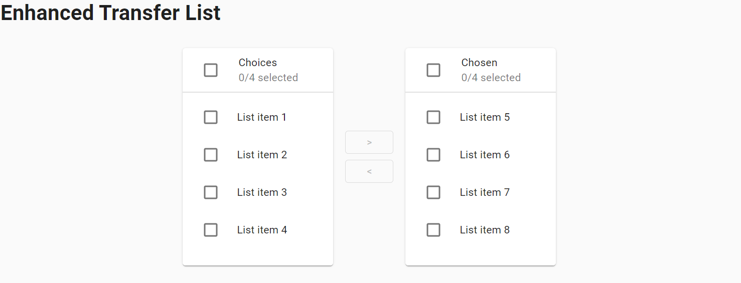
Here is an example with provided MaterialUI v4.12.3 code:
<div class="MuiGrid-root jss160 MuiGrid-container MuiGrid-spacing-xs-2 MuiGrid-align-items-xs-center MuiGrid-justify-content-xs-center">
<div class="MuiGrid-root MuiGrid-item">
<div class="MuiPaper-root MuiCard-root MuiPaper-elevation1 MuiPaper-rounded">
<div class="MuiCardHeader-root jss161">
<div class="MuiCardHeader-avatar">
<span class="MuiButtonBase-root MuiIconButton-root jss152 MuiCheckbox-root MuiCheckbox-colorSecondary MuiIconButton-colorSecondary" aria-disabled="false">...</span>
</div>
<div class="MuiCardHeader-content">
<span class="MuiTypography-root MuiCardHeader-title MuiTypography-body2 MuiTypography-displayBlock">Choices</span>
<span class="MuiTypography-root MuiCardHeader-subheader MuiTypography-body2 MuiTypography-colorTextSecondary MuiTypography-displayBlock">0/4 selected</span>
</div>
</div>
<hr class="MuiDivider-root">
<div class="MuiList-root jss162 MuiList-dense MuiList-padding" role="list">
<div class="MuiButtonBase-root MuiListItem-root MuiListItem-dense MuiListItem-gutters MuiListItem-button" tabindex="0" role="listitem" aria-disabled="false">
<div class="MuiListItemIcon-root">
<span class="MuiButtonBase-root MuiIconButton-root jss152 MuiCheckbox-root MuiCheckbox-colorSecondary MuiIconButton-colorSecondary" aria-disabled="false">...</span>
</div>
<div class="MuiListItemText-root MuiListItemText-dense" id="transfer-list-all-item-0-label">
<span class="MuiTypography-root MuiListItemText-primary MuiTypography-body2 MuiTypography-displayBlock">List item 1</span>
</div>
<span class="MuiTouchRipple-root"/>
</div>
<div class="MuiButtonBase-root MuiListItem-root MuiListItem-dense MuiListItem-gutters MuiListItem-button" tabindex="0" role="listitem" aria-disabled="false">
<div class="MuiListItemIcon-root">
<span class="MuiButtonBase-root MuiIconButton-root jss152 MuiCheckbox-root MuiCheckbox-colorSecondary MuiIconButton-colorSecondary" aria-disabled="false">...</span>
</div>
<div class="MuiListItemText-root MuiListItemText-dense" id="transfer-list-all-item-1-label">
<span class="MuiTypography-root MuiListItemText-primary MuiTypography-body2 MuiTypography-displayBlock">List item 2</span>
</div>
<span class="MuiTouchRipple-root"/>
</div>
<div class="MuiButtonBase-root MuiListItem-root MuiListItem-dense MuiListItem-gutters MuiListItem-button" tabindex="0" role="listitem" aria-disabled="false">
<div class="MuiListItemIcon-root">
<span class="MuiButtonBase-root MuiIconButton-root jss152 MuiCheckbox-root MuiCheckbox-colorSecondary MuiIconButton-colorSecondary" aria-disabled="false">...</span>
</div>
<div class="MuiListItemText-root MuiListItemText-dense" id="transfer-list-all-item-2-label">
<span class="MuiTypography-root MuiListItemText-primary MuiTypography-body2 MuiTypography-displayBlock">List item 3</span>
</div>
<span class="MuiTouchRipple-root"/>
</div>
<div class="MuiButtonBase-root MuiListItem-root MuiListItem-dense MuiListItem-gutters MuiListItem-button" tabindex="0" role="listitem" aria-disabled="false">
<div class="MuiListItemIcon-root">
<span class="MuiButtonBase-root MuiIconButton-root jss152 MuiCheckbox-root MuiCheckbox-colorSecondary MuiIconButton-colorSecondary" aria-disabled="false">...</span>
</div>
<div class="MuiListItemText-root MuiListItemText-dense" id="transfer-list-all-item-3-label">
<span class="MuiTypography-root MuiListItemText-primary MuiTypography-body2 MuiTypography-displayBlock">List item 4</span>
</div>
<span class="MuiTouchRipple-root"/>
</div>
<li class="MuiListItem-root MuiListItem-dense MuiListItem-gutters"/>
</div>
</div>
</div>
<div class="MuiGrid-root MuiGrid-item">
<div class="MuiGrid-root MuiGrid-container MuiGrid-direction-xs-column MuiGrid-align-items-xs-center">
<button class="MuiButtonBase-root MuiButton-root MuiButton-outlined jss163 MuiButton-outlinedSizeSmall MuiButton-sizeSmall Mui-disabled Mui-disabled" tabindex="-1" type="button" disabled="" aria-label="move selected right">
<span class="MuiButton-label">></span>
</button>
<button class="MuiButtonBase-root MuiButton-root MuiButton-outlined jss163 MuiButton-outlinedSizeSmall MuiButton-sizeSmall Mui-disabled Mui-disabled" tabindex="-1" type="button" disabled="" aria-label="move selected left">
<span class="MuiButton-label"><</span>
</button>
</div>
</div>
<div class="MuiGrid-root MuiGrid-item">
<div class="MuiPaper-root MuiCard-root MuiPaper-elevation1 MuiPaper-rounded">
<div class="MuiCardHeader-root jss161">
<div class="MuiCardHeader-avatar">
<span class="MuiButtonBase-root MuiIconButton-root jss152 MuiCheckbox-root MuiCheckbox-colorSecondary MuiIconButton-colorSecondary" aria-disabled="false">...</span>
</div>
<div class="MuiCardHeader-content">
<span class="MuiTypography-root MuiCardHeader-title MuiTypography-body2 MuiTypography-displayBlock">Chosen</span>
<span class="MuiTypography-root MuiCardHeader-subheader MuiTypography-body2 MuiTypography-colorTextSecondary MuiTypography-displayBlock">0/4 selected</span>
</div>
</div>
<hr class="MuiDivider-root">
<div class="MuiList-root jss162 MuiList-dense MuiList-padding" role="list">
<div class="MuiButtonBase-root MuiListItem-root MuiListItem-dense MuiListItem-gutters MuiListItem-button" tabindex="0" role="listitem" aria-disabled="false">
<div class="MuiListItemIcon-root">
<span class="MuiButtonBase-root MuiIconButton-root jss152 MuiCheckbox-root MuiCheckbox-colorSecondary MuiIconButton-colorSecondary" aria-disabled="false">...</span>
</div>
<div class="MuiListItemText-root MuiListItemText-dense" id="transfer-list-all-item-4-label">
<span class="MuiTypography-root MuiListItemText-primary MuiTypography-body2 MuiTypography-displayBlock">List item 5</span>
</div>
<span class="MuiTouchRipple-root"/>
</div>
<div class="MuiButtonBase-root MuiListItem-root MuiListItem-dense MuiListItem-gutters MuiListItem-button" tabindex="0" role="listitem" aria-disabled="false">
<div class="MuiListItemIcon-root">
<span class="MuiButtonBase-root MuiIconButton-root jss152 MuiCheckbox-root MuiCheckbox-colorSecondary MuiIconButton-colorSecondary" aria-disabled="false">...</span>
</div>
<div class="MuiListItemText-root MuiListItemText-dense" id="transfer-list-all-item-5-label">
<span class="MuiTypography-root MuiListItemText-primary MuiTypography-body2 MuiTypography-displayBlock">List item 6</span>
</div>
<span class="MuiTouchRipple-root"/>
</div>
<div class="MuiButtonBase-root MuiListItem-root MuiListItem-dense MuiListItem-gutters MuiListItem-button" tabindex="0" role="listitem" aria-disabled="false">
<div class="MuiListItemIcon-root">
<span class="MuiButtonBase-root MuiIconButton-root jss152 MuiCheckbox-root MuiCheckbox-colorSecondary MuiIconButton-colorSecondary" aria-disabled="false">...</span>
</div>
<div class="MuiListItemText-root MuiListItemText-dense" id="transfer-list-all-item-6-label">
<span class="MuiTypography-root MuiListItemText-primary MuiTypography-body2 MuiTypography-displayBlock">List item 7</span>
</div>
<span class="MuiTouchRipple-root"/>
</div>
<div class="MuiButtonBase-root MuiListItem-root MuiListItem-dense MuiListItem-gutters MuiListItem-button" tabindex="0" role="listitem" aria-disabled="false">
<div class="MuiListItemIcon-root">
<span class="MuiButtonBase-root MuiIconButton-root jss152 MuiCheckbox-root MuiCheckbox-colorSecondary MuiIconButton-colorSecondary" aria-disabled="false">...</span>
</div>
<div class="MuiListItemText-root MuiListItemText-dense" id="transfer-list-all-item-7-label">
<span class="MuiTypography-root MuiListItemText-primary MuiTypography-body2 MuiTypography-displayBlock">List item 8</span>
</div>
<span class="MuiTouchRipple-root"/>
</div>
<li class="MuiListItem-root MuiListItem-dense MuiListItem-gutters"/>
</div>
</div>
</div>
</div>
Available methods in Java JDI Light:
- Transfer List
| Method | Description | Return Type |
|---|---|---|
| is() | Returns object for work with assertions | TransferListAssert |
| check(String) | Checks required item | void |
| isChecked(String) | Shows that required item is checked | boolean |
| uncheck(String) | Unchecks required item | void |
| isUnchecked(String) | Shows that required item is unchecked | boolean |
| isMoveRightButtonEnable() | Shows that list's move right button is enable | boolean |
| isMoveRightButtonDisable() | Shows that list's move right button is disable | boolean |
| isMoveLeftButtonEnable() | Shows that list's move left button is enable | boolean |
| isMoveLeftButtonDisable() | Shows that list's move left button is disable | boolean |
| updateLeftItems() | Updates left items list after moving and returns updated actual items list. | List |
| updateRightItems() | Updates right items list after moving and returns updated actual items list. | List |
| moveAllElementsLeft() | Moves all items to the left list by clicking 'Move all left' button. | void |
| moveAllElementsRight() | Moves all items to the right list by clicking 'Move all right' button. | void |
| getItemCheckbox(String) | Gets the checkbox of item with given text (full equality is used by searching). | UIElement |
| moveItemsLeft() | Moves selected items to the left list by clicking 'Move selected left' button. | void |
| moveItemsRight() | Moves selected items to the right list by clicking 'Move selected right' button. | void |
- additional methods of Enhanced Transfer List
| Method | Description | Return Type |
|---|---|---|
| moveAllElementsRight() | Clicks "move all items to right inner list" button | void |
| moveAllElementsLeft() | Clicks "move all items to left inner list" button | void |
Here you can find Transfer List tests
4.45 Text Field
// @FindBy(xpath = "//*[@id='filled-error']/ancestor::*[contains(@class, 'MuiTextField-root')]")
@UI("//*[@id='filled-error']/ancestor::*[contains(@class, 'MuiTextField-root')]")
public static TextField validationTextFields;
@Test
public void validateTextFieldTests() {
TextField validationTextField = validationTextFields.get(1);
validationTextField.show();
validationTextField.has().text("Hello World");
validationTextField.label().has().cssClass("Mui-error");
validationTextField.click();
validationTextField.is().focused();
validationTextField.clear();
validationTextField.is().empty();
validationTextFields.get(2).click();
validationTextField.has().placeholderText("Error");
validationTextField.sendKeys(randomString);
validationTextField.has().text(randomString);
validationTextField.label().has().text("Error");
}
// @FindBy(xpath = "//*[@id='standard-start-adornment']/ancestor::*[contains(@class, 'MuiTextField-root')]")
@UI("//*[@id='standard-start-adornment']/ancestor::*[contains(@class, 'MuiTextField-root')]")
public static TextField inputAdornmentsTextFields;
@Test
public void standardAdornmentTextFieldTests() {
TextField standardAdornmentTextField = inputAdornmentsTextFields.get(1);
standardAdornmentTextField.show();
standardAdornmentTextField.adornment().has().position(START.toString()).and().text("Kg");
standardAdornmentTextField.click();
standardAdornmentTextField.is().focused().and().empty();
standardAdornmentTextField.sendKeys(randomString);
standardAdornmentTextField.has().text(randomString);
standardAdornmentTextField.label().has().text("With normal TextField");
}
Text Fields overview
Text Field is located in the following class:
- Java: com.epam.jdi.light.material.elements.inputs.TextField
The TextField wrapper component is a complete form control including a label, input and help text. It supports standard, outlined and filled styling.
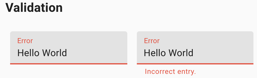
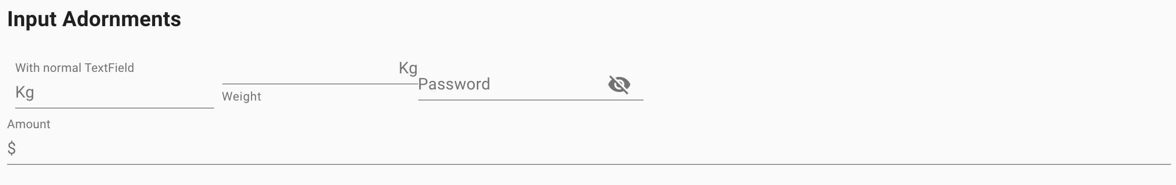
Here are examples with provided MaterialUI v4.12.3 code:
Validation:
<div class="MuiFormControl-root MuiTextField-root">
<label class="MuiFormLabel-root MuiInputLabel-root MuiInputLabel-formControl MuiInputLabel-animated MuiInputLabel-shrink Mui-error Mui-error MuiFormLabel-filled" data-shrink="true" for="standard-error" id="standard-error-label">Error</label>
<div class="MuiInputBase-root MuiInput-root MuiInput-underline Mui-error Mui-error MuiInputBase-formControl MuiInput-formControl">
<input type="text" aria-invalid="true" id="standard-error" value="Hello World" class="MuiInputBase-input MuiInput-input"/>
</div>
</div>
Input Adornments:
<div>
<div class="MuiFormControl-root MuiTextField-root jss210 jss212">
<label class="MuiFormLabel-root MuiInputLabel-root MuiInputLabel-formControl MuiInputLabel-animated MuiInputLabel-shrink" data-shrink="true" for="standard-start-adornment" id="standard-start-adornment-label">With normal TextField</label>
<div class="MuiInputBase-root MuiInput-root MuiInput-underline MuiInputBase-formControl MuiInput-formControl MuiInputBase-adornedStart">
<div class="MuiInputAdornment-root MuiInputAdornment-positionStart">
<p class="MuiTypography-root MuiTypography-body1 MuiTypography-colorTextSecondary">Kg</p>
</div>
<input aria-invalid="false" id="standard-start-adornment" type="text" class="MuiInputBase-input MuiInput-input MuiInputBase-inputAdornedStart" value=""/>
</div>
<div class="MuiFormControl-root jss210 jss211 jss212">
<div class="MuiInputBase-root MuiInput-root MuiInput-underline MuiInputBase-formControl MuiInput-formControl MuiInputBase-adornedEnd">
<input aria-invalid="false" aria-describedby="standard-weight-helper-text" id="standard-adornment-weight" type="text" aria-label="weight" class="MuiInputBase-input MuiInput-input MuiInputBase-inputAdornedEnd" value="">
<div class="MuiInputAdornment-root MuiInputAdornment-positionEnd">
<p class="MuiTypography-root MuiTypography-body1 MuiTypography-colorTextSecondary">Kg</p>
</div>
</div>
<p class="MuiFormHelperText-root" id="standard-weight-helper-text">Weight</p>
</div>
<div class="MuiFormControl-root jss210 jss212">
<label class="MuiFormLabel-root MuiInputLabel-root MuiInputLabel-formControl MuiInputLabel-animated" data-shrink="false" for="standard-adornment-password">Password</label>
<div class="MuiInputBase-root MuiInput-root MuiInput-underline MuiInputBase-formControl MuiInput-formControl MuiInputBase-adornedEnd">
<input aria-invalid="false" id="standard-adornment-password" type="password" class="MuiInputBase-input MuiInput-input MuiInputBase-inputAdornedEnd" value="">
<div class="MuiInputAdornment-root MuiInputAdornment-positionEnd">
<button class="MuiButtonBase-root MuiIconButton-root" tabindex="0" type="button" aria-label="toggle password visibility">...</button>
</div>
</div>
</div>
<div class="MuiFormControl-root jss210 MuiFormControl-fullWidth">
<label class="MuiFormLabel-root MuiInputLabel-root MuiInputLabel-formControl MuiInputLabel-animated MuiInputLabel-shrink" data-shrink="true" for="standard-adornment-amount">Amount</label>
<div class="MuiInputBase-root MuiInput-root MuiInput-underline MuiInputBase-formControl MuiInput-formControl MuiInputBase-adornedStart">
<div class="MuiInputAdornment-root MuiInputAdornment-positionStart">
<p class="MuiTypography-root MuiTypography-body1 MuiTypography-colorTextSecondary">$</p>
</div>
<input aria-invalid="false" id="standard-adornment-amount" type="text" class="MuiInputBase-input MuiInput-input MuiInputBase-inputAdornedStart" value=""/>
</div>
</div>
</div>
</div>
Available methods in Java JDI Light:
| Method | Description | Return Type |
|---|---|---|
| is() | Returns object for work with assertions | TextFieldAssert |
| setValue(String) | Input text | void |
| clear() | Clear data in Text Field | void |
| GetText() | Get current Text from Text Field | String |
| placeHolderText() | Get '{name}' placeholder text | String |
| type() | Get '{name}' type | String |
| isReadonly() | Check that '{name}' is readonly | boolean |
| isEnabled() | Check that '{name}' is enabled | boolean |
| isDisabled() | Check that '{name}' is disabled | boolean |
| isEmpty() | Check that '{name}' text area is empty | boolean |
| setText(String) | Set text '{name}' text area as {0} | void |
| sendKeys(CharSequence...) | Send text to '{name}' text area | void |
| label() | Get '{name}' label | Label |
Here you can find Text Fields tests
4.46 Alert
// @FindBy(xpath = "//div[contains(@class, 'MuiTypography-root')]/ancestor::*[contains(@class, 'MuiAlert-root')]")
@UI("//div[contains(@class, 'MuiTypography-root')]/ancestor::*[contains(@class, 'MuiAlert-root')]")
public static List<Alert> alertsWithDescription;
@DataProvider
public Object[][] alertsWithDescriptionTestData() {
return new Object[][]{
{1, "Error", "This is an error alert — check it out!", "MuiAlert-standardError"},
{2, "Warning", "This is a warning alert — check it out!", "MuiAlert-standardWarning"},
{3, "Info", "This is an info alert — check it out!", "MuiAlert-standardInfo"},
{4, "Success", "This is a success alert — check it out!", "MuiAlert-standardSuccess"}
};
}
@Test(dataProvider = "alertsWithDescriptionTestData", dataProviderClass = AlertDataProvider.class)
public void alertsWithDescriptionTest(int alertIndex, String titleText, String messageText, String alertClass) {
Alert alert = alertsWithDescription.get(alertIndex);
alert.show();
alert.is().displayed();
alert.icon().is().displayed();
alert.title().is().displayed().and().has().text(titleText);
alert.has().text(Matchers.containsString(messageText)).and().cssClass(alertClass);
}
Alert overview
Alert is located in the following class:
- Java: com.epam.jdi.light.material.elements.feedback
An Alert displays a short, important message in a way that attracts the user's attention without interrupting the user's task.
Here are examples with provided MaterialUI v4.12.3 code:
<div class="MuiPaper-root MuiAlert-root MuiAlert-standardError MuiPaper-elevation0" role="alert">
<div class="MuiAlert-icon">
<svg class="MuiSvgIcon-root MuiSvgIcon-fontSizeInherit" focusable="false" viewBox="0 0 24 24" aria-hidden="true">
<path d="M11 15h2v2h-2zm0-8h2v6h-2zm.99-5C6.47 2 2 6.48 2 12s4.47 10 9.99 10C17.52 22 22 17.52 22 12S17.52 2 11.99 2zM12 20c-4.42 0-8-3.58-8-8s3.58-8 8-8 8 3.58 8 8-3.58 8-8 8z"/>
</svg>
</div>
<div class="MuiAlert-message">This is an error alert — check it out!</div>
</div>
Available methods in Java JDI Light:
| Method | Description | Return Type |
|---|---|---|
| is() | Returns object for work with assertions | TextAssert |
| icon() | Returns alert's icon | Icon |
| title() | Returns alert's title | Text |
Here you can find Alert tests
5. Vue.js elements
5.1 Alerts
- Java: com.epam.jdi.light.vuetify.elements.common.Alert.java
//@FindBy(css = "#tileAlert .v-alert")
@UI("#tileAlert .v-alert")
public static Alert tileAlert;
@Test(description = "Check that tile alert is shown as expected")
public void tileAlertTest(){
tileAlert.show();
tileAlert.has().text("Tile Alert")
.has().color("rgba(255, 255, 255, 1)")
.has().backgroundColor("rgba(76, 175, 80, 1)")
.is().notDense()
.is().tile()
.has().type("success");
}
The Alert component is used to convey important information to the user through the use of contextual types, icons, and colors. There are four default types: success, info, warning, and error. Border, icon, and color of the alert could be customized.
Vuetify v2.6.14 code example:
<div role="alert" class="v-alert v-sheet theme--light elevation-2 v-alert--border v-alert--border-bottom">
<div class="v-alert__wrapper">
<span aria-hidden="true" class="v-icon notranslate v-alert__icon theme--light warning--text">
<svg xmlns="http://www.w3.org/2000/svg" viewBox="0 0 24 24" role="img" aria-hidden="true" class="v-icon__svg">
<path d="M12,2L1,21H23M12,6L19.53,19H4.47M11,10V14H13V10M11,16V18H13V16"></path>
</svg>
</span>
<div class="v-alert__content"> Fusce commodo aliquam arcu. </div>
<div class="v-alert__border v-alert__border--bottom warning v-alert__border--has-color"></div>
</div>
</div>
| Method | Description | Return Type |
|---|---|---|
| closeButton() | Returns close button object | VuetifyButton |
| isDismissible() | Returns true if alert has close button | boolean |
| isProminent() | Returns true if alert is prominent and has halo for icon and increased height | boolean |
| hasBorder() | Returns true if alert has border | boolean |
| borderValue() | Returns border side (top, right, bottom or left) | String |
| hasColoredBorder() | Returns true if alert border has color | boolean |
| borderBackGroundColor() | Returns border background color | boolean |
| type() | Returns alert type (info, success, warning, error) or empty string if type is undefined | String |
| Assert method | Description |
|---|---|
| text(Matcher<String> condition) | Asserts if alert text matches provided matcher |
| dismissible() or hasCloseButton() | Asserts if alert has close button |
| notDismissible() or hasNotCloseButton() | Asserts if alert has no close button |
| prominent() | Asserts if alert is prominent and has halo for icon |
| prominent() | Asserts if alert is not prominent and has no halo for icon |
| border() | Asserts if alert is prominent and has halo for icon |
| noBorder() | Asserts if alert is not prominent and has no halo for icon |
| border(String borderValue) | Asserts if alert has expected border side (top, right, bottom or left) |
| coloredBorder() | Asserts if alert has colored border |
| noColoredBorder() | Asserts if alert has not colored border |
| backgroundBorderColor(String borderBackgroundColor) | Asserts if alert has expected border background color |
| type() | Asserts if alert has expected type (info, success, warning, error) |
Alert also have basic JDI elements methods and asserts for Text, Color, Elevation, Outline, Measurements, Theme and others
For examples of usage see: Custom vuetify alert example and JDI vuetify page tests for alerts.
5.2 Avatars
Avatar is located in the following class: - Java: com.epam.jdi.light.vuetify.elements.common.Avatar.java
//@FindBy(css = "#avatarsWithSize .v-avatar")
@UI("#avatarsWithSize .v-avatar")
public static List<Avatar> sizeAvatars;
@Test(dataProvider = "sizeAvatarsTestData", dataProviderClass = AvatarsTestsDataProvider.class,
description = "Test checks sizes of avatars")
public void sizeAvatarTest(int index, int size) {
sizeAvatars.get(index).show();
sizeAvatars.get(index).has().size(size)
.and().has().height(size)
.and().has().heightGreaterThan(size - 10)
.and().has().heightLessThan(size + 10)
.and().has().width(size)
.and().has().widthGreaterThan(size - 10)
.and().has().widthLessThan(size + 10);
}
Vuetify v2.6.14 code example:
<div class="v-avatar indigo" style="height: 36px; min-width: 36px; width: 36px;">
<span class="white--text text-h5">36</span>
</div>
Avatars - graphical representations of users.
| Method | Description | Return Type |
|---|---|---|
| getText() | Gets '{name}' text | String |
| isTile() | Checks that '{name}' is tile | boolean |
| hasLeftAlignment() | Checks that '{name}' has left alignment | boolean |
| hasRightAlignment() | Check that '{name}' has right alignment | boolean |
| color() | Gets '{name}' color | String |
| backgroundColor() | Gets '{name}' background color | String |
| icon() | Gets '{name}' icon | Icon |
| hasIcon() | Checks that '{name}' has icon | boolean |
| image() | Gets '{name}' image | Image |
| height() | Gets '{name}' height | int |
| width() | Gets '{name}' width | int |
| maxHeight() | Gets '{name}' max height | int |
| maxWidth() | Gets '{name}' max width | int |
| minHeight() | Gets '{name}' min height | int |
| minWidth() | Gets '{name}' min width | int |
| isRounded() | Checks that '{name}' is rounded | boolean |
| rounded() | Gets '{name}' rounded value | String |
For examples of usage see: Custom vuetify avatar example (profile card) and JDI vuetify page tests for avatars.
5.3 Banners
- Java: com.epam.jdi.light.vuetify.elements.complex.Banner.java
//@FindBy(css = "#SingleBanner .v-banner")
@UI("#SingleBanner .v-banner")
public static Banner singleBanner;
@Test(description = "Check that Single Banner is shown as expected and toggle switch 'Sticky' works")
public void bannerTest() {
singleBanner.show();
singleBanner.is().displayed();
singleBanner.is().singleLine();
singleBanner.has().text("We can't save your edits while you are in offline mode.");
singleBanner.has().notIcon();
singleBanner.has().notSticky();
singleBannerSwitch.check();
singleBanner.is().sticky();
}
Vuetify v2.6.14 code example:
<div class="v-banner v-sheet theme--light v-banner--single-line">
<div class="v-banner__wrapper">
<div class="v-banner__content">
<div class="v-banner__text">
We can't save your edits while you are in offline mode.
</div>
</div>
<div class="v-banner__actions">
<button type="button" class="v-btn v-btn--text theme--light v-size--default deep-purple--text text--accent-4">
<span class="v-btn__content">Get Online</span>
</button>
</div>
</div>
</div>
The banner component is used as middle-interruptive message to user with 1-2 actions. It comes in 2 variations single-line and multi-line (implicit). These can have icons which you can use with your message and actions.
| Method | Description | Return Type |
|---|---|---|
| bannerContent() | Get Banner content element | UIElement |
| getIconsFromContent() | Get Banner's icons | List<UIElement> |
| bannerActions() | Get Banner's actions element | UIElement |
| isSticky() | Get if Banner is sticky | boolean |
| Assert method | Description |
|---|---|
| text(Matcher |
Assert that Banner's element has expected text |
| sticky() | Assert that Banner is sticky |
| notSticky() | Assert that Banner is not sticky |
| icon() | Assert that Banner has icon |
| notIcon() | Assert that Banner has not icon |
| numberOfButtons(int) | Assert that Banner's number of buttons equals to required number |
In addition, Banner class implements IsText, HasRounded, IsTile, IsShaped, IsOutlined, HasTheme, HasElevation, HasColor, IsSingleLine, HasIcon, MayContainButtons.
For examples of usage see: JDI vuetify page tests for banners.
5.4 Bars
5.4.1 Basic bar
- Java: com.epam.jdi.light.vuetify.elements.complex.bars.BasicBar.java
Basic bar is an abstract class that contains methods that are common for its specific realisations such as App Bar, Tool Bar and System Bar following below.
| Method | Description | Return Type |
|---|---|---|
| isCollapsed() | Get if Basic Bar is collapsed | boolean |
| isExpanded() | Get if Basic Bar is expanded | boolean |
| title() | Get Basic Bar title | Text |
| getHeader() | Get Basic Bar header | UIElement |
| buttons() | Get Basic Bar buttons | List<VuetifyButton> |
| fields() | Get Basic Bar fields | List<UIElement> |
| findIconButton(String buttonLocator) | Get Basic Bar action buttons | VuetifyButton |
| castToIcon(UIElement element) | Get Basic Bar's icon | Icon |
| isExtended() | Get if Basic Bar is extended | boolean |
| isFloating() | Get if Basic Bar is floating | boolean |
In addition, Basic Bar implements IsText, HasColor, IsFlat, IsDense, IsShaped, IsOutlined, HasElevation, HasTheme, HasRounded.
| Assert method | Description |
|---|---|
| text(String text) | Assert that Basic Bar has expected text |
| collapsed() | Assert that Basic Bar is collapsed |
| expanded() | Assert that Basic Bar is expanded |
| extended() | Assert that Basic Bar is extended |
| notExtended() | Assert that Basic Bar is not extended |
| floating() | Assert that Basic Bar is floating |
| notFloating() | Assert that Basic Bar is not floating |
5.4.2 App Bars
- Java: com.epam.jdi.light.vuetify.elements.complex.bars.AppBar.java
//@FindBy(css = "#scrollThresholdBar .v-toolbar")
@UI("#scrollThresholdBar .v-toolbar")
public static AppBarWithImageThresholdOnly thresholdBar;
@Test(description = "Test checks if app bar has image threshold or not")
public void thresholdBarTest(){
thresholdBar.show();
thresholdBar.has().imageFadingOnScroll();
thresholdBar.scrollBarToBottom();
thresholdBar.image().has().attr("style","opacity: 0;");
thresholdBar.is().onBottomPosition();
thresholdBar.scrollBarToTop();
thresholdBar.image().has().attr("style","opacity: 1;");
thresholdBar.is().onTopPosition();
}
Vuetify v2.6.14 code example:
<header class="v-sheet theme--dark v-toolbar v-toolbar--absolute v-toolbar--prominent v-app-bar v-app-bar--fade-img-on-scroll v-app-bar--shrink-on-scroll" data-booted="true" style="height: 128px; font-size: 1.5rem; margin-top: 0px; transform: translateY(0px); left: 0px; right: 0px; background-color: rgb(67, 160, 71); border-color: rgb(67, 160, 71);">
<div class="v-toolbar__image" style="opacity: 1;">
<div class="v-image v-responsive theme--dark" style="height: 128px;">
<div class="v-responsive__sizer" style="padding-bottom: 56.25%;"></div>
<div class="v-image__image v-image__image--cover" style="background-image: linear-gradient(to right top, rgba(55, 236, 186, 0.7), rgba(25, 32, 72, 0.7)), url("https://jdi-testing.github.io/jdi-light/vuetify/pictures/foggy_city_1080.jpeg"); background-position: center center;"></div>
<div class="v-responsive__content" style="width: 1920px;"></div>
</div>
</div>
<div class="v-toolbar__content" style="height: 128px;">
<button type="button" class="v-app-bar__nav-icon v-btn v-btn--icon v-btn--round theme--dark v-size--default">
<span class="v-btn__content"><i aria-hidden="true" class="v-icon notranslate mdi mdi-menu theme--dark"></i></span>
</button>
<div class="v-toolbar__title v-app-bar-title">
<div class="v-app-bar-title__content" style="width: 47px; visibility: visible;">Title</div>
<div class="v-app-bar-title__placeholder" style="visibility: hidden;">Title</div>
</div>
<div class="spacer"></div>
<button type="button" class="v-btn v-btn--icon v-btn--round theme--dark v-size--default">
<span class="v-btn__content"><i aria-hidden="true" class="v-icon notranslate mdi mdi-magnify theme--dark"></i></span>
</button>
<button type="button" class="v-btn v-btn--icon v-btn--round theme--dark v-size--default">
<span class="v-btn__content"><i aria-hidden="true" class="v-icon notranslate mdi mdi-heart theme--dark"></i></span>
</button>
<button type="button" class="v-btn v-btn--icon v-btn--round theme--dark v-size--default">
<span class="v-btn__content"><i aria-hidden="true" class="v-icon notranslate mdi mdi-dots-vertical theme--dark"></i></span>
</button>
</div>
</header>
The App bars component is pivotal to any graphical user interface (GUI), as it generally is the primary source of site navigation. The App bars component works great in conjunction with a Navigation Drawers for providing site navigation in your application.
| Method | Description | Return Type |
|---|---|---|
| hasBackgroundImage() | Get if App bar is scrolled | boolean |
| backgroundImage() | Get App bar's image | Image |
| scrollBarToBottom() | Scroll App bar to bottom | void |
| scrollBarToTop() | Scroll App bar to top | void |
| isCollapsible() | Get if App bar is collapsible | boolean |
| hasImageFadingOnScroll() | Get if App bar has image fading on scroll | boolean |
| isOnTopPosition() | Get if App bar is on top position | boolean |
| isOnBottomPosition() | Get if App bar is on bottom position | boolean |
| isElevateOnScroll() | Get if App bar is elevate on scroll | boolean |
| isScrolled() | Get if App bar is scrolled | boolean |
| isShrinkOnScroll() | Get if App bar shrinks on scroll | boolean |
| isBarShort() | Get if App bar is short | boolean |
| isBarUsualSize() | Get if App bar has usual size | boolean |
| Assert method | Description |
|---|---|
| collapsible() | Assert that App bar is collapsible |
| notCollapsible() | Assert that App bar is not collapsible |
| imageFadingOnScroll() | Assert that App bar has image fading on scroll |
| onTopPosition() | Assert that App bar is on top position |
| onBottomPosition() | Assert that App bar is on bottom position |
| noImageFadingOnScroll() | Assert that App bar has no image fading on scroll |
| elevateOnScroll() | Assert that App bar is elevate on scroll |
| notElevateOnScroll() | Assert that App bar is not elevate on scroll |
| scrolled() | Assert that App bar is scrolled |
| notScrolled() | Assert that App bar is not scrolled |
| backgroundImage() | Assert that App bar has background image |
| noBackgroundImage() | Assert that App bar has no background image |
| shrinkOnScroll() | Assert that App bar shrinks on scroll |
| notShrinkOnScroll() | Assert that App bar doesn't shrink on scroll |
| isShort() | Assert that App bar bar is short |
| isUsualSize() | Assert that App bar bar has usual size |
For examples of usage see: JDI vuetify page tests for app bars.
5.4.3 System bars
- Java: com.epam.jdi.light.vuetify.elements.complex.bars.SystemBar.java
//@FindBy(css = "#AppSystemBar .v-system-bar")
@UI("#AppSystemBar .v-system-bar")
public static SystemBar appSystemBar;
@Test(description = "Test checks if app system bar appears as expected")
public void appSystemBarTest(){
appSystemBar.show();
appSystemBar.has().text("App system bar title");
appSystemBar.is().notWindow();
appSystemBar.has().height(30);
}
Vuetify v2.6.14 code example:
<div class="v-system-bar v-system-bar--fixed theme--light green" id="system-bar-app" style="height: 30px;">
<button type="button" class="v-app-bar__nav-icon v-btn v-btn--icon v-btn--round theme--light v-size--default">
<span class="v-btn__content">
<i aria-hidden="true" class="v-icon notranslate mdi mdi-menu theme--light"></i>
</span>
</button>
<div class="v-toolbar__title">App system bar title</div>
<div class="spacer"></div>
<button type="button" class="v-btn v-btn--icon v-btn--round theme--light v-size--default">
<span class="v-btn__content">
<i aria-hidden="true" class="v-icon notranslate mdi mdi-heart theme--light"></i>
</span>
</button>
<button type="button" class="v-btn v-btn--icon v-btn--round theme--light v-size--default">
<span class="v-btn__content">
<i aria-hidden="true" class="v-icon notranslate mdi mdi-dots-vertical theme--light"></i>
</span>
</button>
</div>
The System bar component can be used for displaying statuses to the user. It looks like the Android system bar and can contain icons, spacers, and some text.
| Method | Description | Return Type |
|---|---|---|
| icons() | Get System Bar icons | List<Icon> |
| isLightsOut() | Get if System Bar is lights out | boolean |
| isWindow() | Get if System Bar is window | boolean |
In addition, System Bar implements HasMeasurement.
| Assert method | Description |
|---|---|
| lightsOut() | Assert that System Bar is lights out |
| notLightsOut() | Assert that System Bar is not lights out |
| window() | Assert that System Bar is window |
| notWindow() | Assert that System Bar is not window |
For examples of usage see: JDI vuetify page tests for system bars.
5.4.4 Toolbars
- Java: com.epam.jdi.light.vuetify.elements.complex.bars.ToolBar.java
//@FindBy(css = "#denseToolbar .v-toolbar")
@UI("#denseToolbar .v-toolbar")
public static ToolBar denseToolbar;
@Test(description = "Check if dense toolbar looks as expected")
public void denseToolBarTest(){
denseToolbar.show();
denseToolbar.is().dense();
denseToolbar.is().notBackgroundImage();
denseToolbar.is().notFlat();
}
Vuetify v2.6.14 code example:
<header class="v-sheet theme--light v-toolbar v-toolbar--dense" style="height: 48px;">
<div class="v-toolbar__content" style="height: 48px;">
<button type="button" class="v-app-bar__nav-icon v-btn v-btn--icon v-btn--round theme--light v-size--default">
<span class="v-btn__content">
<i aria-hidden="true" class="v-icon notranslate mdi mdi-menu theme--light"></i>
</span>
</button>
<div class="v-toolbar__title">Title</div>
<div class="spacer"></div>
<button type="button" class="v-btn v-btn--icon v-btn--round theme--light v-size--default">
<span class="v-btn__content">
<i aria-hidden="true" class="v-icon notranslate mdi mdi-magnify theme--light"></i>
</span>
</button>
<button type="button" class="v-btn v-btn--icon v-btn--round theme--light v-size--default">
<span class="v-btn__content">
<i aria-hidden="true" class="v-icon notranslate mdi mdi-heart theme--light"></i>
</span>
</button>
<button type="button" class="v-btn v-btn--icon v-btn--round theme--light v-size--default">
<span class="v-btn__content">
<i aria-hidden="true" class="v-icon notranslate mdi mdi-dots-vertical theme--light"></i>
</span>
</button>
</div>
</header>
The Toolbar component is pivotal to any graphical user interface (GUI), as it generally is the primary source of site navigation. The toolbar component works great in conjunction with Navigation drawer and Cards.
| Method | Description | Return Type |
|---|---|---|
| hasBackgroundImage() | Get if Toolbar has background image | boolean |
| Assert method | Description |
|---|---|
| backgroundImage() | Assert that Toolbar has background image |
| notBackgroundImage() | Assert that Toolbar has not background image |
For examples of usage see: JDI vuetify page tests for toolbars.
5.5 Bottom navigation
- Java: com.epam.jdi.light.vuetify.elements.complex.BottomNavigation.java
//@FindBy(css = "#scrollThresholdBottomNavigation .v-bottom-navigation")
@UI("#scrollThresholdBottomNavigation .v-bottom-navigation")
public static BottomNavigation bottomNavigationScrollThreshold;
//@FindBy(css = "#fixedBottomNavigation .v-bottom-navigation")
@UI("#fixedBottomNavigation .v-bottom-navigation")
public static BottomNavigation bottomNavigationFixed;
@Test(description = "Test checks bottom navigation position")
public void positionBottomNavigationTest() {
cardWithBottomNavigationScrollThreshold.show();
cardWithBottomNavigationScrollThreshold.scroll(-1500);
bottomNavigationScrollThreshold.is().absolute();
bottomNavigationScrollThreshold.is().notFixed();
bottomNavigationFixed.show();
bottomNavigationFixed.is().fixed();
bottomNavigationFixed.is().notAbsolute();
}
The v-bottom-navigation component is an alternative to the sidebar. It is primarily used for mobile applications and comes in three variants, icons and text, and shift.
Vuetify v2.6.14 code example:
<div class="v-bottom-navigation v-item-group theme--light" file="v-bottom-navigation/usage" style="height: 56px; transform: none;">
<button type="button" value="recent" class="v-btn v-btn--active v-btn--is-elevated v-btn--has-bg theme--light v-size--default">
<span class="v-btn__content">
<span>Recent</span>
<i aria-hidden="true" class="v-icon notranslate mdi mdi-history theme--light">
</i>
</span>
</button>
<button type="button" value="favorites" class="v-btn v-btn--is-elevated v-btn--has-bg theme--light v-size--default">
<span class="v-btn__content">
<span>Favorites</span>
<i aria-hidden="true" class="v-icon notranslate mdi mdi-heart theme--light">
</i>
</span>
</button>
<button type="button" value="nearby" class="v-btn v-btn--is-elevated v-btn--has-bg theme--light v-size--default">
<span class="v-btn__content">
<span>Nearby</span>
<i aria-hidden="true" class="v-icon notranslate mdi mdi-map-marker theme--light">
</i>
</span>
</button>
</div>
| Method | Description | Return Type |
|---|---|---|
| buttonColor(int) | Returns button color by index | String |
| buttonColor(String) | Returns button color by text | String |
| isFixed() | Gets if element has fixed position | boolean |
| isAbsolute() | Gets if element has absolute position | boolean |
| isHorizontal() | Gets if element is horizontal | boolean |
| isGrow() | Gets if element is grow | boolean |
BottomNavigation element implements the following interfaces: HasColor, HasTheme, HasMeasurement
For examples of usage see: JDI vuetify page tests for Bottom Navigation.
5.7 Breadcrumbs
Breadcrumbs is located in the following class:
- Java: com.epam.jdi.light.vuetify.elements.complex.breadcrumbs.Breadcrumbs.java
- Java: com.epam.jdi.light.vuetify.elements.complex.breadcrumbs.Breadcrumb.java
//@FindBy(css = "#differentDividersBreadcrumbs')
@JDIBreadcrumbs(
root = "#differentDividersBreadcrumbs > ul:nth-child(2)",
items = ".v-breadcrumbs__item",
dividers = ".v-breadcrumbs__divider"
)
public static Breadcrumbs forwardSlashedBreadcrumbs;
@JDIBreadcrumbs(root = "#itemSlotBreadcrumbs > ul")
public static Breadcrumbs itemSlotsBreadcrumbs;
@Test(description = "Test checks dividers types")
public void dividersTypeTest() {
dashedBreadcrumbs.show();
dashedBreadcrumbs.has().dividerType("-");
forwardSlashedBreadcrumbs.show();
forwardSlashedBreadcrumbs.has().dividerType("/");
dottedBreadcrumbs.show();
dottedBreadcrumbs.has().dividerType(".");
semicolonBreadcrumbs.show();
semicolonBreadcrumbs.has().dividerType(";");
greaterSignBreadcrumbs.show();
greaterSignBreadcrumbs.has().dividerType(">");
}
Breadcrumbs can be used to specify locators for the root, links and dividers
explicitly through a JDIBreadcrumbs annotation.It is necessary to specify the root of an element.
Vuetify v2.6.14 code example:
<div id="differentDividersBreadcrumbs">
<ul class="v-breadcrumbs theme--light">
<li>
<a href="#dashboard" class="v-breadcrumbs__item">Dashboard</a>
</li>
<li class="v-breadcrumbs__divider">-</li>
<li>
<a href="#link1" class="v-breadcrumbs__item">Link 1</a>
</li>
<li class="v-breadcrumbs__divider">-</li>
<li><a href="#link2" class="v-breadcrumbs__item v-breadcrumbs__item--disabled">Link 2</a>
</li>
</ul>
Breadcrumbs has the following methods:
| Method | Description | Return Type |
|---|---|---|
| selected() | Returns selected element | String |
| selected(String) | Shows that required element is selected | String |
| dividers() | Returns element's dividers | WebList |
| items() | Returns element's items | WebList |
| isLarge() | Check if element is large | boolean |
| setup(Field) | Setting up Breadcrumbs element by Field | void |
| setup(String, String, String) | Returns Breadcrumbs element by locators | Breadcrumbs |
| is() | Returns object for work with assertions | BreadcrumbsAssert |
| isDisabled() | Check that breadcrumb is disabled | boolean |
| isEnabled() | Check that breadcrumb is not disabled | boolean |
5.8 Cards
- Java: com.epam.jdi.light.vuetify.elements.complex.Card.java
//@FindBy(xpath = "//div[./h2[contains(text(), 'Media with text')]]/div")
@UI("//div[./h2[contains(text(), 'Media with text')]]/div")
public static MediaTextCard mediaTextCard;
@Test(description = "Test checks custom element media text card functionality")
public void mediaTextCardTest() {
mediaTextCard.show();
mediaTextCard.is().displayed();
mediaTextCard.image().has().css("background-size", "cover");
mediaTextCard.has().title("Top 10 Australian beaches");
mediaTextCard.has().subtitle(containsString("Number 10"));
mediaTextCard.content().has().text(containsString("Whitehaven Beach"));
mediaTextCard.shareButton().click();
mediaTextCard.exploreButton().click();
}
Card component is a versatile component that can be used for anything from a panel to a static image. The card component has numerous helper components to make markup as easy as possible.
Vuetify v2.6.14 code example:
<div class="grow v-card v-sheet theme--light elevation-2" file="v-card/usage">
<div class="v-card__title">Card title</div>
<div class="v-card__subtitle">Subtitle text</div>
<div class="v-card__text"> Greyhound divisively hello coldly wonderfully marginally far upon excluding. </div>
<div class="v-card__actions">
<button type="button" class="v-btn v-btn--text theme--light v-size--default primary--text">
<span class="v-btn__content"> Action 1 </span>
</button>
<button type="button" class="v-btn v-btn--text theme--light v-size--default primary--text">
<span class="v-btn__content"> Action 2 </span>
</button>
</div>
</div>
Cards may contain anything, you can inherit the Card class and customize it the way you want.
Basically, you have 4 methods: title, subtitle, content and actions.
They return the parts of a card described here.
The content method returns a card text element, but the text method is inherited from UIBaseElement that why it has a different name.
| Method | Description | Return Type |
|---|---|---|
| title() | Returns element's title | Text |
| subtitle() | Returns subtitle JDI UIElement | UIElement |
| content() | Returns content JDI UIElement | UIElement |
| actions() | Returns button group JDI UIElement | ButtonGroup |
| revealCard() | Returns Card's reverse side JDI UIElement | Card |
| progressBar() | Returns ProgressLinear JDI UIElement | ProgressLinear |
| getLoaderHeight | Returns progress bar height | int |
| isLink() | Returns true if card is a link | boolean |
| isHover() | Returns true if card has hovering effect | boolean |
| isRaised() | Returns true if card is raised | boolean |
| Assert method | Description |
|---|---|
| title(Matcher |
Asserts card title text |
| title(String expectedText) | Asserts card title text |
| subtitle(Matcher |
Asserts card subtitle text |
| subtitle(String expectedText) | Asserts card subtitle text |
| loaderHeightPx() | Asserts card loader height |
| link() | Asserts if card is a link |
| notlink() | Asserts if card is not a link |
| hover() | Asserts if card is hovering |
| notHover() | Asserts if card is not hovering |
| raised() | Asserts if card is raised |
| notRaised() | Asserts if card is not raised |
Card also has basic JDI elements methods and asserts for Color, Elevation, Tile, Loading, Shape, Measurements, Alignment, Theme and others
For examples of usage see: Custom vuetify card examples and JDI vuetify page tests for cards.`
5.9 Dialogs
- Java: com.epam.jdi.light.vuetify.elements.complex.Dialog.java
//@FindBy(css = ".v-dialog--scrollable")
@UI(".v-dialog--scrollable")
public static ScrollableDialog scrollableDialog;
@Test(description = "Check if scrollable dialog could be scrolled and option could be selected ")
public static void scrollableDialogTest(){
scrollableDialogButton.show();
scrollableDialogButton.click();
scrollableDialog.is().opened().and().scrollable();
scrollableDialog.radiogroup().is().selected("");
scrollableDialog.radiogroup().select("Bahrain");
scrollableDialog.saveButton().click();
scrollableDialog.is().closed();
scrollableDialogButton.click();
scrollableDialog.is().opened();
scrollableDialog.radiogroup().is().selected("Bahrain");
scrollableDialog.closeButton().click();
scrollableDialog.is().closed();
}
The Dialog component inform users about a specific task and may contain critical information, require decisions, or involve multiple tasks.
Vuetify v2.6.14 code example:
<div class="v-dialog v-dialog--active v-dialog--scrollable" style="transform-origin: center center; max-width: 300px;"
tabindex="0">
<div class="v-card v-sheet theme--light">
<div class="v-card__title">Select Country</div>
<hr role="separator" aria-orientation="horizontal" class="v-divider theme--light">
<div class="v-card__text" style="height: 300px;">
<div class="v-input theme--light v-input--selection-controls v-input--radio-group v-input--radio-group--column">
<div class="v-input__control">
<div class="v-input__slot" style="height: auto;">
<div role="radiogroup" aria-labelledby="input-163" class="v-input--radio-group__input">
<div class="v-radio theme--light">
<div class="v-input--selection-controls__input">
<i aria-hidden="true" class="v-icon notranslate mdi mdi-radiobox-blank theme--light">
</i>
<input aria-checked="false" id="input-164" role="radio" type="radio" name="radio-163" value="bahamas">
<div class="v-input--selection-controls__ripple"></div>
</div>
<label for="input-164" class="v-label theme--light"
style="left: 0px; right: auto; position: relative;">Bahamas,
The</label></div>
<div class="v-radio theme--light">
<div class="v-input--selection-controls__input">
<i aria-hidden="true" class="v-icon notranslate mdi mdi-radiobox-blank theme--light">
</i>
<input aria-checked="false" id="input-166" role="radio" type="radio" name="radio-163" value="bahrain">
<div class="v-input--selection-controls__ripple"></div>
</div>
<label for="input-166" class="v-label theme--light" style="left: 0px; right: auto; position: relative;">Bahrain</label>
</div>
<...>
</div>
</div>
<div class="v-messages theme--light">
<div class="v-messages__wrapper"></div>
</div>
</div>
</div>
</div>
<hr role="separator" aria-orientation="horizontal" class="v-divider theme--light">
<div class="v-card__actions">
<button type="button" class="v-btn v-btn--text theme--light v-size--default blue--text text--darken-1">
<span class="v-btn__content">
Close
</span>
</button>
<button type="button" class="v-btn v-btn--text theme--light v-size--default blue--text text--darken-1">
<span class="v-btn__content">
Save
</span>
</button>
</div>
</div>
</div>
| Method | Description | Return Type |
|---|---|---|
| content() | Get Dialog content | Card |
| isActive() | Get if Dialog is active | boolean |
| isOpened() | Get if Dialog is opened | boolean |
| isClosed() | Get if Dialog is closed | boolean |
| isFullscreen() | Get if Dialog is fullscreen | boolean |
| isPersistent() | Get if Dialog is persistent | boolean |
| isScrollable() | Get if Dialog is scrollable | boolean |
| ihasVisibleContent(UIElement element) | Get if Dialog has visible required element in dialog content | boolean |
| close() | Close Dialog | void |
| close(String closeButtonName) | Close Dialog with required button | void |
| maxWidthPx() | Get Dialog's max-width | int |
| marginPx() | Get Dialog's margin | int |
| Assert method | Description |
|---|---|
| opened() | Assert that Dialog is opened |
| closed() | Assert that Dialog is closed |
| active() | Assert that Dialog is active |
| notActive() | Assert that Dialog is not active |
| fullscreen() | Assert that Dialog is fullscreen |
| notFullscreen() | Assert that Dialog is not fullscreen |
| persistent() | Assert that Dialog is persistent |
| notPersistent() | Assert that Dialog is not persistent |
| scrollable() | Assert that Dialog is scrollable |
| notScrollable() | Assert that Dialog is not scrollable |
| visibleContent(UIElement element) | Assert that Dialog has visible required element in dialog content |
| notVisibleContent(UIElement element) | Assert that Dialog has not visible required element in dialog content |
| maxWidthPx(int width) | Assert that Dialog has required width |
| marginPx(int margin) | Assert that Dialog has margin with required px |
For examples of usage see: JDI vuetify page tests for dialogs.
5.10 Expansion Panels
Java:
- com.epam.jdi.light.vuetify.elements.complex.panels.ExpansionPanels.java
- com.epam.jdi.light.vuetify.elements.complex.panels.ExpansionPanel.java
//@FindBy(css = "#ModelExpansionPanel .v-expansion-panels")
@UI("#ModelExpansionPanel .v-expansion-panels")
public static ExpansionPanels modelExpansionPanels;
@Test(description = "Test checks expansion panel texts")
public void textExpansionPanels(ExpansionPanels panels) {
panels.show();
for (ExpansionPanel expansionPanel : panels.panels()) {
expansionPanel.expand();
expansionPanel.header().has().text(containsString("It"));
expansionPanel.header().has().text("Item");
expansionPanel.content().has().text(LOREM_IPSUM_TEXT);
expansionPanel.is().expanded();
}
}
ExpansionPanels is a list of ExpansionPanel.
The v-expansion-panel component is useful for reducing vertical space with large amounts of information. The default functionality of the component is to only display one expansion-panel body at a time; however, with the multiple property, the expansion-panel can remain open until explicitly closed.
Vuetify v2.6.14 code example:
<div class="pa-4 v-sheet theme--light rounded">
<div class="v-item-group theme--light v-expansion-panels" file="v-expansion-panels/usage">
<div aria-expanded="false" class="v-expansion-panel">
<button type="button" class="v-expansion-panel-header"> Item
<div class="v-expansion-panel-header__icon">
<span aria-hidden="true" class="v-icon notranslate theme--light">
<svg xmlns="http://www.w3.org/2000/svg" viewBox="0 0 24 24" role="img" aria-hidden="true" class="v-icon__svg">
<path d="M7.41,8.58L12,13.17L16.59,8.58L18,10L12,16L6,10L7.41,8.58Z"></path>
</svg>
</span>
</div>
</button>
</div>
</div>
</div>
ExpansionPanels methods:
| Method | Description | Return Type |
|---|---|---|
| panels() | Returns list of panels as Expansion Panel | List<ExpansionPanel> |
| list() | Returns list of panels as UIElement | WebList |
| isEnabled() | Returns true if panel is enabled | boolean |
| isAccordion() | Returns true if panel is accordion | boolean |
| isFocusable() | Returns true if panel is focusable | boolean |
| isInset() | Returns true if panel is inset | boolean |
| isPopout() | Returns true if panel is popout | boolean |
In addition, ExpansionPanels implements HasTheme, IsFlat, IsTile.
| Assert method | Description |
|---|---|
| accordion() | Assert that panel is accordion |
| notAccordion() | Assert that panel is not accordion |
| focusable() | Assert that panel is focusable |
| notFocusable() | Assert that panel is not focusable |
| inset() | Assert that panel is inset |
| notInset() | Assert that panel is not inset |
| popout() | Assert that panel is popout |
| notPopout() | Assert that panel is not popout |
ExpansionPanel methods:
| Method | Description | Return Type |
|---|---|---|
| header() | Returns header element by header locator from JDIExpansionPanels annotation | UIElement |
| headerIcon() | Returns panel header icon | UIElement |
| expander() | Returns expander element by icon locator from JDIExpansionPanels annotation | Icon |
| content() | Expands if panel is closed. Returns content element by content locator from JDIExpansionPanels annotation | UIElement |
| expand() | Expands panel | void |
| close() | Closes panel | void |
| isExpanded() | Returns true if panel is expanded | boolean |
| isClosed() | Returns true if panel is closed | boolean |
| contentColor() | Returns panel header font color | String |
| contentBackgroundColor() | Returns panel content background color | String |
| hasIconDisableRotate() | Check that panel header has icon disable rotate | boolean |
In addition, ExpansionPanel implements HasColor.
| Assert method | Description |
|---|---|
| expanded() | Assert that panel is expanded |
| closed() | Assert that panel is closed |
| contentColor(String color) | Assert that panel has content font color '{0}' |
| contentBackgroundColor(String color) | Assert that panel has content background color '{0}' |
| iconDisableRotate() | Assert that panel has icon disable rotate |
| notIconDisableRotate() | Assert that panel icon rotation is not disabled |
For examples of usage see: JDI vuetify page tests for expansion panels.
5.11 Footers
- Java: com.epam.jdi.light.vuetify.elements.composite.Footer.java
//@FindBy(css = "#IndigoFooter")
@UI("#IndigoFooter")
public static IndigoFooter indigoFooter;
@Test(description = "Test checks custom element indigo footer")
public void indigoFooterTest() {
indigoFooter.show();
// footer itself does not have indigo color but inner container has
indigoFooter.firstChild().has().css("background-color", Colors.INDIGO_LIGHTEN_1.value());
indigoFooter.footerText().has().text(containsString(expectedVuetifyText));
indigoFooter.divider().has().darkTheme();
indigoFooter.descriptionText().has().text(containsString("Phasellus feugiat arcu sapien"));
indigoFooter.socialButtons().forEach(HasClick::click);
}
//@FindBy(css = "#PadlessFooter")
@UI("#PadlessFooter")
public static Footer padlessFooter;
@Test(description = "Test checks if footer is padless or not")
public void padlessFooterTest() {
padlessFooter.show();
padlessFooter.is().padless();
shapedFooter.show();
shapedFooter.is().notPadless();
}
Footer - The v-footer component is used for displaying general information that a user might want to access from any page within your site.
Vuetify v2.6.14 code example:
<footer class="v-footer v-sheet theme--dark v-footer--padless" id="IndigoFooter" data-booted="true">
<div class="indigo lighten-1 white--text text-center v-card v-card--flat v-sheet theme--dark rounded-0">
<div class="v-card__text">
<button type="button" class="mx-4 white--text v-btn v-btn--icon v-btn--round theme--dark v-size--default">
<span class="v-btn__content">
<i aria-hidden="true" class="v-icon notranslate mdi mdi-facebook theme--dark" style="font-size: 24px;"></i>
</span>
</button>
<button type="button" class="mx-4 white--text v-btn v-btn--icon v-btn--round theme--dark v-size--default">
<span class="v-btn__content">
<i aria-hidden="true" class="v-icon notranslate mdi mdi-twitter theme--dark" style="font-size: 24px;"></i>
</span>
</button>
<button type="button" class="mx-4 white--text v-btn v-btn--icon v-btn--round theme--dark v-size--default">
<span class="v-btn__content">
<i aria-hidden="true" class="v-icon notranslate mdi mdi-linkedin theme--dark" style="font-size: 24px;"></i>
</span>
</button>
<button type="button" class="mx-4 white--text v-btn v-btn--icon v-btn--round theme--dark v-size--default">
<span class="v-btn__content">
<i aria-hidden="true" class="v-icon notranslate mdi mdi-instagram theme--dark" style="font-size: 24px;"></i>
</span>
</button>
</div>
<div class="v-card__text white--text pt-0">Footer visible text here</div>
<hr role="separator" aria-orientation="horizontal" class="v-divider theme--dark">
<div class="v-card__text white--text">
2023 — <strong>Vuetify</strong>
</div>
</div>
</footer>
| Method | Description | Return Type |
|---|---|---|
| is() | Returns Assert class | FooterAssert |
| isPadless() | Checks that element is padless | boolean |
| isAbsolute() | Checks that element is absolute | boolean |
| isFixed() | Checks that element is fixed | boolean |
| has() | Returns Assert class | FooterAssert |
| color() | Returns css attribute background-color as String Value | String |
| waitFor() | Returns object for work with assertions | FooterAssert |
| shouldBe() | Returns object for work with assertions | FooterAssert |
| verify() | Returns object for work with assertions | FooterAssert |
| assertThat() | Returns object for work with assertions | FooterAssert |
| classes() | Gets all element's classes as list | List<String> |
| doubleClick() | Double clicks on the element | void |
| dragAndDropTo(int x, int y) | Drags and drops element to certain coordinates | void |
| dragAndDropTo(WebElement to) | Drags and drops element to another element | void |
| getLocation() | Gets element location as point | Point |
| getSize() | Gets element size | Dimension |
| getTagName() | Gets element tag name | String |
| getText() | Gets element text | String |
| getValue() | Gets element text | String |
| hasAttribute(String attrName) | Returns true if the element has an expected attribute | boolean |
| hasClass(String className) | Returns true if the element has an expected class | boolean |
| highlight() | Highlights element with red color | void |
| highlight(String color) | Scrolls view to element and highlights it with a border of specified color | void |
| hover() | Hovers mouse cursor over the element | void |
| isDisabled() | Checks that element is disabled | boolean |
| isDisplayed() | Checks that element is displayed | boolean |
| isEnabled() | Checks that element exists | boolean |
| isHidden() | Checks that element is hidden | boolean |
| isNotExist() | Checks that element does not exist | boolean |
| isNotVisible() | Checks that element is not visible by user | boolean |
| isVisible() | Checks that element is visible by user | boolean |
| labelText() | Gets label text | String |
| printHtml() | Gets element “innerHTML” attribute value | String |
| rightClick() | Right clicks on the element | void |
| setAttribute(String name, String value) | Sets value to the specified attribute | void |
| show() | Scrolls screen view to item | void |
5.12 Form input & controls
5.12.1 Overflow buttons
- Java: com.epam.jdi.light.vuetify.elements.composite.OverflowButton.java
//@FindBy(css = "#OverflowButton .v-overflow-btn")
@UI("#OverflowButton .v-overflow-btn")
public static OverflowButton counterOverflowButton;
@Test(description = "Test checks if overflow button is expanded or not")
public void closeExpandOverflowButtonTest() {
counterOverflowButton.show();
counterOverflowButton.has().placeholder("Overflow Btn w/ counter");
counterOverflowButton.expand();
counterOverflowButton.is().expanded();
counterOverflowButton.close();
counterOverflowButton.is().closed();
counterOverflowButton.select("50%");
counterOverflowButton.is().selected("50%").and().counter(3);
counterOverflowButton.select(1);
counterOverflowButton.is().selected("100%");
counterOverflowButton.select(5);
counterOverflowButton.is().counter(2);
}
v-overflow-btn is used to give the user the ability to select items from the list. It has 3 variations: editable, overflow and segmented
Vuetify v2.6.14 code example:
<div class="container" id="dropdown-example-3" file="v-overflow-btn/prop-counter">
<div
class="v-input my-2 theme--light v-text-field v-text-field--single-line v-text-field--is-booted v-select v-autocomplete v-overflow-btn">
<div class="v-input__control">
<div role="combobox" aria-haspopup="listbox" aria-expanded="false" aria-owns="list-635" class="v-input__slot">
<div class="v-select__slot"><label for="input-635" class="v-label theme--light">Overflow Btn w/ counter</label>
<div class="v-select__selections"><input id="input-635" readonly="readonly" type="text"></div>
<div class="v-input__append-inner">
<div class="v-input__icon v-input__icon--append">
<span aria-hidden="true" class="v-icon notranslate theme--light">
<svg xmlns="http://www.w3.org/2000/svg" viewBox="0 0 24 24" role="img" aria-hidden="true" class="v-icon__svg">
<path d="M7,10L12,15L17,10H7Z"></path>
</svg>
</span>
</div>
</div>
<input type="hidden"></div>
<div class="v-menu"><!----></div>
</div>
<div class="v-text-field__details">
<div class="v-messages theme--light">
<div class="v-messages__wrapper"></div>
</div>
<div class="v-counter theme--light">0</div>
</div>
</div>
</div>
</div>
| Method | Description | Return Type |
|---|---|---|
| expand()/close() | Open/close dropdown menu | void |
| select(String text)/select(int index) | Select element | void |
| sendText(String text) | Set text in input field | void |
| clear() | Clear Overflow button text field | void |
| selected() | Returns selected text | String |
| hasCounter() | Returns if Overflow button has counter | boolean |
| counterValue() | Returns Overflow button counter value | int |
| isExpanded()/isClosed() | Shows that dropdown menu is open/close | boolean |
| isDisabled()/isEnabled() | Shows that required element is disabled/enabled | boolean |
| isEditable() | Shows that required element is editable | boolean |
| loader() | Returns Overflow button loader height | ProgressLinear |
| isSegmented() | Returns if Overflow button is segmented | boolean |
| hasChips() | Returns if Overflow button has chips | boolean |
| hasSmallChips() | Returns if Overflow button has small chips | boolean |
In addition, OverflowButton implements HasPlaceholder, HasMessages, IsReadOnly, IsLoading, IsDense, IsFilled, IsReverse, HasRounded, IsFlat, HasTheme, IsOutlined, IsShaped, IsSingleLine, IsFullWidth.
| Assert method | Description |
|---|---|
| expanded() | Assert that OverflowButton is expanded |
| closed() | Assert that OverflowButton is closed |
| selected(String value) | Assert that OverflowButton has selected value |
| placeholder(String text) | Assert that OverflowButton placeholder has text |
| counter() | Assert that OverflowButton has counter |
| notCounter() | Assert that OverflowButton has not counter |
| counter(int value) | Assert that OverflowButton counter is value |
| editable() | Assert that OverflowButton is editable |
| notEditable() | Assert that OverflowButton is not editable |
| enabled() | Assert that OverflowButton is enabled |
| disabled() | Assert that OverflowButton is disabled |
| hasLoader() | Assert that OverflowButton has loader |
| hasNoLoader() | Assert that OverflowButton has no loader |
| segmented() | Assert that OverflowButton is segmented |
| notSegmented() | Assert that OverflowButton is not segmented |
| chips() | Assert that OverflowButton has chips |
| noChips() | Assert that OverflowButton has no chips |
| smallChips() | Assert that OverflowButton has small chips |
| noSmallChips() | Assert that OverflowButton has no small chips |
In addition, OverflowButtonAssert implements MessagesAssert
For examples of usage see: JDI vuetify page tests for Overflow buttons.
5.12.2 Range Slider
- Java: com.epam.jdi.light.vuetify.elements.complex.RangeSlider.java
//@FindBy(css = "#MinAndMaxRangeSlider .v-slider")
@UI("#MinAndMaxRangeSlider .v-slider")
public static RangeSlider minAndMaxRangeSlider;
@Test(description = "Test checks min and max range slider's values: min(0-n), max(0-n)")
public void minAndMaxRangeSliderTest() {
minAndMaxRangeSlider.show();
minAndMaxRangeSlider.setValue(11, 66);
minAndMaxRangeSlider.has().value(11, 66)
.and().minValue(-50).and().maxValue(90);
minAndMaxRangeSlider.setValue(-50, 90);
minAndMaxRangeSlider.has().value(-50, 90);
}
The v-range-slider component is a better visualization of the number input.
It is used for gathering numerical user data. Sliders reflect a range of values along a bar, from which users may select a single value.
They are ideal for adjusting settings such as volume, brightness, or applying image filters.
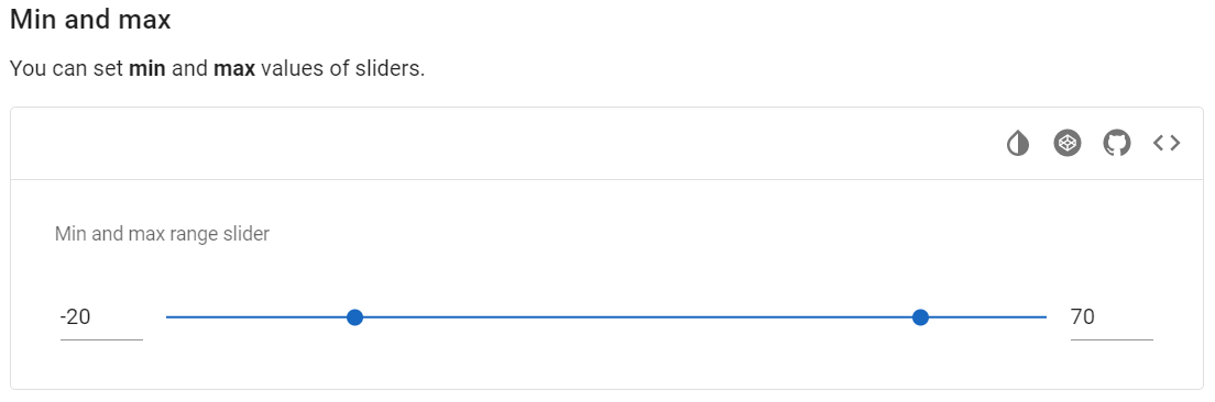
Vuetify v2.6.14 code example:
<div
class="v-input align-center v-input--hide-details v-input--is-label-active
v-input--is-dirty theme--light v-input__slider v-input--range-slider">
<div class="v-input__prepend-outer">
...
</div>
<div class="v-input__control">
<div class="v-input__slot">
<div class="v-slider v-slider--horizontal theme--light">
...
</div>
</div>
</div>
<div class="v-input__append-outer">
...
</div>
</div>
| Method | Description | Return Type |
|---|---|---|
| input() | Returns Range Slider track container | UIElement |
| inputSlot() | Returns Range Slider track container | UIElement |
| trackContainer() | Returns Range Slider track container | UIElement |
| track() | Returns Range Slider track | UIElement |
| thumbContainer() | Returns Range Slider thumb container | WebList |
| trackBackground(int valueLeft, int valueRight) | Returns Range Slider track background | WebList |
| leftThumb() | Returns Range Slider left thumb | UIElement |
| rightThumb() | Returns Range Slider right thumb | UIElement |
| thumbLabels() | Returns Range Slider thumb label | List<Label> |
| thumbLabelValue() | Returns Range Slider thumb label value | List<String> |
| ticks() | Returns Range Slider tick | WebList |
| tickLabel() | Returns Range Slider tick label value | String |
| prependOuterIcon() | Returns Range Slider prepend outer icon | Icon |
| appendOuterIcon() | Returns Range Slider append outer icon | Icon |
| loader() | Returns Range Slider loader | ProgressLinear |
| value() | Returns Range Slider value | List<Double> |
| leftValue() | Returns Range Slider left value | Double |
| rightValue() | Returns Range Slider right value | Double |
| minValue() | Returns Range Slider min value | double |
| maxValue() | Returns Range Slider max value | double |
| setLeftValue(double valueLeft) | Set Range Slider left value to valueLeft | void |
| setRightValue(double valueRight) | Set Range Slider right value to valueRight | void |
| setValue(double valueLeft, double valueRight) | Set Range Slider to valueLeft, valueRight | void |
| offset(double expectedValue, double trackDimension, Double nowValue) | Returns offset | double |
| dragAndDropToXOffsetLeft(double offset) | Drag and drop to offset coordinate | String |
| dragAndDropToXOffsetRight(double offset) | Drag and drop to offset coordinate | String |
| dragAndDropToYOffsetLeft(double offset) | Drag and drop to offset coordinate | String |
| dragAndDropToYOffsetRight(double offset) | Drag and drop to offset coordinate | String |
| ticksSize() | Returns Range Slider ticks size | int |
| thumbColor() | Returns Range Slider thumb color | String |
| trackFillColor() | Returns Range Slider track fill color | String |
| trackBackgroundColor() | Returns Range Slider track background color | String |
| thumbSize() | Returns Range Slider thumb size | int |
| clickOutsideOfSlider() | Clicking outside the sheet | void |
| isTicksAlwaysShow() | Returns if ticks of Range Slider always show | boolean |
| isError() | Returns if Range Slider is error | boolean |
| isSuccess() | Returns if Range Slider is success | boolean |
| hasThumbLabels() | Returns if Range Slider thumb labels is exist | boolean |
| hasInverseLabel() | Returns if Range Slider has inverse label | Boolean |
| isThumbLabelDisplayed() | Returns if thumb label of Range Slider displayed | boolean |
In addition, RangeSlider implements HasLabel, HasOrientation, IsReadOnly, HasMessages, HasTheme, IsDense, HasColor, HasMeasurement, HasDetailsHidden, IsLoading.
| Assert method | Description |
|---|---|
| value(double valueLeft, double valueRight) | Assert that value Range Slider is valueLeft, valueRight |
| leftValue(double valueLeft) | Assert that left value Range Slider is valueLeft |
| rightValue(double valueRight) | Assert that right value Range Slider is valueRight |
| minValue(double value) | Assert that min value Range Slider is passed parameter |
| maxValue(double value) | Assert that max value Range Slider is passed parameter |
| thumbLabelValue(String leftValue, String rightValue) | Assert that thumb label value Range Slider is leftValue, rightValue |
| thumbLabelDisplayed() | Assert that thumb label Range Slider is displayed |
| thumbLabelNotDisplayed() | Assert that thumb label Range Slider is not displayed |
| noThumbLabels() | Assert that Range Slider has no thumb label |
| ticks() | Assert that Range Slider has ticks |
| noTicks() | Assert that Range Slider has no ticks |
| ticksSize(int size) | Assert that Range Slider ticks is always show |
| tickLabel(int index, String label) | Assert that Range Slider tick size is passed parameter |
| label() | Assert that Range Slider has label |
| label(String text) | Assert that Range Slider label is text |
| noLabel() | Assert that Range Slider has not label |
| inverseLabel() | Assert that Range Slider has Inverse label |
| trackFillColor(String color) | Assert that Range Slider track fill color is passed parameter |
| trackColor(String color) | Assert that Range Slider track background color is passed parameter |
| thumbColor(String color) | Assert that Range Slider thumb color is passed parameter |
| thumbSize(int size) | Assert that Range Slider left thumb size is passed parameter |
| error() | Assert that Range Slider is error |
| notError() | Assert that Range Slider is not error |
| success() | Assert that Range Slider is success |
| notSuccess() | Assert that Range Slider is not success |
In addition, RangeSliderAssert implements OrientationAssert
For examples of usage see: JDI Vuetify Range sliders tests
5.12.3 Sliders
- Java: com.epam.jdi.light.vuetify.elements.complex.Slider.java
//@FindBy(css = "#AdjustableSlider .v-slider")
@UI("#AdjustableSlider .v-slider")
public static Slider adjustableSlider;
@Test(description = "Test shows how to work with slider")
public void sliderTest() {
adjustableSlider.show();
adjustableSlider.has().minValue(0).and().has().maxValue(100);
adjustableSlider.is().horizontal();
adjustableSlider.setValue(30);
adjustableSlider.has().value(30);
}
The Slider component is a better visualization of the number input. It is used for gathering numerical user data.
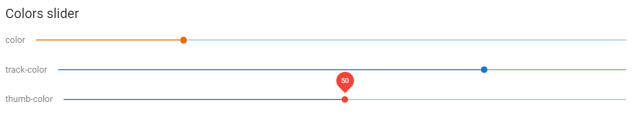
Vuetify v2.6.14 code example:
<div class="v-slider v-slider--horizontal theme--light">
<input value="25" id="input-885" disabled="disabled" readonly="readonly" tabindex="-1">
<div class="v-slider__track-container">
<div class="v-slider__track-background primary lighten-3" style="right: 0px; width: calc(75%);">
</div>
<div class="v-slider__track-fill orange darken-3" style="left: 0px; right: auto; width: 25%;">
</div>
</div>
<div role="slider" tabindex="0" aria-label="color" aria-valuemin="0" aria-valuemax="100" aria-valuenow="25" aria-readonly="false" aria-orientation="horizontal" class="v-slider__thumb-container orange--text text--darken-3" style="left: 25%;">
<div class="v-slider__thumb orange darken-3">
</div>
</div>
</div>
| Method | Description | Return Type |
|---|---|---|
| track() | Get track | UIElement |
| thumb() | Get thumb | UIElement |
| ticks() | Get ticks | WebList |
| tickLabel(int index) | Get tick label value | String |
| thumbLabel() | Get thumb label | Label |
| prependOuterIcon() | Get slider prepend outer icon | Icon |
| appendOuterIcon() | Get slider prepend append icon | Icon |
| loader() | Get loader | ProgressLinear |
| label() | Get label | Label |
| value() | Get value | double |
| minValue() | Get min value | double |
| maxValue() | Get max value | double |
| setValue(Integer value)/ setValue(Double value) | Set slider to value | void |
| ticksSize() | Get ticks size | int |
| thumbSize() | Get thumb size | int |
| backgroundColor() | Get background color | String |
| thumbColor() | Get thumb color | String |
| trackFillColor() | Get track fill color | String |
| trackBackgroundColor() | Get track background color | String |
| clickOutsideOfSlider() | Clicking outside the sheet | void |
| isAlwaysShow() | Check that ticks of required element is always show | boolean |
| isError() | Check that required element is error | boolean |
| isSuccess() | Check that required element is success | boolean |
| hasThumbLabel() | Check that thumb label of required element is existed | boolean |
| hasInverseLabel() | Check that required element has inverse label | boolean |
For examples of usage see: JDI Vuetify Sliders tests
5.12.4 Switches
Switches Vuetify documentation page
Switches are located in the following class:
- Java: com.epam.jdi.light.vuetify.elements.common.Switch.java
//@FindBy(css = "#ColorsSwitch .v-input--switch")
@UI("#ColorsSwitch .v-input--switch")
public static List<Switch> colorSwitches;
@Test(description = "Test checks parameters of switch: color, text, functionality")
public void functionalityAndCssStyleSwitchTest() {
String red = "red";
final Switch redSwitch = colorSwitches.get(1);
redSwitch.show();
redSwitch.is().checked();
redSwitch.label().has().text(red);
redSwitch.has().value(red);
redSwitch.has().color(RED.value());
redSwitch.has().detailsHidden();
redSwitch.uncheck();
redSwitch.is().unchecked();
}
Switches - The v-switch component provides users the ability to choose between two distinct values.
Vuetify v2.6.14 code example:
<div class="v-input v-input--hide-details theme--light v-input--selection-controls v-input--switch">
<div class="v-input__control">
<div class="v-input__slot">
<div class="v-input--selection-controls__input">
<input aria-checked="false" id="input-1187" role="switch" type="checkbox" aria-disabled="false" value="red">
<div class="v-input--selection-controls__ripple">
</div>
<div class="v-input--switch__track theme--light">
</div>
<div class="v-input--switch__thumb theme--light">
<!---->
</div>
</div>
<label for="input-1187" class="v-label theme--light" style="left: 0px; right: auto; position: relative;">red</label>
</div>
</div>
</div>
| Method | Description | Return Type |
|---|---|---|
| check()/uncheck() | Switch element between two states | void |
| value() | Get switch value | String |
| lable() | Get switch label | Lable |
| color() | Get switch color in RGBA format | String |
| backgroundColor() | Get switch background color in RGBA format | String |
| slotsBackgroundColor() | Get switch slot background color in RGBA format | String |
| getMessages() | Get switch messages | List<String> |
| getErrorMessages() | Get switch error messages | List<String> |
| getNumberErrorMessages() | Get the number of switch error messages | Integer |
| getSuccessMessages() | Get switch success messages | List<String> |
| isChecked()/isNotChecked() | Check if switch is selected/not selected | boolean |
| isEnabled() | Check if switch is enabled | boolean |
| isFlat() | Checks that switch is flat | boolean |
| isInset() | Checks that switch is inset | boolean |
| isReadonly() | Checks that switch is readonly | boolean |
| hasMessages() | Check that switch has messages | boolean |
| hasErrorMessage() | Check that switch has error messages | boolean |
| hasSuccessMessage() | Check that switch has success messages | boolean |
| hasIconAppend() | Check that switch has icon-append | boolean |
| hasIconPrepend() | Check that switch has icon-prepend | boolean |
| hasRipple() | Check that switch has ripple | boolean |
For examples of usage see: JDI Vuetify Switch tests.
5.12.5 Text fields
Text Field Vuetify documentation page
Java: com.epam.jdi.light.vuetify.elements.complex.TextField.java
//@FindBy(css = "#FilledTextField .v-text-field")
@UI("#FilledTextField .v-text-field")
public static List<TextField> filledTextField;
@Test (description = "Test checks filled feature")
public void filledTextFieldTest() {
filledTextField.get(1).show();
filledTextField.get(1).is().filled();
hideDetailsTextField.get(1).show();
hideDetailsTextField.get(1).is().notFilled();
}
Text fields components are used for collecting user provided information.
Vuetify v2.6.14 code example:
<div class="pa-4 v-sheet theme--light rounded">
<form novalidate="novalidate" class="v-form" file="v-text-field/prop-counter">
<div class="container">
<div class="row">
<div class="col-sm-6 col-12">
<div class="v-input v-input--is-label-active v-input--is-dirty theme--light v-text-field v-text-field--is-booted">
<div class="v-input__control">
<div class="v-input__slot">
<div class="v-text-field__slot">
<label for="input-3840" class="v-label v-label--active theme--light" style="left: 0px; right: auto; position: absolute;">Regular</label>
<input id="input-3840" type="text">
</div>
</div>
<div class="v-text-field__details">
<div class="v-messages theme--light">
<div class="v-messages__wrapper"></div>
</div>
<div class="v-counter theme--light">18 / 25</div>
</div>
</div>
</div>
</div>
<div class="col-sm-6 col-12">
<div class="v-input v-input--is-label-active v-input--is-dirty theme--light v-text-field v-text-field--is-booted">
<div class="v-input__control">
<div class="v-input__slot">
<div class="v-text-field__slot">
<label for="input-3843" class="v-label v-label--active theme--light" style="left: 0px; right: auto; position: absolute;">Limit exceeded</label>
<input maxlength="25" id="input-3843" type="text">
</div>
</div>
<div class="v-text-field__details">
<div class="v-messages theme--light">
<div class="v-messages__wrapper"></div>
</div>
<div class="v-counter error--text theme--light">50 / 25</div>
</div>
</div>
</div>
</div>
<div class="col-sm-6 col-12">
<div class="v-input v-input--is-label-active v-input--is-dirty theme--light v-text-field v-text-field--is-booted">
<div class="v-input__control">
<div class="v-input__slot">
<div class="v-text-field__slot">
<label for="input-3846" class="v-label v-label--active theme--light" style="left: 0px; right: auto; position: absolute;">Custom counter from prop</label>
<input id="input-3846" type="text">
</div>
</div>
<div class="v-text-field__details">
<div class="v-messages theme--light">
<div class="v-messages__wrapper"></div>
</div>
<div class="v-counter theme--light">2 / 5</div>
</div>
</div>
</div>
</div>
<div class="col-sm-6 col-12">
<div class="v-input v-input--is-label-active v-input--is-dirty theme--light v-text-field v-text-field--is-booted">
<div class="v-input__control">
<div class="v-input__slot">
<div class="v-text-field__slot">
<label for="input-3849" class="v-label v-label--active theme--light" style="left: 0px; right: auto; position: absolute;">Custom counter from slot</label>
<input id="input-3849" type="text">
</div>
</div>
<div class="v-text-field__details">
<div class="v-messages theme--light">
<div class="v-messages__wrapper"></div>
</div>
<div class="v-counter theme--light">2 / 5</div>
</div>
</div>
</div>
</div>
</div>
</div>
</form>
</div>
Text Field methods:
| Method | Description | Return Type |
|---|---|---|
| isEnabled() | Get that text field is enabled | boolean |
| isFocused() | Get that text field is focused | boolean |
| textInputField() | Get text input field | UIElement |
| details() | Get text field details | UIElement |
| slot() | Get text field slot | UIElement |
| counter() | Get text field counter | UIElement |
| prefix() | Get text field prefix | UIElement |
| suffix() | Get text field suffix | UIElement |
| getIconsByLocator(String locator) | Get text field icon by locator '{0}' | List<Icon> |
| prependOuterIcons() | Get text field prepend outer icons | List<Icon> |
| prependInnerIcons() | Get text field prepend inner icons | List<Icon> |
| appendInnerIcons() | Get text field append inner icons | List<Icon> |
| appendOuterIcons() | Get text field append outer icons | List<Icon> |
| hasPrependOuterIcon() | Get if text field has prepend outer icon | boolean |
| hasPrependInnerIcon() | Get if text field has prepend inner icons | boolean |
| hasAppendInnerIcon() | Get if text field has append inner icons | boolean |
| hasAppendOuterIcon() | Get if text field has append outer icons | boolean |
| getPrependOuterIcon() | Get text field prepend outer icons | Icon |
| getPrependInnerIcon() | Get text field prepend inner icons | Icon |
| getAppendInnerIcon() | Get text field append inner icons | Icon |
| getAppendOuterIcon() | Get text field append outer icons | Icon |
| getTextType() | Get text type of text field | String |
| hasPlaceholder() | Get if text field has placeholder | boolean |
| isAutofocus() | Get if text field is autofocus | boolean |
| loader() | Get text field loader | ProgressLinear |
| getLoaderHeight() | Get text field loader height | int |
In addition, Text Field implements HasLabel, HasPlaceholder, IsInput, HasClick, HasColor, HasIcon, HasMeasurement, HasMessages, HasRounded, HasTheme, IsClearable, IsDense, IsFilled, IsFlat, IsLoading, IsOutlined, IsReadOnly, IsReverse, IsShaped, IsSingleLine, IsSolo, IsFullWidth, HasDetailsHidden
| Assert method | Description |
|---|---|
| focused() | Assert that text field is focused |
| notFocused() | Assert that text field is not focused |
| textType(String textType) | Assert that text type of text field is '{0}' |
| placeholder() | Assert that text field has not placeholder |
| placeholder(String placeholder) | Assert that text field placeholder is '{0}' |
| counter(int currentCounter, int maxCounter) | Assert that text field current counter is '{0}' and max counter is '{1}' |
| labelText(String label) | Assert that text field has label |
| label() | Assert that text field has label |
| appendOuterIcon() | Assert that text field has append outer icon |
| appendInnerIcon() | Assert that text field has append inner icon |
| prependOuterIcon() | Assert that text field has prepend outer icon |
| prependInnerIcon() | Assert that text field has prepend inner icon |
| autofocus() | Assert that text field is autofocus |
| notAutofocus() | Assert that text field is not autofocus |
| loaderHeightPx(int height) | Assert that text field has loader height {0} |
For examples of usage see: JDI vuetify page tests for Text Field.
5.12.6 Text areas
TextArea Vuetify documentation page
Java: com.epam.jdi.light.vuetify.elements.complex.TextArea.java
//@FindBy(css = "#NoResizeTextarea .v-textarea")
@UI("#NoResizeTextarea .v-textarea")
public static TextArea noResizeTextArea;
@Test (description = "Test checks text which was set in textarea")
public void textInputTextAreaTest() {
autoGrowTextArea.show();
autoGrowTextArea.has().text("The Woodman set to work at once, and so "
+ "sharp was his axe that the tree was soon chopped nearly through.");
autoGrowTextArea.clear();
autoGrowTextArea.setLines("1 row", "2 row", "3 row", "4 row", "5 row");
autoGrowTextArea.has().lines("1 row", "2 row", "3 row", "4 row", "5 row");
}
Textarea components are used for collecting large amounts of textual data.
Vuetify v2.6.14 code example:
<div class="v-input v-textarea v-textarea--auto-grow v-textarea--no-resize v-input--is-label-active v-input--is-dirty
theme--light v-text-field v-text-field--filled v-text-field--is-booted v-text-field--enclosed">
<div class="v-input__control">
<div class="v-input__slot">
<div class="v-text-field__slot">
<label for="input-5565" class="v-label v-label--active theme--light" style="left: 0px; right: auto; position: absolute;">Label</label>
<textarea name="input-7-1" id="input-5565" rows="5" style="height: 120px;"></textarea>
</div>
</div>
<div class="v-text-field__details">
<div class="v-messages theme--light">
<div class="v-messages__wrapper"></div>
</div>
</div>
</div>
</div>
TextArea methods:
| Method | Description | Return Type |
|---|---|---|
| slot() | Get textArea slot | UIElement |
| textArea() | Get textarea | UIElement |
| progress() | Get textArea loader | ProgressLinear |
| hint() | Get textArea hint | UIElement |
| details() | Get textArea details | UIElement |
| prependOuterIcon() | Get textArea prepend outer icon | Icon |
| hasPrependOuterIcon() | Get if textArea has prepend outer icon | boolean |
| prependInnerIcon() | Get textArea prepend inner icon | Icon |
| hasPrependInnerIcon() | Get if textArea has prepend inner icon | boolean |
| appendOuterIcon() | Get textArea append outer icon | Icon |
| hasAppendOuterIcon() | Get if textArea has append outer icon | boolean |
| appendInnerIcon() | Get textArea append inner icon | Icon |
| hasAppendInnerIcon() | Get if textArea has append inner icon | boolean |
| counter() | Get textArea counter | UIElement |
| counterValue() | Get textArea counter | int |
| getLines() | Get textArea lines | List<String> |
| isAutofocus() | Get if textArea is autofocus | boolean |
| suffix() | Get textArea suffix | UIElement |
| prefix() | Get textArea prefix | UIElement |
| setLines(String... lines) | Set textArea lines '{0}' | void |
| height() | Get textArea height | int |
| rows() | Get textArea rows attr | int |
| isAutogrow() | Get if textArea is autogrow | boolean |
| isNotResizable() | Get if textArea is not resizable | boolean |
| hasSuffix() | Get if textArea has suffix | boolean |
| hasPrefix() | Get if textArea has prefix | boolean |
| hasPlaceholder() | Get if textArea has placeholder | boolean |
| isReversed() | Get if textArea is reversed | boolean |
| getLoaderHeight() | Get textArea loader height | int |
In addition, TextArea implements HasLabel, HasPlaceholder, HasIcon, IsVuetifyInput, HasColor, HasMeasurement, HasMessages, HasRounded, HasTheme, IsClearable, IsDense, IsFilled, IsFlat, IsLoading, IsOutlined, IsReadOnly, IsShaped, IsSingleLine, IsSolo, IsFullWidth, HasDetailsHidden
| Assert method | Description |
|---|---|
| text(String text) | Assert that textArea has text '{0}' |
| autoGrow() | Assert that textArea is auto grow |
| notAutoGrow() | Assert that textArea is not auto grow |
| notResizable() | Assert that textArea is not resizable |
| resizable() | Assert that textArea rows count is {0} |
| lines(Matcher<? super List<String>> condition) | Assert that textArea has lines {0} |
| lines(String... lines) | Assert that textArea has lines {0} |
| label() | Assert that textArea has label |
| suffix() | Assert that textArea has suffix |
| notSuffix() | Assert that textArea has not suffix |
| prefix() | Assert that textArea has prefix |
| notPrefix() | Assert that textArea has not prefix |
| icon() | Assert that textArea has icon |
| notIcon() | Assert that textArea has not icon |
| prependOuterIcon() | Assert that textArea has prepend outer icon |
| prependInnerIcon() | Assert that textArea has prepend inner icon |
| appendOuterIcon() | Assert that textArea has append outer icon |
| appendInnerIcon() | Assert that textArea has append inner icon |
| placeholder() | Assert that textArea has placeholder |
| notPlaceholder() | Assert that textArea has not placeholder |
| placeholderText(String text) | Assert that textArea has placeholder text '{0}' |
| counterValue(int n) | Assert that textArea has counter value '{0}' |
| autofocus() | Assert that textArea is autofocused |
| notAutofocus() | Assert that textArea is not autofocus |
| reversed() | Assert that textArea is reversed |
| notReversed() | Assert that textArea is not reversed |
| loaderHeightPx(int height) | Assert that textArea has loader height {0} |
| hint(String msg) | Assert that textArea hint message is '{0}' |
| hint(Matcher<String> condition) | Assert that textArea hint message is '{0}' |
For examples of usage see: JDI vuetify page tests for TextArea.
5.12.7 Radio buttons
- Java: com.epam.jdi.light.vuetify.elements.complex.radiobuttons.RadioButton.java
- Java: com.epam.jdi.light.vuetify.elements.complex.radiobuttons.RadioButtons.java
//@FindBy(css = "#ColorsRadioButton .col-12[1] [role=radio]")
@UI("#ColorsRadioButton .col-12[1] [role=radio]")
public static RadioButtons colorLeftRadioButtons;
@Test(description = "Test checks radio button selection")
public void selectEnumRadioButtonsTest() {
colorLeftRadioButtons.show();
colorLeftRadioButtons.select(RadioTestData.indigo);
colorLeftRadioButtons.is().selected(RadioTestData.indigo);
colorLeftRadioButtons.select(RadioTestData.orange);
colorLeftRadioButtons.is().selected(RadioTestData.orange);
colorLeftRadioButtons.select(RadioTestData.red);
colorLeftRadioButtons.is().selected(RadioTestData.red);
}
//@FindBy(css = "#DirectionRadioButton input[role = 'radio']")
@UI("#DirectionRadioButton input[role = 'radio']")
public static RadioButtons directionRadioButtons;
@Test(description = "Test checks radio button value")
public void valueRadioButtonsTest() {
directionRadioButtons.show();
directionRadioButtons.has().value("Option 1");
directionRadioButtons.has().value("Option 2");
}
//@FindBy(css = "#SuccessReadOnlyRadioButtonWithHint [role=radio]")
@UI("#SuccessReadOnlyRadioButtonWithHint [role=radio]")
public static RadioButtons successRadioButtons;
@Test(description = "Test checks if radio button has messages or not")
public void messagesRadioButtonTest() {
successRadioButtons.show();
successRadioButtons.has().messagesCount(1);
successRadioButtons.has().messageText("some hint");
successRadioButtons.has().successMessages();
successRadioButtons.has().noErrorMessages();
}
The Vuetify RadioButton component is a simple radio button. When combined with the v-radio-group component you can provide groupable functionality to allow users to select from a predefined set of options.
<div role="radiogroup" aria-labelledby="input-580" class="v-input--radio-group__input">
<div class="v-radio theme--light v-item--active">
<div class="v-input--selection-controls__input">
<span aria-hidden="true" class="v-icon notranslate theme--light primary--text">
<svg xmlns="http://www.w3.org/2000/svg" viewBox="0 0 24 24" role="img" aria-hidden="true" class="v-icon__svg">
<path d="M12,20C7.58,20 4,16.42 4,12C4,7.58 7.58,4 12,4C16.42,4 20,7.58 20,12C20,16.42 16.42,20 12,20M12,2C6.48,2 2,6.48 2,12C2,17.52 6.48,22 12,22C17.52,22 22,17.52 22,12C22,6.48 17.52,2 12,2M12,7C9.24,7 7,9.24 7,12C7,14.76 9.24,17 12,17C14.76,17 17,14.76 17,12C17,9.24 14.76,7 12,7Z"></path>
</svg>
</span>
<input aria-checked="true" id="input-581" role="radio" type="radio" name="radio-580" value="1">
<div class="v-input--selection-controls__ripple primary--text"></div>
</div>
<label for="input-581" class="v-label theme--light" style="left: 0px; right: auto; position: relative;">Radio 1</label>
</div>
<div class="v-radio theme--light">
<div class="v-input--selection-controls__input">
<span aria-hidden="true" class="v-icon notranslate theme--light">
<svg xmlns="http://www.w3.org/2000/svg" viewBox="0 0 24 24" role="img" aria-hidden="true" class="v-icon__svg">
<path d="M12,20C7.58,20 4,16.42 4,12C4,7.58 7.58,4 12,4C16.42,4 20,7.58 20,12C20,16.42 16.42,20 12,20M12,2C6.48,2 2,6.48 2,12C2,17.52 6.48,22 12,22C17.52,22 22,17.52 22,12C22,6.48 17.52,2 12,2Z"></path>
</svg>
</span>
<input aria-checked="false" id="input-583" role="radio" type="radio" name="radio-580" value="2">
<div class="v-input--selection-controls__ripple"></div>
</div>
<label for="input-583" class="v-label theme--light" style="left: 0px; right: auto; position: relative;">Radio 2</label>
</div>
<div class="v-radio theme--light">
<div class="v-input--selection-controls__input">
<span aria-hidden="true" class="v-icon notranslate theme--light">
<svg xmlns="http://www.w3.org/2000/svg" viewBox="0 0 24 24" role="img" aria-hidden="true" class="v-icon__svg">
<path d="M12,20C7.58,20 4,16.42 4,12C4,7.58 7.58,4 12,4C16.42,4 20,7.58 20,12C20,16.42 16.42,20 12,20M12,2C6.48,2 2,6.48 2,12C2,17.52 6.48,22 12,22C17.52,22 22,17.52 22,12C22,6.48 17.52,2 12,2Z"></path>
</svg>
</span>
<input aria-checked="false" id="input-585" role="radio" type="radio" name="radio-580" value="3">
<div class="v-input--selection-controls__ripple"></div>
</div>
<label for="input-585" class="v-label theme--light" style="left: 0px; right: auto; position: relative;">Radio 3</label>
</div>
</div>
| Method | Description | Return Type |
|---|---|---|
| label() | Returns label | UIElement |
| icon() | Returns RadioButton's icon | UIElement |
| isDisabled() | Checks that element is disabled | boolean |
| theme() | Get theme | String |
| color() | Returns css attribute background-color as String Value | String |
| labelColor() | Get element label color | String |
| label() | Get element label | Label |
| list() | Returns list of elements | WebList |
| radioButtons() | Returns element's radio buttons | List<RadioButton> |
| backgroundColor() | Returns element's background color | String |
| isReadOnly() | Checks that element is readonly | boolean |
| hasMessage() | Check that element has message | boolean |
| getMessage() | Returns element's message text | String |
| isDense() | Checks if element is dense | boolean |
| messages(String locator) | Get List |
List<UIElement> |
| messagesText(String locator) | Get elements messages text by locator | List<String> |
| select(String/int/Enum) | Select radiobutton by value/index | void |
| labelText() | Gets the text of a label | String |
| selected() | Get selected radiobutton value | String |
| values() | Returns list of values | List |
| waitFor() | Returns object for work with assertions | RadioButtonsAssert |
| shouldBe() | Returns object for work with assertions | RadioButtonsAssert |
| verify() | Returns object for work with assertions | RadioButtonsAssert |
| assertThat() | Returns object for work with assertions | RadioButtonsAssert |
| classes() | Gets all element's classes as list | List<String> |
| doubleClick() | Double clicks on the element | void |
| dragAndDropTo(int x, int y) | Drags and drops element to certain coordinates | void |
| dragAndDropTo(WebElement to) | Drags and drops element to another element | void |
| getLocation() | Gets element location as point | Point |
| getSize() | Gets element size | Dimension |
| getTagName() | Gets element tag name | String |
| getText() | Gets element text | String |
| getValue() | Gets element text | String |
| hasAttribute(String attrName) | Returns true if the element has an expected attribute | boolean |
| hasClass(String className) | Returns true if the element has an expected class | boolean |
| highlight() | Highlights element with red color | void |
| highlight(String color) | Scrolls view to element and highlights it with a border of specified color | void |
| hover() | Hovers mouse cursor over the element | void |
| isDisabled() | Checks that element is disabled | boolean |
| isDisplayed() | Checks that element is displayed | boolean |
| isEnabled() | Checks that element exists | boolean |
| isHidden() | Checks that element is hidden | boolean |
| isNotExist() | Checks that element does not exist | boolean |
| isNotVisible() | Checks that element is not visible by user | boolean |
| isVisible() | Checks that element is visible by user | boolean |
| labelText() | Gets label text | String |
| printHtml() | Gets element “innerHTML” attribute value | String |
| rightClick() | Right clicks on the element | void |
| setAttribute(String name, String value) | Sets value to the specified attribute | void |
| show() | Scrolls screen view to item | void |
For examples of usage see: JDI Vuetify Radiobuttons tests.
5.12.8 Combobox
Comboboxes are located in the following class:
- Java: com.epam.jdi.light.vuetify.elements.complex.Combobox.java
//@FindBy(css = "#DenseCombobox div[role ='combobox']")
@JDICombobox(
root = "#DenseCombobox div[role ='combobox']",
listItems = "//ancestor::div[@id = 'app']//div[contains(@class, 'v-autocomplete__content')]//div[@class='v-list-item__title']")
public static Combobox denseCombobox;
@Test(description = "Test checks combobox base functionality")
public void baseFunctionalityTest() {
List<String> testValueList = Arrays.asList("Programming", "Design", "Vue", "Vuetify");
denseCombobox.expand();
denseCombobox.is().expanded();
denseCombobox.close();
denseCombobox.is().closed();
denseCombobox.has().label("Combobox");
denseCombobox.select("Design");
denseCombobox.select("Vue");
denseCombobox.is().selected(testValueList);
denseCombobox.unselect(testValueList);
denseCombobox.is().notSelected(testValueList);
}
The combobox component allows the user to enter values that do not exist within the provided items.
Vuetify v2.6.14 code example:
<div class="container container--fluid" id="DenseCombobox">
<div class="row">
<div class="col col-12">
<div class="v-input v-input--is-label-active v-input--is-dirty v-input--is-focused v-input--dense theme--light v-text-field v-text-field--is-booted v-text-field--enclosed v-text-field--outlined v-select v-select--is-menu-active v-select--is-multi v-autocomplete primary--text">
<div class="v-input__control">
<div role="combobox" aria-haspopup="listbox" aria-expanded="true" aria-owns="list-244" class="v-input__slot">
<fieldset aria-hidden="true">
<legend style="width: 64.5px;">
<span class="notranslate"></span>
</legend>
</fieldset>
<div class="v-select__slot">
<label for="input-244" class="v-label v-label--active theme--light primary--text" style="left: 0px; right: auto; position: absolute;">Combobox</label>
<div class="v-select__selections">
<div class="v-select__selection v-select__selection--comma">Vuetify, </div>
<div class="v-select__selection v-select__selection--comma">Programming</div>
<input id="input-244" type="text" autocomplete="off" aria-activedescendant="list-item-661-0">
</div>
<div class="v-input__append-inner">
<div class="v-input__icon v-input__icon--append">
<i aria-hidden="true" class="v-icon notranslate mdi mdi-menu-down theme--light primary--text"></i>
</div>
</div>
<input type="hidden" value="Vuetify,Programming"></div>
<div class="v-menu"></div>
</div>
<div class="v-text-field__details">
<div class="v-messages theme--light primary--text">
<div class="v-messages__wrapper"></div>
</div>
</div>
</div>
</div>
</div>
</div>
</div>
| Method | Description | Return Type |
|---|---|---|
| setup(Field field) | Set up combobox | void |
| setup(String comboboxLocator, String listItemsLocator) | Set up and return combobox | Combobox |
| selectedChips() | Returns list of selected chips | List<Chip> |
| selectedValues() | Returns list of selected values | List<String> |
| select() | Returns select element | UIElement |
| input() | Returns select input | UIElement |
| expander() | Returns expander element | UIElement |
| counter() | Returns counter element | UIElement |
| prefix() | Returns prefix element | UIElement |
| suffix() | Returns suffix element | UIElement |
| list() | Returns list element | WebList |
| label() | Returns label | Label |
| isError() | Checks if combobox has error status | boolean |
| isSuccess() | Checks if combobox has error success | boolean |
| expand() | Expand combobox | void |
| close() | Close combobox | void |
| select(String value) | Select value from combobox | void |
| select(List<String> values) | Select values from combobox | void |
| unselect(String values) | Unselect value from combobox | void |
| unselect(List<String> values) | Unselect values from combobox | void |
| sendKeys(String keys) | Send keys | void |
| isExpanded() | Returns true if list of values is open | boolean |
| isSelected(String value) | Returns true if value is selected | boolean |
| isSelected(List<String> values) | Returns true if values is selected | boolean |
| isLoading() | Returns true if combobox is loading | boolean |
| hasChips() | Returns true if combobox has chips | boolean |
| hasSmallChips() | Returns true if combobox has small chips | boolean |
| hasPlaceholder() | Returns true if combobox has placeholder | boolean |
| placeholder() | Returns placeholder | String |
| isAutofocus() | Returns true if combobox is autofocused | boolean |
| hasCounter() | Returns true if combobox has counter | boolean |
| hasPrefix() | Returns true if combobox has prefix | boolean |
| hasSuffix() | Returns true if combobox has suffix | boolean |
| hasCounterValue() | Returns counter value | String |
| getPrefixText() | Returns prefix | String |
| getSuffixText() | Returns suffix | String |
| clear() | Clears combobox | void |
Element also has overridden methods from Interfaces: HasMessages, IsReadOnly, IsDense, IsOutlined, IsSolo, IsFullWidth, HasTheme, ICoreElement, IsFlat, HasRounded, IsShaped, HasDetailsHidden
For examples of usage see: JDI Vuetify Combobox tests.
5.12.9 Selects
Selects Vuetify documentation page
Selects are located in the following class:
- Java: com.epam.jdi.light.vuetify.elements.complex.Select.java
//@FindBy(xpath = "//div[@id = 'CustomTextAndValueSelect']//div[contains(@class, 'v-select')]")
@JDropdown(root = "//div[@id = 'CustomTextAndValueSelect']//div[contains(@class, 'v-select')]",
value = "//div[contains(@class, 'v-select__selection--comma')]",
list = "//ancestor::div[@id = 'app']//div[contains(@class, 'v-menu__content')]//div[contains(@class, 'v-list-item--link')]",
expand = "//i[contains(@class, 'v-icon')]")
public static Dropdown customSelect;
@Test(description = "Test checks basic functionality of simple select")
public void basicFunctionalityTest() {
customSelect.show();
customSelect.is().displayed();
customSelect.expand();
customSelect.is().expanded();
customSelect.select("New York");
customSelect.is().selected("New York");
customSelect.is().collapsed();
}
Select components are used for collecting user provided information from a list of options.
Vuetify v2.6.14 code example:
<div class="v-input v-input--is-label-active v-input--is-dirty v-input--dense theme--light v-text-field v-text-field--is-booted v-select">
<div class="v-input__control">
<div role="button" aria-haspopup="listbox" aria-expanded="false" aria-owns="list-160" class="v-input__slot">
<div class="v-select__slot">
<label for="input-160" class="v-label v-label--active theme--light" style="left: 0px; right: auto; position: absolute;">Standard</label>
<div class="v-select__selections">
<div class="v-select__selection v-select__selection--comma">Foo</div>
<input id="input-160" readonly="readonly" type="text" aria-readonly="false" autocomplete="off">
</div>
<div class="v-input__append-inner">
<div class="v-input__icon v-input__icon--append">
<i aria-hidden="true" class="v-icon notranslate mdi mdi-menu-down theme--light">
</i>
</div>
</div>
<input type="hidden" value="Foo">
</div>
<div class="v-menu">
</div>
</div>
<div class="v-text-field__details">
<div class="v-messages theme--light">
<div class="v-messages__wrapper">
</div>
</div>
</div>
</div>
</div>
| Method | Description | Return Type |
|---|---|---|
| expand()/close() | Open/close list of values | void |
| select(String value)/select(int index) | Select option from list of value | void |
| selected() | Returns selected value | String |
| label() | Get element label | Label |
| labelText() | Return label text | String |
| messageText() | Return message text | String |
| getText() | Returns selected value | String |
| isDisplayed() | Checks that element is displayed | boolean |
| isEnabled() | Checks that element exists | boolean |
For examples of usage see: JDI Vuetify Select tests.
5.12.10 File inputs
File inputs are located in the following class:
- Java: com.epam.jdi.light.vuetify.elements.complex.FileInput.java
//@FindBy(css = "#ChipsFileInput .v-file-input[1]")
@JDIFileInput(root = "#ChipsFileInput .v-file-input[1]")
public static FileInput chipsFileInput;
//@FindBy(css = "#ChipsFileInput .v-file-input[2]")
@JDIFileInput(root = "#ChipsFileInput .v-file-input[2]")
public static FileInput smallChipsFileInput;
@Test(description = "Test checks that multiple files can be uploaded one by one and at once")
public void uploadMultipleFilesFileInputTest() {
chipsFileInput.show();
chipsFileInput.is().multiple();
chipsFileInput.uploadFiles(asList(pathTXT.toString(),pathPNG.toString()));
chipsFileInput.has().files(asList(pathTXT.getFileName().toString(),pathPNG.getFileName().toString()));
smallChipsFileInput.show();
smallChipsFileInput.is().multiple();
smallChipsFileInput.uploadFile(pathTXT.toString());
smallChipsFileInput.has().file(pathTXT.getFileName().toString());
smallChipsFileInput.uploadFile(pathPNG.toString());
smallChipsFileInput.has().files(asList(pathTXT.getFileName().toString(),pathPNG.getFileName().toString()));
}
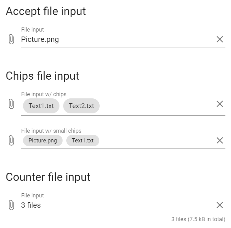
The File input component is a specialized input that provides a clean interface for selecting files, showing detailed selection information and upload progress.
Vuetify v2.6.14 code example:
<div class="v-input theme--light v-text-field v-text-field--is-booted v-file-input" id="MultipleFileInput">
<div class="v-input__prepend-outer">
<div class="v-input__icon v-input__icon--prepend">
<button type="button" aria-label="prepend icon" class="v-icon notranslate v-icon--link mdi mdi-paperclip theme--light"></button>
</div>
</div>
<div class="v-input__control">
<div class="v-input__slot">
<div class="v-text-field__slot">
<label for="input-145" class="v-label theme--light" style="left: 0px; right: auto; position: absolute;">File input</label>
<div class="v-file-input__text"></div>
<input id="input-145" type="file" multiple="multiple">
</div>
<div class="v-input__append-inner"><div>
</div>
</div>
</div>
<div class="v-text-field__details">
<div class="v-messages theme--light">
<div class="v-messages__wrapper"></div>
</div>
</div>
</div>
</div>
| Method | Description | Return Type |
|---|---|---|
| isMultiply() | Shows that element can take multiply files | boolean |
| textInputField() | Returns text input area | UIElement |
| counter() | Returns counter | UIElement |
| prefix() | Returns prefix | UIElement |
| suffix() | Returns suffix | UIElement |
| prependOuterIcons() | Returns list of prepend outer icons | List<Icon> |
| prependInnerIcons() | Returns list of prepend inner icons | List<Icon> |
| appendInnerIcons() | Returns list of append inner icons | List<Icon> |
| appendOuterIcons() | Returns list of append outer icons | List<Icon> |
| getPrependOuterIcon() | Returns first prepend outer icon | Icon |
| getPrependInnerIcon() | Returns first prepend inner icon | Icon |
| getAppendInnerIcon() | Returns first append inner icon | Icon |
| getAppendOuterIcon() | Returns first append outer icon | Icon |
| getText() | Returns text | String |
| label() | Returns label | Label |
| placeholder() | Returns placeholder text | String |
| setText(String text) | Set text | void |
| sendKeys(CharSequence... value) | Add text | void |
| clear() | Clear text area | void |
| focus() | Set mouse to text area | void |
| isDisplayed() | Check if element is displayed | boolean |
| isDisabled() | Check if element is disabled | boolean |
| files() | Returns files list | WebList |
| getIconByLocator(String locator) | Returns list of Icons | List<Icon> |
| accept() | Get accepted types | String |
| getFiles() | Returns files name list | List<String> |
| uploadFile(String path) | Upload file | void |
| uploadFiles(List<String> paths) | Upload files | void |
| setup(Field field) | Set up annotation | void |
| setup(String root, String files) | Set up and return input | FileInput |
| backgroundColor() | Returns background color | String |
| labelColor() | Returns label color | String |
| isAutofocus() | Checks if autofocus is enabled | boolean |
| getLoaderHeight() | Returns loader height | int |
For examples of usage see: JDI Vuetify File inputs tests.
5.12.11 Forms
Forms under Vuetify are the same as Forms from HTML5. Please, follow the link for Forms overview
5.12.12 Autocompletes
Autocomplete elements are located in the following class:
- Java: com.epam.jdi.light.vuetify.elements.complex.Autocomplete.java
//@FindBy(xpath = "//div[@id='style']/div[2]//div[2]/div[contains(@class, 'v-autocomplete')]")
@JAutocomplete(root = "//div[@id='style']/div[2]//div[2]/div[contains(@class, 'v-autocomplete')]",
listItems = "//div[contains(@class, 'v-autocomplete__content') and not(contains(@style, 'display'))]//div[@class='v-list-item__title']")
public static Autocomplete lightDenseShapedOutlinedAutocomplete;
//@FindBy(xpath = "//div[@id='style']/div[2]//div[3]/div[contains(@class, 'v-autocomplete')]")
@JAutocomplete(root = "//div[@id='style']/div[2]//div[3]/div[contains(@class, 'v-autocomplete')]",
listItems = "//div[contains(@class, 'v-autocomplete__content') and not(contains(@style, 'display'))]//div[@class='v-list-item__title']")
public static Autocomplete lightDenseFilledRoundedAutocomplete;
@Test(description = "Test checks appearance of autocompletes and their values")
public void styleAutocompleteTest() {
List<String> list = Arrays.asList("foo", "bar", "fizz", "buzz");
lightDenseShapedOutlinedAutocomplete.is()
.light()
.dense()
.shaped()
.outlined();
lightDenseShapedOutlinedAutocomplete.expand();
lightDenseShapedOutlinedAutocomplete.listItems().has().values(list);
lightDenseShapedOutlinedAutocomplete.close();
lightDenseFilledRoundedAutocomplete.is()
.filled()
.rounded();
lightDenseFilledRoundedAutocomplete.expand();
lightDenseFilledRoundedAutocomplete.listItems().has().values(list);
lightDenseFilledRoundedAutocomplete.close();
darkSoloAutocomplete.is()
.dark()
.solo();
darkSoloAutocomplete.expand();
darkSoloAutocomplete.listItems().has().values(list);
darkSoloAutocomplete.close();
darkSoloInvertedAutocomplete.is()
.dark()
.soloInverted();
darkSoloInvertedAutocomplete.expand();
darkSoloInvertedAutocomplete.listItems().has().values(list);
darkSoloInvertedAutocomplete.close();
}
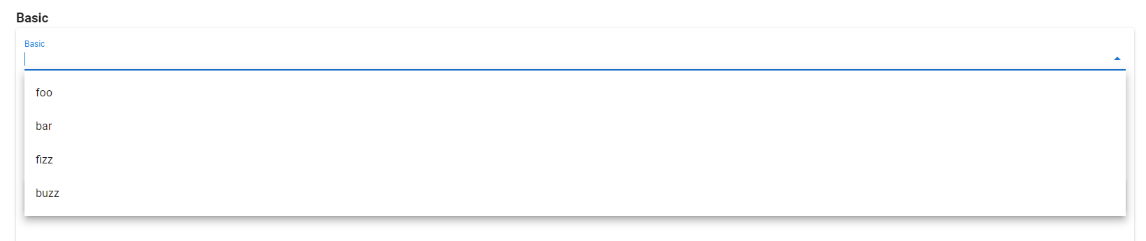
The Autocomplete component offers simple and flexible type-ahead functionality.
Vuetify v2.6.14 code example:
<div class="v-input theme--light v-text-field v-text-field--is-booted v-select v-autocomplete">
<div class="v-input__control">
<div role="combobox" aria-haspopup="listbox" aria-expanded="false" aria-owns="list-996" class="v-input__slot">
<div class="v-select__slot">
<input file="v-autocomplete/usage" id="input-996" type="text" autocomplete="off">
<div class="v-input__append-inner">
<div class="v-input__icon v-input__icon--append">
<span aria-hidden="true" class="v-icon notranslate theme--light">
<svg xmlns="http://www.w3.org/2000/svg" viewBox="0 0 24 24" role="img" aria-hidden="true" class="v-icon__svg">
<path d="M7,10L12,15L17,10H7Z"></path>
</svg>
</span>
</div>
</div>
<input type="hidden"></div>
<div class="v-menu"></div>
</div>
<div class="v-text-field__details">
<div class="v-messages theme--light">
<div class="v-messages__wrapper"></div>
</div>
</div>
</div>
</div>
| Method | Description | Return Type |
|---|---|---|
| root() | Return root of the element | UIElement |
| value() | Return value element | UIElement |
| input() | Return input element | UIElement |
| listItems() | Locate list items | UIElement |
| isExpanded() | Check if element is expanded | boolean |
| expand() | Expand element | void |
| close() | Close expanded element | void |
| select(String value) | Select value from expanded list | void |
| select(List<String> values) | Select values from expanded list | void |
| unselect(String value) | Unselect value from expanded list | void |
| unselect(List<String> values) | Unselect values from expanded list | void |
| isSelected(String value) | Check if the value is selected | boolean |
| isSelected(List<String> values) | Check if the values are selected | boolean |
| isDisabled() | Check if element is disabled | void |
| typeText(String value) | Set text | void |
| clearTextField() | Clear text area | void |
| clickClear() | Click clear button | void |
Autocomplete also implements ISetup
| Assert method | Description |
|---|---|
| expanded() | Assert that element is expanded |
| closed() | Assert that element is closed |
| selected(String value) | Assert that element is selected |
| selected(List<String> values) | Assert that elements are selected |
| notSelected(String value) | Assert that element is not selected |
| notSelected(List<String> values) | Assert that elements are not selected |
| disabled() | Assert that element is disabled |
| active() | Assert that element is active |
| empty() | Assert that element is empty |
| empty() | Assert that element has solo style |
| filled() | Assert that element has filled style |
| soloInverted() | Assert that element has solo-inverted style |
| outlined() | Assert that element has outlined style |
| dense() | Assert that element has dense style |
| shaped() | Assert that element has shaped style |
| rounded() | Assert that element has rounded style |
| dark() | Assert that element has dark style |
| light() | Assert that element has light style |
For examples of usage see: JDI Vuetify Autocompletes tests.
5.12.13 Checkboxes
Checkbox Vuetify documentation page
Checkbox is located in the following class:
- Java: com.epam.jdi.light.vuetify.elements.common.VueCheckbox.java
//@FindBy(css = "#ModelArrayCheckboxes .v-input--checkbox")
@UI("#ModelArrayCheckboxes > .v-input--checkbox")
@WaitAfterAction(1)
public static List<VueCheckbox> modelAsArrayCheckboxes;
@Test(description = "Test checks checkbox labels, and array texts")
public void modelAsArrayCheckboxesTest() {
modelAsArrayCheckboxes.get(1).is().checked();
modelAsArrayCheckboxes.get(2).is().unchecked();
modelArray.has().text("[ \"" + modelAsArrayCheckboxes.get(1).labelText() + "\" ]");
modelAsArrayCheckboxes.get(2).check();
modelArray.has().text("[ \"John\", \"Jacob\" ]");
modelAsArrayCheckboxes.get(1).uncheck();
modelArray.has().text("[ \"Jacob\" ]");
modelAsArrayCheckboxes.get(2).uncheck();
modelArray.has().text("[]");
}
Checkboxes - The v-checkbox component provides users the ability to choose between two distinct values.
These are very similar to a switch and can be used in complex forms and checklists.
A simpler version, v-simple-checkbox is used primarily as a lightweight alternative in data-table components to select rows or display inline boolean data.
Vuetify v2.6.14 code example:
<div class="v-input v-input--hide-details v-input--is-label-active v-input--is-dirty theme--light v-input--selection-controls v-input--checkbox red--text">
<div class="v-input__control">
<div class="v-input__slot">
<div class="v-input--selection-controls__input">
<i aria-hidden="true" class="v-icon notranslate mdi mdi-checkbox-marked theme--light red--text"></i>
<input aria-checked="true" id="input-661" role="checkbox" type="checkbox" value="red">
<div class="v-input--selection-controls__ripple red--text"></div>
</div>
<label for="input-661" class="v-label theme--light" style="left: 0px; right: auto; position: relative;">red</label>
</div>
</div>
</div>
Checkbox element contains following methods:
| Method | Description | Return Type |
|---|---|---|
| is() | Checkbox assert | CheckboxAssert |
| check() | Checks '{name}' | void |
| uncheck() | Unchecks '{name}' | void |
| isChecked() | Checks that '{name}' is checked | boolean |
| isUnchecked() | Checks that '{name}' is not selected | boolean |
| isDisabled() | Checks that '{name}' is disabled | boolean |
| isEnabled() | Checks that '{name}' is enabled | boolean |
| label() | Gets '{name}' label | Label |
| labelText() | Gets '{name}' label text | String |
| isIndeterminate() | Checks that '{name}' is indeterminate | boolean |
| isSuccess() | Checks that '{name}' is success | boolean |
| isError() | Checks that '{name}' is error | boolean |
| color() | Gets '{name}' color | String |
| backgroundColor() | Gets '{name}' background color | String |
| labelColor() | Gets '{name}' label color | String |
| isDense() | Checks that '{name}' is dense | boolean |
| messages() | Gets '{name}' messages | List<UIElement> |
| messagesText(String locator) | Gets '{name}' messages text by locator '{0}' | List<UIElement> |
| messagesText() | Gets '{name}' messages text | List<String> |
| messagesCount() | Gets '{name}' messages count | int |
| hasErrorMessages() | Checks that '{name}' has error messages | boolean |
| errorMessagesText() | Gets '{name}' error messages | List<String> |
| errorMessagesCount() | Gets the number of '{name}' error messages | int |
| hasSuccessMessages() | Checks that '{name}' has success messages | boolean |
| successMessagesText() | Gets '{name}' success messages | List<String> |
| successMessagesCount() | Get the number of '{name}' success messages | int |
| isReadOnly() | Check that '{name}' is readonly | boolean |
For examples of usage see: JDI vuetify page tests for Checkboxes
5.12.14 Inputs
Input is located in the following class:
- Java: package com.epam.jdi.light.vuetify.elements.common.Input.java
@FindBy(xpath = "//form[@id='HideDetailsInput']/div[2]")
@UI("//form[@id='HideDetailsInput']/div[2]")
public static Input hideDetailsAnotherInput;
@Test(description = "Test checks type text feature")
public void typeTextInputTest() {
String textToType = "Some text";
hideDetailsAnotherInput.show();
hideDetailsAnotherInput.hasTextField();
hideDetailsAnotherInput.typeText(textToType);
hideDetailsAnotherInput.has().typedText();
hideDetailsAnotherInput.has().typedText(textToType);
}
Input - The v-input component gives you a baseline to create your own custom inputs. It consists of a prepend/append slot, messages, and a default slot.
Vuetify v2.6.14 code example:
<div class="v-input v-input--has-state theme--light error--text" id="ErrorCountInput2" errors="">
<div class="v-input__control">
<div class="v-input__slot">Input</div>
<div class="v-messages theme--light error--text" role="alert">
<div class="v-messages__wrapper">
<div class="v-messages__message">error1</div>
<div class="v-messages__message">error2</div>
</div>
</div>
</div>
</div>
Input element implements following interfaces: HasLabel, IsReadOnly, HasMessages, IsLoading, HasColor, HasTheme, HasMeasurement, IsDense, HasDetailsHidden.
Input element has following methods:
| Method | Description | Return Type |
|---|---|---|
| is() | Input Assert | InputAssert |
| hasTextField() | Checks that '{name}' has text field | boolean |
| typeText(String text) | Types text into '{name}' input field | void |
| clearAndTypeText(String text) | Clears '{name}' text field and type text into it | void |
| hasTypedText() | Checks that '{name}' has typed text in the text field | boolean |
| getTypedText() | Gets '{name}' typed text | String |
| hasTextInSlot() | Checks that '{name}' has text in slot | boolean |
| getTextInSlot() | Gets '{name}' text from slot | String |
| clearTextField() | Clears '{name}' text field | void |
| isFocused() | Checks that '{name}' is focused | boolean |
| hasPrependOuterIcon() | Checks that '{name}' has prepend outer icon | boolean |
| clickOnPrependOuterIcon() | Clicks on '{name}' prepend outer icon | void |
| hasPrependInnerIcon() | Checks that '{name}' has prepend inner icon | boolean |
| clickOnPrependInnerIcon() | Clicks on '{name}' prepend inner icon | void |
| hasAppendOuterIcon() | Checks that '{name}' has append outer icon | boolean |
| clickOnAppendOuterIcon() | Clicks on '{name}' prepend outer icon | void |
| hasAppendInnerIcon() | Checks that '{name}' has append inner icon | boolean |
| clickOnAppendInnerIcon() | Clicks on '{name}' prepend inner icon | void |
| hasSwitch() | Checks that '{name}' has switch | boolean |
| switchIsChecked() | Checks that '{name}' switch is checked | boolean |
| checkSwitch() | Checks '{name}' switch | void |
| uncheckSwitch() | Unchecks '{name}' switch | void |
| label() | Gets '{name}' label | Label |
| hasLabel() | Checks that '{name}' has label | Boolean |
| labelText() | Gets '{name}' label text | String |
| isDisabled() | Checks that '{name}' is disabled | boolean |
| isReadOnly() | Checks that '{name}' is readonly | boolean |
| messages() | Gets '{name}' messages | List<UIElement> |
| messagesText(String locator) | Gets '{name}' messages text by locator '{0}' | List<UIElement> |
| messagesText() | Gets '{name}' messages text | List<String> |
| messagesCount() | Gets '{name}' messages count | int |
| hasErrorMessages() | Checks that '{name}' has error messages | boolean |
| errorMessagesText() | Gets '{name}' error messages | List<String> |
| errorMessagesCount() | Gets the number of '{name}' error messages | int |
| hasSuccessMessages() | Checks that '{name}' has success messages | boolean |
| successMessagesText() | Gets '{name}' success messages | List<String> |
| successMessagesCount() | Gets the number of '{name}' success messages | int |
| isLoading() | Check that '{name}' is loading | boolean |
| color() | Get '{name}' color | String |
| backgroundColor() | Get '{name}' background color | String |
| height() | Gets '{name}' height | int |
| width() | Gets '{name}' width | int |
| maxHeight() | Gets '{name}' max height | int |
| maxWidth() | Gets '{name}' max width | int |
| minHeight() | Gets '{name}' min height | int |
| minWidth() | Gets '{name}' min width | int |
| isDense() | Checks that '{name}' is dense | boolean |
| hasDetailsHidden() | Checks that '{name}' has details hidden | boolean |
Examples of usage see on the following page: Input tests
5.12.15 OTP input
- Java: com.epam.jdi.light.vuetify.elements.complex.OtpInput.java
//@FindBy(css = "#PlainOtpInput .v-otp-input")
@UI("#PlainOtpInput .v-otp-input")
public static OtpInput plainOtpInput;
@Test(description = "Test checks entered values of plain otp")
public void typeValuesOtpInputTest() {
plainOtpInput.clear();
plainOtpInput.typeValues(Arrays.asList("1", "2", "3", "4", "5"));
plainOtpInput.has().text("12345");
}
The OTP input is used for MFA procedure of authenticating users by a one-time password.
<div data-v-1cf3c16a="" file="v-otp-input/misc-loading">
<div data-v-1cf3c16a="" class="ma-auto position-relative" style="max-width: 300px;">
<div data-v-1cf3c16a="" class="v-otp-input theme--light">
<div class="v-input theme--light v-text-field v-text-field--is-booted v-text-field--outlined">...</div>
<div class="v-input theme--light v-text-field v-text-field--is-booted v-text-field--outlined">...</div>
<div class="v-input theme--light v-text-field v-text-field--is-booted v-text-field--outlined">...</div>
<div class="v-input theme--light v-text-field v-text-field--is-booted v-text-field--outlined">...</div>
<div class="v-input theme--light v-text-field v-text-field--is-booted v-text-field--outlined">...</div>
<div class="v-input theme--light v-text-field v-text-field--is-booted v-text-field--outlined">...</div>
</div>
<div data-v-1cf3c16a="" class="v-overlay v-overlay--absolute theme--dark" style="z-index: 5;">
<div class="v-overlay__scrim" style="opacity: 0; background-color: rgb(33, 33, 33); border-color: rgb(33, 33, 33);"></div>
</div>
</div>
</div>
| Method | Description | Return Type |
|---|---|---|
| inputs() | Returns OtpInput inputs | List<TextField> |
| length() | Returns OtpInput length | int |
| isPlain() | Returns if OtpInput is plain | boolean |
| type() | Returns OtpInput type | String |
| typeValues(List |
Type values to OtpInput | void |
| getText() | Returns value of OtpInput | String |
In addition, OtpInput implements HasTheme, IsReadOnly, IsText, IsInput
| Assert method | Description |
|---|---|
| length(int expectedLength) | Check that OtpInput has expectedLength |
| plain() | Check that OtpInput is plain |
| notPlain() | Check that OtpInput is not plain |
| type(String expectedType) | Check that OtpInput has expectedType |
In addition, OtpInputAssert implements ThemeAssert
For examples of usage see: JDI Vuetify OTP Input tests
5.13 Groups
5.13.1 Button Groups
- Java: com.epam.jdi.light.vuetify.elements.complex.ButtonGroup.java
//@FindBy(css = "#MandatoryButtonGroup .v-item-group")
@UI("#MandatoryButtonGroup .v-item-group")
public static ButtonGroup mandatoryButtonGroup;
@Test(description = "Test checks button group feature: 'mandatory'")
public void mandatoryButtonGroupTest() {
mandatoryButtonGroup.is().displayed();
mandatoryButtonGroup.is().selected(1);
mandatoryButtonGroup.getButtonByIndex(2).click();
mandatoryButtonGroup.is().selected(2);
mandatoryButtonGroup.getAllButtons().stream().forEachOrdered(HasClick::click);
mandatoryButtonGroup.is().selected(4);
}
Button group is a complex container for buttons (wrapper for v-item-group built specifically to work with v-btn).
Vuetify v2.6.14 code example:
<div class="v-item-group theme--light v-btn-toggle">
<button type="button" class="v-btn v-item--active v-btn--active v-btn--is-elevated v-btn--has-bg theme--light v-size--default">
<span class="v-btn__content">
<i aria-hidden="true" class="v-icon notranslate mdi mdi-format-align-left theme--light">
</i>
</span>
</button>
<button type="button" class="v-btn v-btn--is-elevated v-btn--has-bg theme--light v-size--default">
<span class="v-btn__content">
<i aria-hidden="true" class="v-icon notranslate mdi mdi-format-align-center theme--light">
</i>
</span>
</button>
<button type="button" class="v-btn v-btn--is-elevated v-btn--has-bg theme--light v-size--default">
<span class="v-btn__content">
<i aria-hidden="true" class="v-icon notranslate mdi mdi-format-align-right theme--light">
</i>
</span>
</button>
<button type="button" class="v-btn v-btn--is-elevated v-btn--has-bg theme--light v-size--default">
<span class="v-btn__content">
<i aria-hidden="true" class="v-icon notranslate mdi mdi-format-align-justify theme--light">
</i>
</span>
</button>
</div>
| Method | Description | Return Type |
|---|---|---|
| getButtonByIndex(int) | Returns button with required index | VuetifyButton |
| getButtonByText(text) | Returns button with required text | VuetifyButton |
| getButtonWithText(text) | Returns button with partial text | VuetifyButton |
| getAllButtons() | Returns all buttons | List<VuetifyButton> |
| list() | Returns all buttons as WebList | WebList |
| selected(int) | Returns true if item is selected | boolean |
| size(int) | Asserts element's size | ButtonGroupAssert |
ButtonGroup also has basic JDI elements methods and asserts for ISetup, HasClick, HasIcon, HasColor, HasTheme, HasRounded, IsShaped, HasMeasurement, IsDense, IsTile
For examples of usage see: Vuetify Button groups tests.
5.13.2 Chip Groups
- Java: com.epam.jdi.light.vuetify.elements.complex.ChipGroup.java
//@FindBy(css = "#ColumnChipGroup .v-chip-group")
@UI("#ColumnChipGroup .v-chip-group")
public static ChipGroup columnChipGroup;
//@FindBy(css = "#MultipleChipGroup .v-chip-group")
@UI("#MultipleChipGroup .v-chip-group")
public static ChipGroup multipleChipGroup;
//@FindBy(css = "#FilterResultsChipGroup .v-chip-group")
@UI("#FilterResultsChipGroup .v-chip-group")
public static List<ChipGroup> filterResultsChipGroup;
@Test(description = "Test checks that chip group is of column type")
public void columnChipGroupTest() {
columnChipGroup.show();
columnChipGroup.is().column();
mandatoryChipGroup.show();
mandatoryChipGroup.is().notColumn();
}
@Test(description = "Test checks multiple selection within a group")
public void multipleChipGroupTests() {
List<String> valuesToTest = Arrays.asList(EXPECTED_CHIP_TEXTS.get(0), EXPECTED_CHIP_TEXTS.get(3),
EXPECTED_CHIP_TEXTS.get(4));
multipleChipGroup.show();
multipleChipGroup.select(valuesToTest);
multipleChipGroup.is().selected(valuesToTest);
multipleChipGroup.deselect(valuesToTest);
multipleChipGroup.is().deselected(valuesToTest);
}
@Test(description = "Test checks that element of a filter chip group is selected")
public void selectFilterChipGroupTest() {
String valueToSelect = "Elevator";
ChipGroup chooseAmenitiesChipGroup = filterResultsChipGroup.get(1);
chooseAmenitiesChipGroup.select(valueToSelect);
chooseAmenitiesChipGroup.is().selected(valueToSelect);
chooseAmenitiesChipGroup.getElement(valueToSelect).has().filterIconDisplayed();
}
Chip groups - a group of compact elements that represent an input, attribute, or action.
Chips can contain an icon, text, actions etc. Chip groups make it easy for users to select
filtering options for more complex implementations.
The v-chip-group supercharges the v-chip component by providing groupable functionality.
It is used for creating groups of selections using chips.
<div class="row justify-space-around" file="v-chip-group/prop-mandatory">
<div class="col-sm-10 col-md-8 col-12">
<div class="py-4 px-1 v-sheet theme--light elevation-10">
<div class="v-item-group theme--light v-slide-group v-slide-group--is-overflowing v-chip-group">
<div class="v-slide-group__prev v-slide-group__prev--disabled">
<!---->
</div><div class="v-slide-group__wrapper">
<div class="v-slide-group__content">
<span tabindex="0" class="v-chip primary--text v-chip--active v-chip--clickable v-chip--no-color theme--light v-size--default">
<span class="v-chip__content"> Work </span>
</span>
<span tabindex="0" class="v-chip v-chip--clickable v-chip--no-color theme--light v-size--default">
<span class="v-chip__content"> Home Improvement </span>
</span>
<span tabindex="0" class="v-chip v-chip--clickable v-chip--no-color theme--light v-size--default">
<span class="v-chip__content"> Vacation </span>
</span>
<span tabindex="0" class="v-chip v-chip--clickable v-chip--no-color theme--light v-size--default">
<span class="v-chip__content"> Food </span>
</span>
<span tabindex="0" class="v-chip v-chip--clickable v-chip--no-color theme--light v-size--default">
<span class="v-chip__content"> Drawers </span>
</span>
<span tabindex="0" class="v-chip v-chip--clickable v-chip--no-color theme--light v-size--default">
<span class="v-chip__content"> Shopping </span>
</span>
<span tabindex="0" class="v-chip v-chip--clickable v-chip--no-color theme--light v-size--default">
<span class="v-chip__content"> Art </span>
</span>
<span tabindex="0" class="v-chip v-chip--clickable v-chip--no-color theme--light v-size--default">
<span class="v-chip__content"> Tech </span>
</span>
<span tabindex="0" class="v-chip v-chip--clickable v-chip--no-color theme--light v-size--default">
<span class="v-chip__content"> Creative Writing </span>
</span>
</div>
</div>
<div class="v-slide-group__next v-slide-group__next--disabled">
<!---->
</div>
</div>
</div>
</div>
</div>
| Method | Description | Return Type |
|---|---|---|
| groupElements() | Returns list of Chips contained in the chip group | List<Chip> |
| getElement(String) | Gets the first chip in a group with specified text | Chip |
| select(String) | Selects chip in a group with specified text | void |
| select(String...) | Selects chips with specified texts | void |
| deselect(String) | Deselects the chip in a group with specified text | void |
| deselect(String...) | Deselects chips with specified texts | void |
| isColumn() | Gets if element is column | boolean |
| getTexts() | Gets chips texts | Set<String> |
Also ChipGroup implements IsGroupElement, HasTheme, HasColor.
| Assert method | Description |
|---|---|
| text(String...) | Asserts the values of the chips |
| selected(String...) | Asserts that chips with certain values are selected |
| selected(String) | Asserts that certain chip in the group is selected |
| deselected(String...) | Asserts that chips with certain values are deselected |
| deselected(String) | Asserts that certain chip in the group is deselected |
| size() | Asserts size of the chip group |
| notColumn() | Asserts that element is not column |
For examples of usage see: Chip Group tests
5.13.3 Item Groups
- Java: com.epam.jdi.light.vuetify.elements.complex.ItemGroup.java
//@FindBy(css = "#MandatoryItemGroup .v-card")
@UI("#MandatoryItemGroup .v-card")
public static ItemGroup mandatoryItemGroup;
@Test(description="Test checks items feature: 'mandatory', i.e. only one item is always chosen")
public void mandatoryItemGroupTest() {
//Check that before selecting any item we already have first element item--active
mandatoryItemGroup.get(1).has().cssClass("v-item--active");
//Check that if we select already item--active element it stays selected
mandatoryItemGroup.select(1);
mandatoryItemGroup.has().selected(1);
//And other items in group stay not selected
mandatoryItemGroup.has().notSelected(2)
.and().notSelected(3);
//Check that if we select next item it becomes 'selected' and all other items become 'not selected'
mandatoryItemGroup.select(2);
mandatoryItemGroup.has().selected(2);
mandatoryItemGroup.has().notSelected(1)
.and().notSelected(3);
//Check theme of the group
mandatoryItemGroup.is().darkTheme();
}
Item groups The v-item-group provides the ability to create a group of selectable items out of any component.
This is the baseline functionality for components such as v-tabs and v-carousel.
Items can contain an icon, text, actions etc.
<div class="v-item-group theme--light" file="v-item-group/usage">
<div class="container">
<div class="row">
<div class="col-md-4 col-12">
<div tabindex="0" class="d-flex align-center v-card v-card--link v-sheet theme--dark" style="height: 200px;">
<!---->
</div>
</div>
<div class="col-md-4 col-12">
<div tabindex="0" class="d-flex align-center v-card v-card--link v-sheet theme--dark" style="height: 200px;">
<!---->
</div>
</div>
<div class="col-md-4 col-12">
<div tabindex="0" class="d-flex align-center v-card v-card--link v-sheet theme--dark" style="height: 200px;">
<!---->
</div>
</div>
</div>
</div>
</div>
| Method | Description | Return Type |
|---|---|---|
| selected(int) | Item with certain index is selected | boolean |
| notSelected(int) | Item with certain index is not selected | boolean |
| itemIcon(int) | Gets icon of item with certain index | Icon |
Also ItemGroup implements HasTheme.
| Assert method | Description |
|---|---|
| selected(int) | Asserts that item with certain index is selected |
| notSelected(int) | Asserts that item with certain index is not selected |
For examples of usage see: Item Groups tests
5.13.4 List Item Groups
- Java: com.epam.jdi.light.vuetify.elements.complex.ListItemGroups.java
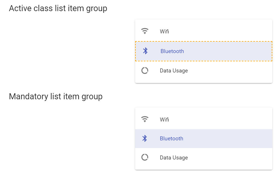
//@FindBy(css = "#ActiveClassListItemGroup .v-list-item")
@UI("#ActiveClassListItemGroup .v-list-item")
public static List<ListItemGroups> activeClassListItemGroup;
//@FindBy(css = "#MandatoryListItemGroup .v-list-item")
@UI("#MandatoryListItemGroup .v-list-item")
public static List<ListItemGroups> mandatoryListItemGroup;
@Test(description = "Test checks if list item is active or not")
public void activeClassListItemGroupTest() {
for (int element = 1; element <= activeClassListItemGroup.size(); element++) {
activeClassListItemGroup.get(element).click();
activeClassListItemGroup.get(element).is().active();
activeClassListItemGroup.get(element).click();
activeClassListItemGroup.get(element).is().notActive();
}
}
@Test(description = "Test checks that list item group is mandatory : Mandatory (y/n)",
dataProvider = "listItemGroupsDataProvider", dataProviderClass = ListItemGroupDataProvider.class)
public void mandatoryListItemGroupTest(List<String> expectedTitles) {
for (int element = 1; element <= expectedTitles.size(); element++) {
mandatoryListItemGroup.get(element).click();
mandatoryListItemGroup.get(element).is().active();
mandatoryListItemGroup.get(element).click();
mandatoryListItemGroup.get(element).is().active();
}
for (int element = 1; element <= expectedTitles.size(); element++) {
mandatoryListItemGroup.get(element).click();
}
}
List item groups - a group of selectable items from any component. Items can contain an icon, text, actions etc.
The v-list-item-group provides the ability to create a group of selectable v-list-items.
The v-list-item-group component utilizes v-item-group at its core to provide a clean interface for interactive lists.
<div class="mx-auto v-card v-sheet theme--light" file="v-list-item-group/usage" style="max-width: 500px;">
<div role="list" class="v-list v-sheet theme--light">
<div role="listbox" class="v-item-group theme--light v-list-item-group">
<div tabindex="0" role="option" aria-selected="false" class="v-list-item v-list-item--link theme--light">
<div class="v-list-item__icon">
<i aria-hidden="true" class="v-icon notranslate mdi mdi-inbox theme--light">
</i>
</div>
<div class="v-list-item__content">
<div class="v-list-item__title">Inbox</div>
</div>
</div>
<div tabindex="0" role="option" aria-selected="true" class="v-list-item v-item--active v-list-item--active v-list-item--link theme--light">
<div class="v-list-item__icon">
<i aria-hidden="true" class="v-icon notranslate mdi mdi-star theme--light">
</i>
</div>
<div class="v-list-item__content">
<div class="v-list-item__title">Star</div>
</div>
</div>
<div tabindex="0" role="option" aria-selected="false" class="v-list-item v-list-item--link theme--light">
<div class="v-list-item__icon">
<i aria-hidden="true" class="v-icon notranslate mdi mdi-send theme--light">
</i>
</div>
<div class="v-list-item__content">
<div class="v-list-item__title">Send</div>
</div>
</div>
<div tabindex="0" role="option" aria-selected="false" class="v-list-item v-list-item--link theme--light">
<div class="v-list-item__icon">
<i aria-hidden="true" class="v-icon notranslate mdi mdi-email-open theme--light">
</i>
</div>
<div class="v-list-item__content">
<div class="v-list-item__title">Drafts</div>
</div>
</div>
</div>
</div>
</div>
| Method | Description | Return Type |
|---|---|---|
| isActive | Get if required element is active | boolean |
| hasBorder | Get if item has border | boolean |
| hasTitle() | Get if element has expected title | boolean |
| getText() | Returns text | String |
| isFlat() | Get if element is flat | boolean |
| theme() | Get element theme | String |
| isSubgroup() | Get if element is subgroup | boolean |
| isNoAction() | Get if element is no-action | boolean |
Also ListItemGroup implements HasClick, HasIcon, IsFlat, HasColor, HasTheme.
| Assert method | Description |
|---|---|
| active() | Asserts that item is active |
| notActive() | Asserts that item is not active |
| title() | Asserts that item has title |
| noTitle() | Asserts that item has no title |
| border() | Asserts that item has border |
| noBorder() | Asserts that item has no border |
| icon() | Asserts that item has icon |
| noIcon() | Asserts that item has no icon |
| containsText(String) | Asserts that item has certain text |
| subGroup() | Asserts that item is sub-group |
| notSubGroup() | Asserts that item is not sub-group |
| noAction() | Asserts that item is no-action |
Active class
You can set a class which will be added when an item is selected.
Mandatory class
At least one item must be selected.
Multiple class
You can select multiple items at one time.
Flat list
You can easily disable the default highlighting of selected v-list-items. This creates a lower profile for a user’s choices.
Selection controls
Using the default slot, you can access an items internal state and toggle it. Since the active property is a boolean, we use the true-value prop on the checkbox to link its state to the v-list-item.
For examples of usage see: Vuetify List Item Groups tests.
5.13.5 Slide Groups
- Java: com.epam.jdi.light.vuetify.elements.complex.SlideGroup.java
//@FindBy(css = "#MultipleSlideGroup .v-item-group")
@UI("#MultipleSlideGroup .v-item-group")
public static SlideGroup multipleSlideGroup;
@Test(description="Test checks slide group feature: 'multiple' and max selections")
public void multipleSlideGroupTests() {
//Interface IsMultiple cannot be used as there is no "--is-multi"
//On our test-site we have the following max=3 selections
multipleSlideGroup.show();
multipleSlideGroup.is().displayed();
//Check that on selecting 2 slides we have 2 active slides
multipleSlideGroup.slideByIndex(1).click();
multipleSlideGroup.slideByIndex(3).click();
multipleSlideGroup.slideByIndex(1).click();
multipleSlideGroup.slideByIndex(3).click();
//Check that on selecting 4 slides we have only 3 selected slides as it is our max
for (int i = 1; i <= 4; i++) {
multipleSlideGroup.slideByIndex(i).click();
}
}
Slide group component is used to display pseudo paginated information. It uses Item Group at its core and provides a baseline for different components (for instance Tabs and Chip Group).
Vuetify v2.6.14 code example:
<div class="mx-auto v-sheet theme--light elevation-8" file="v-slide-group/prop-active-class" style="max-width: 800px;">
<div class="pa-4 v-item-group theme--light v-slide-group v-slide-group--has-affixes v-slide-group--is-overflowing">
<div class="v-slide-group__prev v-slide-group__prev--disabled">
<span aria-hidden="true" class="v-icon notranslate v-icon--disabled theme--light">
<svg xmlns="http://www.w3.org/2000/svg" viewBox="0 0 24 24" role="img" aria-hidden="true" class="v-icon__svg">
<path d="M15.41,16.58L10.83,12L15.41,7.41L14,6L8,12L14,18L15.41,16.58Z">
</path>
</svg>
</span>
</div>
<div class="v-slide-group__wrapper">
<div class="v-slide-group__content">
<div tabindex="0" class="ma-4 v-card v-card--link v-sheet theme--light grey lighten-1" style="height: 200px; width: 100px;">
<div class="row fill-height align-center justify-center">
<!---->
</div>
</div>
<div tabindex="0" class="ma-4 v-card v-card--link v-sheet theme--light grey lighten-1" style="height: 200px; width: 100px;">
<div class="row fill-height align-center justify-center">
<!---->
</div>
</div>
<div ...</div>
<div ...</div>
<div tabindex="0" class="ma-4 v-card v-card--link v-sheet theme--light grey lighten-1" style="height: 200px; width: 100px;">
<div class="row fill-height align-center justify-center">
<!---->
</div>
</div>
</div>
</div>
<div class="v-slide-group__next">
<span aria-hidden="true" class="v-icon notranslate theme--light">
<svg xmlns="http://www.w3.org/2000/svg" viewBox="0 0 24 24" role="img" aria-hidden="true" class="v-icon__svg">
<path d="M8.59,16.58L13.17,12L8.59,7.41L10,6L16,12L10,18L8.59,16.58Z">
</path>
</svg>
</span>
</div>
</div>
</div>
| Method | Description | Return Type |
|---|---|---|
| getNextButton() | Get 'next slide' button | VuetifyButton |
| getPreviousButton() | Get 'previous slide' button | VuetifyButton |
| slideByIndex() | Get slide by index | Card |
| getSlides() | Get list of slides | WebList |
| slideIsSelected(int) | Get if slide is selected | boolean |
| position() | Get slide position | int |
SlideGroup also implements HasIcon, HasTheme
| Assert method | Description |
|---|---|
| displayed() | Asserts that slide is displayed |
| slideSelected(int) | Asserts that slide is selected |
| slideNotSelected(int) | Asserts that slide is not selected |
| iconSlidesVisible(String) | Asserts that slide icon is visible |
| previousButtonActive() | Asserts that slide 'previous button' is active |
| previousButtonDisabled() | Asserts that slide 'previous button' is disabled |
| nextButtonActive() | Asserts that slide 'next button' is active |
| nextButtonDisabled() | Asserts that slide 'next button' is disabled |
For examples of usage see: Slide Groups tests
5.13.6 Windows
- Java: com.epam.jdi.light.vuetify.elements.complex.Windows.java
//@FindBy(css = "#VerticalWindow .v-window")
@UI("#VerticalWindow .v-window")
public static Windows<SlideWindow> verticalWindows;
@Test(description = "Check if vertical window hasn't 'previous' button, has an arrow on hover and a light theme")
public void verticalWindowsTest() {
verticalWindows.show();
verticalWindows.is().lightTheme();
verticalWindows.is().showArrowsOnHover();
verticalWindows.has().noPreviousButton();
}
Vuetify v2.6.14 code example:
<div class="v-window v-item-group theme--light v-window--show-arrows-on-hover">
<div class="v-window__container" style="">
<div class="v-window-item" style="display: none;">
<div class="v-card v-sheet theme--light grey" style="height: 200px;">
<div class="row fill-height align-center justify-center">
<h1 class="white--text" style="font-size: 5rem;"> Slide 1</h1>
</div>
</div>
</div>
<div class="v-window-item" style="display: none;">
<div class="v-card v-sheet theme--light grey" style="height: 200px;">
<div class="row fill-height align-center justify-center">
<h1 class="white--text" style="font-size: 5rem;"> Slide 2 </h1>
</div>
</div>
</div>
<div class="v-window-item v-window-item--active" style="">
<div class="v-card v-sheet theme--light grey" style="height: 200px;">
<div class="row fill-height align-center justify-center">
<h1 class="white--text" style="font-size: 5rem;"> Slide 3 </h1>
</div>
</div>
</div>
<div class="v-window__prev">
<button type="button" class="v-btn v-btn--icon v-btn--round theme--light v-size--default"
aria-label="Previous visual">
<span class="v-btn__content">
<i aria-hidden="true" class="v-icon notranslate mdi mdi-chevron-right theme--light"
style="font-size: 36px;"></i>
</span>
</button>
</div>
</div>
</div>
The Windows component provides the baseline functionality for transitioning content from 1 pane to another. Other components such as Tabs, Carousels and Steppers utilize this component at their core.
| Method | Description | Return Type |
|---|---|---|
| active() | Get active window from Windows element | UIElement |
| previousButton() | Get Windows element previous button | Button |
| nextButton() | Get Windows element next button | Button |
| activeItem() | Get active window from Windows element | T |
| activeItem(Class |
Get active window as required class from Windows element | <W> W |
| items() | Get all child windows of Windows element as a list | List<T> |
| showArrowsOnHover() | Get if Windows shows arrows on hover | boolean |
In addition, Windows implements ISetup, HasTheme.
| Assert method | Description |
|---|---|
| showArrowsOnHover() | Assert that Windows shows arrows on hover |
| notShowArrowsOnHover() | Assert that Windows doesn't show arrows on hover |
| noNextActionsButton() | Assert that Windows has no next actions button |
| previousButton() | Assert that Windows has previous button |
| noPreviousButton() | Assert that Windows has no previous button |
| nextButton() | Assert that Windows has next button |
| noNextButton() | Assert that Windows has no next button |
In addition, WindowsAssert implements ThemeAssert
For examples of usage see:JDI vuetify page tests for windows.
5.14 Lists (VuetifyList)
The v-list - component is used to display information. It can contain an avatar, content, actions, subheaders and much more. Lists present content in a way that makes it easy to identify a specific item in a collection. They provide a consistent styling for organizing groups of text and images.
In JDI framework v-lists are represented by the following classes:
- Java: com.epam.jdi.light.vuetify.elements.composite.VuetifyList.java
- Java: com.epam.jdi.light.vuetify.elements.composite.VuetifyListGroup.java
- Java: com.epam.jdi.light.vuetify.elements.common.ListItem.java #
//@FindBy(css = "#SubGroupList .v-list")
@UI("#SubGroupList .v-list")
public static VuetifyList subGroupList;
@Test(description = "Test shows how to test list with subgroups")
public static void subGroupListTest() {
ListItem adminItem = subGroupList.item("Admin");
ListItem actionsItem = subGroupList.item("Actions");
ListItem usersItem = subGroupList.item("Users");
subGroupList.show();
subGroupList.has().size(6);
usersItem.is().expanded();
adminItem.is().displayed().and().expanded();
actionsItem.is().displayed();
subGroupList.item("Management").is().displayed();
subGroupList.item("Settings").is().displayed();
usersItem.click();
usersItem.is().collapsed();
adminItem.is().hidden();
actionsItem.is().hidden();
subGroupList.has().size(2);
}
//@FindBy(css = "#ThreeLineList .v-list")
@UI("#ThreeLineList .v-list")
public static VuetifyList threeLineList;
@Test(description = "Test checks that list has dividers")
public static void hasDividerLinesListTest() {
threeLineList.show();
threeLineList.divider(1).is().horizontal();
}
Vuetify v2.6.14 code example:
<div role="list" class="v-list v-sheet theme--light">
<div tabindex="-1" role="listitem" class="v-list-item theme--light">
<div class="v-list-item__icon">
<i aria-hidden="true" class="v-icon notranslate mdi mdi-home theme--light">
</i>
</div>
<div class="v-list-item__title">Home</div>
</div>
<div class="v-list-group v-list-group--active primary--text">
<div tabindex="0" aria-expanded="true" role="button" class="v-list-group__header v-list-item v-list-item--active v-list-item--link theme--light">
<div class="v-list-item__icon v-list-group__header__prepend-icon">
<i aria-hidden="true" class="v-icon notranslate mdi mdi-account-circle theme--light">
</i>
</div>
<div class="v-list-item__title">Users</div>
<div class="v-list-item__icon v-list-group__header__append-icon">
<span aria-hidden="true" class="v-icon notranslate theme--light">
<svg xmlns="http://www.w3.org/2000/svg" viewBox="0 0 24 24" role="img" aria-hidden="true" class="v-icon__svg">
<path d="M7.41,8.58L12,13.17L16.59,8.58L18,10L12,16L6,10L7.41,8.58Z">
</path>
</svg>
</span>
</div>
</div>
<div class="v-list-group__items">
<div class="v-list-group v-list-group--active v-list-group--no-action v-list-group--sub-group primary--text">
<div tabindex="0" aria-expanded="true" role="button" class="v-list-group__header v-list-item v-list-item--active v-list-item--link theme--light">
<div class="v-list-item__icon v-list-group__header__prepend-icon">
<span aria-hidden="true" class="v-icon notranslate theme--light">
<svg xmlns="http://www.w3.org/2000/svg" viewBox="0 0 24 24" role="img" aria-hidden="true" class="v-icon__svg">
<path d="M7,10L12,15L17,10H7Z">
</path>
</svg>
</span>
</div>
<div class="v-list-item__content">
<div class="v-list-item__title">Admin</div>
</div>
</div>
<div class="v-list-group__items">
<div tabindex="0" role="listitem" class="v-list-item v-list-item--link theme--light">
<div class="v-list-item__title">Management</div>
<div class="v-list-item__icon">
<i aria-hidden="true" class="v-icon notranslate mdi mdi-account-multiple-outline theme--light">
</i>
</div>
</div>
<div tabindex="0" role="listitem" class="v-list-item v-list-item--link theme--light">
<div class="v-list-item__title">Settings</div>
<div class="v-list-item__icon">
<i aria-hidden="true" class="v-icon notranslate mdi mdi-cog-outline theme--light">
</i>
</div>
</div>
</div>
</div>
<div class="v-list-group v-list-group--no-action v-list-group--sub-group">
<div tabindex="0" aria-expanded="false" role="button" class="v-list-group__header v-list-item v-list-item--link theme--light">
<div class="v-list-item__icon v-list-group__header__prepend-icon">
<span aria-hidden="true" class="v-icon notranslate theme--light">
<svg xmlns="http://www.w3.org/2000/svg" viewBox="0 0 24 24" role="img" aria-hidden="true" class="v-icon__svg">
<path d="M7,10L12,15L17,10H7Z">
</path>
</svg>
</span>
</div>
<div class="v-list-item__content">
<div class="v-list-item__title">Actions</div>
</div>
</div>
<!---->
</div>
</div>
</div>
</div>
| Method | Description | Return Type |
|---|---|---|
| is() | Assert action | VuetifyListAssert |
| item(int)/item(String) | Gets specific item of a list by its index and title | ListItem |
| itemsWebList() | Gets list of items. Each element of the list is a UIElement | WebList |
| subheader(int) | Gets the subheader of a list using the subheader index | Subheader |
| divider(int) | Gets the divider of a list using the divider index | Divider |
| dividers() | Gets the dividers of a list | WebList |
| items() | Gets list of items. Each element of the list is a ListItem | List<ListItem> |
| size() | Gets size of a list (i.e. amount of its items) | int |
| groups() | Gets list groups | List<VuetifyListGroup> |
| group(String) | Gets list grou with certain title | VuetifyListGroup |
| isDisabled() | Checks if a list is disabled | boolean |
| isRounded() | Checks if a list is rounded | boolean |
Also VuetifyList implements ICoreElement, HasTheme, HasElevation, IsDense, IsFlat, HasRounded, IsShaped.
| Assert method | Description |
|---|---|
| size(int) | Assert list size |
| disabled() | Assert that element is disabled |
| enabled() | Assert that element is enabled |
| groupSize(int) | Assert group list size |
| dividersSize(int) | Assert dividers list size |
| expanded() | Checks that the list item is expanded |
| collapsed() | Checks that the list item is collapsed |
| active() | Checks that the list item is active |
| notActive() | Checks that the list item is not active |
For more examples of usage see: JDI Vuetify Lists tests.
5.15 Overlays
- Java: com.epam.jdi.light.vuetify.elements.common.Overlay.java
//@FindBy(css = "#AbsoluteOverlay button")
@UI("#AbsoluteOverlay button")
public static VuetifyButton absoluteOverlayButton;
@Test(description = "Check that overlay position is absolute")
public void absolutePositionOverlaysTest() {
absoluteOverlayButton.show();
absoluteOverlayButton.click();
absoluteOverlay.has().absolutePosition();
}
//@FindBy(css = "#AdvancedOverlay")
@UI("#AdvancedOverlay")
public static UIElement advancedOverlayCard;
@Test(description = "Check overlay color")
public void colorOverlaysTest() {
advancedOverlayCard.show();
advancedOverlayCard.hover();
advancedOverlay.has().backgroundColor(CYAN_DARKEN_5.value());
}
//@FindBy(css = "#ZIndexOverlay button")
@UI("#ZIndexOverlay button")
public static VuetifyButton zIndexOverlayButton;
@Test(description = "Check overlay z-index value")
public void zIndexOverlaysTest() {
zIndexOverlayButton.show();
zIndexOverlayButton.click();
zIndexOverlay.has().zIndex(0);
}
The Overlay - The v-overlay component is used to provide emphasis on a particular element or parts of it. It signals to the user of a state change within the application and can be used for creating loaders, dialogs and more.


Vuetify v2.6.14 code example:
<div id="app">
<v-app id="inspire">
<div class="text-center">
<v-btn
color="error"
@click="overlay = !overlay"
>
Show Overlay
</v-btn>
<v-overlay :value="overlay"></v-overlay>
</div>
</v-app>
</div>
| Method | Description | Return Type |
|---|---|---|
| absolutePosition() | Returns object for work with assertions | OverlayAssert |
| backgroundColor() | Gets background color | String |
| has() | Returns object for work with assertions | OverlayAssert |
| hover() | Hovers mouse cursor over the element | void |
| isAbsolute() | Shows that required element is absolute | boolean |
| isDisplayed() | Shows that required element is displayed | boolean |
| is() | Returns object for work with assertions | OverlayAssert |
| notAbsolutePosition() | Returns object for work with assertions | OverlayAssert |
| opacity() | Gets opacity | double |
| show() | Scrolls screen view to item | void |
| zIndex() | Gets z-index | int |
5.16 Pagination
- Java: com.epam.jdi.light.vuetify.elements.complex.Pagination.java
You can specify locators for the root and items to find page buttons in the root.
Also, you can specify locators for left and right navigation buttons,
locator for buttons with 'more' value like '...'. All of it you can do
explicitly through a JDIPagination annotation.
It is necessary to specify the root of an element.
//@FindBy(css = "#TotalVisiblePagination .v-pagination")
@JDIPagination(root = "#TotalVisiblePagination .v-pagination")
public static Pagination totalVisiblePagination;
@Test(description = "Test checks visible pagination components")
public void totalVisiblePaginationTest() {
totalVisiblePagination.is().enabled();
totalVisiblePagination.is().atStart();
totalVisiblePagination.select("15");
totalVisiblePagination.has().selected("15");
totalVisiblePagination.is().atEnd();
List<String> actualButtonsFromEndToStart = new ArrayList<>();
actualButtonsFromEndToStart.add(totalVisiblePagination.selected());
while (totalVisiblePagination.hasPrevious()) {
totalVisiblePagination.back();
actualButtonsFromEndToStart.add(totalVisiblePagination.selected());
}
jdiAssert(actualButtonsFromEndToStart, equalTo(asList(
"15", "14", "13", "12", "11", "10", "9", "8", "7", "6", "5", "4", "3", "2", "1"
)));
totalVisiblePagination.is().atStart();
}

Vuetify v2.6.14 code example:
<nav role="navigation" aria-label="Pagination Navigation">
<ul class="v-pagination v-pagination--circle theme--light">
<li>
<button disabled="disabled" type="button" aria-label="Previous page" class="v-pagination__navigation v-pagination__navigation--disabled">
<span aria-hidden="true" class="v-icon notranslate theme--light">
<svg xmlns="http://www.w3.org/2000/svg" viewBox="0 0 24 24" role="img" aria-hidden="true" class="v-icon__svg">
<path d="M15.41,16.58L10.83,12L15.41,7.41L14,6L8,12L14,18L15.41,16.58Z">
</path>
</svg>
</span>
</button>
</li>
<li>
<button type="button" aria-current="true" aria-label="Current Page, Page 1" class="v-pagination__item v-pagination__item--active primary">1</button>
</li>
<li>
<button type="button" aria-label="Goto Page 2" class="v-pagination__item">2</button>
</li>
<li>
<button type="button" aria-label="Goto Page 3" class="v-pagination__item">3</button>
</li>
<li>
<button type="button" aria-label="Goto Page 4" class="v-pagination__item">4</button>
</li>
<li>
<button type="button" aria-label="Next page" class="v-pagination__navigation">
<span aria-hidden="true" class="v-icon notranslate theme--light">
<svg xmlns="http://www.w3.org/2000/svg" viewBox="0 0 24 24" role="img" aria-hidden="true" class="v-icon__svg">
<path d="M8.59,16.58L13.17,12L8.59,7.41L10,6L16,12L10,18L8.59,16.58Z">
</path>
</svg>
</span>
</button>
</li>
</ul>
</nav>
| Method | Description | Return Type |
|---|---|---|
| list() | Returns list of page buttons by items locator from JDIPagination annotation |
WebList |
| leftNavigation() | Get left navigation button | VuetifyButton |
| rightNavigation() | Get right navigation button | VuetifyButton |
| nextIcon() | Get next icon | UIElement |
| previousIcon() | Get previous icon | UIElement |
| moreButton() | Get more button | UIElement |
| activeButton() | Get active button | VuetifyButton |
| totalVisible() | Get total visible | Integer |
| selected() | Get selected button text | String |
| selected(String option) | Returns true if page button with text is selected | boolean |
| selected(int index) | Returns true if page button with index is selected | boolean |
| selectedPage() | Get if button from list by name is selected | PaginationPage |
| page(String option) | Get page by name | PaginationPage |
| page(int index) | Get page by index | PaginationPage |
| isStart() | Returns true if left navigation is disable | boolean |
| isEnd() | Returns true if right navigation is disable | boolean |
| hasNext() | Returns true if right navigation button is enabled | boolean |
| next() | Click on right navigation button | void |
| hasPrevious() | Returns true if left navigation button is enabled | boolean |
| back() | Click on left navigation button | void |
| isCircle() | Get if circle | boolean |
Pagination also implements ISetup, HasTheme
| Assert method | Description |
|---|---|
| atStart() | Assert that pagination is at start |
| atEnd() | Assert that pagination is at end |
| circle() | Assert that pagination is circle |
| notCircle() | Assert that pagination is not circle |
| currentPageAriaLabel() | Assert aria-label value |
| previousAriaLabel() | Assert previous-aria-label value |
| nextAriaLabel() | Assert next-aria-label value |
| pageAriaLabel() | Assert page-aria-label value |
| nextIcon(String icon) | Assert next icon value |
| previousIcon(String icon) | Assert previous icon value |
| totalVisible(Integer totalVisible) | Assert total visible value |
For examples of usage see: JDI vuetify page tests for pagination.
5.17 Ratings
- Java: com.epam.jdi.light.vuetify.elements.complex.Rating.java
//@FindBy(css = "#IncrementedRating .v-rating .mdi-star.yellow--text")
@JDIRating(root = "#IncrementedRating .v-rating",
fullIcon = ".mdi-star.yellow--text")
public static Rating incrementedRating;
@Test(description = "Test checks rating's value")
public void valueRatingTest() {
incrementedRating.setValue(3);
incrementedRating.is().value(3);
incrementedRating.setValue(3.5);
incrementedRating.is().value(3.5);
incrementedRating.hoverSetValue(5);
incrementedRating.is().value(5);
incrementedRating.hoverSetValue(4.5);
incrementedRating.is().value(4.5);
incrementedRatingCard.hover();
incrementedRating.is().value(3.5);
}
//@FindBy(css = "#CardRatingsRating .v-rating")
@JDIRating(root = "#CardRatingsRating .v-rating")
public static Rating cardRatingsRating;
//@FindBy(xpath = ""//*[@id='ClearableRating']/following-sibling::div[contains(@class, 'v-rating')]")
@JDIRating(root = "//*[@id='ClearableRating']/following-sibling::div[contains(@class, 'v-rating')]")
public static Rating clearableRating;
@Test(description = "Test checks rating's theme : theme(dark/light)")
public void themeRatingTest() {
cardRatingsRating.show();
cardRatingsRating.has().darkTheme();
clearableRating.show();
clearableRating.has().lightTheme();
}
}
Rating - The rating component is a specialized but crucial piece in building user widgets. Collecting user feedback via ratings is a simple analytic that can provide a lot of feedback to your product or application.
Vuetify v2.6.14 code example:
<div class="v-rating">
<button type="button" aria-label="Rating 1 of 5" class="v-icon notranslate v-icon--link mdi mdi-star theme--light yellow--text text--darken-3" style="font-size: 36px;"></button>
<button type="button" aria-label="Rating 2 of 5" class="v-icon notranslate v-icon--link mdi mdi-star theme--light yellow--text text--darken-3" style="font-size: 36px;"></button>
<button type="button" aria-label="Rating 3 of 5" class="v-icon notranslate v-icon--link mdi mdi-star theme--light yellow--text text--darken-3" style="font-size: 36px;"></button>
<button type="button" aria-label="Rating 4 of 5" class="v-icon notranslate v-icon--link mdi mdi-star theme--light yellow--text text--darken-3" style="font-size: 36px;"></button>
<button type="button" aria-label="Rating 5 of 5" class="v-icon notranslate v-icon--link mdi mdi-star-half-full theme--light yellow--text text--darken-3" style="font-size: 36px;"></button>
</div>
| Method | Description | Return Type |
|---|---|---|
| length() | Get quantity of Rating buttons | int |
| getRatingButtons() | Get Rating buttons | WebList |
| color() | Get color of rating button | String |
| color(int) | Get color of rating button | String |
| hoverSetValue(double) | Set rating to 'rating' with a mouse hover | void |
| getValue() | Get rating | Double |
| setValue(double) | Set rating to 'rating' with a mouse click | void |
| theme() | Get theme | String |
| size() | Get size rating buttons | int |
| setup(Field) | Setting up Rating element by Field | void |
| setup(String, String, String) | Returns Rating element by locators | Rating |
| is() | Returns object for work with assertions | RatingAssert |
| has() | Returns object for work with assertions | RatingAssert |
| waitFor() | Returns object for work with assertions | RatingAssert |
| shouldBe() | Returns object for work with assertions | RatingAssert |
| verify() | Returns object for work with assertions | RatingAssert |
| assertThat() | Returns object for work with assertions | RatingAssert |
For examples of usage see: JDI Vuetify Ratings tests
5.18 Snackbars
- Java: com.epam.jdi.light.vuetify.elements.common.Snackbar.java
//@FindBy(css = ".v-card--flat .v-snack--absolute")
@UI(".v-card--flat .v-snack--absolute")
public static Snackbar snackbar;
@Test(description = "Test checks that Snackbar has all expected attributes")
public static void snackbarTest() {
snackbar.show();
snackbar.has().leftAlignment()
.is().shaped().and().notElevated()
.has().color("rgba(255, 255, 255, 0.87)")
.has().top();
}
Snackbar component is used to display a quick message to a user. Snackbars support positioning, removal delay, and callbacks.
Vuetify v2.6.14 code example:
<div class="v-snack v-snack--active v-snack--bottom v-snack--has-background v-snack--multi-line">
<div class="v-snack__wrapper v-sheet theme--dark" style="">
<div role="status" aria-live="polite" class="v-snack__content"> I'm a multi-line snackbar. </div>
<div class="v-snack__action ">
<button type="button" class="v-btn v-btn--text theme--dark v-size--default red--text v-snack__btn">
<span class="v-btn__content"> Close </span>
</button>
</div>
</div>
</div>
| Method | Description | Return Type |
|---|---|---|
| text() | Returns snackbar's text | String |
| isOpen() | Returns true if snackbar is shown | boolean |
| isClosed() | Shows true if snackbar is not shown | boolean |
| isTop() | Returns true if snackbar is positioned at the top | boolean |
| isBottom() | Returns true if snackbar is positioned at the bottom | boolean |
| isMultiLine() | Returns true if snackbar is configured to display multiple lines of text message | boolean |
| wrapperLocator() | Returns ".v-snack__wrapper" string | String |
| Assert method | Description |
|---|---|
| visible() | Asserts if snackbar is present on the page |
| closed() | Asserts if snackbar is not present on the page |
| text(String text) | Asserts if alert text matches provided matcher |
| centered() | Asserts if snackbar is positioned at the center |
| top() | Asserts if snackbar is positioned at the top |
| bottom() | Asserts if snackbar is positioned at the bottom |
| multiline() | Asserts if snackbar is configured to display multiple lines of text |
Snackbar also has basic JDI elements methods and asserts for Text, Color, Elevation, Outline, Measurements, Orientation, Alignment, Theme and others
For examples of usage see: JDI vuetify page tests for snackbars.
5.19 Sparklines
- Java: com.epam.jdi.light.vuetify.elements.common.Sparkline.java
//@FindBy(css = "#HeartRateSparkline svg")
@UI("#HeartRateSparkline svg")
public static Sparkline heartRateSparkline;
@Test(description = "Test shows how to work with sparkline")
public void heartRateSparklineTests() {
heartRateSparkline.show();
heartRateSparkline.is().trendline().and().has().lineWidth(3);
}
The Sparkline component can be used to create simple graphs, like GitHub’s contribution chart.

Vuetify v2.6.14 code example:
<svg display="block" stroke-width="3.3" viewBox="0 0 300 75" class="primary--text">
<defs>
<linearGradient id="1095" gradientUnits="userSpaceOnUse" x1="0" y1="100%" x2="0" y2="0">
<stop offset="0" stop-color="violet">
</stop>
<stop offset="1" stop-color="purple">
</stop>
</linearGradient>
</defs>
<path d="M13 64 L13 62L22.785714285714285 57.1S32.57142857142857 52.2 41.3219935257291 45.6274953737407L42.35714285714286 44.85S52.142857142857146 37.5 60.79052164855101 28.839711166560598L61.92857142857144 27.699999999999996S71.71428571428572 17.9 81.5 27.7L81.5 27.7S91.28571428571429 37.5 99.92954132377821 26.679442795416325L101.49505322540635 24.719696144838043S110.85714285714286 13 118.29104441586853 26.02831944708051L125.00481795208934 37.79457511165435S130.42857142857144 47.3 140.21428571428572 42.4L140.21428571428572 42.4S150 37.5 156.83055402148378 46.05065704149245L163.46377962120047 54.354293467415175S169.57142857142858 62 179.3571428571429 62L179.3571428571429 62S189.14285714285717 62 198.6355787299902 59.623355106287136L198.92857142857144 59.55S208.71428571428572 57.1 213.7137085096145 48.33823786015738L220.85181272698864 35.82831944708051S228.2857142857143 22.799999999999997 236.59781456911125 35.28635210454809L239.54504257374595 39.71364789545191S247.8571428571429 52.2 255.29104441586856 39.17168055291948L259.9946698698458 30.928319447080515S267.42857142857144 17.9 273.5132300039538 31.610467899419984L287 62L287 64 Z" fill="url(#1095)" stroke="none" style="transform-origin: center bottom; transition: transform 2000ms ease 0s; transform: scaleY(1);">
</path>
</svg>
| Method | Description | Return Type |
|---|---|---|
| getPathShape() | Get SVG-specific path shape definition | String |
| getLabelTexts() | Get data point label texts | List<String> |
| getLinearGradientMap() | Get map representation (keys: offsets, values: stop-colors) | Map<String, String> |
| lineWidth() | Get line width | int |
| labelFontSize() | Get label font size | int |
| bars() | Get bars | List<UIElement> |
| getBarsWidths() | Get bars width | List<Integer> |
| getBarsHeights() | Get bars height | List<Integer> |
| isBar() | Shows that sparkline has type bar | boolean |
| isTrendline() | Shows that sparkline has type trendline | boolean |
| hasLabels() | Shows that sparkline has visible labels | boolean |
| isFilled() | Shows that sparkline is filled | boolean |
For examples of usage see: JDI vuetify page tests for sparklines
5.20 Subheaders
Java: com.epam.jdi.light.vuetify.elements.common.Subheader.java
//@FindBy(css = "#InsetSubheader .v-subheader")
@UI("#InsetSubheader .v-subheader")
public static Subheader insetSubheader;
@Test(description = "Test checks inset Subheader features: 'theme' and 'text'")
public void insetSubheaderTest(){
insetSubheader.is().displayed();
insetSubheader.is().lightTheme();
insetSubheader.is().inset();
insetSubheader.is().text("Subheader");
}
Subheader - The Subheader component is used to separate sections of lists.
Vuetify v2.6.14 code example:
<div class="v-card v-sheet theme--light">
<div class="v-subheader v-subheader--inset theme--light"> Subheader </div>
<div role="list" class="v-list v-sheet theme--light">
<div tabindex="-1" role="listitem" class="v-list-item theme--light">
<div class="v-list-item__action">
<i aria-hidden="true" class="v-icon notranslate mdi mdi-label theme--light"></i>
</div>
<div class="v-list-item__content">
<div class="v-list-item__title">List item 1</div>
</div>
</div>
<hr role="separator" aria-orientation="horizontal" class="v-divider v-divider--inset theme--light">
<div tabindex="-1" role="listitem" class="v-list-item theme--light">
<div class="v-list-item__action">
<i aria-hidden="true" class="v-icon notranslate mdi mdi-label theme--light"></i>
</div>
<div class="v-list-item__content">
<div class="v-list-item__title">List item 2</div>
</div>
</div>
</div>
</div>
| Method | Description | Return Type |
|---|---|---|
| is() | Returns Assert class | SubheaderAssert |
| isInset() | Checks if element has "v-subheader--inset" class | boolean |
| has() | Returns Assert class | SubheaderAssert |
| classes() | Gets all element's classes as list | List<String> |
| doubleClick() | Double clicks on the element | void |
| dragAndDropTo(int x, int y) | Drags and drops element to certain coordinates | void |
| dragAndDropTo(WebElement to) | Drags and drops element to another element | void |
| getLocation() | Gets element location as point | Point |
| getSize() | Gets element size | Dimension |
| getTagName() | Gets element tag name | String |
| getText() | Gets element text | String |
| getValue() | Gets element text | String |
| hasAttribute(String attrName) | Returns true if the element has an expected attribute | boolean |
| hasClass(String className) | Returns true if the element has an expected class | boolean |
| highlight() | Highlights element with red color | void |
| highlight(String color) | Scrolls view to element and highlights it with a border of specified color | void |
| hover() | Hovers mouse cursor over the element | void |
| isDisabled() | Checks that element is disabled | boolean |
| isDisplayed() | Checks that element is displayed | boolean |
| isEnabled() | Checks that element exists | boolean |
| isHidden() | Checks that element is hidden | boolean |
| isNotExist() | Checks that element does not exist | boolean |
| isNotVisible() | Checks that element is not visible by user | boolean |
| isVisible() | Checks that element is visible by user | boolean |
| labelText() | Gets label text | String |
| printHtml() | Gets element “innerHTML” attribute value | String |
| rightClick() | Right clicks on the element | void |
| setAttribute(String name, String value) | Sets value to the specified attribute | void |
| show() | Scrolls screen view to item | void |
5.21 Tables
5.21.1 Simple Tables
- Java: package com.epam.jdi.light.vuetify.elements.complex.tables.SimpleTable.java
The Simple Tables component is a simple wrapper component around the
| Method | Description | Return Type |
|---|---|---|
| hasFixedHeader() | Get if Simple Table has fixed header | boolean |
| hasFixedHeight() | Shows that table has fixed height | boolean |
In addition, SimpleTable class implements IsDense, HasTheme
| Assert method | Description |
|---|---|
| fixedHeader() | Assert that Simple Table has fixed header |
| fixedHeight() | Assert that Simple Table has fixed height |
| cellValue(int colNum, int rowNum, String data) | Assert that Simple Table's first column has required element |
| columnTitle(int colNum, String reqTitle) | Assert that Simple Table's column has title |
For examples of usage see: Vuetify Simple Table tests.
5.21.2 Data Tables
- Java: package com.epam.jdi.light.vuetify.elements.complex.tables.DataTable.java
//@FindBy(css = "#CustomFilterTable .v-data-table")
@UI("#CustomFilterTable .v-data-table")
public static DataTable customFilterTable;
@Test(description = "Check that tile alert is shown as expected")
public void customFilterTableTest(){
customFilterTable.show();
customFilterTable.has()
.footer(true)
.header(true)
.nextPageButton(false)
.elementValue(1,1,FROZEN_YOGURT.value());
customFilterTable.selectNumberOfRowsPerPage("5");
customFilterTable.nextPage();
customFilterTable.has().elementValue(1,1,JELLY_BEAN.value());
customFilterTable.previousPage();
customFilterTable.sortDescBy("Carbs (g)");
customFilterTable.has().elementValue(1,1,LOLLIPOP.value());
}
The Data Table component is used for displaying tabular data and to extend the Simple Table element
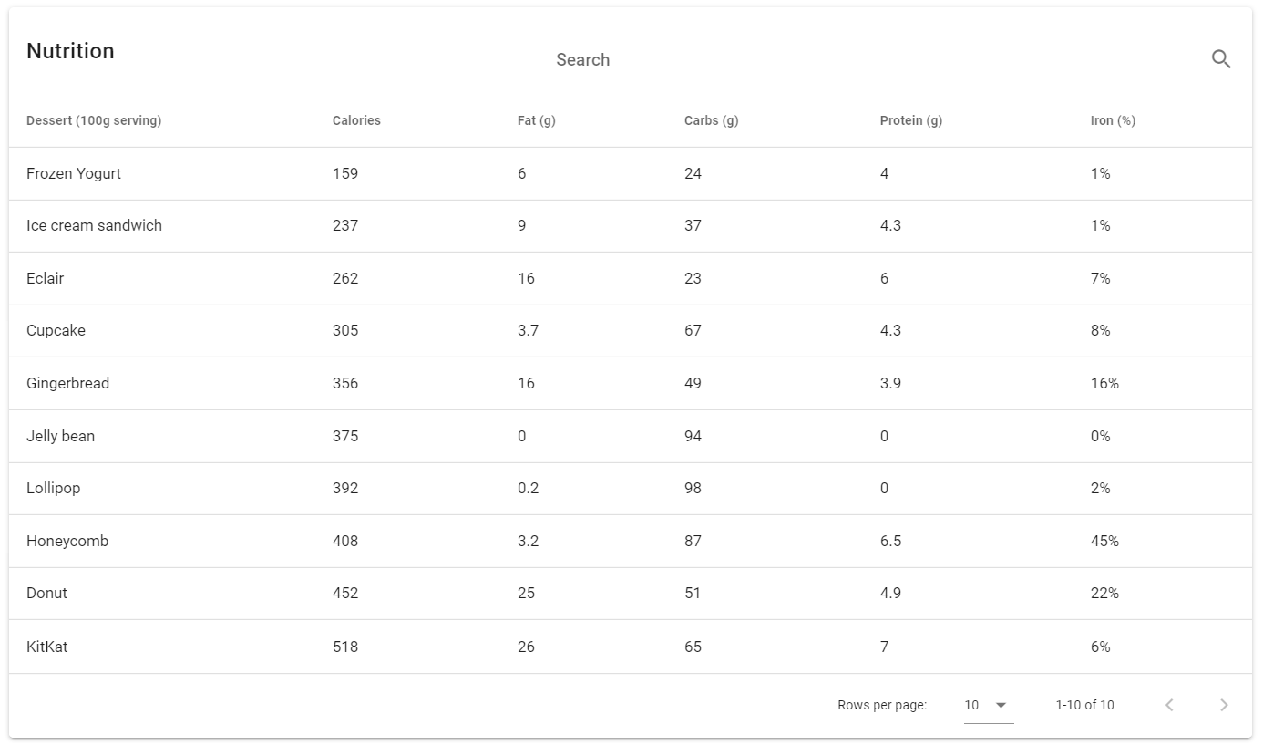
Vuetify v2.6.14 code example:
<div class="v-data-table elevation-1 v-data-table--has-bottom theme--light" file="v-data-table/usage">
<div class="v-data-table__wrapper">
<table>
<colgroup>
<col class="">
<col class="">
<col class="">
<col class="">
<col class="">
<col class="">
</colgroup>
<thead class="v-data-table-header">
<tr>
<th role="columnheader" scope="col" aria-label="Dessert (100g serving)" class="text-start"><span>Dessert (100g serving)</span>
</th>
<th role="columnheader" scope="col" aria-label="Calories: Not sorted. Activate to sort ascending." aria-sort="none" class="text-start sortable">
<span>Calories</span>
<span aria-hidden="true" class="v-icon notranslate v-data-table-header__icon theme--light" style="font-size: 18px; height: 18px; width: 18px;">
<svg xmlns="http://www.w3.org/2000/svg" viewBox="0 0 24 24" role="img" aria-hidden="true" class="v-icon__svg" style="font-size: 18px; height: 18px; width: 18px;">
<path d="M13,20H11V8L5.5,13.5L4.08,12.08L12,4.16L19.92,12.08L18.5,13.5L13,8V20Z">
</path>
</svg>
</span>
</th>
<th> <...>
</th>
</tr>
</thead>
<tbody>
<tr class="">
<td class="text-start">Frozen Yogurt</td>
<td class="text-start">159</td>
<td class="text-start">6</td>
<td class="text-start">24</td>
<td class="text-start">4</td>
<td class="text-start">1</td>
</tr>
<tr class="">
<...>
</tr>
</tbody>
</table>
</div>
<div class="v-data-footer">
<div class="v-data-footer__select">Rows per page:
<div class="v-input v-input--hide-details v-input--is-label-active v-input--is-dirty theme--light v-text-field v-text-field--is-booted v-select">
<div class="v-input__control">
<div role="button" aria-haspopup="listbox" aria-expanded="false" aria-owns="list-2478" class="v-input__slot">
<div class="v-select__slot">
<div class="v-select__selections">
<div class="v-select__selection v-select__selection--comma">5</div>
<input aria-label="Rows per page:" id="input-2478" readonly="readonly" type="text" aria-readonly="false" autocomplete="off">
</div>
<div class="v-input__append-inner">
<div class="v-input__icon v-input__icon--append">
<span aria-hidden="true" class="v-icon notranslate theme--light">
<svg xmlns="http://www.w3.org/2000/svg" viewBox="0 0 24 24" role="img" aria-hidden="true" class="v-icon__svg">
<path d="M7,10L12,15L17,10H7Z">
</path>
</svg>
</span>
</div>
</div>
<input type="hidden" value="5"></div>
<div class="v-menu"><!----></div>
</div>
</div>
</div>
</div>
<div class="v-data-footer__pagination">1-5 of 10</div>
<div class="v-data-footer__icons-before">
<button type="button" disabled="disabled" class="v-btn v-btn--disabled v-btn--icon v-btn--round v-btn--text theme--light v-size--default" aria-label="Previous page">
<span class="v-btn__content">
<span aria-hidden="true" class="v-icon notranslate theme--light">
<svg xmlns="http://www.w3.org/2000/svg" viewBox="0 0 24 24" role="img" aria-hidden="true" class="v-icon__svg">
<path d="M15.41,16.58L10.83,12L15.41,7.41L14,6L8,12L14,18L15.41,16.58Z">
</path>
</svg>
</span>
</span>
</button>
</div>
<div class="v-data-footer__icons-after">
<button type="button" class="v-btn v-btn--icon v-btn--round v-btn--text theme--light v-size--default" aria-label="Next page">
<span class="v-btn__content">
<span aria-hidden="true" class="v-icon notranslate theme--light">
<svg xmlns="http://www.w3.org/2000/svg" viewBox="0 0 24 24" role="img" aria-hidden="true" class="v-icon__svg">
<path d="M8.59,16.58L13.17,12L8.59,7.41L10,6L16,12L10,18L8.59,16.58Z">
</path>
</svg>
</span>
</span>
</button>
</div>
</div>
</div>
| Method | Description | Return Type |
|---|---|---|
| selectNumberOfRowsPerPage(String value) | Select Data Table's number of rows per page | void |
| nextPage() | Switch Data Table to the next page | void |
| previousPage() | Switch Data Table to the previous page | void |
| sortDescBy(String value) | Sort Data Table by value in descending order | void |
| groupedData() | Get Data Table groups list with the list of content of the first column | Map<String, List<String>> |
| previousPage() | Switches to the previous page | void |
| nextPage() | Switches to the next page | void |
| firstPage() | Switches to the first page | void |
| lastPage() | Switch Data Table to the last page | void |
| currentPage() | Get Data Table's page number | void |
| sortAscBy(String value) | Sorts elements by the required value in ascending order | void |
| removeSort(String value) | Turn off Data Table sort | void |
| isSortedBy(String value) | Shows that elements sorted by the value | boolean |
| collapseGroup(String groupName) | Collapses the required group | void |
| isGroupExpanded(String groupName) | Get if required group is expanded in Data Table | boolean |
| expandGroup(String groupName) | Expands the required group | void |
| groupBy(String colName) | Group Data Table by required column | void |
| removeGroups() | Remove all groups | void |
| hasGroup() | Shows that Data Table has required group | boolean |
| isLoading() | Get if Data Table is loading | boolean |
| isSelected(int colNum, int elNum) | Get if required element in required Data Table's column is selected | boolean |
| expandRow(int numEl) | Expand row Data Table's element | void |
| isRowExpanded(int numEl) | Get if required Data Table's element is expanded | boolean |
| collapseRow(int rowNumber) | Collapse Data Table's required row | void |
| selectNumberOfRowsPerPage(String value) | Select Data Table's number of rows per page | void |
| isFixedHeader() | Check if Data Table has fixed header | boolean |
In addition, DataTable class implements HasTheme, IsLoading, HasMeasurement.
| Assert method | Description |
|---|---|
| elementName(int elNum, String elName) | Assert that Data Table's element has required name |
| elementValue(int colNum, int elNum, String elName) | Assert that Data Table has required value |
| sortedBy(String column) | Assert that Data Table columns are sorted by column's value |
| notSortedBy(String value) | Assert that Data Table columns aren't sorted by coulmn's value |
| cellSelected(int colNum, int elNum) | Assert that Data Table element is selected |
| cellNotSelected(int colNum, int elNum) | Assert that Data Table element isn't selected |
| header(int colNum, String value) | Assert that Data Table column header has required number |
| rowExpanded(int elNum) | Assert that Data Table element is expanded |
| rowCollapsed(int elNum) | Assert that Data Table element is collapsed |
| groupCollapsed(String groupName) | Assert that Data Table group is collapsed |
| groupExpanded(String groupName) | Assert that Data Table group is expanded |
| group(String groupName) | Assert that Data Table has group |
| numberOfRowsPerPageInput(boolean enabled) | Assert that Data Table has number of rows per page input field |
| firstPageButton(boolean enabled) | Assert that Data Table has first page button |
| previousPageButton(boolean enabled) | Assert that Data Table has previous page button |
| nextPageButton(boolean enabled) | Assert that Data Table has next page button |
| lastPageButton(boolean enabled) | Assert that Data Table has last page button |
| currentPage(int expectedCurrentPage) | Assert Data Table current page |
| footer(boolean isDisplayed) | Assert that Data Table has footer |
| header(boolean isDisplayed) | Assert that Data Table has header |
| rowWithValues(int rowNumber, String... values) | Assert that Data Table row has values |
| sortEnabled(String column, boolean isEnabled) | Assert that Data Table sort is enabled for column |
| sortRequired(boolean isRequired) | Assert that Data Table sort is required for the table |
| groupSize(String groupName, int expectedSize) | Assert that Data Table group has size |
| fixedHeader(boolean isFixedHeader) | Assert that Data Table has fixed header |
| noRowInColumn(int columnNum, String rowValue) | Assert that Data Table do not have specific row |
| rowInColumn(int columnNum, String rowValue) | Assert that Data Table have specific row |
For examples of usage see: Vuetify Data Table tests.
5.21.3 Data Iterators
- Java: package com.epam.jdi.light.vuetify.elements.complex.tables.DataIterator.java
//@FindBy(css = "#FilterTable .v-data-iterator")
@UI("#FilterTable .v-data-iterator")
public static FilterDataIterator filterDataIterator;
@Test(description = "Check that Filter Data Iterator Table is shown as expected")
public void filterDataIteratorTest() {
filterDataIterator.show();
filterDataIterator.nextPage.click();
filterDataIterator.nextPage.click();
filterDataIterator.item(1).has().title(KITKAT.value());
filterDataIterator.previousPage.click();
filterDataIterator.item(2).has().title(HONEYCOMB.value());
filterDataIterator.previousPage.click();
filterDataIterator.item(1).has().title(CUPCAKE.value());
filterDataIterator.filterDataSearchField.clearAndTypeText(FROZEN_YOGURT.value());
filterDataIterator.item(1).has().title(FROZEN_YOGURT.value());
filterDataIterator.filterDataSearchField.clear();
filterDataIterator.filterSortSelect.select("Carbs");
filterDataIterator.sortDesc();
filterDataIterator.item(1).has().title(LOLLIPOP.value());
filterDataIterator.itemsPerPage.select("12");
filterDataIterator.has().numberOfElements(10);
}
The Data iterators component is used for displaying data, and shares a majority of its functionality with the Data Tables component. Features include sorting, searching, pagination, and selection.
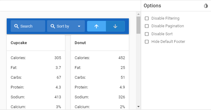
Vuetify v2.6.14 code example:
<div class="container container--fluid" id="FilterTable">
<div class="v-data-iterator">
<header class="mb-1 v-sheet theme--dark v-toolbar blue darken-3" style="height: 64px;">
<div class="v-toolbar__content" style="height: 64px;">
<div class="v-input v-input--hide-details theme--dark v-text-field v-text-field--single-line v-text-field--solo v-text-field--solo-inverted v-text-field--solo-flat v-text-field--is-booted v-text-field--enclosed">
<div class="v-input__control">
<div class="v-input__slot">
<div class="v-input__prepend-inner">
<div class="v-input__icon v-input__icon--prepend-inner">
<i aria-hidden="true" class="v-icon notranslate mdi mdi-magnify theme--dark"></i>
</div>
</div>
<div class="v-text-field__slot">
<label for="input-1019" class="v-label theme--dark" style="left: 0px; right: auto; position: absolute;">Search</label>
<input id="input-1019" type="text">
</div>
<div class="v-input__append-inner">
<div></div>
</div>
</div>
</div>
</div>
<div class="spacer"></div>
<div class="v-input v-input--hide-details theme--dark v-text-field v-text-field--single-line v-text-field--solo v-text-field--solo-inverted v-text-field--solo-flat v-text-field--is-booted v-text-field--enclosed v-select">
<div class="v-input__control">
<div role="button" aria-haspopup="listbox" aria-expanded="false" aria-owns="list-1021" class="v-input__slot">
<div class="v-input__prepend-inner">
<div class="v-input__icon v-input__icon--prepend-inner">
<i aria-hidden="true" class="v-icon notranslate mdi mdi-magnify theme--dark"></i>
</div>
</div>
<div class="v-select__slot">
<label for="input-1021" class="v-label theme--dark" style="left: 0px; right: auto; position: absolute;">Sort by</label>
<div class="v-select__selections">
<input id="input-1021" readonly="readonly" type="text" aria-readonly="false" autocomplete="off">
</div>
<div class="v-input__append-inner">
<div class="v-input__icon v-input__icon--append">
<i aria-hidden="true" class="v-icon notranslate mdi mdi-menu-down theme--dark"></i>
</div>
</div>
<input type="hidden" value="name">
</div>
<div class="v-menu"><!----></div>
</div>
</div>
</div>
<div class="spacer"></div>
<div class="v-item-group theme--dark v-btn-toggle">
<button type="button" value="false" class="v-btn v-item--active v-btn--active v-btn--has-bg theme--dark v-size--large blue">
<span class="v-btn__content">
<i aria-hidden="true" class="v-icon notranslate mdi mdi-arrow-up theme--dark"></i>
</span>
</button>
<button type="button" value="true" class="v-btn v-btn--has-bg theme--dark v-size--large blue">
<span class="v-btn__content">
<i aria-hidden="true" class="v-icon notranslate mdi mdi-arrow-down theme--dark"></i>
</span>
</button>
</div>
</div>
</header>
<div class="row">
<div class="col-sm-6 col-md-4 col-lg-3 col-12">
<div class="v-card v-sheet theme--light">
<div class="v-card__title subheading font-weight-bold">
Cupcake
</div>
<hr role="separator" aria-orientation="horizontal" class="v-divider theme--light">
<div role="list" class="v-list v-sheet theme--light v-list--dense">
<div tabindex="-1" role="listitem" class="v-list-item theme--light">
<div class="v-list-item__content">
Calories:
</div>
<div class="v-list-item__content align-end">
305
</div>
</div>
<div tabindex="-1" role="listitem" class="v-list-item theme--light">
<div class="v-list-item__content">
Fat:
</div>
<div class="v-list-item__content align-end">
3.7
</div>
</div>
<div tabindex="-1" role="listitem" class="v-list-item theme--light">
<div class="v-list-item__content">
Carbs:
</div>
<div class="v-list-item__content align-end">
67
</div>
</div>
<div tabindex="-1" role="listitem" class="v-list-item theme--light">
<div class="v-list-item__content">
Protein:
</div>
<div class="v-list-item__content align-end">
4.3
</div>
</div>
<div tabindex="-1" role="listitem" class="v-list-item theme--light">
<div class="v-list-item__content">
Sodium:
</div>
<div class="v-list-item__content align-end">
413
</div>
</div>
<div tabindex="-1" role="listitem" class="v-list-item theme--light">
<div class="v-list-item__content">
Calcium:
</div>
<div class="v-list-item__content align-end">
3%
</div>
</div>
<div tabindex="-1" role="listitem" class="v-list-item theme--light">
<div class="v-list-item__content">
Iron:
</div>
<div class="v-list-item__content align-end">
8%
</div>
</div>
</div>
</div>
</div>
<div class="col-sm-6 col-md-4 col-lg-3 col-12">
<...>
</div>
</div>
<div class="row mt-2 align-center justify-center">
<span class="grey--text">Items per page</span>
<div class="v-menu"><!----></div>
<button type="button" class="ml-2 v-btn v-btn--text theme--dark v-size--default primary--text" role="button" aria-haspopup="true" aria-expanded="false">
<span class="v-btn__content">4
<i aria-hidden="true" class="v-icon notranslate mdi mdi-chevron-down theme--dark"></i>
</span>
</button>
<div class="spacer"></div>
<span class="mr-4 grey--text">Page 1 of 3</span>
<button type="button" class="mr-1 v-btn v-btn--is-elevated v-btn--fab v-btn--has-bg v-btn--round theme--dark v-size--default blue darken-3">
<span class="v-btn__content">
<i aria-hidden="true" class="v-icon notranslate mdi mdi-chevron-left theme--dark"></i>
</span>
</button>
<button type="button" class="ml-1 v-btn v-btn--is-elevated v-btn--fab v-btn--has-bg v-btn--round theme--dark v-size--default blue darken-3">
<span class="v-btn__content">
<i aria-hidden="true" class="v-icon notranslate mdi mdi-chevron-right theme--dark"></i>
</span>
</button>
</div>
</div>
</div>
| Method | Description | Return Type |
|---|---|---|
| item(int childIndex) | Gets an item From Data Iterator Table by required index | T |
| headers() | Gets Data Iterator Table's header | List<ToolBar> |
In addition, there are methods sortDesc(),sortAsc() inside FilterDataIterator.java. Also, DataIterator class implements IsContainer, ISetup.
| Assert method | Description |
|---|---|
| numberOfElements(int n) | Assert that Data Iterator Table has required number of columns per page |
| text(String value) | Assert that Data Iterator Table has required text inside |
| text(Matcher validation) | Assert that Data Iterator Table has required text inside |
For examples of usage see: Vuetify Data Iterators tests.
5.22 Tabs (VuetifyTabs)
- Java: com.epam.jdi.light.ui.html.elements.complex.VuetifyTabs.java
//@FindBy(css = "#IconsTextTabs")
@UI("#IconsTextTabs")
public static VuetifyTabs iconAndTextTabs;
@Test(description = "Test checks texts and icons on tabs", dataProviderClass = TabsTestsDataProvider.class,
dataProvider = "iconsTextTabsTestsData")
public static void iconsTextTabsTest(int index, String text, String iconType) {
iconAndTextTabs.show();
iconAndTextTabs.select(index);
iconAndTextTabs.get(index).has().text(text);
iconAndTextTabs.icons().get(index - 1).has().type(iconType);
}
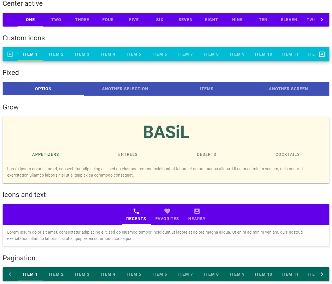
The v-tabs component is used for hiding content behind a selectable item. This can also be used as a pseudo-navigation for a page, where the tabs are links and the tab-items are the content.
<div class="v-tabs v-tabs--fixed-tabs theme--dark" file="v-tabs/prop-fixed-tabs">
<div role="tablist" class="v-item-group theme--dark v-slide-group v-tabs-bar v-tabs-bar--is-mobile white--text indigo" data-booted="true">
<div class="v-slide-group__prev v-slide-group__prev--disabled">
<!---->
</div>
<div class="v-slide-group__wrapper">
<div class="v-slide-group__content v-tabs-bar__content" style="transform: translateX(0px);">
<div class="v-tabs-slider-wrapper" style="height: 2px; left: 176px; width: 176px;">
<div class="v-tabs-slider">
</div>
</div>
<div tabindex="0" aria-selected="false" role="tab" class="v-tab"> Option </div>
<div tabindex="0" aria-selected="true" role="tab" class="v-tab v-tab--active"> Another Selection </div>
<div tabindex="0" aria-selected="false" role="tab" class="v-tab"> Items </div>
<div tabindex="0" aria-selected="false" role="tab" class="v-tab"> Another Screen </div>
</div>
</div>
<div class="v-slide-group__next v-slide-group__next--disabled">
<!---->
</div>
</div>
</div>
| Method | Description | Return Type |
|---|---|---|
| list() | Get list of tabs | WebList |
| menu() | Get list of menu items | WebList |
| icons() | Get list of icons | List<Icon> |
| navigation() | Get next button | SlideGroup |
| menuButton() | Get menu buttons | List<VuetifyButton> |
| isSelected(int) | Get if element is selected | boolean |
| isFixed() | Get if element is fixed | boolean |
| isGrow() | Get if element is grow | boolean |
| isRight() | Get if element is right | boolean |
| isVertical() | Get if element is vertical | boolean |
| isAlignWithTitle() | Get if element is align with title | boolean |
| getTabTextContent() | Get tab text content | String |
| color() | Get color | String |
| backgroundColor() | Get background color | String |
| theme() | Get theme | String |
| tabsSliderSize() | Get tabs slider size | int |
| isTabDisabled(int) | Get if tab is disabled | boolean |
| tabsSliderColor() | Get tabs slider color | String |
| tabHasHref(int) | Get if tab has href | boolean |
| getTabHref(int) | Get tab href | String |
| showArrows() | Get if element shows arrows on hover | boolean |
VuetifyTabs also implements HasColor, HasTheme
| Assert method | Description |
|---|---|
| selected(int) | Assert that tab is selected |
| notSelected(int) | Assert that tab is not selected |
| size(int) | Assert tab size |
| fixed() | Assert that tab is fixed |
| grow() | Assert that tab is grow |
| notGrow | Assert that tab is not grow |
| right() | Assert that tab is right |
| notRight() | Assert that tab is not right |
| vertical() | Assert that tab is vertical |
| notVertical() | Assert that tab is not vertical |
| tabExist(int) | Assert that tab exists |
| tabNotExist(int) | Assert that tab does not exist |
| tabTextContent(Matcher<String> condition) | Assert that tab text content is as expected |
| tabTextContentContaining(String) | Assert that tab text content contains certain text |
| alignWithTitle() | Assert that tab is align with title |
| notAlignWithTitle() | Assert that tab is not align with title |
| tabSliderSizePx(int) | Assert tab slider size |
| tabSliderColor(String) | Assert tab slider color |
| tabDisabled(int) | Assert that tab is disabled |
| tabEnabled(int) | Assert that tab is enabled |
| tabHref(int) | Assert that tab has href |
| noTabHref(int) | Assert that tab has no href |
| tabHref(int index, String href) | Assert that actual tab href is as expected |
| showArrows() | Assert that element shows arrows |
| notShowArrows() | Assert that element does not show arrows |
For examples of usage see: JDI vuetify page tests for tabs.
5.23 Icons
- Java: package com.epam.jdi.light.vuetify.elements.common.Icon.java
//@FindBy(css = "#ClickIcon .v-icon")
@UI("#ClickIcon .v-icon")
public static Icon clickIcon;
@Test(description = "Test checks that Icons are clickable")
public void clickIconTests() {
clickIcon.is().displayed().and().clickable();
clickIcon.has().type("mdi-chevron-right").and()
.height(36).and().width(36);
clickIcon.click();
clickIcon.has().alertOnIconClick("You clicked next!");
clickIcon.handleAlert();
}
Icons - The v-icon component provides a large set of glyphs to provide context to various aspects of your application.
For a list of all available icons, visit the official Material Design Icons page.
To use any of these icons simply use the mdi- prefix followed by the icon name.
Vuetify v2.6.14 code example:
<i aria-hidden="true" class="v-icon notranslate mdi mdi-domain theme--light green--text text--darken-2"
style="font-size: 36px;"></i>
Icons element includes following methods:
| Method | Description | Return Type |
|---|---|---|
| findAll(UIBaseElement<?> rootElement) | Finds all '{name}' icons | List<Icon> |
| findAll(UIElement rootElement) | Finds all '{name}' icons | List<Icon> |
| toIcon(UIElement element) | Casts '{name}' to icon | Icon |
| getMdiMap() | Gets '{name}' mdi-map | BidiMap<String, String> |
| getMdiIconName() | Gets '{name}' mdi name | String |
| getType() | Gets '{name}' type | String |
| color() | Gets '{name}' color | String |
| hasType() | Gets '{name}' type | String |
| getAlertTextOnIconClick() | Gets '{name}' alert text after clicking on it | String |
| dismissAlert() | Dismiss '{name}' alert | void |
| isEnabled() | Checks that '{name}' is enabled | boolean |
| isAccessible() | Checks that '{name}' is accessible | boolean |
| label() | Gets '{name}' label | Label |
| getCursorType() | Gets '{name}' cursor type | String |
| hasLeftAlignment() | Checks that '{name}' has left alignment | boolean |
| hasRightAlignment() | Checks that '{name}' has right alignment | boolean |
| height() | Gets '{name}' height | int |
| width() | Gets '{name}' width | int |
| maxHeight() | Gets '{name}' max height | int |
| maxWidth() | Gets '{name}' max width | int |
| minHeight() | Gets '{name}' min height | int |
| minWidth() | Gets '{name}' min width | int |
Examples of usage see on the following page: Vuetify Icon tests.
5.24 Carousels
- Java: package com.epam.jdi.light.vuetify.elements.complex.Carousel.java
//@FindBy(css = ".v-carousel#VerticalCarousel")
@UI(".v-carousel#VerticalCarousel")
public static Carousel verticalCarousel;
@Test(description = "Check if Vertical Carousel looks as expected and if it is possible to navigate through slides")
public void verticalDelimitersCarouselTest() {
verticalCarousel.show();
verticalCarousel.is().loading().and().has().loaderHeightPx(4);
verticalCarousel.progressBar().has().barColor(BLUE.value());
verticalCarousel.hasVerticalDelimiters();
verticalCarousel.has().contentText("First Slide");
verticalCarousel.goToSlide(4);
verticalCarousel.has().contentText("Fourth Slide");
}
Carousel component is used to display large numbers of visual content on a rotating timer.
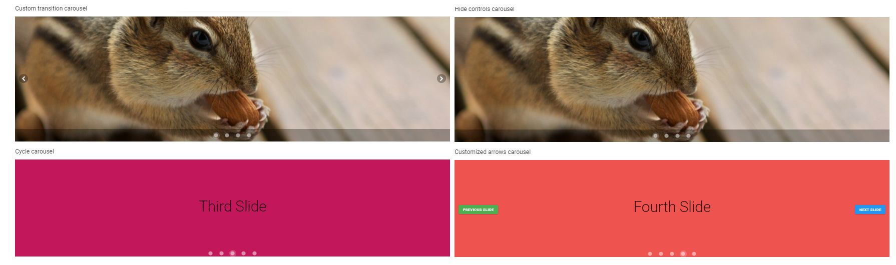
Vuetify v2.6.14 code example:
<div class="v-window v-item-group theme--dark v-carousel v-carousel--vertical-delimiters" carousel-dot-margin="8px"
id="VerticalCarousel" style="height: 400px;">
<div class="v-window__container">
<div class="v-window-item" style="">
<div class="v-image v-responsive v-carousel__item theme--light" style="height: 400px;">
<div class="v-responsive__content">
<div class="v-sheet theme--light indigo" style="height: 100%;">
<div class="row fill-height align-center justify-center">
<div class="text-h2">
First Slide
</div>
</div>
</div>
</div>
</div>
</div>
<div class="v-window-item" style="display: none;">
<div class="v-image v-responsive v-carousel__item theme--light" style="height: 400px;">
<div class="v-responsive__content">
<div class="v-sheet theme--light warning" style="height: 100%;">
<div class="row fill-height align-center justify-center">
<div class="text-h2">
Second Slide
</div>
</div>
</div>
</div>
</div>
</div>
<...>
</div>
<div class="v-carousel__controls" style="left: auto; right: auto;">
<div class="v-item-group theme--dark">
<button type="button" value="0" class="v-carousel__controls__item v-btn v-item--active v-btn--active v-btn--icon v-btn--round theme--dark v-size--small" aria-label="Carousel slide 1 of 5">
<span class="v-btn__content">
<i aria-hidden="true" class="v-icon notranslate mdi mdi-circle theme--dark" style="font-size: 18px;"></i>
</span>
</button>
<button type="button" value="1" class="v-carousel__controls__item v-btn v-btn--icon v-btn--round theme--dark v-size--small" aria-label="Carousel slide 2 of 5">
<span class="v-btn__content">
<i aria-hidden="true" class="v-icon notranslate mdi mdi-circle theme--dark" style="font-size: 18px;"></i>
</span>
</button>
<...>
</div>
</div>
<div role="progressbar" aria-valuemin="0" aria-valuemax="100" aria-valuenow="20" class="v-progress-linear v-carousel__progress v-progress-linear--visible theme--dark" style="height: 4px;">
<div class="v-progress-linear__background blue" style="opacity: 0.3; left: 20%; width: 80%;"></div>
<div class="v-progress-linear__buffer"></div>
<div class="v-progress-linear__determinate blue" style="width: 20%;"></div>
</div>
</div>
| Method | Description | Return Type |
|---|---|---|
| delimiters() | Get Carousel's delimiters | ButtonGroup |
| nextButton() | Get Carousel's 'next' button | VuetifyButton |
| previousButton() | Get Carousel's 'previous' button | VuetifyButton |
| progressBar() | Get Carousel's progress bar | VuetifyButton |
| getDelimitersIcons() | Get Carousel delimiter's icons | List<Icon> |
| slideCounter() | Get Carousel's slide counter | Text |
| goToSlide(int slideNumber) | Go to slide number | void |
| getAllSlides() | Get all Carousel's slides | List<WebElement> |
| plusButton() | Get Carousel's 'plus' button | VuetifyButton |
| minusButton() | Get Carousel's 'minus' button | VuetifyButton |
| showArrowsOnHover() | Get if Carousel shows arrows on hover | boolean |
| hideDelimiters() | Get if Carousel hides delimiters | boolean |
| getLoaderHeight() | Get Carousel loader's height | int |
In addition, Carousel implements IsText, HasImage, HasColor, HasTheme, IsLoading, HasMeasurement.
| Assert method | Description |
|---|---|
| contentText(String text) | Assert that Carousel has required text |
| showArrowsOnHover() | Assert that Carousel shows arrows on hover |
| notShowArrowsOnHover() | Assert that Carousel doesn't show arrows on hover |
| delimitersHidden() | Assert that Carousel hides delimiters |
| notDelimitersHidden() | Assert that Carousel does not hides delimiters |
| verticalDelimiters() | Assert that Carousel has vertical delimiters |
| horizontalDelimiters() | Assert that Carousel has horizontal delimiters |
| loaderHeightPx(int height) | Assert that Carousel has expected loader height |
For examples of usage see: Vuetify Carousel tests.
5.25 Navigation Drawers
- Java: package com.epam.jdi.light.vuetify.elements.complex.NavigationDrawer.java
//@FindBy(css = "#ImagesNavigationDrawer .v-navigation-drawer")
@UI("#ImagesNavigationDrawer .v-navigation-drawer")
public static NavigationDrawer imagesNavigationDrawer;
@Test(description = "Test checks that drawer has expected text and expected number of options")
public void itemsTextNavigationDrawerTest() {
List<String> expectedItems = Arrays.asList("Inbox", "Supervisors", "Clock-in");
imagesNavigationDrawer.show();
imagesNavigationDrawer.is().displayed();
imagesNavigationDrawer.has().text(expectedItems);
imagesNavigationDrawer.has().itemSize(3);
imagesNavigationDrawer.is().absolute();
}
The v-navigation-drawer component is what your users will utilize to navigate through the application.
The navigation-drawer is pre-configured to work with or without vue-router right out the box.
For the purpose of display, some examples are wrapped in a v-card element.
Within your application you will generally place the v-navigation-drawer as a direct child of v-app.
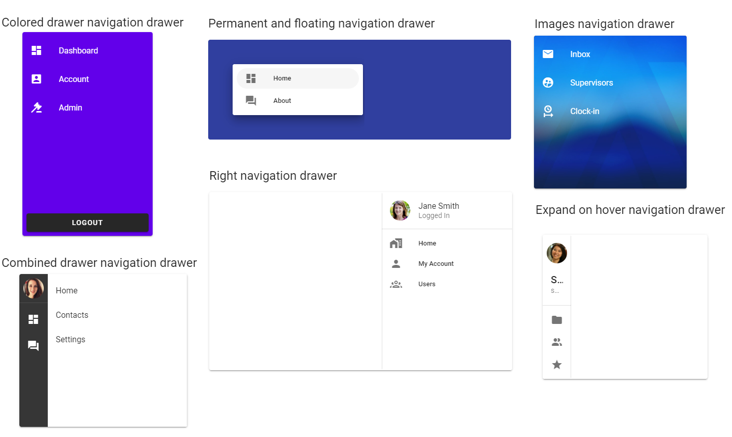
Vuetify v2.6.14 code example:
<div class="v-navigation-drawer__content">
<div role="list" class="v-list v-sheet theme--dark">
<div tabindex="0" role="listitem" class="v-list-item v-list-item--link theme--dark">
<div class="v-list-item__icon"><i aria-hidden="true" class="v-icon notranslate mdi mdi-email theme--dark"></i></div>
<div class="v-list-item__content">
<div class="v-list-item__title">Inbox</div>
</div>
</div>
<div tabindex="0" role="listitem" class="v-list-item v-list-item--link theme--dark">
<div class="v-list-item__icon">
<i aria-hidden="true" class="v-icon notranslate mdi mdi-account-supervisor-circle theme--dark"></i></div>
<div class="v-list-item__content">
<div class="v-list-item__title">Supervisors</div>
</div>
</div>
<div tabindex="0" role="listitem" class="v-list-item v-list-item--link theme--dark">
<div class="v-list-item__icon">
<i aria-hidden="true" class="v-icon notranslate mdi mdi-clock-start theme--dark"></i></div>
<div class="v-list-item__content">
<div class="v-list-item__title">Clock-in</div>
</div>
</div>
</div>
</div>
| Method | Description | Return Type |
|---|---|---|
| items() | Returns NavigationDrawer's list items | List<ListItem> |
| itemsText() | Returns NavigationDrawer's list items text | List<String> |
| overlay() | Returns NavigationDrawer overlay | Overlay |
| get(int index) | Returns NavigationDrawer's list item on index {0} | ListItem |
| get(String title) | Returns NavigationDrawer's list item by title {0} | ListItem |
| size() | Returns NavigationDrawer's number of items | int |
| isExpanded() | Returns if NavigationDrawer is expanded | boolean |
| isCollapsed() | Returns if NavigationDrawer is collapsed | boolean |
| isClosed() | Returns if NavigationDrawer is closed | boolean |
| isOpened() | Returns if NavigationDrawer is opened | boolean |
| isRight() | Returns if NavigationDrawer is located on the right | boolean |
| backgroundImage() | Returns NavigationDrawer's background image (in RGBA format) | Image |
| backgroundColor() | Returns NavigationDrawer's background color | String |
| button() | Returns NavigationDrawer's button | VuetifyButton |
| width() | Returns NavigationDrawer's width | boolean |
| height() | Returns NavigationDrawer's height | boolean |
| isAbsolute() | Returns if NavigationDrawer is absolute | boolean |
| isBottom() | Returns if NavigationDrawer is bottom | boolean |
| isClipped() | Returns if NavigationDrawer is clipped | boolean |
| isExpandedOnHover() | Returns if NavigationDrawer is expanded on hover | boolean |
| isFloating() | Returns if NavigationDrawer is floating | boolean |
| isMiniVariant() | Returns if NavigationDrawer is mini-variant | boolean |
| isTemporary() | Returns if NavigationDrawer is temporary | boolean |
In addition, NavigationDrawer implements HasClick, HasTheme
| Assert method | Description |
|---|---|
| displayed() | Assert that NavigationDrawer is displayed |
| itemSize(int value) | Assert that NavigationDrawer has expected number of items |
| collapsed() | Assert that NavigationDrawer is collapsed |
| expanded() | Assert that NavigationDrawer is expanded |
| opened() | Assert that NavigationDrawer is opened |
| closed() | Assert that NavigationDrawer is closed |
| right() | Assert that NavigationDrawer is located on the right side |
| backgroundColor(String color) | Assert that NavigationDrawer has expected background color |
| text(List<String> values) | Check NavigationDrawer text of items |
| absolute() | Assert that NavigationDrawer is absolute |
| bottom() | Assert that NavigationDrawer is bottom |
| clipped() | Assert that NavigationDrawer is clipped |
| floating() | Assert that theme of NavigationDrawer is floating |
| height(int height) | Assert that NavigationDrawer height is passed parameter |
| width(int width) | Assert that NavigationDrawer width is passed parameter |
| temporary() | Assert that theme of NavigationDrawer is temporary |
| permanent() | Assert that theme of NavigationDrawer is permanent |
| miniVariant() | Assert that theme of NavigationDrawer is mini-variant |
| overlay() | Assert that NavigationDrawer has overlay |
| noOverlay() | Assert that NavigationDrawer has no overlay |
| expandedOnHover() | Assert that theme of NavigationDrawer is expanded on hover |
In addition, NavigationDrawerAssert implements ThemeAssert
For examples of usage see: JDI Vuetify Navigation Drawers tests.
5.26 Tooltips
Java: package com.epam.jdi.light.vuetify.elements.common.Tooltip.java
//@FindBy(css = "div.v-tooltip__content")
@UI("div.v-tooltip__content")
public static Tooltip tooltip;
@Test(description = "Test checks specific text of text tooltip")
public void textTooltipsTest() {
homeIconWithTooltip.is().displayed();
buttonWithTooltip.hover();
tooltip.is().displayed();
tooltip.has().text("Tooltip for \"Button\"");
homeIconWithTooltip.hover();
tooltip.is().displayed();
tooltip.has().text("Tooltip for \"mdi-home\"");
textWithTooltip.hover();
tooltip.is().displayed();
tooltip.has().text("Tooltip for \"This text has a tooltip\"");
}
@Test(dataProvider = "colorsTooltipsTestDataProvider", dataProviderClass = TooltipsTestsDataProvider.class,
description = "Test checks that tooltip has specific color")
public void colorTooltipTest(int index, String color) {
coloredButtons.get(index).hover();
tooltip.is().displayed();
tooltip.has().color(color);
}
Tooltip - Tooltip is useful for conveying information when a user hovers over an element. Its display can be controlled programmatically. When activated, tooltips display a text label identifying an element, such as a description of its function.
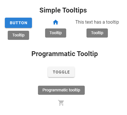
Vuetify v2.6.14 code example:
<div data-app="true" id="app" class="v-application v-application--is-ltr theme--light">
<div class="v-application--wrap">...</div>
<div class="v-tooltip__content" style="left: 436px; top: 242px; z-index: 8; display: none;"> <span>Tooltip for "Button"</span></div>
<div class="v-tooltip__content" style="left: 313px; top: 309px; z-index: 8; display: none;"> <span>Left tooltip</span></div>
</div>
| Method | Description | Return Type |
|---|---|---|
| is() | Returns Assert class | TooltipAssert |
| has() | Returns Assert class | TooltipAssert |
| color() | Returns css attribute background-color as String Value | String |
| classes() | Gets all element's classes as list | List<String> |
| doubleClick() | Double clicks on the element | void |
| dragAndDropTo(int x, int y) | Drags and drops element to certain coordinates | void |
| dragAndDropTo(WebElement to) | Drags and drops element to another element | void |
| focus() | Focuses on element | void |
| getLocation() | Gets element location as point | Point |
| getSize() | Gets element size | Dimension |
| getTagName() | Gets element tag name | String |
| getText() | Gets element text | String |
| getValue() | Gets element text | String |
| hasAttribute(String attrName) | Returns true if the element has an expected attribute | boolean |
| hasClass(String className) | Returns true if the element has an expected class | boolean |
| highlight() | Highlights element with red color | void |
| highlight(String color) | Scrolls view to element and highlights it with a border of specified color | void |
| hover() | Hovers mouse cursor over the element | void |
| isDisabled() | Checks that element is disabled | boolean |
| isDisplayed() | Checks that element is displayed | boolean |
| isEnabled() | Checks that element exists | boolean |
| isHidden() | Checks that element is hidden | boolean |
| isNotExist() | Checks that element does not exist | boolean |
| isNotVisible() | Checks that element is not visible by user | boolean |
| isVisible() | Checks that element is visible by user | boolean |
| jsExecute(String jsCode) | Executes JavaScript code | String |
| labelText() | Gets label text | String |
| printHtml() | Gets element “innerHTML” attribute value | String |
| rightClick() | Right clicks on the element | void |
| setAttribute(String name, String value) | Sets value to the specified attribute | void |
| show() | Scrolls screen view to item | void |
For examples of usage see: Tooltips tests.
5.27 Progress
5.27.1 Progress circular
//@FindBy(css = "#ColorProgress .v-progress-circular"
@UI("#ColorProgress .v-progress-circular")
public static List<ProgressCircular> colorProgressCirculars;
@Test(dataProvider = "colorProgressCircularsTestsDataProvider", dataProviderClass = ProgressCircularDataProvider.class,
description = "Test checks parameters of progress circular")
public void colorProgressCircularsTests(int index, String color, int height, int width, int value) {
colorProgressCirculars.get(index).is()
.displayed()
.notSpinning()
.color(color)
.height(height)
.width(width)
.value(value)
.text(String.valueOf(index));
}
//@FindBy(css = "#SizeWidthProgress .v-progress-circular"
@UI("#SizeWidthProgress .v-progress-circular")
public static List<ProgressCircular> sizeWidthProgressCirculars;
@Test(dataProvider = "sizeWidthProgressCircularsTestsDataProvider", dataProviderClass = ProgressCircularDataProvider.class,
description = "Test checks size and width of progress circular")
public void sizeWidthProgressCircularsTests(int index, String color, int height, int width, int thickness) {
sizeWidthProgressCirculars.get(index).is()
.displayed()
.spinning()
.color(color)
.height(height)
.width(width)
.thickness(thickness);
}
- Java: package com.epam.jdi.light.vuetify.elements.common.ProgressCircular.java
Progress circular - The v-progress-circular component is used to convey data circularly to users. It also can be put into an indeterminate state to portray loading.
Vuetify v2.6.14 code example:
<div data-v-ce46f1fc="" class="text-center" file="v-progress-circular/prop-color">
<div data-v-ce46f1fc="" role="progressbar" aria-valuemin="0" aria-valuemax="100" aria-valuenow="100" class="v-progress-circular v-progress-circular--visible blue-grey--text" style="height: 32px; width: 32px;">
<svg xmlns="http://www.w3.org/2000/svg" viewBox="22.857142857142858 22.857142857142858 45.714285714285715 45.714285714285715" style="transform: rotate(0deg);">
<circle fill="transparent" cx="45.714285714285715" cy="45.714285714285715" r="20" stroke-width="5.714285714285714" stroke-dasharray="125.664" stroke-dashoffset="0" class="v-progress-circular__underlay">
</circle>
<circle fill="transparent" cx="45.714285714285715" cy="45.714285714285715" r="20" stroke-width="5.714285714285714" stroke-dasharray="125.664" stroke-dashoffset="0px" class="v-progress-circular__overlay">
</circle>
</svg>
<div class="v-progress-circular__info">
</div>
</div>
<div ...
</div>
</div>
| Method | Description | Return Type |
|---|---|---|
| is() | Returns Assert class | ProgressCircularAssert |
| has() | Returns Asserts class | ProgressCircularAssert |
| getRotate() | Returns value of the element's start angle | int |
| getText() | Returns element text | String |
| getThickness() | Returns value element's line thickness | int |
| getValue() | Returns element value | int |
| displayed() | Asserts that element is displayed | ProgressCircularAssert |
| color() | Asserts that element has expected color | ProgressCircularAssert |
| hasColor() | Returns color of the element in rgba | String |
| hasNoLabel() | Asserts that element has no label | ProgressCircularAssert |
| height() | Returns height of the element | String |
| height() | Asserts that element has expected height | ProgressCircularAssert |
| isSpinning() | Shows that element is spinning | boolean |
| notSpinning() | Asserts that element is not spinning | ProgressCircularAssert |
| spinning() | Asserts that element is spinning | ProgressCircularAssert |
| rotate() | Asserts that element has expected start angle | ProgressCircularAssert |
| text() | Asserts that element has expected text | ProgressCircularAssert |
| thickness() | Asserts that element has expected line thickness | ProgressCircularAssert |
| value() | Asserts that element has expected value | ProgressCircularAssert |
| width() | Asserts that element has expected width | String |
Java Progress Circular test examples
5.27.2 Progress linear
Progress linear is located in the following class:
- Java: package com.epam.jdi.light.vuetify.elements.common.ProgressLinear.java
//@FindBy(css = "#QueryProgress .v-progress-linear")
@UI("#QueryProgress .v-progress-linear")
public static ProgressLinear queryProgressLinear;
@Test(description = "Test checks absolute value of progress linear and checks if it is hidden : value")
public void absoluteValueHiddenProgressLinearTests() {
queryProgressLinear.show();
Timer.waitCondition(() -> queryProgressLinear.getValue() == 25);
queryProgressLinear.has().value(25.0);
Timer.waitCondition(() -> queryProgressLinear.getValue() == 50);
queryProgressLinear.has().value(50.0);
Timer.waitCondition(() -> queryProgressLinear.getValue() == 75);
queryProgressLinear.has().value(75.0);
Timer.waitCondition(() -> queryProgressLinear.getValue() == 100);
queryProgressLinear.has().value(100.0);
Timer.waitCondition(queryProgressLinear::isHidden);
queryProgressLinear.is().hidden();
Timer.waitCondition(queryProgressLinear::isDisplayed);
queryProgressLinear.has().valueMax(100.0);
}
Progress linear component is used to convey data circularly to users. They can also represent an indeterminate amount, such as loading or processing.
Vuetify v2.6.14 code example:
<div role="progressbar" aria-valuemin="0" aria-valuemax="0" aria-valuenow="0" class="v-progress-linear v-progress-linear--visible theme--light" style="height: 4px;">
<div class="v-progress-linear__stream red--text text--lighten-2" style="width: 100%;"></div>
<div class="v-progress-linear__background red lighten-2" style="opacity: 0.3; left: 0%; width: 0%;"></div>
<div class="v-progress-linear__buffer" style="width: 0%;"></div>
<div class="v-progress-linear__determinate red lighten-2" style="width: 0%;"></div>
</div>
| Method | Description | Return Type |
|---|---|---|
| hasBarColor() | Returns color of the bar in rgba | String |
| backgroundColor() | Returns background bar color in rgba | String |
| isDeterminate() | Shows that bar is determinate | boolean |
| isIndeterminate() | Shows that bar is indeterminate | boolean |
| isReactive() | Shows that bar is reactive | boolean |
| isRounded() | Shows that bar is rounded | boolean |
| isStriped() | Shows that bar is striped | boolean |
| getValue() | Returns bar's value | Double |
| getMaxValue() | Returns bar's max value | Double |
| hasStream() | Shows that bar has stream | boolean |
For examples of usage see: Progress linear tests.
5.28 Menus
Menus are located in the following class:
- Java: package com.epam.jdi.light.vuetify.elements.complex.Menu.java
//@FindBy(css = "div.menuable__content__active")
@UI("div.menuable__content__active")
public static Menu activeMenu;
@Test(description = "Test checks that active menu appears after hover upon the button")
public void openOnHoverMenuTests() {
waitCondition(openOnHoverMenuButton::isDisplayed);
openOnHoverMenuButton.show();
openOnHoverMenuButton.hover();
activeMenu.is().displayed()
.and().countOfOptions(4)
.and().optionsTitles(OPTIONS_TITLES);
openOnHoverMenuButton.click();
activeMenu.is().displayed();
offsetXMenuButton.hover();
activeMenu.is().hidden();
}
Menu component shows a menu at the position of the element that was used to activate it.
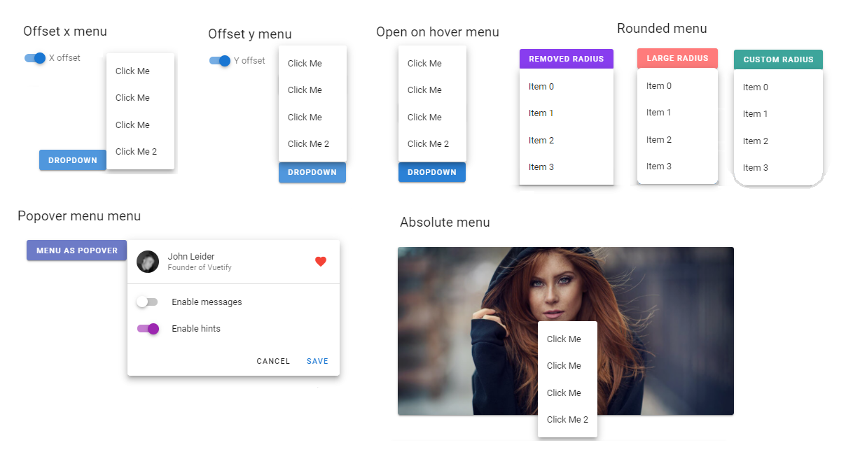
Vuetify v2.6.14 code example:
<div role="menu" class="v-menu__content theme--light menuable__content__active" style="min-width: 121px; top: 767px; left: 562px; transform-origin: left top; z-index: 8;">
<div class="v-list v-sheet theme--light">
<div tabindex="-1" id="list-item-196" class="v-list-item theme--light">
<div class="v-list-item__title">Click Me</div>
</div>
<div tabindex="-1" id="list-item-197" class="v-list-item theme--light">
<div class="v-list-item__title">Click Me</div>
</div>
<div tabindex="-1" id="list-item-198" class="v-list-item theme--light">
<div class="v-list-item__title">Click Me</div>
</div>
<div tabindex="-1" id="list-item-199" class="v-list-item theme--light">
<div class="v-list-item__title">Click Me 2</div>
</div>
</div>
</div>
| Method | Description | Return Type |
|---|---|---|
| close() | Closes menu | void |
| topPosition() | Returns amount of pixels from top | int |
| leftPosition() | Returns amount of pixels from left | int |
| countOfOptions() | Returns number of options in menu | int |
| optionsTitles() | Returns list of titles of options in menu | List<String> |
| items() | Returns items list | List<String> |
| hasRemovedRadius() | Shows that menu has removed radius | boolean |
| hasLargeRadius() | Shows that menu has large radius | boolean |
For examples of usage see: Menus tests.
5.29 Images
Image is located in the following class:
- Java: package com.epam.jdi.light.vuetify.elements.common.Image.java
//@FindBy(xpath = "//*[contains(text(), 'Placeholder image')]")
@WithText("Placeholder image")
public static UIElement placeholderImageContainer;
//@FindBy(css = "#GradientsImage .v-image")
@UI("#GradientsImage .v-image")
public static Image gradientImage;
@Test(description = "Test checks image max height and width, and expected source")
public void maxMeasurementImageTest() {
placeholderImageContainer.show();
placeholderImage.has().maxHeight(300).and().maxWidth(500);
placeholderImage.has().sourcePath("https://jdi-testing.github.io/jdi-light/vuetify/pictures/placeholder_60.jpeg");
}
Image - The v-img component is packed with features to support rich media.
Combined with the vuetify-loader, you can add dynamic progressive images to provide a better user experience.
Vuetify v2.6.14 code example:
<div class="v-image v-responsive theme--light" aria-label="alternate-text-here" role="img" >
<div class="v-responsive__sizer" style="padding-bottom: 60%;"></div>
<div class="v-image__image v-image__image--cover" style="background-image: url("https://source.for.image/goes?here"); background-position: center center;"></div>
<div class="v-image__placeholder">
<div class="v-responsive__content style="width: 1600px;">
<div data-v-6b11fdaf="" class="fill-height repeating-gradient"></div>
</div>
</div>
| Method | Description | Return Type |
|---|---|---|
| alternateText() | Returns image alternate text if present | String |
| getSourcePath() | Returns path to source image | String |
| isContain() | Returns true if image is set to preserve its original aspect ratio | boolean |
| hasGradient() | Shows that image has gradient | boolean |
| hasPlaceholder() | Shows that image has placeholder (shown while image is loading) | boolean |
| Assert method | Description |
|---|---|
| altText(String expectedText) | Assert if image has expected alternate test |
| contain() | Assert if image is set to preserve its original aspect ratio |
| notContain() | Assert if image is not set to preserve its original aspect ratio |
| displayed() | Assert if image is displayed |
| sourcePath(String expectedSourcePath) | Assert if image has expected source path |
| gradient() | Assert if image has gradient over |
| noGradient() | Assert if image has no gradient over |
| placeholder() | Assert if image has loader placeholder (loader overlay) |
| noPlaceholder() | Assert if image has no loader placeholder (loader overlay) |
Image also have basic JDI elements methods and asserts for Measurements and Theme
For examples of usage see: JDI Vuetify Images tests.
5.30 Timelines
Java:
- com.epam.jdi.light.vuetify.elements.complex.timelines.TimeLine.java
- com.epam.jdi.light.vuetify.elements.complex.timelines.TimeLineItem.java
//@FindBy(css = "#AdvancedTimeline .v-timeline")
@JDITimeLine(root = "#AdvancedTimeline .v-timeline")
public static TimeLine<OrderLine, UIElement> advancedTimeline;
@Test(description = "Check if Advanced Timeline increases its size by 1 item with text which was posted in the first item input")
public void advancedTimeLineTest(){
advancedTimeline.show();
advancedTimeline.has().size(8);
advancedTimeline.defaultItem(2).body().has().text("TODAY");
advancedTimeline.defaultItem(1).body().find("input").sendKeys("Test text");
advancedTimeline.defaultItem(1).body().find("button").click();
advancedTimeline.has().size(9);
advancedTimeline.item(2).body().message().has().text("Test text");
}
You can specify locators for the TimeLine by using JDITimeLine annotation:
Locator in JDITimeLine |
Description |
|---|---|
root |
used to set the root of the TimeLine |
items |
used to find TimeLineItems in the TimeLine |
body |
used to set body of each TimeLineItem |
divider |
used to set divider of each TimeLineItem |
opposite |
used to set opposite of each TimeLineItem |
It is necessary to specify the root of an element.
Vuetify v2.6.14 code example:
<div class="v-timeline v-timeline--dense theme--light">
<span>
<div class="v-timeline-item v-timeline-item--fill-dot theme--light">
<div class="v-timeline-item__body">
<div role="alert" class="v-alert white--text v-sheet theme--light info">
<div class="v-alert__wrapper">
<i aria-hidden="true" class="v-icon notranslate v-alert__icon mdi mdi-information theme--light"></i>
<div class="v-alert__content">
Lorem ipsum dolor sit amet, no nam oblique veritus.
Commune scaevola imperdiet nec ut, sed euismod convenire principes at.
Est et nobis iisque percipit, an vim zril disputando voluptatibus, vix an salutandi sententiae.
</div>
</div>
</div>
</div>
<div class="v-timeline-item__divider">
<div class="v-timeline-item__dot v-timeline-item__dot--small">
<div class="v-timeline-item__inner-dot info"></div>
</div>
</div>
</div>
</span>
</div>
The TimeLine is used for stylistically displaying chronological information.
| Method | Description | Return Type |
|---|---|---|
| isAlignTop() | Get if Timelines is align to top | boolean |
| isReversed() | Get if Timelines is reverse | boolean |
| items() | Get list of items from Timelines | List<TimeLineItem |
| item(int index) | Get item by required index from Timelines | TimeLineItem<T, U> |
| defaultItem(int index) | Get default item by required index from Timelines | TimeLineItem<UIElement, UIElement> |
| setup(Field field) | Setting up Timleines by field | void |
In addition, TimeLine implements ISetup, IsDense.
| Assert method | Description |
|---|---|
| alignTop() | Assert that Timelines is align to top |
| notAlignTop() | Assert that Timelines is not align to top |
| reversed() | Assert that Timelines is reversed |
| notReversed() | Assert that Timelines is not reversed |
Besides, TimeLineAssert implements DenseAssert
Also, there are Assert methods for Timeline Item:
| Assert method | Description |
|---|---|
| smallDot() | Assert that Timelines Item is small |
| largeDot() | Assert that Timelines Item is large |
| dotColor(Enum<?> color) | Assert that dot color of Timelines Item is equal to required |
For examples of usage see: JDI Vuetify TimeLine tests.
5.31 Pickers
5.31.1 Time pickers
- Java: com.epam.jdi.light.vuetify.elements.complex.TimePicker.java
//@FindBy(css = "#TimePicker")
@JTimePicker("#TimePicker")
public static TimePicker timePicker;
@Test (description = "Test checks that time picker has expected disabled hours")
public void test(){
timePicker.show();
timePicker.setTime("14:53:48");
timePicker.has()
.title("2:53:48PM")
.time(LocalTime.parse("14:53:48"))
.hours(2)
.minutes(53)
.pmPeriod()
.format12()
.darkTheme();
timePicker.switchToMinutes();
timePicker.has().selectedNumber(53);
timePicker.scroll(13);
timePicker.has().selectedNumber(40);
}
The v-time-picker is stand-alone component that can be utilized in many existing Vuetify components. It offers the user a visual representation for selecting the time.
Vuetify v2.6.14 code example:
<div class="v-picker v-card v-picker--time theme--light">
<div class="v-picker__title primary">
<div class="v-time-picker-title">
<div class="v-time-picker-title__time">
<div class="v-picker__title__btn">2</div>
<span>:</span>
<div class="v-picker__title__btn v-picker__title__btn--active">53</div>
<span>:</span>
<div class="v-picker__title__btn">48</div>
</div>
<div class="v-time-picker-title__ampm v-time-picker-title__ampm--readonly">
<div class="v-picker__title__btn v-picker__title__btn--active">PM</div>
</div>
</div>
</div>
<div class="v-picker__body theme--light" style="width: 290px;">
<div class="v-time-picker-clock__container">
<div class="v-time-picker-clock__ampm primary--text">
<div class="v-picker__title__btn v-picker__title__btn--active">PM</div>
<div class="v-picker__title__btn">PM</div>
</div>
<div class="v-time-picker-clock theme--light">
<div class="v-time-picker-clock__inner">
<div class="v-time-picker-clock__hand accent" style="transform: rotate(318deg) scaleY(1);"></div>
<span class="v-time-picker-clock__item" style="left: 50%; top: 0%;">
<span>00</span>
</span>
<span class="v-time-picker-clock__item" style="left: 75%; top: 6.69873%;">
<span>05</span>
</span>
<!-- clock face numbers 10 .. 45 -->
<span class="v-time-picker-clock__item" style="left: 6.69873%; top: 25%;">
<span>50</span>
</span>
<span class="v-time-picker-clock__item" style="left: 25%; top: 6.69873%;">
<span>55</span>
</span></div>
</div>
</div>
</div>
</div>
| Method | Description | Return Type |
|---|---|---|
| setTime(String time) | Sets Time Picker to provided time (time string in ISO-8601 extended local time format) | void |
| setTime(LocalTime time) | Sets Time Picker to provided time | void |
| setTime(int hours, int minutes) | Sets Time Picker to provided hours and minutes | void |
| setTime(int hours, int minutes, int seconds) | Sets Time Picker to provided hours, minutes, seconds | void |
| select(int number) | Selects number on a currently shown clock face | void |
| setHours(int hours) | Switches Time Picker to hours (selects AM/PM if needed) and set hours (0-23) | void |
| setMinutes(int minutes) | Switches TimeP icker to minutes and sets minutes (0-59) | void |
| setSeconds(int seconds) | Switches Time Picker to seconds and sets seconds (0-59) | void |
| hasSeconds() | Returns true if Time Picker configured to show seconds | boolean |
| switchToAM() | Switches Time picker to AM | void |
| switchToPM() | Switches Time Picker to PM | void |
| switchToHours() | Switches Time Picker to hours selector | void |
| switchToMinutes() | Switches Time Picker to minutes selector | void |
| switchToSeconds() | Switches Time Picker to seconds selector | void |
| titleText() | Returns Time Picker time from title as is, without formatting ('17:01', '5:01:08PM') | String |
| titleTime() | Returns Time Picker time from title as LocalTime object | LocalTime |
| titleHours() | Returns Time Picker time hours | int |
| titleMinutes() | Returns Time Picker time minutes | int |
| titleSeconds() | Returns Time Picker time seconds | int |
| is12h() | Returns true if Time Picker is 12h or false if 24h | boolean |
| amPmPeriod() | Returns currently selected AM/PM period "AM" or "PM" | String |
| clockNumbers() | Returns all numbers shown on the clock face | List<Integer> |
| enabledClockNumbers() | Returns enabled numbers on the Clock face | List<Integer> |
| disabledClockNumbers() | Returns disabled numbers on the Clock face | List<Integer> |
| selectedNumber() | Returns currently selected number on the Clock face | int |
| titleBackgroundColor() | Returns background color of the Time Picker title (hex) | String |
| isLandscape() | Checks if the Time Picker displayed in landscape mode | boolean |
| title() | Returns JDI UIElement representing title | UIElement |
| clock() | Returns JDI UIElement representing clock face | UIElement |
| Assert method | Description |
|---|---|
| title(String titleTime) | Asserts that title has expected text |
| time(LocalTime time) | Asserts that title has expected title |
| hours(int hours) | Asserts that title has expected hours |
| minutes(int minutes) | Asserts that title has expected minutes |
| seconds(int seconds) | Asserts that title has expected seconds |
| disabledNumbers(Integer... expectedDisabledNumbers) | Asserts that clock face has expected disabled numbers (only shown) |
| enabledNumbers(Integer... expectedEnabledNumbers) | Asserts that clock face has expected enabled numbers (only shown) |
| selectedNumber(int expectedSelectedNumber) | Asserts that clock face has expected selected number (or clock hand points to expected number) |
| format12() | Asserts that clock has 12h format |
| format24() | Asserts that clock has 24h format |
| amPeriod() | Asserts that 12h format clock is set to AM |
| pmPeriod() | Asserts that 24h format clock is set to PM |
| landscape() | Asserts that Time Picker is in landscape orientation |
| notLandscape() | Asserts that Time Picker is not in landscape orientation |
Time Picker also has basic JDI elements methods and asserts for Color, Theme, Elevation, Measurements and others. For examples of usage see: JDI Vuetify TimePickers tests.
5.31.2 Date pickers
- Java: com.epam.jdi.light.vuetify.elements.complex.DatePicker.java
//@FindBy(css = "#OrientationDatePicker .v-picker")
@JDatePicker(root = "#OrientationDatePicker .v-picker")
public static DatePicker orientationDatePicker;
@Test (description = "Test checks date picker's orientation")
public void testOrientationDatePicker() {
orientationDatePicker.show();
orientationDatePicker.has().portraitOrientation();
orientationSwitcher.check();
orientationDatePicker.has().landscapeOrientation();
}
It is necessary to specify the root of an element. Also, if you work with expandable date pickers (such as active pickers, dialog and menu pickers etc), you have to define expandedRoot.
Vuetify v2.6.14 code example:
<div class="v-picker v-card v-picker--date theme--dark">
<div class="v-picker__title">
<div class="v-date-picker-title">
<div class="v-picker__title__btn v-date-picker-title__year">2023</div>
<div class="v-picker__title__btn v-date-picker-title__date v-picker__title__btn--active">
<div>Wed, Mar 1</div>
</div>
</div>
</div>
<div class="v-picker__body theme--dark" style="width: 290px;">
<div>
<div class="v-date-picker-header theme--dark">
<button type="button" class="v-btn v-btn--icon v-btn--round theme--dark v-size--default" aria-label="Previous month">
<span class="v-btn__content">
<i aria-hidden="true" class="v-icon notranslate mdi mdi-chevron-left theme--dark"></i>
</span>
</button>
<div class="v-date-picker-header__value">
<div class="accent--text">
<button type="button">March 2023</button>
</div>
</div>
<button type="button" class="v-btn v-btn--icon v-btn--round theme--dark v-size--default" aria-label="Next month">
<span class="v-btn__content">
<i aria-hidden="true" class="v-icon notranslate mdi mdi-chevron-right theme--dark"></i>
</span>
</button>
</div>
<div class="v-date-picker-table v-date-picker-table--date theme--dark">
<table>
<thead>
<tr>
<th>S</th>
<th>M</th>
<...>
</tr>
</thead>
<tbody>
<tr>
<td></td>
<td></td>
<td></td>
<td>
<button type="button" class="v-btn v-btn--text v-btn--rounded theme--dark">
<div class="v-btn__content">1</div>
</button>
</td>
<...>same for 2-4<...>
</tr>
<tr>
<td>
<button type="button" class="v-btn v-btn--text v-btn--rounded theme--dark">
<div class="v-btn__content">5</div>
</button>
</td>
<...>same for 6-11<...>
</tr>
<tr>
<...>same as previous tr block<...>
</tr>
<tr>
<...>dates 19-23 as 25<...>
<td>
<button type="button" class="v-btn v-date-picker-table__current v-btn--rounded v-btn--outlined theme--dark accent--text">
<div class="v-btn__content">24</div>
</button>
</td>
<td>
<button type="button" class="v-btn v-btn--text v-btn--rounded theme--dark">
<div class="v-btn__content">25</div>
</button>
</td>
</tr>
<tr>
<td>
<button type="button" class="v-btn v-btn--text v-btn--rounded theme--dark">
<div class="v-btn__content">26</div>
</button>
</td>
<...>same as 27-31<...>
<td></td>
</tr>
</tbody>
</table>
</div>
</div>
</div>
</div>
The Date picker is a fully featured date selection component that lets users select a date, or range of dates.
| Method | Description | Return Type |
|---|---|---|
| setup(String rootLocator, String expandedRootLocator) | Setting up Date pickers by rootLocator and expandedRootLocator | DatePicker |
| root() | Returns root of Date pickers | UIElement |
| expandedRoot() | Returns expanded root of Date pickers | UIElement |
| expand() | Expand Date pickers | void |
| toNextMonth() | Click Date pickers next month button | void |
| toPreviousMonth() | Click Date pickers previous month button | void |
| selectDay(final String date) | Select Date pickers day of month | void |
| getMonthAndYear() | Get Date pickers shown month and year | String |
| getMonth() | Get Date pickers shown month | String |
| getMonth(Locale locale) | Get Date pickers shown month based on locale | String |
| getYear() | Get Date pickers shown year | String |
| getYear(Locale locale) | Get Date pickers shown year based on locale | String |
| getDate() | Get Date pickers shown date | String |
| getDayOfMonth() | Get Date pickers shown day of month | String |
| getDayOfMonth(Locale locale) | Get Date pickers shown day of month based on locale | String |
| getActiveDayOfMonth() | Get Date pickers active day of month | String |
| changeMonth() | Click Date pickers change month button | void |
| selectMonth(String month) | Select Date pickers month | void |
| changeYear() | Click Date pickers change year button | void |
| selectYear(final String year) | Select Date pickers year | void |
| getResultDate() | Get Date pickers result date in the field | String |
| getCode() | Get Date pickers code for active date picker | String |
| getClearButton() | Get Date pickers clear button | UIElement |
| clear() | Clear Date pickers date input field | void |
| setDate(final String date) | Set Date pickers value to required in date input field | void |
| getFormattedDate() | Get Date pickers ISO formatted date | String |
| getDateFieldReadonlyAttribute() | Get Date pickers readonly attribute of date field | String |
| changeYearCornerButton() | Click Date pickers small change year button in the upper left corner | void |
| getColor() | Get Date pickers color from color field | String |
| getDisabledDates() | Get Date pickers list of disabled dates | List<String> |
| getEnabledDates() | Get Date pickers list of enabled dates | List<String> |
| getEnabledDatesElements() | Get Date pickers list of enabled dates elements | List<UIElement> |
| getDisabledDatesElements() | Get Date pickers list of disabled dates elements | List<UIElement> |
| getNextMonthIconClass() | Get Date pickers class of next month icon | String |
| getPreviousMonthIconClass() | Get Date pickers class of previous month icon | String |
| getAdditionalYearIcon() | Get Date pickers additional year icon element | UIElement |
| getAllActiveDaysOfMonth() | Get all Date pickers active days of month | List<String> |
| getShownMultipleDates() | Get Date pickers shown multiple dates | List<String> |
| doubleClickDay(final String date) | Double click on Date pickers day of month | void |
| hoverMonth(final String month) | Hover Date pickers month | void |
| rightClickYear(final String year) | Right click Date pickers year | void |
| getEventCirclesColor() | Get Date pickers list of colors for all event dates | List<String> |
| getColorFieldWidth() | Get Date pickers width of color field | int |
| getColorFieldHeight() | Get Date pickers height of color field | int |
| getChangeYearButton() | Get Date pickers change year button element | UIElement |
| getChangeMonthButton() | Get Date pickers change month button element | UIElement |
| getMainField() | Get Date pickers main field element | UIElement |
| getAllMonths() | Get Date pickers all months | List<String> |
| getExpandedElement() | Get Date pickers expanded element | UIElement |
| isElevated() | Get if Date pickers is elevated | boolean |
In addition, DatePicker implements ISetup, HasElevation, HasMeasurement, HasTheme.
| Assert method | Description |
|---|---|
| date(String date) | Assert that Date pickers date field has required value |
| color(String color) | Assert that Date pickers field color is as expected |
| dayOfMonth(String dayOfMonth) | Assert that Date pickers shown day of month is as expected |
| dayOfMonth(String dayOfMonth, Locale locale) | Assert that Date pickers shown day of month is as expected based on locale |
| month(String month) | Assert that Date pickers shown month is as expected |
| month(String month, Locale locale) | Assert that Date pickers shown month is as expected based on locale |
| year(String year) | Assert that Date pickers shown year is as expected |
| year(String year, Locale locale) | Assert that Date pickers shown year is as expected based on locale |
| disabledDatesNonEmptyList() | Assert that Date pickers list of disabled dates is not empty |
| enabledDatesNonEmptyList() | Assert that Date pickers list of enabled dates is not empty |
| clickableEnabledDates() | Assert that Date pickers enabled dates are clickable |
| nonClickableDisabledDates() | Assert that Date pickers disabled dates are non-clickable |
| nextMonthIconClass(String nextMonthIconClass) | Assert that Date pickers next month icon class is as expected |
| previousMonthIconClass(String previousMonthIconClass) | Assert that Date pickers previous month icon class is as expected |
| additionalYearIcon() | Assert that Date pickers additional year icon exists |
| properSetOfActiveDays(Set |
Assert that Date pickers chosen dates are as expected |
| properShownMultipleDates() | Assert that Date pickers all chosen dates are shown in menu list |
| activeDatesInRange(int startDay, int finalDay) | Assert that Date pickers all dates in range 'start day - final day' are active |
| eventColorCirclesNonEmptyList() | Assert that Date pickers list of event color circles is not empty |
| properColorsOfEventCircles(String... colors) | Assert that Date pickers has following colors of event circles |
| resultDate(String resultDate) | Assert that Date pickers result date field has required date |
| visibleChangeYearButton() | Assert that Date pickers change year button is visible |
| mainDateFieldIsNotExist() | Assert that Date pickers main date field does not exist |
| mainDateField() | Assert that Date pickers main date field exists |
| formattedDate(String formattedDate) | Assert that Date pickers formatted date field has required date |
| dateFieldReadonlyAttribute() | Assert that Date pickers date field has readonly attribute |
| properExternalLibFormattingDate(LocalDate date) | Assert that Date pickers required result date is formatted according to external libraries |
| emptyResultDate() | Assert that Date pickers result date is empty |
| portraitOrientation() | Assert that Date pickers has portrait orientation |
| landscapeOrientation() | Assert that Date pickers has landscape orientation |
| expanded() | Assert that expandable Date pickers is expanded |
In addition, DatePickerAssert implements ElevationAssert
For examples of usage see: JDI Vuetify DatePickers tests.
5.31.3 Date pickers - month
- Java: com.epam.jdi.light.vuetify.elements.complex.DatePickerMonth.java
It is necessary to specify the root of an element. Also, if you work with expandable date pickers - month (such as picker in menu, picker in dialog etc), you have to define expandedRoot. This is the root of element after expansion is done.
//@FindBy(css = "#ColorsMonthPicker > div:nth-child(1)")
@JDatePickerMonth(root = "#ColorsMonthPicker > div:nth-child(1)")
public static DatePickerMonth firstColorMonthPicker;
@Test(description = "Change date month picker test")
public void changeDateMonthPickerTest() {
firstColorMonthPicker.show();
firstColorMonthPicker.selectMonth(chosenMonth);
firstColorMonthPicker.has().month(chosenMonthFull);
firstColorMonthPicker.selectMonth(chosenMonthTwo);
firstColorMonthPicker.has().month(chosenMonthTwoFull);
firstColorMonthPicker.has().year(currentYear);
firstColorMonthPicker.nextYear();
firstColorMonthPicker.has().year(currentYear + 1);
firstColorMonthPicker.previousYear();
firstColorMonthPicker.previousYear();
firstColorMonthPicker.has().year(currentYear - 1);
firstColorMonthPicker.selectMonth(chosenMonth);
firstColorMonthPicker.changeYear();
firstColorMonthPicker.selectYear(currentYear + 99);
firstColorMonthPicker.has().year(currentYear + 99);
firstColorMonthPicker.changeYear();
firstColorMonthPicker.selectYear(currentYear);
firstColorMonthPicker.changeYear();
firstColorMonthPicker.selectYear(currentYear - 100);
firstColorMonthPicker.has().year(currentYear - 100);
firstColorMonthPicker.changeYearCornerButton();
firstColorMonthPicker.selectYear(currentYear);
firstColorMonthPicker.has().year(currentYear);
}
Vuetify v2.6.14 code example:
<div class="v-picker v-card v-picker--date theme--light">
<div class="v-picker__title primary">
<div class="v-date-picker-title">
<div class="v-picker__title__btn v-date-picker-title__year">2023</div>
<div class="v-picker__title__btn v-date-picker-title__date v-picker__title__btn--active">
<div>April</div>
<...>
</div>
<div class="v-picker__body theme--light" style="width: 290px;">
<div>
<div class="v-date-picker-header theme--light">
<button type="button" class="v-btn v-btn--icon v-btn--round theme--light v-size--default" aria-label="Previous year">
<span class="v-btn__content">
<span aria-hidden="true" class="v-icon notranslate theme--light">
<svg xmlns="http://www.w3.org/2000/svg" viewBox="0 0 24 24" role="img" aria-hidden="true" class="v-icon__svg">
<path d="M15.41,16.58L10.83,12L15.41,7.41L14,6L8,12L14,18L15.41,16.58Z"></path>
</svg>
<...>
</button>
<div class="v-date-picker-header__value">
<div class="accent--text">
<button type="button">2023</button>
</div>
</div>
<button type="button" class="v-btn v-btn--icon v-btn--round theme--light v-size--default" aria-label="Next year">
<span class="v-btn__content">
<span aria-hidden="true" class="v-icon notranslate theme--light">
<svg xmlns="http://www.w3.org/2000/svg" viewBox="0 0 24 24" role="img" aria-hidden="true" class="v-icon__svg">
<path d="M8.59,16.58L13.17,12L8.59,7.41L10,6L16,12L10,18L8.59,16.58Z"></path>
</svg>
<...>
</button>
</div>
<div class="v-date-picker-table v-date-picker-table--month theme--light">
<table>
<tbody>
<tr>
<td>
<button type="button" class="v-btn v-size--default v-btn--text theme--light">
<div class="v-btn__content">Jan</div>
</button>
</td>
<td>
<button type="button" class="v-btn v-size--default v-btn--text theme--light">
<div class="v-btn__content">Feb</div>
</button>
</td>
<td>
<button type="button" class="v-btn v-size--default v-btn--text theme--light">
<div class="v-btn__content">Mar</div>
</button>
</td>
</tr>
<...> same lines for the next month's rows<...>
</tbody>
</table>
</div>
<...>
The v-date-picker can be used as a standalone month picker component.
| Method | Description | Return Type |
|---|---|---|
| root() | Return root of the element | UIElement |
| expandedRoot() | Return expanded root element | UIElement |
| expand() | Expand picker (if this is expandable picker) | void |
| selectMonth(final String month) | Select month | void |
| nextYear() | Click next year button | void |
| previousYear() | Click previous year button | void |
| changeYear() | Click button to change year (the same as the field between arrow buttons) | void |
| changeYearCornerButton() | Click change year button (small button in top left corner) | void |
| selectYear(final int year) | Select year (after change year button is clicked) | void |
| getNextYearIconClass() | Get next year icon class | String |
| getPreviousYearIconClass() | Get previous year icon class | String |
| getAdditionalYearIcon() | Get additional year icon | UIElement |
| getAdditionalYearIconClass() | Get additional year icon class | String |
| getYear() | Get shown year | Integer |
| getMonth() | Gets month from top color field | String |
| getDisabledMonths() | Get list of all disabled months | List<String> |
| getEnabledMonths() | Get list of all enabled months | List<String> |
| getEnabledMonthElements() | Get list of enabled month elements | List<UIElement> |
| getDisabledMonthElements() | Get list of disabled month elements | List<UIElement> |
| getAllActiveMonths() | Get list of all active months (to check multiple picker) | List<String> |
| getResultDate() | Get result date (only for expandable picker), this is the date appearing after expandable part is closed | String |
| getMonthField() | Get month field element | UIElement |
| getColorFieldWidth() | Get color field width | int |
| getColorFieldHeight() | Get color field height | int |
| getAllMonths() | Get all months | List<String> |
| hoverMonth(String month) | Hover month | void |
| has()/is() | Return Assert class | DatePickerMonthAssert |
Date pickers - month element also implements ISetup, HasMeasurement, HasColor, HasTheme, HasElevation
| Assert method | Description |
|---|---|
| nextYearIconClass(String iconClass) | Assert that next year icon class is correct |
| previousYearIconClass(String iconClass) | Assert that previous year icon class is correct |
| additionalYearIcon() | Assert that has additional year icon |
| additionalYearIconClass(String iconClass) | Assert that additional year icon class is correct |
| year(int year) | Assert that correct year is shown |
| month(String month) | Assert that correct month is shown |
| enabledMonthsNonEmptyList() | Assert that list of enabled months is not empty |
| disabledMonthsNonEmptyList() | Assert that list of disabled months is not empty |
| clickableEnabledMonths() | Assert that enabled months are clickable |
| nonClickableDisabledMonths() | Assert that disabled months are non-clickable |
| properSetOfActiveMonths(Set |
Assert that all chosen months are correctly chosen |
| resultDate(String resultDate) | Assert that result date field has proper date |
| notMonthField() | Assert that hasn't month field |
| monthField() | Assert that has month field |
| portraitOrientation() | Assert that has portrait orientation |
| landscapeOrientation() | Assert that has landscape orientation |
For examples of usage see: JDI Vuetify DatePickersMonth tests.
5.31.4 Color pickers
- Java: com.epam.jdi.light.vuetify.elements.complex.ColorPicker.java
//@FindBy(css = "#CanvasColorPicker > div:first-child")
@UI("#CanvasColorPicker > div:first-child")
public static ColorPicker noCanvasColorPicker;
@Test(description = "Test checks color model picking from a non-canvas slider")
public void noCanvasColorPickerTest(){
noCanvasColorPicker.show();
noCanvasColorPicker.has().inputModel(RGBA);
noCanvasColorPicker.colorModelButton().click();
noCanvasColorPicker.has().inputModel(HSLA);
noCanvasColorPicker.colorModelButton().click();
noCanvasColorPicker.has().inputModel(HEX)
.and().hexInputFieldStringColorValue(INITIAL_HEX_STRING_COLOR);
}
The Color picker allows you to select a color using a variety of input methods.
Vuetify v2.6.14 code example:
<div class="v-color-picker ma-2 v-sheet theme--light theme--light" style="max-width: 300px;">
<div class="v-color-picker__controls">
<div class="v-color-picker__preview">
<div class="v-color-picker__dot">
<div style="background: rgb(255, 0, 0);"></div>
</div>
<div class="v-color-picker__sliders">
<div class="v-input v-color-picker__hue v-input--hide-details theme--light v-input__slider v-color-picker__track">
<div class="v-input__control">
<div class="v-input__slot">
<div class="v-slider v-slider--horizontal theme--light">
<input value="0" id="input-2294" disabled="disabled" readonly="readonly" tabindex="-1">
<div class="v-slider__track-container">
<div class="v-slider__track-background primary lighten-3" style="right: 0px; width: calc(100%);"></div>
<div class="v-slider__track-fill primary" style="left: 0px; right: auto; width: 0%;"></div>
</div>
<div role="slider" tabindex="0" aria-valuemin="0" aria-valuemax="360" aria-valuenow="0" aria-readonly="false" aria-orientation="horizontal" class="v-slider__thumb-container grey--text text--lighten-2" style="left: 0%;">
<div class="v-slider__thumb grey lighten-2"></div>
</div>
</div>
</div>
</div>
</div>
<div class="v-input v-color-picker__alpha v-input--hide-details v-input--is-label-active v-input--is-dirty theme--light v-input__slider v-color-picker__track"
style="background-image: linear-gradient(to right, transparent, rgb(255, 0, 0));">
<div class="v-input__control">
<div class="v-input__slot">
<div class="v-slider v-slider--horizontal theme--light">
<input value="1" id="input-2295" disabled="disabled" readonly="readonly" tabindex="-1">
<div class="v-slider__track-container">
<div class="v-slider__track-background primary lighten-3" style="right: 0px; width: calc(0%);">
</div>
<div class="v-slider__track-fill primary" style="left: 0px; right: auto; width: 100%;">
</div>
</div>
<div role="slider" tabindex="0" aria-valuemin="0" aria-valuemax="1" aria-valuenow="1" aria-readonly="false" aria-orientation="horizontal" class="v-slider__thumb-container grey--text text--lighten-2" style="left: 100%;">
<div class="v-slider__thumb grey lighten-2"></div>
</div>
</div>
</div>
</div>
</div>
</div>
</div>
<div class="v-color-picker__edit">
<div class="v-color-picker__input">
<input type="number" min="0" max="255" step="1">
<span>R</span>
</div>
<div class="v-color-picker__input">
<input type="number" min="0" max="255" step="1">
<span>G</span>
</div>
<div class="v-color-picker__input">
<input type="number" min="0" max="255" step="1">
<span>B</span>
</div>
<div class="v-color-picker__input">
<input type="number" min="0" max="1" step="0.01">
<span>A</span>
</div>
<button type="button" class="v-btn v-btn--icon v-btn--round theme--light v-size--small">
<span class="v-btn__content">
<span aria-hidden="true" class="v-icon notranslate theme--light">
<svg xmlns="http://www.w3.org/2000/svg" viewBox="0 0 24 24" role="img" aria-hidden="true" class="v-icon__svg">
<path d="M12,18.17L8.83,15L7.42,16.41L12,21L16.59,16.41L15.17,15M12,5.83L15.17,9L16.58,7.59L12,3L7.41,7.59L8.83,9L12,5.83Z"></path>
</svg>
</span>
</span>
</button>
</div>
</div>
</div>
| Method | Description | Return Type |
|---|---|---|
| canvas() | Gets canvas element | UIElement |
| canvasDot() | Gets canvas dot element | UIElement |
| colorDot() | Gets color dot element | UIElement |
| hueSlider() | Gets hue slider | Slider |
| alphaSlider() | Gets alpha slider | Slider |
| inputRH() | Gets R(from RGBA) or H(from HSLA) input field | TextField |
| inputGS() | Gets G(from RGBA) or S(from HSLA) input field | TextField |
| inputBL() | Gets B(from RGBA) or B(from HSLA) input field | TextField |
| inputA() | Gets A input field | TextField |
| inputHEX() | Gets HEX input field | TextField |
| colorModelButton() | Gets color model button | Button |
| swatches() | Gets list of swatches colors | WebList |
| setColor(String value) | Set required color to Color Picker | void |
| getCanvasStyle() | Get canvas style from Color Picker | String |
| getCanvasDotStyle() | Get canvasDot style from Color Picker | String |
| getInputModel() | Get input model from Color Picker | String |
| getColor(UIElement element) | Get color from Color Picker | Color |
| getColorsFromSwatches() | Get colors from Color Picker swatches | ArrayList<Color> |
| getElementStyle(UIElement element) | Get required element's style | String |
In addition, ColorPicker implements HasElevation, HasTheme.
| Assert method | Description |
|---|---|
| canvasStyle() | Assert that Color Picker canvas has style |
| canvasDotStyle() | Assert that Color Picker canvasDot has style |
| inputModel(String inputModel) | Assert that Color Picker input model is as expected |
| hueSliderValue() | Assert that Color Picker hueSlider has value |
| alphaSliderValue() | Assert that Color Picker alphaSlider has value |
| hueSliderValueHaveChanged(double initialValue) | Assert that Color Picker hueSlider value have changed |
| alphaSliderValueHaveChanged(double initialValue) | Assert that Color Picker alphaSlider value have changed |
| color(String color) | Assert that Color Picker has required color |
| hexInputFieldLength(int length) | Assert that Color Picker hex input field length is as expected |
| hexInputFieldStringColorValue(String color) | Assert that Color Picker hex input field color string value is as expected |
In addition, ColorPickerAssert implements ElevationAssert
For examples of usage see: JDI Vuetify ColorPickers tests.
5.32 Virtual Scroller
- Java: com.epam.jdi.light.vuetify.elements.complex.VirtualScroller.java
//@FindBy(css = "#BenchVirtualScroller .v-virtual-scroll")
@UI("#BenchVirtualScroller .v-virtual-scroll")
public static VirtualScroller benchScroller;
@Test(description = "Test checks that scroller has expected height and width")
public void measurementVirtualScrollerTest() {
benchScroller.show();
benchScroller.has().height(300);
benchScroller.has().heightGreaterThan(200);
benchScroller.has().heightLessThan(400);
benchScroller.has().width(400);
benchScroller.has().widthGreaterThan(300);
benchScroller.has().widthLessThan(500);
benchScroller.has().itemsHeight(64);
}
The v-virtual-scroll component displays a virtual, infinite list. It supports dynamic height and scrolling vertically.
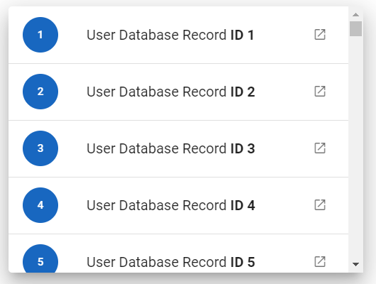
Vuetify v2.6.14 code example:
<div class="v-virtual-scroll" style="height: 300px;">
<div class="v-virtual-scroll__container" style="height: 448000px;">
<div class="v-virtual-scroll__item" style="top: 0px;">
<div tabindex="-1" class="v-list-item theme--light">
<div class="v-list-item__action">
<button type="button" class="v-btn v-btn--fab v-btn--has-bg v-btn--round theme--light v-size--small primary">
<span class="v-btn__content"> 1 </span></button>
</div>
<div class="v-list-item__content">
<div class="v-list-item__title"> User Database Record <strong>ID 1</strong></div>
</div>
</div>
</div>
</div>
</div>
It can render an unlimited amount of items by rendering only what it needs to fill the scroller’s viewport.
| Method | Description | Return Type |
|---|---|---|
| scrollToElement(String text) | Scrolls to element with text | void |
| scrollToTop() | Scrolls virtual scroller to top | void |
| items() | Returns virtual scroller list items | List<ListItem> |
| item(String itemText) | Returns item with text | ListItem |
| itemsText() | Returns items text | List<String> |
| itemHeight() | Returns item height | int |
| position() | Returns scrolled position in px | int |
| scrollToPosition(int y) | Scrolls element to position | void |
| show(ListItem item) | Shows item | void |
In addition, VirtualScroller implements HasMeasurement.
| Assert method | Description |
|---|---|
| itemsCount(int expectedCount) | Assert that number of rendered items of VirtualScroller are expected count |
| items() | Assert that VirtualScroller items are exist |
| text(String... expectedText) | Assert that VirtualScroller items has text |
| itemsHeight(int expectedItemsHeight) | Assert that VirtualScroller has expected items height |
In addition, VirtualScrollerAssert implements MeasurementAssert
For examples of usage see: JDI vuetify page tests for Virtual Scroller
5.33 Skeleton loader
- Java: com.epam.jdi.light.vuetify.elements.complex.SkeletonLoader.java
//@FindBy(css = "#DarkAnimationSkeletonLoader > .v-skeleton-loader")
@UI("#DarkAnimationSkeletonLoader > .v-skeleton-loader")
public static SkeletonLoader darkSkeletonLoader
@Test(description = "Check if dark skeleton loader looks as expected and is not boilerplate")
public void darkSkeletonLoaderTest() {
darkSkeletonLoader.show();
darkSkeletonLoader.has().darkTheme();
darkSkeletonLoader.is().notBoilerplate();
darkSkeletonLoader.is().elevated();
darkSkeletonLoader.is().tile();
}
The Skeleton loader component is a versatile tool that can fill many roles within a project. At its heart, the component provides an indication to the user that something is coming but not yet available. There are over 30 pre-defined options available that can be combined to make custom examples.
Vuetify v2.6.14 code example:
<div class="v-skeleton-loader v-skeleton-loader--boilerplate v-skeleton-loader--is-loading theme--light mb-6">
<div class="v-skeleton-loader__card-avatar v-skeleton-loader__bone">
<div class="v-skeleton-loader__image v-skeleton-loader__bone"></div>
<div class="v-skeleton-loader__list-item-avatar v-skeleton-loader__bone">
<div class="v-skeleton-loader__avatar v-skeleton-loader__bone"></div>
<div class="v-skeleton-loader__text v-skeleton-loader__bone"></div>
</div>
</div>
<div class="v-skeleton-loader__article v-skeleton-loader__bone">
<div class="v-skeleton-loader__heading v-skeleton-loader__bone"></div>
<div class="v-skeleton-loader__paragraph v-skeleton-loader__bone">
<div class="v-skeleton-loader__text v-skeleton-loader__bone"></div>
<div class="v-skeleton-loader__text v-skeleton-loader__bone"></div>
<div class="v-skeleton-loader__text v-skeleton-loader__bone"></div>
</div>
</div>
<div class="v-skeleton-loader__actions v-skeleton-loader__bone">
<div class="v-skeleton-loader__button v-skeleton-loader__bone"></div>
<div class="v-skeleton-loader__button v-skeleton-loader__bone"></div>
</div>
</div>
| Method | Description | Return Type |
|---|---|---|
| avatar() | Get Skeleton loader's avatar | UIElement |
| text() | Get Skeleton loader's text | UIElement |
| heading() | Get Skeleton loader's heading | UIElement |
| button() | Get Skeleton loader's button | UIElement |
| image() | Get Skeleton loader's image | UIElement |
| article() | Get Skeleton loader's article | UIElement |
| paragraph() | Get Skeleton loader's paragraph | UIElement |
| actions() | Get Skeleton loader's actions | UIElement |
| divider() | Get Skeleton loader's divider | UIElement |
| isBoilerplate() | Get if Skeleton loader's is boilerplate | boolean |
In addition, SkeletonLoader implements HasTheme, HasElevation, HasCursor, HasMeasurement, IsTile.
| Assert method | Description |
|---|---|
| boilerplate() | Assert that Skeleton loader is boilerplate |
| notBoilerplate() | Assert that Skeleton loader is not boilerplate |
For examples of usage see: JDI vuetify page tests for Skeleton Loader.
5.34 Parallax
Parallax is located in the following class:
- Java: com.epam.jdi.light.vuetify.elements.composite.Parallax.java
//@FindBy(css = "#CustomHeightParallax")
@UI("#CustomHeightParallax")
public static Parallax customHeightParallax;
@Test(description = "Test checks that image with parallax has expected height")
public void customHeightParallaxTests() {
customHeightParallax.has().noContent();
int expectedHeight = 300;
customHeightParallax.has().height(expectedHeight);
}
@Test(description = "Test checks that image with parallax has expected headers' text and content")
public void contentParallaxTests() {
contentParallax.has().content();
String expectedHeader = "Vuetify";
String expectedSubheader = "Build your application today!";
contentParallax.getHeader().is().text(expectedHeader);
contentParallax.getSubheader().is().text(expectedSubheader);
}
The v-parallax component creates a 3D effect that makes an image appear to scroll slower than the window. A parallax causes a shift in a background image when the user scrolls the page.
Vuetify v2.6.14 code example:
<div class="v-parallax" id="CustomHeightParallax" style="height: 300px;">
<div class="v-parallax__image-container">
<img src="https://cdn.vuetifyjs.com/images/parallax/material2.jpg" alt="" class="v-parallax__image" style="display: block; opacity: 1; transform: translate(-50%, 150px);">
</div>
<div class="v-parallax__content"></div>
</div>
v-parallax element has following methods:
| Method | Description | Return Type |
|---|---|---|
| heightPx() | Returns the value of the parallax container height attribute | int |
| hasContent() | Checks if the parallax container has any elements within | boolean |
| image() | Returns the background image of the parallax container (return type is JDI Light HTML Image) | Image |
| content() | Checks if elements in content section is not empty | ParallaxAssert |
| noContent() | Checks if elements in content section is empty | ParallaxAssert |
For examples of usage see: JDI vuetify page tests for Parallax
5.35 TreeView
Java:
- com.epam.jdi.light.vuetify.elements.complex.TreeView.java
- com.epam.jdi.light.vuetify.elements.complex.TreeViewNode.java
You can specify locators for the TreeView by using JDITreeView annotation:
Locator in JDITreeView |
Description |
|---|---|
core |
used to set the core of the TreeView |
coreNodes |
used to set nodes in the core of TreeView |
nodeNodes |
used to set nodes in the node of TreeView |
root |
used set element with data in TreeView node |
toggle |
used to set toggle in the root of TreeView |
checkbox |
used to set checkbox in the root of TreeView |
content |
used to set content in the root of TreeView |
full |
used to set class that used as a sign of full checked checkbox |
part |
used to set class that used as a sign of partly checked checkbox |
not |
used to set class that used as a sign of not checked checkbox |
It is necessary to specify the core of an element.
//@FindBy(css = "#SelectableTreeview.v-treeview")
@UI("#SelectableTreeview.v-treeview")
public static TreeView selectableTreeView;
@Test(description = "Test checks if tree-view node is selected or not")
public void selectTreeViewTest(){
selectableTreeView.node(1).walk(checkedTree->{
checkedTree.has().checkbox();
checkedTree.check();
checkedTree.is().selected();
checkedTree.uncheck();
checkedTree.is().notSelected();
});
}
The TreeView component is useful for displaying large amounts of nested data.
Vuetify v2.6.14 code example:
<div class="v-treeview theme--light" id="ActivatableTreeview">
<div aria-expanded="false" class="v-treeview-node">
<div class="v-treeview-node__root">
<button type="button" class="v-icon notranslate v-treeview-node__toggle v-icon--link mdi mdi-menu-down theme--light">
</button>
<div class="v-treeview-node__content">
<div class="v-treeview-node__label">Applications :</div>
</div>
</div>
</div>
<div aria-expanded="true" class="v-treeview-node">
<div class="v-treeview-node__root">
<button type="button" class="v-icon notranslate v-treeview-node__toggle v-icon--link mdi mdi-menu-down theme--light v-treeview-node__toggle--open">
</button>
<div class="v-treeview-node__content">
<div class="v-treeview-node__label">Documents :</div>
</div>
</div>
<div class="v-treeview-node__children">
<div aria-expanded="true" class="v-treeview-node">
<div class="v-treeview-node__root">
<div class="v-treeview-node__level"></div>
<button type="button" class="v-icon notranslate v-treeview-node__toggle v-icon--link mdi mdi-menu-down theme--light v-treeview-node__toggle--open">
</button>
<div class="v-treeview-node__content">
<div class="v-treeview-node__label">vuetify :</div>
</div>
</div>
<div class="v-treeview-node__children">
<div aria-expanded="true" class="v-treeview-node">
<div class="v-treeview-node__root">
<div class="v-treeview-node__level"></div>
<div class="v-treeview-node__level"></div>
<button type="button" class="v-icon notranslate v-treeview-node__toggle v-icon--link mdi mdi-menu-down theme--light v-treeview-node__toggle--open">
</button>
<div class="v-treeview-node__content">
<div class="v-treeview-node__label">src :</div>
</div>
</div>
<div class="v-treeview-node__children">
<div aria-expanded="false" class="v-treeview-node v-treeview-node--leaf">
<div class="v-treeview-node__root">
<div class="v-treeview-node__level"></div>
<div class="v-treeview-node__level"></div>
<div class="v-treeview-node__level"></div>
<div class="v-treeview-node__level"></div>
<div class="v-treeview-node__content">
<div class="v-treeview-node__label">index : ts</div>
</div>
</div>
</div>
<...>
</div>
</div>
</div>
</div>
<div aria-expanded="false" class="v-treeview-node">
<div class="v-treeview-node__root">
<div class="v-treeview-node__level"></div>
<button type="button" class="v-icon notranslate v-treeview-node__toggle v-icon--link mdi mdi-menu-down theme--light">
</button>
<div class="v-treeview-node__content">
<div class="v-treeview-node__label">material2 :</div>
</div>
</div>
</div>
</div>
</div>
<...>
<...>
</div>
| Method | Description | Return Type |
|---|---|---|
| childNodes() | Get TreeView check list | WebList |
| allNodes() | Get TreeView check list | WebList |
| node(String value) | Get TreeView node string value | TreeViewNode |
| node(int index) | Get TreeView item with required index | TreeViewNode |
| treeViewNodes() | Get TreeView list of nodes | List<TreeViewNode> |
| isHoverable() | Get if TreeView is hoverable | boolean |
| fullSize() | Get TreeView size | int |
| expandAllNodes() | Expand all nodes in TreeView | void |
| closeAllNodes() | Close all nodes in TreeView | void |
In addition, TreeView implements ISetup, IsLoading, ISelector, IsDense.
| Assert method | Description |
|---|---|
| hoverable() | Assert that TreeView is hoverable |
| notHoverable() | Assert that TreeView is not hoverable |
In addition, TreeViewAssert implements LoadingAssert
Also, there is a TreeViewNode that has its own methods.
| Method | Description | Return Type |
|---|---|---|
| isLeaf() | Get if TreeViewNode is a leaf | boolean |
| isActive() | Get if TreeViewNode is active | boolean |
| isFullyMarked() | Get if TreeViewNode is fully marked | boolean |
| isPartlyMarked() | Get if TreeViewNode is partly marked | boolean |
| isNotMarked() | Get if TreeViewNode is not marked | boolean |
| isExpanded() | Get if TreeViewNode is expanded | boolean |
| root() | Get TreeViewNode root | UIElement |
| expanders() | Get TreeViewNode expanders | List<VuetifyButton> |
| checkbox() | Get TreeViewNode root checkbox | UIElement |
| value() | Get root value from TreeViewNode | UIElement |
| checkList() | Get TreeViewNode check list | WebList |
| nodes() | Get TreeViewNode list of nodes | List<TreeViewNode> |
| icon() | Get TreeViewNode icon | Icon |
| expand() | Expand TreeViewNode | void |
| close() | Close TreeViewNode | void |
| activate() | Activate TreeViewNode | void |
| deactivate() | Deactivate TreeViewNode | void |
| selectCheckbox() | Select TreeViewNode checkbox | void |
| select() | Select TreeViewNode value | void |
| walk(Consumer<? super TreeViewNode> visitor) | Navigates through TreeViewNodes under node | void |
| checkboxColor() | Get TreeViewNode checkbox color | String |
In addition, TreeViewNode implements IMultiSelector, CanBeSelected, HasCheck, IListSelector
| Assert method | Description |
|---|---|
| expanded() | Assert that TreeViewNode is expanded |
| collapsed() | Assert that TreeViewNode is collapsed |
| hasLabel() | Assert that TreeViewNode has label |
| leaf() | Assert that TreeViewNode is a leaf |
| notLeaf() | Assert that TreeViewNode is not a leaf |
| active() | Assert that TreeViewNode is active |
| notActive() | Assert that TreeViewNode is not active |
| selected() | Assert that TreeViewNode is selected |
| notSelected() | Assert that TreeViewNode is not selected |
| checkbox() | Assert that TreeViewNode has checkbox |
| noCheckbox() | Assert that TreeViewNode has no checkbox |
| fullyMarked() | Assert that TreeViewNode is fully marked |
| isPartlyMarked() | Assert that TreeViewNode is partly marked |
| notMarked() | Assert that TreeViewNode is not marked |
| checked(Matcher<? super List<String>> values) | Assert that required values checked in TreeViewNode |
| checked(String... values) | Assert that only required values are checked in TreeViewNode |
| checked(List<String> values) | Assert that only required values are checked in TreeViewNode |
| color(String color) | Assert that color of TreeViewNode is equal to required color |
| checkboxColor(String color) | Assert that checkbox color of TreeViewNode is equal to required color |
In addition, TreeViewNodeAssert implements RoundedAssert
For examples of usage see: JDI Vuetify TreeView tests.
5.36 Button (VuetifyButton)
Button Vuetify documentation page
Button is located in the following class:
- Java: com.epam.jdi.light.vuetify.elements.common.VuetifyButton.java
//@FindBy(css = ".elevation-2")
@UI(".elevation-2")
public static VuetifyButton commonButton;
@Test(description = "Test checks that common button is clickable")
public void commonButtonsTests() {
commonButton.has().hasNoLabel();
commonButton.show();
commonButton.is().displayed();
commonButton.has().elevated();
commonButton.has().lightTheme();
commonButton.click();
commonButtonState.has().text("Button clicked");
}
// @FindBy(xpath = "//h2[text()='Depressed Buttons']/following-sibling::button")
@UI("//h2[text()='Depressed Buttons']/following-sibling::button")
public static List<VuetifyButton> depressedNormalButton;
// @FindBy(id = "depr-buttons-state")
@UI("#depr-buttons-state")
public static Text depressedButtonState;
@Test(description = "Test checks button feature: 'depressed' and colors of the buttons",
dataProvider = "depressedButtons",
dataProviderClass = ButtonsDataProvider.class)
public void depressedButtonsTests(int index, boolean enabled, String color, String name) {
VuetifyButton button = depressedNormalButton.get(index);
button.has().hasNoLabel();
button.show();
button.is().displayed();
button.has().backgroundColor(color);
if (enabled) {
button.is().enabled();
button.click();
depressedButtonState.has().text("Depressed button clicked: " + name);
} else {
button.is().disabled();
}
depressedButtonState.has().text("Depressed button clicked: " + name);
}
Button - the v-btn component that replaces the standard html button
with a material design theme and a multitude of options. Any color helper
class can be used to alter the background or text color.
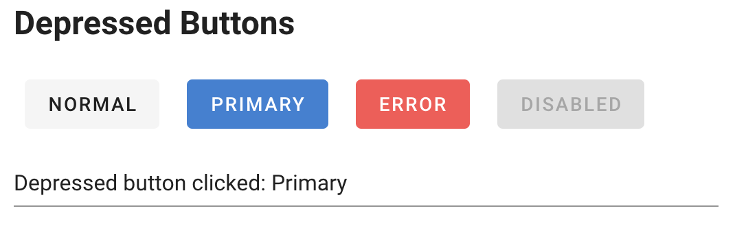
Vuetify v2.6.14 code example:
<div class="row align-center justify-space-around" file="v-btn/prop-depressed">
<button type="button" class="v-btn v-btn--has-bg theme--light v-size--default">
<span class="v-btn__content"> Normal </span>
</button>
<button type="button" class="v-btn v-btn--has-bg theme--light v-size--default primary">
<span class="v-btn__content"> Primary </span>
</button>
<button type="button" class="v-btn v-btn--has-bg theme--light v-size--default error">
<span class="v-btn__content"> Error </span>
</button>
<button type="button" disabled="disabled" class="v-btn v-btn--disabled v-btn--has-bg theme--light v-size--default">
<span class="v-btn__content"> Disabled </span>
</button>
</div>
Available methods in Java JDI Light:
| Method | Description | Return Type |
|---|---|---|
| is() | Returns object for work with assertions | VuetifyButtonAssert |
| has() | Returns object for work with assertions | VuetifyButtonAssert |
| and() | Returns object for work with assertions | VuetifyButtonAssert |
| ariaLabel() | Returns attribute "aria-label" | String |
| show() | Scrolls screen view to item | void |
| isLoading() | Shows that element is loading | boolean |
| element() | Returns VuetifyButton element | VuetifyButton |
| loading() | Assert that element is loading | VuetifyButtonAssert |
| clickable() | Checks that element is clickable | VuetifyButtonAssert |
| icon() | Checks that element has icon | VuetifyButtonAssert |
| waitFor() | Returns object for work with assertions | VuetifyButtonAssert |
| shouldBe() | Returns object for work with assertions | VuetifyButtonAssert |
| verify() | Returns object for work with assertions | VuetifyButtonAssert |
| assertThat() | Returns object for work with assertions | VuetifyButtonAssert |
| icon() | Returns button's icon | Icon |
| loader() | Returns button's loader | UIElement |
| isLoading() | Checks that the button is loading | boolean |
| color() | Returns css attribute background-color as String Value | String |
| waitFor() | Returns object for work with assertions | VuetifyButtonAssert |
| classes() | Gets all element's classes as list | List<String> |
| doubleClick() | Double clicks on the element | void |
| dragAndDropTo(int x, int y) | Drags and drops element to certain coordinates | void |
| dragAndDropTo(WebElement to) | Drags and drops element to another element | void |
| getLocation() | Gets element location as point | Point |
| getSize() | Gets element size | Dimension |
| getTagName() | Gets element tag name | String |
| getText() | Gets element text | String |
| getValue() | Gets element text | String |
| hasAttribute(String attrName) | Returns true if the element has an expected attribute | boolean |
| hasClass(String className) | Returns true if the element has an expected class | boolean |
| highlight() | Highlights element with red color | void |
| highlight(String color) | Scrolls view to element and highlights it with a border of specified color | void |
| hover() | Hovers mouse cursor over the element | void |
| isDisabled() | Checks that element is disabled | boolean |
| isDisplayed() | Checks that element is displayed | boolean |
| isEnabled() | Checks that element exists | boolean |
| isHidden() | Checks that element is hidden | boolean |
| isNotExist() | Checks that element does not exist | boolean |
| isNotVisible() | Checks that element is not visible by user | boolean |
| isVisible() | Checks that element is visible by user | boolean |
| labelText() | Gets label text | String |
| printHtml() | Gets element “innerHTML” attribute value | String |
| rightClick() | Right clicks on the element | void |
| setAttribute(String name, String value) | Sets value to the specified attribute | void |
Here you can find Buttons tests.
5.37 Chips
Chips Vuetify documentation page
Chips are located in the following class:
- Java: com.epam.jdi.light.vuetify.elements.common.Chip.java
//FindBy(css = "#ClosableChip > .v-chip")
@UI("#ClosableChip > .v-chip")
public static List<Chip> closableChips;
//FindBy(css = "#ColoredChip > .v-chip")
@UI("#ColoredChip > .v-chip")
public static List<Chip> coloredChips;
@Test (description = "Test checks removable feature")
public void closableChipTests() {
Chip closableChip = closableChips.get(1);
Chip greyChip = coloredChips.get(1);
closableChip.show();
closableChip.is().displayed().and().removable();
closableChip.close();
closableChip.is().hidden();
greyChip.show();
greyChip.is().notRemovable();
}
Chips - The v-chip component is used to convey small pieces of information.
Using the close property, the chip becomes interactive, allowing user interaction.
This component is used by the v-chip-group for advanced selection options.
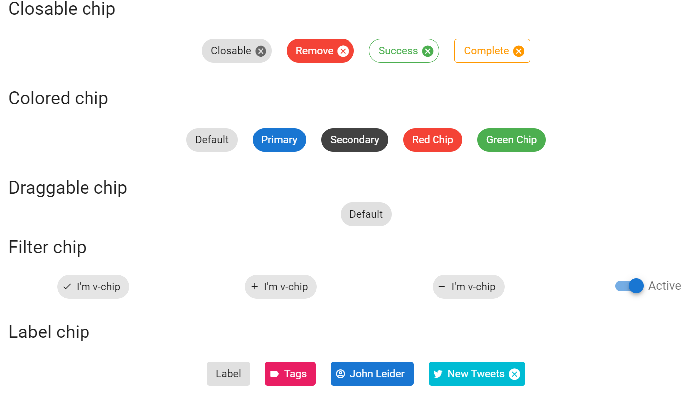
Vuetify v2.6.14 code example:
<div class="text-center" id="ColoredChip">
<span class="ma-2 v-chip v-chip--no-color theme--light v-size--default">
<span class="v-chip__content">
Default
</span>
</span>
<span class="ma-2 v-chip theme--light v-size--default primary">
<span class="v-chip__content">
Primary
</span>
</span>
<span class="ma-2 v-chip theme--light v-size--default secondary">
<span class="v-chip__content">
Secondary
</span>
</span>
<span class="ma-2 v-chip theme--light v-size--default red white--text">
<span class="v-chip__content">
Red Chip
</span>
</span>
<span class="ma-2 v-chip theme--light v-size--default green white--text">
<span class="v-chip__content">
Green Chip
</span>
</span>
</div>
Available methods in Java JDI Light:
| Method | Description | Return Type |
|---|---|---|
| is() | Returns object for work with assertions | ChipAssert |
| getText() | Gets chip text | String |
| click() | Clicks the chip | void |
| close() | Clicks the chip's close button | void |
| isDraggable() | Checks if the chip is draggable | boolean |
| active() | Checks if the chip is active | boolean |
| isFilterIconDisplayed() | Checks if the chip's filter icon is displayed | boolean |
| isLabel() | Checks if the chip is marked as label chip | boolean |
| hasImage() | Checks if the chip has an image | boolean |
| isEnabled() | Checks if the chip is enabled | boolean |
| getContent() | Get chip content | UIElement |
| fontSize() | Gets chip font size | String |
| borderColor() | Gets chip border color | String |
| hasXSmallSize() | Checks if the chip has x-small size | boolean |
| hasSmallSize() | Checks if the chip has small size | boolean |
| hasDefaultSize() | Checks if the chip has default size | boolean |
| hasLargeSize() | Checks if the chip has large size | boolean |
| hasXLargeSize() | Checks if the chip has x-large size | boolean |
| isRemovable() | Checks if the chip is revomable | boolean |
| isPill() | Checks if the chip is pill | boolean |
Chip class implement following interfaces: HasClick, HasColor, HasIcon, HasImage, HasTheme, IsOutlined, HasMeasurement.
For examples of usage see: JDI Vuetify Chip tests.
5.38 Aspect Ratios
Aspect Ratios Vuetify documentation page
//@FindBy(css = ".v-responsive")
@UI(".v-responsive")
public static AspectRatios aspectRatiosContainer;
@Test(description = "Test checks aspect ration of an element")
public void aspectRatioImageTests() {
aspectRatiosContainer.has().ratio(16, 9);
}
- Java: com.epam.jdi.light.vuetify.elements.common.AspectRatios.java
Aspect Ratios - the v-responsive component can be used to fix any section to a specific aspect ratio.
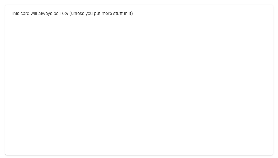
Vuetify v2.6.14 code example:
<div class="v-responsive">
<div class="v-responsive__sizer" style="padding-bottom: 56.25%;">
</div>
<div class="v-responsive__content">
<div class="v-card__text">
This card will always be 16:9 (unless you put more stuff in it)
</div>
</div>
</div>
Aspect Ratios element contains following methods:
| Method | Description | Return Type |
|---|---|---|
| ratioValue(double width, double height) | Ratio of '{name}' has width '{0}' and height '{1}' | double |
For examples of usage see: JDI Vuetify Aspect Ratios tests
5.39 Badge
Badge Vuetify documentation page
Badge is located in the following class:
- Java: com.epam.jdi.light.vuetify.elements.common.Badge.java
//@FindBy(css = "#simpleBadges .v-badge")
@UI("#simpleBadges .v-badge")
public static List<Badge> simpleBadges;
//@FindBy(css = "#customBadges .v-badge--icon")
@UI("#customBadges .v-badge--icon")
public static Badge lockUnlockAccountBadge;
//@FindBy(css = "#customBadges .v-badge--dot")
@UI("#customBadges .v-badge--dot")
public static Badge dotBadge;
//@FindBy(css = "#customBadges .v-badge--avatar")
@UI("#customBadges .v-badge--avatar")
public static Badge imageBadge;
@Test(description = "Test checks different types of badges")
public void typeBadgesTest() {
lockUnlockAccountBadge.is().icon();
dotBadge.has().notIcon();
imageBadge.has().avatar();
dotBadge.has().notAvatar();
dotBadge.is().dot();
imageBadge.is().notDot();
}
@Test(description = "Test checks that badge has text")
public void textBadgesTest() {
Badge simpleBadge = simpleBadges.get(1);
simpleBadge.show();
simpleBadge.has().text("1");
}
Badges - The v-badge component superscripts or subscripts an avatar-like icon or text onto content to highlight information to a user or to just draw attention to a specific element.
Content within the badge usually contains numbers or icons.

Vuetify v2.6.14 code example:
<span class="v-badge theme--light">
<i aria-hidden="true" class="v-icon notranslate mdi mdi-email theme--light" style="font-size: 36px;"></i>
<span class="v-badge__wrapper">
<span aria-atomic="true" aria-label="Badge" aria-live="polite" role="status" class="v-badge__badge primary" style="inset: auto auto calc(100% - 4px) calc(100% - 4px);">1</span>
</span>
</span>
Badges element contains following methods:
| Method | Description | Return Type |
|---|---|---|
| badge() | Gets '{name}' badge | UIElement |
| isBordered() | Checks that '{name}' is bordered | boolean |
| isInline() | Checks that '{name}' is inline | boolean |
| isBottom() | Checks that '{name}' is bottom | boolean |
| isOverlap() | Checks that '{name}' is overlap | boolean |
| isDot() | Checks that '{name}' is dot | boolean |
| isAvatar() | Checks that '{name}' is avatar | boolean |
| backgroundColor() | Gets '{name}' background color | String |
| image() | Gets '{name}' image | Image |
| isDisplayed() | Checks that '{name}' is displayed | boolean |
| icon() | Gets '{name}' icon | Icon |
| hasIcon() | Checks that '{name}' has icon | boolean |
| getText() | Gets '{name}' badge text | String |
| isTile() | Checks that '{name}' is tile | boolean |
| hasLeftAlignment() | Checks that '{name}' has left alignment | boolean |
| hasRightAlignment() | Checks that '{name}' has right alignment | boolean |
| color() | Gets '{name}' color | String |
| backgroundColor() | Gets '{name}' background color | String |
| image() | Gets '{name}' image | Image |
Badge also implements IsText, IsTile, HasAlignment,HasClick, HasColor, HasIcon, HasImage, HasTheme
For examples of usage see: JDI vuetify page tests for Badges
5.40 Divider
Divider Vuetify documentation page
Divider is located in the following class:
- Java: com.epam.jdi.light.vuetify.elements.common.Divider.java
//@FindBy(css = ".v-divider--inset")
@UI(".v-divider--inset")
public static List<Divider> horizontalDividers;
//@FindBy(css = ".v-divider--vertical")
@UI(".v-divider--vertical")
public static List<Divider> verticalDividers;
@Test(description = "Test checks horizontal dividers")
public void horizontalDividersTest() {
horizontalDividers.stream()
.map(Divider::is)
.forEach(DividerAssert::horizontal);
}
@Test(description = "Test checks vertical dividers")
public void verticalDividersTest() {
verticalDividers.stream()
.map(Divider::is)
.forEach(DividerAssert::vertical);
}
Vuetify v2.6.14 code example:
<hr role="separator" aria-orientation="horizontal"
class="v-divider v-divider--inset theme--light">
Dividers element contains following methods:
| Method | Description | Return Type |
|---|---|---|
| isInset() | Checks that '{name}' is inset | boolean |
For examples of usage see: JDI vuetify page tests for Dividers
5.41 Sheets
- Java: com.epam.jdi.light.vuetify.elements.common.Sheet.java
//@FindBy(css = "#RoundedSheet")
@UI("#ElevationSheet .v-sheet div")
public static Sheet elevatedSheet;
@Test(description = "Check that sheet with expected attributes is present")
public void elevatedSheetTest() {
elevatedSheet.show();
elevatedSheet.is().displayed()
.is().notRounded()
.is().notShaped()
.has().elevation(12)
.has().color("rgba(255, 255, 255, 1)")
.has().height(100).and().has().width(100);
}
The Sheet component is a transformable "piece of paper" that provides a basic foundation for Vuetify features. For example, properties such as rounded and shaped modify the border-radius property while elevation increases/decreases box-shadow.
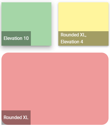
Vuetify v2.6.14 code example:
<div class="d-flex v-sheet theme--light elevation-4 rounded yellow lighten-3" style="height: 150px; width: 150px;">
<div class="mt-auto align-center justify-center d-flex px-2 v-sheet theme--dark" style="height: 50px; background-color: rgba(0, 0, 0, 0.36); border-color: rgba(0, 0, 0, 0.36);">
Rounded XL, Elevation 4
</div>
</div>
| Method | Description | Return Type |
|---|---|---|
| borderRadius() | Returns sheet border radius in px | int |
| Assert method | Description |
|---|---|
| borderRadius(int value) | Asserts if sheet has expected border radius |
Sheet also have basic JDI elements methods and asserts for Text, Color, Elevation, Measurements, Theme and others
For examples of usage see: JDI Vuetify Sheets tests
5.42 Calendars
- Java: com.epam.jdi.light.vuetify.elements.complex.Calendar.java
//@FindBy(css = "#calendar-type-week")
@UI("#calendar-type-week")
public static Calendar typeWeekCalendar;
@Test(description = "Check if Calendar is weekly and has required events")
public static void typeWeekCalendarTest(){
typeWeekCalendar.show();
typeWeekCalendar.is().weekly();
typeWeekCalendar.has().totalNumberOfEvents(3);
typeWeekCalendar.has().eventTitle(2,"Mash Potatoes");
}
The Calendars component is used to display information in a daily, weekly, monthly, or category view. The daily view has slots for all day or timed elements, and the weekly and monthly view has a slot for each day. The category view has a slot for each category in the day and timed sections based on the categories given or the categories in the given events. Optionally you can pass in an array of events and they will be rendered over the appropriate days and times.
Vuetify v2.6.14 code example:
<div data-v-53316f16="" class="v-calendar v-calendar-daily theme--light v-calendar-events" id="calendar-type-week">
<div class="v-calendar-daily__head" style="margin-right: 17px;">
<div class="v-calendar-daily__intervals-head" style="width: 60px;"></div>
<div class="v-calendar-daily_head-day v-past">
<div class="v-calendar-daily_head-weekday">Sun</div>
<div class="v-calendar-daily_head-day-label">
<button type="button" class="v-btn v-btn--fab v-btn--has-bg v-btn--round theme--light v-size--default transparent">
<span class="v-btn__content">6</span>
</button>
</div>
</div>
<...>
<div class="v-calendar-daily_head-day v-present">
<div class="v-calendar-daily_head-weekday primary--text">Tue</div>
<div class="v-calendar-daily_head-day-label">
<button type="button" class="v-btn v-btn--fab v-btn--has-bg v-btn--round theme--light v-size--default primary">
<span class="v-btn__content">8</span>
</button>
</div>
</div>
<div class="v-calendar-daily_head-day v-future">
<div class="v-calendar-daily_head-weekday">Wed</div>
<div class="v-calendar-daily_head-day-label">
<button type="button" class="v-btn v-btn--fab v-btn--has-bg v-btn--round theme--light v-size--default transparent">
<span class="v-btn__content">9</span>
</button>
</div>
</div>
<...>
</div>
<div class="v-calendar-daily__body">
<div class="v-calendar-daily__scroll-area">
<div class="v-calendar-daily__pane" style="height: 1152px;">
<div class="v-calendar-daily__day-container">
<div class="v-calendar-daily__intervals-body" style="width: 60px;">
<div class="v-calendar-daily__interval" style="height: 48px;">
<div class="v-calendar-daily__interval-text"></div>
</div>
<...>same lines for other 23 hours<...>
</div>
<div class="v-calendar-daily__day v-past">
<div class="v-calendar-daily__day-interval" style="height: 48px;"></div>
<...>
<div class="v-event-timed-container"></div>
</div>
<...>
<div class="v-calendar-daily__day v-present">
<div class="v-calendar-daily__day-interval" style="height: 48px;"></div>
<...>
<div class="v-event-timed-container"></div>
</div>
<div class="v-calendar-daily__day v-future">
<div class="v-calendar-daily__day-interval" style="height: 48px;"></div>
<...>
<div class="v-event-timed-container">
<div class="v-event-timed primary white--text" style="top: 600px; height: 144px; left: 0%; width: 100%;">
<div class="pl-1">
<span class="v-event-summary"><strong>Mash Potatoes</strong><br>12:30 PM - 3:30 PM</span>
</div>
</div>
</div>
</div>
<...>
</div>
</div>
</div>
</div>
</div>
| Method | Description | Return Type |
|---|---|---|
| activeDay() | Get active date of Calendar | int |
| isDailyType() | Get if Calendar has daily type | boolean |
| isWeeklyType() | Get if Calendar has weekly type | boolean |
| hasCategories() | Get if Calendar has categories | boolean |
| hasDayIntervals() | Get if Calendar has intervals | boolean |
| getCategory(int catNum) | Get Calendar's required category name | String |
| getDayInterval(int intNum) | Get Calendar's required interval text | String |
| isToday() | Check that Calendar has the current day | boolean |
| dailyEvent(int eventNum) | Get Calendar required event summary | UIElement |
| selectSlot(int week, int day, int slot) | Select Calendar's slot | void |
| slotTitle(int week, int day, int slot) | Get slot's title | String |
| hasCurrentTimeLine() | Get if Calendar has current time line | boolean |
| displayedDaysOfMonth() | Returns a list of days that are visible now | List<WebElement> |
| events() | Returns a list of events that are visible on a Calendar | WebList |
| intervals() | Returns a list of intervals of a calendar | WebList |
| intervalHeaders() | Returns a list of intervals headers of a calendar | WebList |
| intervalBody() | Gets a parent interval element that contains all intervals of calendar | UIElement |
| dayEvents(int day) | Returns a list of timed events from a required day | WebList |
| calendarDays() | Returns a list of calendar's days | WebList |
| eventRipple(int eventNumber) | Gets a required ripple event | UIElement |
In addition, Calendar implements HasTheme.
| Assert method | Description |
|---|---|
| daily() | Assert that Calendar is of daily type |
| weekly() | Assert that Calendar is of weekly type |
| today() | Assert that Calendar has the today |
| category(int catNum, String catName) | Assert that Calendar has the category |
| eventTitle(int eventNum, String eventName) | Assert that Calendar has the event by required event number with required title |
| dayInterval(int intNum, String intText) | Assert that Calendar has the day interval |
| categories() | Assert that Calendar has categories |
| intervals() | Assert that Calendar has intervals |
| slotHasTitle(int week, int day, int slot, String title) | Assert that the Calendar slot has the title |
| currentTimeLine() | Assert that Calendar has the current time line |
| numberOfEventsPerDay(int dayNumber, int expectedNumberOfEvents) | Assert that Calendar has expected number of daily events |
| totalNumberOfEvents(int expectedNumberOfEvents) | Assert that Calendar has expected number of daily events |
| activeDay(int expectedDayOfMonth) | Assert that Calendar has active date |
| numberOfIntervals(int expectedNumberOfIntervals) | Assert that Calendar has number of intervals |
In addition, CalendarAssert implements ThemeAssert
For examples of usage see: JDI vuetify page tests for Calendars.
5.43 Steppers
Stepper Vuetify documentation page
Java:
- com.epam.jdi.light.vuetify.elements.complex.stepper.Stepper.java
- com.epam.jdi.light.vuetify.elements.complex.stepper.Step.java
//@FindBy(css = "#NonLinearStepper .v-stepper")
@UI("#NonLinearStepper .v-stepper")
public static List<Stepper> nonLinearStepper;
@Test(description = "Test checks if step is active or not")
public void activeStepStepperTest() {
Stepper stepper = nonLinearStepper.get(1);
stepper.show();
List<Step> steps = stepper.steps();
steps.get(0).is().active();
steps.get(1).is().notActive();
steps.get(1).click();
steps.get(0).is().notActive();
steps.get(1).is().active();
steps.get(2).is().notActive();
steps.get(2).click();
steps.get(1).is().notActive();
steps.get(2).is().active();
steps.get(0).click();
steps.get(0).is().active();
}
The v-stepper component displays progress through numbered steps.
Vuetify v2.6.14 code example:
<div class="pa-4 v-sheet theme--light rounded">
<div class="v-stepper v-sheet theme--light" file="v-stepper/usage">
<div class="v-stepper__header">
<div tabindex="-1" class="v-stepper__step v-stepper__step--active">
<span class="v-stepper__step__step primary">1</span>
<div class="v-stepper__label"> Name of step 1</div>
</div>
<hr role="separator" aria-orientation="horizontal" class="v-divider theme--light">
<div tabindex="-1" class="v-stepper__step v-stepper__step--inactive">
<span class="v-stepper__step__step">2</span>
<div class="v-stepper__label"> Name of step 2 </div>
</div>
<hr role="separator" aria-orientation="horizontal" class="v-divider theme--light">
<div tabindex="-1" class="v-stepper__step v-stepper__step--inactive">
<span class="v-stepper__step__step">3</span>
<div class="v-stepper__label"> Name of step 3 </div>
</div>
</div>
<div class="v-stepper__items">
<div class="v-stepper__content" style="transform-origin: center top 0px;">
<div class="v-stepper__wrapper">
<div class="mb-12 v-card v-sheet theme--light grey lighten-1" style="height: 200px;"></div>
<button type="button" class="v-btn v-btn--is-elevated v-btn--has-bg theme--light v-size--default primary">
<span class="v-btn__content"> Continue </span>
</button>
<button type="button" class="v-btn v-btn--text theme--light v-size--default">
<span class="v-btn__content"> Cancel </span>
</button>
</div>
</div>
<div class="v-stepper__content" style="display: none;">
<div class="v-stepper__wrapper">
<div class="mb-12 v-card v-sheet theme--light grey lighten-1" style="height: 200px;"></div>
<button type="button" class="v-btn v-btn--is-elevated v-btn--has-bg theme--light v-size--default primary">
<span class="v-btn__content"> Continue </span>
</button>
<button type="button" class="v-btn v-btn--text theme--light v-size--default">
<span class="v-btn__content"> Cancel </span>
</button>
</div>
</div>
</div>
</div>
</div>
Stepper methods:
| Method | Description | Return Type |
|---|---|---|
| getStep(int index) | Returns step by index | Step |
| steps() | Returns list of steps for stepper | List<Step> |
| getContentList() | Returns content list for stepper | WebList |
| isNonLinear() | Get if stepper is non-linear | boolean |
| hasAltLabel() | Get if stepper has alt label | boolean |
In addition, Stepper implements HasOrientation, HasColor, HasTheme, HasElevation, HasMeasurement, IsOutlined, HasRounded, IsShaped, IsTile.
| Assert method | Description |
|---|---|
| nonLinear() | Assert that stepper is non-linear |
| linear() | Assert that stepper is linear |
| altLabel() | Assert that stepper has alt label |
| notAltLabel() | Assert that stepper has not alt label |
Step methods:
| Method | Description | Return Type |
|---|---|---|
| isActive() | Get if step is active | boolean |
| isComplete() | Get if step is complete | boolean |
| isEditable() | Get if step is editable | boolean |
| hasError() | Get if step has error | boolean |
In addition, Step implements IClickable, HasColor.
| Assert method | Description |
|---|---|
| active() | Assert that step is active |
| notActive() | Assert that step is not active |
| complete() | Assert that step is complete |
| notComplete() | Assert that step is not complete |
| editable() | Assert that step is editable |
| notEditable() | Assert that step is not editable |
| text(String currentText) | Assert that step text is {0} |
| contains(String locator) | Assert that step contains {0} |
| error() | Assert that step step has error |
| noError() | Assert that step step has error |
For examples of usage see: JDI vuetify page tests for steppers.
5.44 Grids
Grids Vuetify documentation page
Java:
- com.epam.jdi.light.vuetify.elements.complex.Grid.java
//@FindBy(css = "#AlignGridSystem")
@UI("#AlignGridSystem")
public static Grid alignGrid;
@Test(description = "Test checks grid's vertical alignment")
public void alignGridSystemTests() {
alignGrid.show();
List<String> alignments = Arrays.asList("start", "center", "end");
alignGrid.is().displayed();
for (int i = 1; i <= 3; i++) {
alignGrid.has().rowVerticalAlignment(i, alignments.get(i - 1));
alignGrid.has().cellVerticalAlignment(4, i, alignments.get(i - 1));
}
alignGrid.has().cellText("One of three columns", 1, 2);
}
Vuetify comes with a 12 point grid system built using flexbox. The grid is used to create specific layouts within an application’s content. It contains 5 types of media breakpoints that are used for targeting specific screen sizes or orientations, xs, sm, md, lg and xl.
Vuetify v2.6.14 code example:
<div class="pa-4 v-sheet theme--light rounded">
<div class="container grey lighten-5"
file="grid/usage">
<div class="row no-gutters">
<div class="col-sm-4 col-12">
<div class="pa-2 v-card v-sheet v-sheet--outlined theme--light rounded-0"> One of three columns </div>
</div>
<div class="col-sm-4 col-12">
<div class="pa-2 v-card v-sheet v-sheet--outlined theme--light rounded-0"> One of three columns </div>
</div>
<div class="col-sm-4 col-12">
<div class="pa-2 v-card v-sheet v-sheet--outlined theme--light rounded-0"> One of three columns </div>
</div>
</div>
</div>
</div>
Grid methods:
| Method | Description | Return Type |
|---|---|---|
| getRowByIndex(int rowIndex) | Get grid row by index | UIElement |
| getCellsInRow(int rowIndex) | Get grid cell in row {0} | WebList |
| getCellByIndex(int rowIndex, int columnIndex) | Get grid cell by index in row {0} | UIElement |
| getCellsFromRowWithStatus(int rowIndex, String status) | Get grid row's status | String |
| getCellWithStatus(int rowIndex, int columnIndex, String status) | Get grid cell status | String |
| getRowVerticalAlignment(int rowIndex) | Get grid row vertical alignment | String |
| getRowHorizontalAlignment(int rowIndex) | Get grid row horizontal alignment | String |
| getCellVerticalAlignment(int rowIndex, int columnIndex) | Get grid cell's alignment in row {0} | String |
| getCellOrder(int rowIndex, int columnIndex) | Get grid cell's order in row {0} | String |
| hasCellOffset(int rowIndex, int columnIndex) | Get if grid cell in row {0} has an offset | boolean |
| hasCellsWithEqualWidthInRow(int rowIndex) | Get if grid row {0} has sells with equal widths | boolean |
| hasCellWithCustomWidth(int rowIndex, int columnIndex) | Get if grid cell in row {0} has custom width | String |
| hasMargin(int rowIndex, int columnIndex) | Get if grid cell in row {0} has custom margin | boolean |
| getCellBackgroundColor(int rowIndex, int columnIndex) | Get grid cell in row '{0}' column '{1}' background color | String |
| getCellFontColor(int rowIndex, int columnIndex) | Get grid cell in row '{0}' column '{1}' font color | String |
| hasRowWithSpacers(int rowIndex) | Get if grid has row {0} with spacers | boolean |
| hasCellWithAutoWidth(int rowIndex, int columnIndex) | Get if grid cell in row {0} has auto-width | boolean |
| isFluid() | Get if grid is fluid | boolean |
| hasNoGuttersRow(int rowIndex) | Get if grid has no-gutters | boolean |
| isDense(int rowIndex) | Get if grid is fluid | boolean |
| Assert method | Description |
|---|---|
| displayed() | Assert that grid is displayed |
| cellText(String text, int rowIndex, int columnIndex) | Assert that grid has text '{0}' in in column '{1}' |
| rowVerticalAlignment(int rowIndex, String alignment) | Assert that grid row '{0}' has vertical alignment '{1}' |
| rowHorizontalAlignment(int rowIndex, String alignment) | Assert that grid row '{0}' has horizontal alignment '{1}' |
| cellVerticalAlignment(int rowIndex, int columnIndex, String alignment) | Assert that grid cell at row '{0}' column '{1}' has vertical alignment '{2}' |
| cellOrder(int rowIndex, int columnIndex, String order) | Assert that grid cell at row '{0}' column '{1}' has order '{2}' |
| cellOrder(int rowIndex, int columnIndex, int order) | Assert that grid cell at row '{0}' column '{1}' has order '{2}' |
| cellOffset(int rowIndex, int columnIndex) | Assert that grid cell at row '{0}' column '{1}' has offset |
| noCellOffset(int rowIndex, int columnIndex) | Assert that grid cell at row '{0}' column '{1}' has no offset |
| cellWithEqualWidthsInRow(int rowIndex) | Assert that grid cells in row '{0}' have equal width |
| cellWithDifferentWidthsInRow(int rowIndex) | Assert that grid cells in row '{0}' have different width |
| cellWithCustomWidth(int rowIndex, int columnIndex, int widthParameter) | Assert that grid cell at row '{0}' column '{1}' has width '{2}' - integer from 1 to 12 |
| cellWithMargin(int rowIndex, int columnIndex) | Assert that grid cell at row '{0}' column '{1}' has margin |
| cellWithoutMargin(int rowIndex, int columnIndex) | Assert that grid cell at row '{0}' column '{1}' has no margin |
| cellBackgroundColor(int rowIndex, int columnIndex, String color) | Assert that grid cell in row '{0}' column '{1}' has background color '{2}' |
| cellFontColor(int rowIndex, int columnIndex, String color) | Assert that grid cell in row '{0}' column '{1}' has font color '{2}' |
| rowWithSpacers(int rowIndex) | Assert that grid row '{0}' has spacers |
| rowWithoutSpacers(int rowIndex) | Assert that grid row '{0}' has no spacers |
| cellWithAutoWidth(int rowIndex, int columnIndex) | Assert that grid cell at row '{0}' column '{1}' is auto-width |
| fluid() | Assert that grid is fluid |
| notFluid() | Assert that grid is not fluid |
| noGuttersRow(int rowIndex) | Assert that grid row '{0}' is no-gutters |
| notNoGuttersRow(int rowIndex) | Assert that grid row '{0}' is not no-gutters |
| dense(int rowIndex) | Assert that grid row is dense |
| notDense(int rowIndex) | Assert that grid row is not dense |
For examples of usage see: JDI vuetify page tests for grids.
JDI features
JDI Features for parameters in BDD steps
Using locator aliases as parameters
Scenario: input element
When I input "simple 1234" in "Name"
Then the "Name" text matches to "\w{6} \d{4}"
Then the "Logout" is hidden
Scenario: click element
When I click on "Red Button"
Then the Alert text equals to "Red button"
Features have locators taken from file-based PageObjects instead of element names.
html5page.json for JSON-based locators (contains CSS locators):
{
"Red Button": "[value*='Red Button']",
"Name": "#name",
"Logout": ".fa-sign-out"
}
Note: Locators are defined via JSON file/files with an arbitrary name. But these JSON file/files must be located in json.page.objects package.
Keep in mind: All the elements are collected from these JSON file/files and stored in a global hash map.
Therefore it is essential that all the elements are defined with unique names.
BDD feature test examples
Json PageObject file example
Using locators as parameters
Scenario: click element
When I click on "[value*='Red Button']"
Then the Alert text equals to "Red button"
Scenario: clear element
When I input "simple text" in "#name"
Then the "#name" text equals to "simple text"
When I clear "#name"
Then the "#name" text equals to ""
Feature allows using a locator instead of an element name as a parameter.
Using element names defined with capital letter as locator IDs
Scenario: isDisabled element
Then the "Disabled Name" is disabled
Scenario: check element
When check "Accept Conditions"
Then the "Accept Conditions" is selected
"Disabled Name" element is automatically searched by #disabled-name smart locator.
"Accept Conditions" element is automatically searched by #accept-conditions smart locator.
Features have locators automatically generated if there is no available PageObject JSON alias
and the element name is defined with a capital letter.
When <I> click on "Element name"
Smart locator is generated as an ID with lowercase element name: #element-name.
BDD feature test examples
For better understanding of this test example remove "Name": "#name" from html5page.json to make sure the smart locator works.
Using aliases for page URLs
#Instead of this:
Scenario: bootstrap page
Given Page with URL "\<LINK TO HOME PAGE\>" opened
Scenario: contacts page
When I open URL "\<LINK TO CONTACTS PAGE\>"
Then the URL "\<LINK TO CONTACTS PAGE\>" is opened
#Use this:
Scenario: json based bootstrap page
When I open "Bootstrap Page" page
Then the "Bootstrap Page" page is opened
Scenario: json based contacts page
When I open "Contacts Page" page
Then the "Contacts Page" page is opened
Pages can be opened by alias instead of URL.
pages.json:
{
"Home Page": "/",
"Bootstrap Page": "/bootstrap.html"
}
Aliases for pages are defined in pages.json.
Note: the domain URL part is read from test.properties automatically.
BDD feature test examples
JDI Light BDD Steps
Label
Label action examples:
When I click on "JDI Title"
Label validation examples:
Then the "JDI Title" text equals to "JDI TESTING PLATFORM"
Then the "JDI Title" text contains "JDI"
Then the "JDI Title" text matches to ".* TESTING .*"
Then the "JDI Title" is enabled
Then the "JDI Title" is disabled
Then the "JDI Title" is displayed
Then the "JDI Title" disappears
Then the "JDI Title" is hidden
Then the "JDI Title" does not appear
Then the "JDI Title" does not appear during "5" seconds
Scenario example for Label:
Scenario: Text equals
Given I open "Html5 Page"
Then the "Jdi Title" text equals to "JDI TESTING PLATFORM"
Actions:
When <I> click on "<ELEMENT NAME>"
Validations:
Then the "<ELEMENT NAME>" text equals to "<TEXT>"
Then the "<ELEMENT NAME>" text contains "<TEXT>"
Then the "<ELEMENT NAME>" text matches to "<REGEXP>"
Then the "<ELEMENT NAME>" is enabled
Then the "<ELEMENT NAME>" is disabled
Then the "<ELEMENT NAME>" is displayed
Then the "<ELEMENT NAME>" disappears
Then the "<ELEMENT NAME>" is hidden
Then the "<ELEMENT NAME>" does not appear
Then the "<ELEMENT NAME>" does not appear during "<SECONDS>" seconds
More information in the Tutorial
Cucumber tests for Label
ColorPicker
ColorPicker action example:
When I set "Color Picker" to "#00FF00" color
ColorPicker validation examples:
Then the "Color Picker" color equals to "#00FF00"
Then the "Color Picker" label text equals to "Select a color"
Then the "Color Picker" color is "#00FF00"
Then the "Color Picker" is enabled
Then the "Color Picker" is disabled
Then the "Color Picker" is displayed
Then the "Color Picker" disappears
Then the "Color Picker" is hidden
Then the "Color Picker" does not appear
Then the "Color Picker" does not appear during "5" seconds
Scenario example for ColorPicker:
Scenario: Color picker set color test
Given I open "Html5 Page"
When I set "Color Picker" to "#ffd7a6" color
Then the "Color Picker" color equals to "#ffd7a6"
Actions:
When <I> set "<ELEMENT NAME>" to "<COLOR HEX CODE>"
Validations:
Then the "<ELEMENT NAME>" color equals to "<COLOR HEX CODE>"
Then the "<ELEMENT NAME>" label text equals to "<TEXT>"
Then the "<ELEMENT NAME>" color is "<COLOR HEX CODE>"
Then the "<ELEMENT NAME>" is enabled
Then the "<ELEMENT NAME>" is disabled
Then the "<ELEMENT NAME>" is displayed
Then the "<ELEMENT NAME>" disappears
Then the "<ELEMENT NAME>" is hidden
Then the "<ELEMENT NAME>" does not appear
Then the "<ELEMENT NAME>" does not appear during "<SECONDS>" seconds
More information in the Tutorial
Cucumber tests for ColorPicker
DropDown
DropDown action example:
When I Select "Pirate" field from "Drop Down"
DropDown validation examples:
Then the "Pirate" in "Drop Down" is selected
Then the "Drop Down" is enabled
Then the "Drop Down" is disabled
Then the "Drop Down" is displayed
Then the "Drop Down" disappears
Then the "Drop Down" is hidden
Then the "Drop Down" does not appear
Then the "Drop Down" does not appear during "5" seconds
Scenario example for DropDown:
Scenario: Selected Test
Given I open "Html5 Page"
When I Select "Pirate" field from "Dress Code"
Then the "Pirate" in "Dress Code" is selected
Actions:
When <I> select "<TEXT>" field from "<ELEMENT NAME>"
Validations:
Then the "<TEXT>" in "<ELEMENT NAME>" is selected
Then the "<ELEMENT NAME>" is enabled
Then the "<ELEMENT NAME>" is disabled
Then the "<ELEMENT NAME>" is displayed
Then the "<ELEMENT NAME>" disappears
Then the "<ELEMENT NAME>" is hidden
Then the "<ELEMENT NAME>" does not appear
Then the "<ELEMENT NAME>" does not appear during "<SECONDS>" seconds
More information in the Tutorial
Cucumber tests for DropDown
Image
Image validation examples:
Then the "Jdi Logo" attribute "src" equals to "https;//jdi-testing.github.io/jdi-light/images/jdi-logo.jpg"
Then the "Jdi Logo" attribute "alt" equals to "Jdi Logo 2"
Then the "Jdi Logo" attribute "src" contains "jdi-logo.jpg"
Then the "Jdi Logo" attribute "height" contains "100"
Then the "Jdi Logo" attribute "width" contains "101"
Then the "Jdi Logo" is enabled
Then the "Jdi Logo" is disabled
Then the "Jdi Logo" is displayed
Then the "Jdi Logo" disappears
Then the "Jdi Logo" is hidden
Then the "Jdi Logo" does not appear
Then the "Jdi Logo" does not appear during "5" seconds
Scenario example for Image:
Scenario: Image validation test
Given I open "Html5 Page"
And refresh webpage
Then the "Jdi Logo" attribute "src" contains "jdi-logo.jpg"
And the "Jdi Logo" attribute "height" contains "100"
And the "Jdi Logo" attribute "width" contains "101"
Validations:
Then the "<ELEMENT NAME>" attribute "<ATTRIBUTE NAME>" equals to "<TEXT>"
Then the "<ELEMENT NAME>" attribute "<ATTRIBUTE NAME>" contains "<TEXT>"
Then the "<ELEMENT NAME>" is enabled
Then the "<ELEMENT NAME>" is disabled
Then the "<ELEMENT NAME>" is displayed
Then the "<ELEMENT NAME>" disappears
Then the "<ELEMENT NAME>" is hidden
Then the "<ELEMENT NAME>" does not appear
Then the "<ELEMENT NAME>" does not appear during "<SECONDS>" seconds
More information in the Tutorial
Cucumber tests for Image
Icon
Image validation examples:
Then the "Jdi Logo" attribute "src" equals to "http;//jdi-testing.github.io/jdi-light/images/jdi-logo.jpg"
Then the "Jdi Logo" attribute "alt" equals to "Jdi Logo 2"
Then the "Jdi Logo" attribute "src" contains "jdi-logo.jpg"
Then the "Jdi Logo" attribute "height" contains "100"
Then the "Jdi Logo" attribute "width" contains "101"
Then the "Jdi Logo" is enabled
Then the "Jdi Logo" is disabled
Then the "Jdi Logo" is displayed
Then the "Jdi Logo" disappears
Then the "Jdi Logo" is hidden
Then the "Jdi Logo" does not appear
Then the "Jdi Logo" does not appear during "5" seconds
Scenario example for Image:
Scenario: Image validation test
Given I open "Html5 Page"
And refresh webpage
Then the "Jdi Logo" attribute "src" contains "jdi-logo.jpg"
And the "Jdi Logo" attribute "height" contains "100"
And the "Jdi Logo" attribute "width" contains "101"
Note: this element is an alias for Image.
Validations:
Then the "<ELEMENT NAME>" attribute "<ATTRIBUTE NAME>" equals to "<TEXT>"
Then the "<ELEMENT NAME>" attribute "<ATTRIBUTE NAME>" contains "<TEXT>"
Then the "<ELEMENT NAME>" is enabled
Then the "<ELEMENT NAME>" is disabled
Then the "<ELEMENT NAME>" is displayed
Then the "<ELEMENT NAME>" disappears
Then the "<ELEMENT NAME>" is hidden
Then the "<ELEMENT NAME>" does not appear
Then the "<ELEMENT NAME>" does not appear during "<SECONDS>" seconds
More information in the Tutorial
Cucumber tests for Image
Alert
Alert action examples:
When I accept alert
When dismiss alert
Alert validation examples:
Then the Alert text equals to "Red Button"
Then the Alert text contains "Red B"
Then the Alert text matches to "\w{3} \d{6}"
Scenario example for Alert:
Scenario: Alert text contains
Given open "Html5 page"
When click on "Red Button"
Then the Alert text contains "Red B"
Actions:
When <I> accept alert
When <I> dismiss alert
Validations:
Then the Alert text equals to "<TEXT>"
Then the Alert text contains "<TEXT>"
Then the Alert text matches to "<REGEXP>"
More information in the Tutorial
Cucumber tests for Alert
FileInput
FileInput action examples:
When I upload file "/res/general.xml" by "Avatar" file input element
When try to upload file "/res/general.xml" by "File Input" file input element
FileInput validation examples:
Then the "Avatar" file input element label equals to "Profile picture"
Then the "Avatar" file input element label contains "picture"
Then the "Avatar" file input element text equals to "fakepath\general.xml"
Then the "Avatar" file input element text contains "general.xml"
Then the "Avatar" attribute "id" equals to "avatar"
Then "File Input" is enabled
Then "File Input" is disabled
Then "File Input" is displayed
Then "File Input" disapears
Then "File Input" is hidden
Then "File Input" does not appear
Then "File Input" is does not appear during "5" seconds
Scenario example for FileInput:
Scenario: Upload file by enabled file input element
Given I open "Html5 Page"
When I upload file "/res/general.xml" by "Avatar" file input element
Then the "Avatar" text contains "general.xml"
Actions:
When <I> upload file "<PATH TO FILE>" by "<ELEMENT NAME>" file input element
When <I> try to upload file "<PATH TO FILE>" by "<ELEMENT NAME>" file input element
Validations:
Then the "<ELEMENT NAME>" file input element label equals to "<TEXT>"
Then the "<ELEMENT NAME>" file input element label contains "<TEXT>"
Then the "<ELEMENT NAME>" file input element text equals to "<TEXT>"
Then the "<ELEMENT NAME>" file input element text contains "<TEXT>"
Then the "<ELEMENT NAME>" attribute "<ATTRIBUTE NAME>" equals to "<TEXT>"
Then the "<ELEMENT NAME>" is enabled
Then the "<ELEMENT NAME>" is disabled
Then the "<ELEMENT NAME>" is displayed
Then the "<ELEMENT NAME>" disappears
Then the "<ELEMENT NAME>" is hidden
Then the "<ELEMENT NAME>" does not appear
Then the "<ELEMENT NAME>" does not appear during "<SECONDS>" seconds
More information in the Tutorial
Cucumber tests for FileInput
Link
Link action examples:
When I click on "Github Link"
When I higlight "Github Link"
When I show "Github Link"
When I set "Github Link" attribute "alt" with value "Github JDI Link EDITED"
Actions:
When <I> click on "<ELEMENT NAME>"
When <I> highlight "<ELEMENT NAME>"
When <I> show "<ELEMENT NAME>"
When <I> set "<ELEMENT NAME>" attribute "<ATTRIBUTE NAME>" with value "<ATTRIBUTE NAME>"
Link validation examples:
Then the "Github Link" is enabled
Then the "Github Link" is disabled
Then the "Github Link" is displayed
Then the "Github Link" is hidden
Then the "Github Link" URL path equals to "/jdi-testing"
Then the "Github Link" text equals to "Github JDI"
Then the "Github Link" text contains "JDI"
Then the "Github Link" text matches to "[a-zA-Z]{6} JE*DI"
Then the "Github Link" reference equals to "https//github.com/jdi-testing"
Then the "Github Link" reference contains "github"
Then the "Github Link" reference matches to "https//github.com/.*"
Then the "Github Link" alternative text equals to "Github JDI Link"
Then the "Github Link" alternative text contains "JDI"
Then the "Github Link" alternative text matches to "Git.* JE*DI Link"
Then the "Github Link" attribute "alt" equals to "Github JDI Link"
Then the "Github Link" attribute "href" contains "https//github.com"
Then the "Github Link" attribute "ui" matches to "github.link"
Then the "Github Link" does not appear
Then the "Github Link" does not appear during "5" seconds
Scenario examples for Link:
Scenario: Click link test
Given I open "Html5 Page"
When click on "Github Link"
Then the current URL is "https//github.com/jdi-testing"
Scenario: Link alternative text matching to RegExp
Given I open "Html5 Page"
Then the "Github Link" alternative text matches to "Git.* JE*DI Link"
Validations:
Then the "<ELEMENT NAME>" is enabled
Then the "<ELEMENT NAME>" is disabled
Then the "<ELEMENT NAME>" is displayed
Then the "<ELEMENT NAME>" is hidden
Then the "<ELEMENT NAME>" URL path equals to "<TEXT>"
Then the "<ELEMENT NAME>" text equals to "<TEXT>"
Then the "<ELEMENT NAME>" text contains "<TEXT>"
Then the "<ELEMENT NAME>" text matches to "<REGEXP>"
Then the "<ELEMENT NAME>" reference equals to "<TEXT>"
Then the "<ELEMENT NAME>" reference contains "<TEXT>"
Then the "<ELEMENT NAME>" reference match to "<REGEXP>"
Then the "<ELEMENT NAME>" alternative text equals to "<TEXT>"
Then the "<ELEMENT NAME>" alternative text contains "<TEXT>"
Then the "<ELEMENT NAME>" alternative text matches to "<REGEXP>"
Then the "<ELEMENT NAME>" attribute "<ATTRIBUTE NAME>" equals to "<TEXT>"
Then the "<ELEMENT NAME>" attribute "<ATTRIBUTE NAME>" contains "<TEXT>"
Then the "<ELEMENT NAME>" attribute "<ATTRIBUTE NAME>" matches to "<REGEXP>"
Then the "<ELEMENT NAME>" does not appear
Then the "<ELEMENT NAME>" does not appear during "<SECONDS>" seconds
More information in the Tutorial
Cucumber tests for Link
Button
Button action examples:
When I click on "Red Button"
When I click with JS on "Red Button"
When I focus on "Blue Button"
When I right click on "Red Button"
When I highlight "Blue Button"
When I show "Red Button"
When I set "Red Button" attribute "test-jdi" with vlaue "test-value"
Button validation examples:
Then the "Red Button" text equals to "Big Red Button-Input"
Then the "Red Button" text contains "Red Button"
Then the "Red Button" text matches to ".+"
Then the "Red Button" attribute "test-jdi" equals to "test-value"
Then the "Red Button" attribute "test-jdi" contains "test"
Then the "Red Button" attribute "test-jdi" matches to ".{10}"
Then the "Red Button" is enabled
Then the "Disabled Button" is disabled
Then the "Disabled Button" is displayed
Then the "Ghost Button" is hidden
Then the "Ghost Button" disappears
Then the "Ghost Button" does not appear
Then the "Suspend Button" does not appear during "5" seconds
Then the "Red Button" css "font-size" equals to "14px"
Then the "Red Button" attribute "type" equals to "button"
Scenario example for Button:
Given I open "Home Page" page
Then the "Red Button" is displayed
And the "Red Button" is enabled
And the "Red Button" text equals to "Big Red Button-Input"
And the "Red Button" text contains "Red Button"
And the "Red Button" css "font-size" equals to "14px"
And the "Red Button" attribute "type" equals to "button"
And the "Disabled Button" is disabled
When click on "Blue Button"
Then the alert text equals to "Blue button"
Actions:
When <I> click on "<ELEMENT NAME>"
When <I> click with JS on "<ELEMENT NAME>"
When <I> focus on "<ELEMENT NAME>"
When <I> right click on "<ELEMENT NAME>"
When <I> highlight "<ELEMENT NAME>"
When <I> show "<ELEMENT NAME>"
When <I> set "<ELEMENT NAME>" attribute "<ATTRIBUTE NAME>" with value "<ATTRIBUTE VALUE>"
Validations:
Then the "<ELEMENT NAME>" text equals to "<TEXT>"
Then the "<ELEMENT NAME>" text contains "<TEXT>"
Then the "<ELEMENT NAME>" text matches to "<REGEXP>"
Then the "<ELEMENT NAME>" attribute "<ELEMENT NAME>" equals to "<TEXT>"
Then the "<ELEMENT NAME>" attribute "<ELEMENT NAME>" contains "<TEXT>"
Then the "<ELEMENT NAME>" attribute "<ELEMENT NAME>" matches to "<REGEXP>"
Then the "<ELEMENT NAME>" is enabled
Then the "<ELEMENT NAME>" is disabled
Then the "<ELEMENT NAME>" is displayed
Then the "<ELEMENT NAME>" is hidden
Then the "<ELEMENT NAME>" disappears
Then the "<ELEMENT NAME>" does not appear
Then the "<ELEMENT NAME>" does not appear during "<TIME>" seconds
Then the "<ELEMENT NAME>" css "<ATTRIBUTE NAME>" equals to "<TEXT>"
Then the "<ELEMENT NAME>" attribute "<ATTRIBUTE NAME>" equals to "<TEXT>"
<button type="button" id="red-button" class="btn btn-danger" onclick="alert('Red button');" ondblclick="alert('Double Click');" oncontextmenu="alert('Right Click');">Red button
</button>
More information in the Tutorial
Cucumber tests) for Button
DateTimeSelector
DateTimeSelector action example:
When I set date "2018-11-13" in "Birth Date"
DateTimeSelector validation example:
Then the "Birth Date" text equals to "1985-06-18"
Then the "Birth Date" text contains "1985"
Then the "Birth Date" is enabled
Then the "Birth Date" label text equals to "Birth date"
Then the "Birth Date" label text contains "Birth"
Then the "Birth Date" attribute min equals to "1970-01-01"
Then the "Birth Date" attribute max equals to "2030-12-31"
Scenario example for DateTimeSelector:
Scenario: Set date
Given I open "Html5 Page"
Then the "Birth Date" text equals to "1985-06-18"
When Set date "2018-11-13" in "Birth Date"
Then the "Birth Date" text equals to "2018-11-13"
Actions:
When <I> set date "<TEXT>" in "<ELEMENT NAME>"
Validations:
Then the "<ELEMENT NAME>" text equals to "<TEXT>"
Then the "<ELEMENT NAME>" text contains "<TEXT>"
Then the "<ELEMENT NAME>" is enabled
Then the "<ELEMENT NAME>" label text equals to "<TEXT>"
Then the "<ELEMENT NAME>" label text contains "<TEXT>"_
Then the "<ELEMENT NAME>" attribute min equals to "<TEXT>"
Then the "<ELEMENT NAME>" attribute max equals to "<TEXT>"
More information in the Tutorial
There are BDD test examples for Input Type Date derivatives:
Input Type Date,
Input Type Week,
Input Type Month,
Input Type Time,
DateTime-Local
Checkbox
Checkbox action examples:
When check "Accept Conditions"
When uncheck "Accept Conditions"
When click on "Accept Conditions"
Checkbox validation examples:
Then the "Accept Conditions" is enabled
Then the "Accept Conditions" is disabled
Then the "Accept Conditions" is displayed
Then the "Accept Conditions" is hidden
Then the "Accept Conditions" label text equals to "Accept terms and conditions"
Then the "Accept Conditions" label text contains "terms and conditions"
Then the "Accept Conditions" label text matches to "[a-zA-Z]{6} JE*DI"
Then the "Accept Conditions" does not appear
Then the "Accept Conditions" does not appear during "5" seconds
Scenario examples for Checkbox:
Scenario: Get label text test
Given I open "Html5 Page"
When I check "Accept Conditions"
Then the "Accept Conditions" label text equals to "Accept terms and conditions"
Scenario: Click test
Given I open "Html5 Page"
When I check "Accept Conditions"
Then "Accept Conditions" is selected
When I click on "Accept Conditions"
Then the "Accept Conditions" is deselected
Actions:
When <I> check "<ELEMENT NAME>"
When <I> uncheck "<ELEMENT NAME>"
When <I> click on "<ELEMENT NAME>"
Validations:
Then the "<ELEMENT NAME>" is enabled
Then the "<ELEMENT NAME>" is disabled
Then the "<ELEMENT NAME>" is displayed
Then the "<ELEMENT NAME>" is hidden
Then the "<ELEMENT NAME>" label text equals to "<TEXT>"
Then the "<ELEMENT NAME>" label text contains "<TEXT>"
Then the "<ELEMENT NAME>" label text matches to "<REGEXP>"
Then the "<ELEMENT NAME>" does not appear
Then the "<ELEMENT NAME>" does not appear during "<SECONDS>" seconds
More information in the Tutorial
Cucumber tests for Checkbox
Progress Bar
Progress Bar validation examples:
Then the "Progress" attribute "max" equals to "110"
Then the "Progress" progress volume greater or equal to 10
Then the "Progress" progress volume less or equal to 110
Then the "Progress" label text equals to "Progress"
Then the "Progress" label text contains "ress"
Then the "Progress" is enabled
Then the "Progress" is disabled
Then the "Progress" is displayed
Then the "Progress" is hidden
Then the "Progress" does not appear
Then the "Progress" does not appear during "5" seconds <br>
Scenario example for Progress Bar:
Scenario: progress bar validation
Given I open "Html5 Page" page
Then the "Progress" attribute "max" equals to "100"
And the "Progress" progress volume greater or equal to 10
And the "Progress" progress volume less or equal to 100
And the "Progress" attribute "value" equals to "70"
And the "Progress" is enabled
Validations:
Then the "<ELEMENT NAME>" attribute "<ATTRIBUTE NAME>" equals to "<TEXT>"
Then the "<ELEMENT NAME>" progress volume greater or equal to "<TEXT>"
Then the "<ELEMENT NAME>" progress volume less or equal to "<TEXT>"
Then the "<ELEMENT NAME>" label text equals to "<TEXT>"
Then the "<ELEMENT NAME>" label text contains "<TEXT>"
Then the "<ELEMENT NAME>" is enabled
Then the "<ELEMENT NAME>" is disabled
Then the "<ELEMENT NAME>" is displayed
Then the "<ELEMENT NAME>" is hidden
Then the "<ELEMENT NAME>" does not appear
Then the "<ELEMENT NAME>" does not appear during "<NUMBER>" seconds
More information in the Tutorial
Cucumber tests for Progress Bar
Text
Text validation examples:
Then the "Jdi Text" text equals to "Powerful Framework for UI Tests Automation. Suitable for any UI project such as Web(Html5, Angular, React...), Mobile(Android IOs), Desktop(Win app) etc."
Then the "Jdi Text" text contains "Powerful Framework for UI"
Then the "Jdi Text" is enabled
Then the "Jdi Text" text matches to ".+"
Then the "Jdi Text" css "font-size" equals to "14px"
Then the "Jdi Text" css "font-family" contains "Source Sans Pro"
Then the "Jdi Text" css "font-family" matches to "(.*)sans-serif"
Then the "Jdi Text" is enabled
Then the "Jdi Text" is disabled
Then the "Jdi Text" is displayed
Then the "Jdi Text" disappears
Then the "Jdi Text" is hidden
Then the "Jdi Text" does not appear
Then the "Jdi Text" does not appear during "5" seconds
Scenario example for Text:
Scenario: Text validation test
Given I open "Html5 Page"
Then the "Jdi Text" is enabled
Then the "Jdi Text" text contains "Powerful Framework for UI"
Validations:
Then the "<ELEMENT NAME>" text equals to "<TEXT>"
Then the "<ELEMENT NAME>" text contains "<TEXT>"
Then the "<ELEMENT NAME>" text matches to "<REGEXP>"
Then the "<ELEMENT NAME>" css "<ATTRIBUTE NAME>" equals to "<TEXT>"
Then the "<ELEMENT NAME>" css "<ATTRIBUTE NAME>" contains "<TEXT>"
Then the "<ELEMENT NAME>" css "<ATTRIBUTE NAME>" matches to "<REGEXP>"
Then the "<ELEMENT NAME>" is enabled
Then the "<ELEMENT NAME>" is disabled
Then the "<ELEMENT NAME>" is displayed
Then the "<ELEMENT NAME>" disappears
Then the "<ELEMENT NAME>" is hidden
Then the "<ELEMENT NAME>" does not appear
Then the "<ELEMENT NAME>" does not appear during "<SECONDS>" seconds
More information in the Tutorial
Cucumber tests for Text
ComboBox
ComboBox action examples:
When select "Coconut" field from "Ice Cream"
When select index 5 in "Ice Cream"
When I clear "Ice Cream"
When I input "New text" in "Ice Cream"
When send keys "Test" to "Ice Cream"
When focus on "Ice Cream"
ComboBox validation examples:
Then the "Ice Cream" is enabled
Then the "Ice Cream" combobox selected value is "Coconut"
Then the "Ice Cream" text equals to "Coconut"
Then the "Ice Cream" text contains "Van"
Then the "Ice Cream" text matches to "(.*)nut"
Then the "Ice Cream" label text equals to "Choose your lovely icecream"
Then the "Ice Cream" label text contains "lovely icecream"
Then the "Ice Cream" label text matches to "(.*)icecream"
Then the "Ice Cream" placeholder equals to "Ice cream"
Then the "Ice Cream" placeholder contains "cream"
Then the "Ice Cream" placeholder matches to "(.*)cream"
Then the "Ice Cream" is disabled
Then the "Ice Cream" is displayed
Then the "Ice Cream" disappears
Then the "Ice Cream" is hidden
Then the "Ice Cream" does not appear
Then the "Ice Cream" does not appear during "5" seconds
Scenario example:
Scenario: Select combobox value test
Given I open "Html5 Page"
When select "Chocolate" field from "Ice Cream"
Then the "Ice Cream" combobox selected value is "Chocolate"
Actions:
When <I> select "<VALUE>" field from "<ELEMENT NAME>"
When <I> select value "<INDEX NUMBER>" in "<ELEMENT NAME>"
When <I> clear "<ELEMENT NAME>"
When <I> input "<TEXT>" in "<ELEMENT NAME>"
When <I> send keys "<TEXT>" to "<ELEMENT NAME>"
When <I> focus on "<ELEMENT NAME>"
Validations:
Then the "<ELEMENT NAME>" is enabled
Then the "<ELEMENT NAME>" combobox selected value is "<VALUE>"
Then the "<ELEMENT NAME>" text equals to "<TEXT>"
Then the "<ELEMENT NAME>" text contains "<TEXT>"
Then the "<ELEMENT NAME>" text matches to "<REGEXP>"
Then the "<ELEMENT NAME>" label text equals to "<TEXT>"
Then the "<ELEMENT NAME>" label text contains "<TEXT>"
Then the "<ELEMENT NAME>" label text matches to "<REGEXP>"
Then the "<ELEMENT NAME>" placeholder equals to "<TEXT>"
Then the "<ELEMENT NAME>" placeholder contains "<TEXT>"
Then the "<ELEMENT NAME>" placeholder matches to "<REGEXP>"
Then the "<ELEMENT NAME>" is disabled
Then the "<ELEMENT NAME>" is displayed
Then the "<ELEMENT NAME>" disappears
Then the "<ELEMENT NAME>" is hidden
Then the "<ELEMENT NAME>" does not appear
Then the "<ELEMENT NAME>" does not appear during "<SECONDS>" seconds
More information in the Tutorial
Cucumber tests for ComboBox
DataList
Note: this element is an alias for ComboBox
Datalist action examples:
When select "Coconut" field from "Ice Cream"
When select index 5 in "Ice Cream"
When I clear "Ice Cream"
When I input "New text" in "Ice Cream"
When send keys "Test" to "Ice Cream"
When focus on "Ice Cream"
Datalist validation examples:
Then the "Ice Cream" is enabled
Then the "Ice Cream" datalist selected value is "Coconut"
Then the "Ice Cream" text equals to "Coconut"
Then the "Ice Cream" text contains "Van"
Then the "Ice Cream" text matches to "(.*)nut"
Then the "Ice Cream" label text equals to "Choose your lovely icecream"
Then the "Ice Cream" label text contains "lovely icecream"
Then the "Ice Cream" label text matches to "(.*)icecream"
Then the "Ice Cream" placeholder equals to "Ice cream"
Then the "Ice Cream" placeholder contains "cream"
Then the "Ice Cream" placeholder matches to "(.*)cream"
Then the "Ice Cream" is disabled
Then the "Ice Cream" is displayed
Then the "Ice Cream" disappears
Then the "Ice Cream" is hidden
Then the "Ice Cream" does not appear
Then the "Ice Cream" does not appear during "5" seconds
Actions:
When <I> select "<VALUE>" field from "<ELEMENT NAME>"
When <I> select value "<INDEX NUMBER>" in "<ELEMENT NAME>"
When <I> clear "<ELEMENT NAME>"
When <I> input "<TEXT>" in "<ELEMENT NAME>"
When <I> send keys "<TEXT>" to "<ELEMENT NAME>"
When <I> focus on "<ELEMENT NAME>"
Validations:
Then the "<ELEMENT NAME>" is enabled
Then the "<ELEMENT NAME>" datalist selected value is "<VALUE>"
Then the "<ELEMENT NAME>" text equals to "<TEXT>"
Then the "<ELEMENT NAME>" text contains "<TEXT>"
Then the "<ELEMENT NAME>" text matches to "<REGEXP>"
Then the "<ELEMENT NAME>" label text equals to "<TEXT>"
Then the "<ELEMENT NAME>" label text contains "<TEXT>"
Then the "<ELEMENT NAME>" label text matches to "<REGEXP>"
Then the "<ELEMENT NAME>" placeholder equals to "<TEXT>"
Then the "<ELEMENT NAME>" placeholder contains "<TEXT>"
Then the "<ELEMENT NAME>" placeholder matches to "<REGEXP>"
Then the "<ELEMENT NAME>" is disabled
Then the "<ELEMENT NAME>" is displayed
Then the "<ELEMENT NAME>" disappears
Then the "<ELEMENT NAME>" is hidden
Then the "<ELEMENT NAME>" does not appear
Then the "<ELEMENT NAME>" does not appear during "<SECONDS>" seconds
More information in the Tutorial
Cucumber tests for DataList
NumberSelector
NumberSelector action examples:
When I set text "2.1" in "Height"
When I focus on "Height"
When I input "2.1" in "Height"
When highlight "Height"
When show "Height"
When set "Height" attribute "test-jdi" with vlaue "test"
NumberSelector validation examples:
Then the "Height" label text equals to "Height (metres)"
Then the "Height" label text contains "(metres)"
Then the "Height" label text label text matches to "\w{15}"
Then the "Height" placeholder equals to "20 cm increments. Range [0.3,2.5]"
Then the "Height" placeholder contains "20 cm"
Then the "Height" placeholder matches to "\d{2}"
Then the "Height" text equals to "2.1"
Then the "Height" text contains "2.1"
Then the "Height" text matches to "\d{5}\w{4}"
Then the "Height" attribute "jdi-test" equals to "jdi test"
Then the "Height" attribute "jdi-test" contains "jdi"
Then the "Height" attribute "jdi-test" matches to "\w{3} \w{4}"
Then the "Height" number selector min is "0.3"
Then the "Height" number selector max is "2.5"
Then the "Height" number selector step is "0.2"
Then the "Height" number selector value is greater or equal to "0.3"
Then the "Height" number selector value less or equal to "2.5"
Then the "Height" number selector value is greater than "0.0"
Then the "Height" number selector value less than "3.0"
Then the "Height" does not appear
Then the "Height" does not appear during "5" seconds
Scenario example for NumberSelector:
Scenario: Validation
Given I open "Html5 Page"
Then the "Height" number selector min is "0.3"
And the "Height" number selector max is "2.5"
And the "Height" number selector step is "0.2"
And the "Height" placeholder contains "20 cm increments"
And the "Height" number selector value is greater or equal to "0.3"
And the "Height" number selector value less or equal to "2.5"
And the "Height" text equals to "2.1"
Actions:
When <I> Focus on "<ELEMENT NAME>"
When <I> Set text "<TEXT>" in "<ELEMENT NAME>"
When <I> Input "<TEXT>" in "<ELEMENT NAME>"
When <I> Highlight "<ELEMENT NAME>"
When <I> Show "<ELEMENT NAME>"
When <I> Set "<ELEMENT NAME>" attribute "<ATTRIBUTE NAME>" with value "<ATTRIBUTE VALUE>"
Validations:
Then the "<ELEMENT NAME>" label text equals to "<TEXT>"
Then the "<ELEMENT NAME>" label text contains "<TEXT>"
Then the "<ELEMENT NAME>" label text matches to "<REGEXP>"
Then the "<ELEMENT NAME>" placeholder equals to "<TEXT>"
Then the "<ELEMENT NAME>" placeholder contains "<TEXT>"
Then the "<ELEMENT NAME>" placeholder matches to "<REGEXP>"
Then the "<ELEMENT NAME> text equals to "<TEXT>"
Then the "<ELEMENT NAME>" text contains "<TEXT>"
Then the "<ELEMENT NAME>" text matches to "<REGEXP>"
Then the "<ELEMENT NAME>" attribute "<ATTRIBUTE NAME>" equals to "<TEXT>"
Then the "<ELEMENT NAME>" attribute "<ATTRIBUTE NAME>" contains "<TEXT>"
Then the "<ELEMENT NAME>" attribute "<ATTRIBUTE NAME>" matches to "<REGEXP>"
Then the "<ELEMENT NAME>" number selector min is "<VALUE>"
Then the "<ELEMENT NAME>" number selector max is "<VALUE>"
Then the "<ELEMENT NAME>" number selector step is "<VALUE>"
Then the "<ELEMENT NAME>" number selector value is greater or equal to "<VALUE>"
Then the "<ELEMENT NAME>" number selector value less or equal to "<VALUE>"
Then the "<ELEMENT NAME>" number selector value is greater than "<VALUE>"
Then the "<ELEMENT NAME>" number selector value less than "<VALUE>"
Then the "<ELEMENT NAME>" does not appear
Then the "<ELEMENT NAME>" does not appear during "<SECONDS>" seconds
More information in the Tutorial
Cucumber tests for NumberSelector
Range
Range action examples:
When I install "Volume" value to 5
Range validation examples:
Then the "Volume" attribute "min" equals to "10"
Then the "Volume" range volume greater or equal to 10
Then the "Volume" range volume less or equal to 100
Then the "Volume" label text equals to "Volume"
Then the "Volume" label text contains "lume"
Then the "Volume" is enabled
Then the "Volume" is disabled
Then the "Volume" is displayed
Then the "Volume" is hidden
Then the "Volume" does not appear
Then the "Volume" does not appear during "5" second
Scenario example for Range:
Scenario: Validation Volume element test
Then the "Volume" is enabled
And the "Volume" attribute "min" equals to "10"
And the "Volume" attribute "max" equals to "100"
And the "Volume" attribute "step" equals to "5"
And the "Volume" range volume greater or equal to 10
And the "Volume" range volume less or equal to 100
And the "Volume" attribute "value" equals to "90"
Actions:
When <I> set "<ELEMENT NAME>" value to "<VALUE>"
Validations:
Then the "<ELEMENT NAME>" attribute "<ATTRIBUTE NAME>" equals to "<TEXT>"
Then the "<ELEMENT NAME>" range volume greater or equal to "<VALUE>"
Then the "<ELEMENT NAME>" range volume less or equal to <VALUE>
Then the "<ELEMENT NAME>" label text equals to "<TEXT>"
Then the "<ELEMENT NAME>" label text contains "<TEXT>"
Then the "<ELEMENT NAME>" is enabled
Then the "<ELEMENT NAME>" is disabled
Then the "<ELEMENT NAME>" is displayed
Then the "<ELEMENT NAME>" is hidden
Then the "<ELEMENT NAME>" does not appear
Then the "<ELEMENT NAME>" does not appear during "<SECONDS>" seconds
More information in the Tutorial
Cucumber tests for Range
TextArea
TextArea actions examples:
When I send keys "sent keys" to "Text Area"
When clear "Text Area"
When I input "text to input" in "Text Area"
When focus on "Text Area"
When I set text "text to set" in "Text Area"
When highlight "Text Area"
When show "Text Area"
When set "Text Area" attribute "minlength" with value "1" element
When I input in the "Text Area" line "only one line of text"
When I input in the "Text Area" lines
| line1 |
| line 2 |
TextArea validations examples:
Then the "Text Area" label text equals to "Text example"
Then the "Text Area" label text contains "Text"
Then the "Text Area" label text matches to "Text example."
Then the "Text Area" placeholder equals to "Input huge text"
Then the "Text Area" placeholder contains "huge text"
Then the "Text Area" placeholder matches to "I.*"
Then the "Text Area" text equals to "some text"
Then the "Text Area" text contains "some"
Then the "Text Area" text matches to ".*"
Then the "Text Area" attribute "id" equals to "text-area"
Then the "Text Area" attribute "id" contains "area"
Then the "Text Area" attribute "id" matches to "text-?area"
Then the "Text Area" is enabled
Then the "Text Area" is disabled
Then the "Text Area" is displayed
Then the "Text Area" is hidden
Then the "Text Area" does not appear
Then the "Text Area" does not appear during "5" seconds
Then the "Text Area" rows count equals 3
Then the "Text Area" columns count equals 33
Then the "Text Area" minimal length equals 10
Then the "Text Area" maximal length equals 200
Then the lines in the "Text Area" are equal
| line1 |
| line2 |
Scenario example for TextArea:
Scenario: Add new line test
Given I open "Html5 Page"
When I clear "Text Area"
When I input in the "Text Area" line "line1"
And I input in the "Text Area" line "line2"
Then the lines in the "Text Area" are equal
| |
| line1 |
| line2 |
Actions:
When <I> send keys "<TEXT>" to "<ELEMENT NAME>"
When <I> clear "<ELEMENT NAME>"
When <I> input "<TEXT>" in "<ELEMENT NAME>"
When <I> focus on "<ELEMENT NAME>"
When <I> set text "<TEXT>" in "<ELEMENT NAME>"
When <I> highlight "<ELEMENT NAME>"
When <I> show "<ELEMENT NAME>"
When <I> set "<ELEMENT NAME>" attribute "<ATTRIBUTE NAME>" with value "<TEXT>" element
When <I> input in the "<ELEMENT NAME>" line "<TEXT>"
When <I> input in the "<ELEMENT NAME>" lines
|<GHERKIN DATA TABLE>|
Validations:
Then the "<ELEMENT NAME>" label text equals to "<TEXT>"
Then the "<ELEMENT NAME>" label text contains "<TEXT>"
Then the "<ELEMENT NAME>" label text matches to "<REGEXP>"
Then the "<ELEMENT NAME>" placeholder equals to "<TEXT>"
Then the "<ELEMENT NAME>" placeholder contains "<TEXT>"
Then the "<ELEMENT NAME>" placeholder matches to "<REGEXP>"
Then the "<ELEMENT NAME>" text equals to "<TEXT>"
Then the "<ELEMENT NAME>" text contains "<TEXT>"
Then the "<ELEMENT NAME>" text matches to "<REGEXP>"
Then the "<ELEMENT NAME>" attribute "<ATTRIBUTE NAME>" equals to "<TEXT>"
Then the "<ELEMENT NAME>" attribute "\ATTRIBUTE NAME>" contains "<TEXT>"
Then the "<ELEMENT NAME>" attribute "<ATTRIBUTE NAME>" matches to "<REGEXP>"
Then the "<ELEMENT NAME>" is enabled
Then the "<ELEMENT NAME>" is disabled
Then the "<ELEMENT NAME>" is displayed
Then the "<ELEMENT NAME>" is hidden
Then the "<ELEMENT NAME>" does not appear
Then the "<ELEMENT NAME>" does not appear during "<SECONDS>" seconds
Then the "<ELEMENT NAME>" rows count equals "<TEXT>"
Then the "<ELEMENT NAME>" columns count equals "<TEXT>"
Then the "<ELEMENT NAME>" minimal length equals "<TEXT>"
Then the "<ELEMENT NAME>" maximal length equals "<TEXT>"
Then the lines in the "<ELEMENT NAME>" are equal
|<GHERKIN DATA TABLE>|
More information in the Tutorial
Cucumber tests for TextArea
Menu
Menu actions examples:
When I select "Contact form" in "Left Menu" menu
When I select "Service;Dates" items in "Left Menu" menu
When I show "Contact form" in "Left Menu" menu
Menu validations examples:
Then the "Left Menu" is enabled
Then the "Left Menu" is disabled
Then the "Left Menu" is displayed
Then the "Left Menu" is hidden
Then the "Left Menu" does not appear
Then the "Left Menu" does not appear during "5" seconds
Then the "Contact form" in "Left Menu" menu is selected
Then the "Contact form" in "Left Menu" menu is deselected
Scenario examples for Menu:
Scenario: Select items test
Given I open "Html5 Page"
When I check "Accept Conditions"
When select items in "Left Menu" menu
| Service |
| Dates |
Then the "Dates Page" page is opened
Scenario: Is validation test
Given I open "Html5 Page"
When I check "Accept Conditions"
Then the "HTML 5" in "Left Menu" menu is selected
Actions:
When <I> select "<VALUE>" in "<ELEMENT NAME>" menu
When <I> select items in "<ELEMENT NAME>" menu:
|<GHERKIN DATA TABLE>|
When <I> show "<VALUE>" in "<ELEMENT NAME>" menu
Validations:
Then the "<ELEMENT NAME>" is enabled
Then the "<ELEMENT NAME>" is disabled
Then the "<ELEMENT NAME>" is displayed
Then the "<ELEMENT NAME>" is hidden
Then the "<ELEMENT NAME>" does not appear
Then the "<ELEMENT NAME>" does not appear during "<SECONDS>" seconds
Then the "<VALUE>" in "<ELEMENT NAME>" menu is selected
Then the "<VALUE>" in "<ELEMENT NAME>" menu is deselected
More information in the Tutorial
Cucumber tests for Menu
TextField
TextField action example:
When I send keys "Lorem" to "Name"
When I set text "Lorem" in "Name"
When I clear "Name"
When I input "Lorem" in "Name"
TextField validation examples:
Then the "Name" placeholder equals to "Input name"
Then the "Name" text equals to "Lorem"
Then the "Name" text is "Lorem"
Then the "Name" is enabled
Then the "Name" is disabled
Then the "Name" is displayed
Then the "Name" is hidden
Then the "Name" text does not appear
Then the "Name" text does not appear during 5 seconds
Scenario example for TextField:
Scenario: sendKeys test
Given I open "Html5 Page"
When I send keys "Lorem" to "Name"
Then the "Name" text equals to "Lorem"
Actions:
When <I> send keys "<TEXT>" to "<ELEMENT NAME>"
When <I> set text "<TEXT>" to "<ELEMENT NAME>"
When <I> clear "<ELEMENT NAME>"
When <I> input "<TEXT>" to "<ELEMENT NAME>"
Validations:
Then the "<ELEMENT NAME>" placeholder equals to "<TEXT>"
Then the "<ELEMENT NAME>" text equals to "<TEXT>"
Then the "<ELEMENT NAME>" text is "<TEXT>"
Then the "<ELEMENT NAME>" is enabled
Then the "<ELEMENT NAME>" is disabled
Then the "<ELEMENT NAME>" is displayed
Then the "<ELEMENT NAME>" is hidden
Then the "<ELEMENT NAME>" does not appear
Then the "<ELEMENT NAME>" does not appear during "<SECONDS>" seconds
More information in the Tutorial
Cucumber tests for TextField
MultiSelector
MultiSelector actions examples:
When I check in the "Multi Dropdown" values
| Electro | Metalic |
When I check in the "Multi Dropdown" values by number
| 1 | 5 |
When I check value "Steam" in the "Multi Dropdown"
Actions:
When <I> check in the <ELEMENT NAME> values:
|<GHERKIN DATA TABLE>|
When <I> check in the <ELEMENT NAME> values by number:
|<GHERKIN DATA TABLE>|
When <I> check value <ELEMENT NAME> in the <ELEMENT NAME>
MultiSelector validation examples:
Then the "Multi Dropdown" selected values
| Electro | Wood |
Then the "Multi Dropdown" selected value is "Steam"
Then the "Multi Dropdown" values has item "Wood"
Then the "Multi Dropdown" has disabled item "Disabled"
Then the "Multi Dropdown" has no enabled item "Disabled"
Then the "Multi Dropdown" has enabled items
| Electro | Metalic |
Then the "Multi Dropdown" contains items
| Disabled | Wood | Steam | Electro | Metalic |
Scenario: MultiSelector validation
Given I open "Html5 Page"
Then the "Ages" selected value is "Steam"
And the "Ages" values has item "Wood"
And the "Ages" has disabled item "Disabled"
And the "Ages" has no enabled item "Disabled"
And the "Ages" has enabled items
| Electro | Metalic |
Validations:
Then the <ELEMENT NAME> selected values:
|<GHERKIN DATA TABLE>|
Then the <ELEMENT NAME> selected value is <VALUE>
Then the <ELEMENT NAME> values has item <VALUE>
Then the <ELEMENT NAME> has disabled item <VALUE>
Then the <ELEMENT NAME> has no enabled item <VALUE>
Then the <ELEMENT NAME> has enabled items:
|<GHERKIN DATA TABLE>|
Then the <ELEMENT NAME> contains items:
|<GHERKIN DATA TABLE>|
More information in the Tutorial
Cucumber tests for CheckList
MultiDropDown
Note: this element is an alias for MultiSelector
MultiDropDown actions examples:
When I check in the "Multi Dropdown" values
| Electro | Metalic |
When I check in the "Multi Dropdown" values by number
| 1 | 5 |
When I check value "Steam" in the "Multi Dropdown"
Actions:
When <I> check in the <ELEMENT NAME> values:
|<GHERKIN DATA TABLE>|
When <I> check in the <ELEMENT NAME> values by number:
|<GHERKIN DATA TABLE>|
When <I> check value <ELEMENT NAME> in the <ELEMENT NAME>
MultiDropDown validation examples:
Then the "Multi Dropdown" selected values
| Electro | Wood |
Then the "Multi Dropdown" selected value is "Steam"
Then the "Multi Dropdown" values has item "Wood"
Then the "Multi Dropdown" has disabled item "Disabled"
Then the "Multi Dropdown" has no enabled item "Disabled"
Then the "Multi Dropdown" has enabled items
| Electro | Metalic |
Then the "Multi Dropdown" contains items
| Disabled | Wood | Steam | Electro | Metalic |
Scenario: MultiDropDown validation
Given I open "Html5 Page"
Then the "Ages" selected value is "Steam"
And the "Ages" values has item "Wood"
And the "Ages" has disabled item "Disabled"
And the "Ages" has no enabled item "Disabled"
And the "Ages" has enabled items
| Electro | Metalic |
Validations:
Then the <ELEMENT NAME> selected values:
|<GHERKIN DATA TABLE>|
Then the <ELEMENT NAME> selected value is <VALUE>
Then the <ELEMENT NAME> values has item <VALUE>
Then the <ELEMENT NAME> has disabled item <VALUE>
Then the <ELEMENT NAME> has no enabled item <VALUE>
Then the <ELEMENT NAME> has enabled items:
|<GHERKIN DATA TABLE>|
Then the <ELEMENT NAME> contains items:
|<GHERKIN DATA TABLE>|
More information in the Tutorial
Cucumber tests for CheckList
CheckList
CheckList actions examples:
When I check element "Hot option" in "Weather" checklist
When I select fields from "Weather" checklist
| Cold |
| Hot option |
When I check elements in "Weather" checklist
| Hot option |
When I select in "Weather" checklist elements by numbers
| 1 |
| 2 |
When I check all elements in "Weather" checklist
When I uncheck all elements in "Weather" checklist
When I check elements in "Weather" checklist
| Rainy day |
| Sunny |
CheckList validation examples:
Then in the "Weather" checklist checked element is "Cold"
Then the "Weather" checklist text is "Hot option"
Then count of selected elements in "Weather" checklist is "2"
Then in the "Weather" checklist checked elements are
| Hot option |
| Sunny |
Scenario example for CheckList:
Scenario: Check element via numbers test
When I check in "Weather" checklist elements by numbers
| 1 |
| 4 |
Then in the "Weather" checklist checked elements are
| Hot option |
| Sunny |
Actions:
When <I> check element "<VALUE>" in "<ELEMENT NAME>" checklist
When <I> select fields from "<ELEMENT NAME>" checklist:
|<GHERKIN DATA TABLE>|
When <I> check elements in "<ELEMENT NAME>" checklist:
|<GHERKIN DATA TABLE>|
When <I> uncheck element "<VALUE>" in "<ELEMENT NAME>" checklist
When <I> uncheck in "<ELEMENT NAME>" checklist elements:
|<GHERKIN DATA TABLE>|
When <I> uncheck in "<ELEMENT NAME>" checklist elements by numbers:
|<GHERKIN DATA TABLE>|
When <I> uncheck in "<ELEMENT NAME>" checklist element by numbers "<NUMBER>"
When <I> check in "<ELEMENT NAME>" checklist element by numbers "<NUMBER>"
When <I> check in "<ELEMENT NAME>" checklist elements by numbers:
|<GHERKIN DATA TABLE>|
When <I> select in "<ELEMENT NAME>" checklist elements by numbers:
|<GHERKIN DATA TABLE>|
When <I> select in "<ELEMENT NAME>" checklist element by numbers "<NUMBER>"
When <I> check all elements in "<ELEMENT NAME>" checklist
When <I> uncheck all elements in "<ELEMENT NAME>" checklist
Validations:
Then in the "<ELEMENT NAME>" checklist checked element is "<VALUE>"
Then count of selected elements in "<ELEMENT NAME>" checklist is "<COUNT>"
Then in the "<ELEMENT NAME>" checklist checked element are:
|<GHERKIN DATA TABLE>|
Then the "<ELEMENT NAME>" checklist text is "<ELEMENT NAME>"
Then the "<ELEMENT NAME>" is enabled
Then the "<ELEMENT NAME>" is disabled
Then the "<ELEMENT NAME>" is displayed
Then the "<ELEMENT NAME>" is hidden
Then the "<ELEMENT NAME>" does not appear
Then the "<ELEMENT NAME>" does not appear during "<SECONDS>" seconds
More information in the Tutorial
Cucumber tests for CheckList
Table
Table actions examples:
When I click the cell in row "2" in column "2" of the table "Simple Table"
Table validation examples:
Then the "Users Table" is enabled
Then the "Users Table" is disabled
Then the "Users Table" is displayed
Then the "Users Table" is hidden
Then the cell in row "1" in column "3" of the table "Simple Table" is selected
Then the cell in row "1" in column "3" of the table "Simple Table" is deselected
Then the "Users Table" does not appear
Then the "Users Table" does not appear during "5" seconds
Then the "Users Table" table columns count equals "4"
Then the "Users Table" table rows count equals "6"
Then the "Users Table" table header has items
Then the "Users Table" table preview equals values
Then the "Users Table" table has size "6"
Then the "Users Table" table has size greater than "3"
Then the "Users Table" table has size less or equal to "6"
Then the "Users Table" table is not empty
Then the "Users Table" table has row that contains value "Ivan" in column "User"
Then the "Users Table" table all rows contain value "Vip" in column "Description"
Then the "Users Table" table has no rows which contain value "Vip" in column "Description"
Then the "Users Table" table has at least "3" rows which contain value " " in column "User"
Then the "Users Table" table has exact "2" rows which contain value "R" in column "User"
Then the "Users Table" table has exact "1" rows which have value "Roman" in column "User"
Scenario examples for Table:
Scenario: Get label text test
Given I open "Users Page"
Then the "Users Table" table columns count equals "4"
And the "Users Table" table rows count equals "6"
And the "Users Table" table header has items
| Number |
| Type |
| User |
| Description |
Scenario: Common matchers test
Given I open "Users Page"
Then the "Users Table" table has size "6"
And the "Users Table" table has size greater than "3"
And the "Users Table" table has size less or equal to "6"
And the "Users Table" table is not empty
Actions:
When <I> click the cell in row <ROW NUMBER> in column <COLUMN NUMBER> of the table <ELEMENT>
Validations:
Then the "<ELEMENT NAME>" is enabled
Then the "<ELEMENT NAME>" is disabled
Then the "<ELEMENT NAME>" is displayed
Then the "<ELEMENT NAME>" is hidden
Then the cell in row <ROW NUMBER> in column <COLUMN NUMBER> of the table <ELEMENT> is selected
Then the cell in row <ROW NUMBER> in column <COLUMN NUMBER> of the table <ELEMENT> is deselected
Then the "<ELEMENT NAME>" does not appear
Then the "<ELEMENT NAME>" does not appear during "<SECONDS>" seconds
Then the "<ELEMENT NAME>" table columns count equals "<COUNT>"
Then the "<ELEMENT NAME>" table rows count equals "<COUNT>"
Then the "<ELEMENT NAME>" table header has items:
|<GHERKIN DATA TABLE>|
Then the "<ELEMENT NAME>" table preview equals values:
|<GHERKIN DATA TABLE>|
Then the "<ELEMENT NAME>" table has size "<SIZE>"
Then the "<ELEMENT NAME>" table has size greater than "<SIZE>"
Then the "<ELEMENT NAME>" table has size less or equal to "<SIZE>"
Then the "<ELEMENT NAME>" table is not empty
Then the "<ELEMENT NAME>" table has row that contains value "<TEXT>" in column "<COLUMN>"
Then the "<ELEMENT NAME>" table all rows contain value "<TEXT>" in column "<COLUMN>"
Then the "<ELEMENT NAME>" table has no rows which contain value "<TEXT>" in column "<COLUMN>"
Then the "<ELEMENT NAME>" table has at least "<COUNT>" rows which contain value "<TEXT>" in column "<COLUMN>"
Then the "<ELEMENT NAME>" table has exact "<COUNT>" rows which contain value "<TEXT>" in column "<COLUMN>"
Then the "<ELEMENT NAME>" table has exact "<COUNT>" rows which have value "<TEXT>" in column "<COLUMN>"
More information in the Tutorial
Cucumber tests for Table
DataTable
Note: this element is an alias for Table
Table validation examples:
Then the "Users Table" is enabled
Then the "Users Table" is disabled
Then the "Users Table" is displayed
Then the "Users Table" is hidden
Then the "Users Table" does not appear
Then the "Users Table" does not appear during "5" seconds
Then the "Users Table" table columns count equals "4"
Then the "Users Table" table rows count equals "6"
Then the "Users Table" table header has items
Then the "Users Table" table preview equals values
Then the "Users Table" table has size "6"
Then the "Users Table" table has size greater than "3"
Then the "Users Table" table has size less or equal to "6"
Then the "Users Table" table is not empty
Then the "Users Table" table has row that contains value "Ivan" in column "User"
Then the "Users Table" table all rows contain value "Vip" in column "Description"
Then the "Users Table" table has no rows which contain value "Vip" in column "Description"
Then the "Users Table" table has at least "3" rows which contain value " " in column "User"
Then the "Users Table" table has exact "2" rows which contain value "R" in column "User"
Then the "Users Table" table has exact "1" rows which have value "Roman" in column "User"
Scenario examples for Table:
Scenario: Get label text test
Given I open "Users Page"
Then the "Users Table" table columns count equals "4"
And the "Users Table" table rows count equals "6"
And the "Users Table" table header has items
| Number |
| Type |
| User |
| Description |
Scenario: Common matchers test
Given I open "Users Page"
Then the "Users Table" table has size "6"
And the "Users Table" table has size greater than "3"
And the "Users Table" table has size less or equal to "6"
And the "Users Table" table is not empty
Validations:
Then the "<ELEMENT NAME>" is enabled
Then the "<ELEMENT NAME>" is disabled
Then the "<ELEMENT NAME>" is displayed
Then the "<ELEMENT NAME>" is hidden
Then the "<ELEMENT NAME>" does not appear
Then the "<ELEMENT NAME>" does not appear during "<SECONDS>" seconds
Then the "<ELEMENT NAME>" table columns count equals "<COUNT>"
Then the "<ELEMENT NAME>" table rows count equals "<COUNT>"
Then the "<ELEMENT NAME>" table header has items:
|<GHERKIN DATA TABLE>|
Then the "<ELEMENT NAME>" table preview equals values:
|<GHERKIN DATA TABLE>|
Then the "<ELEMENT NAME>" table has size "<SIZE>"
Then the "<ELEMENT NAME>" table has size greater than "<SIZE>"
Then the "<ELEMENT NAME>" table has size less or equal to "<SIZE>"
Then the "<ELEMENT NAME>" table is not empty
Then the "<ELEMENT NAME>" table has row that contains value "<TEXT>" in column "<COLUMN>"
Then the "<ELEMENT NAME>" table all rows contain value "<TEXT>" in column "<COLUMN>"
Then the "<ELEMENT NAME>" table has no rows which contain value "<TEXT>" in column "<COLUMN>"
Then the "<ELEMENT NAME>" table has at least "<COUNT>" rows which contain value "<TEXT>" in column "<COLUMN>"
Then the "<ELEMENT NAME>" table has exact "<COUNT>" rows which contain value "<TEXT>" in column "<COLUMN>"
Then the "<ELEMENT NAME>" table has exact "<COUNT>" rows which have value "<TEXT>" in column "<COLUMN>"
More information in the Tutorial
Cucumber tests for Table
Form
Form actions examples:
When fill form "Contact Form" with data
| name | Roman |
| lastName| Iovlev |
| position| ChiefQA |
| passportNumber| 654321 |
| passportSeria| 1234 |
| description| JDI - awesome UI automation tool |
| acceptConditions| true |
| gender| Female |
| religion| Other |
When I submit form "Contact Form"
When I save form
JSON data file examples:
When fill form "Contact Form" with "Roman Contacts"
When send form "Contact Form" with "Roman Contacts"
Form validation examples:
Then the form "Contact Form" data equals to
| name| Roman |
| lastName | Iovlev |
| position | ChiefQA |
| passportNumber | 654321 |
| passportSeria | 1234 |
| description | JDI - awesome UI automation tool |
| acceptConditions | true |
| gender| Female |
| religion| Other |
Then the form "Contact Form" is displayed
Then the form "Contact Form" is hidden
Then the form "Contact Form" does not appear
Then the form "Contact Form" does not appear during 7
Then the form "Contact Form" disappear
JSON data file examples:
Then the form "Contact Form" data equals to "Roman Contacts"
Form scenario example:
Scenario: fillContactForm
Given I open "Contact Form Page"
When fill form "Contact Form" with data
| name| Roman |
| lastName | Iovlev |
| position | ChiefQA |
| passportNumber | 654321 |
| passportSeria | 1234 |
| description | JDI - awesome UI automation tool |
| acceptConditions | true |
| gender | Female |
| religion | Other |
And I submit form "Contact Form"
Then the form "Contact Form" data equals to
| name | Roman |
| lastName | Iovlev |
| position | ChiefQA |
| passportNumber | 654321 |
| passportSeria | 1234 |
| description | JDI - awesome UI automation tool |
| acceptConditions | true |
| gender | Female |
| religion | Other |
Actions:
When <I> fill form <ELEMENT NAME> with data:
|<GHERKIN DATA TABLE>|
When <I> [submit|login as|send|add|publich|save|update|cancel|close|back|select|next|search] form <ELEMENT NAME> with data:
|<GHERKIN DATA TABLE>|
When <I> [submit|login as|send|add|publich|save|update|cancel|close|back|select|next|search] form
It's also possible to use JSON data files:
When <I> fill form <ELEMENT NAME> with <JSON DATA FILE NAME>
When <I> [submit|login as|send|add|publich|save|update|cancel|close|back|select|next|search] form <ELEMENT NAME> with <JSON DATA FILE NAME>
JSON data file example
Validations:
Then the form <ELEMENT NAME> data equals to:
|<GHERKIN DATA TABLE>|
Then the form <ELEMENT NAME> is displayed
Then the form <ELEMENT NAME> is hidden
Then the form <ELEMENT NAME> does not appear
Then the form <ELEMENT NAME> does not appear during <SECONDS>
Then the form <ELEMENT NAME> disappear
It's also possible to use JSON data files:
Then the form <ELEMENT NAME> data equals to <JSON DATA FILE NAME>
JSON data file example
More information in the Tutorial
Cucumber tests for Form
Radiobuttons
Radiobuttons actions examples:
When I select "Blue" field from "Colors"
When select the radio button with "1" index from "Colors"
When I highlight "Colors"
When set "Colors" attribute "test-jdi" with value "test-value"
Radiobuttons validation examples:
Then the "Colors" text equals to "Blue"
Then the "Colors" text contains "Blue"
Then the "Colors" text matches to "\w{15}"
Then the "Colors" is enabled
Then the "Colors" is disabled
Then the "Colors" is displayed
Then the "Colors" is hidden
Then the "Colors" disappears
Then the "Colors" does not appear
Then the "Colors" does not appear during "2" seconds
Then the "Colors" css "type" equals to "radio"
Then the "Colors" consists of next values
Then the "Colors" contains "Blue" radio button
Then the "Colors" contains "Yellow" disabled radio button
Then the "Colors" does not contain "Yellow" enabled radio button
Then the "Colors" contains next enabled values
| Red | Green | Blue | Yellow |
Scenario example for Radiobuttons:
Given I open "Html5 Page" page
Then the "Html5 Page.Colors" consists of next values
| Red | Green | Blue | Yellow |
When I highlight "Colors"
When I Select "Blue" field from "Html5 Page.Colors"
Then the "Html5 Page.Colors" text equals to "Blue"
Actions:
When <I> select "TEXT" field from "<ELEMENT NAME>"
When <I> select the radio button with "<INDEX>" index from "<ELEMENT NAME>"
When <I> highlight "<ELEMENT NAME>"
When <I> set "<ELEMENT NAME>" attribute "<ATTRIBUTE NAME>" with value "<ATTRIBUTE VALUE>"
Validations:
Then the "<ELEMENT NAME>" text equals to "<TEXT>"
Then the "<ELEMENT NAME>" text contains "<TEXT>"
Then the "<ELEMENT NAME>" text matches to "<REGEXP>"
Then the "<ELEMENT NAME>" is enabled
Then the "<ELEMENT NAME>" is disabled
Then the "<ELEMENT NAME>" is displayed
Then the "<ELEMENT NAME>" is hidden
Then the "<ELEMENT NAME>" disappears
Then the "<ELEMENT NAME>" does not appear
Then the "<ELEMENT NAME>" does not appear during "<SECONDS>" seconds
Then the "<ELEMENT NAME>" css "<ATTRIBUTE NAME>" equals to "<TEXT>"
Then the "<ELEMENT NAME>" attribute "<ATTRIBUTE NAME>" equals to "<TEXT>"
Then the "<ELEMENT NAME>" consists of next values
Then the "<ELEMENT NAME>" contains "<TEXT>" radio button
Then the "<ELEMENT NAME>" contains "<TEXT>" disabled radio button
Then the "<ELEMENT NAME>" does not contain "<TEXT>" enabled radio button
Then the "<ELEMENT NAME>" contains next enabled values:
|"<RADIO_3>" | "<RADIO_2>" | "<RADIO_3>" |
More information in the Tutorial
Cucumber tests for Radiobuttons
WebPage
WebPage action examples:
When I scroll to the bottom of the page
When I scroll to the top of the page
When I scroll "30" px down
When I scroll "20" px up
When I scroll "10" px right
When I scroll "5" px left
When I zoom in
When I go back
When I go forward
When I refresh webpage
WebPage validation examples:
Then the current page title is "Home Page"
Then current page url is "https//jdi-testing.github.io/jdi-light/contacts.html"
Then the bottom of the page is reached
Then the top of the page is reached
Then the page is scrolled "30" px down
Then the page is scrolled "20" px up
Then the page is scrolled "10" px right
Then the page is scrolled "5" px left
Then the page is zoomed
Scenario example for WebPage:
Scenario: scroll to bottom test
Given I should be logged in
When I open "Contact Form Page"
And I scroll to the bottom of the page
Then the bottom of the page is reached
Actions:
When <I> scroll to the bottom of the page
When <I> scroll to the top of the page
When <I> scroll "<NUMBER OF PIXELS>" down
When <I> scroll "<NUMBER OF PIXELS>" up
When <I> scroll "<NUMBER OF PIXELS>" right
When <I> scroll "<NUMBER OF PIXELS>" left
When <I> zoom in
When <I> go back
When <I> go forward
When <I> refresh webpage
Validations:
Then the current page title is "<TEXT>"
Then current page url is "<URL>"
Then the bottom of the page is reached
Then the top of the page is reached
Then the page is scrolled "<NUMBER OF PIXELS>" px down
Then the page is scrolled "<NUMBER OF PIXELS>" px up
Then the page is scrolled "<NUMBER OF PIXELS>" px right
Then the page is scrolled "<NUMBER OF PIXELS>" px left
Then the page is zoomed
More information in the Tutorial
Cucumber tests for WebPage
UI Objects
TBD
Web
Non-Static Site initialization
public class NonStaticTestsInit {
protected NonStaticSite nonStaticSite;
@BeforeSuite(alwaysRun = true)
public void setUp() {
nonStaticSite = new NonStaticSite();
PageFactory.initElements(nonStaticSite);
nonStaticSite.getHomePage().open();
WebSettings.logger.toLog("Non Static site page opened");
}
@AfterSuite(alwaysRun = true)
public void cleanUp() {
WebDriverUtils.killAllSeleniumDrivers();
}
}
The project can be found here.
A simple non-static Page Object can be found here.
Parent class for test cases with non-static initialization can be found here.
A simple non-static site initialization example is presented in the code panel to the right:
JDI Locators
JDI provides various means of locating elements (including using CSS locators and XPath expressions). JDI Light supports Selenium @FindBy(s) locators, while also providing custom locators such as Selenium-like @FindBy(s), aliases @Css/@XPath and custom @ByText and @WithText locators.
Furthermore, JDI Light introduces the @UI locator, which enriches CSS locator syntax with several XPath syntax features.
Apart from locator annotations JDI Light provides support for smart locators. When using this feature, there is no need to explicitly provide locators for elements at all.
Selenium-like annotations
| Annotation | Description | Example |
|---|---|---|
| @FindAll | TBD. The JDI Light annotation should correspond exactly to Selenium @FindAll annotation | TBD |
| @FindBy | This JDI Light locator corresponds to Selenium @FindBy locator. It is used to locate an element using one of the predefined strategies. JDI Light supports most of the Selenium strategies: id, name, className, css, tagName, linkText, partialLinkText, xpath. Added strategy is text, which allows detecting element(s) with the given text inside its text nodes. The group annotation parameter allows to use different @FindBy locators for different test groups. | @FindBy(css = "#passport") |
| @FindBys | TBD. The JDI Light annotation should correspond exactly to Selenium @FindBys annotation | @FindBys({@FindBy(css = ".main-form"), @FindBy(css = "#accept-conditions")}) |
JDI Light-specific annotations
| Annotation | Description | Example |
|---|---|---|
| @ByText("text") | This locator allows detecting element(s) with the given text inside its text nodes. It is equivalent to xpath = ".//*/text()\[normalize-space(.) = 'text'\]/parent::\*" |
@ByText("Calculate") |
| @Css("expr") | This locator is an alias for @FindBy(css = "expr") |
@Css(".fa-sign-out") |
| @JDropdown | This locator helps locate dropdown elements and provides additional features | @JDropdown(root = "div\[ui=combobox\]", value = "input", list = "li", expand = ".caret") |
| @UI("'expr[n]") | This notation allows to enhance CSS locators to choose an element at a specific position. It is equivalent to xpath = ".//xpath-expr\[n\]" |
@UI("\[type=checkbox\]\[1\]") |
| @UI("['text']") | This notation allows to enhance CSS locators to detect element(s) with given text inside its text nodes. It is equivalent to xpath = ".//\*/text()\[normalize-space(.) = 'text'\]/parent::\*" |
@UI(".user\['Roman'\]") or @UI("\['Accept'\] input") |
| @UI("[*'text']") | This notation allows to enhance CSS locators to detect element(s) which contain(s) given text inside its text nodes. It is equivalent to xpath = ".//\*/text()\[contains(normalize-space(.), 'text')\]/parent::\*" |
@UI(".user\[\*'Roma'\]") or @UI("\[\*'Accept'\] input") |
| @UI("expr") | This locator accepts either a CSS locator or an XPath expression as an argument and locates element accordingly. It provides additional features as described below. Additionally, the group annotation attribute allows to use different @UI locators for different test groups. | @UI("#users-table") |
| @UI("expr<") | This notation allows to enhance CSS locators by making it possible to move up the DOM to the parent of the element. E.g. \[’text’\]**<**\[type=checkbox\] is the same as //\*\[text()=’text’\]/..//*\[@type=‘checkbox’\] |
@UI("\[’Ice Cream’\]<\[type=checkbox\]") |
| @WithText("text") | This locator allows detecting element with the given text inside its text nodes. It is equivalent to xpath = ".//*/text()\[contains(normalize-space(.), 'text')\]/parent::\*" |
@WithText("Calculate") |
| @XPath("expr") | This locator is an alias for @FindBy(xpath = "expr") |
@XPath(".//button\[@type='submit'\]") |
Smart locators
See details and examples for Smart locators in the documentation
Windows/Tabs manager
//example 1
homePage.shouldBeOpened();
githubLink.click();
System.out.println("New window is opened: " + newWindowIsOpened());
System.out.println("Windows count: " + windowsCount());
originalWindow(); // open original (first) window
switchToWindow(2); // open second window
assertEquals(repoDescription.getText(), DESCRIPTION_TEXT);
//example 2
homePage.shouldBeOpened();
openNewTab();
switchToWindow(2);
contactFormPage.open();
JDI supports managing opened browser windows and tabs. It can help create/switch/close windows/tabs in the browser. Let's look at the methods available in Java:
| Method | Description | Return Type |
|---|---|---|
| closeWindow() | Close current window | void |
| closeWindow(String value) | Close window with a specific name. | void |
| getWindows() | Returns a list of all windows/tabs | Set |
| newWindowIsOpened() | Check the new window is opened | boolean |
| openNewTab() | Open a new tab | void |
| originalWindow() | Switch to the original window | void |
| setWindowName(String value) | Set readable name for current opened windows | void |
| switchToNewWindow() | Switch to a new window | void |
| switchToWindow(String value) | Switch to windows with names. To set name for the current window, we should use the setWindowName() method |
void |
| switchToWindow(int number) | Switch to window with a number. switchToWindow(2) means switch to the second window | void |
| windowsCount() | Get window count | int |
Alerts
alertButton.click();
acceptAlert();
AlertButton.Click();
GetAlert().AcceptAlert();
alertButton.click();
dismissAlert();
AlertButton.Click();
GetAlert().DismissAlert();
Alert is message window that gets displayed on the screen and pauses the execution of the script until user performs an action.
Note that you can make a static import (Alerts.acceptAlert() > acceptAlert()) in order to simplify your code.
Handle Window alerts/confirm/prompt dialogs described on MDN:
alert('Alert')
alertButton.click();
String text = getAlertText();
assertEquals(text, "Alert Button");
acceptAlert();
AlertButton.Click();
String text = GetAlert().GetAlertText()
GetAlert().AcceptAlert();
alertButton.click();
validateAlert(is("Red button"));
validateAlert(equalToIgnoringCase("red button"));
validateAlert(containsString("Red"));
TBD ValidateAlert
confirm()
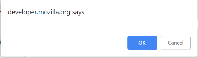
alertButton.click();
inputAndAcceptAlert("Some Text");
AlertButton.Click();
GetAlert().InputAndAcceptAlert("Some text");
prompt('Alert', 'Default value')
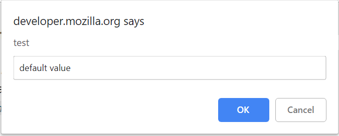
Available methods in Java:
| Method | Description | Return Type |
|---|---|---|
| acceptAlert() | Accept alert | void |
| dismissAlert() | Dismiss alert | void |
| getAlertText() | Get alert text | String |
| inputAndAcceptAlert(String text) | Input the specified text in the alert and accept it | void |
| validateAlert(Matcher |
Validate alert by matching passed value with the alert text | void |
Logs
//set up log level before running a test (for example in TestInit)
logger.setLogLevel(STEP);
@Test
public void loginTest() {
homePage.open();
userIcon.click();
loginForm.loginAs(DEFAULT_USER);
homePage.checkOpened();
}
//results in the log
[22:17.102 STEP] : Open 'Home Page'(url=>https://jdi-testing.github.io/jdi-light/index.html)
[22:23.617 STEP] : Click on 'User Icon'
[22:23.727 STEP] : Login as User(userName:epam; password:1234)
[22:24.516 STEP] : Check that 'Home Page' is opened (url CONTAINS '/index.html'; title EQUALS 'Home Page')
JDI uses the log4j library, but provides more levels of logging (requires log4j.xml / log2j2.xml).
logger.setLogLevel(STEP);
Level STEP can show business-related information in the console output, and you will find the same log in the target/.logs/
| LogLevel | Description |
|---|---|
| OFF(0) | No logging |
| FATAL(100) | Unexpected errors |
| ERROR(200) | Critical errors |
| WARNING(300) | Errors due to wrong parameters |
| STEP(350) | Business related info (JDI-related log level) |
| INFO(400) | Actions Info |
| DEBUG(500) | Debug info (do not use for production stage!) |
| TRACE(600) | Trace info (do not use for production stage!) |
| ALL(MAX_VALUE) | All log messages (do not use for production stage!) |
Reports
Allure
JDILogger:
| Method | Description |
|---|---|
| void error(String msg, Object... args) | Log failed step |
| void step(String msg, Object... args) | Log successful step |
AllureLoggerHelper:
| Method | Description |
|---|---|
| void failStep(String uuid, String screenName) | Log step is failed |
| void passStep(String uuid) | Log step is successfully completed |
| void startStep(String uuid, String message) | Start logging step |
Allure screenshots tests for WebPage.
Report Portal
TBD
SoftAsserts
@Test
public void buttonSoftAssertTest() {
assertSoft();
try {
redButton.assertThat().hidden().displayed()
.disabled().enabled()
.disappear().cssClass(is("uui-button red"))
.text(is("Big Red *** Button-Input"))
.text(containsString("Red Button"))
.attr("type", is("button"))
.tag(is("input"))
.assertResults();
Assert.fail("Test should throw asserts");
} catch (Throwable tr) {
assertThat(tr.getMessage(), is("[java.lang.AssertionError: \n" +
"Expected: is \"hidden\"\n" +
" but: was \"displayed\", java.lang.AssertionError: \n" +
"Expected: is \"disabled\"\n" +
" but: was \"enabled\", java.lang.AssertionError: \n" +
"Expected: is \"disappear\"\n" +
" but: was \"displayed\", java.lang.AssertionError: \n" +
"Expected: is \"Big Red *** Button-Input\"\n" +
" but: was \"Big Red Button-Input\"]"));
}
}
@Test
public void multipleValidationsTest() {
assertSoft();
try {
redButton.is().hidden().displayed().disabled().enabled();
jdiLogo.is().alt(is("Jdi Logo 777"))
.src(containsString("jdi-logo.jpg777"))
.height(is(100))
.width(is(1000));
SoftAssert.assertResults();
Assert.fail("Test should throw asserts");
} catch (Throwable tr) {
assertThat(tr.getMessage(), is("[java.lang.AssertionError: \n" +
"Expected: is \"hidden\"\n" +
" but: was \"displayed\", java.lang.AssertionError: \n" +
"Expected: is \"disabled\"\n" +
" but: was \"enabled\", java.lang.AssertionError: \n" +
"Expected: is \"Jdi Logo 777\"\n" +
" but: was \"Jdi Logo 2\", java.lang.AssertionError: \n" +
"Expected: a string containing \"jdi-logo.jpg777\"\n" +
" but: was \"https://jdi-testing.github.io/jdi-light/images/jdi-logo.jpg\", java.lang.AssertionError: \n" +
"Expected: is <1000>\n" +
" but: was <101>]"));
}
}
Soft Assert — assert that collects errors during test run. It doesn't throw exceptions when asserts fail, saving information about failures instead.
Here is the list of available SoftAssert class methods:
| Method | Description | Return Type |
|---|---|---|
| assertResults() | Outputs assert results | void |
| assertSoft() | Set the soft type of asserts | void |
| assertStrict() | Set the strict type of asserts | void |
| clearResults() | Resets assert results | void |
| setAssertType(String type) | Set the type of asserts | void |
Settings:
test.properties file — to choose the type of assertions, you need to update the
assert.typeproperty value; selectsoftorstricttype (#assert.type=soft | strict).to enable or disable SoftAssert in code, use
assertSoft()orassertStrict()methods from SoftAssert class.
Output results
There are two ways to use assertResults() method:
As a terminal method in a chain of multiple assertions (like in the
buttonSoftAssertTestexample).As a separate method if you need to check several elements (like in the
multipleValidationsTestexample).
JDI asserts
We also have some classes with JDI special asserts in the following packages:
- com.epam.jdi.light.asserts.generic
ListAssert.class includes the following asserts:
| Method | Description |
|---|---|
| each(JFunc1 |
- assert that each of list elements meet condition |
| any(JFunc1 |
- assert that any of list elements meet condition |
| onlyOne(JFunc1 |
- assert that only one of list elements meet condition |
| noOne(JFunc1 |
- assert that none of list elements meet condition |
TextAssert.class includes the following asserts:
| Method | Description |
|---|---|
| text(Matcher |
- asserts that element has presented text |
UIAssert.class includes the following asserts:
| Method | Description |
|---|---|
| displayed() | - assert that element is displayed |
| visible() | - assert that element is visible for user |
| notVisible() | - assert that element is not visible by user |
| disappear() | - assert that element is disappeared |
| hidden() | - assert that element is hidden |
| notAppear(int timeoutSec) | - assert that element does not appear during presented seconds |
| attr(String attrName, Matcher |
- assert that element has presented attribute |
| css(String css, Matcher |
- assert that element has presented css |
| hasClass(String className) | - assert that element has presented css class |
| hasAttribute(String attrName) | - assert that element has presented css class attribute |
| enabled() | - assert that element is enabled |
| disabled() | - assert that element is disabled |
UISelectAssert.class includes the following asserts:
| Method | Description |
|---|---|
| selected(Matcher |
- assert that option selected for element |
| selected(String option) | - assert that option selected for element |
| selected(int i) | - assert that option selected for element |
| values(Matcher<? super List |
- assert that element contains values |
| values(String... values) | - assert that element contains values |
| enabled(String... enabled) | - assert that items enabled |
| size(Matcher |
- assert element size |
| size(int size) | - assert that element size is equals to presented size |
| empty() | - assert that element size is empty |
| notEmpty() | - assert that element size is not empty |
| displayed() | - assert that element is displayed |
| expanded() | - assert that element is expanded |
| collapsed() | - assert that element is collapsed |
| disappear() | - assert that element is disappeared |
| hidden() | - assert that element is hidden |
| notAppear(int timeoutSec) | - assert that element does not appear during presented seconds |
- com.epam.jdi.light.ui.html.asserts
CheckboxAssert.class includes the following asserts:
| Method | Description |
|---|---|
| selected() | - assert that element is selected |
| text(Matcher |
- assert that element has presented text |
| deselected() | - assert that element is not selected |
ColorAssert.class includes the following asserts:
| Method | Description |
|---|---|
| color(String color) | - assert that element has presented color |
DateTimeAssert.class includes the following asserts:
| Method | Description |
|---|---|
| text(Matcher |
- assert that element has presented text |
| date(Matcher |
- assert that element has presented date |
| month(Matcher |
- assert that element has presented month |
| week(Matcher |
- assert that element has presented week |
| time(Matcher |
- assert that element has presented time |
| min(Matcher |
- assert that element has presented minimum value |
| max(Matcher |
- assert that element has presented maximum value |
ImageAssert.class includes the following asserts:
| Method | Description |
|---|---|
| src(Matcher |
- assert that element has presented src |
| fileName(Matcher |
- assert that element has presented file name |
| alt(Matcher |
- assert that element has presented alt |
| height(Matcher |
- assert that element has presented height |
| width(Matcher |
- assert that element has presented width |
LinkAssert.class includes the following asserts:
| Method | Description |
|---|---|
| text(Matcher |
- assert that element has presented text |
| alt(Matcher |
- assert that element has presented alt |
| ref(Matcher |
- assert that element has presented ref |
NumberAssert.class includes the following asserts:
| Method | Description |
|---|---|
| text(Matcher |
- assert that element has presented text |
| min(Matcher |
- assert that element has presented minimum value |
| max(Matcher |
- assert that element has presented maximum value |
| step(Matcher |
- assert that element step is equals to presented |
| placeholder(Matcher |
- assert that element placeholder is equals to presented |
| number(Matcher |
- assert that element number is equals to presented |
ProgressAssert.class includes the following asserts:
| Method | Description |
|---|---|
| max(Matcher |
- assert that element has presented maximum value |
| value(Matcher |
- assert that element value is equals to presented |
RangeAssert.class includes the following asserts:
| Method | Description |
|---|---|
| value(Matcher |
- assert that element value is equals to presented |
| min(Matcher |
- assert that element has presented minimum value |
| max(Matcher |
- assert that element has presented maximum value |
| step(Matcher |
- assert that element step is equals to presented |
TextAreaAssert.class includes the following asserts:
| Method | Description |
|---|---|
| text(Matcher |
- assert that element has presented text |
| rowsCount(Matcher |
- assert that element has presented quantity of rows |
| colsCount(Matcher |
- assert that element has presented quantity of columns |
| minlength(Matcher |
- assert minimum length of element |
| maxlength(Matcher |
- assert minimum length of element |
Driver Settings
We can change default settings placed in the test.properties file (located in src/test/resources):
| Property name | Description | Examples |
|---|---|---|
| chrome.capabilities.path | Path to the Chrome properties file. File should be located in src/test/resources. | chrome.capabilities.path=chrome.properties |
| driver | Specify which driver we want to use: chrome, firefox, ie, edge, opera, safari; or we can just replace it with ${driver} and read the exact driver name from command line or POM file. | driver = ${driver} driver=chrome |
| driver.remote.url | Tests can run on remote web servers. | driver.remote.url=http://localhost:4444/wd/hub |
| driver.remote.run | Explicitly specifies whether JDI should use a local or a remote driver. If not set, JDI would try to select driver based on the presence of driver.remote.url property and path to local driver. |
driver.remote.run=true |
| drivers.folder | Set up the driver folder. Use only absolute paths. The default value equals "resources\drivers". Note that drivers themselves are governed by the driver property. |
drivers.folder = C:\Selenium |
| driver.version | By default, JDI Light will download the latest version of a driver for us, but if we need a specific version we can put it here (in which case the framework will find and download exactly this version). | driver.version = LATEST driver.version = PRELATEST driver.version = 2.23.0 driver.version=3.0.0-beta4 |
| ff.capabilities.path | Path to the Firefox properties file. File should be located in src/test/resources. | ff.capabilities.path=ff.properties |
| ie.capabilities.path | Path to the Internet Explorer properties file. File should be located in src/test/resources. | ie.capabilities.path=ie.properties |
| timeout.wait.element | Set maximum wait for elements on an opened page; by default, equal to 10 seconds. Valid values are integers from 0 to 999. | timeout.wait.element = 20 |
public class TestsInit {
private final String pathToDriver = "src\\test\\resources\\Driver\\chromedriver.exe";
public static WebDriver getMyDriver() {
System.setProperty("webdriver.chrome.driver", pathToDriver);
return new ChromeDriver();
}
@BeforeSuite(alwaysRun = true)
public static void setUp() {
WebDriverFactory.useDriver("my_driver", () -> getMyDriver());
initSite(StaticSite.class);
openUrl(DOMAIN);
}
}
Here is an example of a custom driver initialization:
JDI Settings
| Property name | Description | Examples |
|---|---|---|
| assert.type | Assert type: soft or strict. | assert.type = soft |
| browser.kill | Specify when to shut down the browser. | browser.kill=afterAndBefore browser.kill=after browser.kill=before |
| browser.size | Browser window size. By default, JDI Light will maximize the browser window, but we can set the exact size. | browser.size = MAXIMIZE browser.size = 1024x762 |
| domain | Web application root URL (used when our tests work with a single application). Can also be read from the command line if set up as ${domain}. |
domain = https://jdi-testing.github.io/jdi-light/ domain = http://127.0.0.1:8080 |
| element.search.strategy | This property controls two aspects of element search. First, it limits the scope of searched elements on certain criteria (any (all elements on the page), displayed (elements for which Selenium isDisplayed() is true), enabled (Selenium isDisplayed() and isEnabled() are true), inview (Selenium isDisplayed() and JDI isClickable() are true). Second, it defines a number of found elements (single or multiple). You can set the value of this property either as a comma-separated combination of these options (say, enabled, single), or one of special values: soft (equal to any, multiple) and strict (equal to displayed, single). |
element.search.strategy = soft element.search.strategy = enabled, multiple |
| html.code.strategy | Defines a strategy for writing HTML code of the last web element processed before test failure to log. If it set to on failure value, then web element's HTML code will be logged (and added to Allure report as well) when test fails, if possible. Options: off, on failure, on assert, new page. |
html.code.strategy = off |
| log.level | Defines level of detail in log entries: OFF (no logging); FATAL (unexpected errors); ERROR (critical errors); WARNING (errors due to wrong parameters); STEP (business-related info); INFO (actions info); DEBUG (debug messages); TRACE (trace info); ALL (all log messages). If no level is explicitly specified, it will be treated as INFO. |
log.level = STEP log.level = ERROR |
| page.check.after.open | Check if a page has been opened. Available options: NONE, NEW_PAGE, EVERY_PAGE. |
page.check.after.open = NONE |
| page.load.strategy | Similar to Selenium strategies to load the page. Options: normal, eager, none. |
page.load.strategy = normal |
| screens.folder | Set up the screenshot folder. | screens.folder = C:\Test-screenshot |
| screenshot.strategy | Defines a strategy for taking screenshots. If it set to on fail value, then when a test fails, the last web element processed will be highlighted and page screenshot will be taken, saved and added to Allure report as well, if possible. Options: off, on failure, on assert, new page. |
screenshot.strategy = off |
| smart.locators | A list of templates for Smart locators. Must be separated by ; symbol. |
smart.locators=#%s;[ui=%s] |
| timeout.wait.page | JDI Light automatically defines that new page is opened and in this case will use this timeout (usually it is more than enough for an element). By default, it's 30 seconds. Valid values are integers from 0 to 999. | timeout.wait.page = 40 |
Parallel tests run
TBD
Remote test runs
TBD
SauceLabs integration
Before running JDI project in Sauce Lab, you need to set up Sauce Lab Credentials.
Set Your Sauce Labs Credentials
- Copy your Sauce Labs username and accessKey in the User Settings section of the Sauce Labs Dashboard.
- Open a Terminal window (command prompt for Windows) and set your Sauce Labs Environment variables:
Mac OSX:
$ export SAUCE_USERNAME="username"
$ export SAUCE_ACCESS_KEY="accessKey"
Windows:
> set SAUCE_USERNAME="username"
> set SAUCE_ACCESS_KEY="accessKey"
To set an environment variable permanently in Windows, you must append it to the
PATHvariable.Go to Control Panel > System > Windows version > Advanced System Settings > Environment Variables > System Variables > Edit > New.
Then set the "Name" and "Value" for each variable.
- Test the environment variables:
Mac OSX:
$ echo $SAUCE_USERNAME
$ echo $SAUCE_ACCESS_KEY
WARNING FOR UNIX USERS!
- If you have problems setting your environment variables, run the following commands in your terminal:
$ launchctl setenv SAUCE_USERNAME $SAUCE_USERNAME
$ launchctl setenv SAUCE_ACCESS_KEY $SAUCE_ACCESS_KEY
Windows:
> echo %SAUCE_USERNAME%
> echo %SAUCE_ACCESS_KEY%
Required Sauce Lab Capabilities
The following capabilities are required for Sauce Lab:
username— Sauce Lab username.accessKey— Sauce Lab access key.seleniumVersion— preferred version of Selenium.name— test run name.
Here are some optional capabilities:
maxDuration— how long is the whole test allowed to run.commandTimeout— the max time allowed to wait for a Selenium command.idleTimeout— how long can the browser wait for a new command.
More optional capabilities can be found here.
JDI options
In order to run tests with Sauce Lab you need to set up remote settings in test.properties file:
remote.type=sauce
driver.remote.url=https://ondemand.eu-central-1.saucelabs.com:443/wd/hub
See your personal remote URL: look at the 'Driver Creation' section here.
Remote URL should be different if you are from US.
And that's it. Set Sauce Lab capabilities, set remote execution in test.properties, and you can run tests with Sauce Labs.
Applitools Eyes integration
1. Set your Applitools Eyes key as a system variable
Open a Terminal window (command prompt for Windows) and set your Applitools Eyes key:
Mac OSX:
$ export APPLITOOLS_API_KEY="Applitools_Eyes_key"
Windows:
> set APPLITOOLS_API_KEY="Applitools_Eyes_key"
To set an environment variable permanently in Windows, go to Control Panel > System > Windows version > Advanced System Settings > Environment Variables > System Variables > Edit > New.
Then set the "Name" to APPLITOOLS_API_KEY and "Value" to Applitools_Eyes_key.
Check that the environment variable is set:
Mac OSX:
$ echo $APPLITOOLS_API_KEY
WARNING FOR UNIX USERS!
- If you have problems setting your environment variable, run the following command in your terminal:
$ launchctl setenv APPLITOOLS_API_KEY $APPLITOOLS_API_KEY
Windows:
> echo %APPLITOOLS_API_KEY%
2. Add Applitools Eyes dependency to the pom.xml file:
<dependency>
<groupId>com.epam.jdi</groupId>
<artifactId>jdi-light-eyes</artifactId>
<version>1.3.23</version>
</dependency>
3. Configure before and after methods:
In the before suite method (if you use testNG, that'll the method annotated by @BeforeSuite) call
visualTestInitJdi();
Before each test call (if you use testNG, that'll be in the method annotated by @BeforeMethod)
newVisualTest(method);
In the after suite method call
closeAllEyes();
That's it, check your tests results here.
Multiple domains example
Here is the example MultipleDomainsExampleTest.java of test class with multiple domains. For this example the following files were added to the project: